40 great ads using unique selling point
October 31, 2022
In today's cut-throat business world, competition is fierce, no matter what industry you're in.
With so many options available to consumers, they choose products that fit their needs and lifestyle, making it crucial for you to stand out from the crowd. 🤔
That's where your unique selling proposition (USP) and positioning come in.
Users need to understand what sets you apart from your competitors and why you're the better choice.
Without a clear USP visible in your advertising, your audience may not resonate with your message, leading to a decrease in clicks and purchases from your paid social content.
But don't worry, we've got your back!
We've compiled a list of inspiring examples to help you effectively showcase your USP and position yourself as the best choice for your audience.
So, get ready to differentiate yourself and boost your sales with these expert tips!
The Theory Behind Unique Selling Propositions
What sets your brand and products apart from the rest?
It's your unique selling proposition (USP) - the secret sauce that makes you stand out in a crowded market.
Your USP can be one specific benefit or a combination of factors that sets you apart from the competition.
But, do keep in mind that clarity is key, and less is often more when it comes to USPs.
The most effective USPs are those that communicate your strengths while also offering something valuable and important to your customers.
It's the sweet spot where your skills meet your customers' needs.
This can be a product benefit, like a larger screen or an innovative feature, or even a unique branding approach, like Apple's "Think Different" campaign.
Either way, when you communicate your unique value proposition effectively, your customers will be drawn to your brand and products like moths to a flame.
40 Ads Using Unique Selling Propositions
Let's dive into the world of advertising and explore how top-notch brands use their unique selling points to captivate their audience.
1. Customize this! 💪
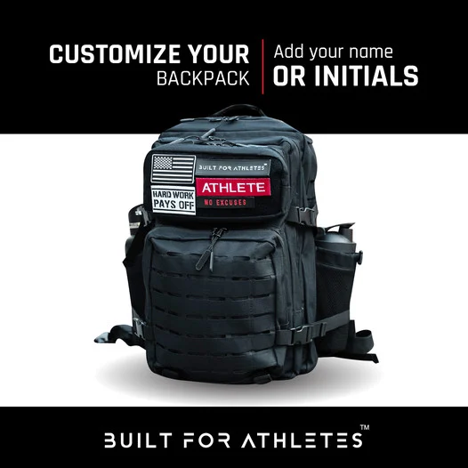
Everyone wants to be unique and stand out from the crowd, right?
So, what better way to make your customers feel special than by allowing them to customize their purchases exactly to their liking?
Built For Athletes understands this desire for personalization and offers high-quality backpacks tailored to sports enthusiasts and gym-goers alike.
But that's not all! Their ad is also visually stunning, thanks to a carefully curated color palette.
2. Eco-conscious fashion 🌊
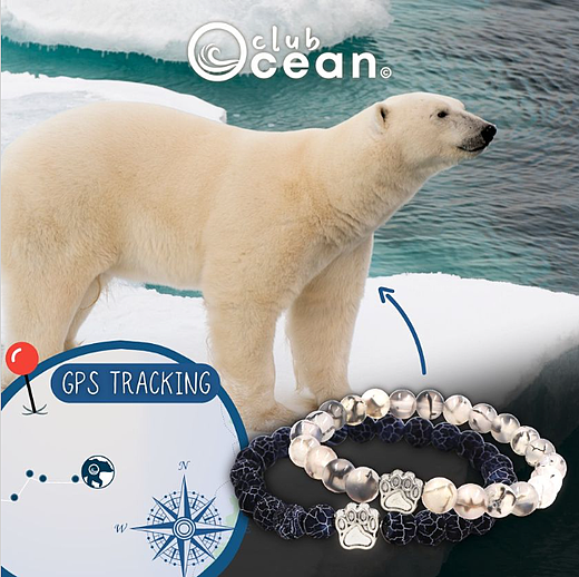
People these days are more mindful of their impact on the environment, and they want to make purchases that align with their values.
That's why Club Ocean's ad is so appealing.
By offering stylish bracelets and accessories that allow customers to track live polar bears in real-time, they're not only selling a product, but also supporting a good cause. 🐻
Not only does this give customers a unique selling proposition to consider, but it also makes them feel like they're making a difference with their purchase.
Who wouldn't want to wear a trendy accessory that also helps save an endangered species?
Sustainability is a powerful USP - here’s how beauty and lifestyle brands use Catalog Ads to highlight eco-friendly values.
3. Quality and attention to detail 🖤

When it comes to high-end products, attention to detail can be a powerful selling point all on its own.
Trendhim knows this well and showcases their products up close and personal, highlighting their intricate details for viewers to admire.
But that's not all they offer.
Their rings and jewelry can also be custom engraved or personalized, providing additional value for potential customers.
And they do it all with a sleek black and gray color scheme, exuding luxury and sophistication that perfectly matches their high-quality products.
4. Less can be more

In advertising, simplicity can be a powerful tool that speaks volumes without being overbearing.
MNMAL understands this and opted for a minimalist approach to showcase their sleek and stylish black watches.
The ad's design is a testament to the idea that less is more, featuring a simple black and white background and a slender, understated font that exudes elegance.
The overall effect is a timeless and sophisticated aesthetic that lets the product speak for itself.
Sometimes, the most effective way to make a statement is to keep it simple.
5. Do all birds fly?🚀
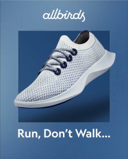
The new ad for Allbirds running shoes is a thing of beauty.
With a simple, clean design that showcases the product in all its glory, this ad is yet another reminder that sometimes less is more.
The ad's strong slogan is a call to action that's sure to motivate even the most reluctant runners.
And while we all know how those Monday morning runs can end, there's no denying the effectiveness of this ad in inspiring people to give it a try.
Of course, it helps that the Allbirds running shoes look incredibly comfortable. With a product this good, there's no need for flashy design or over-the-top marketing tactics.
The shoes speak for themselves, and this ad is a perfect example of how simplicity can be a powerful tool in advertising.
6. Back to the basics

Imagine scrolling through your Instagram feed and suddenly, an ad for the Oura Ring catches your eye.
The background colors pop, the big white words grab your attention, and the sleek, technological ring practically jumps off the screen.
But what really sets this ad apart is how it showcases the product's benefits.
In just a few short seconds, the ad makes a compelling case for why you should buy the Oura Ring.
Whether you're looking to improve your sleep, reduce stress, or optimize your performance, this ring has something to offer.
With its eye-catching design and persuasive selling point, this ad is a prime example of how effective advertising can be when done right.
7. Fun offer for cool friends 😎

You might think that businesses exist solely to attract customers, but the truth is that the most successful ones focus on building relationships instead.
And one of the best ways to create those lasting connections is through fun and engaging advertising.
By using a combination of colors that not only look great together but also inspire trust, businesses can create ads that don't feel like sales pitches.
Instead, it’s an opportunity to connect with customers and build relationships that last.
And that's exactly what makes this ad so effective.
With its fun slogan, simple design, and perfect use of color, it's the kind of ad that doesn't just sell a product. It creates a sense of loyalty and trust that keeps customers coming back for more.
8. I love coffee

This next ad strikes the perfect balance between playful and informative, giving you all the unique details about an amazing product.
Coffee lovers everywhere will agree: every little extra bit makes buying this product even more worthwhile.
So why not showcase all the amazing features of your brand’s product?
It’ll help show the defining reasons why your product is great, and show your customers what sets you apart from your competitors.
9. USP's for the win 😎
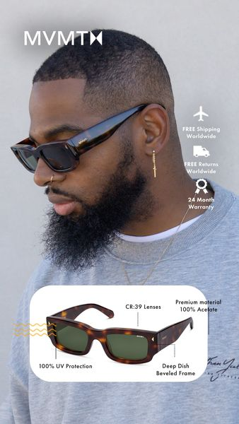
Story ads are the perfect outlet for showcasing all your brand’s unique selling points.
Take a page from MVMT's book: they not only showcase 7 amazing USPs, but they also reassure viewers with their cool-looking logo and model.
Furthermore, including model pictures in paid ads can make the ad more noticeable and make the product easier to relate to.
.png)
We’ve found that , on average, ads that include faces reach a higher performance, and that top-performing advertisers use people in content almost twice as much (+92%), compared to bottom performers
10. USP + sale

Who doesn't love a good sale, especially in the summertime?
But what makes things even better is when a brand goes above and beyond to showcase their unique selling points.
Take this brand for example: they've done an amazing job highlighting their thin and stylish design, which is sure to turn heads.
And when you see something up close, you know it's important and represents quality and craftsmanship.
When combining strong value propositions with urgency, these Campaign-focused Catalog Ads show how to drive conversions at scale.
11. Serious TECH
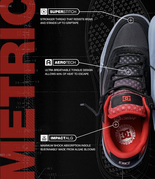
Wow, this ad is seriously slick!
The combination of red, white, and black is a real winner, creating a look that's both striking and stylish.
But what really sets this ad apart is the way DC has chosen to showcase the unique selling points of their shoe.
It's an approach that really catches the eye, making the shoe feel special, new, and important.
And even if you don't take the time to read through the USPs, you know you're getting something of value because this shoe is just that good.
Tech products shine when their USPs are visually clear - see how electronics brands design Catalog Ads to highlight performance.
12. 80% pink
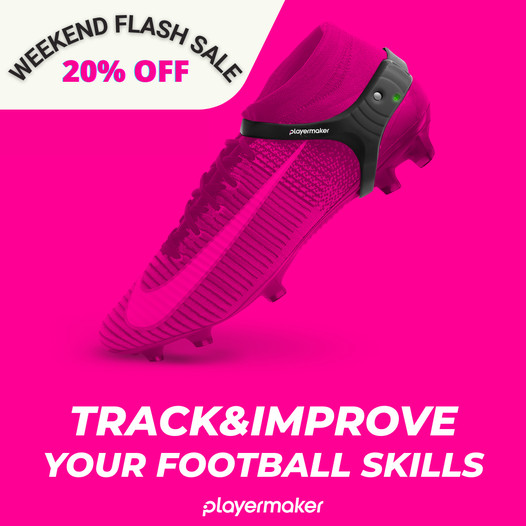
This ad is a triple threat, nailing three key jobs of any successful advertisement.
First up, it grabs your attention. Check!
Next, it presents real value. Check!
And finally, it offers a great deal. Check!
It's a simple but effective approach that's sure to get results.
After all, customers need to notice your ad and feel like they're getting something of value.
And by adding a bit of urgency into the mix, you'll be sure to see those sales start rolling in.💸💸
13. More subscribers with a sandwich
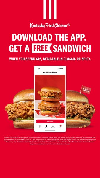
With beloved targeting options disappearing from Facebook and other platforms, it's time to take matters into your own hands.
The solution? Own your audience!
Building an email list or increasing your app users is a smart move. And this ad from KFC is a great example.
By offering a free sandwich, they not only entice more people to come into their shop, but also increase their app user base.
It's a win-win situation!
Sure, the free sandwich may cost them a bit, but it more than pays for itself in the long run.
Often, a small incentive can go a long way in attracting new customers and keeping your current ones coming back for more.
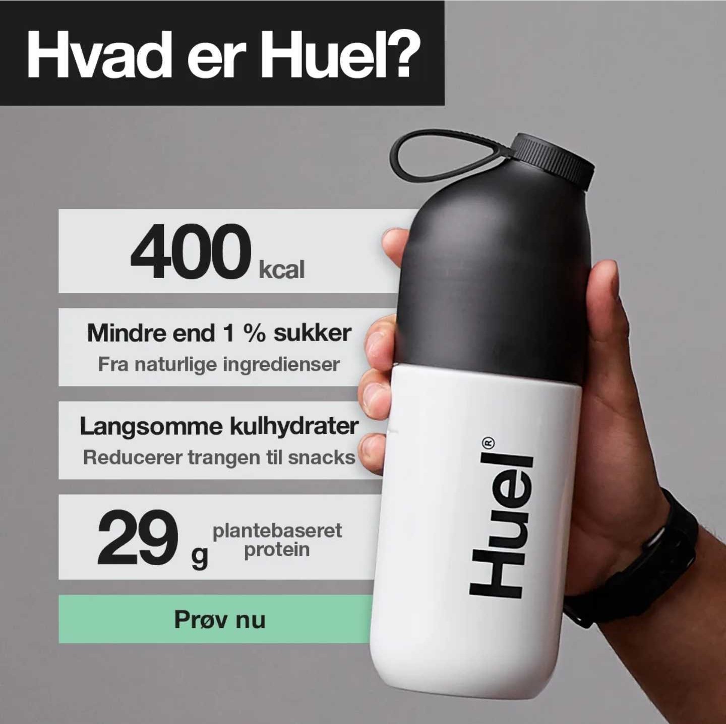
14. Fueled with purpose
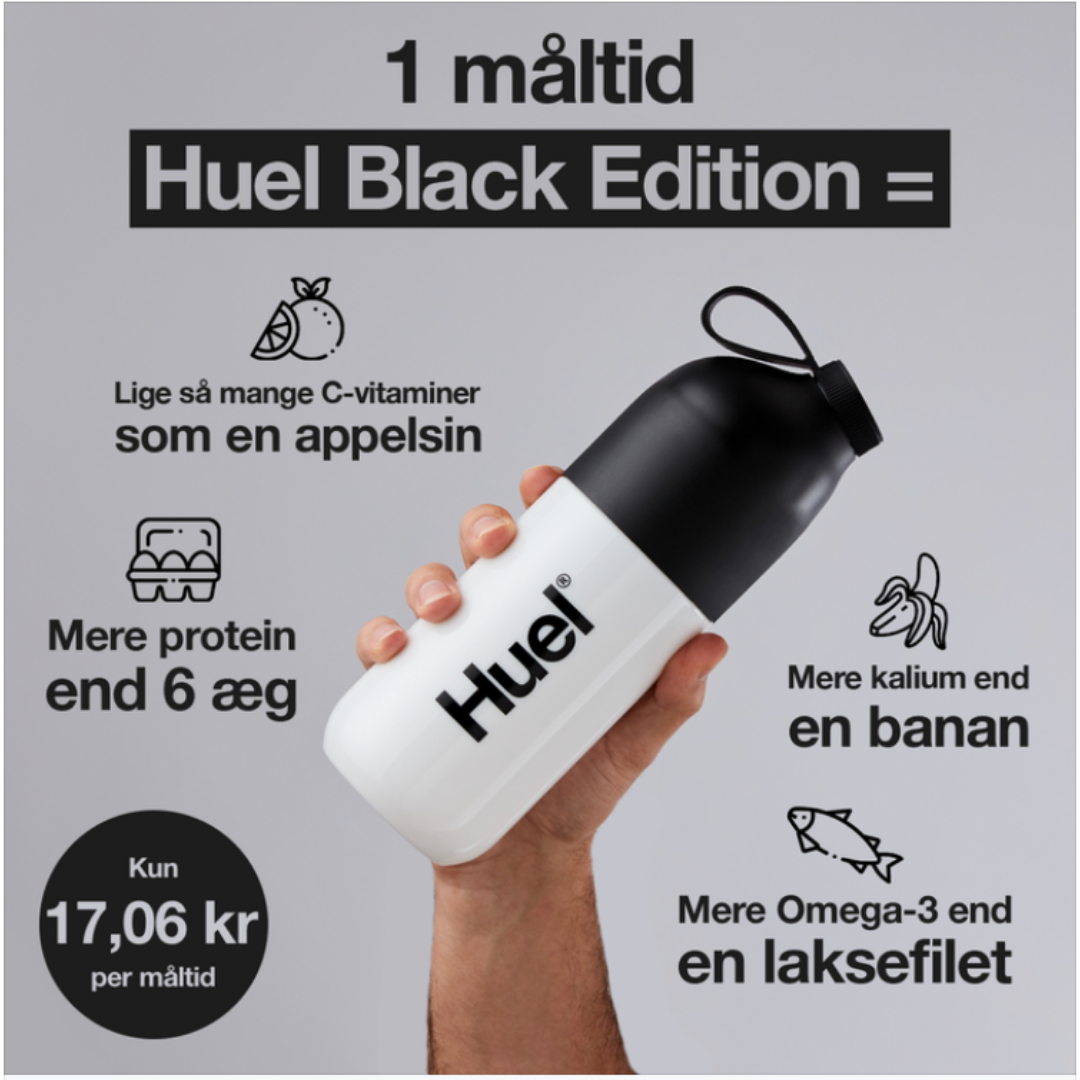
Huel's ad screams healthy and sustainable living, capturing attention with a well-positioned product and relatable human touch.
With a clear message and emphasis on its unique selling points, it's easy to see how Huel's meal replacement shakes fit into any busy lifestyle.
It's an ad that's both informative and visually stunning, hitting all the marks for a successful marketing campaign, and all while keeping the end customer in mind.
Purpose-driven messaging often connects best with mid- and high-end markets - this guide shows how luxury brands shape their Catalog Ads to elevate brand identity.
15. Compact design with a sharp close up⌚
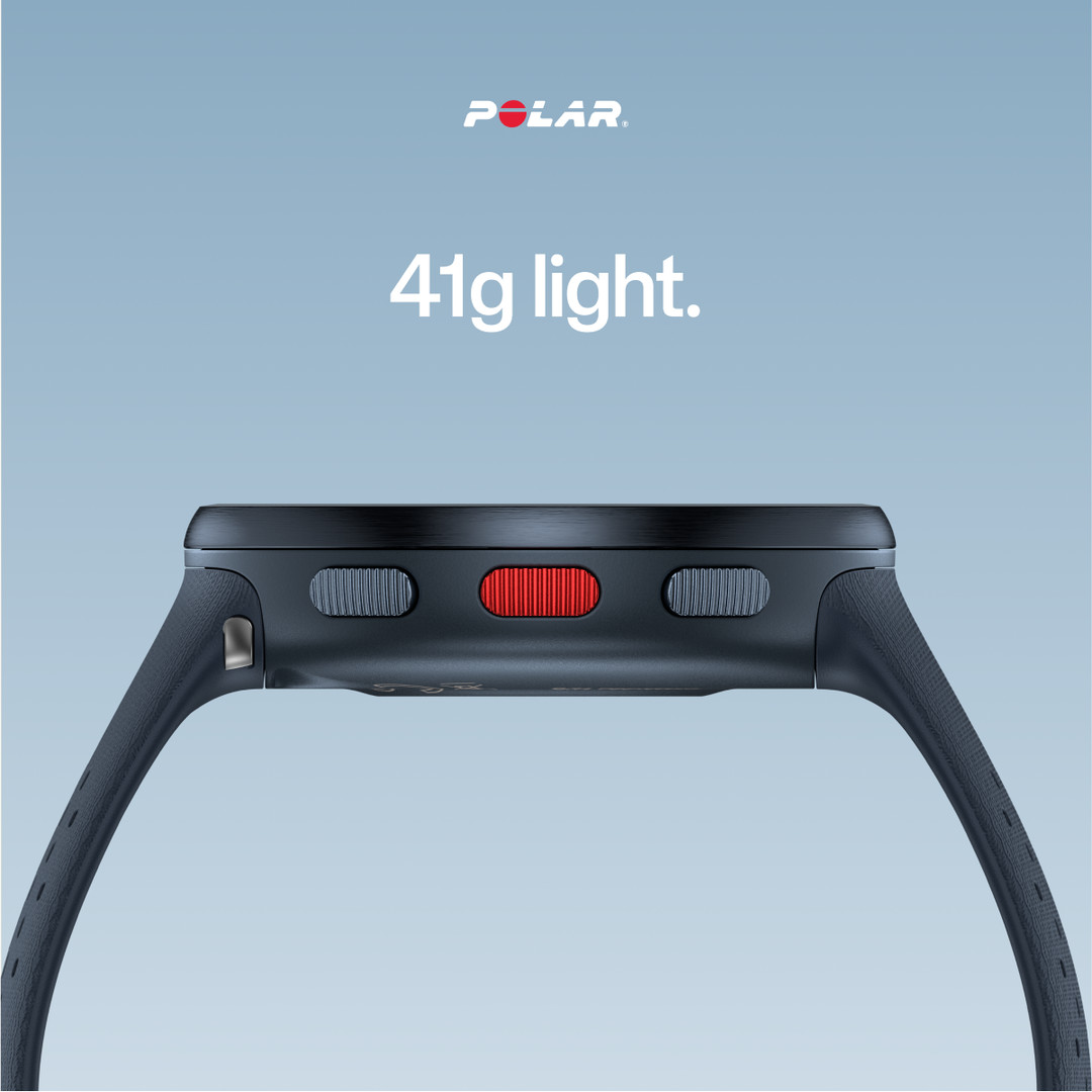
Polar's products are known for their clean design and simple functionality, and this ad is a perfect representation of that.
The product is the star of the show, showcased in a stunning close-up that highlights its sleek and slim design.
The copy is relatively short but effective, drawing attention to the main selling point: a watch that weighs only 41g!
The side angle shot further emphasizes the watch's slimness, making it an irresistible option for anyone looking for a weightless watch.
16. Classy and sophisticated design
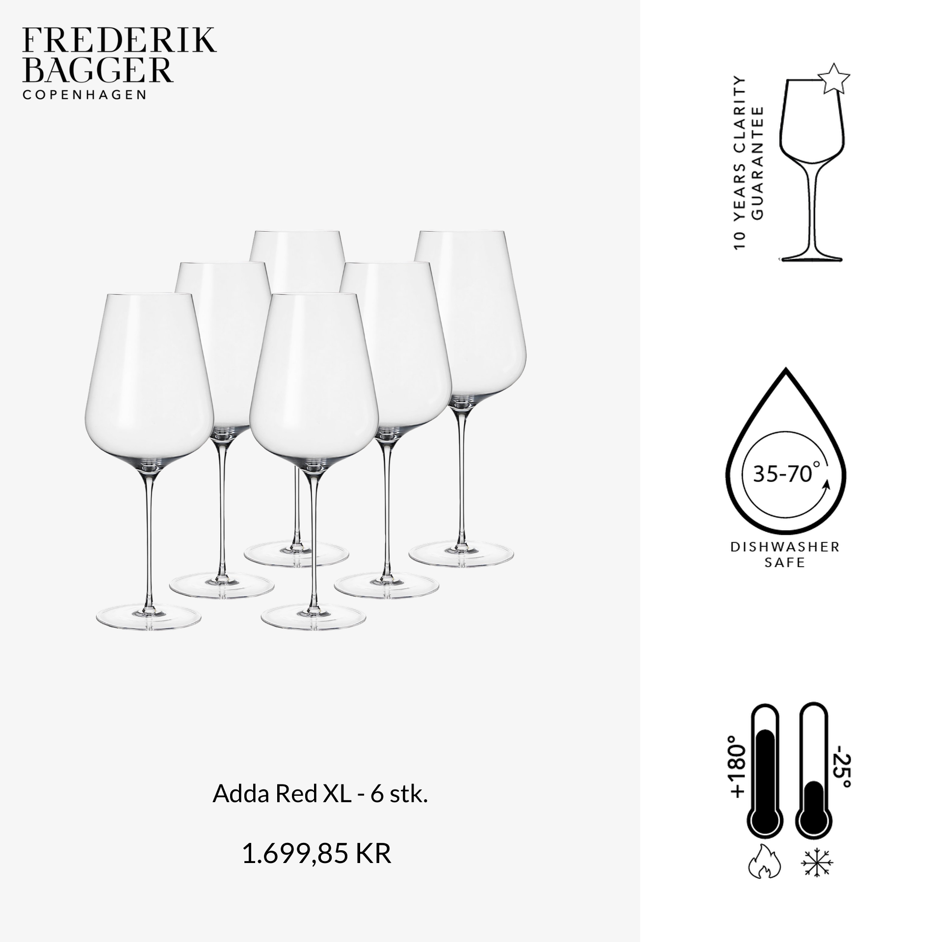
This next ad is an absolute masterpiece of design!
The creators have skillfully applied the rule of thirds and color contrast to create a visually stunning and sophisticated image.
Furthermore, the wine glasses from Frederik Bagger Copenhagen are showcased beautifully, with all the essential product information presented neatly on the side.
This ad is sure to captivate your attention and leave you longing for these elegant glasses.
.png)
What’s more is that this ad knows the importance of using light, bright color choices, which has been shown to perform 70% better than dark content throughout most of the year.
Overall, using light content has been proven to yield higher ROIs than darker creatives, making it a smart choice for eCommerce brands looking to maximize their success.
17. The perfect mix of content and creativity.
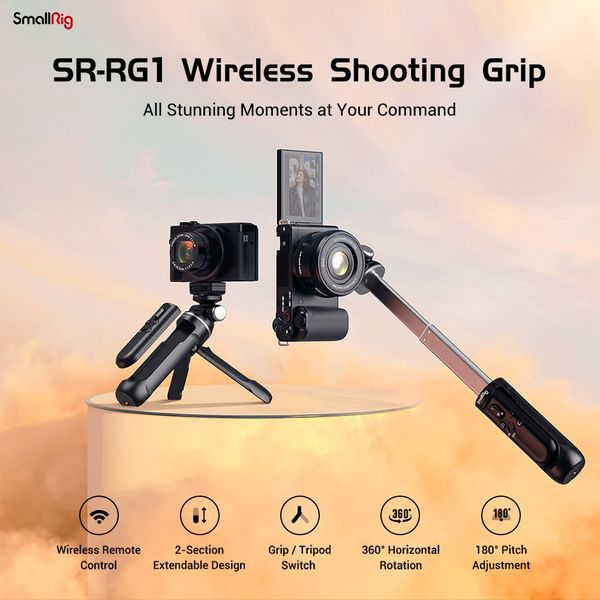
This ad is a visual masterpiece with a misty background and a perfect sundown sky-cloud blending.
The wireless shooting grip takes center stage and is positioned on top to emphasize its ability to capture shots from any angle.
The ad's ethereal vibe perfectly matches the grip's steadiness and durability, even in challenging environments.
The use of small icons as product specs makes it easy for viewers to digest information without feeling overwhelmed.
Overall, a great ad showcasing everything the product can do!
18. Dynamic sales start now!
The use of the rule of thirds is perfectly demonstrated in this ad, with one-third of the space dedicated to the unique selling points and two-thirds for the product.
The red background grabs attention and the model photos keep it.
This ad includes all the elements that help buyers make decisions, and can be even more effective when combined with retargeting for cart abandonment.
Consider including information about where the product is made, delivery details, logos, brand and model information, and shopping options in your own ads, and you’ll be well on your way to landing that next sale.
19. Tenzin Norgay would be jealous

These boots were made for winter adventures and this ad makes it crystal clear.
With a snowy background and a clever image of a non-slip sole, you know these boots will keep you steady on your feet.
Plus, the ad showcases the variety of colors available, and with a whopping 49% discount, it's hard to resist.
But on top of all that, fast delivery means customers can hit the trails in no time.
Overall, this is another great example of how to showcase your products using a unique selling proposition.
20. Prickly leather ⌚
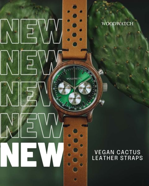
The wooden watch springs into view, with a slick top-down look. On the left, we have 5x New, the first four are merely outlined and the final one in bold so that we really know that this is new. This all means there’s an exciting and also cohesive whole that revolves around a new product that has a unique selling point, and every part of the ad supports that particular notion.
21. But can it run Crysis?
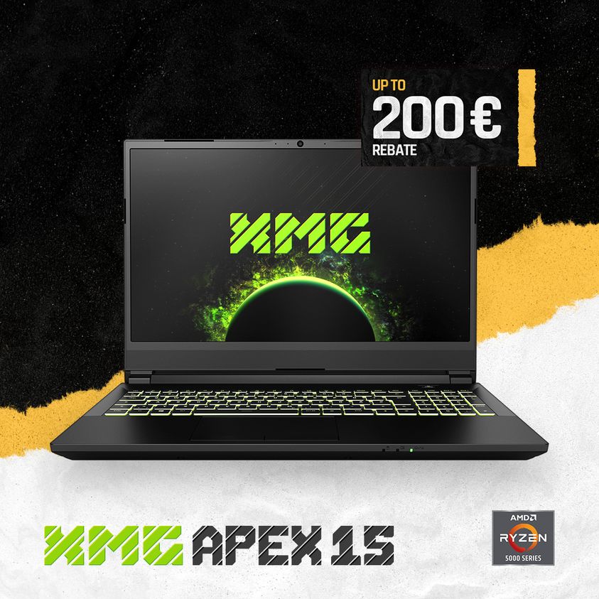
Boom, there it is front and center, looking like we are already using the laptop. We get a view of the screen with the nice XMG logo and the keyboard. No imagination needed, not a black block to stare at. The logo of XMG has its own particular color, soylent green, which makes it stand out amidst the three other main colors used for the background and for the pricing bracket in the right corner of the product. Another fine detail is the AMD Ryzen sticker in the bottom right corner, just for the product-savvy nerds.
22. These can definitely run Crysis
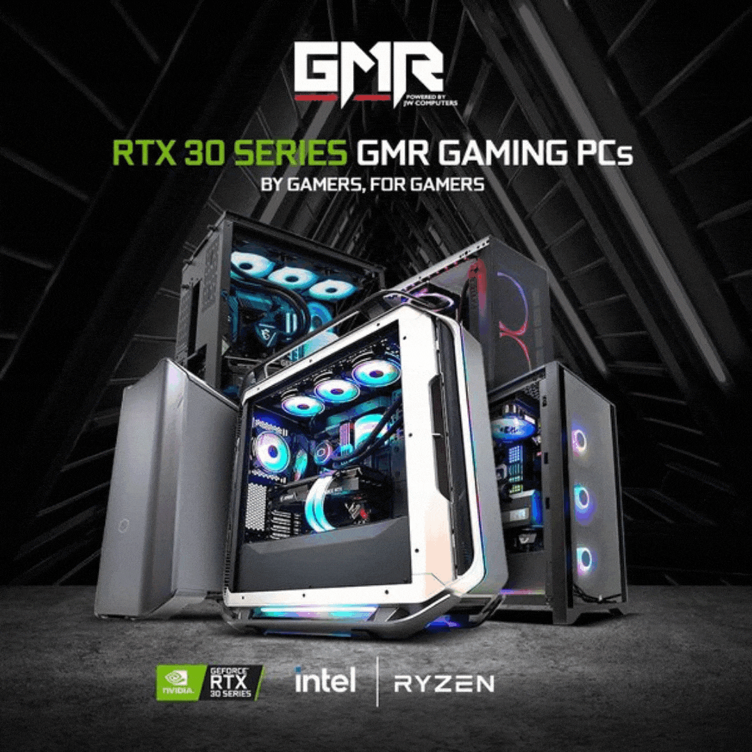
RAZER, THOR, SEKIRA, PHANTOM! The carrousel ad bubbles with excitement with each new product jumping at you. It starts with a collection of different stationary PCs and then it scrolls through the visually diverse cabinets, with those powerful names in eye-catching colors. It gives the ad some punch, and the breakneck speed of the images keeps us engaged and invites a second or third viewings just in case we missed something on the first go. And for the PC master race it is always a nice detail to show what the PC has been built with. A powerful ad, simply put, that packs a lot of punch.
23. Imagine your living room here
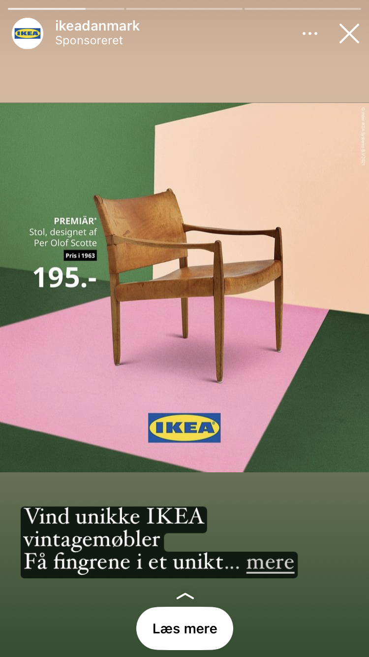
The chair catches our eyes, it's a vintage chair in an IKEA ad, unexpected and intriguing .🤔 Here everything is very angular, matching the design of the chair itself and the IKEA Logo. Two different earthy colors of green contrasting the wooden sheen of the chair and the pink floor cuts through the dark green as if it was a carpet. The different colored slanted squares gives the chair a sense of depth and space, thus it invites us to quickly assess how it would look in our home. To the left, just right next to the back of the chair we can see the name, the designer, and the price in white. All the necessary information to inform a purchase.
.png)
This ad also chose to visibly display the price of the chair, which is a good practice to provide more information and align price expectations before users click.
On average, eCommerce ads that show the price perform 25% better than ads that don't.
Keep that in mind...
Immersive visuals make lifestyle products shine - see how Home & Lifestyle brands use Catalog Ads to help customers visualize the product in their lives.
24. Cool Blue

Let us stay for a brief moment in the snack department. An open tub of ice cream overflowing with the frozen creamy goodness is at the forefront of the image, the cholesterol rising by just looking at it. The whole image emanates a coolness to it. The mix of a soft blue tint, and the white text, reminds us of the ice cream. The snowflake Icon and the ‘Delivered frozen’ guarantee🥶 is unexpected, delivery right to the doorstep! Better yet: it also promises that we won’t receive a room temperature tub of sludge with cookie dough in it. Being an Instagram story, the view time is limited and the ad has only the necessary information present, to awaken your hunger for ice cream.
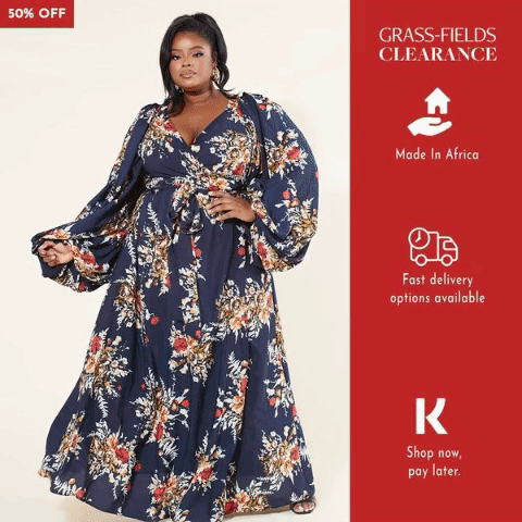
25. Removing any barriers of buying
This ad has all the elements to help buyers make a decisions Competition on Black Friday sales is fierce. Any additional information that can help make a buying decision is crucial. This ad showsmultiple unique selling props:
- The savings on Black Friday
- Urgency element (Limited time deals)
- Logo's Brand and Product + model
- Delivery details
- Black Friday sticker
.png)
The color choice in this ad is perfect - not only visually but also judging from our data.
For Black Week advertising, black & orange is the best performing color combination, with a 37% higher performance than the standard black & yellow.
Orange is similar enough to yellow to still evoke "BLACK FRIDAY!", but different enough to stand out among same-looking Black Friday campaigns.
26. Multiple visual focal points ⚡
One of the things that we really enjoy about this ad is how it has a lot going on visually. The color scheme, font choices, and layout all work together to display an attractive design. The product placement is done really well too. It stands out nicely against the grey background, while also pairing well with the green in splashes. This draws attention, and makes you want to look an extra time 👀 The use of text splash gives the reader a break from the ad's visuals, plus it does a good job at laying out the information that you need.💯 The concept overall works really well visually and causes readers to take notice.
27. Law of similarity?

The ad clearly shows what the product and the offer are about. The Gestalt Law of Similarity is at play here. It regroups similar elements together by perceptible characteristics. It is all about proportion, texture, color... centering the product on the picture creates a natural focal point for the ad. The font is big and bold, so it stands out and can be read clearly even from a distance. This makes it easy for consumers to read, which increases ad awareness. The design is simple yet well-balanced and eye-catching, which makes it attractive to buyers.
28. Product relevance
This ad is a great example of a mid-funnel ad. Mid-funnel ads typically focus on highlighting key and relevant information in order to convince customers to purchase a product. This example shows exactly what the customer needs in order for them to take action when they are at this stage of consideration. 📲 Another thing that stands out is that there are no other distractions around it. The white space makes it easier for your eyes to focus on the product.
29. 1/2, 1/3, 2/3
This is another ad that uses the cropping of products to catch our attention, and letting our brain fill in the parts we can't see - and that is not too hard, because most of us know what these products look like. The brilliant placements with the Rule Of Thirds in mind really help toward the calming and nice feel of the ad. The two left thirds are reserved for the products, while the third to the right is used for showing information about said products.
30. 3D bottle
The first thing you notice in this ad is undoubtedly the bottle and the hand holding it - after that, it's the big numbers. And there are a couple of great reasons for this. The first thing is the feel of depth in this ad, which makes the bottle jump right out in our face. Secondly is quite simple the hand/arm, because we humans love to see other humans - this grabs our attention. The last thing is the overlap between the product and the description, because of the overlap between these two elements - we naturally notice both. You can read more about elements grabbing attention right here.
31. Pink food

There is no doubt on what they want us to focus on. The text. Having white text on a very bright and saturated color, makes the text feel almost engraved in the background itself. Everything is centered in the ad, and the most calm part (where our eyes gives the most attention) is the top half where they conveniently have their tagline written.
32. New toothbrush?
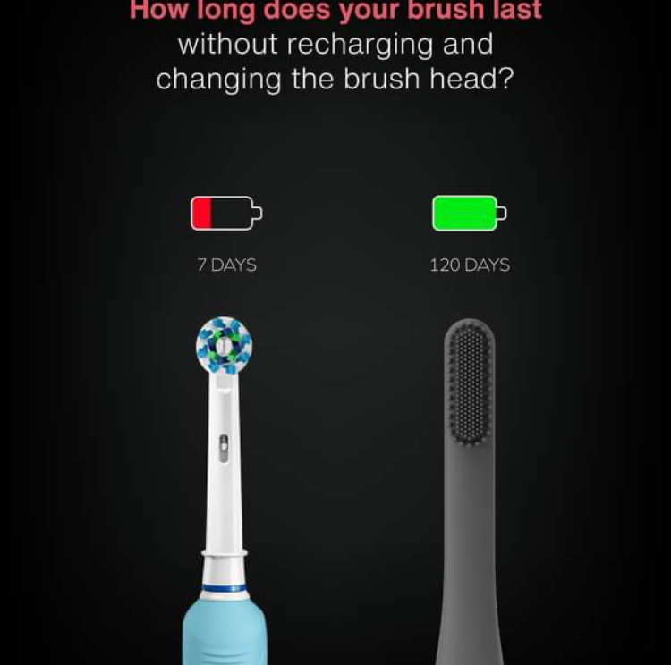
Bright colors on a black background are impossible not to notice. That's why we notice the green and red battery icons. Another thing we notice quickly is the 'normal' electric toothbrush, and that's actually quite interesting why they did that. It might be because you see that it is a toothbrush, and afterwards look at their toothbrush and think "this is actually quite cool”
33. The perfect combo
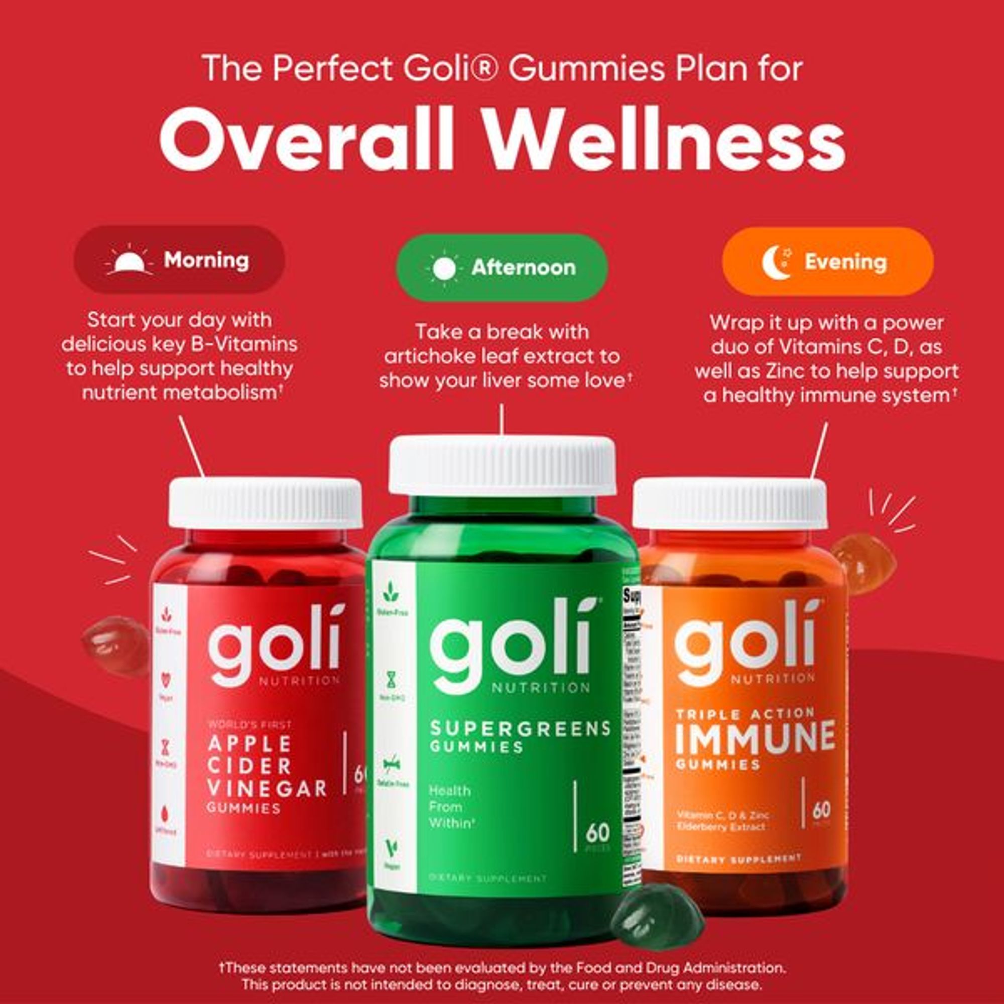
Once again, we have a product ad filled with simple, easy-to-understand value. Goli shows not one but three of their supplement products that are—highlighted in large, easy-to-read font—great for supporting your overall wellness. The ad also makes it easy to see the difference between the three types of supplements by explaining exactly when they're meant to be taken, what's in them, and what health benefits they provide. And another great thing is they've chosen to do all this on a bright red, visually-stunning background, which quickly grabs your attention and draws you in to read more about their product.
34. The power of energy
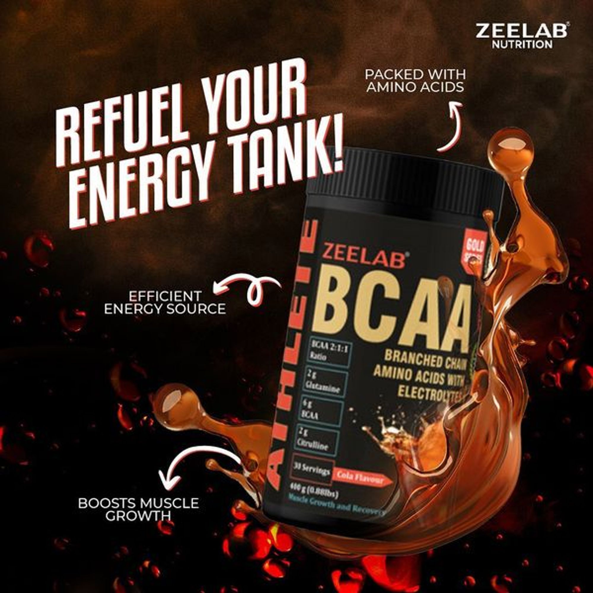
Keeping your ads simple and to the point can often be beneficial. But other times, you can create an active scene to captivate the audience's attention and draw them in to learn more. And this next ad from ZEELAB does precisely this! Overall, it has a lot going on, including a large, in-your-face font for its tagline and a small, almost imperceptible logo for a touch of added branding. But what we really like about this ad is that they've listed out the benefits of the product. So once the active scene grabs your attention, you're automatically drawn to reading and learning more about what the product offers!
35. Eye-catching benefits

Sahira created an elegant and visually-captivating ad. They've chosen bright red and soft blue colors, contrasting beautifully with the model's natural skin tone. These genuinely powerful colors automatically catch your attention and cause viewers to stop scrolling. The model also wears various jewelry pieces, making the scene even more beautiful and drawing attention to the product itself. And on top of all that, the brand chose to highlight its product's most significant benefit—its water-resistant jewelry. So not only will the ad stop viewers in their steps, but they will also easily understand the benefit of buying and wearing jewelry from Sahira.
36. Feeling good about what you buy
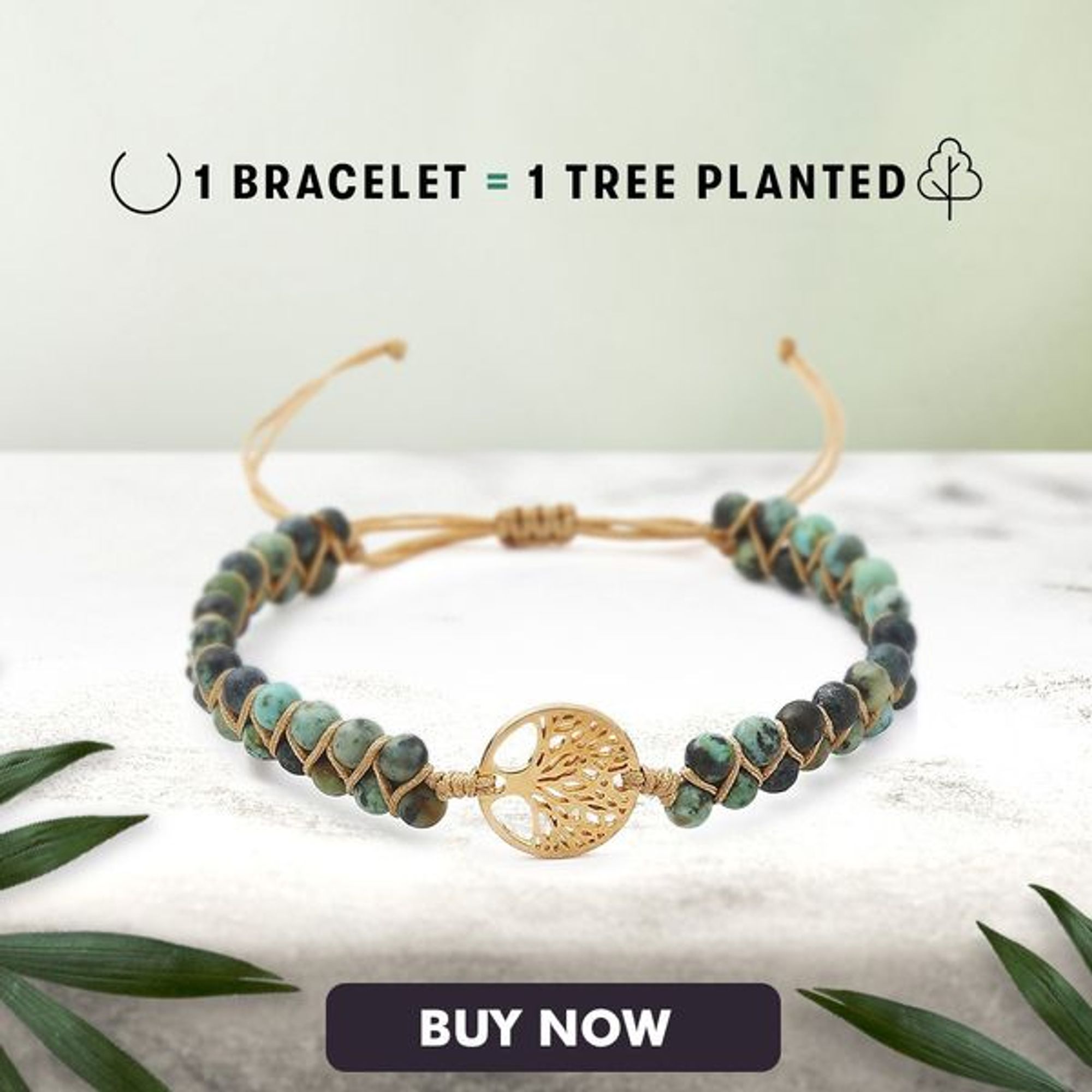
Nowadays, consumers are pickier than ever before. Not only do they want great quality products at affordable prices, but they also want products from companies that are socially and ethically responsible for the planet on which we all live. And that's why this next brand has done such a great job! Not only did they create an ad that's pleasing to look at. They've also added value by explaining to their customers that they will plant one tree for every bracelet purchased. In other words, customers can feel great about buying this product because their money is going to a good cause—promoting a more sustainable planet. Talk about a great selling proposition that can help any brand stand out from its less eco-friendly competitors!
Emotional selling points are key to brand loyalty - this case study shows how Vero Moda used strong USPs to increase sales by 60%.
37. Leading with value
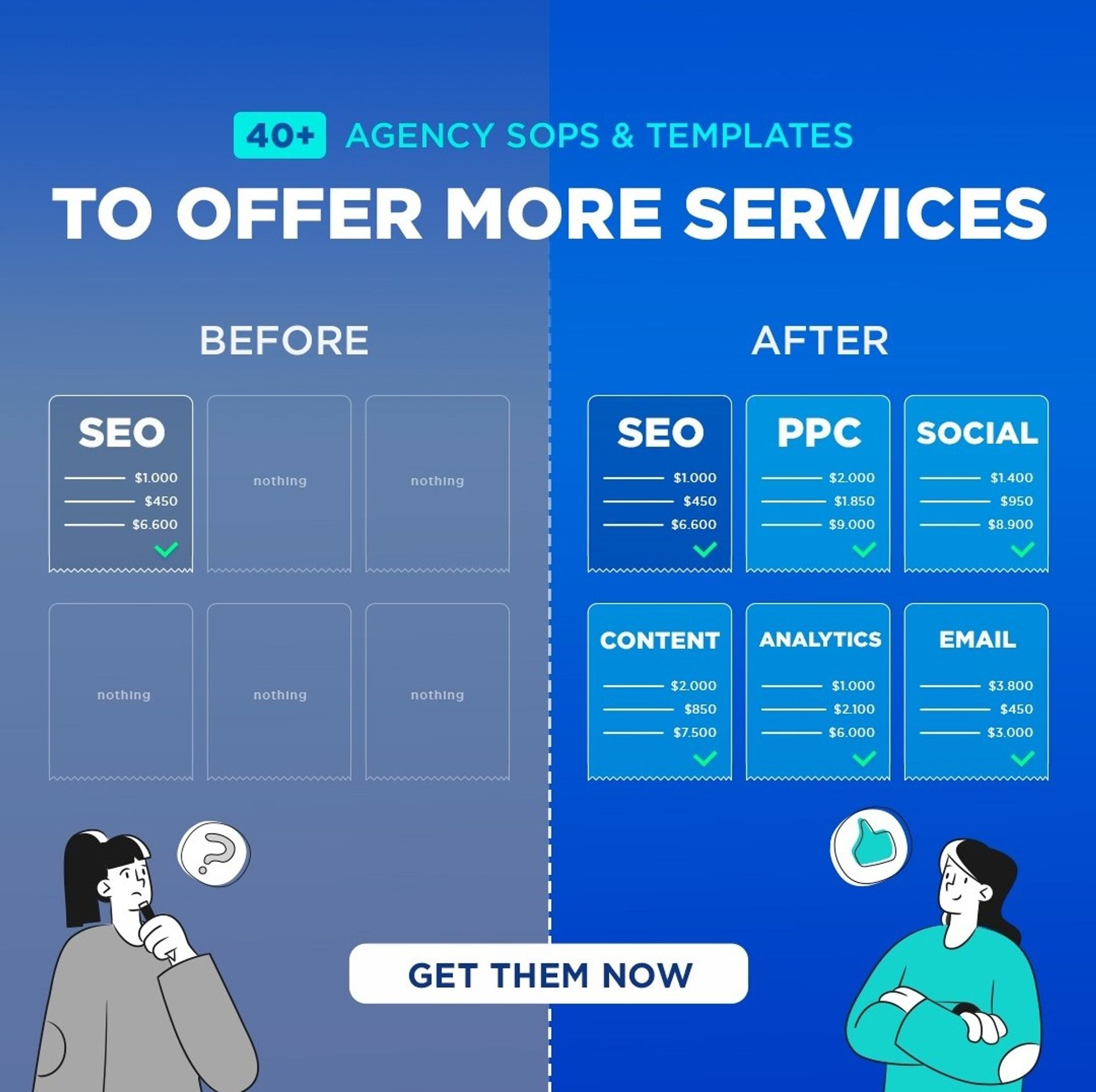
When advertising from one business to another, you must lead with value. Providing value in a clear, concise, and meaningful way ensures that when other businesses see the ad, they'll know exactly what you're offering and what they'll get out of the deal before they waste any of their time. As exemplified in this ad, a great way to do this is to use a simple graphic that compares before and after. If you can show your viewers the value of your offer as concisely as possible, you can easily create an effective lead-generation ad.
38. Freeing your customers

A keyword like FREE is a great way to draw people into learning more about whatever you're offering. But you can't just cast a line while shouting free and hope for the best. It's vital to ensure you're also targeting the right audience and providing real value. This next ad is great because the brand recognized that its target audience likely already has a list of leads. So rather than offering them a way to generate new leads, they're offering a way to capitalize on an existing lead generation process—by giving 2,000 pre-written SMS messages for FREE! Talk about a great value!
39. Poppin' problems with colors
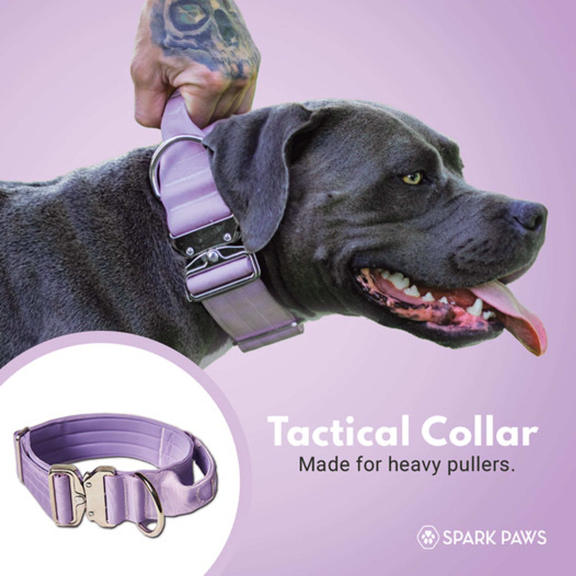
If you own or know someone who owns a dog, you know how frustrating it is to have a dog that walks you rather than being walked by you. And that's why Spark Paws has done a great job with this highly vibrant, problem-solving ad. We love that they're marketing a product that solves a widespread pain point—dogs that pull when being walked. They've even addressed this problem in their tagline: "Made for heavy pullers." But on top of that, they've also done a great job choosing a background color that genuinely pops, making it easy to see and hard to ignore.
40. Colorful and evocative themes

When creating great ads, themes and concepts are a great way to ensure that everything from the images, colors, and copy all come together nicely. This Go Mate ad is excellent because their products use natural, herbal ingredients. Therefore, their choice to show a rainforest in the background perfectly aligns with the product. On top of that, the ad also features bright, vibrant colors, which quickly grab your attention, and they even mention their unique selling point (USP)---that their product is good for your brain!
The power of a unique selling proposition in advertising
Each product on the market is tailored to a specific need, or want, with a certain set of features and specifications. Not all shoes are made the same, and not all computers will be able to run the same games. The unique selling proposition of your products is what sets them apart from your competitors, and to be successful, your customers need to understand the unique value your offer provides.
This doesn't have to mean listing all product details in every ad - no one wants to read that much. Your uniqueness can come from any part of your business. It can be anything from fast delivery, niche positioning or the values of your brand.
So don't just blend in with all other advertisers - make sure users know what makes you different, and a perfect fit for their needs.
But how exactly can you make sure your ads stand out from the rest?
Confect makes it extremely easy to customize your product or catalog ads, by including information, such as price, discounts, logos, and more!
Try it today for free!
More great ads to learn from!
Keep the inspiration flowing with these amazing ad examples:
Try Confect for Free
Confect can help you to create great-looking Catalog ads and Dynamic Product ads for Facebook, Instagram, TikTok, Snapchat and Pinterest.