5 great ads grabbing attention
June 1, 2022

Having social media ads that stands out and grabs your target audiences attentions is crucial.
It helps with brand recognition and will contribute towards increase in sales and ROI.
We have selected 5 great examples on ad visuals that stands out and grabs attention.
Use these are inspiration for your own ads. And if you're looking for a great way to edit your catalog ads, Confect provides a simple, all-in-one solution for designing, customizing, and editing brand-specific ad content that ensures your campaigns will do better than before!
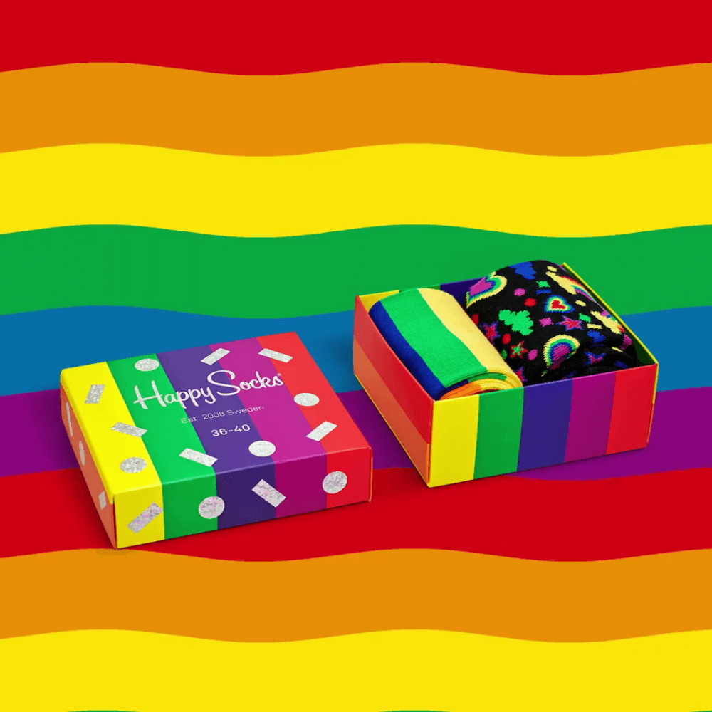
Disturbing stripes

Wow - this ad is colorful and bright to look at! Something your eyes are immediately drawn to.
Besides being a great tribute to the Pride-movement the horizontal stripes from the backgrounds clashes with the vertical stripes from the box, making sure that the customers stop scrolling in order to watch the ad.
A small detail for the pros: Look how they placed the dark colors on the background right behind the bright product itself, so the product get way more attention than if placed on the yellow stripes.
Look at this brand new product

Your product, 5-6 words, and a nice background - that is all you will need to launch a great product.
The blue/teal background goes really well with each other, and the product fits well because of the blue light-strip. This very simple and nice mix of blue colors - and it's highlighting the product.
The "fire tv" text stands out a whole lot! It is almost the first thing you see while looking at the ad, that is indeed on purpose. Notice how the ad is using cold blue colors, and the "fire tv" text is a warm orange. Probably on purpose to mix warm and cold colors for contrast.
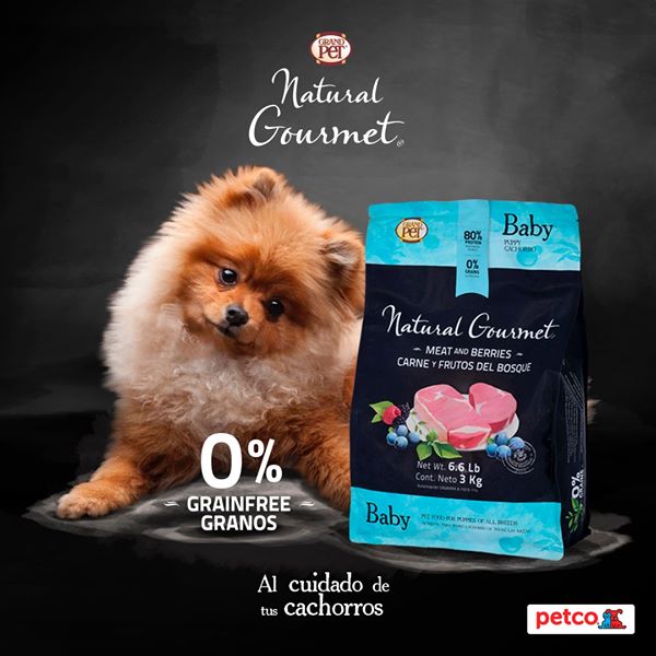
Woof woof!

Admit it - you looked at the dog immediately, maybe even before you looked at the ad above it. That's because cute dogs with cute faces are selling!
Since the ad has captured your attention your eyes will start to look at the bright blue color and the delicious steak on the product - another great trick.
Cute dogs and delicious food - a great combination for your reptile-brain.
Orange speakers

Damn there's bang for the bucks in this ad.
The background is almost creating a great silhouette for the speaker because of the powerful orange, that surely will make you stop scrolling.
The logo in the top left of the speaker is lighting up with it's bright white metal-color.
Also, if you know the history of the company Soundboks, you will associate the colors with the biggest festival in their home-country: Roskilde Festival.
Learn about Color choices that lift performance.
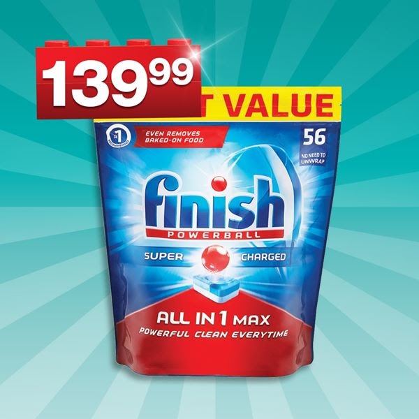
The all in one product

All the lines in the background around the product, leads our eyes to look at the product immediately. A great use of visual cues.
It uses a triadic color scheme with a blue, yellow and red combination - and it works just as well in this ad to create a great and pleasing harmony for your eyes.
The product also have a really small drop shadow, which makes the product stand more out from the background - so they are sure the product pops out to your eyes.
Did you like the examples in this article? every week we analyze 5 great ad's and give our detailed insights, If you would like to receive the analysis every Tuesday you can sign up here.
Learn from the best, weekly ad analysis by Confect.
All these ads have been featured in Grand Theft Ads.


Our free email every Tuesday with 5 great ads and a short explanation on why they are so great.
The ads are from the biggest companies in the world, so there’s a lot of inspiration to collect for e-Commerce companies.
Our free email every Tuesday with 5 great ads and a short explanation on why they are so great.
The ads are from the biggest companies in the world, so there’s a lot of inspiration to collect for e-Commerce companies.


No spam, no sales, just one email every Tuesday with 5 ads and two sentences on each why the ad is so great.
More great ads
Keep the insipration flowing with these amazing ad examples:
