14 Facebook clothing ads examples
January 9, 2022
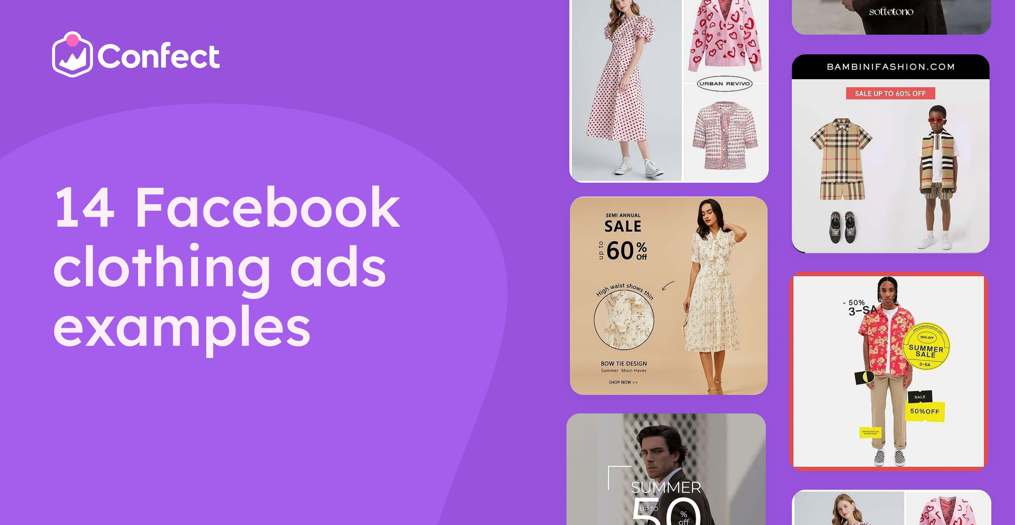
If you're in the apparel industry, you already know that staying relevant and engaging with your customers is essential.
That's why every clothing brand should be advertising on social media, especially Facebook, which boasts nearly 3 billion monthly users.
But what's the best way to advertise on Facebook? Which ad styles perform the best?
And how can you ensure that your ads will have the maximum impact on your target audience?
To help you find out, we've gathered 14 examples of the best clothing ads used on Facebook in the past.
From creative designs to powerful copywriting, the following list of Facebook clothing ad examples will give you an idea of creating engaging ads that will resonate with your target audience.
How can you cuztomize your Facebook clothing ads?
Most dynamic product ads you see are basic packshots against a white background... AKA, they're boring!
But the good news is that your DPAs don't have to be a bore!
With Confect, you can instantly cuztomize your catalog ads, adding prices, discounts, logos, and other relevant information to your Dynamic Product Ads, ensuring that they'll stand apart from the rest!
1. Never too young to dress with style
When it comes to clothing and apparel, it's essential to appreciate the power of an ad's visual design.
This next ad on our list of the best Facebook clothing ad examples shows an example of the outfit the advert is selling and a stylish model wearing it.
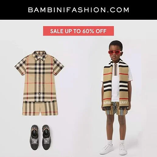
Using a model is genius because it makes it easy for parents to imagine what their little one might look like wearing the same outfit.
Secondly, the advertiser also used a bold red color to highlight their sale, which ensures viewers won’t miss seeing it.
2. Rainbow socks
It’s nothing new that colors can hugely impact your audience. And that’s why the background in this next ad truly makes it a great Facebook clothing ad example.
The choice of such vibrant colors and a gradient match what the company is selling.
Being colorful is also attention-grabbing and evokes a feeling of bright youthfulness, which anyone can appreciate.
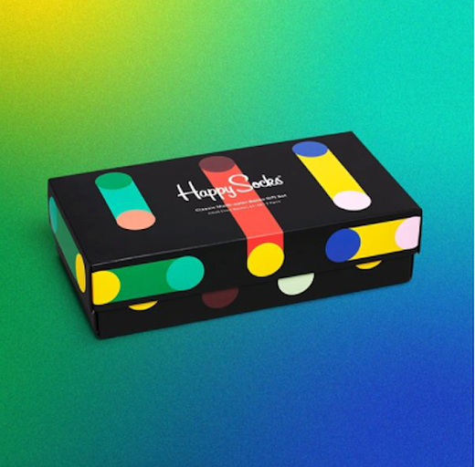
The product packaging is also much darker than the background, which helps it stand out.
3. Free boxers
Once again, we have an ad that leverages a stark contrast between the product and the ad background.
With a light blue background, the bright red product and package are easily seen.
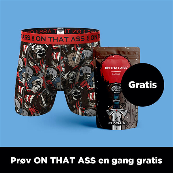
Even better, the light background makes it super easy for viewers to see the word "gratis" or free!
Unsurprisingly, ads that use words like free or gratis often get more impressions.
After all, who doesn't love getting free stuff?
4. Fun offer for cool friends
The most successful customers don't want customers. They want genuine relationships with the people they sell their products to.
And a great way to do this is to create fun and exciting ads that aren't overly aggressive or "sales-y."
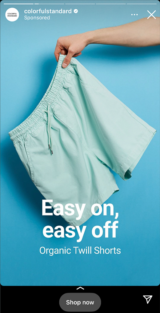
Here is an excellent Facebook clothing ad example of a fun and colorful ad that uses a blue background and product.
Blue is an excellent color choice because it's known as a color that evokes feelings of trust, and trust is a critical element of any successful relationship.
5. Time is running out!
Another great tactic you can use in your ads is to create a sense of urgency or the fear of missing out.
This next ad has several elements that do this!
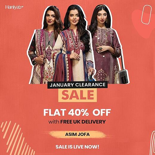
It states that its items are on clearance, highlights the word "sale" with a bright yellow background, and tells you that the sale is live NOW!
Combined, these elements ensure you know a sale is going on.
But it also makes you feel like you might miss out if you don't act now.
6. One heart wasn't enough
Sometimes colors and feelings are enough.
In this next ad, we can see a model wearing a cute outfit and a few other examples of other outfits the company has for sale.
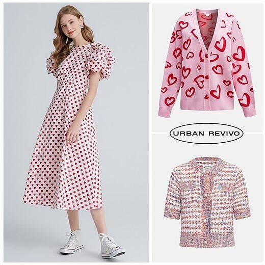
There are no big sale stickers or discounts.
Just images of the brand's unique products, an attractive model wearing them, and the company's name.
Sometimes, less is more!
7. Flowing robes
Not only does this ad show beauty and luxury, but it also highlights flowing movements that accentuate the product the model is wearing.
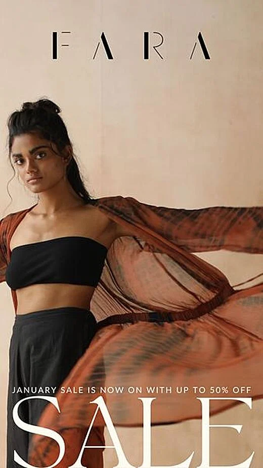
Furthermore, the model makes direct eye contact with the camera, making the ad feel more personal.
And the colors she is wearing are stark in contrast with the kimono, which makes an impactful statement about the brand and its products.
8. Say yes to the dress
Bright colors and direct information are the best parts of this next ad.
The images of the bright red dress easily capture our visual attention, and then we're also met with the discount and how much money we're saving if we act now.
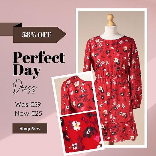
Nothing fancy!
Sometimes, a visually stunning product and a good deal are enough to draw in new customers. Especially if you advertise clothes on Facebook.
9. The Gestalt laws' effect
This next ad combines visually-stunning colors with a bit of social proof, which is never bad.
The visual aspect of the ad itself is significant because it shows the product upside down, which is different and can help set it apart from other similar ads.
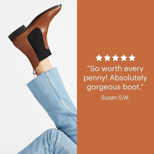
But more importantly, the brand used a customer testimonial to provide potential customers with proof that they are selling a great product.
The fact is that people are generally more inclined to buy a product if they know others have bought it and liked it!
10. Limited time sale
Next up, we have an ad highlighting a serious-looking model and a sale that will only last for a limited time.
In large, bold letters, the ad tells us that you can get up to 50% off your next purchase, but you have to act sooner rather than later.
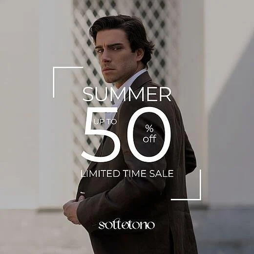
And as we mentioned earlier, urgency and the fear of missing out can be great ways to improve the performance of your ads.
11. Elegant summer sale
Simplicity is another important design concept, which is why this next ad made our list of the best Facebook clothing ad examples.
The following FB clothing ad example shows an ad stating the company is having a summer sale.
The only other visual elements are the company's logo and the simple image of a model wearing a stylish outfit.
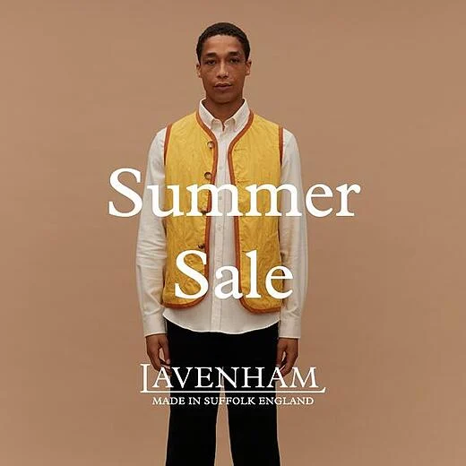
This is a basic yet practical ad layout because it states everything you need to know without any other overwhelming elements to look at.
12. Attention grabber
Bold lettering and sexy visuals are other great ways to capture an audience's attention.
But to go even further, the ad generates a sense of urgency by highlighting its "never-before-seen prices."
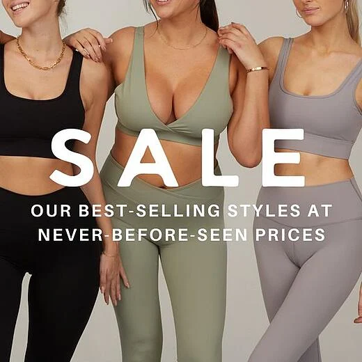
And this is enough to make almost anyone want to click through and find out how much they can save.
13. USP + Sale
Every brand needs something that helps set them apart from its competitors. This is referred to as a unique selling proposition.
While highlighting a sale is excellent, this brand goes even further to highlight what makes them different.
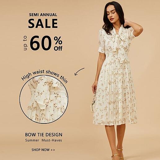
Shown closeup, viewers get a better look, not only at what makes this brand different but also at the quality and craftsmanship of the product.
14. Stickers of 50% off
Next up, we have an ad highlighting the importance of negative space.
Here, we can see plenty of open white space, which makes the ad's model and other information more noticeable.
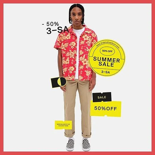
Truthfully, a lot is going on here.
But because of the negative space, the ad doesn't seem crowded or overwhelming to look at.
Lessons learned for the best Facebook clothing ad examples
Now that we’ve gone through our list, let’s summarize what we can learn from these great ad examples:
- Using models improves the way people perceive products in ads: By featuring attractive and relatable individuals using or endorsing products, advertisers can enhance the perception of their product's desirability, quality, and effectiveness. Models can help consumers visualize themselves using the product, leading to increased engagement and a higher likelihood of making a purchase.
- Color theory in advertising: Color theory emphasizes the psychological and emotional impact of different colors in advertising. Colors have the power to evoke specific emotions and influence consumer behavior. Advertisers use color strategically to create a desired mood, highlight key information, and strengthen brand associations.
- The word "Free" is an attention grabber: People truly have affinity for free products or services. So offering something for free in advertising can serve as a powerful attention-grabbing technique.
- Being less sales-y is better than being pushy: A more subtle and persuasive approach to advertising is often more effective than being overly aggressive or pushy. By focusing on providing valuable information, addressing customer needs, and engaging in a more authentic and conversational tone, advertisers can establish credibility and foster long-term customer loyalty.
- Urgency is your friend when it comes to effective ads: By using time-limited offers, or limited stock, advertisers encourage immediate action from consumers. The fear of missing out (FOMO) on a great deal or opportunity can drive impulsive buying behavior and increase conversion rates.
- Product designs can speak for themselves: Well-designed products can effectively communicate their value and benefits without excessive reliance on written or spoken messages. When product designs are intuitive, visually appealing, and user-friendly, they can create a positive impression, convey quality, and differentiate the product from competitors.
- Gestalt's principles of design: Gestalt's principles of design refer to a set of principles derived from Gestalt psychology, which explain how humans perceive and organize visual information. These principles include concepts such as figure-ground, proximity, similarity, continuity, closure, and symmetry. Advertisers utilize these principles to create visually engaging and coherent advertisements, ensuring that the message is easily understood and memorable.
These advertising concepts highlight various strategies and techniques used by advertisers to capture attention, evoke emotions, build trust, create a sense of urgency, and influence consumer behavior in order to promote their products or services effectively.
Facebook clothing ad examples to inspire your next campaign
Because of its popularity, Facebook is one of the most powerful platforms for clothing brands looking to engage with their customers and increase sales.
Creating high-quality ads explicitly tailored toward your target audience can drive traffic to your site and ultimately boost sales.
We hope these 14 examples of great clothing ads give you some ideas to create your next successful campaigns on Facebook!
Good luck!
Learn more about the fashion industry: Optimizing the ad body, Including logos, Using models in content, How text impacts performance.
More great ads
Keep the insipration flowing with these amazing ad examples:
