5 great ads using contrast
June 1, 2022
Ads using contrast in the visuals can be simple to make but yet very effective in performance. The contrast is what it takes to stand out and attract the attention of your target group. Use this simple ad hack in your next campaign.
We collected 5 simple but great examples of contrast ads, let's look at a few contrast advertising examples that are grabbing attention using this simple, but highly effective ad technique.
The Psychology of The Contrast Effect in Ads
There are several steps in the decision-making process when people look at ads. This means that you have to grab attention, trigger interest, increase desire and finally convince the viewer to take action.
The contrast effect is instant impact. Your ad will stand out immediately, great for grabbing attention. It draws potential customers’ eyes towards it, motivating them to read on (triggering interest).
Using contrast can play a big role in increasing buying desire, because contrasting colors or light tones with dark ones creates an emotional reaction in the brain, influencing our buying decisions.
Therefore, it's important to use contrasts that match your brand style and target group. Finally, adding more information about your product (a text explaining what you're selling) helps viewers understand the product.
Thus, you're not only grabbing attention but also building trust with your brand, which is necessary for convincing potential customers to take action.
The benefits of contrast and color theory in advertising
Colors and contrast are vital design elements in marketing and advertising as they play a crucial role in capturing attention, conveying messages, and influencing consumer behavior.
Here are other benefits that make color and contrast so important:
- Attention-grabbers: Colors have the power to catch the eye and stand out in a sea of visual stimuli. Using vibrant and contrasting colors can attract immediate attention and make an advertisement or marketing material visually striking.
- Branding and recognition: Colors are closely associated with brand identities and can evoke specific emotions or perceptions. Consistent use of colors in branding and advertising helps in creating brand recognition and association. When consumers encounter these colors repeatedly, they begin to associate them with the brand, making it easier to remember and recall in the future.
- Emotional impact: Colors have the ability to evoke emotions and create a desired mood or atmosphere. Different colors can elicit various emotional responses. For example, warm colors like red and orange may evoke feelings of excitement or energy, while cool colors like blue and green can evoke a sense of calmness or trust. By strategically using colors and different levels of contrast, marketers can influence the emotional response of their target audience and create a connection with their brand or product.
- Message communication: Colors and contrast can aid in effectively conveying messages and information. They can be used to highlight key points, emphasize important details, or create visual hierarchies. The right color combinations and contrasts can improve readability and make the message more easily understood.
- Differentiation and competitiveness: In a competitive marketplace, it is essential to differentiate a brand or product from its competitors. By using distinctive color palettes and contrasts, marketers can help their offerings to be easily identifiable and memorable, setting them apart from competitors.
Contrast advertising examples with unique Selling Point
If your customer journey is long, you can really benefit by showing different value propositions at different times.
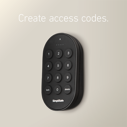
This can be done like this lock-company has done by simply showing one selling point to the customer - that you can easily create access codes. It's as simple as that.
The selling point is the secondary thing in this ad because it's clear that they have made the background beige with the white text color to make the black lock stand out.
Use greyscale to create a contrast ad
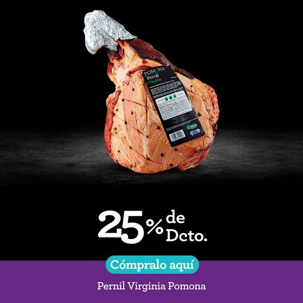
Our brain sees the light before darkness and colors before grayscale. Therefore it’s perfect for placing your product like in this ad. On a really dark background - and focus all the ads lightning and saturation to the product.
This ad also speaks to our reptile brain as we see food. That is just a thing that everybody notices fast, sometimes without even knowing it yourself.
This ad highlights the parts in your ad you want people to see. As in this ad, the delicious ham and the 25% off text.
Contrast within less is more
Often less is more.
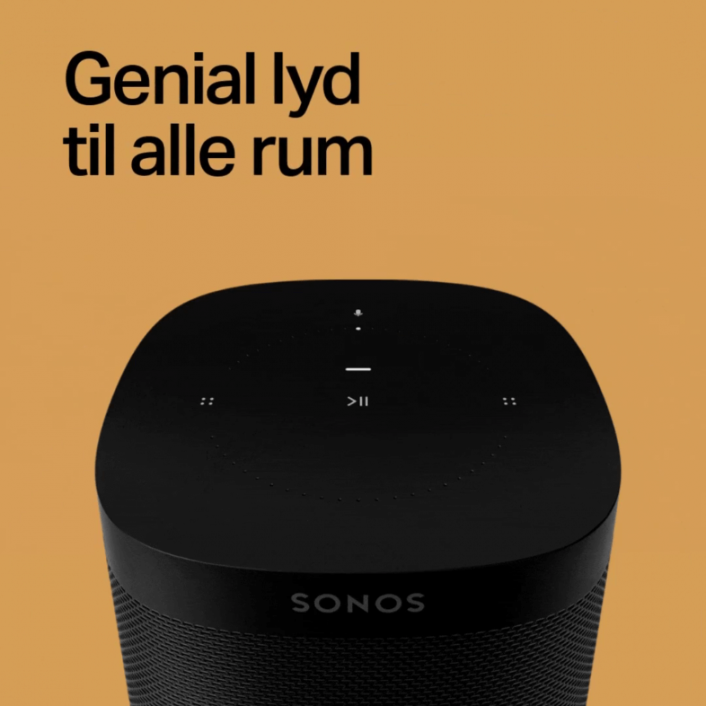
This creative from the Swedish speaker-company Sonos is simple and flat yet so elegant.
Because of the brown background, your eyes instantly go to the text and the black speaker - but in a non-intrusive way, since the contrast from the black to the brown is easier on the eyes than white or some other light colors.
Last but not least, the lighting of the product is world-class, done by a professional.
Great use of light and colors
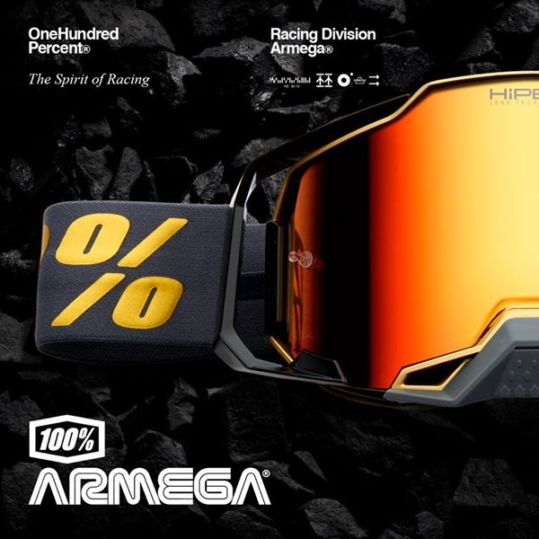
As we really like to say in our email-series Grand Theft Ads our brain recognizes light before darkness and saturated colors before grayscale.
And that’s exactly why this ad made it onto our list of the best contrast advertising examples!
Yellow is one of the "lightest" colors, so it has really high contrast. Because of this, our eyes are directed to the pair of googles, almost immediately - and after that, the text.
The dark and rough background gives a great contrast to the product while also giving the ad a rough/action feeling, which works great because of the sports goggles.
Learn about Color choices that lift performance.
Merry Christmas
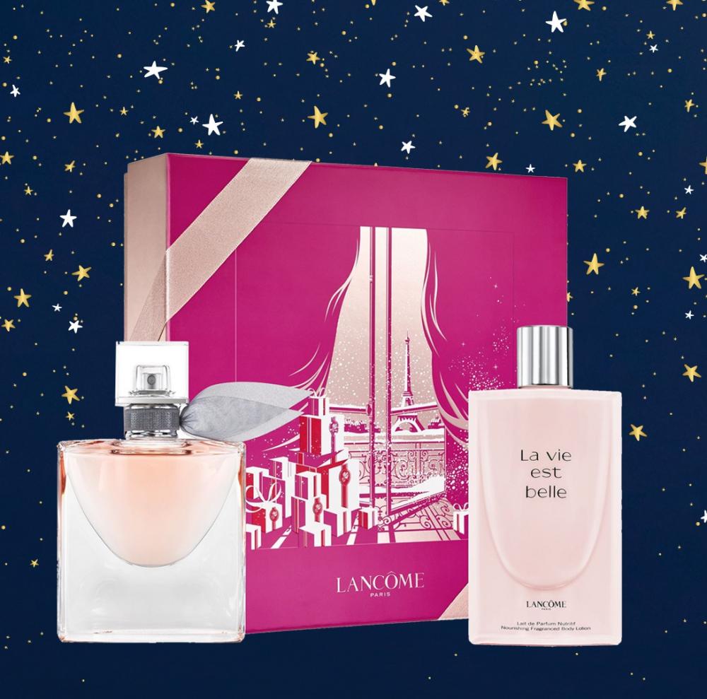
Our eyes see light before darkness, and therefore, it's a genius move to use the night-heaven with light products - making you look at the products but seeing the night theme.
The products are warm and bright, while the background is cold and dark, making a great contrast. The stars are so small and in a pattern that it creates the feeling of a Christmas night without disturbing the ad.
The ad uses a subtle color scheme with the primary colors red (box), blue (background), and yellow (stars).
What Kind of Contrast Do You Want to Be Remembered by?
Keep in mind that strong contrasts are great for grabbing attention but seeing them all the time can also create fatigue. If your ad is everywhere, then it won't work as well anymore because people will get used to it.
This means high contrast ads might work at first, but the effect isn't long-lasting. However, this doesn't mean using any, or very little contrast is better for branding!
You have to find a good balance between contrasting solid colors and enough space for the eyes to rest, which impacts your target group more.
Remember: Keep your target group in mind: Use a contrasting tone or visual style (stronger colors, tonalities, bolder looks, more space around objects/people) to highlight what you want to get across if your brand targets different age groups or people with different mindsets.
This way, you get attention from different kinds of people while still maintaining a coherent look!
Looking for a simple, yet extremely effective way to makes your ads stand out?
With Confect automation, you can create custom branded content for all your Facebook DPA campaign, so that your ads will stand out in a sea of boring, similar-looking ads.
Try Confect today for free, and make your dynamic product ads better than the rest!
Access even more ad inspiration
All these ads have been featured in Grand Theft Ads.

Our free email every Tuesday with 5 great ads and a short explanation on why they are so great.
The ads are from the biggest companies in the world, so there’s a lot of inspiration to collect for e-Commerce companies.

No spam, no sales, just one email every Tuesday with 5 ads and two sentences on each why the ad is so great. Tap here to join.
More great contrast advertising examples
Keep the insipration flowing with these amazing ad examples: