The secret behind beautiful ads
June 1, 2022
There’s a reason we refer to beautiful people as “attractive”. Beauty makes us look twice. It draws our attention and retains it.
From images to creations, people to places, beauty is all around us, but its uniqueness is something that can be used to make very effective advertisements.
Beautiful ads also tend to perform better in terms of ROAS, they encourage clicks and purchases.
We have noticed top brands in all categories spending a little extra on understanding and creating beautiful adverts. We looked in to the best, what did they do? what is their strategy behind and how do they create beautiful ads that works.
Let's explore what is behind beautiful advertisements and how can we use this knowledge to improve ours.
Breathtaking Structure is the key for good ads
The structure of an object, or the structure of an ad, can create its beauty. Structure can be beauty in architecture, and it can also be the beauty in how an ad is put together, or how the objects in an image are arranged to relate to one another.

Take the structure of this mattress ad. Every detail in the image is designed to be beautiful by itself. The matte gray of the headboard, the pops of yellow in the paintings, and the immaculate dresser are all beautiful. However, the true beauty of this ad is in the arrangement of items.
You see, the structure of their layout is what makes the whole image so aesthetically pleasing and satisfying to the viewer.
When an artist presents so much to look at in one picture, there needs to be a certain flow so that the eyes don’t move right off the image and onto the next. At first, you’re attracted to the artwork on the wall because of the color, but then you’re drawn to the bed and the contrast of the darkness of the headboard and the bright white sheets. This is the beauty of structure in an image.
Symmetry and Simplicity makes ads beautiful
In the human mind, symmetry is often viewed as beautiful because that’s how we were designed. Since the mind is two-sided and symmetrical, we attract to that same principle when seen in images.
While ads do not have to be exactly symmetrical to be attractive, the human eye will continue to follow in a loop around ads with good symmetry, so the ad will keep the attention of the viewer longer.
Another key to beauty in ads can be found through simplicity.
We like simplicity as it does not require much of our brain power to understand it. It is easy to consume.
You can achieve simplicity in your ad visuals by using basic shapes, clear lines, smooth curves and symmetry. Avoid placing to many objects in your image as it can clutter the visual.

Here we have a beautiful ad example that uses symmetry and simplicity.
The watches are elegant, and the product is attractive by itself, naturally. But the presentation is so simple and elegant that the viewer wants to continue to look, taking in the image as a whole, the shining metal of the watches against the matted marble background.
The eye then moves inward, to the small details of the watch.
Why? Well, where else is there to look? The beautiful advertisement works so that they eye wants to remain on the image, but it’s so simple that the eye has no choice but to look inside the watches to appreciate the detail of the product.
In your own ads, try to play with the combination of symmetry and simplicity to draw the attention of the viewer and keep it. You’d be amazed at how going back to the basics of making simple and beautiful ads can be so effective in today’s world of clustered and busy images.
Beautiful ads comes naturally
Sometimes, it comes down to finding the kind of images that every person finds attractive. One of the best places to start in this genre is all around you every day…in nature.
Nature and Nature scenes subliminally calm us down, shows prosperity and indicates trust.

Look at this Wine advertisement for example.
Is the nature in the background necessary? Absolutely not. But it adds a beautiful backdrop to a simple setup in the front.
The nature aspect also builds trust and incentivizes that product is natural - so good for us.
This ad is beautiful to nearly anyone who sees it because includes three of the basic attributes of beauty: simplicity, symmetry, and nature. These are all the characteristics to and eye catching ads.
The simplicity comes from the setup in the front, just a bottle and box on the table. It’s clean and clear as to what you’re supposed to look at.
The nature part is obvious, but it also ties in the symmetry. The symmetry actually comes from the symbolism of the nature background when tied in with the wine, since the nature scene in the background is a vineyard where wine is created.
If you’re struggling for inspiration in your ads, try to get “back to the roots” of what can create natural beauty in images, which is oftentimes nature itself.
Depth is a part of beautiful ads
The world we live in is three dimensional , yet the images are 2 dimensional. The trick to beautiful ads here comes to making them feel like three dimensional, and more relatable to our brain.
Depth helps you to create and imagine the image of the environment in your mind. Making it way more engaging.
Beautiful ads commonly feature depth, where the product is in sharp and placed foreground while the background is blurred out.

Here we have an beautiful ad example with champagne bottle in foreground and slightly blurred background that extends in the far, creating feeling of depth.
If you want to create feeling of depth in your ads you can use different techniques, like: play with lightning, shadows, layer elements, use backgrounds with depth feeling and many others.
Beautiful ads position products at the eye level
If you wan to create eye catching ads, then bringing the object to an eye level makes them feel more natural it makes you feel a part of the action the part of the story.
Being at eye-level immerses the viewer in what’s happening, the beauty of authenticity and detail in one.
For example bellow you are advertising coffee beans show the hands of the person picking up the beans and the plant where it grows. Your attention get's directly involved with the process, you feel like you are there, a part of the process.

High resolution for high quality ads
Visuals in high resolution help to highlight the beauty of product you try to advertise. Naturally high resolution images has more detail in them and details attract attention.
High resolution images are commonly associated with good quality and craftmanship.
Beautiful ads with high definition images are very common if you have a luxury product. You want to emphasize the quality, detailing and craftmanship of your product. The beauty lies here in detail.
Additionally high resolution images portray perfection and flawlessness together with idealism.
Here is an example with high resolution image from a watch company. A clean image of the watch in very high definition highlighting the level of craftsmanship and quality of the product.

Feelings and emotions within ads
Beautiful ads are the ones that touch us on an emotional level. They capture feelings and story therefore these ads are more powerful and beautiful then the regular ones.
These visuals encourage fantasy, imagination and enhance empathy. All feelings that will make your advert more memorable. Feelings and emotion are not the only way to connect with your audience, we recently wrote and article about other ways of grabbing attention with your ads.
Using ad visuals with feeling and emotions will eventually associate these feelings with your brand- letting you to connect with your audience on a emotional level.
We have seen brand focused company engaging with their audience on a emotional level all across the funnel.
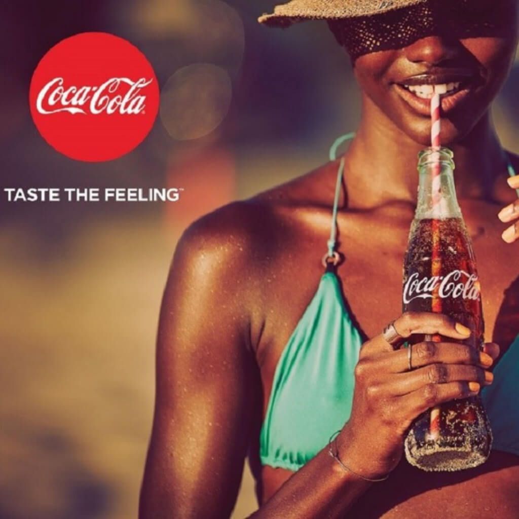
Coca cola is well know for capturing emotion and being associated with emotion. All of their ads always are with positive emotions, smiles, good times. In a long run it has made their brand to be related with a this feeling.
Complimenting colors
Beautiful ads has beautiful colors in them , that is quite simple right? But there is more to it then you think. In fact there is quite serious biology behind why humans like some colors more than others.
Human color preferences are deeply connected with emotional responses that seem to lack any rational basis.
You might not notice this on your day to day actions, but it is clear that everyone has it in them.
Marketing people study design theories to better understand how our brain works and how to use this knowledge into making better advertisements.
A study done few years back shows that our color perception is very experience based. We associate different colors with different felling. Some remind us about safety, security, good times while others about hazards, danger and threat.
We should use this knowledge into creating more beautiful advertisements that connects with our audience.
If you are aiming to make eye catching ads visuals, it would be advised to consider what are the association with articular colors you want to use? do these colors reflect emotion your brand wants to deliver to buyer?
Beautiful ads are creative
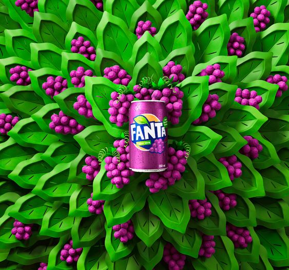
Beautiful ads make you stop scrolling, creativity is something we as humans appreciate a lot and it always gets noticed.
Hoverer, having a creativity in your ads is almost guaranteed to make your ad beautiful to the audience. It is not easy, and most likely that is what done right it is so beautiful.
Recently we have seen more and more advertiser trying to b creative and stand out in the busy feeds. Being creative and smart can definitely enable you in to making some beautiful ads that will grab attention of your audience.
Find your formula to beautiful ads
Now you have seen few examples and techniques on how to create beautiful ads. Next step is to take all the inspiration and turn it in to the action.
Every week we are sharing deep dive in 5 beautiful ad examples. What worked, why it worked, what is the thought behind it? Sign up for Grand Theft Ads
Alternatively, if you're interested in designing and editing custom Dynamic Product Ads for your next Facebook campaign, you can try Confect today for free!
Confect is an all-in-one solution for creating great ads that aren't only beautiful, but that will also be more specific to your brand, and its products or services, so that you'll always stand apart from the competition!
More great ads
Keep the insipration flowing with these amazing ad examples:
