18 Examples of ads using Gestalt’s laws of perceptual organization
November 16, 2022

Are you tired of creating beautiful ad creatives that don't perform as well as you'd like them to?
Well, it turns out that there's a real science behind making visually appealing designs that are also user-friendly and functional.
It's like the art of making a delicious cake—you want it to look amazing and taste great too!
Imagine you’ve created an ad that's a real stunner. It's got beautiful colors, sleek fonts, and eye-catching images.
But when someone sees it, they just can't figure out what your main offer is.
That's where Gestalt laws come in! They can help you create ads that are both beautiful to look at and easy to understand.
So it's kind of like having your cake and eating it too!
But, what exactly are Gestalt laws?
Think of them as the secret ingredients to your recipe for advertising success. They're a set of rules that guide how humans see and perceive visual information.
By using these principles in your designs, you can create ads that not only look great but also communicate their message effectively.
And just an FYI, using Confect is one of the easiest ways to edit, customize, and enhance your Facebook collection ads, so they'll always stand out above the rest!
Using our automated software, you can easily increase your brand's revenue, by creating custom, brand-specific content for all your DPAs and Facebook ad campaigns.
Below, we've created a list of some of the best Gestalt advertising examples to inspire you to create ads that are not only stunning but also easy to comprehend.
But first, let's review what exactly Gestalt's law is all about.
What Are Gestalt Laws?
Gestalt laws or principles are a set of rules that describe how the human eye perceives visual elements, and they can help you create ads that are impossible to ignore.
Think of them as the magic ingredients that can turn a boring ad into a work of art!
When you look at something, your brain automatically tries to make sense of it, which is why it’s not only important to choose the appropriate elements for your designs, but the way you place those elements and group them together can make a difference too.
Gestalt principles refer to the way our brains put all the puzzle pieces together.
For example, the law of proximity states that objects that are close to each other are perceived as a group.
So, if you want to draw attention to a specific element in your ad, you can group it with other elements that are close by.
This will make it stand out and grab the viewer's attention.
Another principle is the law of similarity, which states that objects that look similar are also perceived as a group.
So, if you want to create a sense of unity in your ad, you can use similar colors, shapes, or themes to help tie everything together.
There are several other principles that make up the whole set of Gestalt laws, including continuation, closure, figure/ground, symmetry, and order.
In the end, using these principles can help you create designs that not only look great but also communicate your message effectively.
The 6 principles of Gestalt theory
- Figure-Ground: The figure-ground principle refers to the perception of objects or figures as distinct from their background. It suggests that our visual perception naturally separates elements into a foreground (figure) and a background (ground). By distinguishing between the main object of interest and the surrounding environment, this principle helps us make sense of visual scenes.
- Proximity: The principle of proximity states that objects that are close to each other tend to be perceived as a group. When elements are positioned near one another, we perceive them as belonging together or forming a unified whole. Proximity plays a role in creating visual relationships and organizing information into meaningful clusters.
- Similarity: The similarity principle asserts that objects that share similar visual characteristics, such as color, shape, size, or texture, are perceived as belonging to the same group. When elements exhibit common features, they are grouped together, allowing us to perceive patterns, categories, and relationships in visual stimuli.
- Continuity: The continuity principle suggests that our brains prefer to perceive continuous and smooth patterns rather than abrupt changes or interruptions. It implies that elements arranged in a way that creates a smooth and continuous flow tend to be perceived as a single unit or form. Continuity helps us perceive visual elements as interconnected and allows for effortless visual scanning.
- Closure: The closure principle describes our tendency to mentally complete incomplete or fragmented visual elements to perceive them as whole objects. Even when presented with partial information, our brains strive to fill in the missing gaps and create a complete and recognizable shape or form. Closure aids in organizing visual information and helps us make sense of incomplete stimuli.
- Symmetry and Order: The principle of symmetry and order states that we tend to perceive objects as balanced, harmonious, and orderly. Symmetrical and balanced arrangements are visually pleasing and create a sense of stability. We naturally seek symmetry and order in our perception of visual elements, and they often convey a sense of aesthetic appeal and clarity.
These principles of Gestalt theory provide insights into how our brains organize and perceive visual information.
When it comes to advertising, they offer a foundation for understanding visual perception, design principles, and how humans interpret and make sense of the visual world around them.
So, by knowing and understanding these principles, you can create better, more compelling advertisements for your next campaign.
18 great Gestalt advertising examples
So now that you know what Gestalt principles are, let’s take a look at some real Gestalt advertising examples using these principles.
1. 2:3 Shoes!
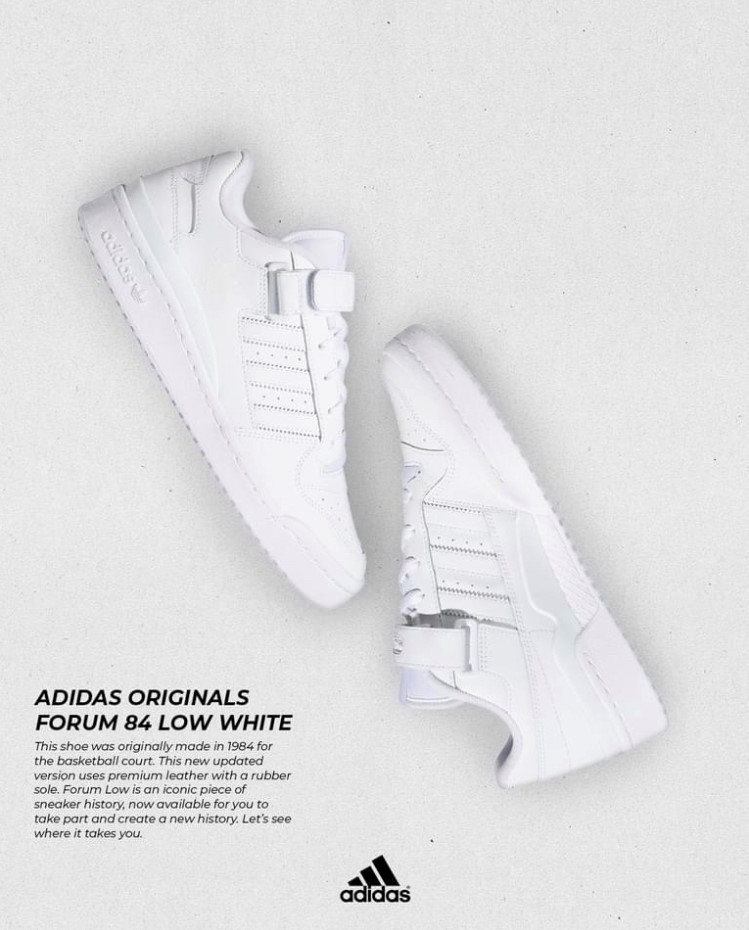
Notice how the shoes are lined up in a way that almost creates a perfect rectangle?
That's no accident. It's the magic of Gestalt principles at work.
Again, these rules describe how the human eye perceives visual elements, and by using them in your design to create easily recognizable shapes and patterns, you can create ads that stand out from the rest.
Furthermore, the clean and contrast-filled design, with just black and white colors, makes it a breeze for our brains to figure out what to focus on.
It's like a breath of fresh air in a cluttered world of colorful and busy ads!
2. Pizza-lap
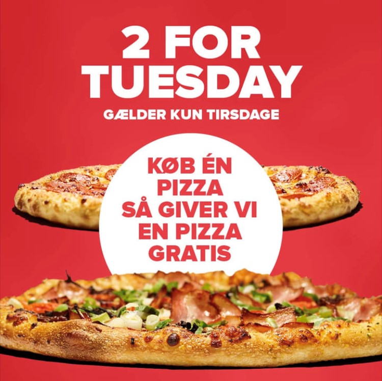
Another powerful Gestalt principle is to overlap different design elements to create a natural and attention-grabbing effect.
And this next ad is a perfect example of how to do it right!
Just take a look at the pizza in the foreground. It immediately jumps out at you allowing the ad to speak to your primal, reptile brain.
But wait, what's that behind the pizza? A bold and beautiful splash of color that instantly captivates your attention!
The white splash with red text creates a striking contrast against the background and makes it impossible to look away.
And the fact that it overlaps with the pizza adds a sense of depth and dimension to the design.
Another striking feature of this ad is that it uses the X for Y (or 2 for 1) sale, which, on average, performs as much as 35% better than other types of sales.
 (1).png)
3. Summer party
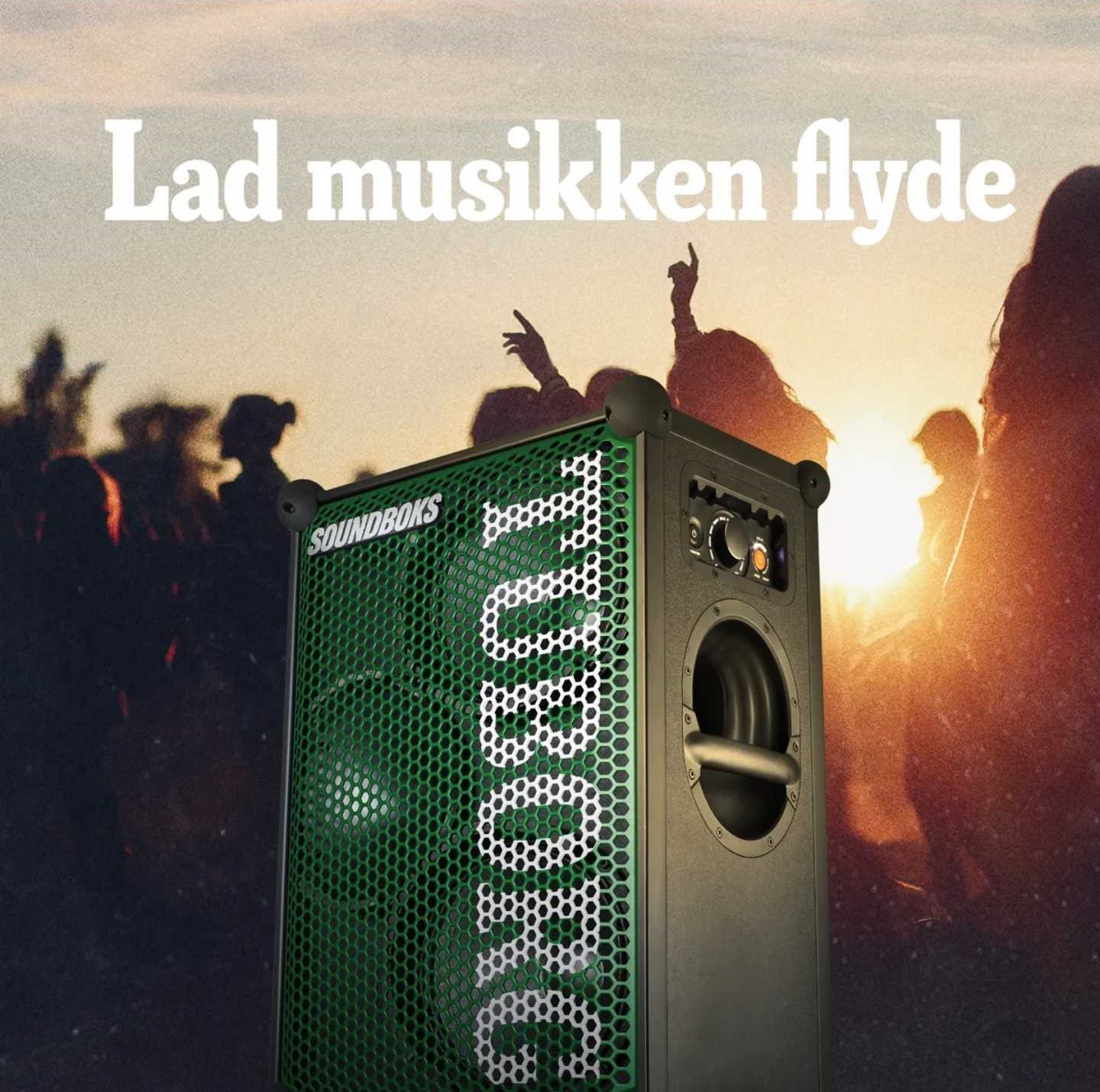
Cropping design elements out of the frame can actually be a powerful way to emphasize their importance and create a more natural feel to your ad.
For instance, check out the big speaker in the center of the frame. By cropping off its bottom, it immediately grabs our attention and seems larger than life.
But on top of that, the people dancing in the background and the sun located right on the edge of the product are genius touches that drive even more attention to the speaker.
It's like the ad is saying, "Hey, don't look away! This speaker is where the party's at!"
Seasonal ads benefit from strong visual organization - see how fashion brands use Catalog Ads to align with seasonal trends and visuals.
4. Multi color car

Sometimes, less is more, and cropping can be your secret weapon.
By cropping out part of the car, the ad instantly grabs our attention and leaves us wanting more.
But what really makes this ad work is its simplicity. The text is the star of the show, drawing our focus with its bold, multi-color design.
But here's the thing: this ad could have worked with any background and the effect would have been the same.
That's the power of strong, attention-grabbing text. It doesn't matter what's behind it.
Your eyes will be drawn to it no matter what!
5. Big overlap
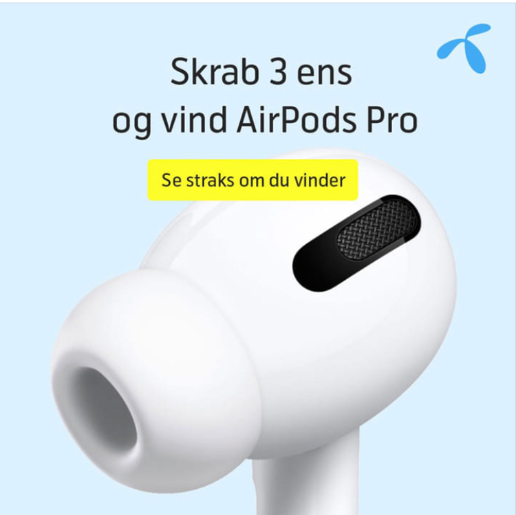
By taking up 60% of the ad space, the oversized product demands our attention and instantly captures our focus.
But the ad creators were smart and aligned the oversized Airpod to fill only the bottom two-thirds of the ad, ensuring that it doesn't feel overwhelming or out of place.
And, to really make the ad pop, they employed another tried-and-true tactic: overlapping elements.
The bright yellow box with text overlapping the Airpod draws our eyes even more, making sure that we don't miss it.
So if you want your product ads to stand out in your ad, think big and bold.
And don't be afraid to experiment with different visual elements and techniques, like overlapping and strategic alignment.
6. Jumping out

Here we have an advertiser who has opted for using a darker shade to create contrast and guide our eyes towards the focal point of the ad.
And when you see it, what's the first thing you notice?
We bet it’s those two big, bold logos sitting proudly at the top.
The contrast of the white against the bright red background ensures they don't go unnoticed, making for a striking and memorable ad.
Gestalt’s figure-ground principle pairs well with attention-grabbing ad layouts - these Catalog Ad design tips will help you boost performance.
7. Paris Shoes
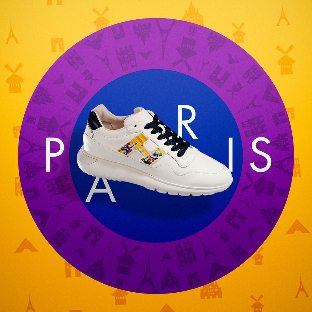
In a sea of vibrant colors, this product's white hue makes it stand out like a shining star.
And to further draw our attention, the circles in the background change colors, highlighting the product's presence.
And the cherry on top?
The "H" on the product is the only element that breaks away from the shoe’s color scheme, making it an irresistible focal point.
8. Easter Egg
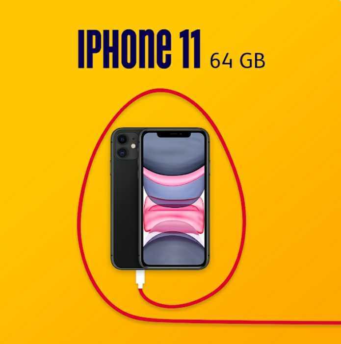
This ad cleverly uses the Gestalt principle of closure to trick our brains into seeing the charger as an Easter egg.
How egg-citing!
Proximity is also at play here as the egg-charger and phone are grouped together, drawing our attention to the product.
The bold red color of the charger cable pops against the yellow background and darker elements, further emphasizing the product as a cohesive unit.
9. More Easter eggs

By overlapping the border of the ad, you can quickly grab people's attention, just like they did with the bird's nest in this next ad.
The positioning of the nest is also brilliant: placed on one half of the ad, it immediately captures attention, while the text on the other half pops out thanks to its gold writing on a white background.
Now that's some egg-ceptional design!
10. Biiiig phone

This next ad uses a smart design technique by placing bright products against a dark background to create contrast.
Our eyes are naturally drawn to the brighter elements, which in this case are the purple phone and the text at the top.
Additionally, the phones are oversized which further grabs our attention, and completes the overall design of the ad.
Large-scale product focus works especially well for tech ads - check how electronics brands utilize Catalog Ads to highlight key product features.
11. The red-white boys
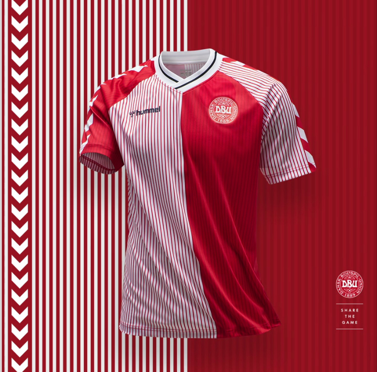
Stripes can be a powerful graphic design tool when used creatively.
In this ad, they're utilized in the background, adding depth and making the product stand out.
Interestingly, the same colors and stripes are also present on the product itself, which is a smart move to incorporate design elements from the product into the ad, creating a stronger connection between the two
12. Remember the check up!
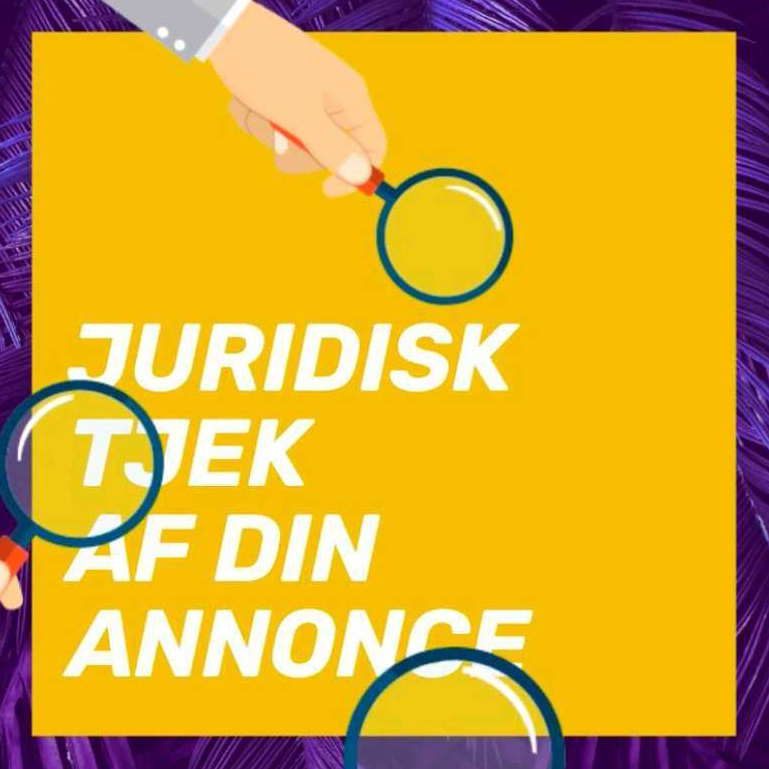
Once again, this ad features overlapping design elements to make it more engaging.
The magnifying glass overlapping the text is not only visually interesting, but also ties into the theme of the ad, which is about checkups.
Finally, the yellow square in the background, framed by purple, adds to the visual appeal and makes the ad feel more enclosed, drawing our attention even more.
This type of messaging fits health-conscious or service-oriented verticals - see how Home & Lifestyle brands use Catalog Ads to emphasize reminders and care-based value props.
13. Effective book effects
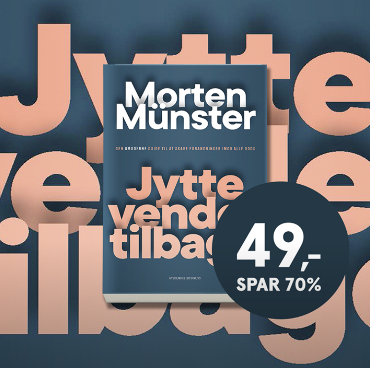
At first, this ad may seem complex with its multiple layers. But the overall design is genius!
The blue background serves as the base, and on top of it, we see pink text in different sizes, followed by a book, and more text in varying sizes on the book’s cover, and lastly, the price splash.
The use of colors is well thought out and creates a sense of harmony in the ad.
However, the placement of the elements is even more impressive.
The book is perfectly positioned according to the rule of thirds, while the price splash sits right in the middle of the intersection between the second and third section of the ad.
Furthermore, eCommerce sales ads that show savings perform, on average, 59% better than sale ads that don't highlight savings.
So in this case, showing that the book is on for a 70% discount is perfect since it would be less attractive if it only said $49.
.png)
14. Where to look

Here, the bold and attention-grabbing text is the star of the show, taking up the most space and demanding your focus.
But there's more to this ad than just big text. The clever use of design principles is a real treat too!
See that yellow line in the corner?
Follow it as it cuts right through the text and draws your eye to the blue on the other side.
And if that weren't enough to captivate and direct our attention, the ad also features a fascinating infographic that you won't want to miss.
This ad is a true masterclass in visual storytelling.
15. Grouping Together
Different shades of the same color can be your answer to create magnificent ad creatives.
By using this technique, you can easily direct the viewer's focus where you want it, without being too distracting.
Not only does this work because of the colors, but it's also because of Gestalt’s principle of grouping.
In this ad, the products are displayed inside "boxes" of the same color, creating five distinct groups.
But, if you remove the boxes, you'd see that there are actually eight different products being showcased.
This is a great way to subtly divide up your ad, especially if you want to show different products that don't necessarily fit together.
16. "Trick-or-Treat!"

This next ad expertly uses colorful illustrations to bring the spirit of Halloween to life!
From playful ghosts to vibrant orange hues to the perfect Halloween font, every detail is perfectly arranged to create a fun and festive look that will delight your senses.
The bright and eye-catching background is sure to grab your attention and set your heart racing with excitement.
And who can resist those adorable animal snouts?
Not only do they appeal to pet owners, but they also add an irresistible touch of whimsy and charm to the ad.
17. Solving Pain Points

Do you ever feel like you're constantly struggling with problems and pain points?
Well, guess what?
Savvy advertisers are onto you!
They know that by tapping into your daily struggles, they can up their marketing game and help you find the solutions you're looking for.
That's why addressing customer pain points and problems is such a powerful marketing tool.
By showing that they understand your struggles and have the solutions to make them go away, businesses and brands can establish themselves as trusted allies in your journey as a customer.
Take this ad from Elements Marketing, for example.
They get it! Social media can be a real headache for businesses.
So, they cut straight to the chase with their ad: "Need social media help?" We’ve got your solution!
Solving customer pain points visually is key - these case studies show how smart design led to dramatic improvements in performance.
18. Reenergize Your Ad Routine

Rise and shine! We're totally loving the breakfast vibes in this ad.
The focal point of the design is a gorgeous "sunrise" that perfectly captures the brand's essence as an ideal breakfast food.
It's like a ray of sunshine in your morning routine!
But wait, there's more!
The tagline "Reenergize your routine" is an absolute stroke of genius.
They're not just selling a product, they're selling a lifestyle.
They want you to kickstart your day with their delicious food and make it a part of your daily routine.
And let's be real, if a food brand can make themselves a staple in your life, they're basically already on your grocery list.
BONUS AD EXAMPLE!
Perceptual organization 📸
Sometimes, you truly can create truly magnificent ads just by playing around with Gestalt’s laws.
Because, as we've learned today, the way you lay out your ad's creative can make an impact on the way people see and perceive your content.
With a bit of creativity, you can even create ad designs that guide and direct viewer attention to certain parts of the ad first.
Just like this great ad example, which creates a truly breathtaking sense of depth by the way the image is laid out.
The photographer has separated the image into foreground, mid-ground, and background, which is a wonderful way to focus the audience’s attention on the product.
The ad doesn't need any fancy copywriting or anything else, but the products are laid out in a way that’s unique and attention-grabbing.
Finding inspiration from our list of Gestalt advertising examples
When it comes to advertising, every second counts.
With the increasingly shorter attention spans of people using social platforms, it's crucial for advertisers to make their creative designs understood and comprehended as quickly as possible.
And that’s precisely where Gestalt laws come in handy!
Still, it's important to note that using a Gestalt principle doesn't guarantee success.
However, they’re an excellent starting point for making your creatives more user-friendly and customer-centric.
You can use these principles to experiment and create visually appealing and easy-to-understand ads that captivate your audience's attention and boost your campaign's probability of success.
Try Confect for Free
Confect can help you to create great-looking Catalog ads and Dynamic Product ads for Facebook, Instagram, TikTok, Snapchat and Pinterest.