The ultimate guide for designing catalog ads on Facebook
November 9, 2023
.jpg)
Catalog ads are the bread and butter for many marketers out there.
Why?
It’s because they work!
Catalog ads don’t limit you to showing your viewers only one product, one sale, or one promotion at a time.
Instead, catalog ads give them the ability to interact with your ads, so that they can see a wider selection of content that might appeal to them.
But, like any type of advertising, there’s a lot you can do to improve and optimize your catalog ads, ensuring your campaigns perform the way they should!
In the following guide, we’re exploring everything there is to know about designing and creating great catalog ads on Facebook.
We’ve based our insights on some 1.5 billion ad impressions, which shows that we’ve actually done our homework.
For instance, we’ve found a ton of simple, yet powerful insights, such as:
- Catalog ads that showing the name of a product perform about 30% worse than similar ads that don’t show the product name.
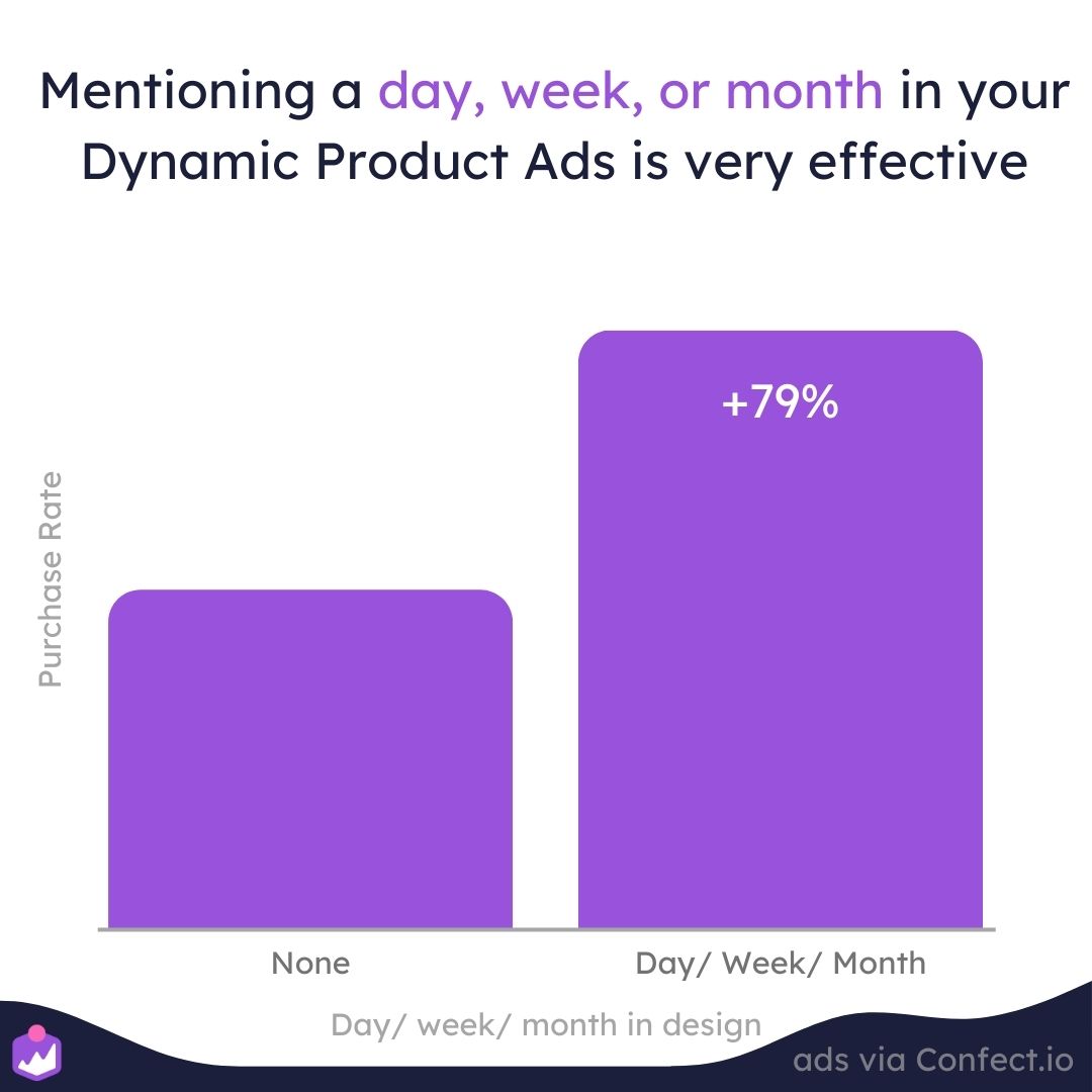
- That showing campaigns in your catalog ads, on average, can lead to about 79% better performance.
- Or that showing a product’s branding in a catalog ads usually leads to about 43% better performance!
Keep reading, and we’ll take you through dozens of other insightful tips like these!
But first…
What exactly are catalog ads?
Catalog ads are also sometimes referred to as Dynamic Product Ads or Product Feed Ads.
But no matter what you call them, they’re one of the most widely used types of advertising on platforms like Meta.
But why are so many people using catalog ads?
It’s because they’re based on past user behavior, such as visiting a website or leaving items unpurchased in a shopping cart.
In other words, they’re just extremely good at getting potential customers to follow through and buy a product.
It’s also a more hands-off type of advertising, where you can set up your campaign, then sit back and let Meta’s extensive knowledge of its users make the decisions about which products to show your followers and when.
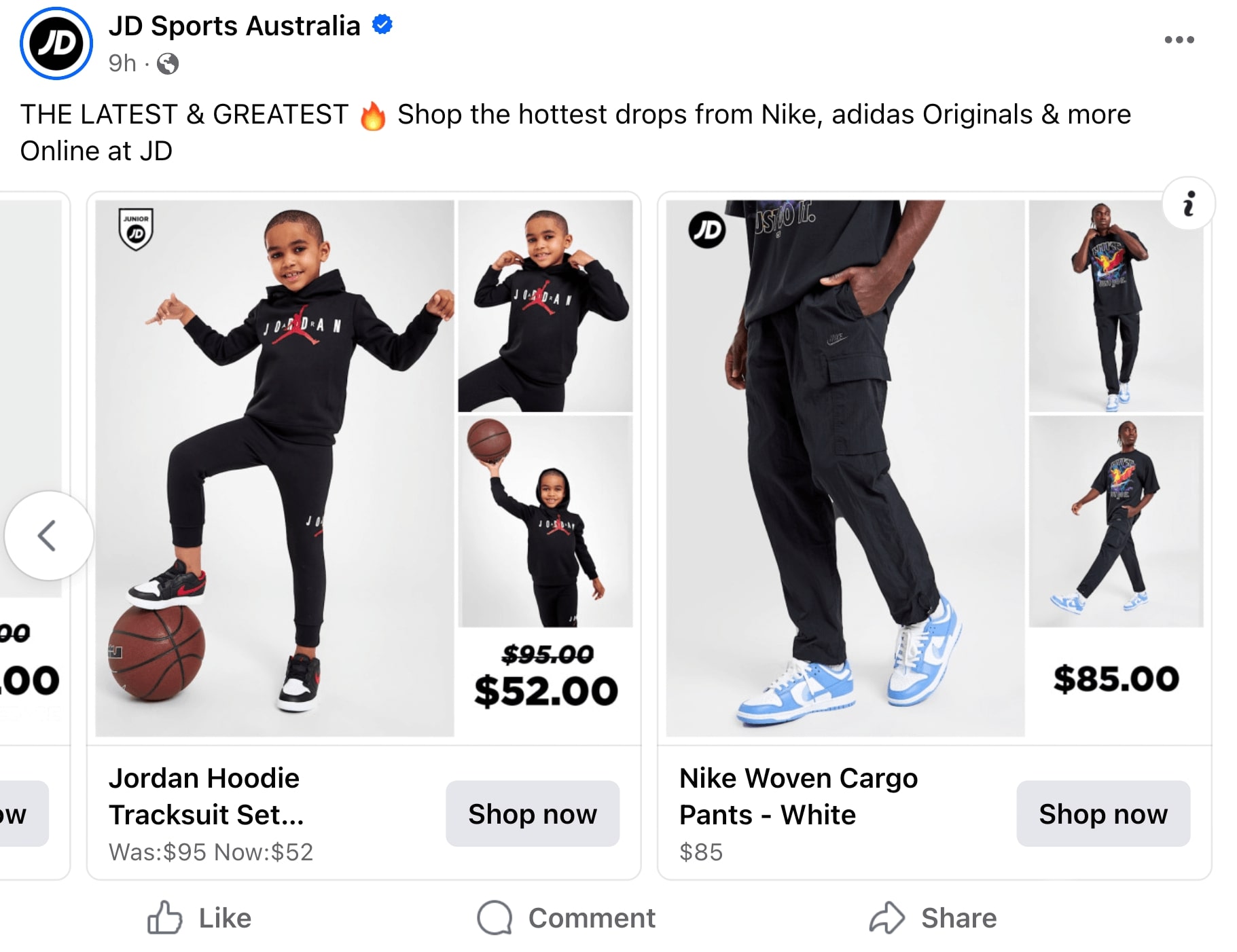
To run a catalog ad campaign, all you’ll need to do is create a product catalog based on the products available through your web store.
From there, Meta will make all the decisions about which products it will show to users based on their past behavior.
For example, let’s say you sell running shoes through your website.
If somebody has previously interacted with a running shoe ad from some other brand, there’s a good chance Meta will show your shoe ads to that same customer.
All that to say that your ads will be shown to people who are likely already very interested in what you have for sale!
That’s already pretty great in itself, but let’s dive deeper into what you can do to make your catalog ads even more effective!
How to design the best catalog ads on Meta
Now that we’ve established why catalog ads are effective, we have some bad news for you…
Historically, there hasn’t been any way to design the look and overall creative aspects of your catalog ads.
And unfortunately, this leaves most catalog ads looking like generic product images, which can be dull and boring to look at as a potential customer.
Generic catalog ads are also bad because:
- They look just like any of your competitors’ ads, especially those who are selling the same products.
- It leaves you unable to create brand-specific catalog ads complete with your business name and logo.
- You miss out on potential revenue since, according to Facebook, ad design is the leading factor that influences an ad’s performance.
Fortunately, with Confect, you CAN edit your catalog ads to include logos, prices, brand names, and other relevant information!
And to make things even easier for you, Confect lets you design a single template, and then it can be applied to ALL the products in your catalog, improving not only the way they look to your audience, but also how well they perform!
-1.jpg)
And we’re not just saying that!
We’ve actually seen, on average, a 30% increase in Return On Ad Spend (ROAS) across different advertisers that have used our editing software.
Want to know how other advertisers are designing their ads? Check out some design examples here!
However, it’s important to remember that the way you design your ads will have a big influence over how they’re perceived by your audience.
We’ve seen some designs perform as much as 4.5x better.
But we’ve also seen other edited designs perform worse due to the advertisers making their creatives too cluttered or just not visually-appealing.
Regardless, being able to edit and customize your designs is a massive opportunity for your brand!
So if you’re serious about improving your campaign performance, keep scrolling and we’ll dive into what we’ve learned from some of the most ambitious advertisers on Meta.
Analyzing catalog ads on Facebook
As mentioned, we’ve based the following analysis on some 1.5 billion impressions, more than 46 million clicks, and over 739K purchases from our customers who’ve used our editing software.
These results have been aggregated from a total of 170 different eComm companies, 379 product catalogs, and a just under 1,500 ad designs, all of which were used on either Facebook, Instagram, or WhatsApp.
The data was also not pulled from a single industry, but multiple different eCommerce industries in different countries, ranging from January 2022 to February 2023.
Across all these data points, we’ve found that whether we were observing the Purchase Rate or the Click-Through Rate, the performance was heavily influenced by the overall quality of an ad’s design.
-1.jpg)
However, this is exactly what Facebook announced in a 2022 study, where they looked at which factors drove the best ad performance.
The results concluded that "The lever most strongly associated with increased performance on Meta technologies is ad creative execution."
Which, as far as we can surmise, simply means that the creative aspects of your ads are by far THE most important factors that influence performance.
In yet another Facebook study, researchers showed that the best ad designs had an 11x better ROAS than the worst designs.
And Meta isn’t the only platform that has looked into this.
Google has also stated that 70% of an advertising campaign's success can be attributed to ad design, whereas media placement only accounts for 30%.
All that to say that your ad designs can have a tremendous impact on how well your catalog ads perform once they’re live!
How to optimize Facebook catalog ads for Purchase Rate
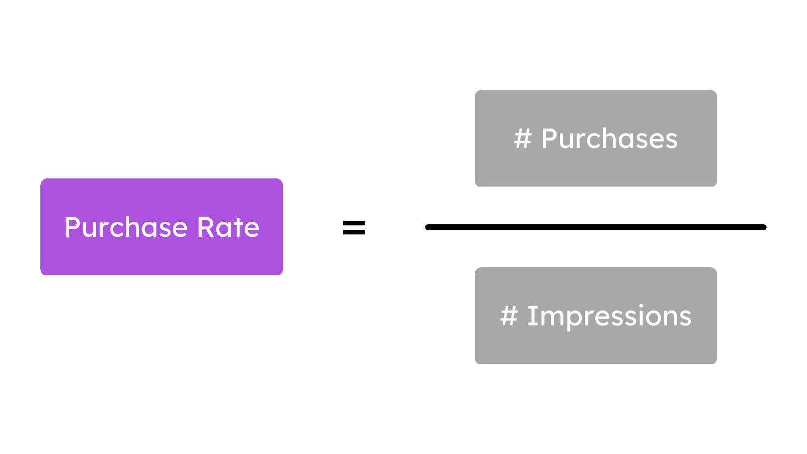
Purchase Rate can be calculated by dividing the total number of purchases made through one of your ads by the total number of impressions it has received.
So basically, it exemplifies how likely a viewer is to make a purchase after seeing an ad.
Sure, your Click-Through Rate and Conversion Rate are important.
But your Purchase Rate combines these two elements to give you better insight in your ad performance.
We’ve found that some design choices lower your Conversion Rate, but increase your Click-Through Rate (e.g. lower-quality traffic), while others will boost your Conversion Rate, but lower your CTR (e.g. higher-quality traffic).
And this is an important distinction to make since it’s better to focus on generating high-quality traffic, consisting of people who are MORE LIKELY to make a purchase, rather than getting a lot of poor-quality traffic from people who aren’t likely interested in your products.
And the reason that catalog ads are so great for pushing people to make purchases is because, rather than showing a single product, they show multiple products, giving the viewer the ability to find something they’re interested in buying.
-1.jpg)
Typically, we’ve found that allowing your viewers to find the right product leads to more sales, and overall, is much better than optimizing your content for clicks.
As a general rule, we recommend taking anything you’ve learned from Conversion Rate A/B tests, and applying them to your catalog ads whenever possible.
And again, remember that our insights are based on different brands in different industries.
Therefore, we strongly encourage you, no matter what, to A/B test your designs and find what works best for your specific brand, products, and audience.
If you're aiming to maximize results, see how top brands use Advantage+ Shopping Campaigns to boost purchase rates with Catalog Ads.
Designing the best best catalog ads on Facebook
Now that we’ve got all that out of the way, let’s dive into all the juicy insights and everything else we’ve learned from studying 1.5 billion impressions.
Good designs perform much better!
Ok, so we’ve already explained this…
But it’s an important fact to keep in mind since it’s something that advertisers often forget about when they start editing and customizing their designs.
And more specifically, we’ve found that designs that contain more details perform better!
In fact, we’ve found that catalog ads with 6 or more elements perform between 38% to 42% better than designs with only 2 or 3 elements.
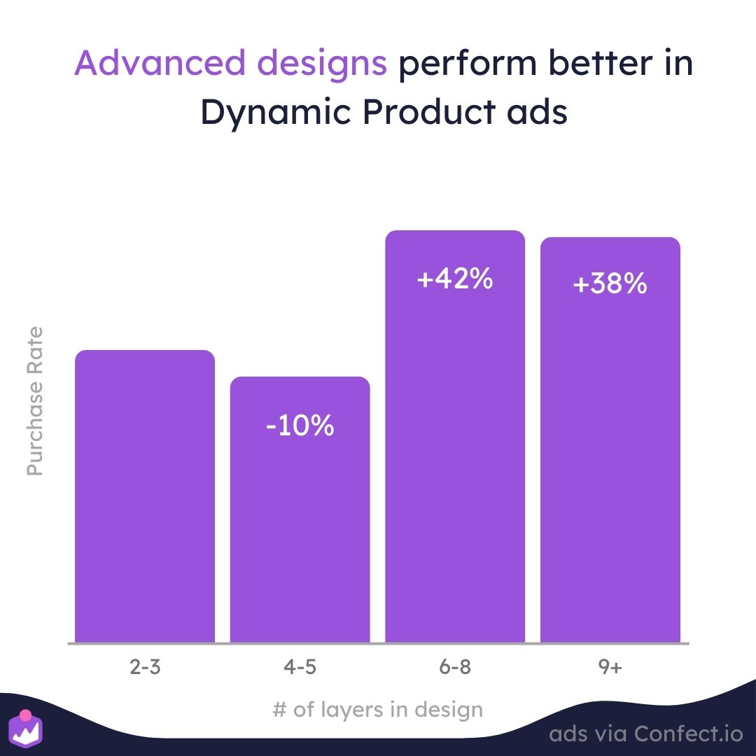
This helps illustrate the importance of working with a great graphic designer and taking the time to think about the most important elements that you’ll want to include.
So to sum it up, it’s not good enough to just change the background in your ads…
The more details, and the more information you can convey, the more purchases you’ll reap from your next campaign.
Personalizing your catalog ads with design rules
Another great reason to use Confect is that it allows you to create Design Rules, which will determine which designs are used for which products.
Design Rules are simply conditional statements, which help to improve how your ads are displayed.
For example, you can set up Design Rules to show a specific design for any products that are on sale, or for new products, best-sellers, look-alikes, etc.
Essentially, this enables you to personalize the experience for your viewers and optimize the design based on which products you’re showing them.
These rules can be set up based on any of the information you have on your products, such as the price, discount, or product category.
But you can also set rules based on schedules or time periods too!
But just how much can Design Rules impact your campaign performance?
Well, having just a single Design Rule, on average, performs 69% better than not having any.
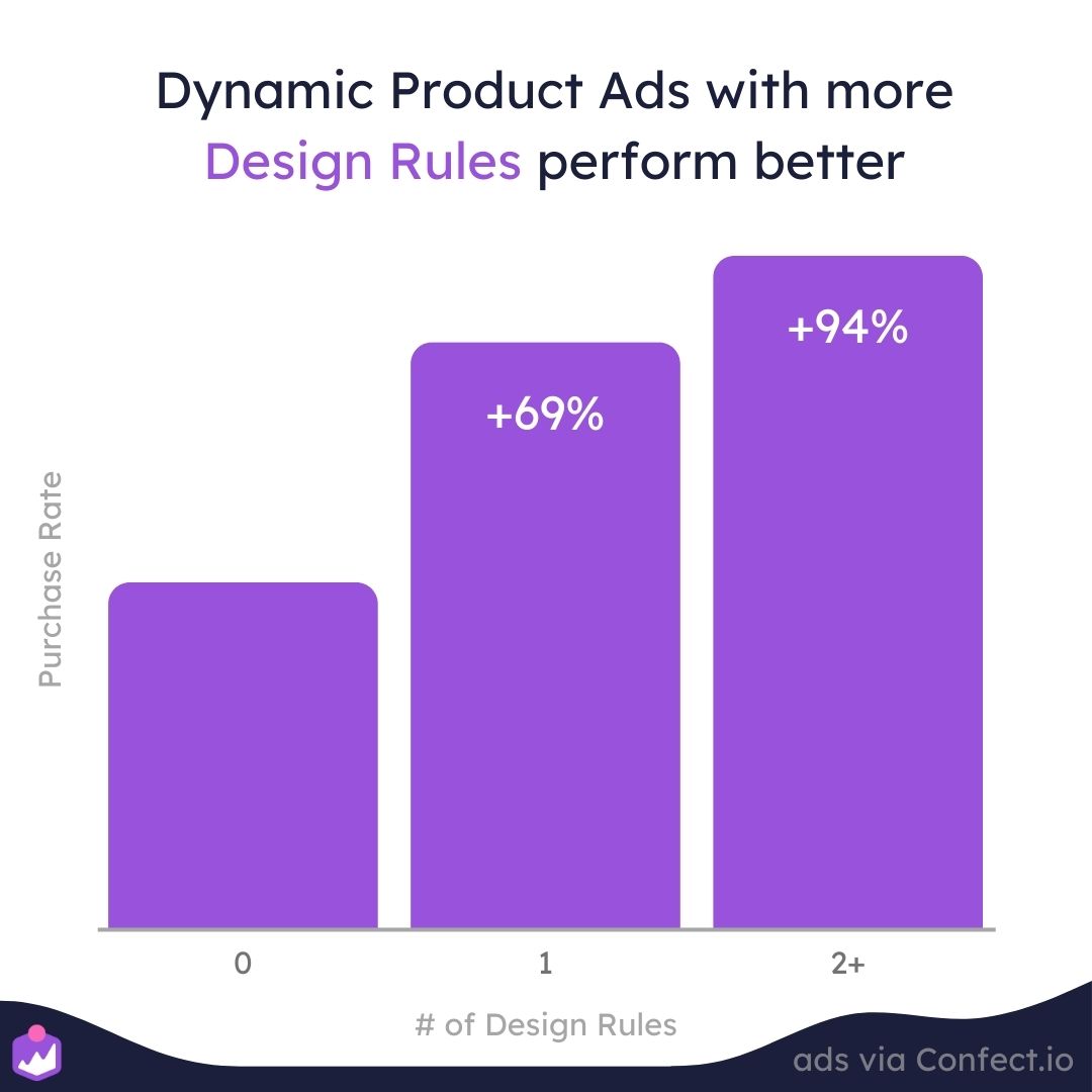
And having 2 or more Design Rules can boost performance by as much as 94%!
So ultimately, the more Design Rules you create, the more personalize the experience will be for your viewers and potential customers.
Because catalog ads show multiple products, it boils down to crafting the best possible experience for each product being viewed.
For example, if you sell bikes, you could set Design Rules to show forest backgrounds for mountain bikes, cityscapes for city bikes, or just yellow backgrounds to highlight bikes or products that are on sale.
So don’t be afraid to set multiple Design Rules! The more the merrier!
Leveraging urgency and scarcity by showing campaigns in your catalog ads
There’s no denying the fact that you can create a sense of urgency in your ads just by showing time-sensitive sales, discounts, or promotions.
However, advertisers often forget the importance of using time-sensitive campaigns in their catalog ads.
On the bright side, by using scheduled Design Rules, you can change all your catalog ads to show your campaign information, and then have them automatically switch back to normal once the promotion has ended.
Aside from the obvious fact that this can help you leverage time-sensitive urgency and scarcity, it also makes optimizing and managing your ads much more hands-off.
And, to top it all off, using Design Rules is just a great way to sync up your top-funnel catalog ads with your bottom-funnel catalog ads.
Overall, this is a great strategy because it shows your viewer a product they’re likely already interested in purchasing.
But more importantly, they’ll see that they’re looking at a time-sensitive promotion, which should induce a sense of urgency, making them not want to miss out on a great deal.
And all that explains why we’ve found that when a catalog ad mentions a specific day, week, or month, on average, it performs about 79% better than similar ads that don’t mention any time-sensitive periods.
We truly believe this is a great tactic to add into your repertoire, not only because it can improve performance, but also because you can improve your campaign performance without having to start over from scratch.
You see, when you make changes to your ads, Meta has to restart the machine learning phase.
But when you make changes to your ad creatives by using Design Rules, Meta continues using its existing knowledge to deliver your them to the best potential customers for you!
In other words, you can leverage scarcity and urgency, while also synchronizing your ad messages across your entire catalog, and all without being penalized by Facebook algorithm.
Talk about a smart advertising strategy!
Lastly, we want to mention that holidays, like Christmas and Black Friday, are some of THE BEST and most time-sensitive periods for advertisers like you.
So, to learn how other advertisers are baking on this important time period, check out our collection of Black Friday ads and all the insights we’ve gathered from them!
Urgency boosts conversions - learn how brands run powerful Catalog Ads for Campaigns & Sales here.
Avoid ad fatigue with your catalog ads
Have you ever seen an ad on Facebook so many times that you simply started ignoring it?
Well, that’s exactly what we’re referring to when we talk about ad fatigue—the phenomenon of when social media users get bored of seeing the same ad.
And, as you might have guessed, it’s a serious problem for eCommerce advertisers!
Which helps to explain why we see conversion campaign performance drop by about 38%, on average, after the first 5 weeks of being live.
After 8 weeks, things get even worse with performance dropping by as much as 53%!
Obviously, when we create campaigns, the dream is that we can just launch our ads and have them remain always-on.
However, the reality is that there’s more work involved than that… Unfortunately.
On the other hand, when you’re running catalog ads, the opposite is true!
Catalog ad performance does not deteriorate as much as over time!
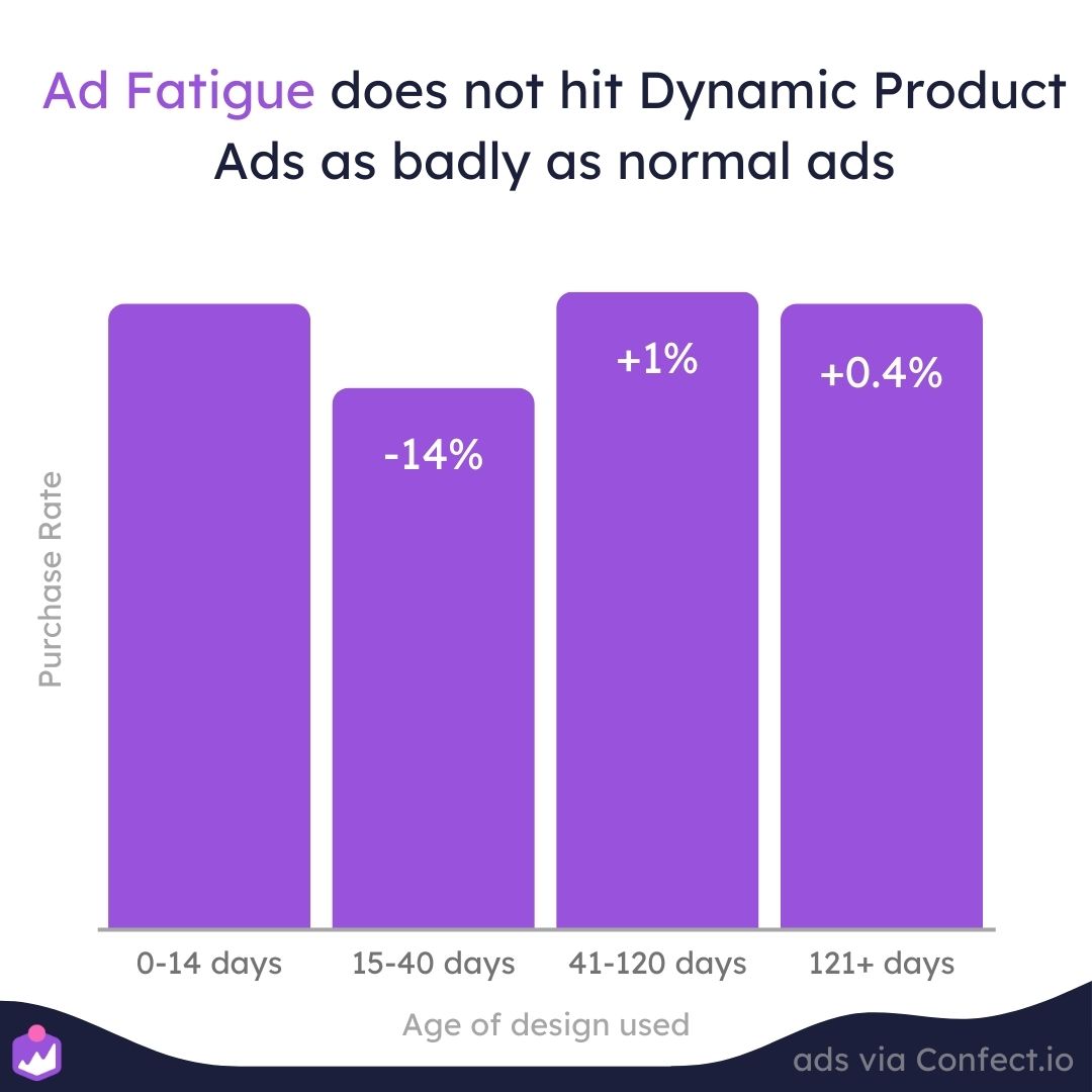
After about 120 days, catalog ad performance only fluctuates about 1% up or down, making them the ideal ad format for when you want to create a campaign and leave it on at all times.
Because catalog ads show more than a single product, they won’t always appear the same to the viewer.
So, for example, if a viewer gets tired of seeing shoe ads, the catalog can then show them shirts, or hats, or any other product that they haven’t seen a bunch of times before.
Based on this information, we still encourage you to A/B test your catalog ads as much as possible to find out which designs perform the best.
Essentially, when ad fatigue isn’t an issue, you should focus your time and energy on finding the absolute best design elements that improve, not impede, your campaign performance.
Keeping designs fresh is crucial - see how always-on campaigns maintain performance through smart creative variation.
Using product text fields in your catalog ad designs
Another cool way to optimize your catalog ads is by inserting product text fields that will automatically adjust based on information from your web store.
In other words, your catalog ads can automatically adjust text, such as the product’s name, price, category, brand name, etc.
This type of dynamic information automatically provides potential customers with the facts they’re likely already looking for.
And in turn, this simplifies the buying process!
Which helps explain why we’ve found that catalog ads with dynamic product text fields perform about 44% better than similar ads without these fields.
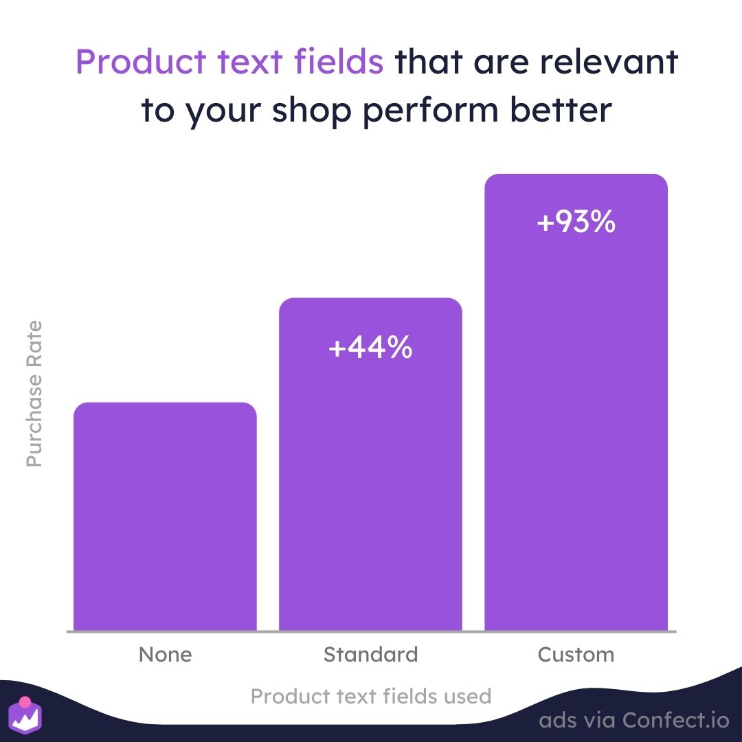
However, these are just standard product fields that can be found in virtually any shop.
But an even better tidbit:
We’ve also found that using custom product text fields that are specific to your shop perform as much as 93% better!
So, the more relevant the information you include, the better your catalog ads will perform!
When we say custom product fields, we mean metadata such as labels or properties that are specific to your business, your products, or your industry as a whole.
For instance, you might include product information such as best-sellers, new or trending products, or even the number of products you have left in stock.
You can also include industry-level information, such as:
- For wines, it might be the product’s country of origin
- For fashion products, it might be the material or carbon footprint
- For tech products, it could be memory storage
- For food, you might include whether or not the product is organic
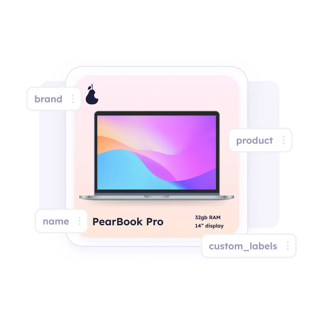
Of course, those are only a handful of opportunities, and there are really a ton of different ways you can leverage custom product information to make your catalog ads even more compelling to your viewers.
Just think about the information that your potential customers are likely looking for, and by providing that information directly in your ads, you’ll be simplifying the buyer’s journey, and making it more likely they’ll make a purchase.
Check out our guide on using product attributes here!
How to use product information in your catalog ads on Facebook
So far, we’ve mostly focused on how to design your catalog ads, which can ultimately be summed up as:
The more relevant the information in your designs is, the better your ads will perform!
But that leaves us wondering what information makes the biggest impact on your overall campaign performance!?
Price? Product name? Branding?
 (1)-1.jpg)
To find out, keep reading and we’ll explore which information will help your catalog ads perform to the best of their capabilities!
Using price in catalog ads
You can learn more about using prices and see a bunch of real examples in our ultimate guide on using price in catalog ads.
There’s no doubt that money influences the majority of our decisions in life. Prices are even considered by some as the foundation of the global economy.
Therefore, it’s crucial to remember that the decisions of your customers to buy or not to buy will largely be based upon the price of your products—both in terms of the actual cost and the perceived value of what you have for sale.
In other words, price is literally THE most important data point your ad viewers will be looking for!
 (1) (1)-1.jpg)
This is most likely why we see catalog ads that show prices having a lower click-through rate.
If the price is shown, there’s no need for people to click on the ad to find out.
Conversely, we also see that when prices aren’t shown, catalog ads typically have a higher click-through rate.
At first glance, this might seem bad since you WANT people clicking on your ads.
But it also means that those who do actually click will already know the price of your product, meaning that they’re already more likely to convert!
In other words, showing prices might decrease your CTR, but it does improve the overall quality of your traffic!
And that explains why we’ve found that catalog ads with prices perform about 20% better than similar designs without pricing information.
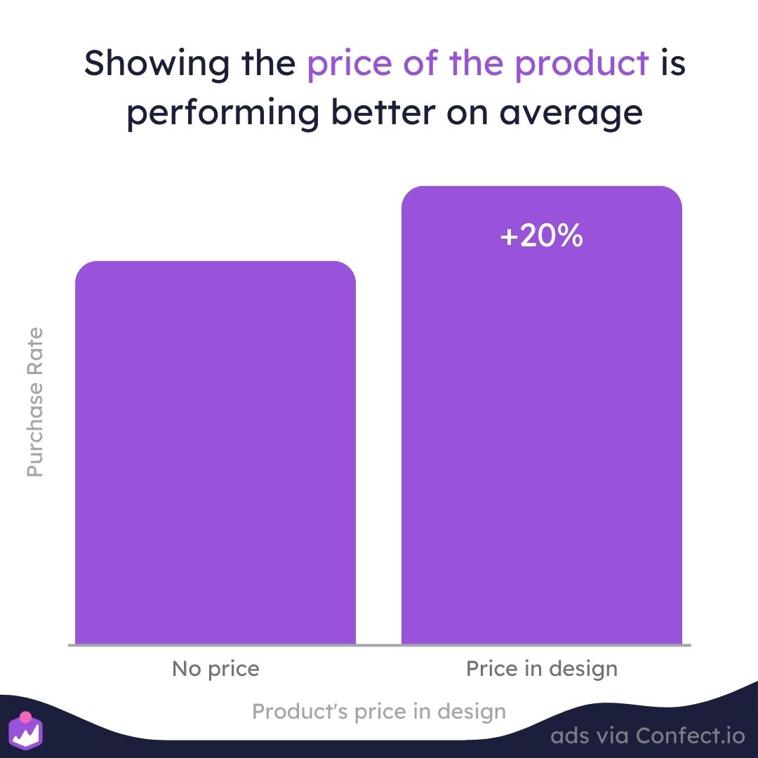
To break this down even further: you just don’t want people clicking on your ads to realize they’re not happy with the price, meaning that they’ll quickly bounce away from your website.
This just leads to a higher bounce rate and less time spent on your web pages.
 (1)-1.png)
Conversely, sometimes product prices just feel expensive when the viewer doesn’t yet know the benefits or features of a product, which is usually only displayed on your product page.
That’s why we recommend you always include pricing information for bottom-funnel retargeting ads, where the customers likely already know your products and their benefits.
Meanwhile, your top-funnel ads should focus primarily on explaining the benefits and features of your products.
Another exciting insight is that we’ve noticed a 25% increase in performance in normal ads around payday.
Click here to learn more about increasing ad performance by using price!
Savings and discounts in catalog ads
You can learn more about showing discounts and see a bunch of real examples in our ultimate guide on using savings and discounts in your catalog ads.
So we’ve already mentioned why price and perceived value are important data points.
But there’s one great way to lower the perceived cost and increase the perceived value of your offering:
Savings and discounts!
We all know that people love great deals, which is why we consistently see sales and discount ads performing the best!
-1.jpg)
So yes, discounts do lower the overall cost of a product. But that’s not the only reason why sales ads are so effective…
It’s also because your viewers see sales and discounts as only being available for a limited-time.
This means they’ll have a fear of missing out, and will be more likely to take action now!
In other words, savings and discounts work wonders because they use the concepts of urgency and scarcity, which is precisely why we see these types of ads perform about 45% better than similar designs.
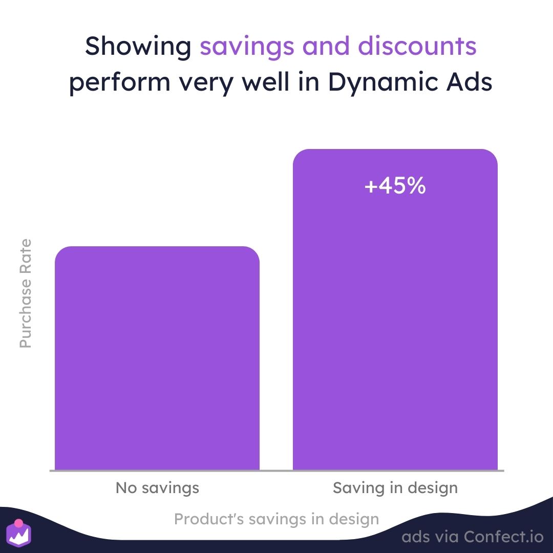
And there’s multiple ways to show savings!
For example, you can show savings in dollar format ($20 off), or, you can show savings in percentage formage (20% off).
Regardless, if your products are discounted, you should always show the savings in one form or another.
After all, cost and perceived value are THE most important factors that influence the decision to buy or not.
But is there any difference between showing savings in percentage or dollar format?
From our findings, savings for lower-priced products should be in percentage format and savings on higher-priced items should be shown in dollar format.
 (1)-1.jpg)
According to the rule of 100, which is illustrate in Jonah Berger’s book called Contagious: Why things catch on:
"If the product’s price is less than $100, the Rule of 100 says that percentage discounts will seem larger. For a $30 T-shirt or a $15 entrée, even a $3 discount is still a relatively small number. But percentage-wise (10 percent or 20 percent), that same discount looks much bigger."
The easiest way to use savings and discounts in your catalog ads is by duplicating your original ad creative into a sales version, then applying it to your product catalog via a Design Rule.
Learn more about using sales in your catalog ads here!
Using product names in your catalog ads
Aside from pricing information, the name of a product is the second most common text field we see Confect customers using.
However, we should note that this is a risky design choice.
After all, on average, we’ve found design templates that include the name of a product to perform about 30% worse!
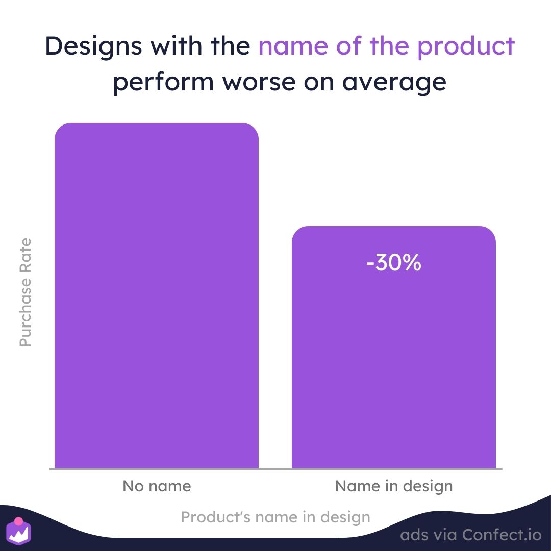
We believe this is because your viewers can already see the product that you’re advertising.
Therefore, they don’t gain much information by knowing that they’re looking at a cell phone, a shoe, or a t-shirt.
Additionally, the name of the product is typically included in the ad copy. So including it in your design is just redundant.
Ultimately, if the name of a product is irrelevant and doesn’t add any new or important information, it won’t add any value.
And even worse, it might make your design seem cluttered and draw attention away from more important information like the price of savings.
Brand names in catalog ads
You can learn more about showing brand names and see a bunch of real examples in our ultimate guide on brand names in your catalog ads.
These days, most consumers are focused on brand names, especially when looking for products that they’re seriously interested in.
After all, nobody wants to buy products from brands they’ve never heard of before.
In other words, brand names are some of the most important information you’ll want to include in your ads.
Including a product’s brand name can help make your products seem more relevant to the viewer, which ultimately, leads to higher-quality traffic.
 (1)-1.jpg)
Ultimately, you don’t want people clicking on your ad if it’s for a brand name they would never use.
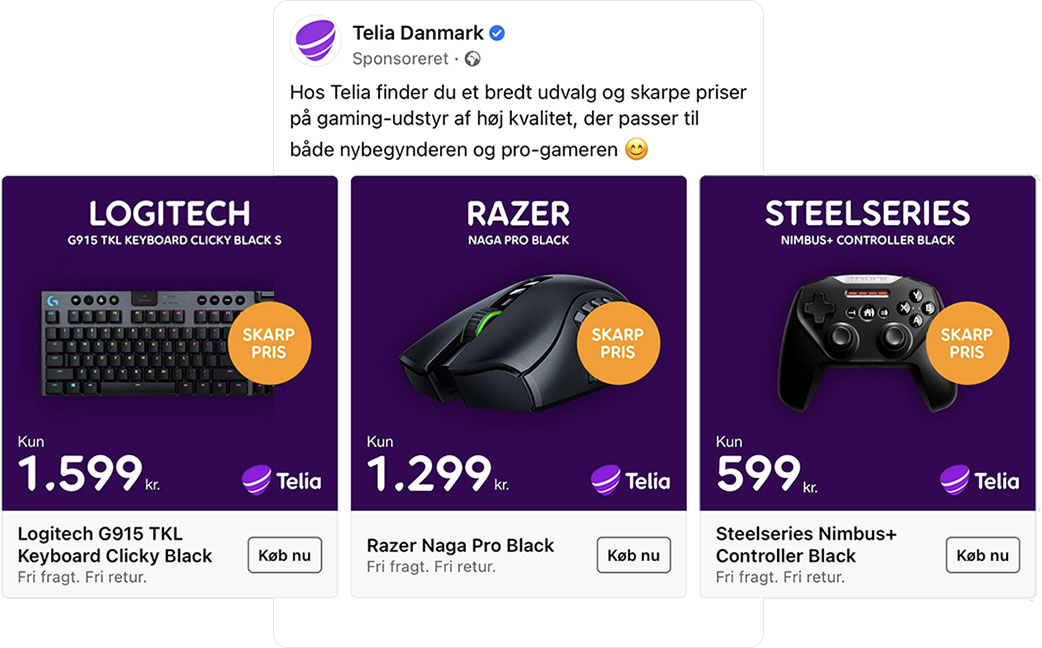
And that’s why we’ve found that catalog ads that include the name brand of a product perform about 43% better than ads that don’t.
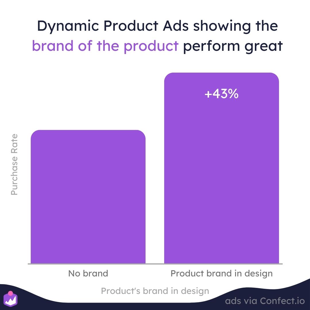
You can show the brand either in the text or visually via Product Assets, where it can be displayed by the brand’s logo.
Sometimes, showing logos or brand names allows advertisers to negotiate procurement agreements or charge fees to their suppliers since they’ll essentially be advertising for them!
However, we should also note that high-end luxury products, like those from Versace or Gucci do not benefit from showing the brand name.
Often, it will increase your click-through rate, but lower your conversion rate, leading to very poor-quality traffic on your website.
In other words, luxury brand names do induce a lot of curiosity, but most people don’t actually buy them because of their exorbitant costs.
Therefore, if you’re advertising these types of products, you should maybe focus more on pricing and savings, which should improve traffic quality.
Visual product assets in catalog ads
As we’ve mentioned a bunch so far, relevant information should always be included in your catalog ad designs.
However, rather than including information in text form, it’s often beneficial to include it via images or logos, which are easier and quicker for our brains to process.
For instance, showing the Adidas logo can grab attention and convey information a lot faster than having your viewers read the name brand in your ad copy.
We’ve even found that catalog ads that use Product Assets perform about 27% better than similar ads that do not include logos or images.
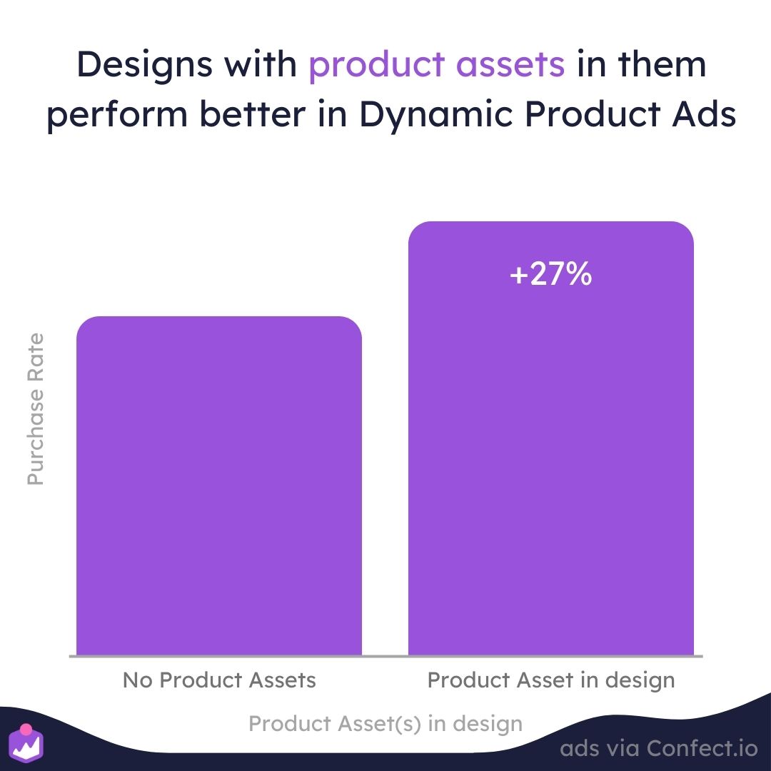
However, Product Assets aren’t just about showing logos.
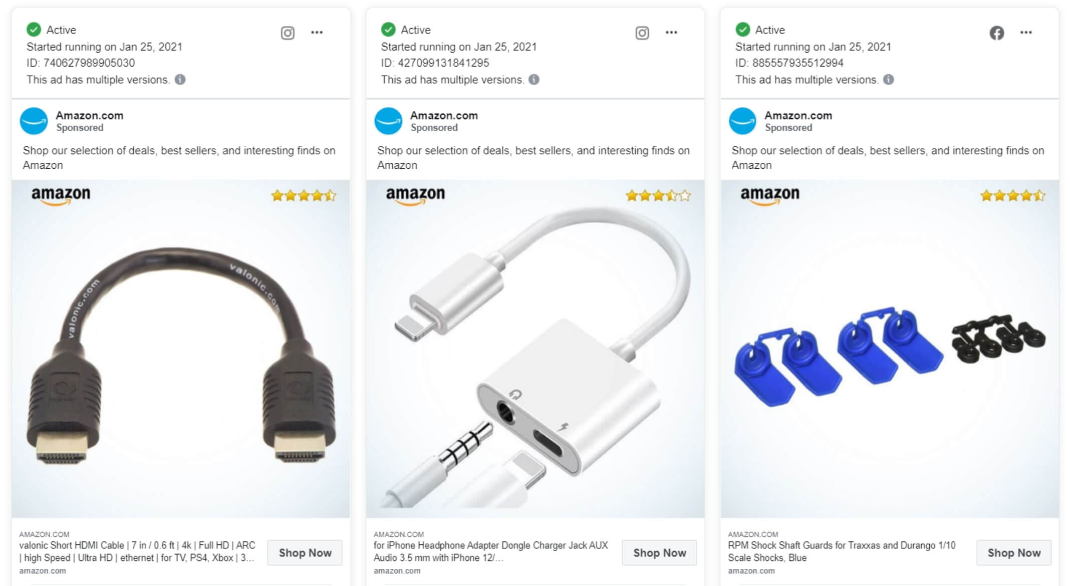
You can also use product ratings to convey information visually via Product Assets, which is exactly what Amazon does for their products alongside the image and their logo.
And that’s not all! You can also use Product Assets to convey information such as:
- Pet food products that show a cat or dog image based on the product type.
- Showing a flag to depict where a product originated
- Showing whether a food product is organic or not.
- Displaying the energy efficiency rating of an electronic product or home appliance.
- Showing different background based on a product’s category
The idea is ultimately to display relevant information visually, instead of having your viewer read it or have to look for it in your ad copy.
Logos in Facebook catalog ads
You can learn more about logos and see a bunch of real examples in our ultimate guide on logos in your catalog ads.
Your company’s most important distinction is your brand logo.
And, as you’ll often see, marketers tend to include brand logos in virtually all of their ads.
But is there any real benefit to doing this?
Well, we’ve found that including a brand logo in your catalog ads can boost performance by as much as 43%!
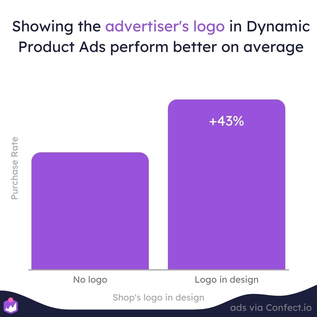
After all, if a viewer already knows and trusts your brand, they’ll be that much more likely to buy something from you.
Showing your brand logo can also help build trust with potential customers, especially when we’re talking about bigger brands where people are already aware of who they are and what they do.
Which is likely why we see smaller brand ads perform worse when their logos are shown, and bigger brands perform better.
 (1) (1)-1.jpg)
Essentially, if people don’t really like your company, showing them your logo won’t do anything to make them trust you.
Therefore, for smaller brands, we recommend building trust and confidence by sharing product reviews, user testimonials, and other pertinent information on your landing page instead.
However, there’s a fine line when it comes to using logos in your catalog ads, depending on whether we’re talking about top or bottom-funnel ads.
Using text in your catalog ads
From everything we’ve discussed so far, one of the most important takeaways is that including relevant information in your designs is important.
But since you won’t likely be able to include everything in your ad creative, you can also include information in your ads by using text as well.
But how much text should you use?
Well, we’ve found that ads WITHOUT ANY TEXT perform the worst!
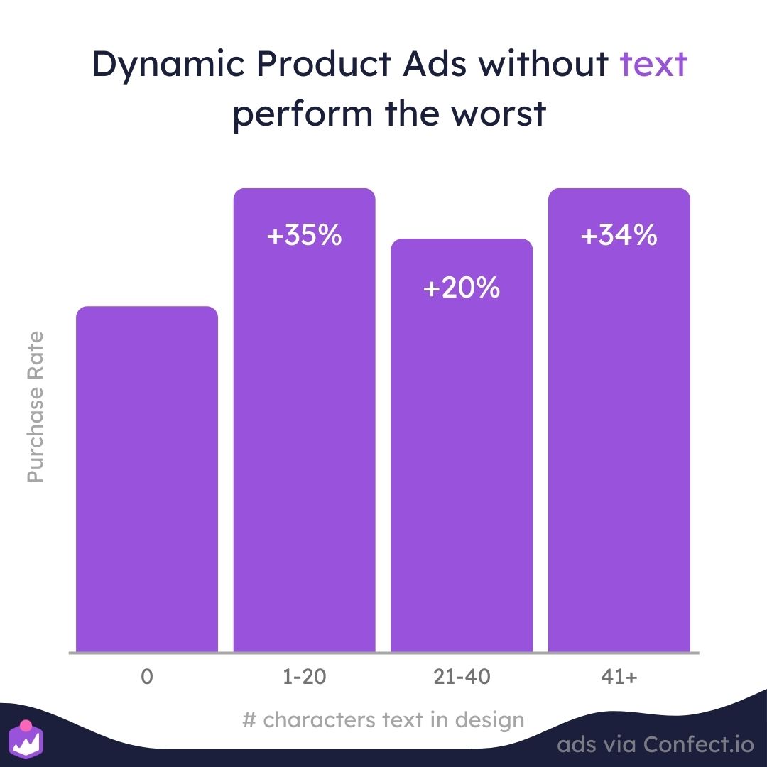
So whether you include 1 character or 50 characters, it really doesn’t matter!
Ultimately, if there’s relevant information, it should be included in your ads via text, no matter how many characters or words it takes.
However, it’s true that the most relevant information is likely to change as time goes by.
So, for example, if you’re running a time-sensitive campaign, the time period might be the most important information to convey, whereas, if you’re running a retargeting campaign, pricing and shipping information might be more important.
So always keep this in mind. But most importantly, remember that it’s vital to include relevant information via text in your catalog ads.
Learn more about text amounts in catalog ads here.
Designing catalog ads that make you money!
Wow! Well, that was a lot of information to go through!
So to sum things up:
- Catalog ads with 1 Design Rule perform 69% better than those without any. And those with two or more Design Rules perform 94% better!
- Catalog ads with 6 or more layers perform 38% to 42% better than those with only 2 or 3 layers.
- Catalog ads that mention a specific day, week, or month perform 79% better
- Ad fatigue isn’t as much of an issue when running catalog ads because they don’t always show the same product.
- Catalog ads with standard product text fields perform 44% better, and catalog ads with custom product text fields perform 93% better than those without any product text fields.
And here’s a recap of how using different types of product information can impact the performance of your next catalog ad campaign.
- Catalog ads that show savings perform 45% better
- Catalog ads that show price perform 20% better
- Catalog ads that show product names perform 30% worse
- Catalog ads with Product Assets perform 27% better
- Catalog ads that show brand names perform 43% better
- Catalog ads with tex perform as much as 35% than similar catalog ads without any text
- Catalog ads that show a logo perform 43% better
So these are all important insights you can use in your upcoming campaigns!
However, it’s vital to remember that these insights were gleaned across all sorts of different brands in different industries.
So your results may vary!
That’s why it’s important to run A/B tests for your catalog ads and to optimize based on your specific brand, your products, and your intended audience.
You can learn more about customizing and optimizing your Catalog Ads here
Try Confect for Free
Confect can help you to create great-looking Catalog ads and Dynamic Product ads for Facebook, Instagram, TikTok, Snapchat and Pinterest.
