Advantage+ Shopping Campaigns: Learn from the best ecommerce brands
February 7, 2024
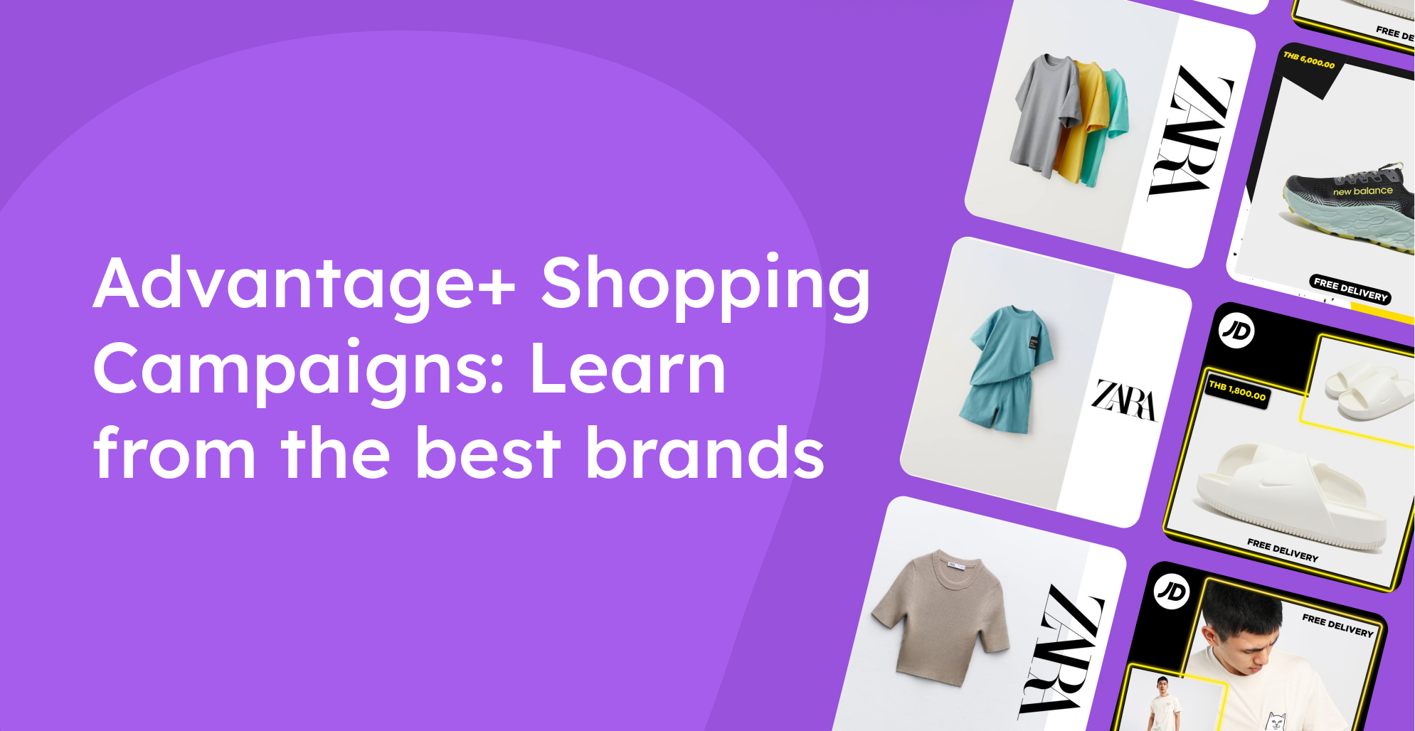
Advantage+ Shopping is the new campaign format from Meta, which will change how all eCommerce companies advertise.
It’s designed to help eCommerce businesses generate even more sales on Meta, which is perfect! But it comes with a price.
With Advantage+, we lose all control over which ad is shown to whom. In other words, we completely lose control over all targeting - which means we have to put our focus elsewhere.
Naturally, it makes the most sense to spend time optimising the part of the ad that gets the most attention: the creative.
.jpg)
We only have the possibility to give Meta ad visuals, ad copy, and some minor targeting settings. So we have to figure out where to put our energy.
If you’ve been advertising on Meta for more than about a year, you’ve surely noticed this undeniable shift in the way we advertisers set up campaigns and ad sets - machine learning algorithms are picking up traction for their ability to optimise themselves automatically.
The new normal for catalog ads
The vast majority of top-performing advertisers already run multiple manual-upload creatives in this manner, but there are still many who bet their entire budget on a single variation of catalog ads.
Nowadays, ad creatives in Meta can be compared to playing darts - the more you throw; the better probability of hitting the center. If you only use one, your chances of winning are much smaller.
Meta best practice: Broader targeting and multiple ad creative options.
- The algorithm will automatically test and compare their effectiveness.
- The budget will be dynamically redistributed to maximise performance.
- Meta will learn to deliver the best variation for each user segment.
- Possible with manual ad sets, but also Advantage+ campaigns.
More creative variety = more options = more algorithm-training data points = higher ROAS
So let’s have a quick peek at how to set this up, and then we’ll look at some examples from top brands.
How it works
Chances are you’re already doing the exact same thing in your manual-uploads, and it’s not much different for catalog ads.
First, you need to come up with a few variations. These can differ in:
- Their visual (i.e., different layouts, elements and colors)
- Or message (i.e., one is plain, one says “free shipping”, and another “free returns”)
Then you will send these into Meta via your Confect catalog as design variants.
Once everything loads, you will simply create multiple ads in your ad set (or campaign if using Advantage+) and pick the correct creative with the Confect dropdown.
Optionally, you can also apply a product set (or different ones to each ad) based on your strategy.
Just publish and let Meta’s AI figure out the winning variation by itself.
Variation ideas for Always-On Catalog Ads
Always-on Catalog Ads are arguably your most important designs, but also the ones that are easiest to forget about! It's a common misconception that you have to change the entire design; hence, it's harder to make the time available for it - but this is not true at all. You can get by with minor modifications to your existing designs.
The most important thing you have to ask yourself is; What are the different ways we can get attention from someone who doesn’t know us?
And then, test out all the ideas you get from answering that question. Change the layout, experiment with placing, spacing, different splashes, and so on.
Always-On campaigns thrive on variation - this guide explains how brands keep Catalog Ads fresh across time without exhausting audiences.
Different layout, same message
One of the most obvious variations to experiment with can easily be the layout. It's pretty simple to make minor changes to the layout while keeping the same message.
Take this ad from JD Sports as an example. A relatively simple Catalog Ads design, but it's still conveying all the information this audience is looking for. The price, the product, the JD Sports logo, and a bar saying "Free Delivery" - This is all the information they've deemed needed for the audience.
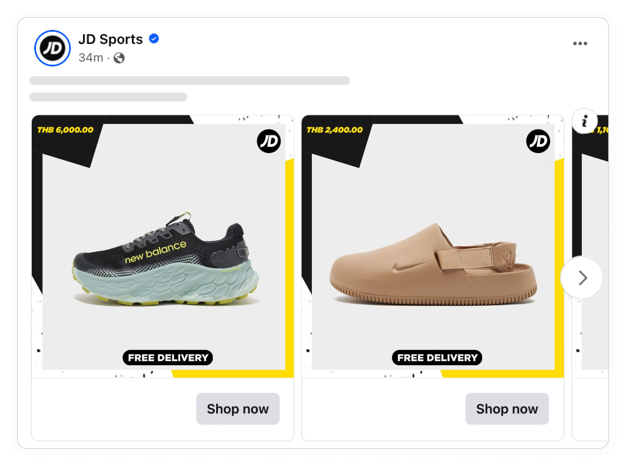
There are thousands of changes/variations you could make to this design.
Let's take a look at another catalog ad design from them. They are showing the exact same information, with the exact same messaging - just a different layout and an added additional image.
There's not a lot of effort needed to get to what, in essence, feels like a completely new design - even though it shares a lot of resemblance with the original one.
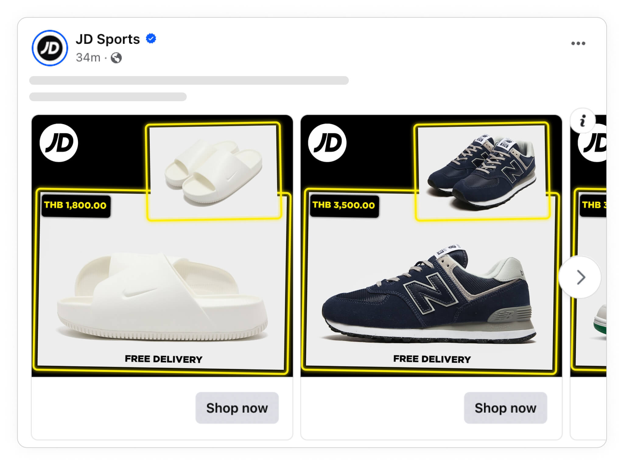
Even though the difference between designs 1 & 2 from JD Sports is very minimal, you can still do even smaller variations and still benefit from it.
In this next ad, JD Sports has basically just flipped the layout from Catalog Ad design number 2.
It's a very limited amount of effort, but it literally turns the design on its head - and who knows, maybe this variation works better in some cases.
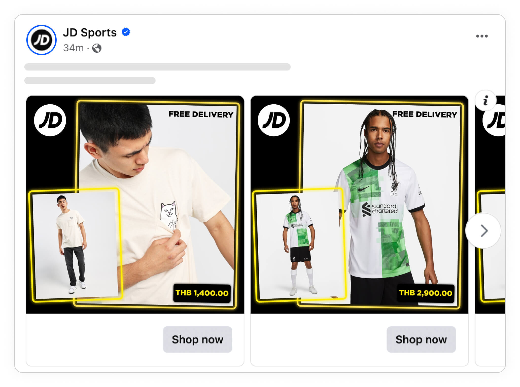
Layouts can be a tougher nut to crack, as there's simply endless opportunities. We've collected hundreds of Catalog Ad design examples you can take inspiration from, both for packshot product images and for designs using model or photo product images.
Only change one element at a time
It's definitely not good in all cases, but sometimes making changes to the entire layout will make sense.
However, you can also benefit from making changes to a single element, such as your brand logo. And sometimes, it might even be way better than changing the entire design.
For instance, you could have a specific design with one kind of splash, but also run a design with a different splash, maybe it's just different colors, or it's a different shape - there are a lot of variations of singular elements you can try out.
And you can also look to your product's attributes to find different bits of information that you can use to make subtle changes to individual elements too!
Take a look at this Catalog Ad from ZARA; in essence, it's a super simple ad with only the product and their logo.
Such a simple ad makes it very obvious to test how they show this logo.
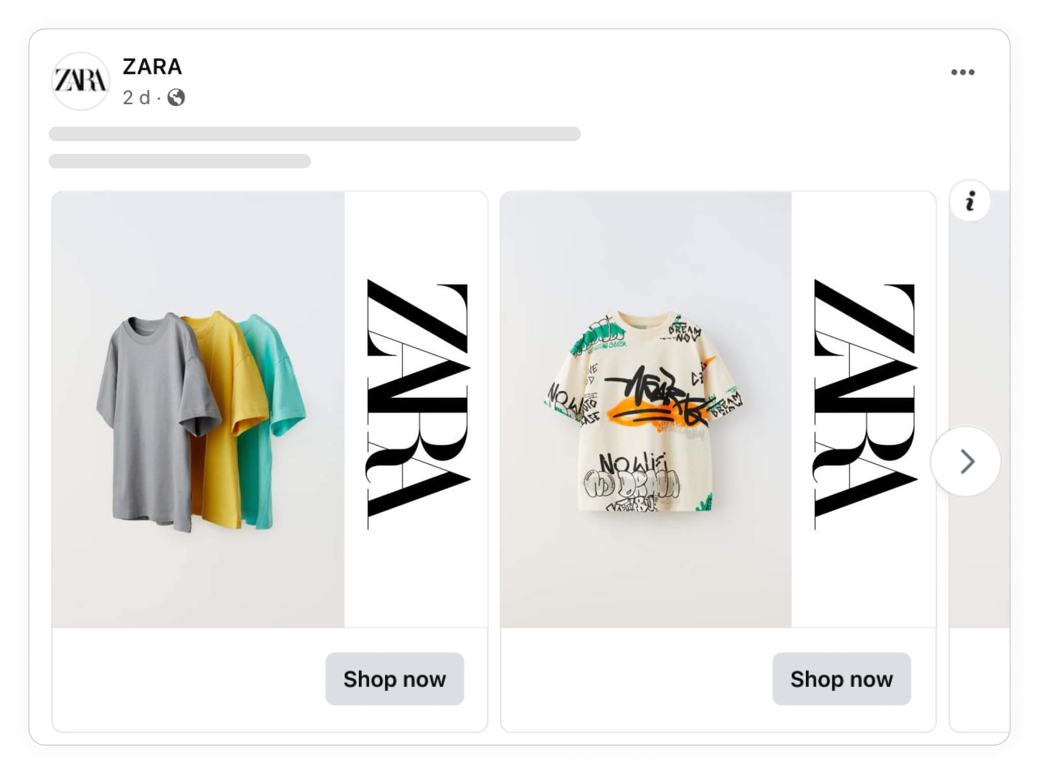
Of course, the possibilities are almost endless with a design like this.
When deciding between two design choices, duplicate the template and try both!
For example:
Should the logo overlap the image or not? = Variation idea
Should the logo be horizontal or vertical? = Variation idea
But, you should also try not to make the vastest changes all the time, so what ZARA has done here is genius: keep the logo in roughly the same position - just a bit larger and moved so it pops more from the image.
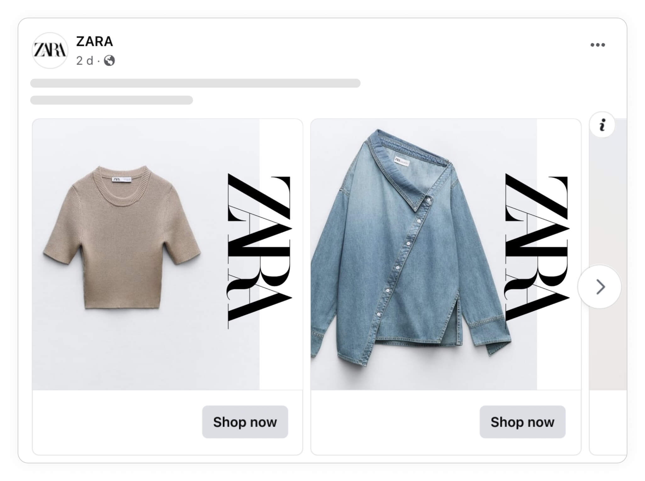
Another variation to make is to play with the size.
They have considerably shrunk the logo in this third variant and turned it around. Giving the ad a completely new look - whereas the two first variations were very much alike, this third one is a bit more different.
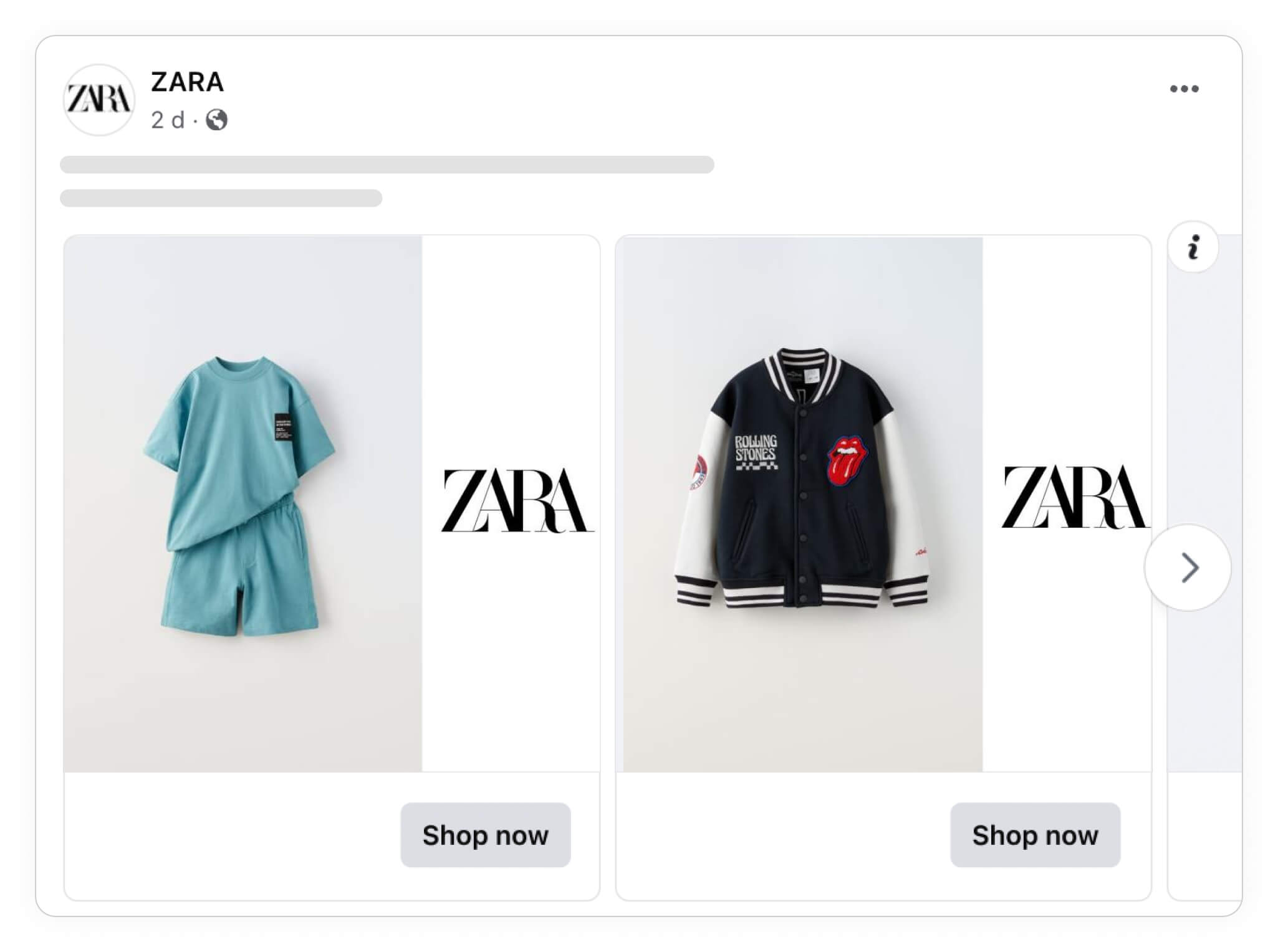
So now you see that you don't need to change the entire layout of your ad to create different variations.
Changing individual elements, such as logos, splashes, or texts can work just as well to create different ad variants to feed Meta's algorithm.
Change the background
It might also be that you just want to change the appearance of an element.
For instance, you could simply change the background, the color of your splash, or something else along that line.
Take a look at the following two examples from NIKE.
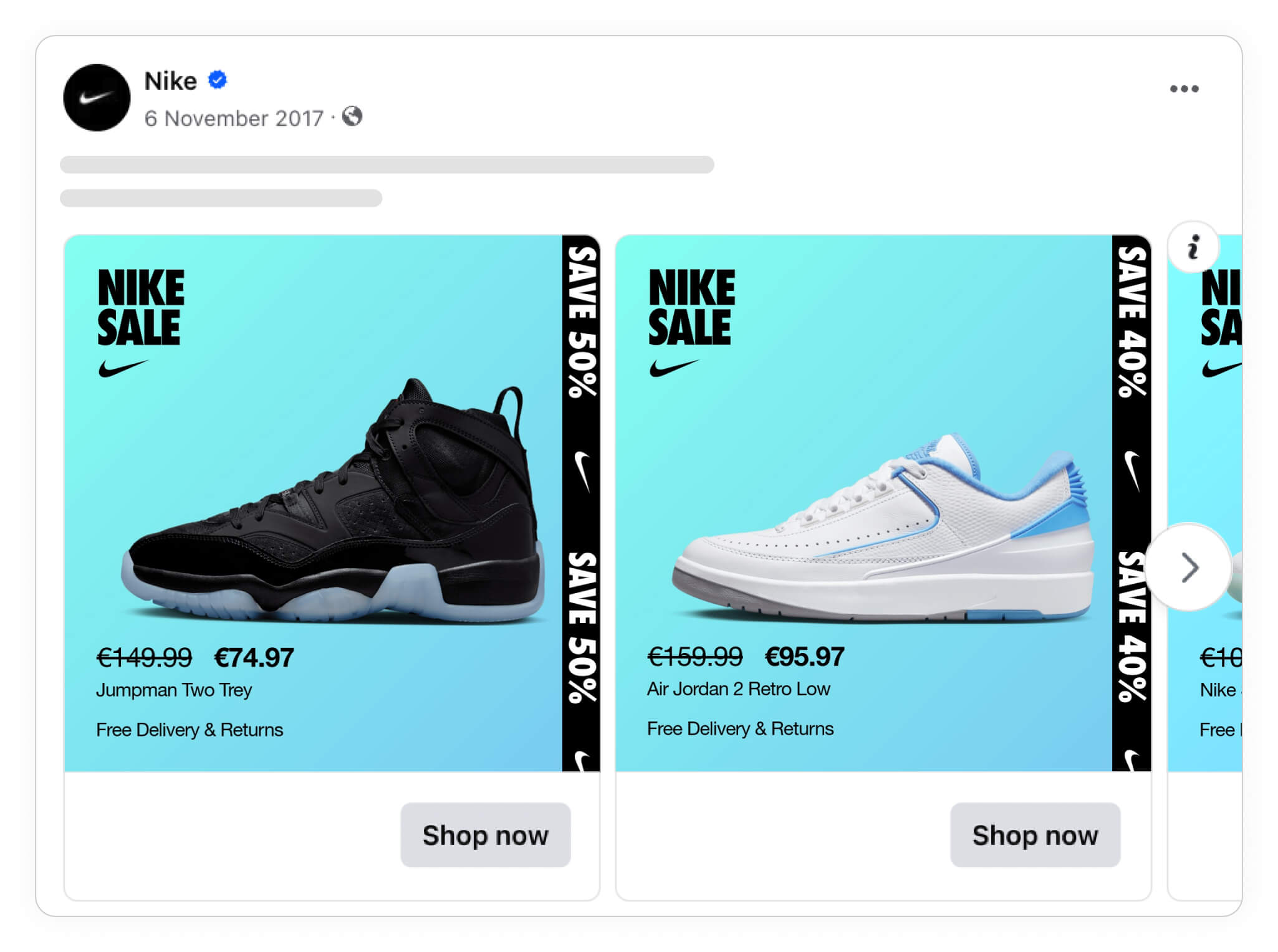
Both Catalog Ads use the same design, but we're just changing the background color. It's simple, but makes for an entirely new ad set that might be better at catching viewer attention.
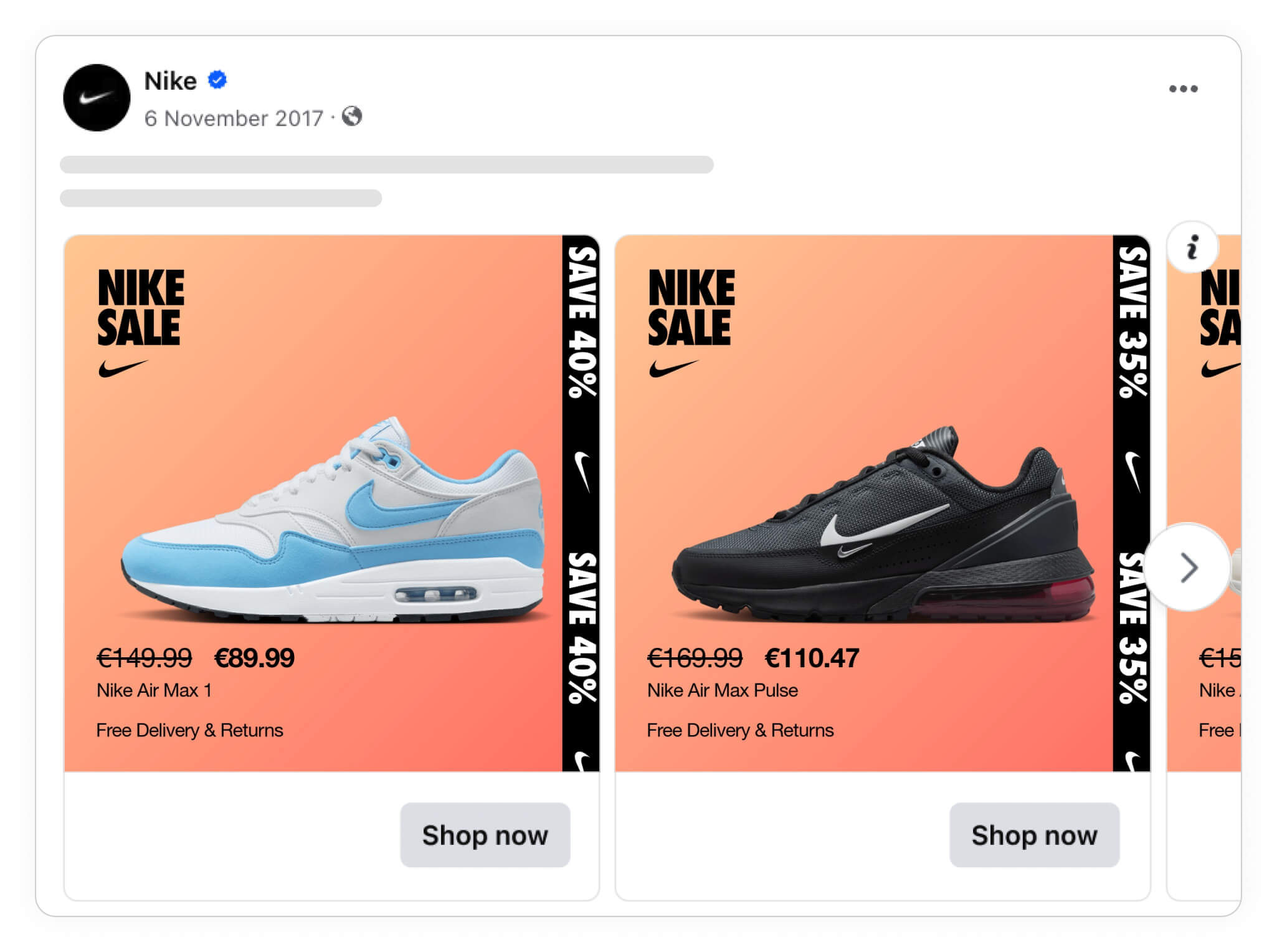
A similar tactic could be to combine the two different colors sets depending on pricing or discounts. For instance, if a product is on sale for 50% off, you would use an orange background, but for regular priced items, you just use blue.
By doing this, you don't have to decide on 1 design, and would simply let the algorithm figure out which background works best!
Additional images
Another great tactic you could use for creative more Catalog Ad variations is to include additional images.
Not only are more images better at catching the audience's attention, but it's also a great way to show off more details from your products.
Here we see a simple Catalog Ad from VANS with no additional images.
 (1).jpg)
There's nothing "wrong" with this ad design, but it's only one way to create an ad.
Alongside your main picture (image_link), include extra ones in your feed (additional_image_link) and add them to the design.
For example:
title: Vans Slip-On
image_link: image1.jpg
additional_image_link: image2.jpg
In the next example, we've included multiple images, which show off what the products look like from different angles, showing the viewer more details, which might help get them interested in the product.
.jpg)
It's subtle, but this is a simple and effective way to create more variations for the algo, AND your target audience!
Product information / changing messages
You can also create ad variations just by including different types of product information to change the overall message behind your ads.
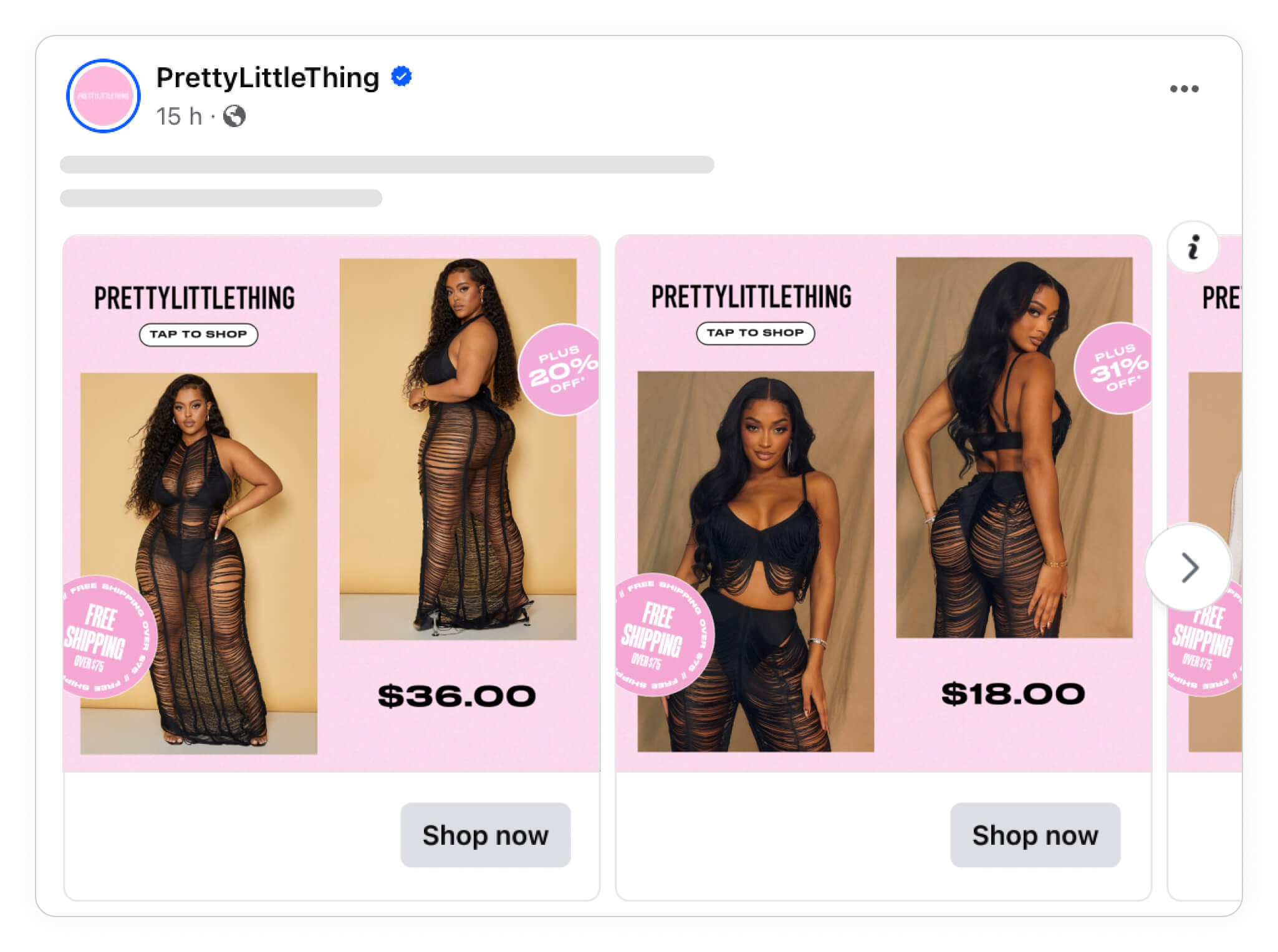
In this example from Pretty Little Thing, we've used the same overall design, but just changed the text and different elements.
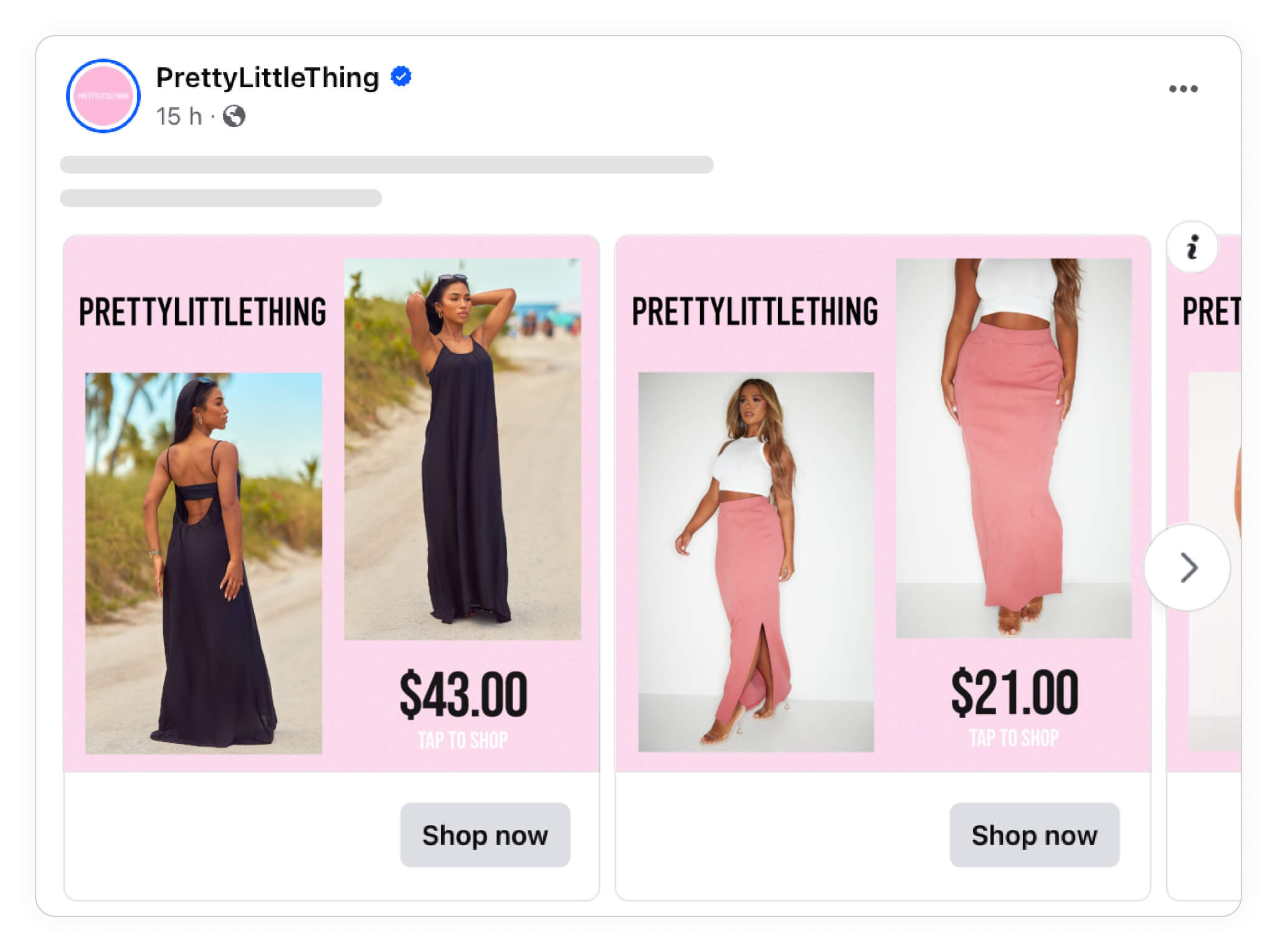
By including free shipping or other pricing or discount information in the splashes, these ads have been entirely transformed.
The offer is still there in the initial design, but we now include additional product information, so the user knows more before they click on the ad and land on the site.
Another common design variation to run is showing that your brand has a Buy Now Pay Later (BNPL) solution, if applicable. Adding in this type of information is just a great way to use information you already have about your brand, your products, and your target audience to create more effective ads.
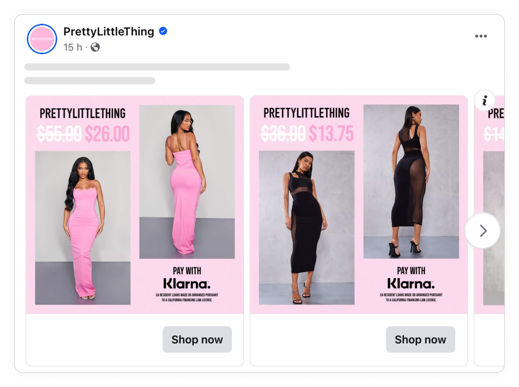
BNPL information is just additional product information that can change the entire message of your ads, and makes for an easy way to create entirely new and different variations of your ads for the algorithm to use.
And you don't have to stop there, you can literally use ANY type of product information, such as pricing, discounts, or even product sizes to create new and different ad variants.
Try out different phrasing
Again, it's not major things you need to change.
You can simply change the wording you use, which can have an impact on the way people are going to react to your Catalog Ad.
For instance, you might have some products that are 50% off, while others are 75% off.
You could either create different ad variations for each of these discounts, and/or you could also create an ad variant that explains your products are on sale UP TO 75%.
The discounts are the same, but the wording is an entirely different way to use pricing psychology.
Include (price) and (sale_price) in your feed so our system can automatically calculate savings or show the previous price.
For example:
title: Nike Air Zoom Infinity Tour
price: 230.00 USD
sale_price: 161.99 USD
Confect: Nike Air Zoom Infinity Tour is on a 30% discount!
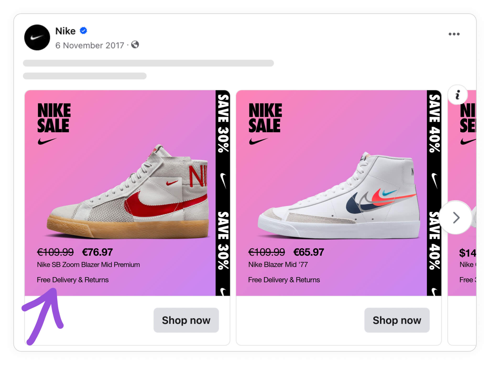
Below we have another Catalog Ad example from Nike, where they highlight different information in different ways.
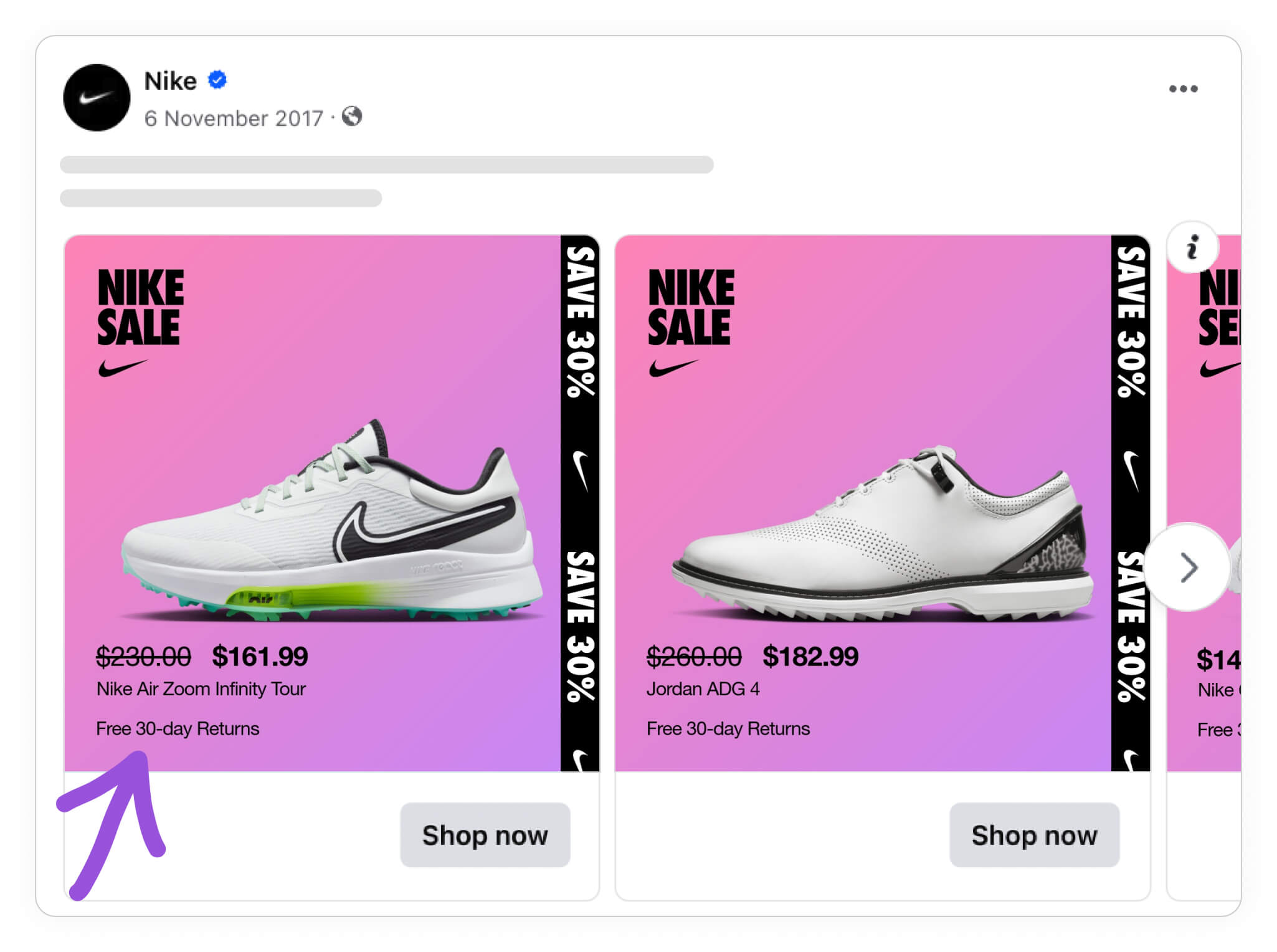
In the first design they say that you can return for free within 30 days. But in the second design, they use different phrasing, stating that delivery & returns are free.
Alternately, you could do something similar by using different phrasing in conjunction with different product names or other product attributes that are relevant to whatever it is you're selling.
But in this example, we're looking at two different ways of approaching the same topic, with one phrasing simply being more specific.
The idea is that people just might react a bit better to one phrasing over the other. And again, by having two similar ads with different text variants, you'll let Meta's algorithm find out which one works best for your audience.
Campaigns & Sales Catalog Ads
Campaigns are also important to consider when creating as many designs as possible for the Meta algorithm.
At the same time, it can be more difficult to make design variations for a specific campaign. A lot of times, you have a visual style connected with the campaign, that you in some sort of way have to take account for.
Campaign periods
Because some campaign sale periods like Black Friday or Christmas are short, it's a good idea to diversify your campaigns and sales so that you'll have a greater chance of success.
Similar to everything else we've covered so far, the idea is that you don't want all of your eggs (your ad budget) in one basket (the same ad design).
Our next two examples, again from Pretty Little Thing, show two different design variants, where they don't really change a lot of stuff, but have still created two distinct campaign ad variations that might perform differently.
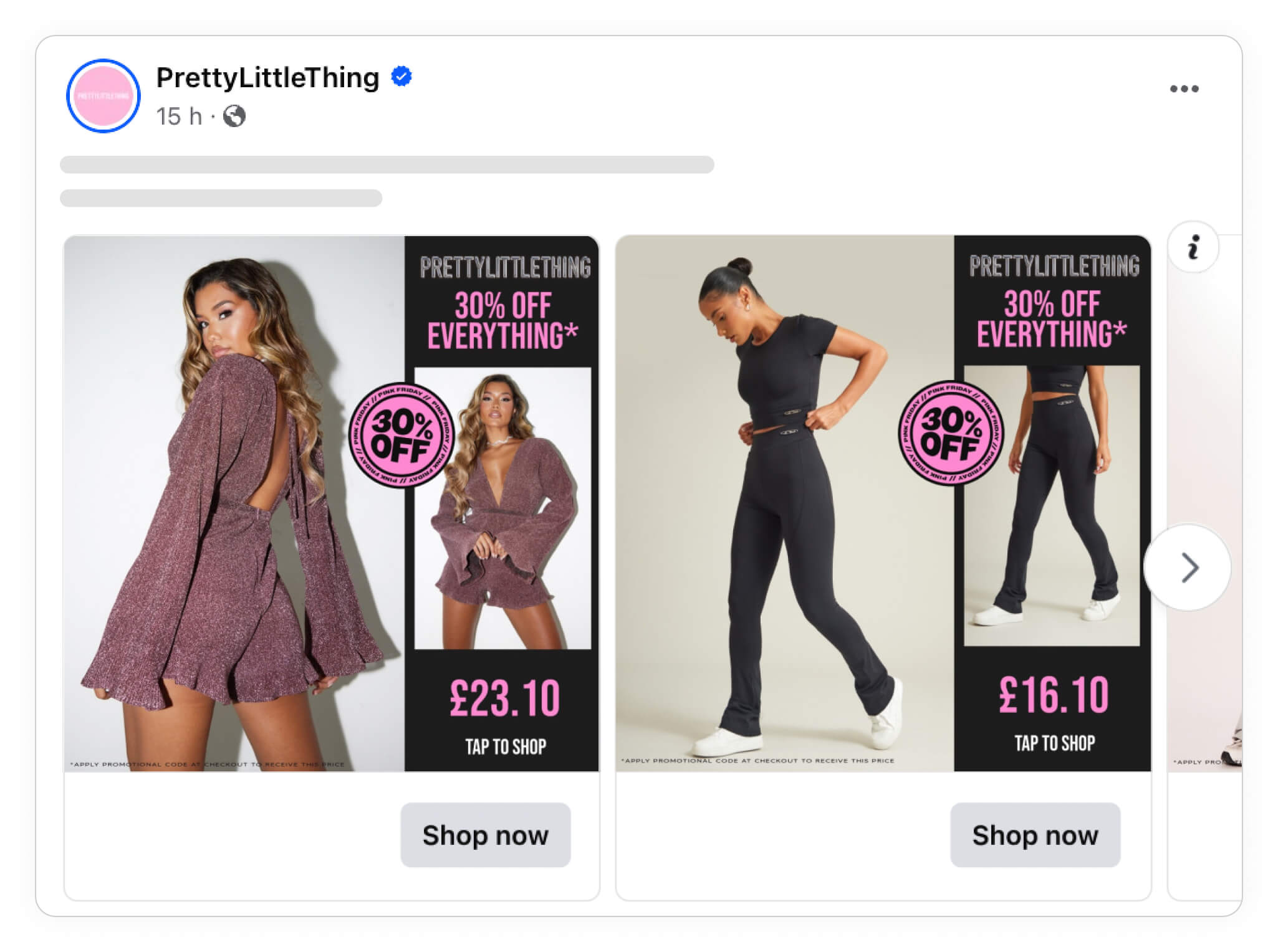
Both Catalog Ads use the same overall design template, there are only minor differences. Which, again, is absolutely perfect; it's not necessarily best to create majorly different designs.
They changed the layout a bit so it gives a different feel - and they moved the text. That is it. But still they have two different designs to try out. It couldn't be easier.

Next we have two great examples from Adidas.
In the first example, they've got a relatively normal ad that shows different shoes against a plain white background.
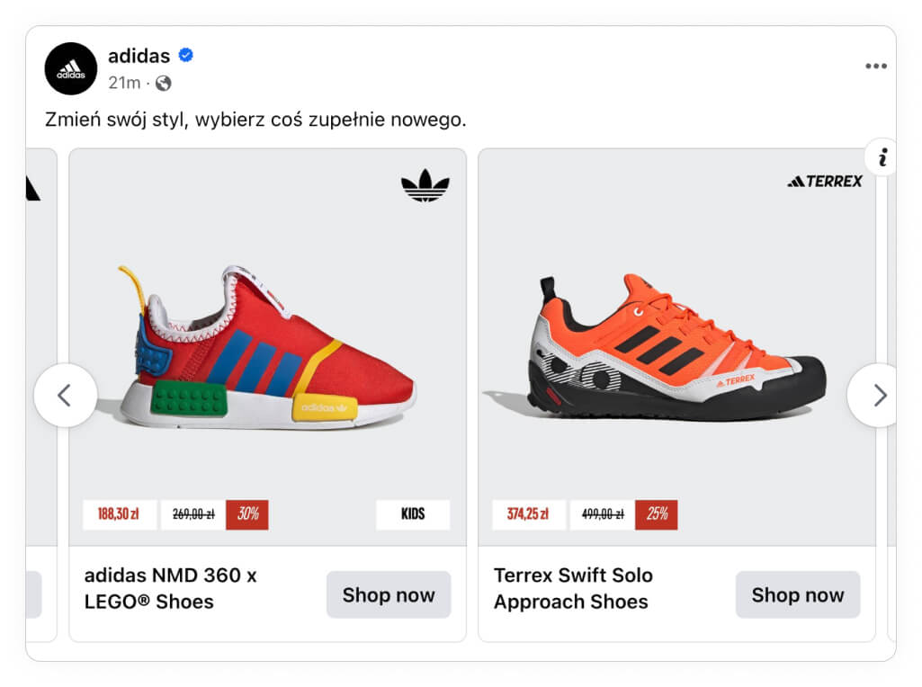
But in the next example, we've updated the frame around the product image to be more relevant to Cyber Monday.
Create a campaign-specific design and schedule it through your Confect catalog.
Design rule example:
On 27/11/2023, use CYBER DEALS
Otherwise, use DEFAULT
The new variant also includes "0 days left," which is a great way to evoke a sense of urgency in your viewers, nudging them to shop now rather than missing out on a great deal.
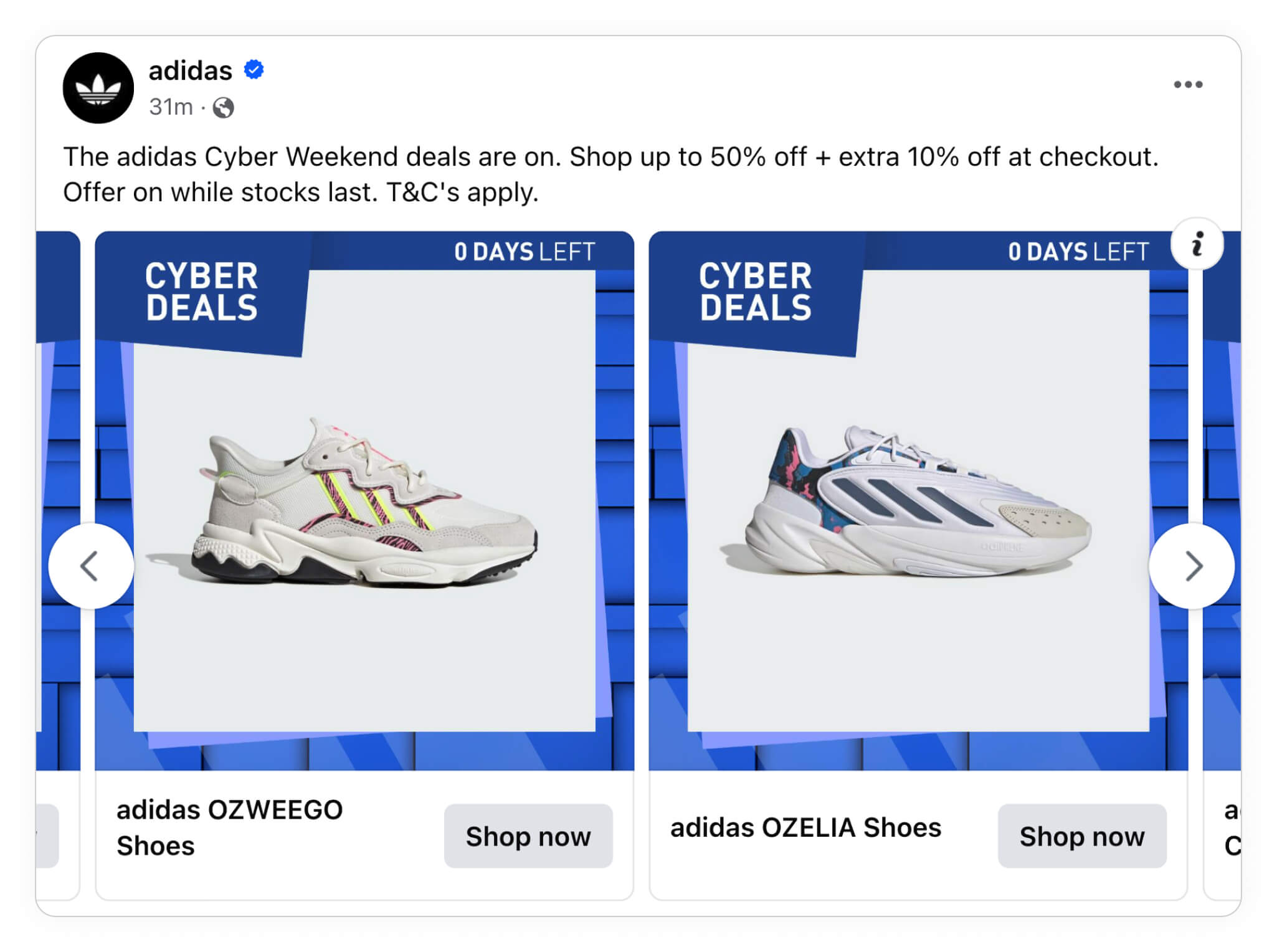
This approach with recreating your always-on design to fit into a campaign is super good! You already know more about what works and what doesn't work in your always-on - bring that knowledge to your campaigns!
Seasonal Sales
Seasonal Sales are a big thing, especially in industries like fashion or beauty this is a very big thing - and the same points from other campaign periods also count here. It's not always that you have the time to make a structured test in these campaigns/sales, so sometimes it's better to diversify your designs.
We've talked a lot about the small differences you can make; of course, this doesn't mean it's the only way to do it! If you want to and have the time, it might also make sense to create to completely different designs for the same campaign.
Seasonal urgency is one of the strongest triggers - check how Black Friday Catalog Ad tactics help brands cut through the noise.
Take a look at these examples from Nike:
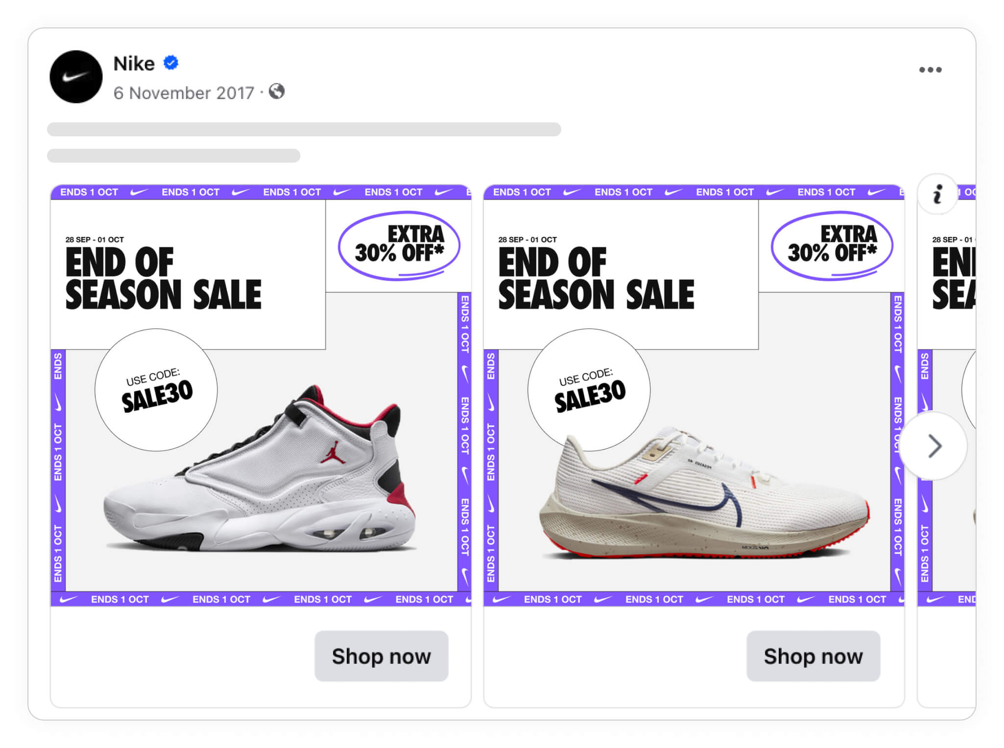
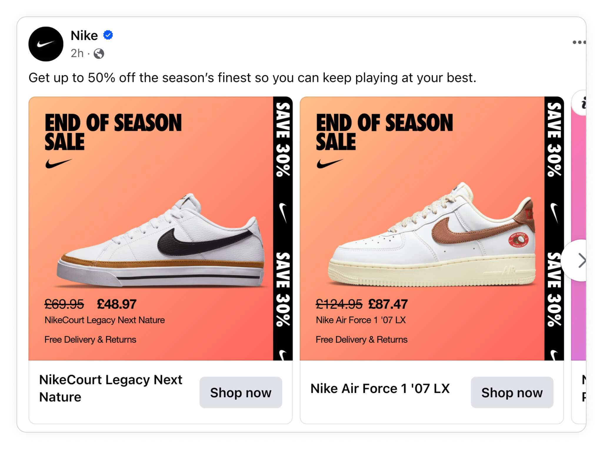
Both ad sets are highlighting an end-of-season campaign, but by using different background colors and different frames, we've got two entirely different ads that might perform better or worse than the other.
They are also taking completely different approaches to seasonal sales. The first design plays a lot on urgency - that you should buy before it's too late - and you can use a code for 30% extra off., While the second design shows the exact price of the product and tells you that there is free shipping & returns.
These are two super valuable ways to approach a sale like this, and they probably both worked really well, yet they are so different.
So far we've shown you how you can change different elements, such as your logo, backgrounds, or text to create different ad variants. But as you may have guessed, there are still even more ways you can use Confect to switch up your ad designs!
Campaign messaging needs to be direct and urgent - see how brands structure their Campaign Catalog Ads to drive immediate results.
Product sets
Yet another way to create different Catalog Ad designs is by separating your ads into different categories or product sets based on their attributes.
For instance, you might run one ad to highlight new arrival products, and others for low stock items, items that have recently been discounted, or just different product categories.
Subbrands and categories
If you have different sub-brands or large product categories - then you can easily give them different designs, just like in the following examples from ZARA.
First, take a look at ZARA's "normal" design. Here, they might highlight a more or less random sampling from their product inventory.
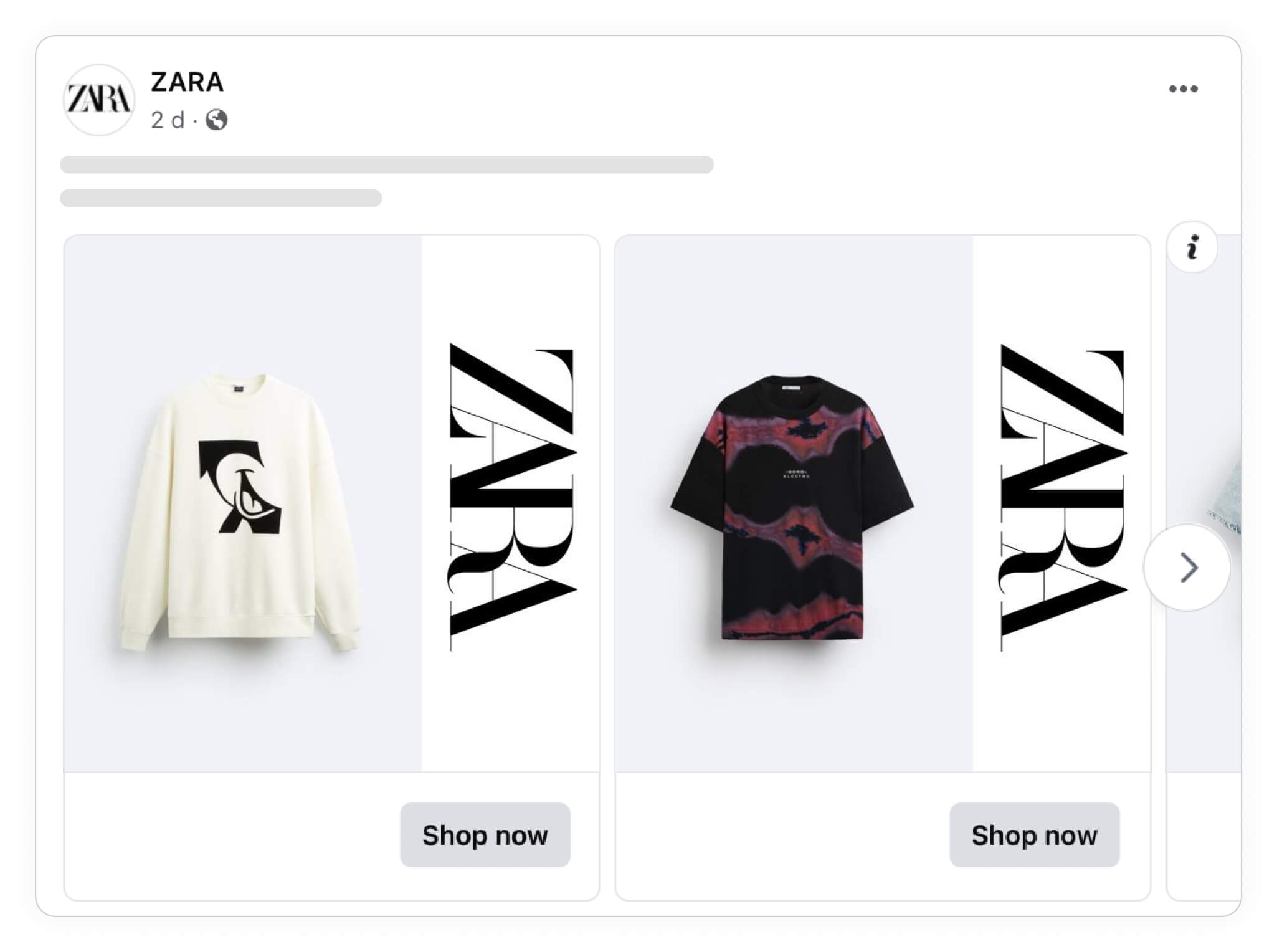
Depending on whatever type of products you sell, think of this "normal" category as a broad mixture of the products you have available.
But then you'd want to narrow down sub-categories of your products, like in the following example where ZARA also created an entirely different design for their ZARA origins collection of products.
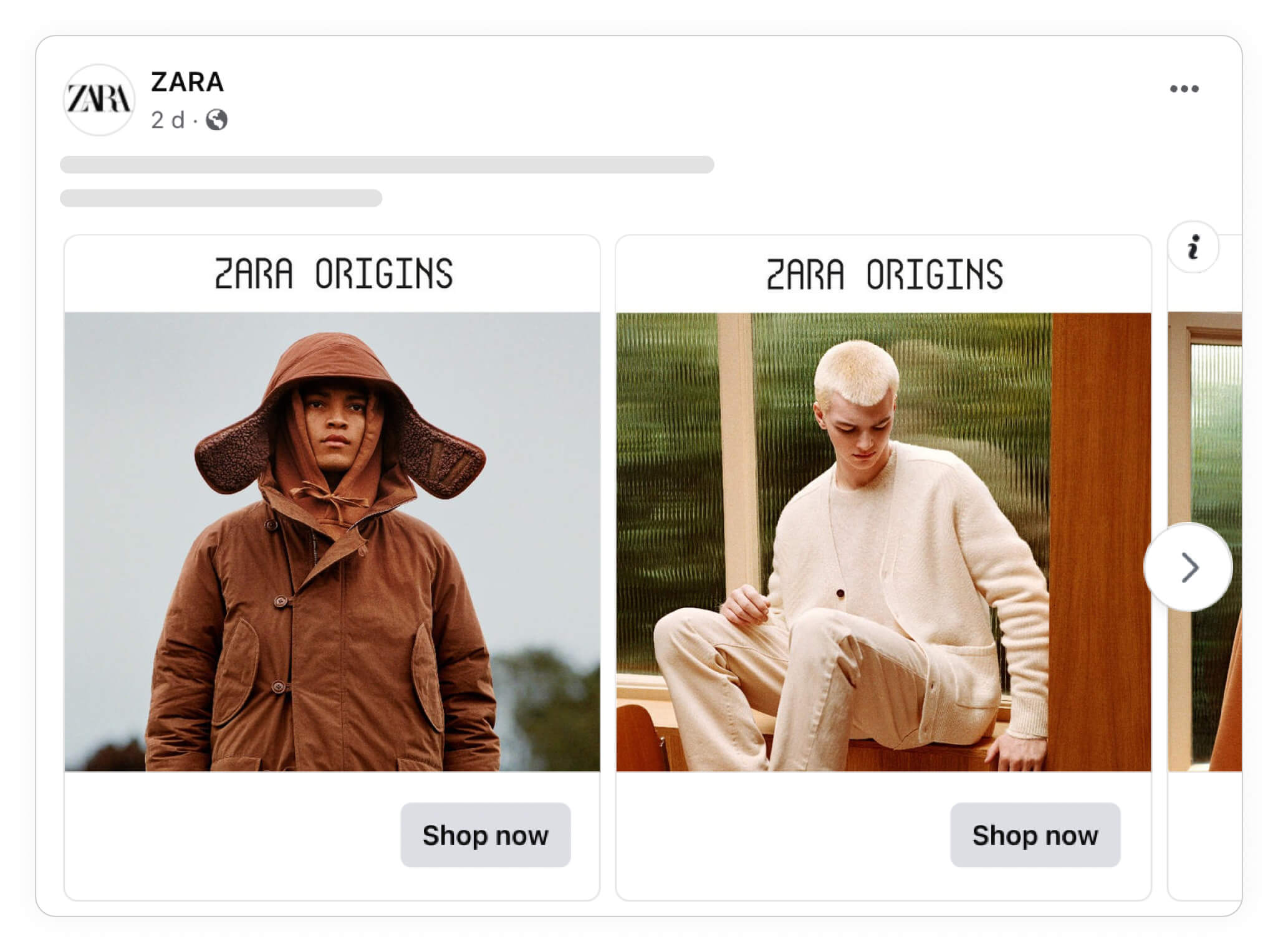
And you can, and should, drill down even more and think of other ways you can create even more sub-categories of your products. Just like here, where ZARA created yet another category for their ZARA athletics wear collection as shown below.
Combine Confect's design variant function with product sets on your ad level.
For example:
Ad1: All products; DEFAULT design
Ad2: Origins product set; ORIGINS design
Ad3: Athleticz product set; ATHLETICZ design
It's the same brand, and part of their same inventory. But by separating their products into different sub-categories, they're able to create entirely new ad variants that might appeal even more (or less) to certain people who see the ad.
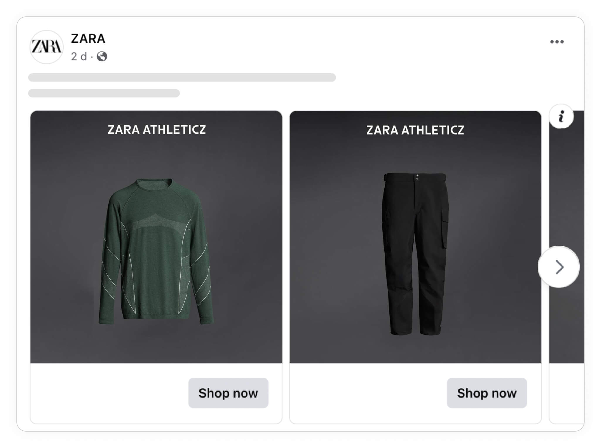
So if you have different product collections like ZARA does, creating ad variants for different collections is a great way to create MORE than just a single type of ad design.
But even if you only have a single type of product, you can create different product sets based on attributes like colors, new arrivals, low inventory, or virtually any other type of categories you can come up with!
Improving your chances of advertising success with MORE designs
As you can see, improving your campaign's creative variety has many potential benefits:
- Improved ad relevance and freshness
- Each user gets the variation most likely to be effective
- More algorithm-training data points lead to higher ROAS
- A diversified and safer approach - not risking all the budget on one variation
And on the plus side, it really doesn't take that much effort to do.
Even a couple of tiny changes in the colors, design elements or message can give you a handful of different options for the algorithm to learn from.
After all, it's what the best advertisers are doing and also what Meta themselves recommend.
Design variety leads to better outcomes - just look at how ROImonks increased ROAS by 60% by testing more variations with Confect.
Try Confect for Free
Confect can help you to create great-looking Catalog ads and Dynamic Product ads for Facebook, Instagram, TikTok, Snapchat and Pinterest.
