24 beauty ads examples
February 22, 2023
If you work in the beauty industry, you already understand the importance of needing to stand out in a crowded market.
And to attract and retain new customers, you need to create ads that aren’t only visually stunning, but also that deliver a clear message about your brand.
But that’s only one part of the equation!
Your ads also need to tap into your customers' deepest desires and aspirations, and provide them with real value.
How exactly do you do that?
By studying some of the best advertising strategies in the beauty industry, you too can learn how to create ads that connect with your audience and that work to drive more sales.
24 effective beauty ads examples for inspiration
Below, we're exploring some of the most effective beauty advertising techniques used by top brands in the industry, so you can apply these learnings to your own campaigns.
.jpg)
1. The more the merrier - makeup advertisment examples
Who said Black Friday offers only had to apply to individual products huh? Sometimes people can make marketing so much more complicated than it is (not saying it’s easy btw, there is a line between simplicity and overdoing it.)
But, the best marketing strategy out there is having a great product…
.png)
What does that mean? Well exactly that, if you work really hard on having a really good product the only thing you need to do is to announce the offer.
What better way to showcase your offer than putting all your best products together in a grid format with a discounted price, you do this and you’ll see website views like never before, the more the merrier.
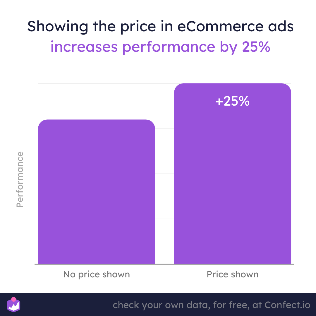
If you're ever in doubt about placing the price in your ads, our dataset shows that ads with prices in them perform 25% better than ads without a price.
2. Sales, sales, sales. Yes it works with beauty ads
It's damn hard to not notice this ad in your feed. The background stands out immediately. Popping colors, fade and glam. It's not just simple contrast we are used to seeing on other ads. The brand made sure to stand out and be authentic to what they are, and trust me, customers love it.
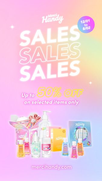
With tripled SALES headline we get their curiosity engaged and 50% confirms it's going to be a good deal. With the playful design, it does not feel so sales-y anymore.
Maybe this is something worth testing with your ads, make them more down-to-earth and more playful!
You can find 11 ways to customize your Facebook dynamic product ads for more revenue here – especially relevant when sales are the focus in beauty campaigns here.
3. The healthy choice that won't break the bank
This beauty advrtisment makes it very clear that you can get a 75% discount on your order. The use of big fonts and graphic elements make it stand out, and the clean and slick design makes it look important. The layout of this ad follows the rule for thirds, with the most important information (the 75% discount) in the top third.
.jpg)
Meanwhile the middle third is where the different products are displayed nicely, and the bottom third highlights the brand name "Vegan Fresco". The colors used are also very effective. Orange is a great color for drawing attention, and the white space makes the ad look clean and easy to read.
Looking to scale low-cost offers like this? Here’s how affordable and discount beauty brands can thrive with Catalog Ads..
4. Keeping it on theme
This next ad is excellent because it uses the prominent theme—Valentine's Day—to provide all the details needed for a great creative this time of year. Dr. Wu Clinical Skincare decided to display its products surrounded by hearts and roses, and they've also used red and pink for its fonts.
(1).jpg)
Together, these elements help keep the Valentine's Day theme consistent throughout this beauty ad example.
But on top of that, the brand chose to promote a limited-time-only sale, which helps create a sense of urgency, enticing viewers to act now before it's too late.
Talk about a great way to bring everything together right now!
5. Beauty ads example with love
Here, we have a simple ad with a clear and obvious theme that's overall pleasant to look at. The color theme is white with various soft reds and pinks, reminiscent of the colors people see and feel when they're in love.
(1).jpg)
In addition, the ad shows several of the brand's products and includes its logo in the upper right-hand corner, which is perfectly unintrusive, yet still keeps its branding present. Overall, a great take on a great Valentine's Day ad!
6. The witch's sublime hands
This ad features a large spider web🕷, a pumpkin, and a woman dressed as a witch. All these elements fit the theme of Halloween. They create a spooky yet fun vibe that puts the viewer in a Halloween state of mind.
People instinctively look at faces. They are naturally drawn to the human element in an ad.
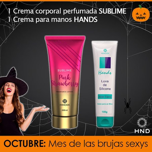
The woman's hand is directed 👉toward the main product. The position of her hands also gives relevance to the products advertised, which are hand and body creams. This contributes to that the products are in focus, and readers’ eyes go towards the products.
7. Catch 'em off guard
When this ad pops up on your screen, you can't help but do a double-take! The unusual design is so eye-catching that it's hard to ignore. But that's not even the best part!
.jpg)
This beauty ad also does a great job by using a higher amount of text in content, which does a fantastic job of explaining why this product is worth your attention. And if that's not enough to convince you, the brand name-drops prestigious publications like GQ, Men's Health, and The Strategist to prove that they're the real deal.
Talk about a winning combination!
8. Maximizing trustworthiness
By featuring a stunning human model, this beauty advertisment example is practically leaping off the page compared to those boring old ads without models. But this ad also uses a secret weapon known as "social proof" to show you that real people just like you have tried this product and loved it!
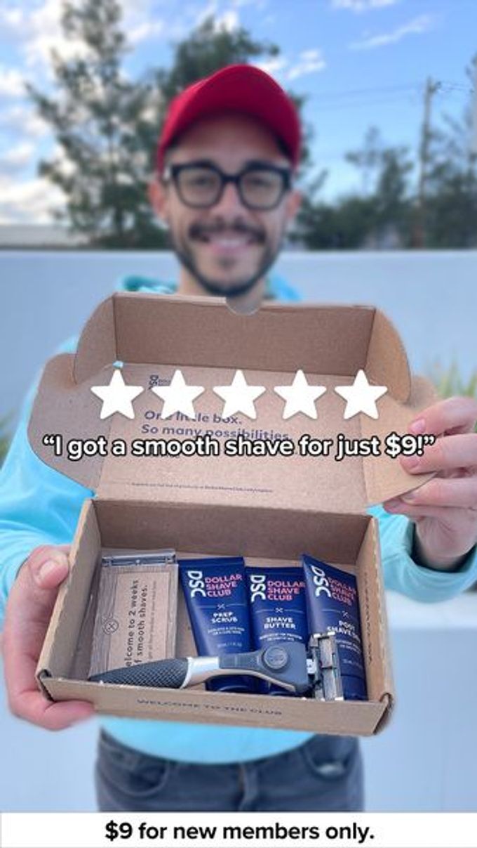
It's like a stamp of approval that lets you know you're making the right choice. This combination of a stunning visual and authentic social proof is the ultimate one-two punch for capturing attention, building trust, and converting potential customers into loyal fans.
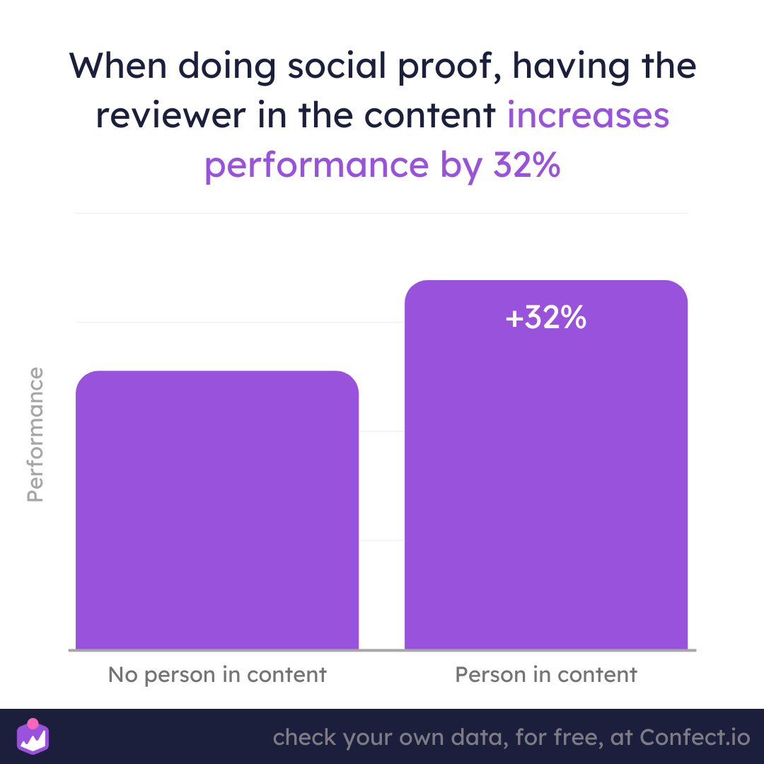
When running social proof ads, also including a person in the creative may just improve the performance by up to 32%.
9. Let's celebrate sales!
The best thing about this ad is the confetti.
Confetti overlays make this ad stand out, especially when celebrating holidays or other calendar events, like Black Friday, Christmas, or Easter.
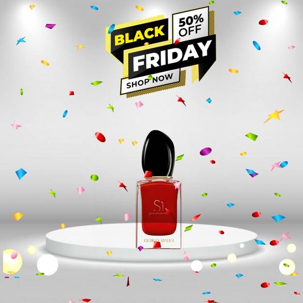
Overlays are an easy way to make simple ads more engaging and yet it's rare for us to see advertisers using them. Using a sticker or overlay on your ads is a simple way to make them more relevant so they stand out more than others!
10. A dangerously great beauty ad
This ad is brightly colored, making it impossible to miss. But it also features a giant warning sign that will stop practically anyone dead in their tracks and make them do a double-take. It's like a siren call that you just can't ignore.
.jpg)
You know why? Because according to reptile brain theory, ads that feature food, danger, or sex are more likely to catch our attention thanks to our simple, primal, reptile-like instincts.
So when you see the warning sign, your reptile brain kicks into high gear and tells you to take a second look.
11. Breaking down a good deal
Not only does this ad show you everything that comes in the set, but it also reveals how much each product costs on its own, which is genius marketing on its own. But wait, it gets even better!
For just $5 USD, customers can snag the entire set valued at a whopping $95 USD! Are you kidding me?
.jpg)
That's practically giving it away! This ad is the ultimate definition of irresistible, and we're pretty sure using a similar tactic can help boost your ad performance too!
12. People crave value - skin care advertisment example
This next beauty ad example is all about delivering maximum value to the consumer. Featuring several products from the brand's lineup, this ad doesn't just promote their offerings. It also shows you exactly how to use them to get the best results possible for your complexion.
.jpg)
And let's be real, who doesn't want to look their best? With a clear, informative message that's conveyed through plenty of text, you won't be left guessing about the benefits of these products.
13. BOGO winning beauty ad example
Here, we've got the ultimate beaty advertising combo that's sure to drive sales through the roof. First up: sales. It's no secret that customers love a good deal, so why not give people what they want?
.jpg)
And when it comes to discounts, getting 2 for the price of 1 is simply irresistible. That's right, we're talking major bang for your buck!
Plus, this beauty brand nailed the art of color psychology with a bright and uplifting palette that's practically jumping off the page. Talk about eye-catching!
14. Eco-friendly is customer-friendly
In today's world, consumers care more than ever about the environment. That's why savvy brands are taking notice and making sustainability a top priority. And this brand is not only talking the talk, but walking the walk by communicating their eco-friendly values loud and clear in their ad.
.jpg)
The best part? It's not just good for the planet, it's good for business!
By aligning themselves with the values of their target audience, they're forging a connection that goes beyond just selling products.
15. Be specific about your offer
When it comes to creating successful beauty ads, it's all about nailing your unique selling proposition, baby!
That's what sets you apart from the competition and keeps customers coming back for more.
And this cosmetics brand is killing it by showcasing their USP in a way that can't be ignored. They've also nailed the color game with their choice of cool blue hues.
.jpg)
This subtle but powerful choice evokes trust and confidence in potential buyers, making it a total no-brainer to choose this brand over the rest.
16. What makes you unique
Successful care brands know the importance of separating themselves from their competitors. It's all about showcasing your unique qualities and leveraging them to win over your audience. And since this product is an alternative, not just another product claiming to be better, it was a great choice to compare it to traditional skincare products.
.jpg)
By highlighting their unique selling propositions (USP) and making the comparison to a competing product, they make it clear why they are the better choice.
17. Brilliant details
This ad may be simple, but it packs a punch! Instead of flashy gimmicks, the advertiser decided to showcase their new contour brush up close and personal, allowing you to fully appreciate all the intricate details.
(1).jpg)
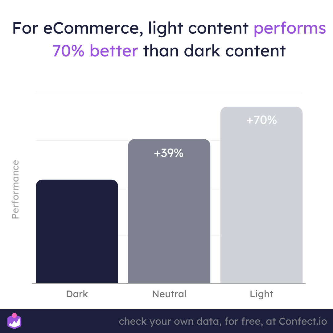
With a lighter background that's been proven to be more impactful than darker shades, every feature of the brush, from its bristles to its finish, is highlighted to perfection. It's safe to say that this beauty ad example is a real winner in every aspect!
Don't underestimate the impact of brightness on your performance. Our data shows that light content performs 70% higher than dark ads.
18. Colorful styles
This next beauty ad is also simple, but it's a true winner in every sense of the word. With a minimalist design that is guaranteed to make your eyes pop, it's impossible not to be captivated by the sheer visual impact of this ad. Plus, did you know that purple is the color of royalty, nobility, and luxury?
.jpg)
That means when you lay eyes on this ad, you're instantly recognizing that you're dealing with products of the highest quality.
Let's also not forget about the clever way the products are laid out in the ad: it's a strange, but attention-grabbing visual that leaves you wanting more. And finally, the call-to-action completes the ad as one that will grab your attention and entice you to take action now.
19. All the makings of a great beuaty ad
Prepare to be wowed by another amazing ad, which masterfully showcases all the fantastic benefits of this incredible product. From being hailed as the #1 company in the UK, to offering a 30-day money-back guarantee and proudly declaring itself 100% cruelty-free, this ad doesn't beat around the bush.
.jpg)
No fancy gimmicks or flashy graphics needed here, just a straightforward list of everything that makes this product so fantastic, all backed up with some seriously impressive social proof.
And with over 5000 five-star reviews, it's easy to see why this ad is convincing viewers left and right that this is truly an amazing product.
20. The power of your product
Step into a world of radiant beauty with this amazing skin care ad, modeled by a stunningly beautiful and glowing model. This ad is a visual testament to the transformative powers of the product, by showing us just how much it can leave our skin looking and feeling better than ever.
.jpg)
But what really sets this ad apart is its effortless simplicity, with nothing but the brand's logo, a simple slogan, and the product itself sharing the screen with the model. And the best part is that using models in ads can boost performance by up to an incredible 46%!
Talk about a great way to showcase your products!
21. Spin the wheel to boost sales
Competitions have always been a great way to draw in potential customers and create a buzz around your brand and its products or services.
But why?
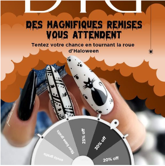
Having a wheel that people can spin simply sparks intrigue and creates curiosity, making the ad viewer want to find out what they might win if they dare to spin.
So for that reason alone, this ad is great. But these types of competition ads also work great as a lead magnet, allowing you to collect lead information as you go!
22. One great beauty ad, one great unique selling proposition - cosmetic advertisment example
So we’ve already covered a few ads that are great because they focus on the product’s unique selling proposition.
And here again, we have an ad that works because they’ve focused on what makes their product special.
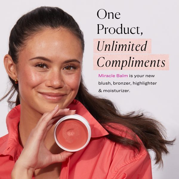
Rather than creating a beauty product that serves a single purpose, this product functions as a blush, bronzer, highlighter, and a moisturizer.
That’s 4 great reasons to use this product all packed into one!
On top of that, this brand also chose to use a model, which is a proven tactic that makes ads more relatable and compelling to viewers.
23. Saving the planet, one eco-friendly beauty product at a time
Here we have yet another great beauty ad that focuses on eco-friendly values, which helps make the company and its products more relatable with modern consumers.
After all, who doesn’t love companies these days who actually try to reduce corporate waste while still delivering great products that deliver value to customers?
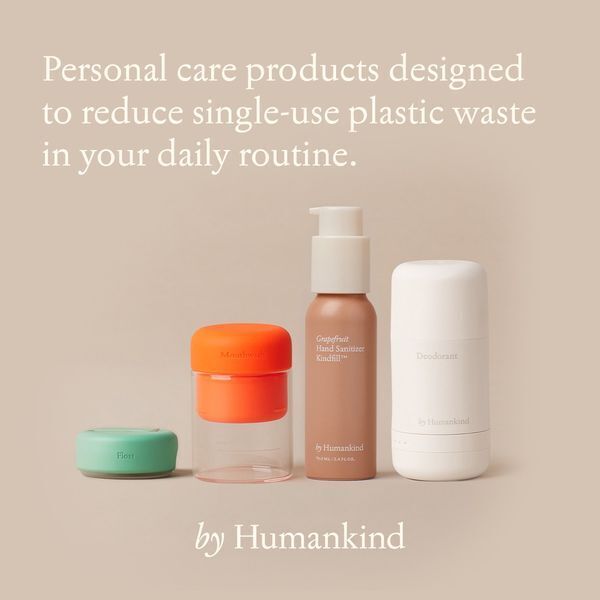
We also love this brand’s use of a soft color palette, which is perfectly in line with a company whose products are soft and gentle on the environment.
And lastly, this ad is just simple!
It clearly explains the brand’s USP, shows their products, and does it all without needing to be flashy or in-your-face about it!
24. Urgency for the win!
We all know that people like taking their time and shopping around for the best deals.
This is smart for the consumer, but for brands, it often means that consumers will forgo making a purchase in the spur of the moment.
And that’s why we love this ad!
They clearly state “SHOP NOW!,” which is often enough to spur individuals into browsing products in the moment, rather than waiting until later.
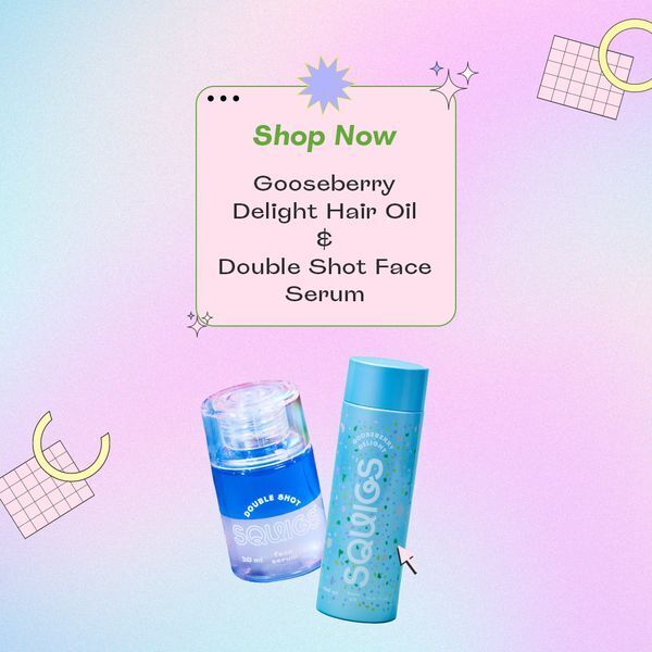
Of course, creating a sense of urgency doesn’t always work.
So to back things up, this brand chose to show not one, but two of their products, which are complementary to each other.
With this clever combo, people are more likely to browse products right now, and instead of only buying one product, there’s a higher chance that they’ll buy two!
Talk about a great ad!
BONUS AD EXAMPLE!
Your ads before and after ☝️
We've often lamented the fact that highlighting your products’ unique selling points is an important way to show your audience why they might like your products.
And that's because USPs speak directly to the things that your target audience already knows they want and need!
Therefore, you can never go wrong when including things like product features or benefits in your ad content. But rather than just listing them, there are a handful of different ways you can present this type of information.
Cue today's bonus ad example, featuring a handy before and after image and comparison chart.
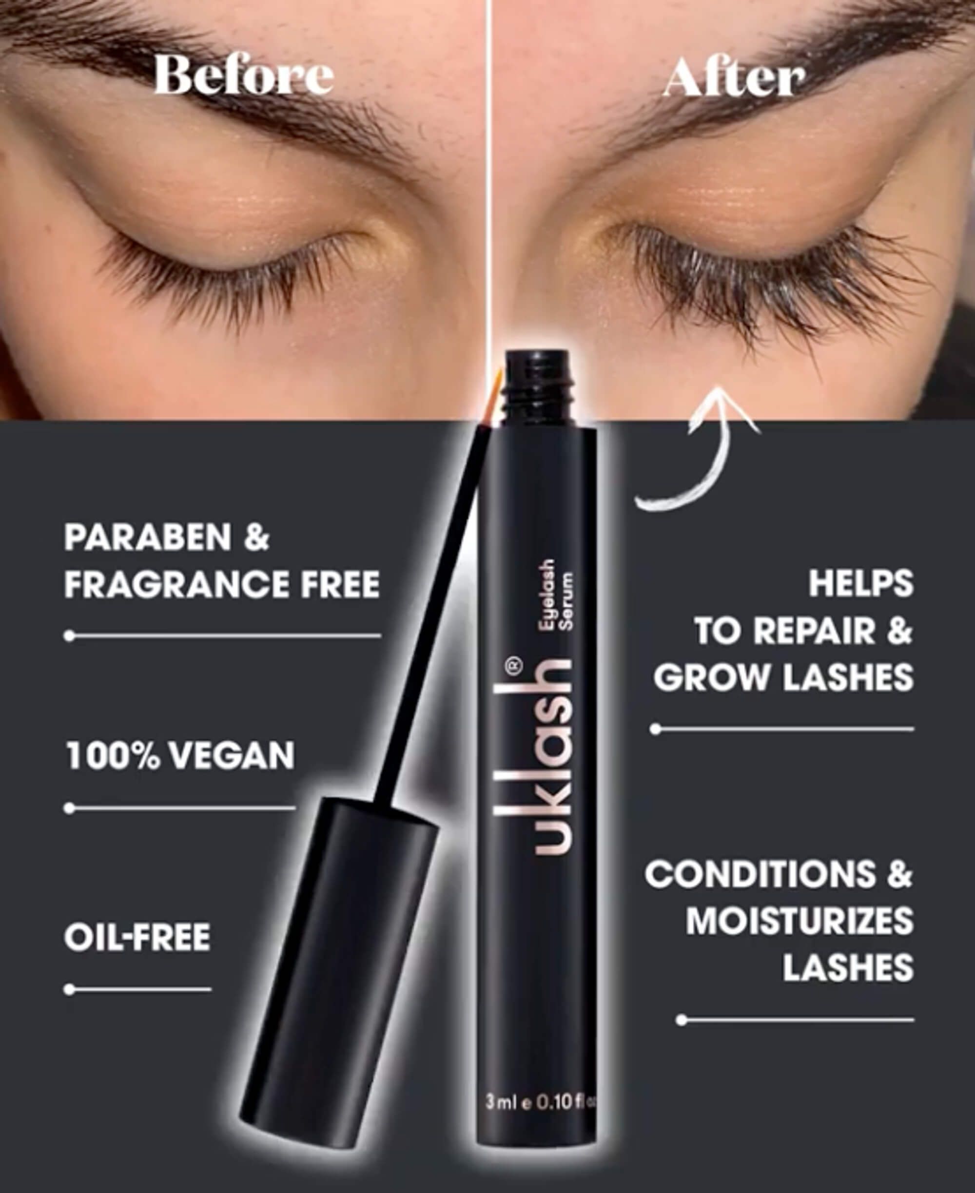
Using before and after comparisons are a great way to make the information easier to process and retain. Plus, the before and after image just makes it super easy to see the difference your beauty products can actually make!
What makes a great beauty ad?
Below, we summarize everything we’ve learned about creating great beauty ads that sell!
Next time, you’re creating an ad campaign for a beauty brand, be sure to keep these important facts in mind.
- Showing the price - Including the price in an eCommerce beauty ad can boost performance by 25%. This transparency helps potential customers understand the cost upfront, reducing any indecision they may have and increasing the likelihood of conversion.
- Clear ad messages - You must always clearly communicate your ad's message, whether it's a sale, promotion, event, or any other offer. Making it obvious what you're trying to convey to your viewers helps them quickly grasp the purpose of the ad and encourages them to take action.
- Surprising or different images - Using unexpected or distinctive visuals in your beauty ad can catch viewers off-guard, prompting them to do a double-take. This element of surprise captures attention and increases engagement, making your ad more memorable.
- Social proof - Incorporating social proof, such as customer reviews, testimonials, or user-generated content, can significantly increase ad performance by 32%. Seeing positive feedback from others builds trust and confidence in potential customers, making them more likely to consider your beauty products.
- Reptile brain theory - Leveraging the reptile brain theory can be effective for ads featuring food, sex, or danger. These primal instincts grab attention and trigger emotional responses. So by leveraging these, you can make your beauty ad more captivating and memorable.
- Providing information and value - Great ads not only promote products or services, but also provide valuable information to the viewer. Whether it's sharing tips, tutorials, or educational content related to beauty, offering useful insights establishes your brand as a trusted resource and builds a positive association with your products.
- Unique selling propositions (USPs) - Highlighting your brand and product's unique selling propositions is crucial in demonstrating why customers should choose you over competitors. Emphasize what sets your beauty products apart, such as innovative ingredients, eco-friendly packaging, or cruelty-free certifications.
- Color theory: The colors used in your beauty ad play a significant role in shaping how people perceive your brand, products, and overall values. Color theory can be used to evoke emotions and create mental associations that can enhance the impact and effectiveness of your beauty ad.
Game-changing advertising strategies for the beauty industry
As you can see, creating effective beauty ads requires a combination of creativity and the use of proven advertising strategies like pricing psychology, color theory, and branding.
By studying the successful strategies used by top brands in the industry, just like the ads we’ve discussed today that used models and that clearly explained the value proposition, you can improve the performance of your own ads.
It’s great to look for inspiration among the ads we’ve discussed here today, but also remember to infuse your own brand's uniqueness into your campaigns.
With the right approach, your beauty ads can stand out and make deeper connections with your audience, ultimately leading to increased sales and better brand recognition.
And the good news is that you can try a free demo of Confect to customize collection ads so that they'll stand out from your competition!
So go ahead and put these strategies into practice, and watch your beauty brand soar to new heights!
More great ads to learn from!
Keep the inspiration flowing with these amazing ad examples:
- 14 ads using a sense of urgency to drive sales
- 16 ads using color theory to evoke emotions
- 10 ads that focus on customers' pain points
- 9 ads that harness the power of pricing psychology
Try Confect for Free
Confect can help you to create great-looking Catalog ads and Dynamic Product ads for Facebook, Instagram, TikTok, Snapchat and Pinterest.
