9 ad examples using pricing psychology
January 10, 2023
Are you always on the hunt for the best deals? Have you ever found yourself scrolling through countless products, comparing prices, and weighing the pros and cons?
Well, if you do, you're definitely not alone!
As humans, it’s only natural for us to want the most benefits for the least amount of money, and we’re usually willing to spend a good amount of time searching for the most value.
And when buying pretty much anything, two main factors come into play: the perceived benefits, and the perceived cost.
And ideally, all effective products and promotions will have a perceived value or benefit that is greater than the perceived or monetary cost.
Most brands try to accomplish this by increasing the value of their offerings through fancy branding, eye-catching labels and designs, and other traditional marketing tactics.
But what if we told you there's another way to make your customers feel like they're getting more than they're paying for?
It's called pricing psychology, and it's a sneaky little trick that can help you skew the cost-benefit ratio in your favor.
In this blog post, we'll dive into the fascinating world of pricing psychology and show you how to use it to your advantage.
But first, let’s take a better look at the theory.
Mastering the art of pricing psychology
Pricing psychology is a fascinating concept that plays a critical role in the world of business.
It's all about using strategic pricing tactics to influence the perceived cost and value of a product. And it can make a huge difference in the success of your campaigns.
One of the most common pricing tactics, which you've definitely seen in real life, is using a price tag of $9.99 instead of $10.00.
This simple trick makes the price appear more attractive to consumers, as our brains tend to focus on the first number in any price.
However, there are also other tactics used in pricing psychology that can help you influence consumers' opinion.
Anchoring and innumeracy are two that stand out as being particularly effective.
Anchoring is all about making the price seem more attractive by anchoring or leading the price expectations higher than it is.
For example, you can show a strikethrough price next to the new, discounted price, or state something like "normally $100, now only $20."
This makes the current price seem more attractive, as it is visibly lower than what the viewer expects the price to be.
Innumeracy, on the other hand, is all about moving away from mathematic principles, and presenting the deal more desirably.
For example, "buy one, get one free" offers make customers feel like they are getting double the value (2 items, rather than only 1), at no extra cost.
Logically, this is the same thing as saying "buy two products at 50% off."
But when a person thinks they’re getting an item for free, their mind is tricked into thinking that it’s a much better deal than getting 50% off buying two products, despite the fact that both deals are exactly the same.
10 ads examples that demonstrate the power of pricing psychology
By using these, and other pricing tactics strategically, you can boost the perceived value/cost ratio of your products and services.
Now, let’s take a look at some real-word examples of pricing psychology in action!
1. Reeling 'em in with a sale
Nobody ever wants to pay full price, which means consumers are constantly on the lookout for a great deal. And that's precisely why this next sales ad example is great at captivating consumer attention and enticing them to click through for a potential conversion.
The "3 for 2" deal is a sneaky trick. Even though it's technically the same price as a 30% discount on all 3 products, it entices users to buy more than one item, and is perceived as a more attractive offer.
Their chosen wording is also interesting in that the sale is only on selected brands. In other words, the viewer won't know exactly what is on sale upon seeing the ad. This tactic is excellent at generating curiosity and enticing the viewer to click through to find out what they can save money on.
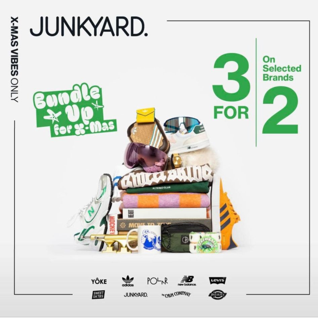
From our dataset, "X for Y" offers are also the second most effective type of sale, performing 35% better than the average sale ad.
.png)
Sales pricing works best when paired with urgency - see how brands run high-converting Campaign Catalog Ads that use pricing to hook buyers.
2. A mouthwatering good deal
Who doesn't love a hot, mouthwatering slice of pizza fresh out of the box? This next ad from Domino's shows just that while also highlighting a 2-for-1 deal, enticing hungry ad viewers to order their next slice of pie while saving a dollar or two.
.png)
Whether you're offering a two for one sale, or a 50% discount, you should know that how people will generally gravitate towards the two for one deal because they'll feel like they're getting something for free.
3. Trendy, not spendy
Color matching is always great when creating ads: product, headline and background colors all match, which makes this ad great. When it comes to colors, commonly, less is more. Advertisers can make nice and contrasting ads using just 2-3 colors.
This pricing ad example also showcases the principle of price anchoring. The strikethrough price makes users think that they can get $29.95 worth of value for just a fraction of the price.
.jpg)
Another thing is the cheesy headline, it gets the attention that then is presented the actual offer - price drop.
Affordable pricing with a fashionable touch? Here’s how low-cost and discount brands use Catalog Ads to attract price-conscious style lovers.
4. Pricing psychology ad example done the Italian way
Combination of shades of white and an interesting 3D effect make the Maccheroni pasta box stand out from the ad. The magic of the ad works due to its clean simplicity.
.jpg)
A couple of maccheroni spilled in the front of the box add to the ad a playful touch of imperfection and at the same time, a target can very well see what the pasta type looks like.
The special offer sign written below the box is great for attracting consumers to take notice of the reduced price.
Also, take note of the price ending. Prices ending with odd numbers (i.e. $1.97) are generally perceived as cheaper and attract price-conscious shoppers.
5. Rock 'em, sock 'em and run 'em in
Here we have a throwback to a Boxing Day sale. The ad itself is simple: a side view of the product. However, the ad makes the great choice of giving us the necessary information under the product.
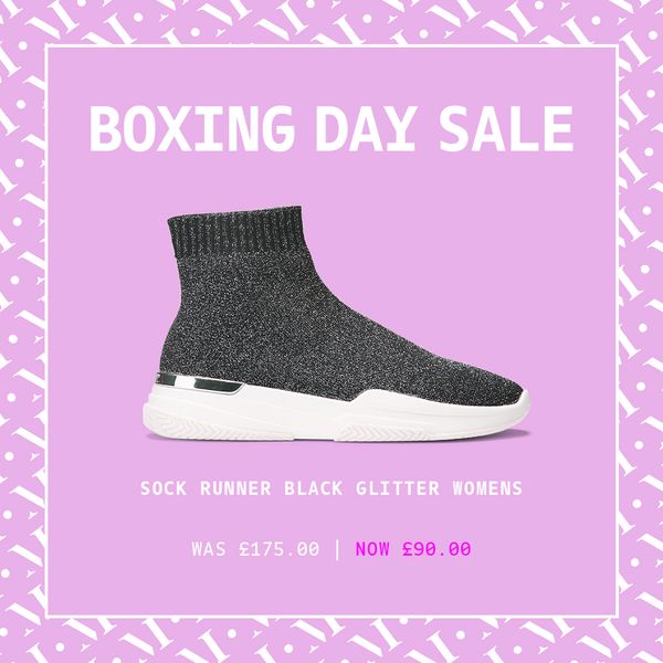
Not only does it detail the specific product, but we can also see, at the bottom of the ad, the before price and the boxing day sales price, with the sales price changing color to a deep purple. This draws more focus to the new price - a tactic called Price Appearance.
Excellent simplicity that gives you all the necessary information!
6. Say yes to the dress
If you haven’t noticed the red floral pattern dress, this ad has got your back in more ways than one, with the nice 58% off arrow directly pointing to the product. ➡️ 💃
What’s also interesting is that in this ad example we can see several images of the dress, giving us a great look at the shoulder and also the floral pattern.

But even better, the ad does the math for us, thank you, showing us exactly how much the original price was and what it is now.
Fashion thrives on value perception - see how fashion brands use Catalog Ads to highlight price-based USPs without cheapening the brand.
7. Clear, straighforward messaging
This GoPro’s "Price Tag" ad makes excellent use of color combination, as well as negative space by leaving the majority of the page empty. This has the effect of drawing your eye to that spot in the middle.
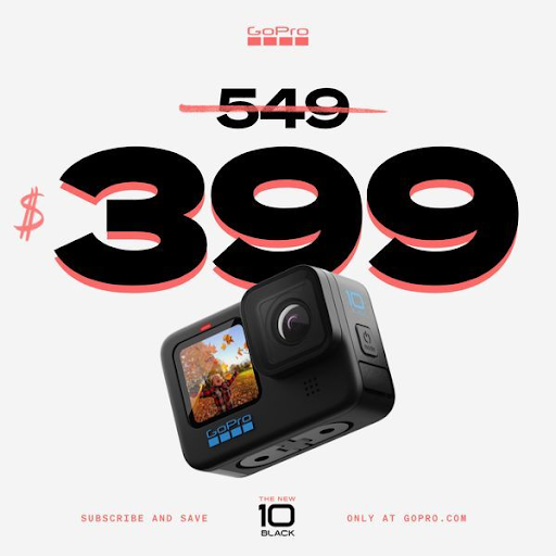
The product placement itself overlaps with the price, where the primary focus is that they are offering a radically discounted price of $399. Everything is perfectly centered with no noise in the ad, which makes the ad work great visually.
8. Using AIDA to improve your ads
When using the AIDA model, the goal is to grab the attention of the consumer, an interest from the consumer, then make the consumer desire the product, and lastly give an option to take action on the desire.
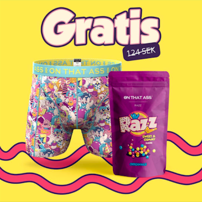
First, the attention is being grabbed by the colour combination. The colours work great here and make us want to look for extra time.
Above the product, the text ‘GRATIS’, which means ‘free of charge’, right next to the original price. Who doesn’t want something for free?
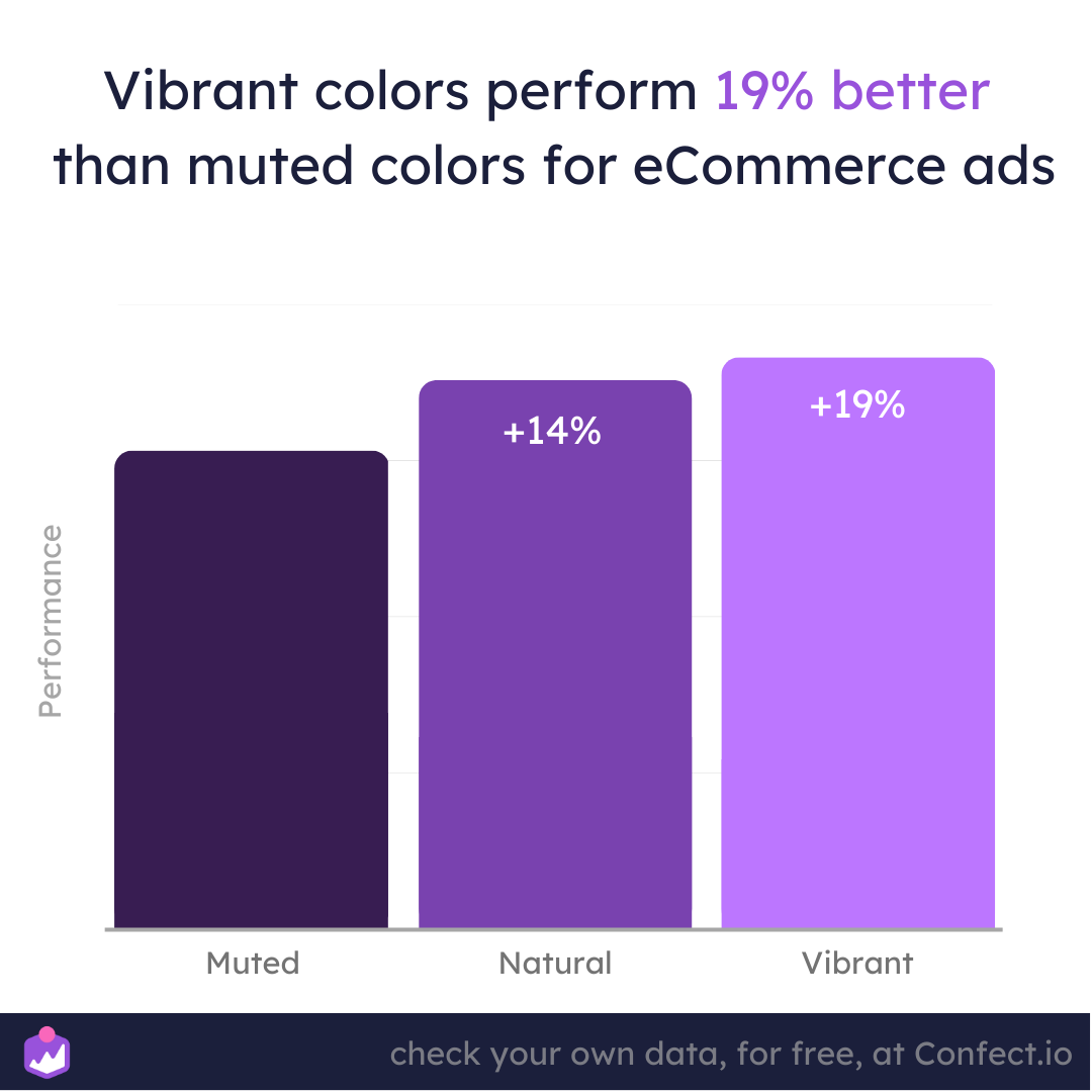
Based on our analysis, this advertiser has made the perfect background color choice. Vibrant saturation is naturally more eye-catching and is correlated with a 19% higher performance than muted colors.
9. Make your offer clear
This ad uses some interesting color schemes for its layout. The bright blue background color really stands out against the tablet which grabs your attention right away. The tablet is displayed in the foreground and shows the audience what the product looks like.
.jpg)
The white and yellow text right above the tablet quickly steals our attention to tell us briefly and to the point about the deal.
The trick is in the bold "$400" text. Even though it's not the standard saving, but instead the maximum discount, it makes us feel like we could save 400 dollars!
There is no overwhelming text, which makes the visual stand out more.
Transparency in pricing messaging matters - check out this case study where clear offers helped Sinnerup cut their cost per purchase by 50%.
Leveraging the secret powers of pricing psychology
As we've seen in these examples, adding some basic pricing tactics to your advertising can drastically change the perceived value of your offer.
But remember, psychological pricing isn't a one-size-fits-all solution.
While you can use these tactics to make your offer more appealing, keep in mind that they should only be used to complement an already strong value proposition.
So don't forget about concepts like branding, messaging, and the value of your offers.
Also, always make sure to consider your target audience and advertising objectives.
For instance, if your focus is on value-driven shoppers, pricing psychology can definitely make a massive difference.
However, for higher-end, luxury products, too much discounting can actually hurt brand perception, and your sales too!
But with some careful consideration and a little bit of the pricing psychology we’ve discussed here today, you can easily create a winning strategy to drive your ad revenue to new heights.
Confect makes it easy to edit your Facebook catalog ads to include pricing information!
Try a free demo of Confect today and see how pricing psychology can have an impact on your ad performance in the future!
More great ads to learn from!
Keep the inspiration flowing with these amazing ad examples:
- 14 ads using a sense of urgency to drive sales
- 16 ads using color theory to evoke emotions
- 10 ads that focus on customers' pain points
- 20 ads from the beauty industry to inspire your next campaign
Try Confect for Free
Confect can help you to create great-looking Catalog ads and Dynamic Product ads for Facebook, Instagram, TikTok, Snapchat and Pinterest.
