14 examples of ads that use sense of urgency and scarcity
March 8, 2023
Let's explore the concept of urgency in advertising, why it matters, and how businesses can use it to their advantage.
We have gathered many great ad examples utilizing urgency and are explaining what is great about them.
You will not only understand why it is smart to use urgency in your ads abut also get plenty of excellent examples and inspiration on how to do it correctly.
Why using urgency in advertising is smart?
Are you someone who procrastinates on making purchases? Do you ever find yourself adding items to your cart when shopping online, only to abandon them at the last minute?
If so, you're not alone.
In today's world, consumers are bombarded with countless options when browsing for things online, making the decision-making process of whether or not to purchase something more complicated and lengthy than ever before.
In fact, some customers take weeks, or even months to decide whether or not the buy something.
So in other words, it’s also harder than ever to get consumers to pay attention to your advertising, and it’s even harder to get them to want to interact with your ads NOW!
And the problem is that the longer your potential customer puts off making a purchase, the higher the chances of them being wooed by a more tempting deal or worse yet, completely forgetting about your offer!
As a result, businesses need to find ways to cut through the noise and create a sense of urgency in their advertising to convince customers to act now, rather than later.
After all, as they say, "time is money," and in the world of paid ads, time is of the essence.
So, buckle up and get ready to learn how to make your customers feel like they need your product or service right now – or risk losing them to the competition!
The theory of urgency in advertising
Have you ever found yourself scrolling through your social media feed, only to stumble upon an ad that caught your eye and made you think, "I need to take advantage of this offer right now!"?
Well, my friend, that feeling was caused by the power of urgency in advertising.
By offering time-sensitive deals or promotions, businesses can trigger a sense of urgency in their ad viewers that compels them to act quickly before the opportunity passes by.
This feeling is also referred to as the fear of missing out, colloquially known as FOMO, as no one wants to miss out on a great deal.
And as much as this can be a great ad tactic, when it comes to creating your own ads, urgency alone won't do the trick.
You need an offer that resonates with your target audience and gets them excited about your product or service in the first place.
Then, only once you’ve crafted a great offer, invoke a sense of urgency in your ads that create a powerful motivator to drive customers to take action.
15 ads examles illustrating the art of urgency
There's a number of different ways you could add a touch of urgency and FOMO into your advertising. From limited-time offers to flash sales, the following ads use urgency to encourage customers to act fast and make a purchase.
So to help you better understand how this works, and give you some inspiration, let's take a look at some examples!
1. Urgency ad that will clean out your viewers pockets
Black Friday is the perfect opportunity for brands to stand out, and it all starts with a great ad creative. The big, eye-catching text and fun visuals used in black week creatives grab people's attention, making them more likely to click and interact with the ad immediately.
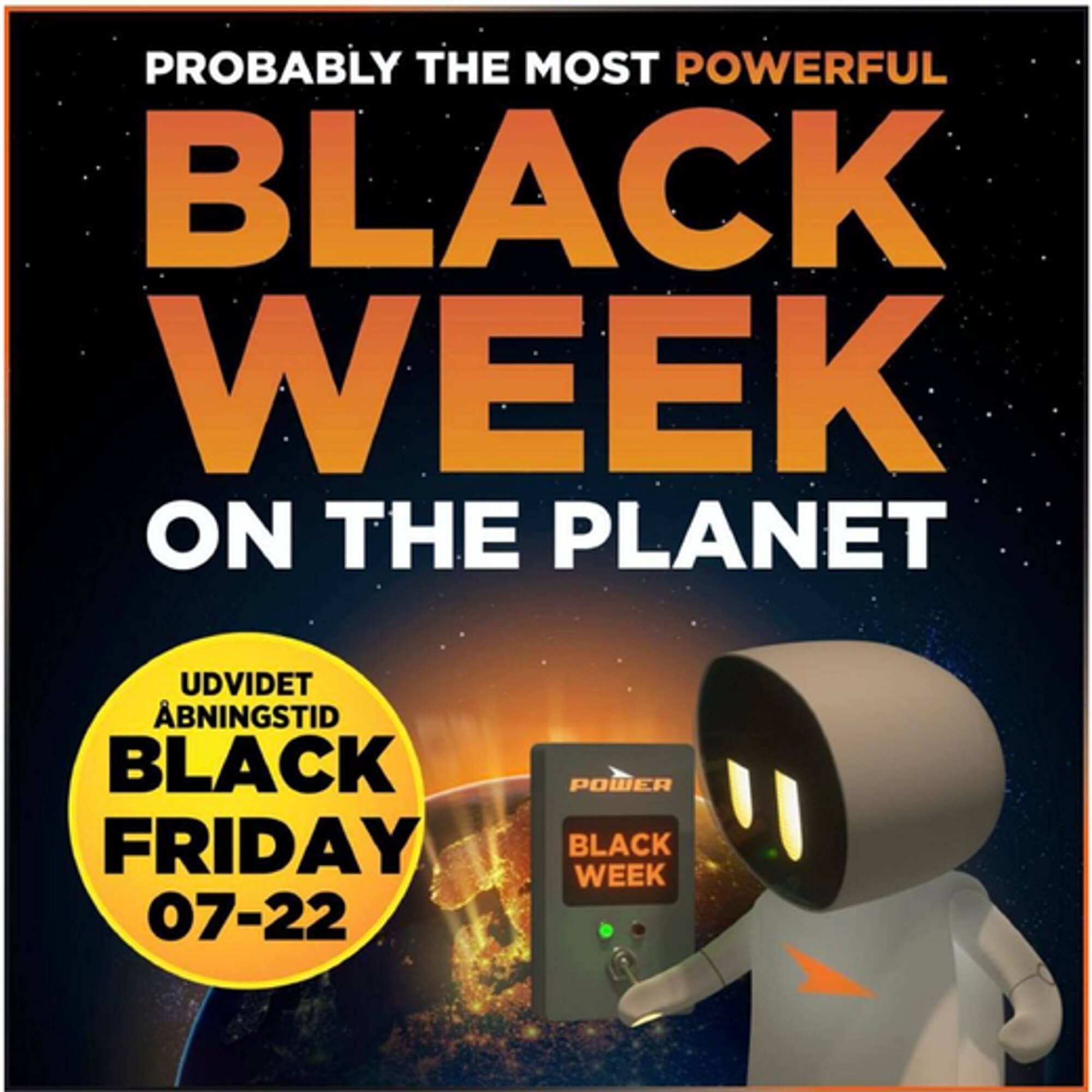
It's also no surprise that big text, vibrant colors, and interesting designs are big hits when it comes to Black Friday ads.
With so many brands competing for attention around that time of year, don't forget to make your ad creative stand out with big text and fun creatives that will beckon your viewers to act now.
If you’re looking to boost revenue fast, these Campaign & Sales Catalog Ads tactics show how urgency converts.
2. A soothing deal that ends soon
The purple color palette😈 is used for a moment to take in all the viewer's attention with a few dark elements to give some visual contrast. The light colors such as white and yellow also give a calm and joyful vibe. Which is reassuring for parents who might be looking for this type of product.

The text is short, easy to read, and to the point, there is also a good visible 'up to 50% off" which is always a great incentive for customers.
And when it comes to urgency, this ad clearly states the end date for the offer, which is a good way to create FOMO without being overly pushy.
3. Eye-catching offers to act now!
The ad is effective because it uses bold, eye-catching colors and a limited-time offer to grab the viewer's attention.
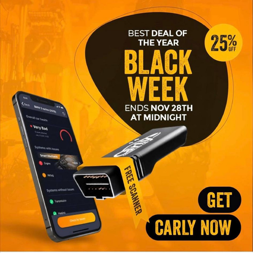
The ad also makes sure to clarify that the offer expires soon. If a user chooses to procrastinate on the purchase, he'll surely miss out on the deal. The bright orange contrasts sharply with the dark background, drawing the viewer's focus to the sale and encouraging them to act quickly.
According to our analysis, orange is actually better for Black Friday than the commonly used yellow!
.png)
4. Add glam to your ads with urgency
Thirsty for success? This ad shows you the exact way to build your ads for it. Branding is really, really important when it comes to ads… And this ad portrays the intention behind the brand and it does it perfectly. You can also see it is classy, elegant and GLAMOROUS.
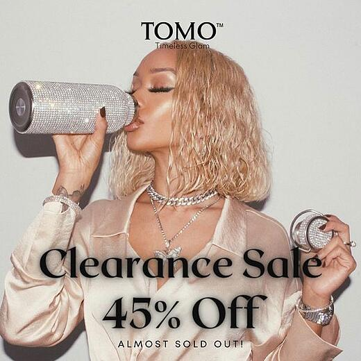
But more importantly, the “ALMOST SOLD OUT!” at the bottom of the ad creates a sense of missing out on the products sale offer, which is perfect to get people to act now.
5. Time is running out! ⏳
This ad just kicks your decision making train out of the rails…
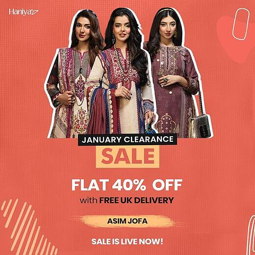
It triggers FOMO in potential clients, and it does this by:
- Stating that the product is in clearance (the first line in black)
- Then once again stating the product is in sale (HUGE yellow sign)
- Then stating what percentage of the product is actually OFF the product… and a little treat letting you know UK has free delivery 😉
- Let’s you know you’re running out of time for buying the product on sale (LIVE NOW!
I mean who wouldn’t feel they’re missing out on a great deal. After all, if other users buy up all the items on a discount, there'll be none left for you.
6. Limited time sales, prime urgency advertising example
The time is limited, and the model is there to assure you to hurry up. A big, bad 50% off placed right in the middle makes sure you notice it, and the side lines guide our attention towards it.
.jpg)
Using small visual cues can help advertisers to control the attention and guide it to the right parts of the ad.
And in this case, they made you want to act now so you don't miss a great deal by clarifying that it's indeed available only for a LIMITED TIME!
Limited-time offers thrive during seasonal campaigns - here’s how brands scale urgency during Black Friday & Black Week.
7. Holiday ads
Taking advantage of holidays and other calendar events is also great since it can get people thinking that they don't want to wait another year to see the same deal. That's why this next ad is so great!
(1).jpg)
Taking advantage of Valentine's Day is a great way to get lovers thinking about taking a first, second, or third honeymoon.
The great part is that the ad is advertising a specific departure date - and it obviously puts a ticking clock on this amazing holiday trip.
Holiday-specific urgency is a proven winner - see how fashion and seasonal brands nail their Catalog Ads during high-pressure sales periods.
8. URGENT!
Brace yourself for an ad that doesn’t mess around and is sure to make you sit up and take notice! They say it like it is: they've got a product that's available at a fantastic price, but there's a catch! The price is going up soon. And they don't want you to miss out on this amazing deal.
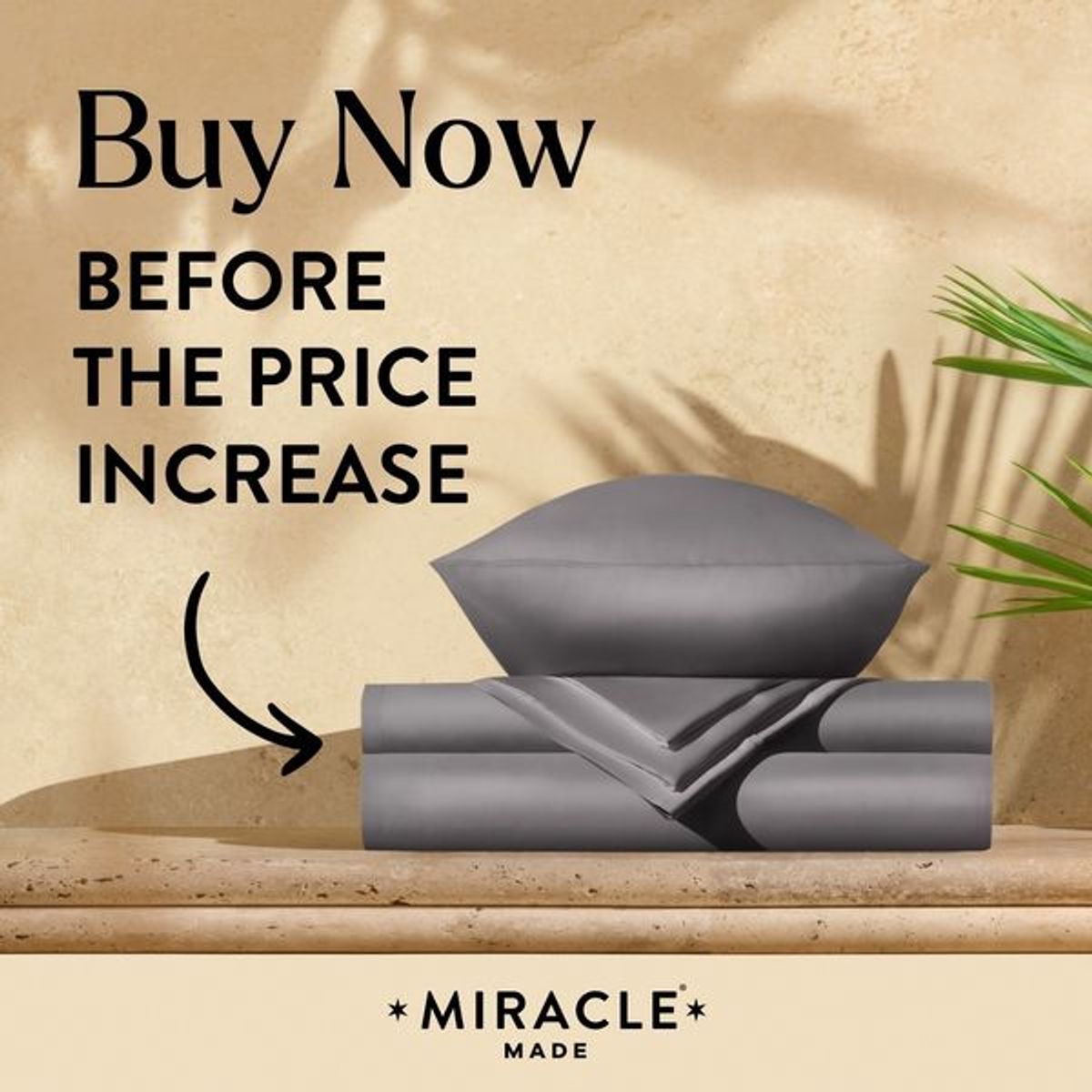
This ad is all about creating a sense of urgency and leveraging the fear of missing out to encourage people to act fast. And the best part? This ad proves that you don't need a fancy design to make an impact. Sometimes, a simple message, like a deal being urgent, can be the most effective ad message of all.
9. Today only?!
The bright yellow stands in contrast to the black background, which makes us notice the important "31% discount" and the top text "TODAY ONLY".
.png)
Even if we put the creative Friday the 13th theme aside (which is amazing by the way), running a "TODAY ONLY" sale is a good tactic to make users drop whatever they're doing and rush to the checkout.
Tomorrow is too late. Either get it (now), or forget it.
The text on this ad takes up a lot of the available space, making it more noticeable and easier to read. Based on our data, it's also a reliable tactic to improve conversions.
.png)
10. Comfort ad its best
This brilliant ad showcases an inviting bed that's almost too tempting to resist. Talk about a great way to advertise your bedding inventory! But wait! This bedding company ad isn't just all about comfort. They're also offering a jaw-dropping 50% sale that's a final call.
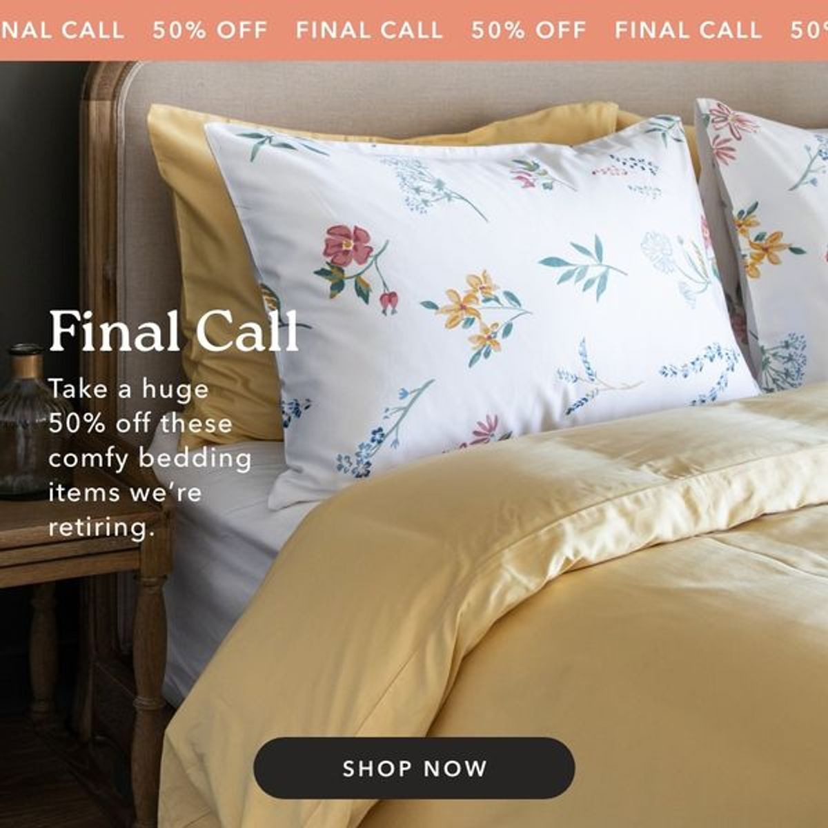
Now, that's what we call a sweet deal! They've cleverly used wording that creates a sense of urgency, making you feel like you have to act now before it's too late. We call this a call-to-action that's too good to ignore!
11. How to make ads irresistible
First of all, this brand is offering a limited-time-only deal that's bound to make anyone want to act now rather than miss out on a good opportunity.
Using time-sensitive sales can be a great way to nonchalantly build urgency into your ads. After all, when the Easter holidays end, so does the offer.
.jpg)
But they also throw in a FREE gift to sweeten the deal. Who can resist the allure of free goodies?
12. Buy two, get two free. A little bit of scarcity
Lots of jewelry are on display, which matches up nicely with the buy 2 and get 2 for free text.

This ad ticks both of the requirements we've outlined in the introduction:
- Great offer: 4 bracelets for the price of 2? Plus a free bracelet with every order? Now that's a good way to get users' interest.
- Limited time: The offer won't last forever, and this ad makes sure the users understand that.
Bundling and promotional scarcity can drive conversion - see how Sinnerup reduced their Cost Per Purchase by 50% with smart offer design.
13. Seasonal sales for the win
What is great about this ad is the thematic juxtaposition of the product in the front and the background: A swerving open road with the sun rising behind the mountains. It sparks the imagination; inviting us to see ourselves biking down that road wearing their gear.
.jpg)
But more importantly, there’s also a winter sale going - ONLY UNTIL January 15th, which makes us inclined to realize that fantasy sooner rather than later.
Seasonality is powerful when combined with urgency - these Catalog Ads for always-on campaigns keep momentum year-round.
14. Only 500 made!?!?!

We like two things about this ad.
- The use of color contrast
- Fear of missing out element (FOMO)
Adding the count of how many watches have been made not only brings up exclusivity but also ads, part of FOMO.
You definitely want to get it before it is sold out. Otherwise, there'll be 500 people rocking this watch - and you won't be one of them.
How top brands persuade customers to act immediately
So there you have it, folks - the secret to turning your ad viewers into paying customers: urgency!
By creating time-sensitive offers that trigger FOMO in your audience, you can speed up the buying process and drive more sales for your business.
But remember, it's not just about slapping a countdown clock on your ad and calling it a day.
You need to pair your ad offering with a sense of excitement and value that makes customers want to act fast in the first place!
And as illustrated by these ad examples, there are plenty of different ways to use urgency in your advertising! Even just using statements like “only valid for the first 100 customers” can introduce a feeling of competitiveness, which can further intensify FOMO.
Just be warned - once you start using urgency in your ads, there's no going back.
You'll be hooked on the rush of customers flocking to your website and making purchases left and right.
But that’s not such a bad thing, is it?
More great ads to learn from!
Keep the inspiration flowing with these amazing ad examples:
Try Confect for Free
Confect can help you to create great-looking Catalog ads and Dynamic Product ads for Facebook, Instagram, TikTok, Snapchat and Pinterest.
