23 examples of ads that use the reptile brain advertising theory
December 13, 2022
Hey, do you want to know the secret to getting people to pay attention to your paid social content?
Hint: it's all about instincts!
We all have them, and they’re hardwired into our brains for survival purposes.
That's why leveraging these instincts can be a surefire way to grab people's attention.
In this post, we’ll take a closer look at some examples of how you can use these natural impulses to make your advertising more effective.
But first, what exactly is reptile brain theory?
The theory of the reptile brain
In advertising, the "reptile brain theory" refers to the idea that humans have a primal, instinctual part of the brain that is responsible for basic survival functions.
This part of the brain is often referred to as the "reptilian brain."
The reptilian brain is primarily concerned with three things: food, danger, and reproduction. These instincts are hardwired into our brains, and we are naturally drawn to things that satisfy these basic needs.
In advertising, this means that messages that focus on food, safety, or sex can be particularly effective at capturing people's attention and creating a sense of urgency.
For example, an advertisement for a fast food chain might use images of juicy burgers and fries to tap into our innate desire for food.
An ad for a home security system might use imagery of burglars to tap into our innate sense of danger.
Or, an ad for a luxury car might use imagery of a beautiful woman or handsome man to tap into our innate desire for sexual reproduction.
While the "reptile brain theory" is not without its critics, many advertisers have found success using this approach. By tapping into our primal instincts, they are able to create ads that are both attention-grabbing and effective at driving sales.
23 ad examples of the reptile brain theory in action
So now that you know all about the reptile brain, let’s take a look at some grade A+ examples of ads that leverage the reptile brain theory.
Get ready to unleash the power of the reptile brain!
1. Attention grabber
It's a well-known fact that both men and women are wired to respond to primal instincts, and nothing triggers those instincts like images of barely-clothed models.
That's why this ad is sure to grab your attention and activate your reptile brain in mere seconds!
Once they've got you hooked, they'll hit you with the details about their campaign or product. And this brand knows exactly how to keep you on the edge of your seat.
Their messaging is all about creating a sense of urgency, using phrases like "never seen before" to let you know that this is your one chance to seize the moment.
.png)
And aside from activating viewers’ reptilian brains, using models is just another great tactic to boost ad performance since having people in content increases relatability and draws attention.
Across all messages and industries, using models in ad content improves performance by an average of 45%!
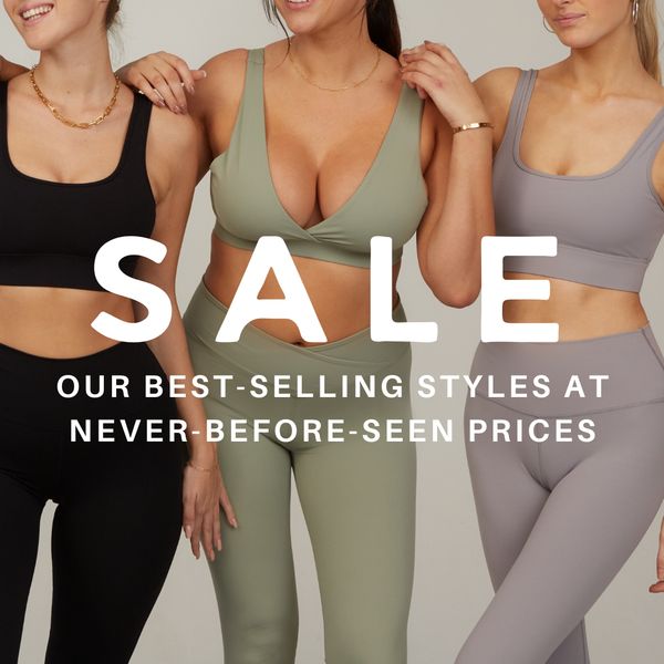
2. All green Aussie spirits
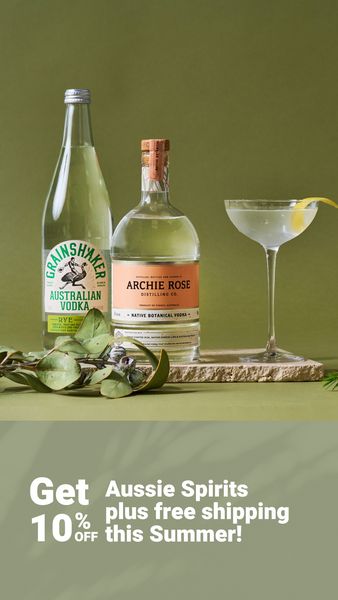
Wow, talk about elegant, classy, and simple all rolled into one! This ad is a true work of art.
The colors are perfectly balanced and complement each other in the most beautiful way. And the best part? It's easy on the eyes and the entire creative is laid out perfectly.
We, as humans with our reptile brains, resonate with this type of offer.
But what really stands out with this ad is the offer of free shipping.
Brands that offer free shipping or include shipping information have been seeing amazing results over the past few months, considerably better than brands that don’t
3. Bronze is good
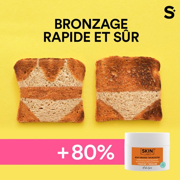
Part of the entire reptile brain theory is that it relies on basic survival instincts, and that’s precisely why this next ad is genius.
Simplicity and metaphors are here to save the day!
These powerful tools are a fantastic way to break through traditional biases and make a lasting impact on your audience.
Sure, it can be a challenge to come up with the perfect metaphor or simplify your message down to its core.
But trust us, the reward is more than worth the effort.
With an out-of-the-box ad like this, you'll be turning heads and grabbing attention in no time.
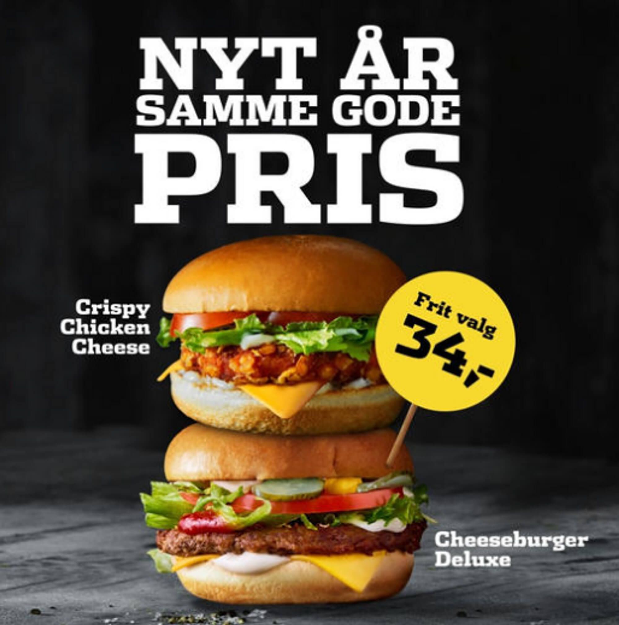
4. Hungry for a big discount?

This ad knows how to grab your attention with just one simple blue stripe.
It takes up 33% of the space, ensuring that you can't miss the core information - a whopping 50% discount!
But wait, there's more! Instead of just stating the discount, this brand is offering two pizzas for the price of one.
This deal is sure to not only go unnoticed, but also to activate your reptile brain and leave you craving a delicious pizza feast.
In short, this ad is another prime example of how simplicity and a good deal can go a long way.
Discounts trigger urgency and impulse - these Catalog Ads for Campaigns & Sales are perfect for driving quick action.
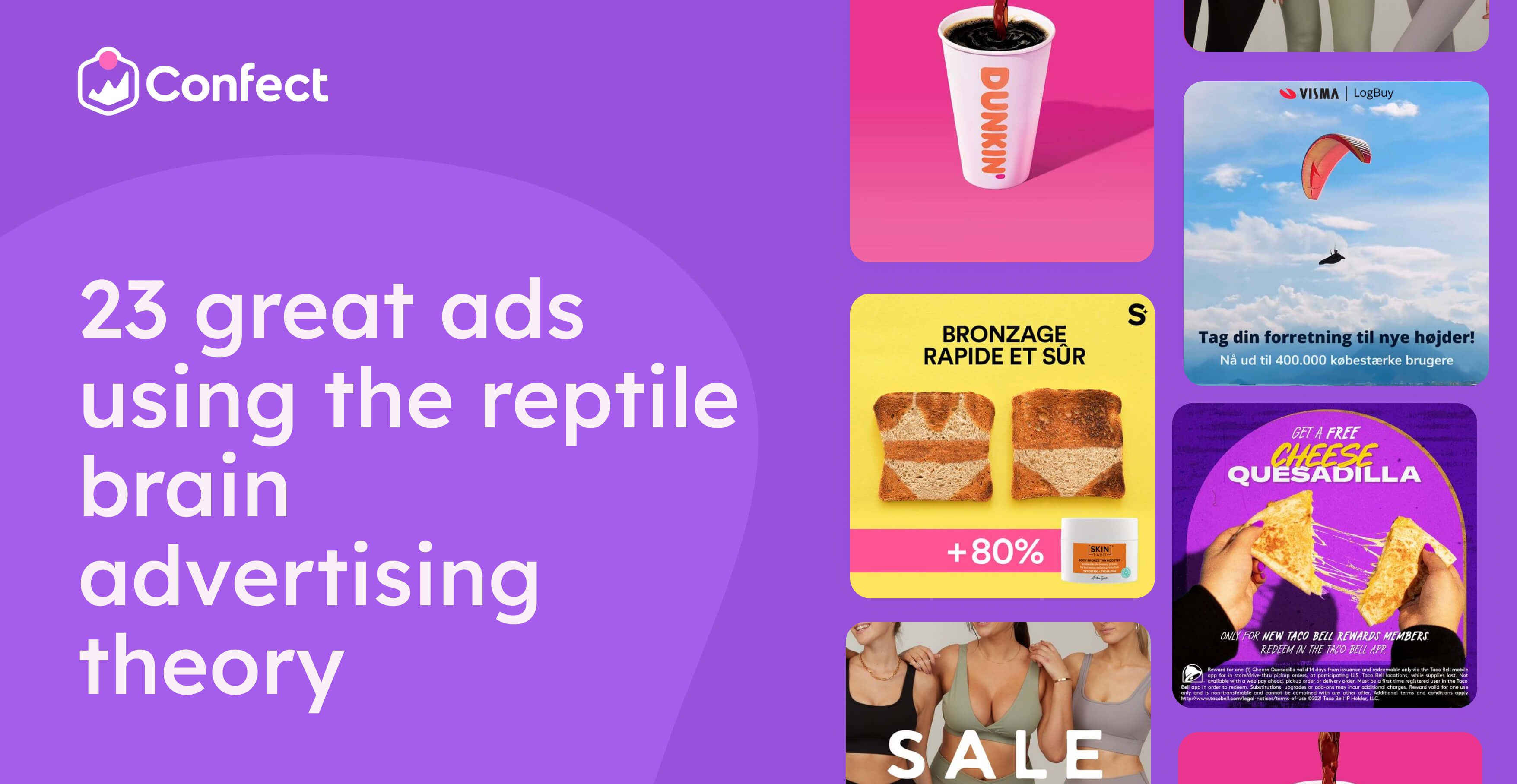
5. A gift for her, but really it's for him
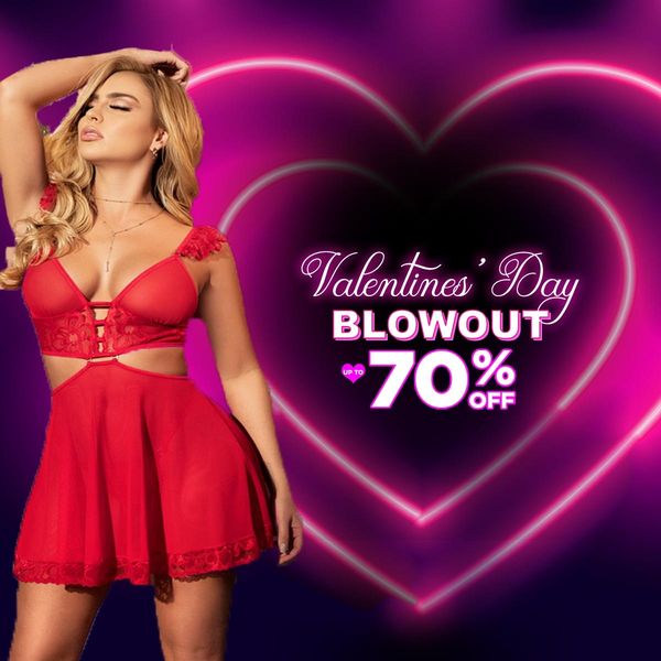
In this ad, the model stands on the left with her arm raised and eyes closed. She's wearing eye-popping red lingerie against a dark purple background—Talk about a sexy way to activate every man's (and some women’s) reptilian brains!
But what really catches your attention are the two neon glowing hearts that encase the word "SALE."
It gives the ad a romantic feel, perfect for the Valentine's Day blowout theme.
Despite the minimal elements, this ad is a powerful and alluring one. It's the perfect way to grab attention and draw customers in for an amazing Valentine's Day sale.
6. Papa simplicity🍕
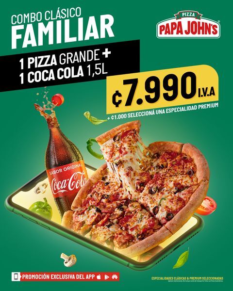
In a world where our attention spans are rapidly decreasing, the perfect ad must be able to grab our attention in a blink of an eye.
And that's exactly what Papa John's has done with their super simple, yet perfect ad.
The product is front and center, with a bold contrast of a green background that makes it pop out of the phone. This attention-grabbing tactic strikes our reptile brain and makes us instantly hungry.
In other words, it's the perfect way to satisfy those pizza cravings!
There's no clutter or unnecessary information—just a simple and effective way to showcase an amazing, hunger-inducing product.
7. Dynamic DUNKIN’
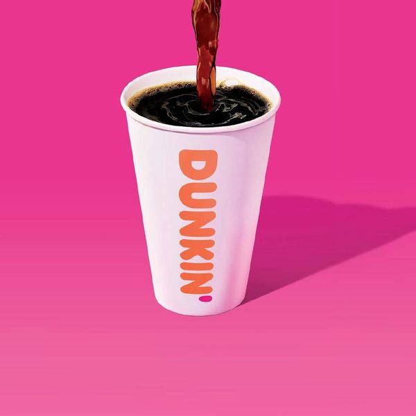
This ad is great, and there are two things that really make it shine.
First, the eye-catching pink gradient background. It's not your typical color, but it creates a great contrast that makes the product stand out.
Plus, the shadow effect adds a layer of realism and depth that really pops.
But that's not all - what really sets this ad apart is the feeling of action happening just outside of the frame.
It creates a sense of instinctual curiosity, drawing us in, capturing our attention, and leaving us with a lasting impression that our reptile brains won’t soon forget.
8. Instinctual desire 🍩
The moment you lay your eyes on this ad, you can't help but be drawn in by the vibrant, eye-catching colors.
What's more, this ad knows just how to speak to our instincts.
As humans, we're wired to remember images more than words, and this ad uses mouth-watering visuals to make our reptile brain think, "Wow, that burger looks delicious!"
It taps into our natural desire for food, stimulating the appetite center of our brain and igniting our “instinctual desire”.
And that's precisely why this ad is so effective!
9. Delicious mmmmm…

Prepare your taste buds for a feast!
As soon as you lay your eyes on this ad, you can practically taste the juicy, succulent burger sizzling on the grill. It's like the ad is speaking directly to your Reptile brain.
With the burger taking up almost half of the ad, there's no mistaking what's on the menu.
And yet, the simple yet clever design uses empty space to balance out the composition, making it all the more appealing.
.png)
We actually have statistical proof for this, which tells us that vibrant colors help ads stand out in a feed, and that more noticeable ads generally lead to more purchases.
On average, vibrant ads perform 19% better than muted ones
The power of sensory appeal drives engagement - this case study with reNewed & Noor Digital shows how emotional triggers improved conversion by 30%.
10. Small details matter🔮🔮

The striking purple background is impossible to miss, and it's what makes this ad truly stand out.
But even better is the perfectly complementary yellow color, which makes the cheese pull look absolutely irresistible.
And if you look closely, you'll notice that the model's nails match the ad’s color theme perfectly!
It's those little details that really make an ad memorable.
And let's be real, who can resist the sight of gooey, melted cheese stretching?
It's a total feast for the eyes and it triggers our primal instinct to indulge in something delicious.
11. Best burgers in town
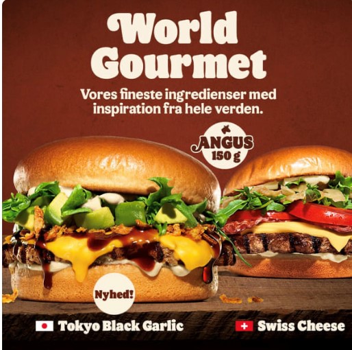
These two juicy burgers are guaranteed to make your reptile brain go wild!
As soon as you lay your eyes on them, your mouth starts watering, right?.
And the colors? Perfectly on point!
This ad uses a clever combination of colors to grab your attention and direct it towards the main offering.
Overall, this ad is a feast for the eyes, and you won't be able to resist taking a bite out of the best burger in town!
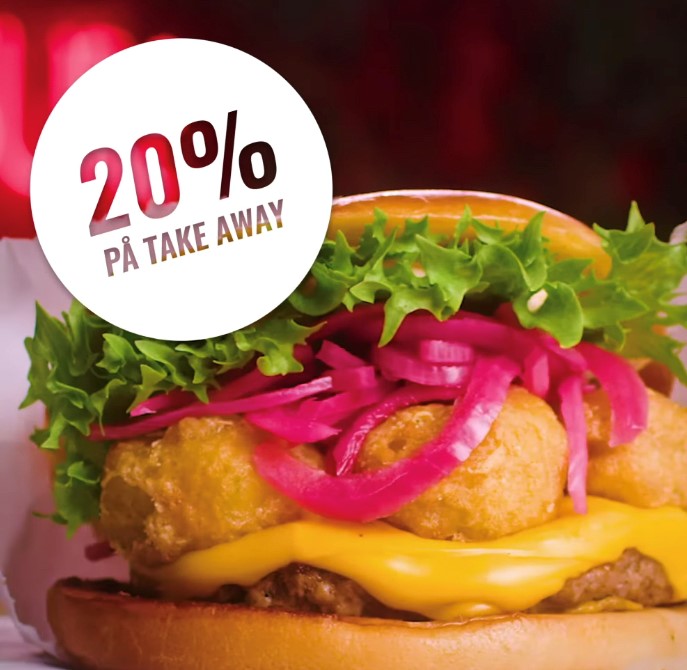
12. Burger-text
Capture their attention and tantalize their taste buds with a mouth-watering ad like this one!
The juicy burger in the center, with its stripes reaching out towards the text, will guide their gaze towards the main offer they won't want to miss.
It’s by speaking directly to our reptile brain that ads like this easily grab our attention and make us crave that delicious burger!
13. Biiiig burger
Here, we have another great example that activates the reptile brain!
By prominently displaying a juicy burger, this ad speaks directly to our primal reptile brain that immediately recognizes danger, sex, and of course, food!
The succulent burger immediately catches our attention, but the addition of red onions takes it up a notch by providing a splash of contrast that makes the burger even more irresistible.
This hunger-inducing ad is sure to make your viewers’ mouths water!
14. A slice missing?
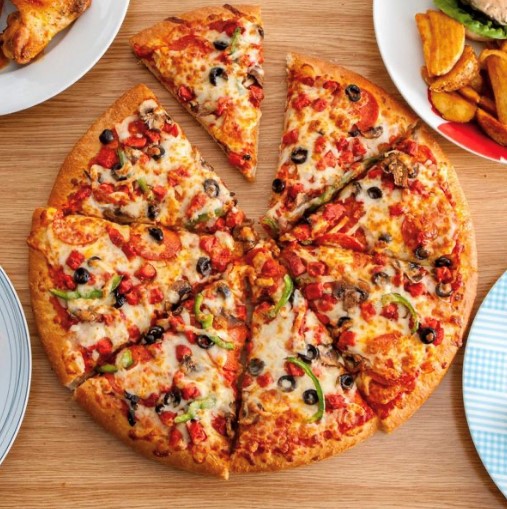
This ad has a simple yet powerful approach.
The mouth-watering pizza takes up the majority of the space, and the slice being taken away just adds to the temptation.
It speaks directly to our reptile brain, igniting our craving for that delicious cheesy goodness!
Who could resist wanting to take a bite?
15. Tripping on Asian cuisine
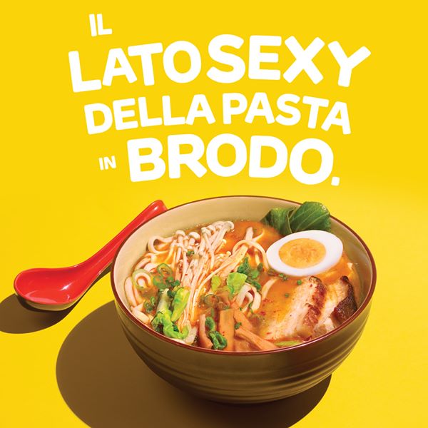
Get ready to drool over this ad that tantalizes not only our taste buds, but also our creative side!
The mouth-watering dish takes center stage, immediately grabbing our reptile brain's attention.
But what really sets this ad apart is the skillful use of colors.
The analogous color harmony of red, yellow, and green creates a visual feast that is soothing and comfortable to look at.
The white text and red spoon pop against the background, directing our gaze to the food and the message.
This ad is a treat for both the eyes and the stomach!
16. Summer & ice cream
Ice cream, anyone?
I don't know about you, but when I look at this ad, I can practically taste the creamy goodness and feel the warmth of a summer day.
That's the kind of emotional connection this ad wants to make with us, and boy does it succeed!
The ice cream is the star of the show, taking up the majority of the bottom of the ad. But when paired with a bright blue, summer sky, this ad steps in up another notch!
Seasonality and indulgence go hand in hand - see how always-on campaigns use creative variation to stay relevant year-round.
17. Light pita?
This ad knows how to grab our attention, and it does so by speaking directly to our reptile brain.
As soon as we see that delicious-looking food, we can't help but focus on it! But there's more to it than just the food.
The bright foreground of the ad, with its vivid colors and striking contrast, draws our eyes in and makes the food even more irresistible.
The splash and the text at the top of the ad are the most vibrant colors in the whole image, making them impossible to miss.
This ad knows how to make a statement and leave a lasting impression.
18. Let's go flying

Get ready to soar with this ad that’s designed to speak directly to our primal reptile brain, the part that responds to danger and adventure.
With a heart-racing image of a paraglider, this ad commands our attention and makes us want to join in on the thrill.
And the Visma logo on the bright red/orange parachute provides the perfect pop of color against the background, making it impossible to miss.
It's no wonder this ad catches our eye so quickly!
19. Food!
Get ready to feel hungry because this ad knows how to speak directly to our primal instincts!
The mouth-watering food featured in the ad is enough to catch anyone's attention, especially those of us who can't resist a good meal.
But on top of that, the green background and yellow text create a perfect color harmony that adds to the overall appeal of the ad.
It's no coincidence that these colors are right next to each other on the color wheel, as they complement each other perfectly while still making sure that every aspect of the ad stands out.
 (1).png)
And what’s even better is that the ad gives plenty of details of the deal, which can drastically improve conversions.
In fact, higher amounts of text in Sales ads performs 165% better than similar ads with lower text amounts!
20. Straight to the point

This company really knows how to speak directly to their target audience: health-conscious individuals.
They don't beat around the bush when it comes to what their product offers.
Instead of focusing on superficial benefits, they cut straight to the chase and clearly outline the nutritional benefits of their product in terms of protein, fiber, and other nutrients.
But what's even better is how they make the information super easy to understand.
By comparing the nutritional content of their shakes to everyday food items like eggs and apples, even non-health nuts can understand the value of their product.
And as if that wasn't enough, they even break down the cost per meal, making it easy for viewers to see the monetary and nutritional value of their shakes.
This is how you frame a health product, and make it desirable to our reptilian brains!
21. Being dynamic is better

Gone are the days of boring, white-background ads that blend together.
This ad is bursting with personality and color, showcasing the brand's best-selling bars in all their glory.
But the real genius of this ad is the use of the carousel format.
Instead of just showing one product, viewers get to see a whole range of options, from chocolatey treats to fruity delights.
It's a dynamic, eye-catching approach that's sure to grab attention and keep viewers engaged.
22. Meal bundles and combos
Who doesn't love a good deal, especially when it comes to food?
And this ad knows it!
With mouthwatering images of fast food sandwiches, it's hard not to start craving a bite.
But what really seals the deal is the choice: chicken or beef. Certain to appeal to almost everyone.
I mean, some of us might as well want to get both of them…
It's a deal that's too good to pass up!
23. Bottling A Lifestyle
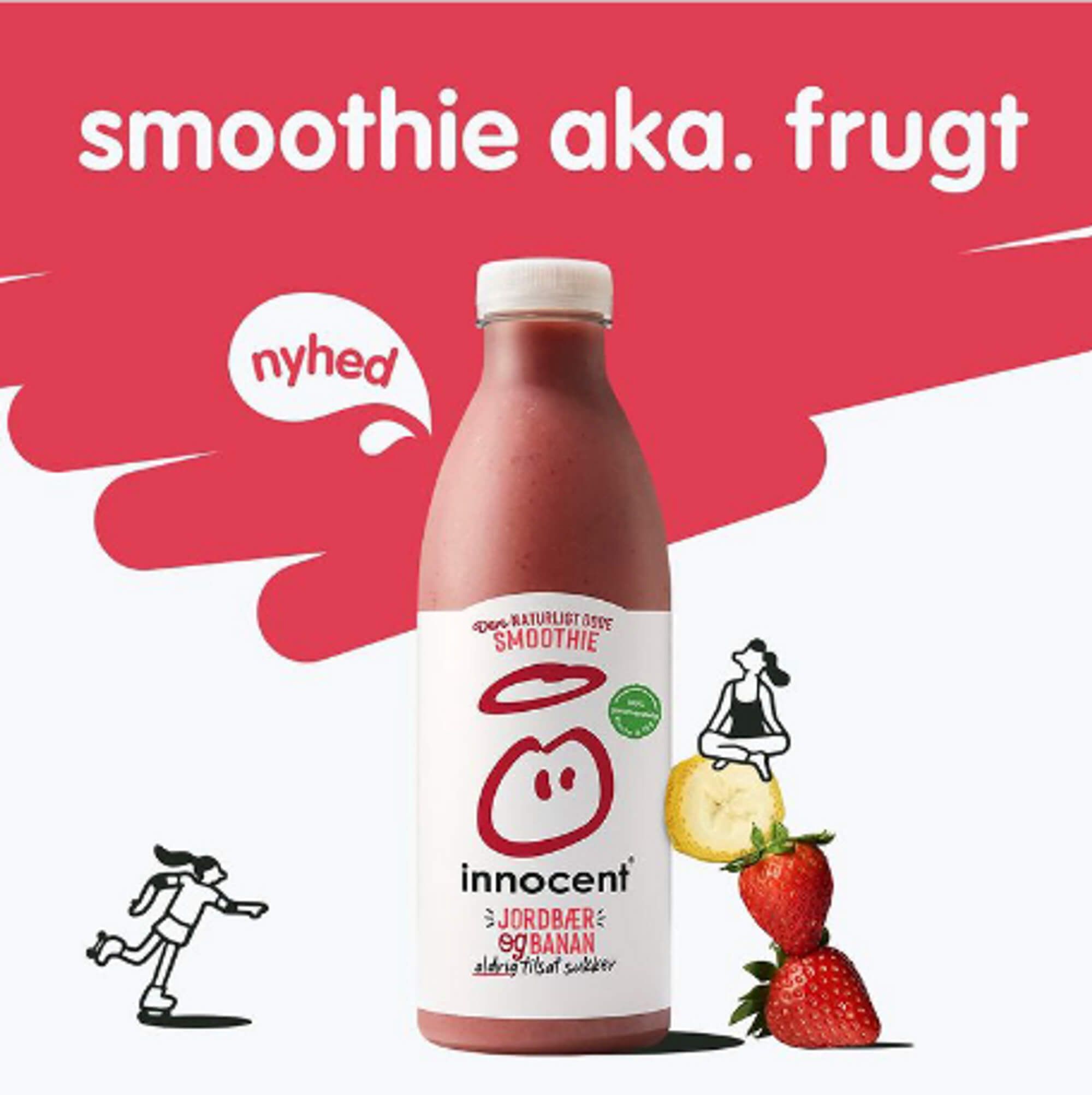
Check out this next ad, which uses the power of color and imagery to draw you in.
First of all, red is the star of the show here. It's the perfect color for food marketing because it triggers feelings of hunger and impulsivity.
But it's not just the color that's working its magic.
The ad also shows off some of the delicious fruit ingredients that go into their smoothies, which is sure to make your mouth water.
And check out the two different women in the ad.
One is meditating, surrounded by peaceful imagery, while the other is roller-skating, representing an active and healthy lifestyle.
This company knows how to appeal to different customers, no matter what their personal style may be.
Lifestyle-based storytelling taps deep instincts - see how Home & Lifestyle brands create emotional appeal with Catalog Ads.
That’s a reptile wrap
So there you have it—a handful of great examples of how to use natural instincts to make your advertising more effective.
Whether it's food, danger, or reproduction, there's no denying that these instincts are hardwired into our brains.
By leveraging these basic instincts in your advertising, you can grab people's attention and make a lasting impression.
But you don’t want to overdo it by being too overtly sexual, violent, or in-your-face.
The risk is that you’ll still likely get attention, but it can have a negative impact on brand perception, which is something you’ll want to avoid at all costs!
Try Confect for Free
Confect can help you to create great-looking Catalog ads and Dynamic Product ads for Facebook, Instagram, TikTok, Snapchat and Pinterest.