16 ad examples using color theory to evoke emotions
December 7, 2022
Today, we’re going to talk about a topic that's often overlooked, yet it has a profound impact on how we perceive the world around us - color!
While we may not always realize it, colors have a language of their own, and they can convey a whole range of emotions and meanings that go beyond what words can express.
From the calming blues to the fiery reds, colors have the power to evoke strong feelings and shape our experiences.
So, whether you're aware of it or not, color theory plays a critical role in how we communicate and understand the world.
And in the world of marketing and advertising, mastering the art of color theory can make all the difference in capturing your audience's attention and influencing their buying decisions.
How, you ask?
There are many ways to use color theory, but editing your collection ads to colors that evoke certain emotions or to include brand colors are two of the best ways!
We'll explain more about that later, but first, let’s take a better look at the psychology behind color in advertising.
The psychology of color in advertising
Color theory is the practice of using color to convey meaning and evoke emotions in the viewer.
The fact is that different colors have different associations and can elicit different reactions from the audience.
For example, have you ever wondered why the color red is so noticeable?
It’s because, thousands of years ago, red was mostly only known as the color of blood, which meant it was a color often associated with injury, danger, and death.
So whenever our ancestors saw this color, it basically told them to pay attention, often because something dangerous was nearby.
And to this day, this instinct has stuck with us, which is why red is the color most often used for stop lights and traffic signs.
Colors have always had a way of conveying information and influencing our perceptions, even if we don't realize it.
And when it comes to advertising, using the right colors can make all the difference in capturing your audience's attention and driving conversions.
20 great ads that use color theory to captivate your attention
By understanding the psychology behind each color, advertisers can use them to align their product offerings with the meanings that users subconsciously extract from them.
If you’re interested in knowing which colors elicit which feelings and emotions, we’ve included a handy list at the end of the article.
But for now, let’s dive into our list of the best ads that drive customer behavior through the power of color.
1. Going back to nature
This next ad shows a series of stunning watches with wooden wristbands, standing out beautifully against a stark, black background. Choosing such a dark background is excellent because it leverages the concept of contrast, allowing the watches and their various wood grains to pop.
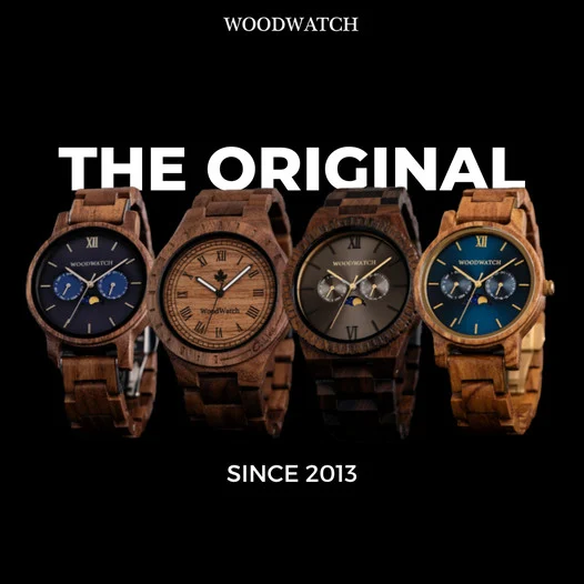
Overall, the colors in this ad evoke feelings of simplicity and sophistication at the same time (which we think is a great choice for watches). Black and brown are also excellent colors for conveying luxury and elegance.
2. Complementary colors
As much as 90% of a person’s product assessment comes from color. So brands must choose colors that not only highlight their products, but that also convey the most appropriate feeling in its viewers.
 (2).png)
This ad from Forét did a fantastic job in choosing soft, subtle colors to highlight its product and convey calm, positive feelings.
Brown is commonly associated with comfort, and the soft orange hues add a bit of enthusiasm and joy into the mix. Either way, remember to show your products. But choose colors that convey the right feelings and emotions too!
3. Sale, sale, sale!
Who doesn't love the flashy, colorful look of a brand-new pair of Converse high-tops? Actually, let me rephrase that… Who doesn't love a great discount on their next pair of flashy, colorful Converse high-tops?
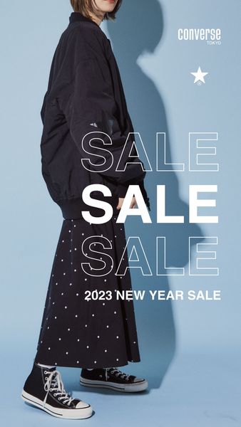
This ad shows a model sporting a stylish pair of high-tops, and it uses a soft blue background, which is ideal for inducing feelings of calmness and reliability.
A very fitting choice for Converse.
Also, using models in advertising helps customers relate to your products better, and according to our data, improves the performance.
.png)
4.Discounts are found in the shadows
Well, not really, discounts are usually not hidden in shadows, and please never hide your discounts in your ads... You should make them easily noticeable. But this creative use of shadows in this ad makes it fun to see, catching your attention, and playing around a bit with color and design.
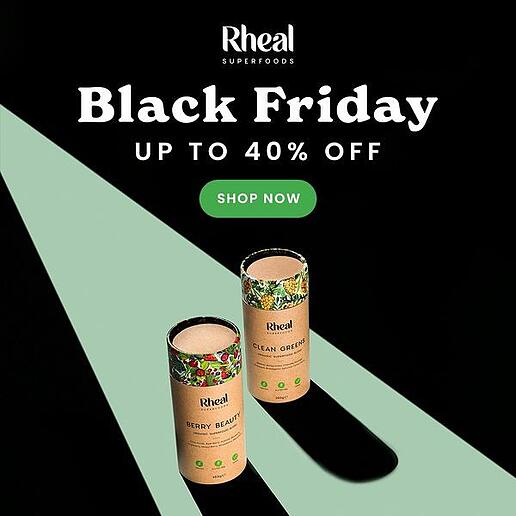
Overall, the ad is so well designed that you want to keep staring at it even though it is so simple. The green in the ad perfectly symbolizes health and balance, which is just right for a brand selling superfoods.
And in contrast, black represents power - the exact thing you're going to feel after treating your body with the vitamins and minerals it needs!
5. Red on black discounts
The contrast between the very cool, black textured background and the bright red not only helps the ad stand out.
It also helps showcase the product and links it to a discount in a blink of an eye. And in the advertising game, everything is about SPEED…
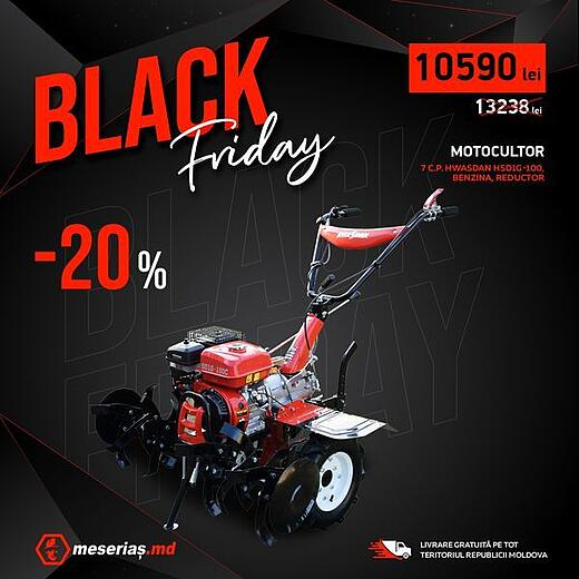
The red color is perfect is for this product, as it evokes action and danger.
And that's a great match for this ad's audience. The average person doesn't need this product, it's meant for hardcore garden fanatics who want to put in the hard work and take control of their yard.
This high-contrast combo works especially well in industries with bold branding - check out how electronics brands use such styles in Catalog Ads.
6. Sit back, drink a beer, and save money
Imagine going home after a stressful day at work, you have just argued with your boss, charts are not showing profits at all and you had so much in your mind you couldn’t even focus on your daily task. EVERYTHING. JUST. SUCKED! Now, you get home and you just crack open a zizzling bottle of beer and comfortably sit on your couch… Sounds comforting, doesn’t it?
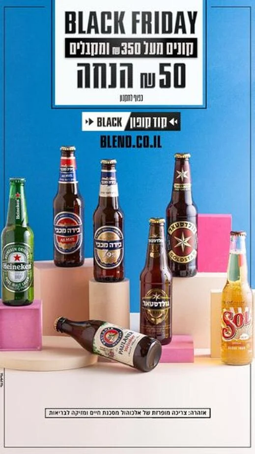
This is why this ad works, it has a happy blue background to transmit calmness and a beautiful creative that shows all the different flavors of beers you could get…
The blue color makes me think of a hot, sunny day on a beach, or by the pool. Needless to say that's a good thing when trying to sell beers.
7. The best caffeinated ad
Take 40% off before every caffeine addict does. Black ads work on Black Friday. There is absolutely no doubt about that. We have unconsciously linked dark-colored ads with Black Friday, so whenever you see them you know a good offer is available.
So, this ad has a dark creative background filled with discount signs, perfect example of using colors to capture attention, but it also helps to highlight the product and creates contrast with the green sign with the offer.
8. Wow! That's a lot of blue!
Everyone wants a 3D printer, and what's better than buying it on SALE? Yes, there is a lot of blue in the ad and no, that is not bad at all.
By making the whole ad blue it makes it easier for other colors to stand out, like the yellow and orange colors letting us know the product is discounted… multiple times. Not only do other colors stand out with a monochromatic ad, stronger shades of blue make the product stand out from the background even though they’re both blue.
And what's more, blue is associated with reliability and trust, subconsciously making you think that this 3D printer will serve you well and never let you down.
9. How to build desire
At simple glance this ad may seem like a simple giveaway, but for a kid this is the deal of their life. Remember going back to school with all your new toys, watching the clock all the time, waiting impatiently for lunch time to come so you can show off all your new toys to your friends?
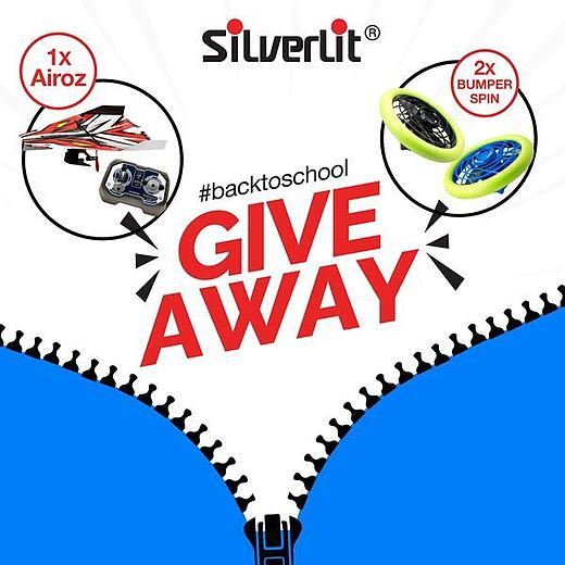
The blue zipper at the bottom revealing the big strong “GIVE AWAY” in red and the toys you could possibly win, builds exactly that desire in kids. That is why this ad works great!
The combination of those two contrasting colors evokes memories of childhood. Perfect for any parent entering the giveaway to bring some joy to their beloved children.
Color is one aspect, but messaging and layout matter too - these Catalog Ad design principles will help increase performance.
10. Thirsty for an ad that will convert?
FRUGT! Man, I’ve been thinking about this word every time I see fruit now. The playfulness in this ad matches the tone and voice of the brand, it’s fun, creative and keeps you engaged by trying to figure out everything that is going on in the image.
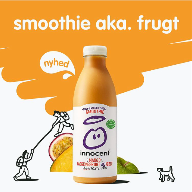
There are only 2 dominant colors in the ad and these two colors paint the whole image in a playful way that just makes the ad look good… They even match with the fruits and drink.
So what do orange and yellow colors mean? Energy, optimism, enthusiasm and happiness - the exact feelings this ad is trying to sell.
Also, based on our analysis, ads with a light brightness, such as this one, perform better on average that darker creatives.
.png)
11. Game colors
The dark backgrounds is not something we see many brands using. But there is a special case with gaming and electronics. They make the products look powerful - darker backgrounds are dramatic.
.jpg)
They give a chance to use neon-like colors to highlight the offering and brand. It's definitely speaks to younger audiences that looks for that boldness in brands!
The little added purple also evokes imagination and mystery. And any devoted gamer will tell you that those two feelings go hand-in-hand with video games.
12. Elegant to the bit
Well, it's a very, very elegant carousel. Our applause to the designer making these visuals. It's clean. The background and podium are chosen in a color complimentary to each unique product - a nice touch.
.gif)
But fonts and text can be just as important as color. Serif font gives the right accent and attitude to the product. It's great to use Serif fonts for more luxurious products, while Sans Serif is commonly recognized for discounts or sales.
In short, this is what this ad makes us feel: simplicity, sophistication, elegance and comfort. And wouldn't you know that that's exactly what black and brown represent.
13. Summer beach vibes
The blue background instantly grabs attention to anyone who was scrolling through their feed. Color choice in this ad is good, yellow font stands out against blue background and the light gray gives nice beach-y feeling.
.jpg)
Sometimes, as much as there are other great parts about this ad, the colors can evoke feelings that are good enough to sell the product.
The blue is reminiscent of a beach, and the orange of a bright and warm sun. Perfect combination for a summer sale.
Seasonal colors and styles are key - see how fashion brands use Catalog Ads to play into summer trends.
14. Black on black
This ad exudes a sense of power with the color black. It is effective in grabbing attention and making a statement.
The background text 'CASIO' matches the brand's name and is situated right behind the product to create a bold impact. You can notice that despite the strong use of black, the product remains the focus of attention.
 (1) - Copy.png)
All the watch details make it stand out even more, allowing customers to have a clear idea of what they are buying. The black-on-black aesthetic is popular in many industries, from fashion to technology. It is seen as modern, sleek, and stylish.
15. Get chic during the holiday season
Pinky background matched with some decorative elements is something any fashion enthusiast would notice. Pastel colors used in the ad serve as a source of softness, upbeat, happy and lively adjectives.
.jpg)
This ad is clear to inform us about the great offers, with 20% and also encourages us to click by getting the even higher offer ( 25%).
It's no surprise that the association between pink and femininity makes it a perfect color for a beauty brand.
16. Make a statement in red
The red and black color scheme is eye-catching and the product image takes up a majority of the ad space, making it impossible to miss. The text on the ad also playfully suggests that the sunglasses will give you a fresh new look that will turn heads.
And the red color gives your subconscious mind the exact same message: "This will get attention".
.jpg)
The gray background subtle highlights the word RAY BAN in a consecutive way that makes it the protagonist of the composition.
Unleashing the power of color theory in your ads
Congratulations! You are now a color theory pro.
From looking at these examples, you should now have a better idea of how colors can play a role in communicating your offers.
By using these concepts in your advertising, you now have the power to create ads that will truly resonate with your audience and evoke the right feelings or emotions.
Colors can make your message more powerful when used correctly. But color choices can also muddle your message if not chosen carefully.
For instance, lower-priced brands using purple or gold colors, which are often associated with royalty and luxury, will undoubtedly send mixed signals to the audience.
So always keep in mind the emotions that colors evoke and make sure that your color choices match the message you want to send.
Meanings of common colors:
- RED: Action, attention, desire, danger
- ORANGE: Stimulation, enthusiasm, joy, encouragement
- YELLOW: Happiness, optimism, inspiration, energy, warmth
- GREEN: Harmony, health, relaxation, balance, safety
- BLUE: Trust, loyalty, calmness, reliability, honesty
- PURPLE: Imagination, mystery, royalty, wisdom
- PINK: Love, compassion, friendliness, femininity, romance
- BROWN: Stability, protection, simplicity, comfort
- BLACK: Power, sophistication, authority, elegance
- WHITE: Innocence, purity, clarity, hope, openness
More great ads to learn from!
Keep the inspiration flowing with these amazing ad examples:
- 14 ads using a sense of urgency to drive sales
- 10 ads that focus on customers' pain points
- 9 ads that harness the power of pricing psychology
- 20 ads from the beauty industry to inspire your next campaign
Try Confect for Free
Confect can help you to create great-looking Catalog ads and Dynamic Product ads for Facebook, Instagram, TikTok, Snapchat and Pinterest.