Tips how to use text for fashion ads
July 31, 2022
When talking about the text in your fashion ads, like how much to write, where to put it, etc., it can quickly become a heated discussion for a marketing team.
Some people may disagree, but data shows the text is extremely important in ads.
Using text is an effective way of communication, as it conveys information and context in a straightforward way.
However, and this especially true in the fashion industry, there’ll always be arguments on what is or isn’t allowed.
Instead of going back and forth and relying on our gut, let's dive into what the data shows us about the most effective way for a fashion brand to use text!
High amount of text works great in fashion ads
There's a very clear pattern in the fashion industry when it comes to text.
The more you use a high amount of text, the more likely consumers are to make purchases from your ads.
You might be able to just rely on a model in your content, but this might not sell as good as an ad that includes text.
Usually, designers aren’t a big fan of text but marketers know how important it is.
The next time you’re arguing with your designer and aren’t sure what to say, utilize this data to show them it’s worth using text and what exactly to use!
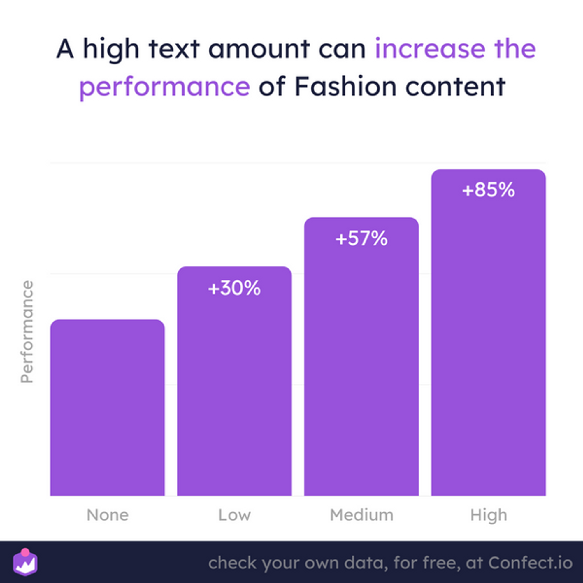
By not using a high text amount, you miss out on an 85% performance lift on average!
Compare that with a 57% increase if you used a medium text amount, and a 30% increase if you used a low text amount.
But is there a specific type of ad that benefits more from using more text?
Sale focused ads performance benefit greatly from high text amount
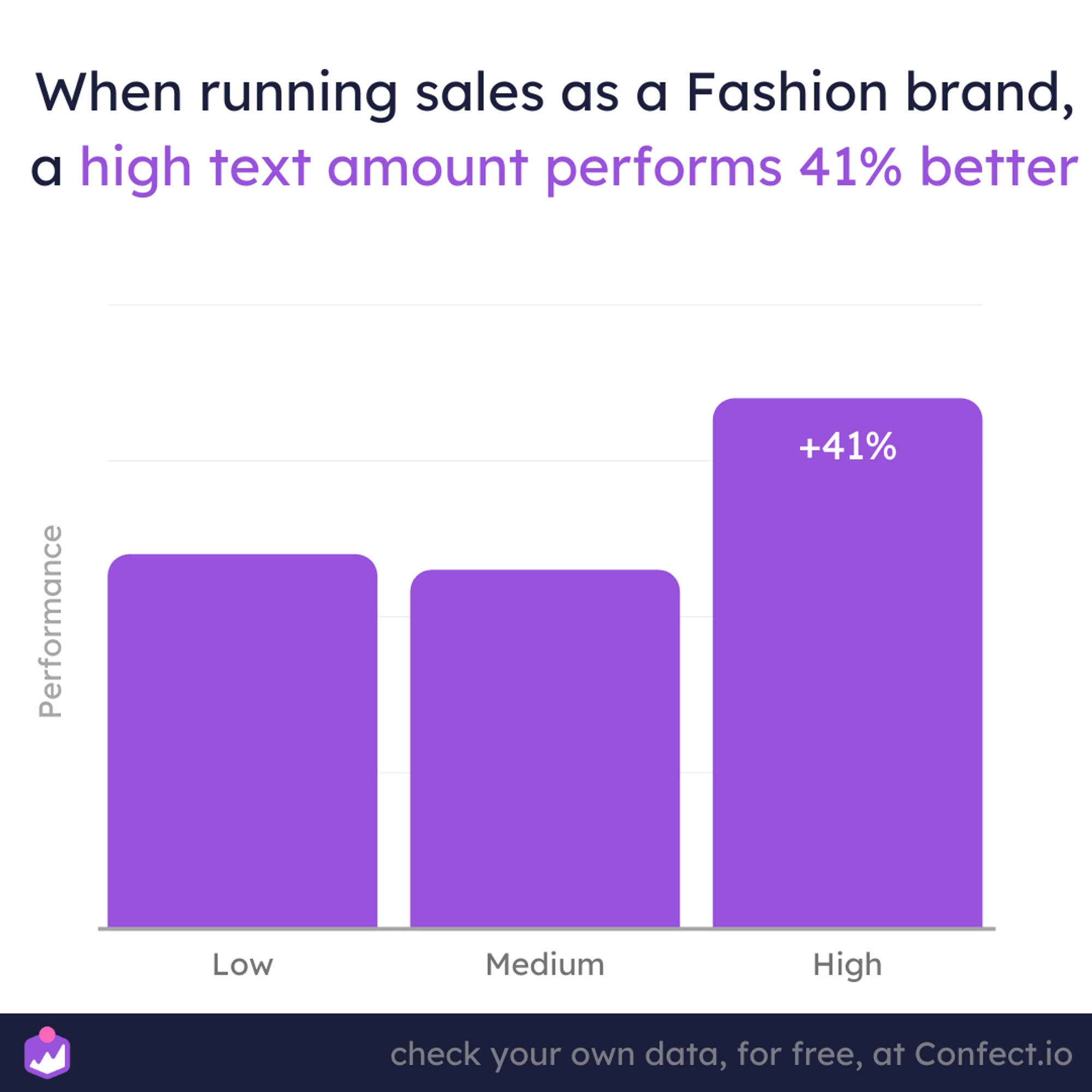
When it comes to offers like a sales ad, using a high text amount increases its performance.
When consumers see an ad with more text, the offer seems better than those with lower text amounts.
This is especially true for fashion brands.
When you’re running sales ads, make sure you describe the sale and not be too vague.
Mention when it begins and ends, as this creates a sense of urgency.
Include how much the savings will be and be specific.
This will make your ads come across like a better offer than those that simply say “sale this weekend”.
Try using high text amounts in your sales ads for better performance.
However, there are some exceptions to the rule depending on the ad messaging.
Let the product talk when it is new
Surprisingly, this is the complete opposite when it comes to ads talking about a new product or collection.
When launching a new collection or product, the less text you use, the better the performance.
Consumers, especially in fashion, want to SEE the product, not be bombarded with texts full of information.
This is where using a model showing what the product looks like on a person helps your ads.
Remember, show, don’t tell when it comes to ads launching new products/collections.
Keep the text short with your new ads.Link to NEW blog post
.png)
But simply using more/less text in your ads isn’t enough.
Where should you place text in a fashion ad?
Knowing how much text to put in your content is important, but not the only important thing. Where you place it can also greatly affect performance.
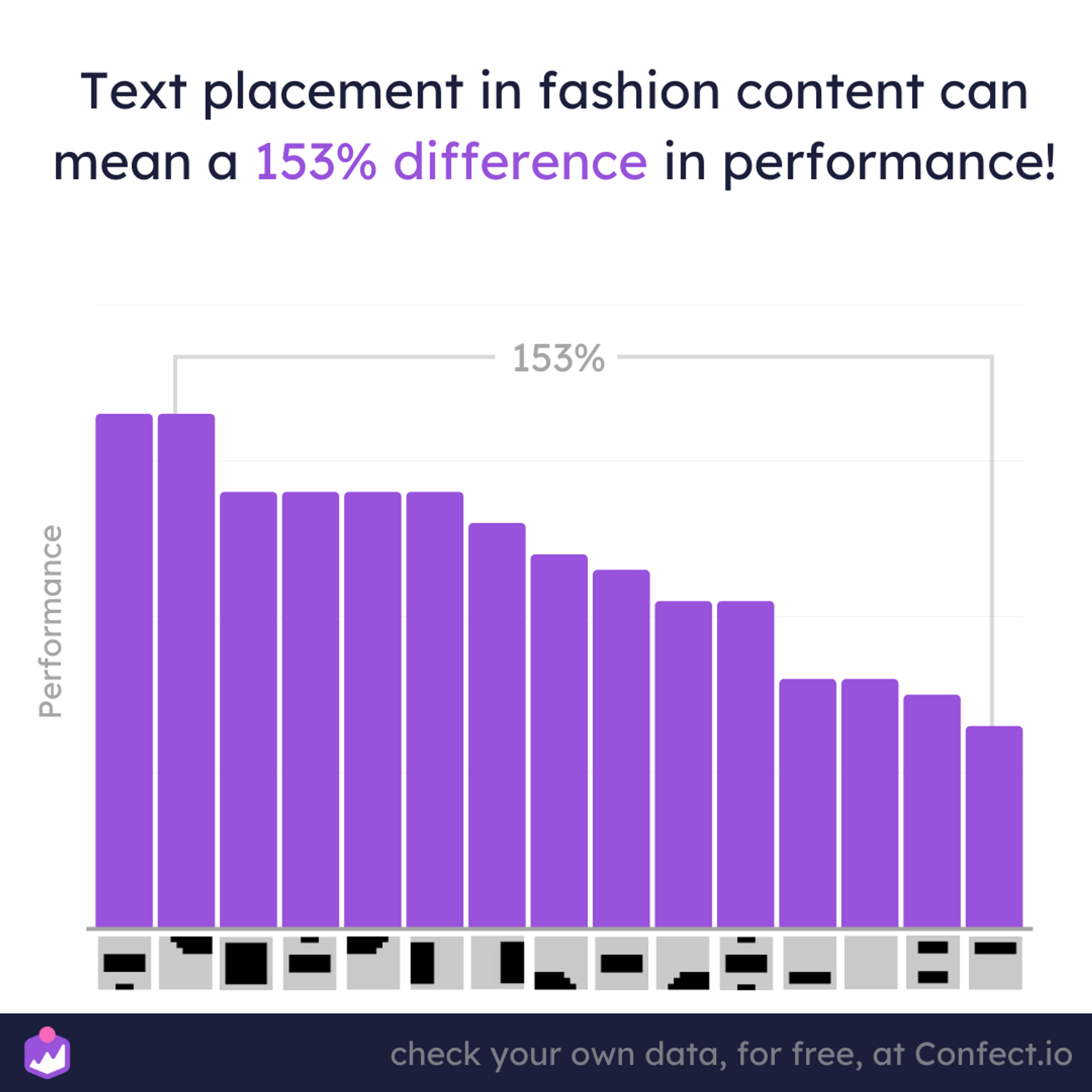
The difference between the best-performing layout and the worst-performing layout is 153%!
However, almost any text layout still performs better than simply not having any text. When we start going through some text layouts, some general patterns start to appear.
Text centered in the middle or at the top performs the best.
Again, there are still big performance differences even when making small l
Let’s take a look at some examples.
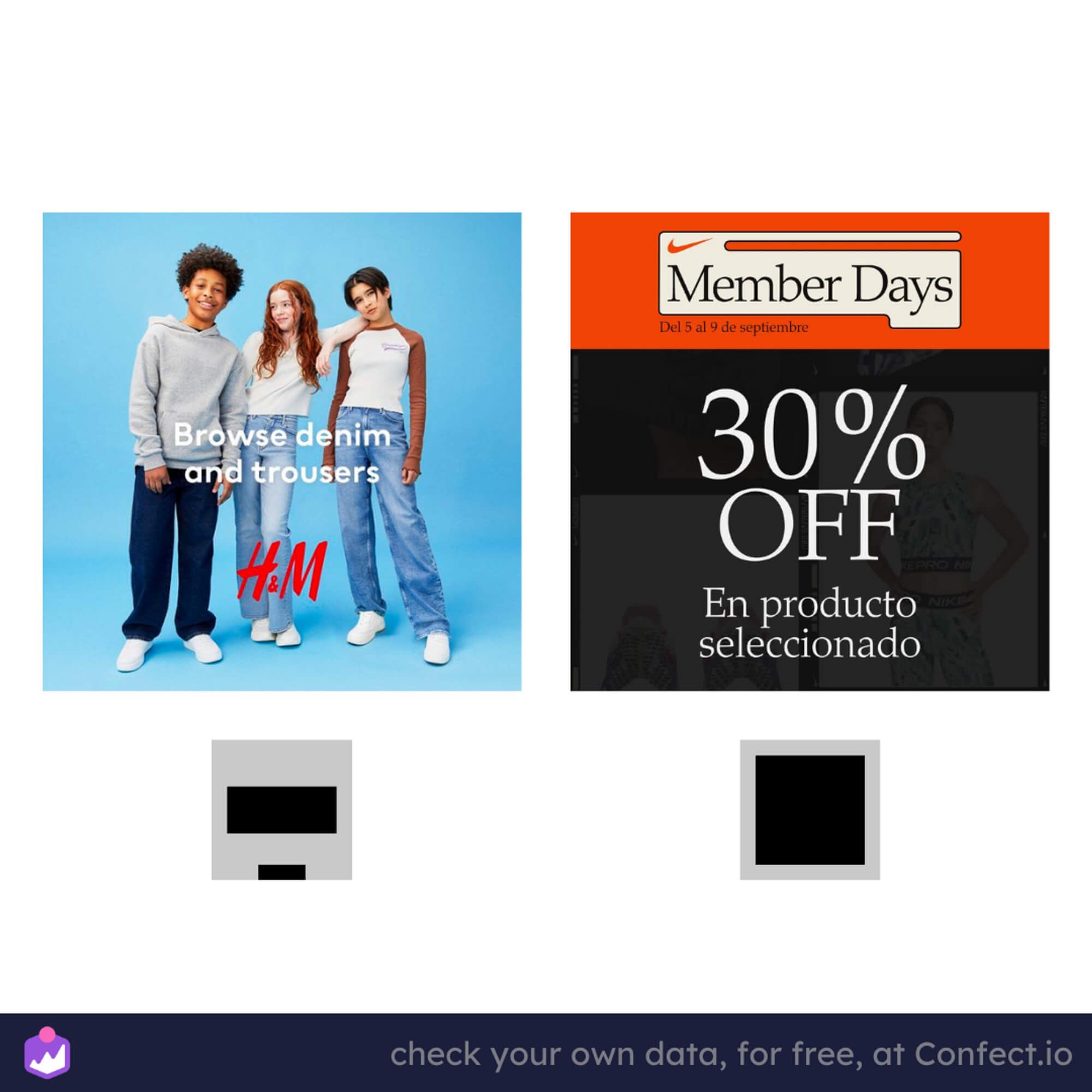
On the left is an ad from H&M that uses text in the middle and a logo or small text at the bottom.
This is a widely used text layout and also the best-performing layout for fashion brands on average.
On the right is a layout for a Nike sale ad.
Again, the more text you add the better the offer seems(Member days, date, savings, selected products, etc.)
All this text and information makes consumers more likely to buy.
Now let’s take a look at some bad examples.
These are the two worst-performing layouts that you probably should avoid using.
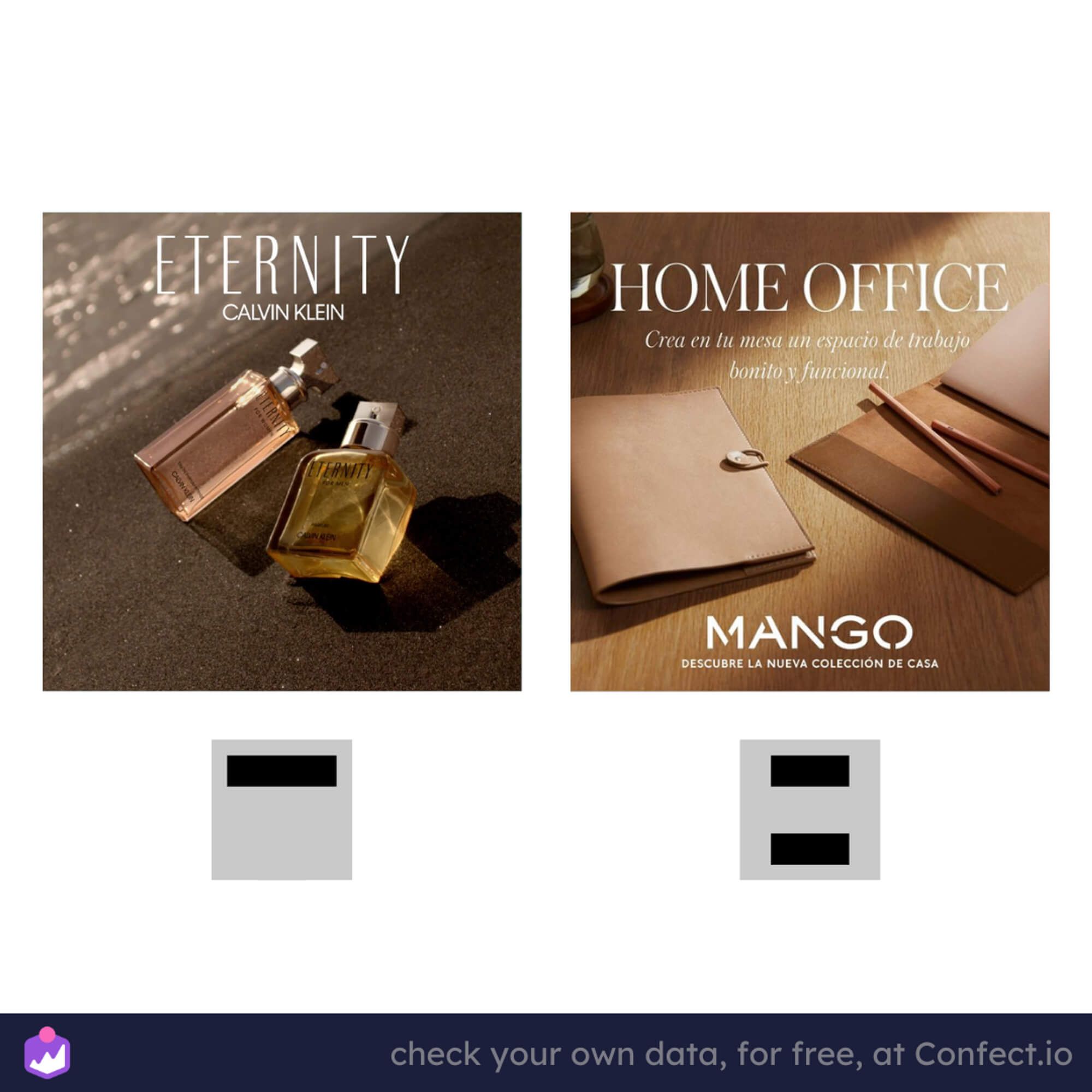
As we mentioned before, based on the data, the best-performing text layouts are texts centered in the middle.
Don’t overlook the text in your content
Texts in your ads play a big role in performance, especially in fashion brands.
Knowing how much text and where to put your text can help your ads perform better.
But we highly suggest you start making decisions based on data, which is what most top fashion brands are doing.
Use these tips for your next ad campaigns and see what kind of results you come up with.
Like always, every brand and niche is different, so make you test these tips out for yourselves.
More to read
This article focuses on the use of text in fashion content. Keep learning and optimizing with the following insights:
- How do logos impact performance for fashion ads
- Content learnings from top fashion brands
- How effective are models in fashion ads
- Better performance by fixing ad bodies for fashion ads
- Shipping and Free returns for fashion ads
- Create better SALES ads for fashion
- How can fashion brands sell New products more effectively
Dataset
The dataset from this article is based on 967m+ impressions and 9500+ pieces of individual content on Meta (Facebook) platforms from Fashion brands ONLY. It takes into account data from only brands within fashion industry in all countries, with the campaign objectives of conversions only. The period is from 01.09.2021 - 16.09.2022.
Numbers are looking at correlation only, not causation. Remember to check your own data: numbers for different brands, industries, and contexts will vary. If you were intrigued about a specific insight, you can go in-depth into the various dimensions and how data can be segmented in Confect, here.
