The ultimate guide for designing dynamic product ads and catalog ads on Facebook
May 1, 2023
This article contains everything you need to know about how to design great-performing Facebook DPA campaigns, and show your potential customers a unique and engaging dynamic catalogue of products they are likely to be interested in. It's 5.000 words and is based on more than 1.5 Billion impressions.
Did you for instance know that:
- Dynamic Product Ads showing the name of the product perform 30% worse on average?
- Or that Dynamic Product Ads showing the brand of the product perform 43% better on average?
- Or that showing campaigns in your Dynamic Product Ads perform 79% better on average?
Keep reading if you want more insights like these, all looking at Dynamic Product Ads specifically.
Table of contents:
Dynamic Product Ads. Catalog Ads. Product feed ads. They are called a lot of things, and they are widely used by eCommerce companies.
The reason so many eCommerce companies use a dynamic catalogue is because they are extremely effective at making people buy.
If you want to utilize the power of data and personalization, Dynamic Product Ads are the way to go. It's a great way to use Meta's gigantic knowledge about your customers and let Meta decide which product to show to which user.
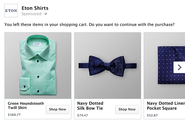
To create a dynamic catalogue, you give Meta a list of all your products - via a product feed from your shop - and from there, Meta can figure out which product each consumer is most likely to buy.
Of course that's effective with their data-driven nature. But there is a way to make them even more effective.
How to design dynamic product ads and catalog ads
The historic biggest problem with Dynamic Product Ads is the missing opportunity to design their look. As a standard, these ads are just your generic product images.
That's a big problem for you as an advertiser for many reasons:
- The ads look like all your competitors' ads since you're selling similar products
- It hurts your brand since you can't use any of your distinctive brand assets
- You miss out on a lot of revenue since ad design is the most important factor to increased performance on Facebook, according to Facebook themselves
With tools like Confect, you can fix this - and edit the designs of your Dynamic Product Ads.
You can design a design template and apply it across all your products in order to improve the design - and thereby the performance - of your Dynamic Product Ads.
.jpg)
On average, across advertisers, we see a 30% increase in Return On Ad Spend by changing the design - but the performance varies wildly based on the design of your Catalog ads. You can see examples of some of these designs here.
We have seen designs performing anything from 4.5x better than the generic product image to designs performing worse than the generic product image (because of cluttered or ugly designs).
Customizing the design of your Dynamic Product Ads is a huge opportunity - but you need a great design in order to redeem this huge potential.
That is why we have made this analysis - so you can see our learnings from designing Dynamic Product Ads for some of the biggest and most ambitious eCommerce companies in the world.
Analyzing Facebook dynamic product ads
This analysis is based on 1.5 billion impressions, 46.4 million clicks, and 739.772 purchases from Confect customers - all eCommerce companies - from their Dynamic Product Ads.
It's aggregated from 170 different eCommerce companies, 379 different product feeds, and 1.456 different designs - all used on Meta platforms like Facebook, Instagram, and Whatsapp.
The data is across multiple industries and countries but used in Dynamic Product Ads only. It ranges from January 2022 to February 2023.
As you can see, there are wild differences in how effective different designs are. The performance, whether you look at Click Through Rate or Purchase Rate, is heavily relying on the quality of the design.
.jpg)
This is not a surprise though - since multiple studies show how important great design is to performance in marketing.
Meta/ Facebook released a study in 2022 where they researched which areas in their Facebook Ads Manager drove the highest performance.
Facebook's conclusion was that "The lever most strongly associated with increased performance on Meta technologies is ad creative execution" - in other words: Out of all the things you can do with your Facebook ads, your creatives/ content is the most important factor to improve performance.
Another study from Facebook shows that the average difference between your top-performing and bottom-performing designs is 11x: Meaning that your best designs have an 11x better Return On Ad Spend than your worst designs.
Google has also researched this and says that 70% of a campaign's success is attributed to the design - media placements only account for 30% of the success.
In other words: Your design is incredibly important to how well your Dynamic Product Ads will perform.
Optimizing for purchases with Facebook DPA
In this article, we will analyze how different design choices affect the Purchase Rate of Dynamic Product Ads.
Purchase Rate is the number of purchases an ad has received divided by the number of impressions it has been served.
In other words, "How likely is a viewer to buy from this ad".
Insights are coming from Meta platforms.
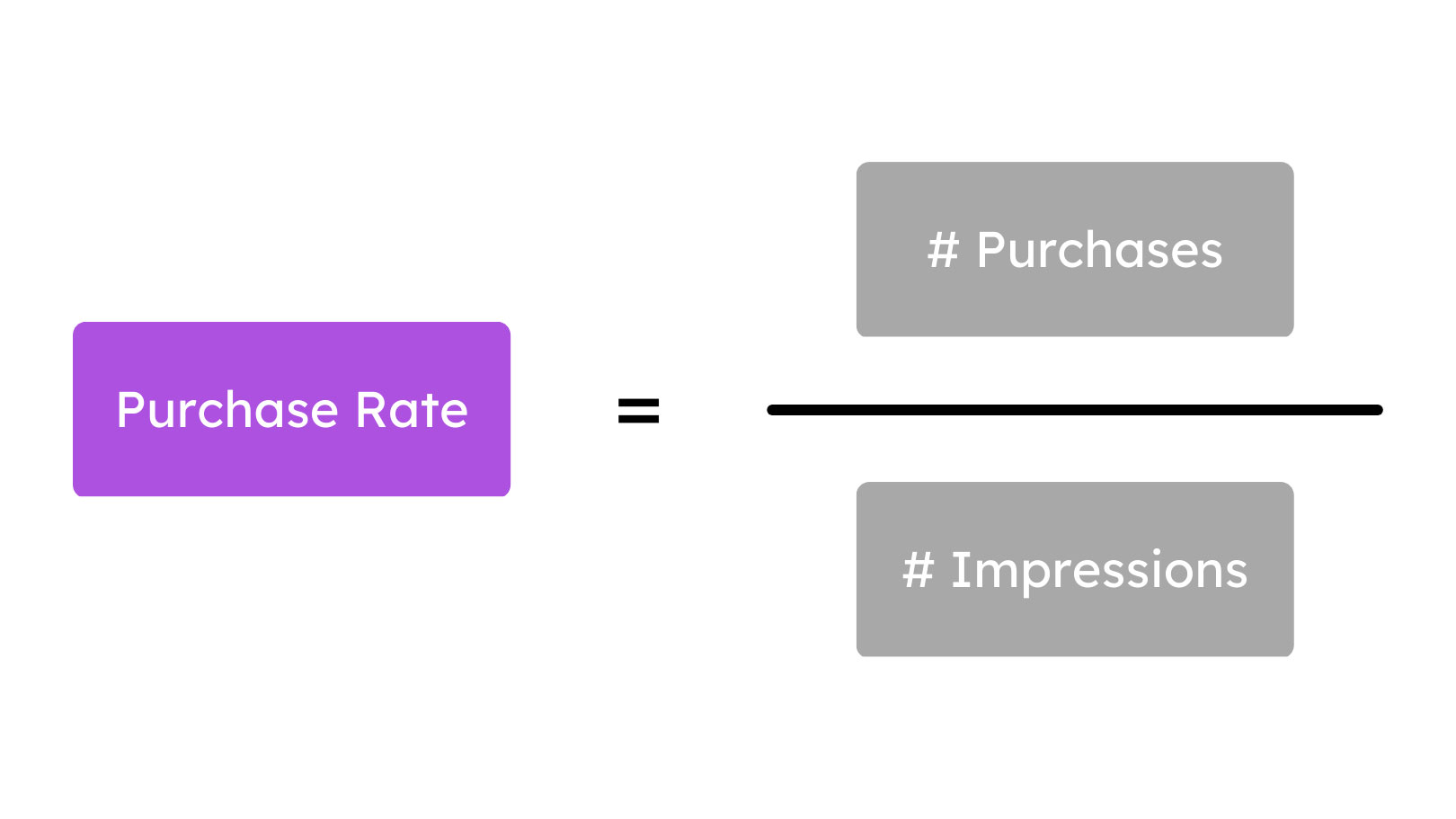
Purchase Rate combines the two most important elements of a great Dynamic Product Ad:
- Click Through Rate: How likely is the viewer to CLICK on the ad?
- Conversion Rate (on site): How qualified are the clicks and traffic from the ad - how likely are they to BUY?
This is important since some design choices increase Click Through Rate but lowers the Conversion Rate (e.g. are great at making people click, but it's low-quality traffic), while other design choices give you more qualified traffic but for a worse Click Through Rate.
In general, for Dynamic Product Ads and other ads using Catalogs, we see that optimizing for getting qualified traffic, e.g. creating traffic that is likely to buy, is more important than optimizing for many clicks.
The reason for this is that these catalog-driven ads typically consist of multiple products - like in a carousel ad - and therefore, it's important to push the viewer to make the buying decision in the ad instead of on your product page.
.jpg)
Show the information that makes the person find the right product, so if they are not interested in the first product, they will scroll to the next one. Typically, we see that this mindset of helping the viewer find the right product in the ad performs better than optimizing for a quick click where the viewer will be disappointed on the product page.
In general, it can be a good idea to take the learnings from your Conversion Rate experiments on the website and apply them to your Dynamic Product Ads.
This article is guiding you through best practices based on this data - but the data differs for different industries, your price range, the size of your brand, where in the funnel the ads are used, and other factors.
Therefore, it's always recommended to A/B test your designs in order to get conclusive insights for your specific brand and context.
The best dynamic product ads and catalog ads designs
Let's dive into the learnings from 1.5 billion impressions on Dynamic Product Ads.
This section will be about how using designs in different ways impacts performance, while the other section will be about how specific product information impact performance.
Great designs do perform better
The first insight might not be a surprise for you, but it is very important nonetheless - and something that is often forgotten when you start customizing your designs for the first time.
But designs with more details - and more love put into them - also perform better on average.
We simply see that dynamic catalogues with 6 or more layers/ elements perform approximately 38-42% better than designs with just 2-3 layers/ elements in them.
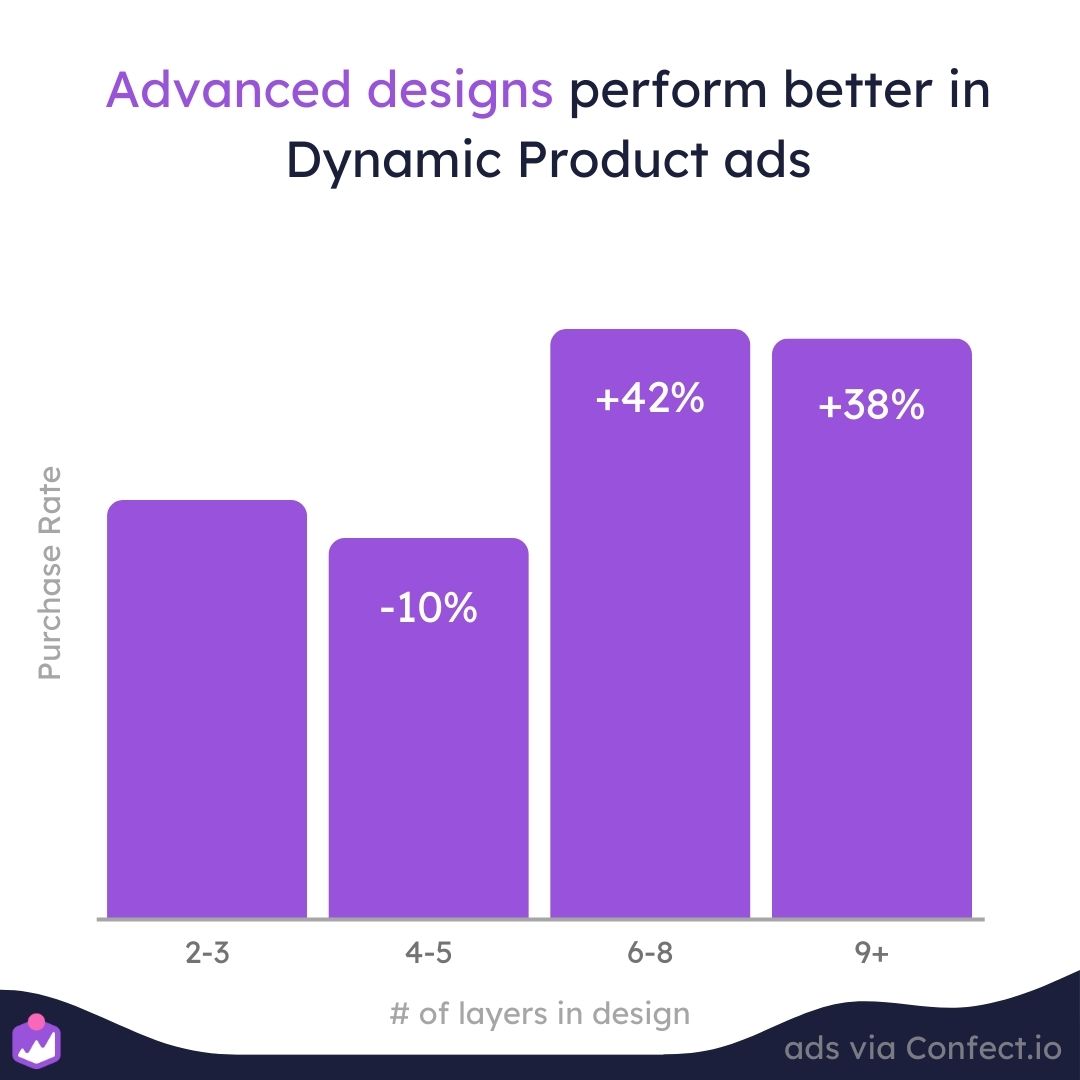
This insight shows the importance of letting a graphic designer make the designs instead of a marketer - and the importance of taking your time crafting the perfect design.
It's simply not enough to just change the background and call it a day - the more love you give your designs, the more purchases they will give you in return.
Using design rules to personalize the experience with DPA's
With Confect you can set up Design Rules - a set of rules that decides which design that is used for which product.
In other words, you can customize conditional "if else" statements like you know from email flows and specify which design to use for which type of product.
This can be showing a specific design for all your products on sale, showing a specific design for a specific category, or based on your other product information like whether the product is new, a best-seller, or alike.
By using multiple designs via these rules, you can customize the experience for the viewer and sell each product better by showing the best possible design for that product.
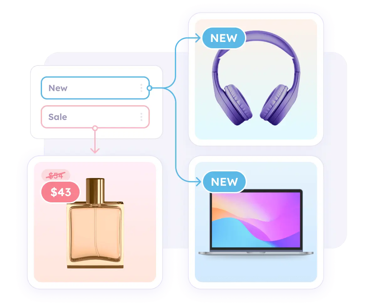
You can set up these rules based on all the information and properties you have on your products, but you can also set them up based on schedules: so you can customize the designs based on your campaign periods.
The more design rules you create, the better you customize the experience for the viewer, and that's probably also the reason we see that catalogs with more design rules perform better.
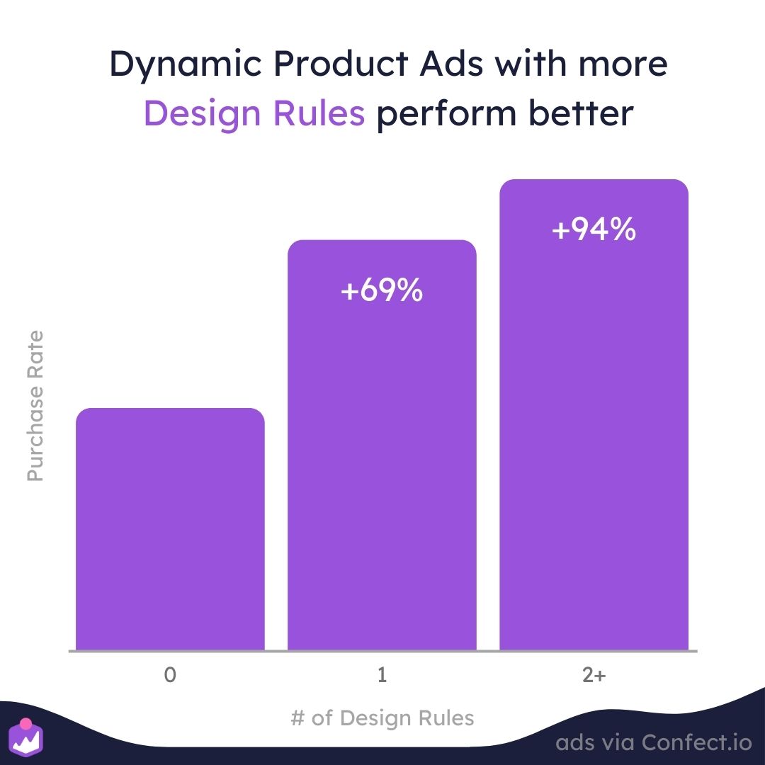
Having 1 design rule (typically used to customize if the product is on sale) on average performs 69% better than not having any design rules while having 2 or more design rules perform massively 94% better.
It's clear that the more you customize the experience with design rules, the better performance you will see.
Since your Dynamic Product ads can show a wide range of products to the viewer, it's all about crafting the best possible environment for each product. If you are a bike shop, it might be relevant to show a forest background for your mountain bikes, a city background for city bikes, and a yellow background for bikes on sale.
The more designs you use in one catalog, the better performance you will see on average.
But as mentioned earlier, design rules don't need to be based on product information; They can also be used for scheduled changes which is ideal for time-sensitive campaigns.
Showing your campaigns in your dynamic product ads
Campaigns are extremely effective - there's no doubt about that. The urgency and scarcity you create by showing a time-sensitive campaign is performing very well.
But unfortunately, campaigns are often forgotten in Dynamic Product Ads that are often seen as an always-on track of your marketing.
For ecommerce companies, this is often seen when their top-funnel ads and their front page is screaming about this new campaign, but once you are hit by their remarketing ads, it looks like business-as-usual.
But - with scheduled Design Rules, you can automatically change to a campaign design in all your Dynamic Product Ads - and let it switch back to normal after your campaign has ended.
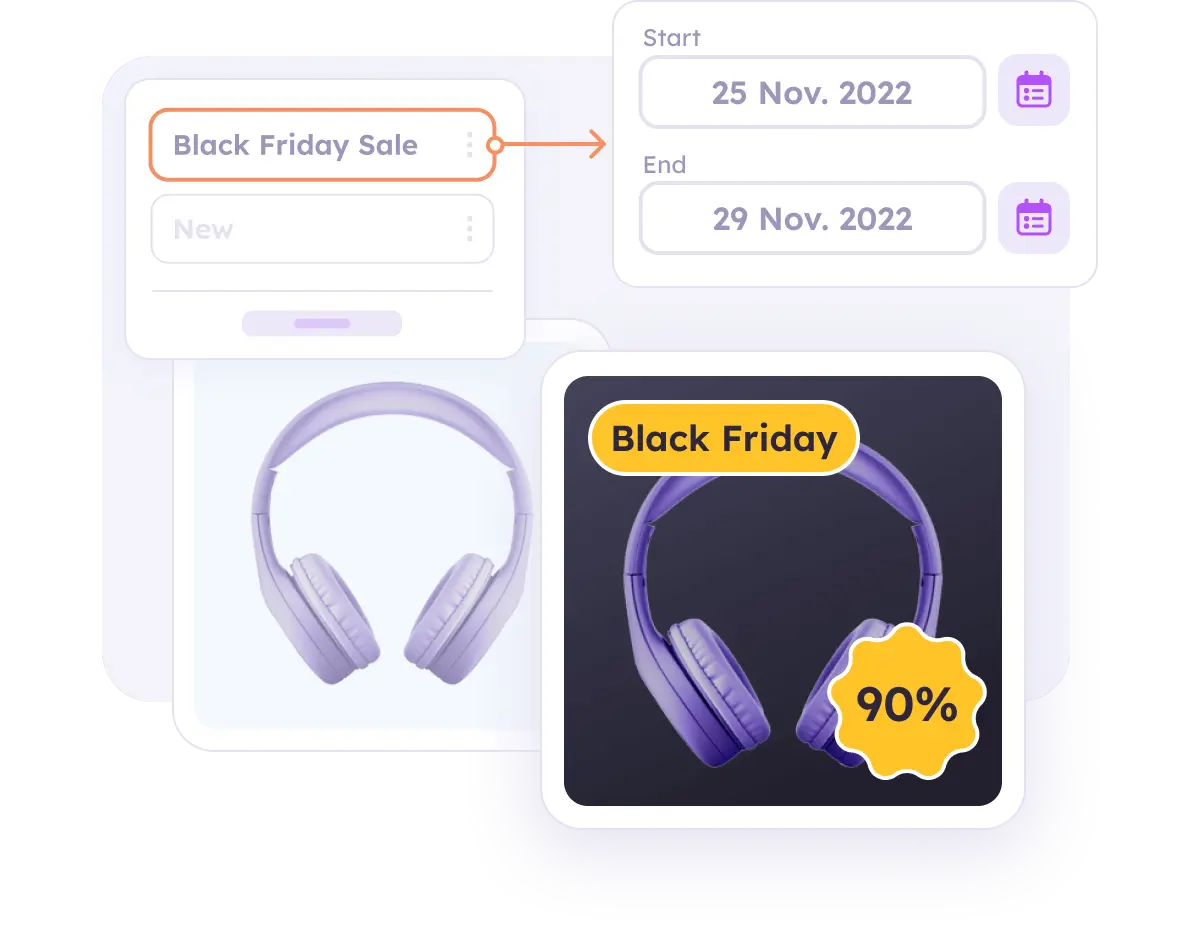
Not only is this extremely effective because of the combination of data and personalization from the Dynamic Product Ads, and the scarcity and urgency of your campaigns.
But it's also a fantastic way to synchronize your communication from your most top-funnel ads to your bottom-funnel Dynamic Ads.
Using campaigns in your Dynamic Product Ads checks all the reasons for a viewer to buy:
- The viewer is shown the specific product they are interested in, not just a random product
- They see that it's part of a time-sensitive campaign, not just a random timing
- Either they buy it now in that time-sensitive campaign, or they wait and lose this offer forever
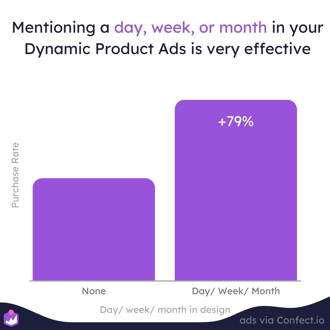
That is probably also why Dynamic Product Ads designs mentioning a day, week, or month perform 79% better than normal designs.
Not only can you utilize your campaigns and improve the urgency and scarcity of your offering, but you actually do it without restarting the learning phase - making it an extra effective tactic to use, especially for shorter campaigns.
Meta restarts the learning phase when you make changes to your ad, but it doesn't restart the learning phase when making changes to your products; but using these design rules will only make changes to your products' images, not the ad itself. That is smart!
.jpg)
In other words: You can improve the messaging of your ad by adding urgency and scarcity from a campaign, synchronizing your message across your whole funnel, but doing it without being penalized by Facebook's learning phase.
The most important campaign for almost all eCommerce companies is Black Friday. If you want to read some learnings we have seen for ads during Black Friday, based on data, you can click here.
Ad fatigue - and using dynamic product ads for always on
When people have seen your ads a lot of times, they automatically get tired of seeing them. They start filtering them out mentally and scroll faster past the ad because of boredom.
This phenomenon of viewers getting bored with ads is called ad fatigue - and it's a serious problem for advertisers.
For normal conversion campaigns, we see that performance on average drops 38% after 5 weeks and 53% after 8 weeks.
Ad fatigue is the direct opposite of the dream for many marketers; building evergreen always-on ads that keep performing, week after week.
But, if you are using Dynamic Product Ads there's great news for you: opposite of normal ads, Dynamic Product Ads are not performing worse over time.
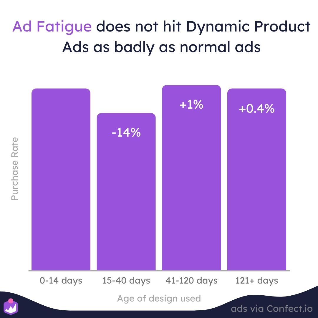
The fact that these designs perform +/- 1% the same after more than 120 days makes them a perfect ad format for always-on campaigns.
The nature of catalogs - with a lot of different products that can be shown to the viewer - also combat this automatically with its dynamic opportunities. If the viewer is tired of seeing shoes, we can just show her hats instead.
Based on this insight, the recommendation would be to keep testing until you find the best-performing design: When ad fatigue doesn't hurt your performance, your time should be used finding the recipe for the best-performing always-on design.
Inserting product text fields in your designs
When you make designs for your product feeds, you can insert text fields that are dynamically inserting product information from your shop.
This can be the name of the product, the price of the product, or any information you have on your product.
It helps your customer understand the products better when they see your Facebook ads, and that's also why we see that designs using product text fields perform better than designs without any product text fields.
 (1).jpg)
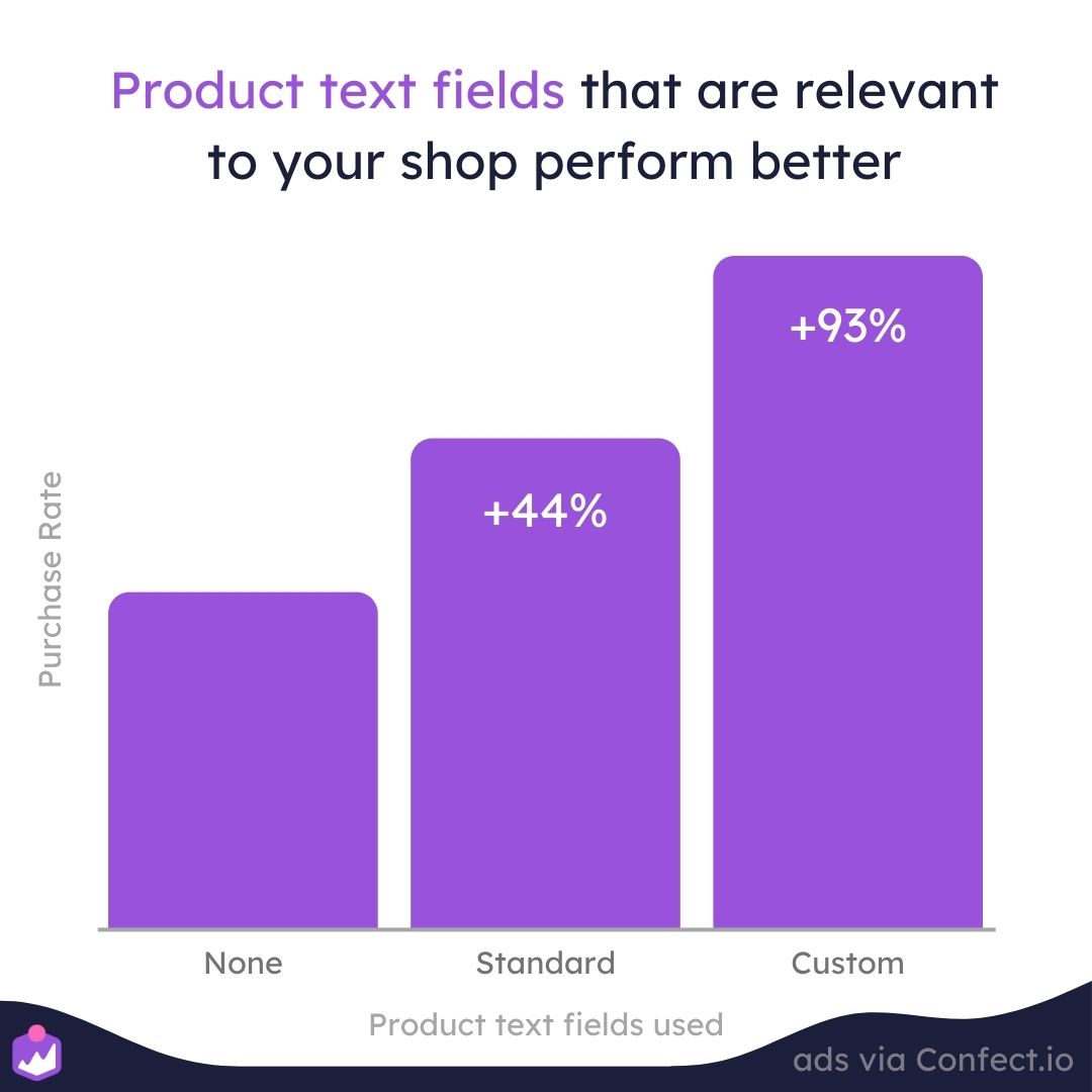
Designs using standard product text fields that all shops have perform 44% better than designs that don't have any product text fields inserted on average. Standard product fields are information like the name of the product, the price, the category, or the brand of the product.
But especially using custom product fields specific to your shop is a great idea:
On average, we see that designs using custom product text fields perform 93% better than designs not using any product text fields.
In other words, the more relevant information you insert about the product, the better your Facebook catalog ads will perform. It's the same as with design rules.
Custom product text fields are product information you have inserted custom from your shop: Either via custom_labels or properties that are specific to your industry specifically.
This can be more general information like whether it's a bestseller/ trending/ new product, how many products are left in stock, a review of the product, and alike.
But it can also be information specific to your industry:
- For wine, this can be the country or the graph of the wine
- For fashion, this can be the collection, materials used, or the Co2 footprint
- For electronics, this can be features like how many gigabytes a product has
- For food, this can be special deals or whether the product is organic or not
- For hardware, this can be the size of the product, the capabilities, or the materials
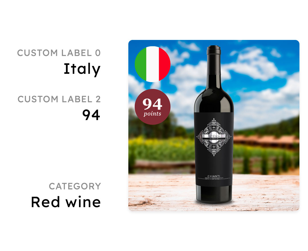
There are many opportunities to use custom product information in your catalog ads, and you should show the information your customer needs to know in order to figure out whether they should buy or not. In other words, you should insert the product information that helps the user make a buying decision.
The best custom text field to use depend on the reason why your customer should buy this specific product.
The more relevant information you show in your Dynamic Product ads, the better performance you will see.
Product information in dynamic Facebook catalog ads
So far we have learned a lot about how to use designs in your Dynamic Product Ads.
A clear learning is that the more relevant your information is to the consumer - the more you should show it.
But how relevant is the normal product information to a customer?
 (1).jpg)
How important is the price - compared to the name of the product - compared to the brand?
And will it improve your performance as an advertiser to show your logo or not?
Let's find out what information that on average performs the best in your Dynamic Product Ads designs.
Price in dynamic product ads
Money rules the world. Some even argue that prices are the foundation of our economy.
All buying decisions taken by your customers revolve around the relationship between the Cost of your product - and the Benefit of it.
Is it simply worth buying or not? That's why the price typically is the most important data point for your customer to know - in order to understand whether they want to pay your price to receive the promised benefit.
 (1) (1).jpg)
This is also why we typically see designs with prices in them having a lower Click Through Rate - because people are curious about the price. So they are more likely to click if the price is not shown.
BUT - and this is an important but - when you show the price in your ad, the people that click (knowing the price) are typically way more likely to convert on your website. They are already qualified to buy the product for your set price.
On average, a dynamic catalogue with prices perform 20% better than designs without prices. This relation is skewed towards the importance of qualifying traffic instead of making more people click.
-1.png)
You simply don't want people to click on your product just to realize they can't afford the product or at least don't want to pay that much for the product. Then they will quickly bounce, and they are not going back to your ad to find a different product.
On the other hand, sometimes the cost/ price can feel steep when you don't know the benefit of the product yet - which is typically explained on the product page.
 (1)-1.png)
So typically for retargeting it can work very well with prices when the customer already knows the benefit, while top funnel ads maybe should focus more on explaining the benefits.
For normal ads we typically see a 25% performance increase for ads showing prices, but especially around payday, the performance goes up. Read more about showing prices in your ads as an eCommerce company.
Showing savings and discounts
As you've read in the price section, the cost/ benefit evaluation is important for your customers. But there's one effective way to quickly lower the perceived cost: Giving a discount or a saving.
People love a great deal, and we typically see that ads for sales or discounts are the best-performing type of ads an eCommerce company can run.
.jpg)
One thing is that the cost of the product is lowered - which of course is important - but it's not the most significant reason that discounts are working so well.
If a product is discounted, it's typically only for a short period - so if you are interested in the product and it's on sale right now, you will have to act RIGHT NOW to get the deal.
Savings are simply a great way of using both scarcity and urgency - which is also why we see that designs with savings and discounts in them on average perform 45% better than designs without.
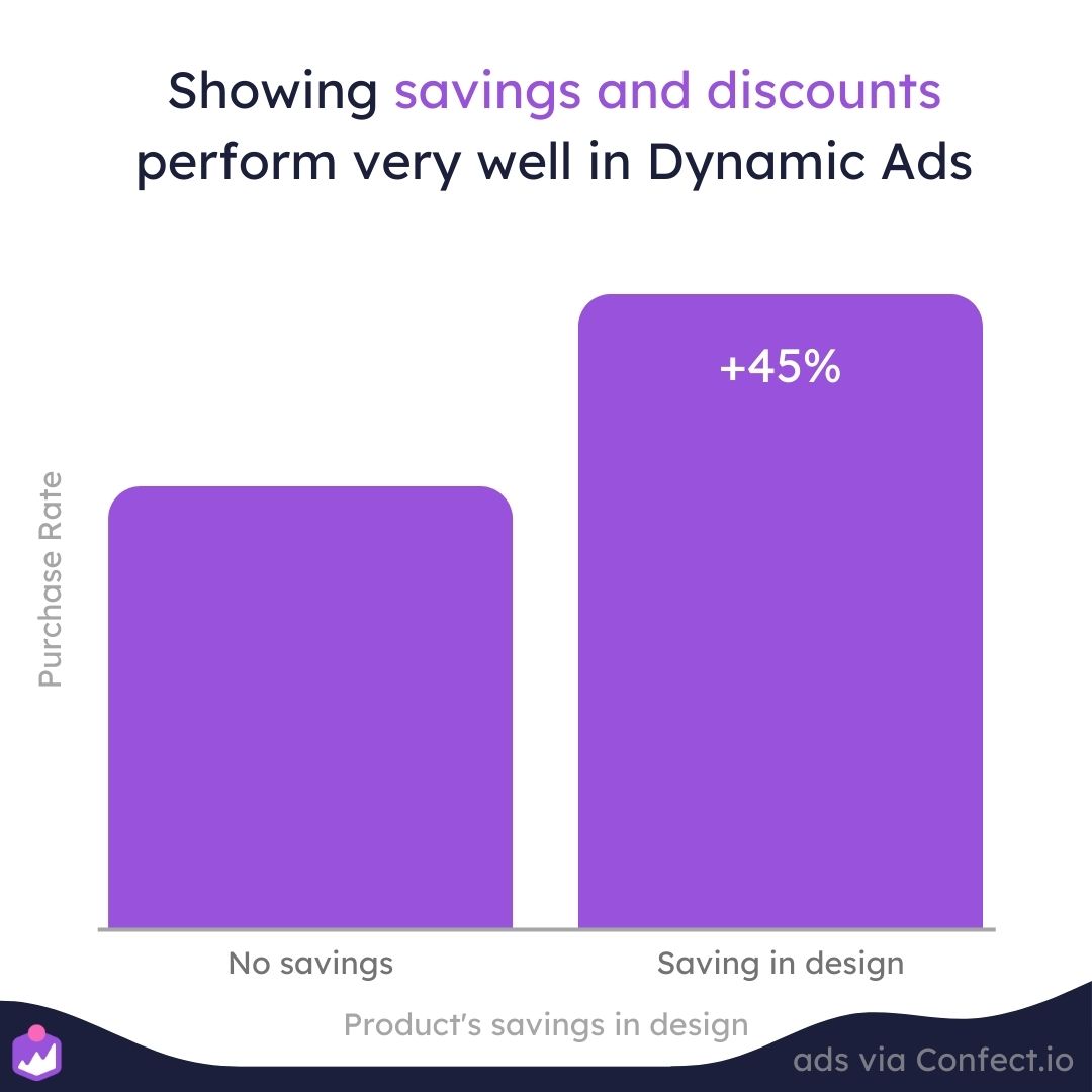
You can show the saving in either percentage (40% off) or in the monetary value (save $19), but no matter what - if you have a discounted product, you should show the discount. That's a big reason for people to buy that product - and maybe the biggest selling proposition for the product.
But - should you show the percentage saving or the monetary saving? Science suggests that for products with low prices, the discount should be shown in percentage to make it feel like a big saving - while expensive products should have their discount shown in the monetary currency.
 (1).jpg)
In his book, Contagious: Why things catch on, Jonah Berger invented the rule of 100:
"If the product’s price is less than $100, the Rule of 100 says that percentage discounts will seem larger. For a $30 T-shirt or a $15 entrée, even a $3 discount is still a relatively small number. But percentage-wise (10 percent or 20 percent), that same discount looks much bigger."
If you aim to show the saving/ discount in your design look into duplicating your original design into a sale version: That you can then apply to your Facebook catalog ads via a design rule.
If you want to learn more about sales, we have also written an article on how to make the best possible sale campaign (backed by data).
Name of the product
The first product text field a lot of Confect users insert in their design is the name of the product. And it also makes sense: In order to buy, you need to understand what you're buying.
But - this is a very risky design choice in your Dynamic Product Ads - the name is one of the worse product text fields you can use on average. Design templates that include the name of the product perform 30% worse on average.
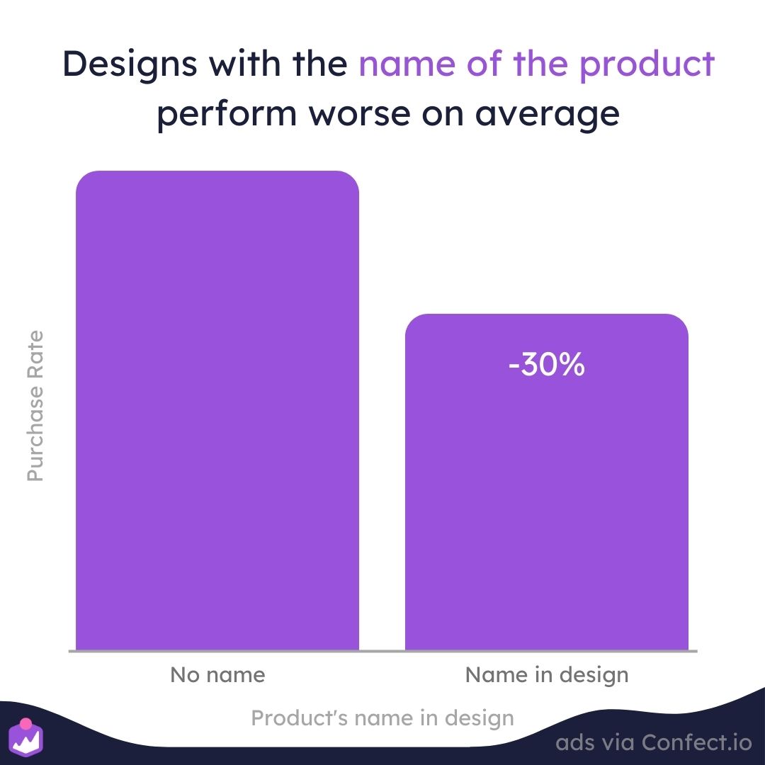
People can already see which product you are showing, so typically there's not a lot of valuable information in this specific product text field. Often it's also written in the ad copy or title already, so the information (that isn't too important) is just repeated twice.
If the name is irrelevant to the viewer - not adding value or new important information - it will probably just make the design more cluttered, taking away attention from the things and product text fields that actually is important to make people buy.
Showing the brand of the product
A lot of consumers are very brand-focused. Especially when it comes to products that they care about; Then the brand can be the primary needed information to make a buying decision.
Brands are essential to redirect the customer to a product matching their expectations: Therefore they are great at making people click on products that are relevant to them - giving you highly qualified traffic.
 (1).jpg)
You simply don't want people to click on a product from a brand they would never buy from; Whether it's because the product/brand is too cheap, too expensive, or has a reputation of something the customer doesn't want.
Dynamic Product Ads showing the brand of the product on average perform 43% better than Dynamic Product Ads that don't.
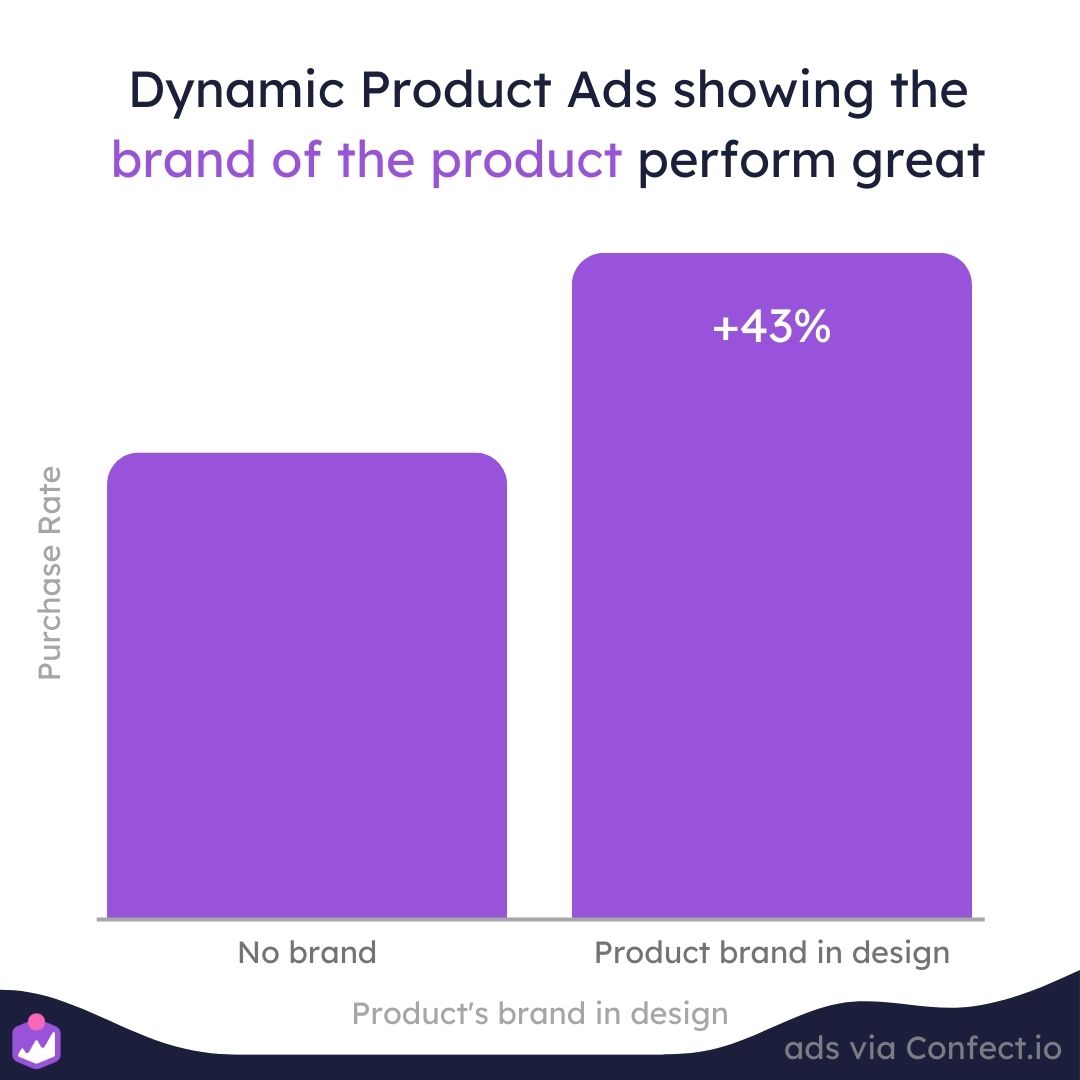
The brand can either be shown in the text - by writing the brand name - or visually shown via Product Assets. With Product assets, you can show a Nike logo for products with brand = Nike, an Adidas logo for products with brand = Adidas, and so on.
Some advertisers even use this to negotiate better procurement agreements and prices with the brands since they advertise their brand - and some even charge the brands for this opportunity, so the brand will have to pay to get their logo shown in the webshop's Facebook catalog ads.
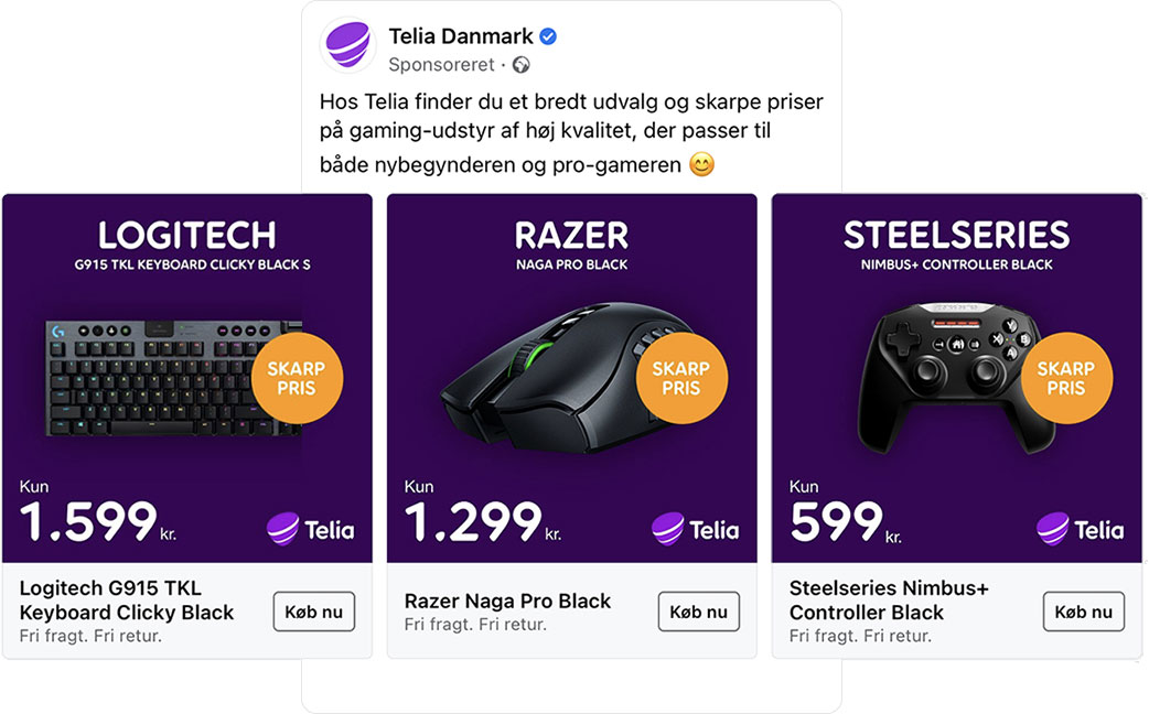
Be aware that for very high-end products like Gucci or Versace, using the logo might increase the Click Through Rate a lot but hurt your Conversion Rate a lot - giving you extremely unqualified traffic to buy. This is because of the curiosity around these state-of-the-art products that people want to see or learn about it but will never spend the money actually buying them.
Therefore for high-end brands, it might be a good idea to showcase the price together with the brand so you get the right customers - that are willing to pay - instead of window shoppers.
Showing information visually via product assets
As said many times in this analysis, if you have relevant or important information about a product, you should add it to your Dynamic Product Ads design.
But since we are human beings with brains - and our brains process visual elements much faster than it reads text - it can be effective to use images instead of text to show the information. And this is where Product Assets show up.
Showing the brand logo, like the Nike swoosh, will grab attention and convey the information way faster than writing the brand name in text.
Designs with Product Assets in them perform 27% better on average in your Dynamic Product Ads.
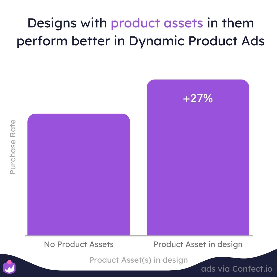
But there are many more options than only showing the brand logo via Product Assets.
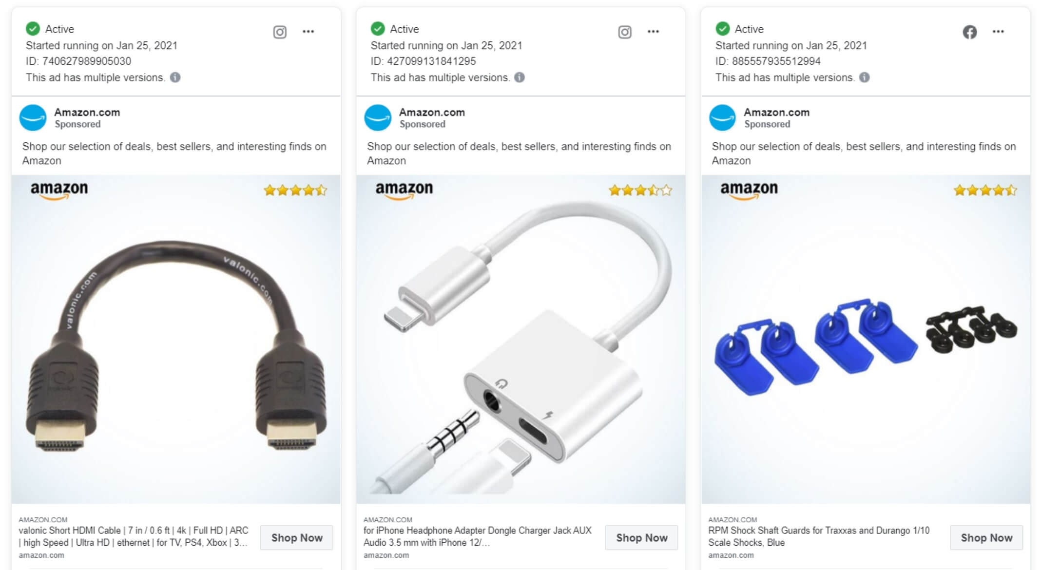
You can also use Product Assets to show the rating of your product in stars - whether it's rated 4 stars or 5 stars. Amazon is doing this by only showing three things in their Dynamic Product Ads: The product image, their logo, and a product asset with the rating of the product in stars.
Or you can use it to show other relevant information:
- Like a pet food store showing a cat/ dog based on the category
- Showing the flag for the country in which the product is produced in
- Showing whether a product is organic or not
- Showing the energy efficiency class of your electronics products
- Showing specific backgrounds based on the category of your product
- Showing your features visually instead of via text
Aim to show relevant information to the viewer - instead of telling it. It's the quickest way to convey important information to your customers' brains.
Inserting your logo in your catalog ads
It's the most important and distinct brand asset your company has: Your logo.
And most marketers like to show the logo in all their marketing - with good reasoning, since it improves your brand and builds mental availability in the mind of your customers.
But - is it effective to include your logo in your Dynamic Product Ads, now your name is already shown in the ad by Facebook and Instagram, with Facebook even showing your logo on top of the ad?
This is especially an interesting dilemma for carousel ads - where the design and products are repeated multiple times, showing your logo a lot of times in the ad.
Here's an insight brand-focused marketers will love: Dynamic Product Ads showing the advertiser's logo perform 43% better on average.
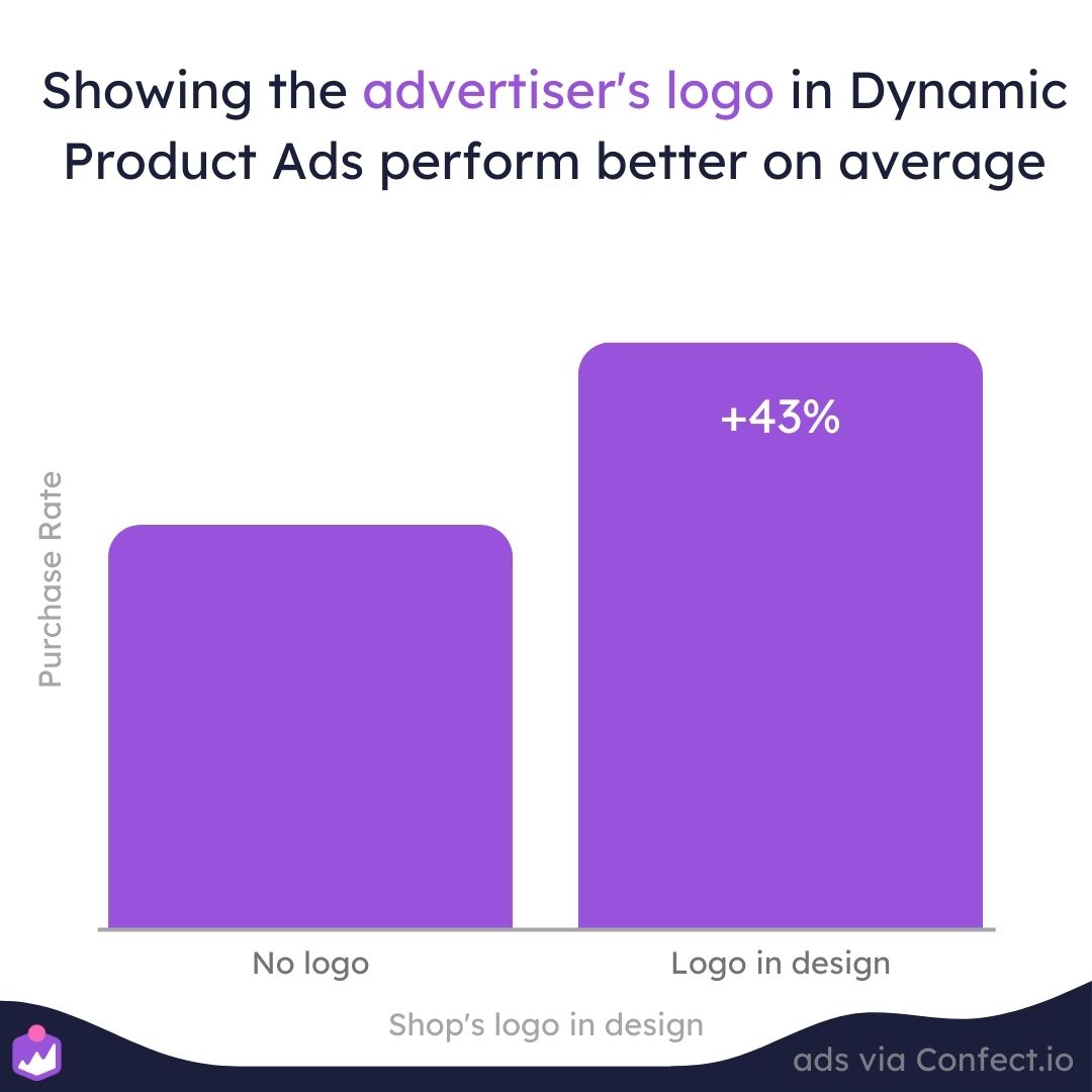
If the viewer knows your brand - and trust it - they are more likely to buy. People trust ads with a logo in them more because it shows the sender of the message. And especially for bigger brands, where the person watching knows the brand, it can be effective.
This is also why we see that large brands perform much better with their logo in the design - where small brands often perform worse when showing their brands.
 (1) (1).jpg)
Adding your logo as a small brand can create doubt in the mind of the consumer since they don't trust you. If you are a small brand, you should try to remove this doubt on the landing page - eventually, with reviews and other trustworthy information.
Be aware that this differs a lot - if you want to learn about when to use your logo in top funnel and bottom funnel ads then click here.
How much text to insert in your dynamic product ads
In this analysis, we have looked at a lot of data - showing which elements and design choices correlate with better performance and which elements and design choices correlate with worse performance.
But which of these design choices should you then include in your Facebook catalog ads design? You probably can't include all of them at one time.
The biggest takeaway here is that designs without any text in them perform the worse. Adding no information at all, either about the product or the shop, is simply performing the worst.
On average Dynamic Product ads without any text in their images perform the worst.
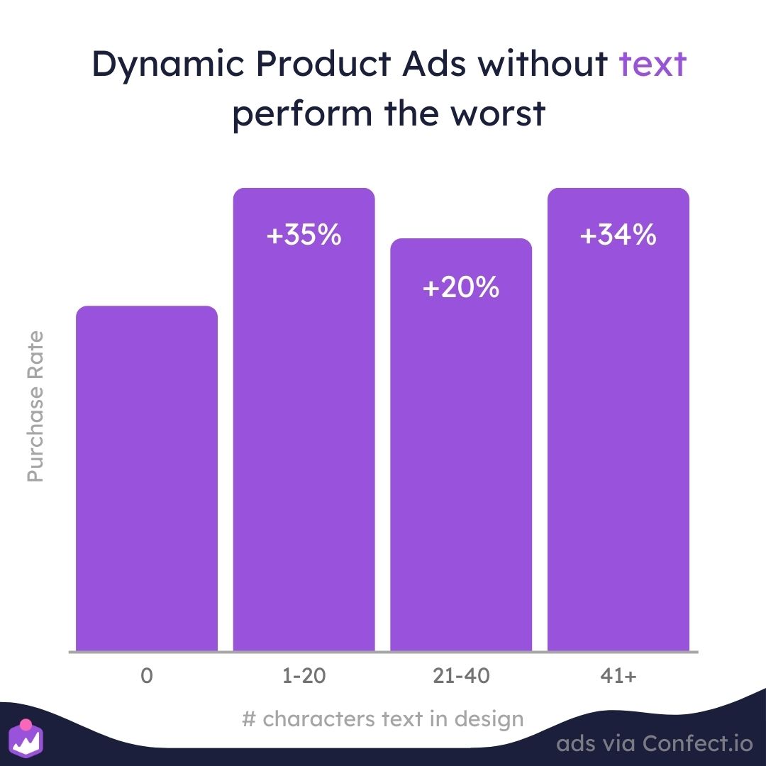
The difference in whether your text amount is 1 character or 50 characters doesn't change performance too much on average - it depends a lot on the single case.
A rule of thumb we see again and again in split tests is that if you have some very relevant information, you should write it - but try not to include irrelevant information.
Relevant information can change over time: If you are currently running a campaign, this might be the most important information. If you are showing your Dynamic Product Ads for prospecting, it might be the features that are the most important information. If you are using Dynamic Product Ads heavily for retargeting, the price and shipping information might be the most important information.
So, as a rule of thumb, always add text: But if you don't have a lot of interesting information, then try to keep it simple.
If you want to learn about the perfect text amount for normal ads, you can read about that here.
Quick summary and conclusion
That was a lot of information - and a lot of data - on how to optimize your Dynamic Product Ads on Facebook, Instagram, and so on.
And what have we learned - here 1.5 billion impressions, 46.4 million clicks, 739.772 purchases, 1.456 different designs, and 379 product feeds later - on how to improve your Dynamic Product Ads?
Here's a "too long; didn't read"-version of the average performance of different design choices:
Designs with more layers perform the best: designs with 6+ layers perform 38%-42% better than 2-3 layers.
Dynamic Product Ads with more Design Rules perform the best: 1 Design rule performs 69% better than no rules, and 2+ design rules perform +94% better than no design rules.
Using campaigns in your Dynamic Product Ads performs the best: Designs mentioning a day, week, or month perform 79% better.
Ad Fatigue does not hit Dynamic Product Ads as badly as normal ads: Actually, it doesn't really hit, making Dynamic Product Ads ideal for Always on.
The more relevant information you insert in your designs, the better performance: Designs with standard product text fields perform 44% better than designs without product text fields, while designs with custom product text fields perform 93% better than designs without product text fields.
And, here's a recap of how different product information influences the performance of your Dynamic Product Ads:
Designs showing the price perform 20% better on average.
Designs showing savings and discounts perform 45% better on average.
Designs showing the name of the product perform 30% worse on average.
Designs showing the brand of the product perform 43% better on average.
Designs using Product Assets perform 27% better on average.
Designs showing the advertiser's logo perform 43% better on average.
Designs with text in them perform 20-35% better on average than designs without text.
But remember - and this is important - all these insights are averages across a lot of industries, countries, brand sizes, price ranges, funnel steps, and alike.
The numbers are also only looking at correlation, not necessarily causation. There might be more factors and variables influencing the performance differences, and those are hard to isolate in an analysis like this.
The most important thing is to A/B test different designs to find the optimal design for your company and brand. Use these insights for building hypotheses, but always split test the different options in order to find the best-performing design.
All the companies in this analysis are using Confect to customize their Dynamic Product Ads. You can read more about how to customize your Dynamic Product Ads here.
