
45 Black Friday Catalog Ad Examples for Meta Ads (2026)
Planning your Black Friday Meta Ads can feel like staring at a blank page. You know your Facebook and Instagram Ads need to stand out during the busiest shopping week of the year, but where do you start?
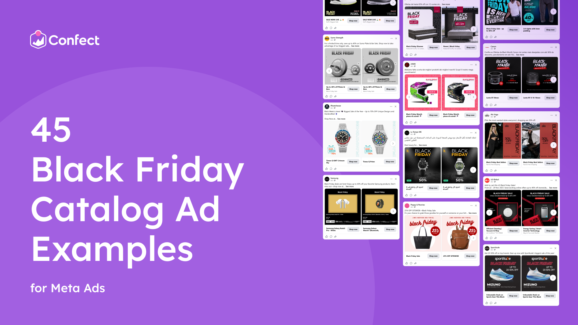
Start here. We went through 17,000 Black Friday Catalog Ads running on Facebook and Instagram and handpicked the 45 best, from small shops and global brands across sports gear, fashion, watches, beds, headphones, sneakers and more. It’s one of the largest collections of Black Friday Meta Catalog Ads you’ll find in one place.
Most Facebook Catalog Ads and Instagram Catalog Ads still run on a plain product photo and during Black Friday that’s exactly what shoppers scroll past. A strong design shows the deal clearly, makes your brand recognizable and gives shoppers a reason to stop. And because one template covers your entire catalog, a single good design decision upgrades every dynamic product ad you run.
You don’t need all 45. You need the one or two that fit your products and your brand. Here’s how to find them:
- Scroll through the ads below and note the ones that catch your eye.
- Read why each one works to understand the design choice behind it.
- Pick one or two ideas and apply them to your own Meta Catalog Ads before Black Friday.
See an ad you like? ClickRecreate with Confect.Confect's AI rebuilds it as a Catalog Ad template filled with your own products.
Let’s dive in.
Table of contents
- Clear price and savings
- Neon price you can't miss
- Black Friday, top to bottom
- Turn every product into a Black Friday gift
- A bold Black Friday
- Let the product fill the frame
- A Black Friday frame
- A hidden lens
- "We never do this"
- Big Black Friday Letters
- The product under the spotlight
- A framed product with the full deal below
- Buy more, pay less
- A real price tag
- Show it at home
- Availability and free shipping
- A double Black Friday discount
- Glowing Black Friday
- The calm Black Friday Ad
- Lowest prices ever
- Colorful ribbons around a Black Friday Deal
- Three angles, like a product page
- The product steps in front
- Let a bold red frame do the shouting
- A face, a price and a full stop
- Mix fonts for a luxe Black Friday look
- The deal in one line
- Make Black Friday impossible to miss
- One detail in each corner
- Make the price impossible to miss
- Let a huge red price do the talking and the ratings seal the deal
- Take ratings a step further
- Lead with the look
- Neon strip to stop the scroll
- Photo grid and an app perk
- A label like a price tag on a shelf
- An extra code on top of a big discount
- Turn one product into a reason to buy more
- A real sticker for a real deal
- Push the coupon code
- Make Black Friday your own
- Bold title with a hero product
- Big black discount
- Big savings badge with a sticker
- Let the brand sell the deal
Clear price and savings
The whole ad is in shades of grey, matching the black rubber plates it’s selling. In a Black Friday feed full of red banners and flashing percentages, the restrained palette stands out while still looking on theme. The barbell sits at an angle, with the large plate close to the camera and the small one fading into the background, which gives the set real weight and depth.
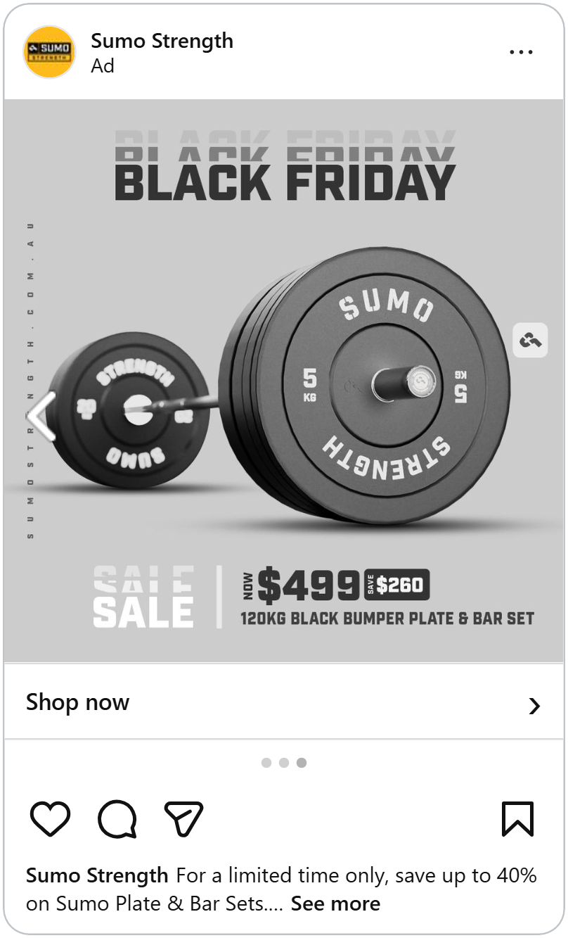
“Black Friday” appears twice at the top: once in solid dark grey, and once above it, faded and cut off, like an echo. “Sale” at the bottom gets the same treatment. The repeated type suggests motion in a still image, which helps stop the scroll without needing video.
Next to “Sale” is the offer: “Now $499,” a dark tag reading “Save $260,” and the full product name, “120kg Black Bumper Plate & Bar Set.” Showing the saving in dollars rather than as a percentage is a smart choice here. On a higher-priced item, $260 off feels bigger than “34% off,” even though it’s the same discount. The exact product name and weight also matter during Black Friday, when shoppers are comparing the same deal across several stores and want to know precisely what they’re getting.
See how showing the price can lift your ad's performance.
Neon price you can't miss
This shoe ad skips the usual “Black Friday” headline and opens with the price. “€60.99” sits at the top in large glowing neon yellow, right above the shoe, so it’s the first thing anyone sees. On Black Friday, shoppers scroll looking for a number and this ad hands it to them instantly.
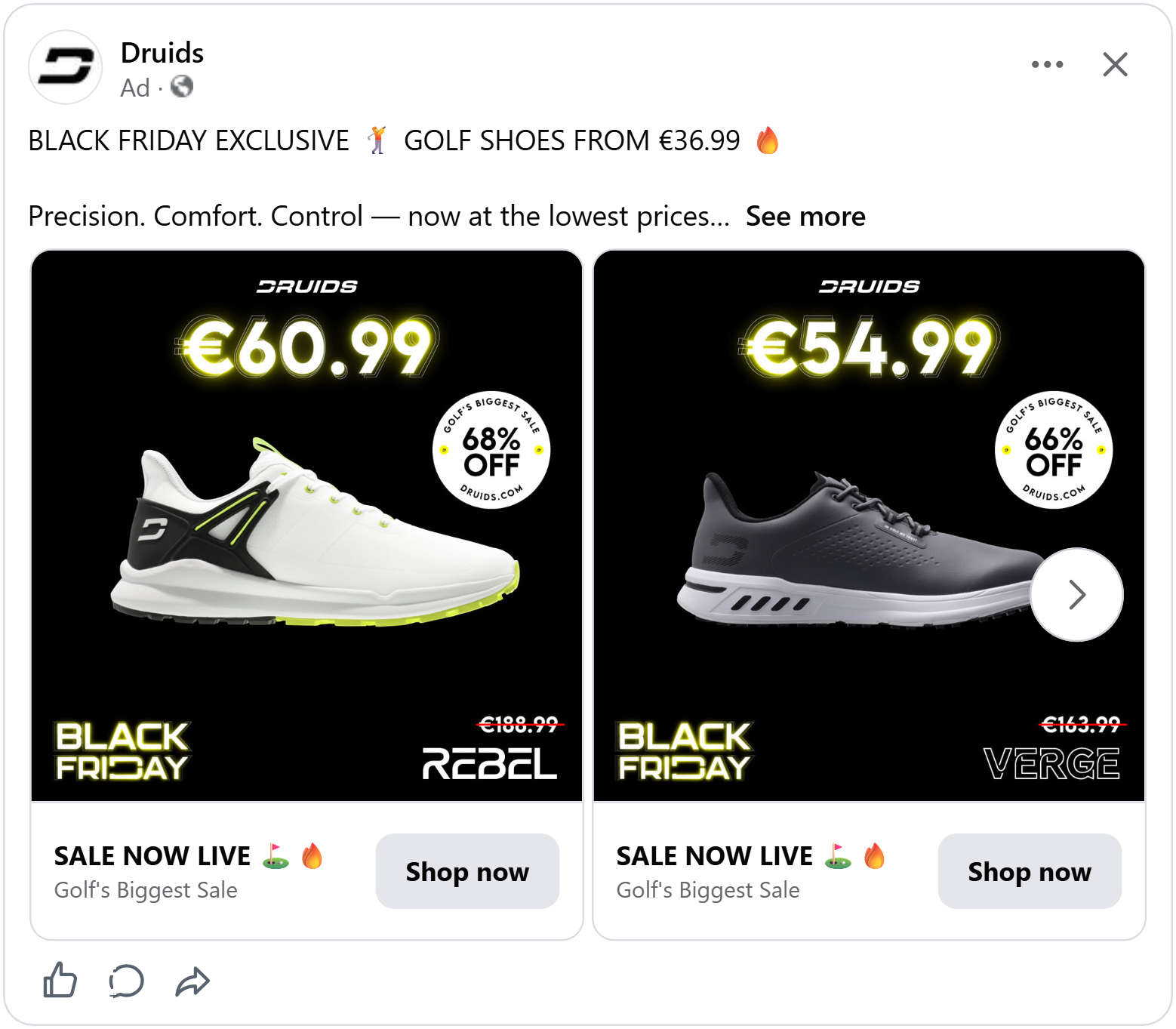
The shoe sits in the center on black, with a round white badge tucked off to the side: “Golf’s biggest sale, 68% off.” Because it breaks the symmetry, the eye jumps from the shoe straight to the size of the discount.
The bottom corners balance each other out. “Black Friday” in neon outline sits on the left and on the right, the crossed-out “€188.99” sits above the shoe’s model name, “Rebel.”
The event, the original price and the product name each get their own corner without competing with the hero price.
Black Friday, top to bottom
Half of this ad is a street-style photo: a woman in a black crop top, leggings and sunglasses, walking past a car at night. It looks like a picture a fashion magazine would print.
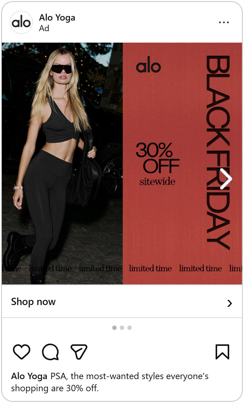
The other half is a warm red panel. "Black Friday" runs down the right edge from top to bottom, in tall, thin letters. In the middle, "30% off sitewide," with "sitewide" in a different, softer font. Along the bottom of the whole ad, a line of small text repeats "limited time."
Writing the headline sideways is a clever space-saver. The photo keeps all its room, and the headline still runs the full height of the ad.
Turn every product into a Black Friday gift
This ad is designed like an open gift box. The product sits inside a red-framed box, the lid with “Black Friday” printed on it is pushed to the bottom corner and red ribbons reading “LG Black Friday” stretch across the black background. It turns a sale into something that feels like a present, which fits the season when many shoppers are buying gifts.
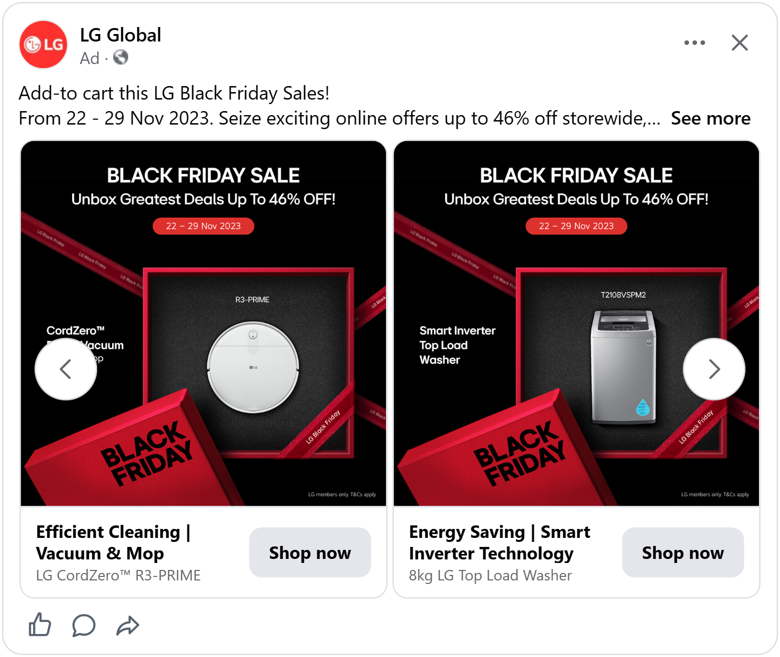
At the top, “Black Friday Sale” sits in big white letters, followed by “Unbox greatest deals up to 46% off!”, the wording matches the box design and “up to 46%” signals big savings across the range. Below it, the sale dates in a red pill tell shoppers exactly how long they have.
The product details are kept simple: the product type on the left (“Smart Inverter Top Load Washer”) and the model number above the product, so shoppers know exactly what they’re looking at.
Learn how to give your Catalog Ads a campaign look that sells.
A bold Black Friday
The first thing you see in this ad is the headline: “Black Friday” in large black and burgundy letters and a burgundy “62% off” badge right underneath. The title tells shoppers it’s a Black Friday deal and the badge tells them how big it is, all at first glance.
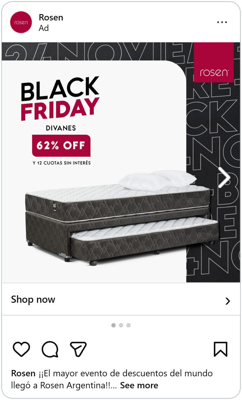
Below sits the product: a bed with a second mattress pulled out underneath, placed on a clean white card. The white space keeps the bed and the offer easy to read.
Behind the card, on a dark background, huge outlined letters repeat “November” and “Black Friday,” cut off at the edges. You don’t need to read them all. They fill the background with Black Friday energy and make the white card pop.
Let the product fill the frame
A watch fills almost the entire ad, on a plain light background. You can count the dots on the dial and read every number on the bezel. For watch lovers, that detail is the reason to stop scrolling.
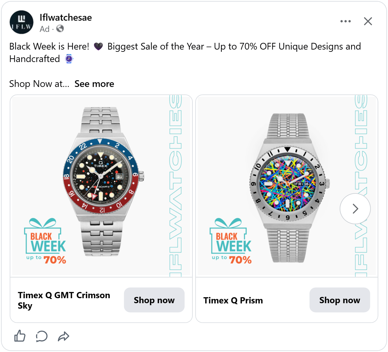
Everything else stays out of the way. The shop’s name, “IFLWatches,” runs down the right edge in thin teal outlines. In the bottom left corner sits a small gift box drawing with “Black Week, up to 70%” in teal and orange. The gift box hints at holiday shopping and “Black Week” stretches the sale beyond a single day, giving shoppers more time to buy.
The teal in the badge matches the teal of the shop’s name, so the two side elements feel like one frame around the watch. The product gets the space, the deal gets a clear corner.
A Black Friday frame
This motocross helmet sits on a white card wrapped in a thick pink border, with “Black Friday” running around all four sides. Wherever the eye lands, the sale is there. It’s an easy way to turn any product photo into a Black Friday ad and because the frame is the same on every card, the whole catalog instantly looks like part of one sale.
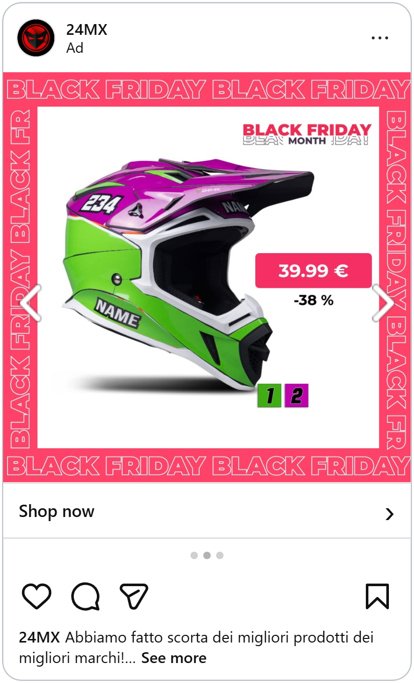
Inside the frame, next to the helmet, sits the price: “39.99 €” in a pink pill, with “-38%” right below it. The pink matches the border, so the price is the one element inside the card that clearly belongs to the sale. Shoppers see the price first and the discount second, which answers both questions they have on Black Friday: how much is it, and how good is the deal.
In the top right corner, a smaller “Black Friday Month” title reminds shoppers the sale runs all month, not just one day.
More ways to frame your products.
A hidden lens
“Black Month” is painted at the top in white brush letters, and the “O” in “Month” is a camera lens. It’s a small detail that ties the sale straight to the product, and photographers will notice it. Below it, a red brush stroke reads “Deals up to 30% off.”
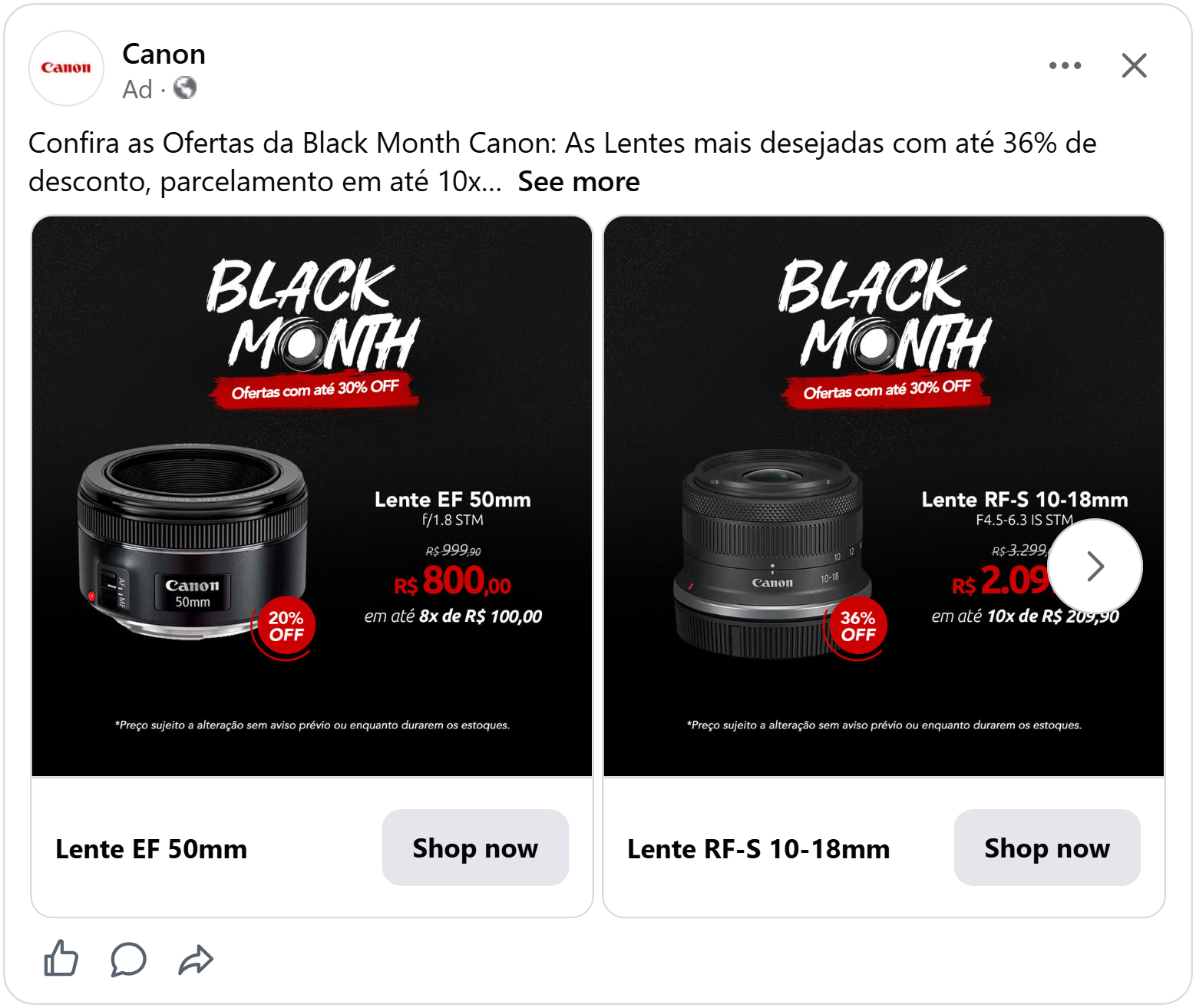
The lens sits on the left with a red discount badge at its base, “20% off” on the EF 50mm, placed right on the product so the saving is attached to what you’re buying. On the right is the full price block: the lens name and specs, the old price crossed out, the new price in big red numbers and the option to pay in 8 instalments.
The red ties it all together. The brush stroke, the discount badge and the new price share the same color on a black background, so the eye goes straight from the headline to the deal. Swipe through and every lens follows the same layout, only the product, prices and discount change.
"We never do this"
The first thing you read in this ad is a small line in red capital letters: (We never do this). Then, underneath, "black friday" in big, curly red letters.
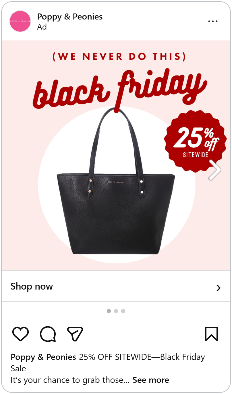
A black leather tote bag hangs in the middle, on a white circle against a pale pink background. Its handle almost touches the word "friday," like the bag is hanging from it. A red badge with wavy edges says "25% off sitewide."
That little line in brackets does a lot. It tells shoppers this sale is rare, so they should pay attention. It also sounds like a real person talking, a bit shy about having a sale at all, which makes the brand feel friendly.
Big Black Friday Letters
The first thing you see in this ad is “Black Friday” glowing in neon red, right above a bright blue Mizuno running shoe. The red and blue are the only strong colors on the dark striped background, so the title and the product grab attention before anything else.
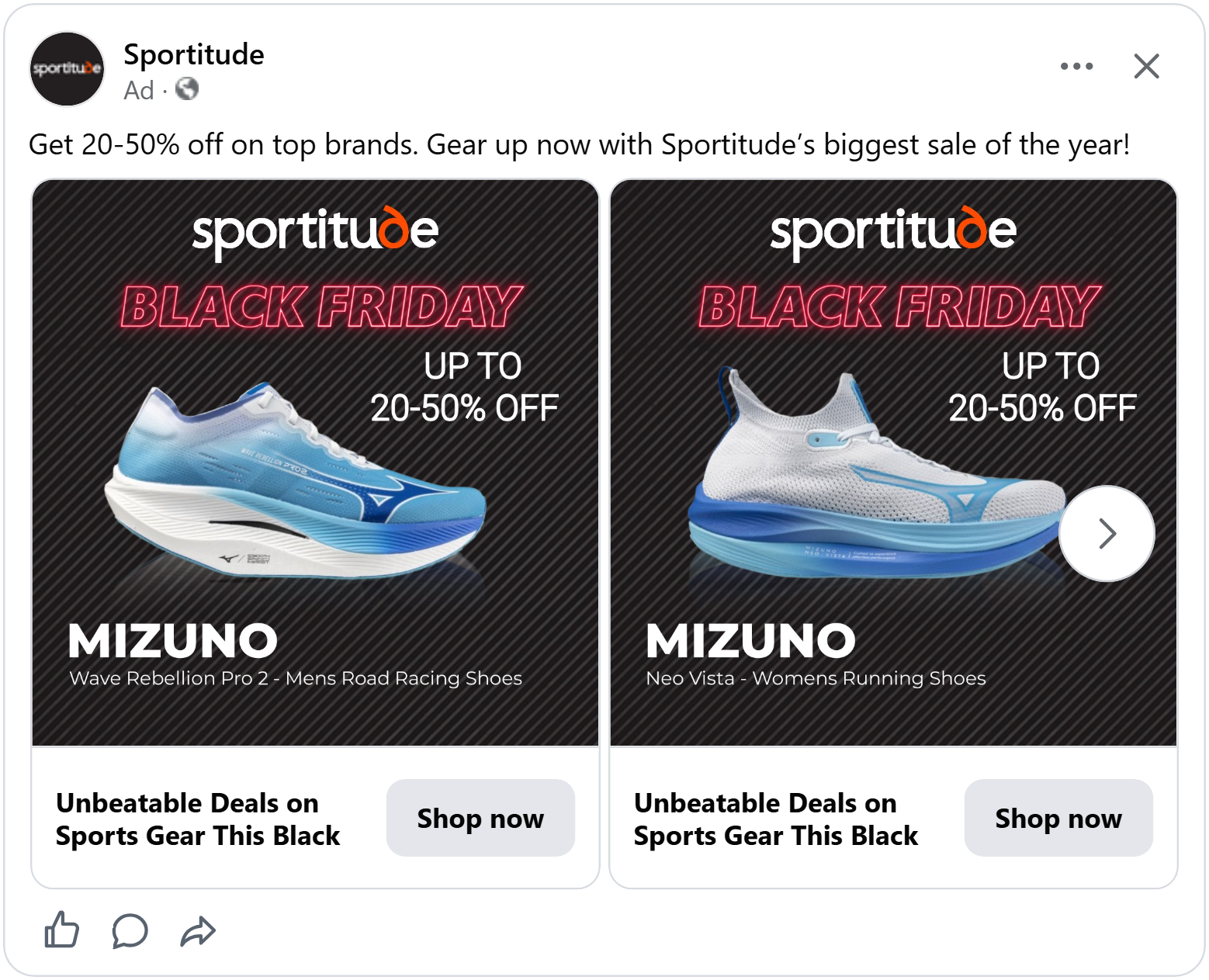
Next, your eye moves to “Up to 20-50% off” on the right. It’s simple white text, but it tells shoppers straight away how big the sale is. Above it all sits the Sportitude logo, with its orange “d” adding a small pop of color that keeps the store name visible.
The dark background with thin diagonal stripes sets the Black Friday mood without needing extra graphics and it makes the neon title and the shoe stand out even more. At the bottom, “MIZUNO” in bold white letters and the full model name let runners recognise the exact shoe they’re looking for.
The product under the spotlight
This ad turns the product into a star on stage. Two beams of light shine down onto a dark, scratched floor, with tiny sparkles floating in the air. In the middle of the light stands an Atomico chronograph with a black leather strap and white stitching.
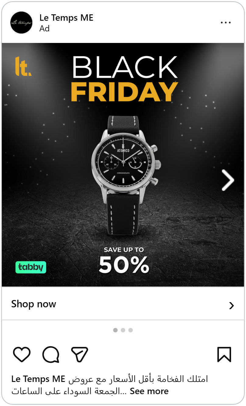
Above the product, “Black” sits in thin white letters with “Friday” in bold gold underneath. The gold matches the Le Temps logo in the top left corner, so the sale and the store look like they belong together.
Below the watch, “Save up to 50%” in big white numbers gives shoppers the size of the deal right after they’ve seen the product. In the bottom left, a small green Tabby logo lets shoppers know they can pay later, without pulling attention away from the watch.
A framed product with the full deal below
The first thing you see in this ad is the product. A pair of white earbuds sits in the center of a gold panel with a soft, raised edge, like a picture in a frame, and nothing else touches it. Right above the frame, a simple “Black Friday” title tells shoppers this is a sale.
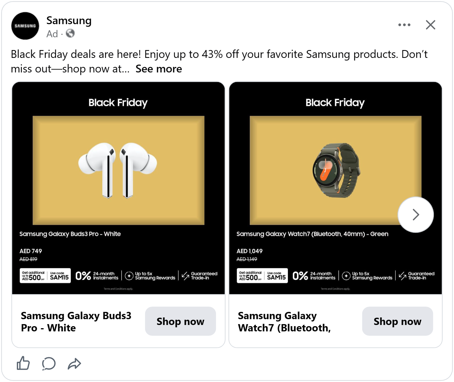
Everything needed to make a decision sits at the bottom. The product name comes first, then the new price in slightly larger text, with the old price crossed out right below it. Seeing both prices together shows the saving instantly, without needing a percentage badge.
Under the price, one row lists the extra perks: an additional discount code, 0% instalments, bonus rewards and a guaranteed trade-in. With the product, the sale and every detail of the offer in one view, shoppers can decide to buy on the spot, which is exactly what you want when Black Friday deals only last a few days.
Buy more, pay less
The first thing you see in this ad is the big yellow paint splash in the top left corner with “Black Friday Sale” in bold black letters. It’s the brightest thing in the ad, so the sale grabs your attention right away. The yellow is also Bummer’s brand color and it’s picked up again in the thin yellow line on the briefs’ waistband.
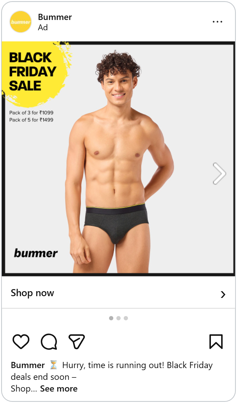
Next, your eye moves to the model, smiling in dark grey briefs against a plain light grey background. With nothing else around him, the product is easy to see.
Then come two small lines under the splash: “Pack of 3 for ₹1099” and “Pack of 5 for ₹1499.” No percentage, no crossed-out price. Underwear is something people buy several of anyway, so instead of a discount, the ad offers more for less: two extra pairs for just ₹400 more. On Black Friday, bundles like this are a simple way to get shoppers to add more to their cart.
See more price tricks that make shoppers buy more.
A real price tag
The first thing you see in this ad is the black price tag hanging at the top: “Up to 70% off.” It looks just like a real tag you’d find in a store, so the discount reads instantly. Tied to it with a string are two speech-bubble labels, one orange and one black, that spell out “Black Friday.” The deal and the event come as one piece, and the bright orange makes sure you notice it.
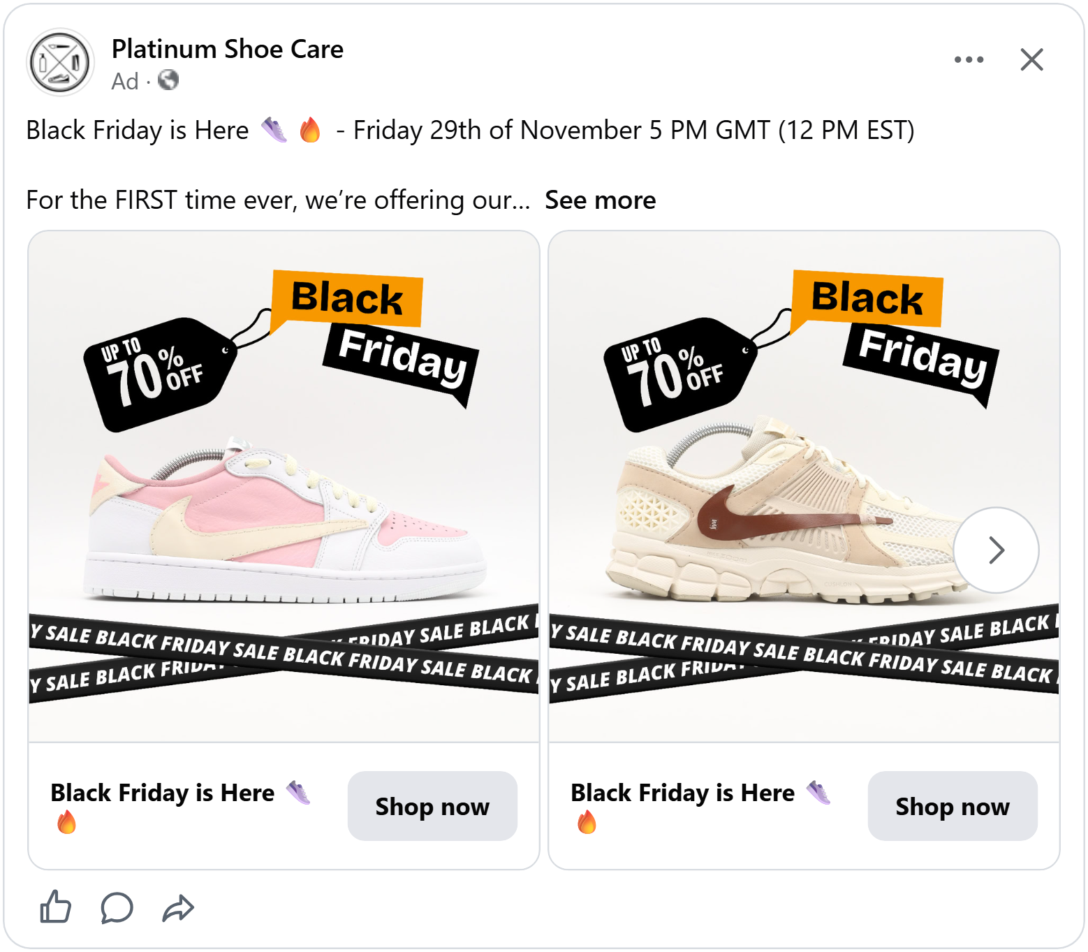
Next, your eye moves down to the sneaker, sitting on a clean white background with nothing around it, so the product is easy to see.
At the bottom, two black tapes cross each other with “Black Friday sale” printed along them, like caution tape. They frame the shoe from below, add energy, and remind shoppers one more time that the sale is on.
Show it at home
The first thing you see in this ad is the price. It sits in huge orange numbers on a black panel, with the old price crossed out right below it. The size of the numbers and the bright orange on black make the deal impossible to miss.
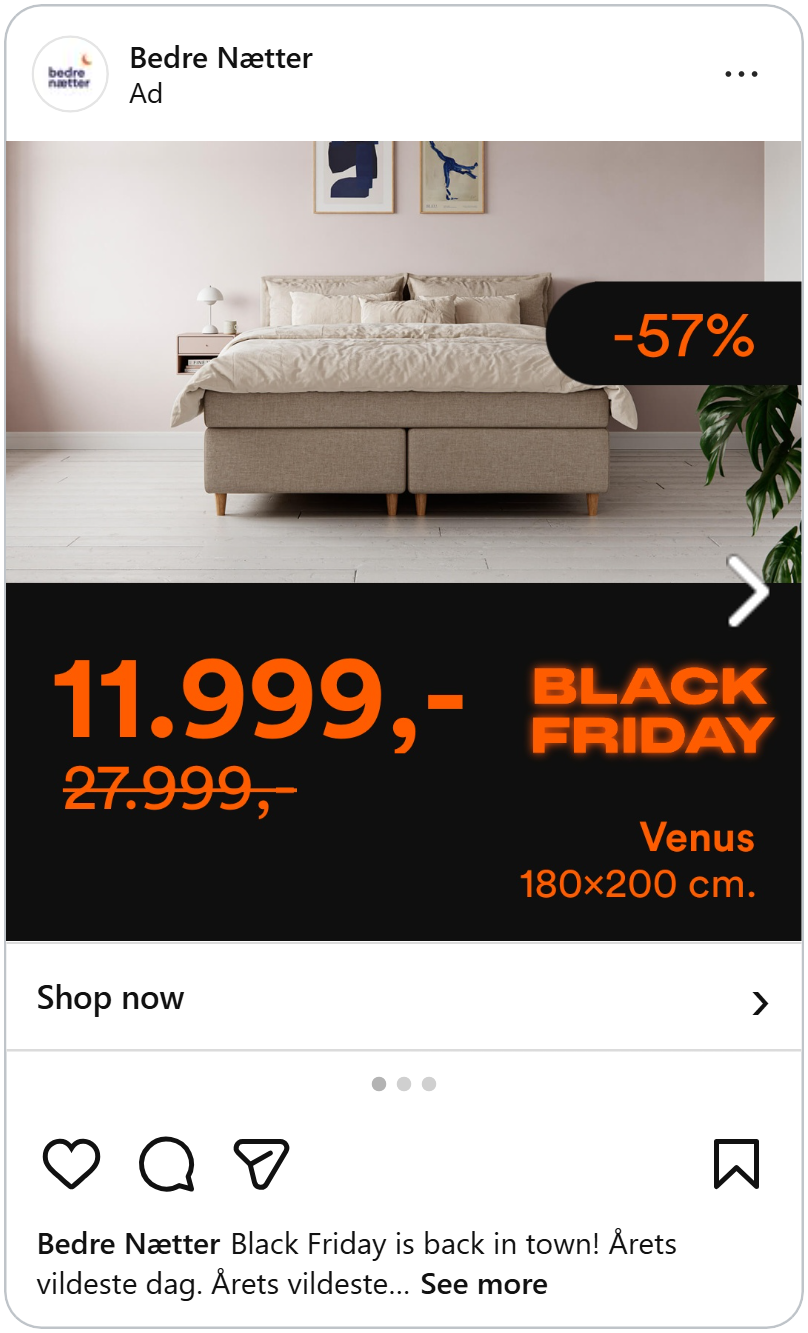
Next, your eye moves up to the bed, shown in a calm, real bedroom with linen sheets, art on the wall and a plant in the corner. Seeing it in a room helps shoppers picture how it would look at home. On the right edge of the photo, a black tab with “-57%” in orange confirms how much they save.
On the right of the price, “Black Friday” glows in orange, and below it sit the bed’s name and size: “Venus, 180×200 cm.” For a bed, the size is one of the first things shoppers check. Having it right next to the price means they don’t have to go looking for it and they can decide faster while the Black Friday deal lasts.
Find out what works best for home and lifestyle brands.
Availability and free shipping
A Coach puffer vest sits on a white card inside a festive green border with gold stars. Across the top: “Act fast! Up to 70% + extra 25% off!” At the bottom, the Coach Outlet logo.
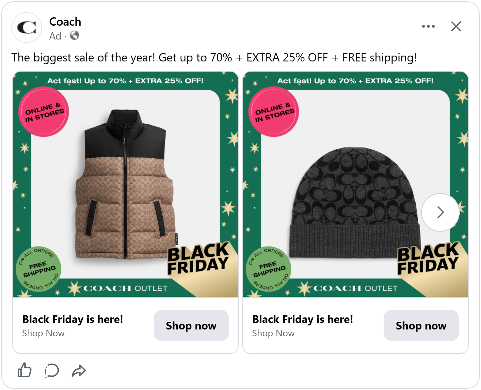
In the top left corner, a pink circle reads “Online & in stores.” It tells shoppers they can grab the deal however they prefer, whether they’re buying from their phone or heading to the mall over the Black Friday weekend.
In the bottom left, a green circle says “Free shipping on all orders.” Unexpected shipping costs are one of the biggest reasons people leave their cart at checkout. Answering that question upfront removes the doubt before shoppers even click.
In the bottom right corner, a gold and black flag with “Black Friday” in bold letters peels up from the edge of the card, like a page being turned. It adds movement to the design and makes sure no one misses which sale this is.
A double Black Friday discount
This ad from JD Sports shows a cream and white sneaker on a light grey card inside a black frame. In the top left corner, a black tab shows the sale price, in bright yellow with the old price crossed out underneath. The JD logo sits in the opposite corner.
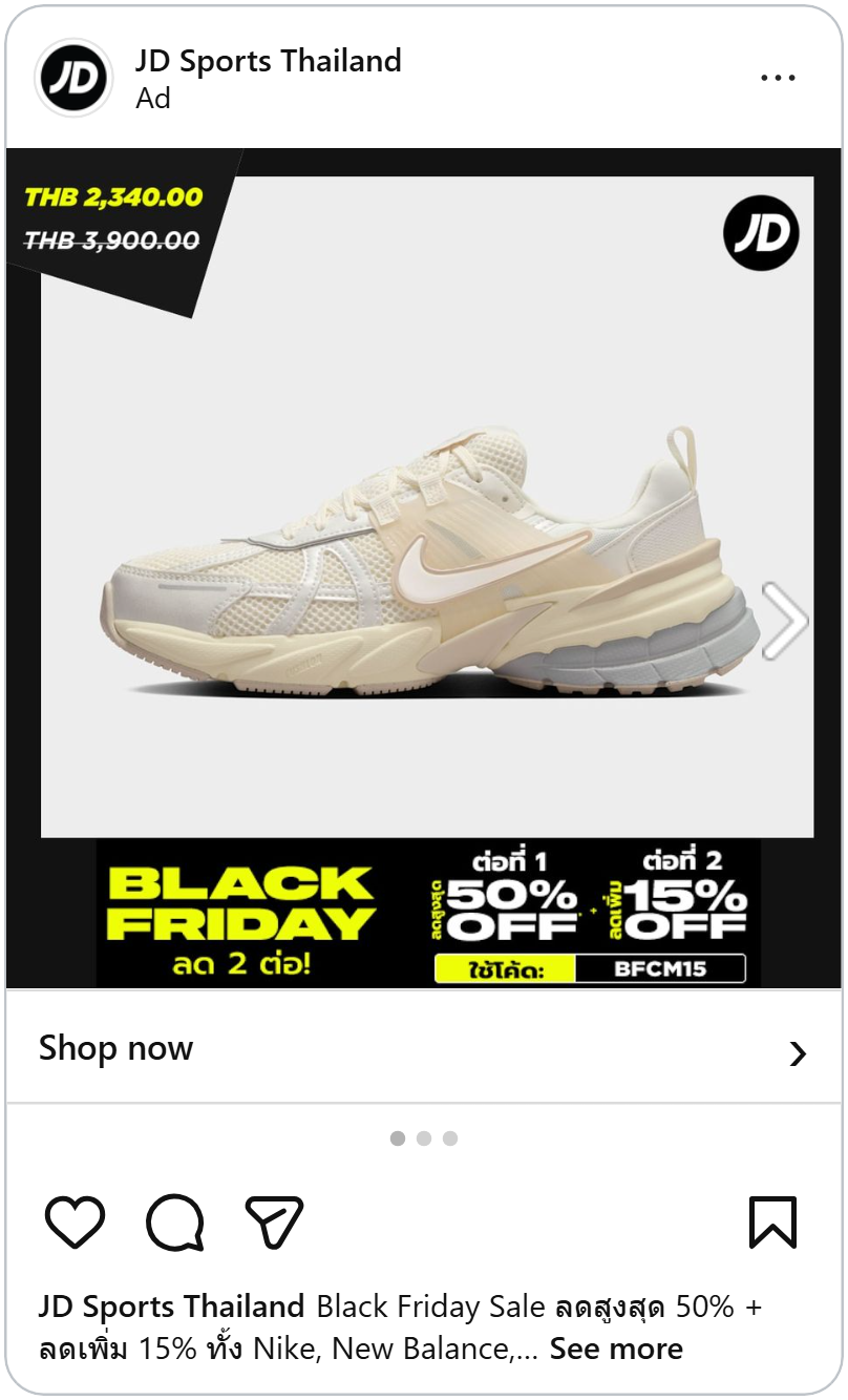
The bottom bar explains the deal in two steps. Step one: up to 50% off. Step two: an extra 15% off with the code BFCM15. The two discounts sit side by side, joined by a small plus sign.
Showing the discount as two steps makes it easy to follow. Shoppers can see the sale they get automatically and the bonus they unlock with the code.
Glowing Black Friday
The first thing you see in this ad is “Black Friday Sale,” stacked in big letters at the top left. The teal is Gamepatch’s brand color, and it glows against the dark background, so the sale and the brand register together.
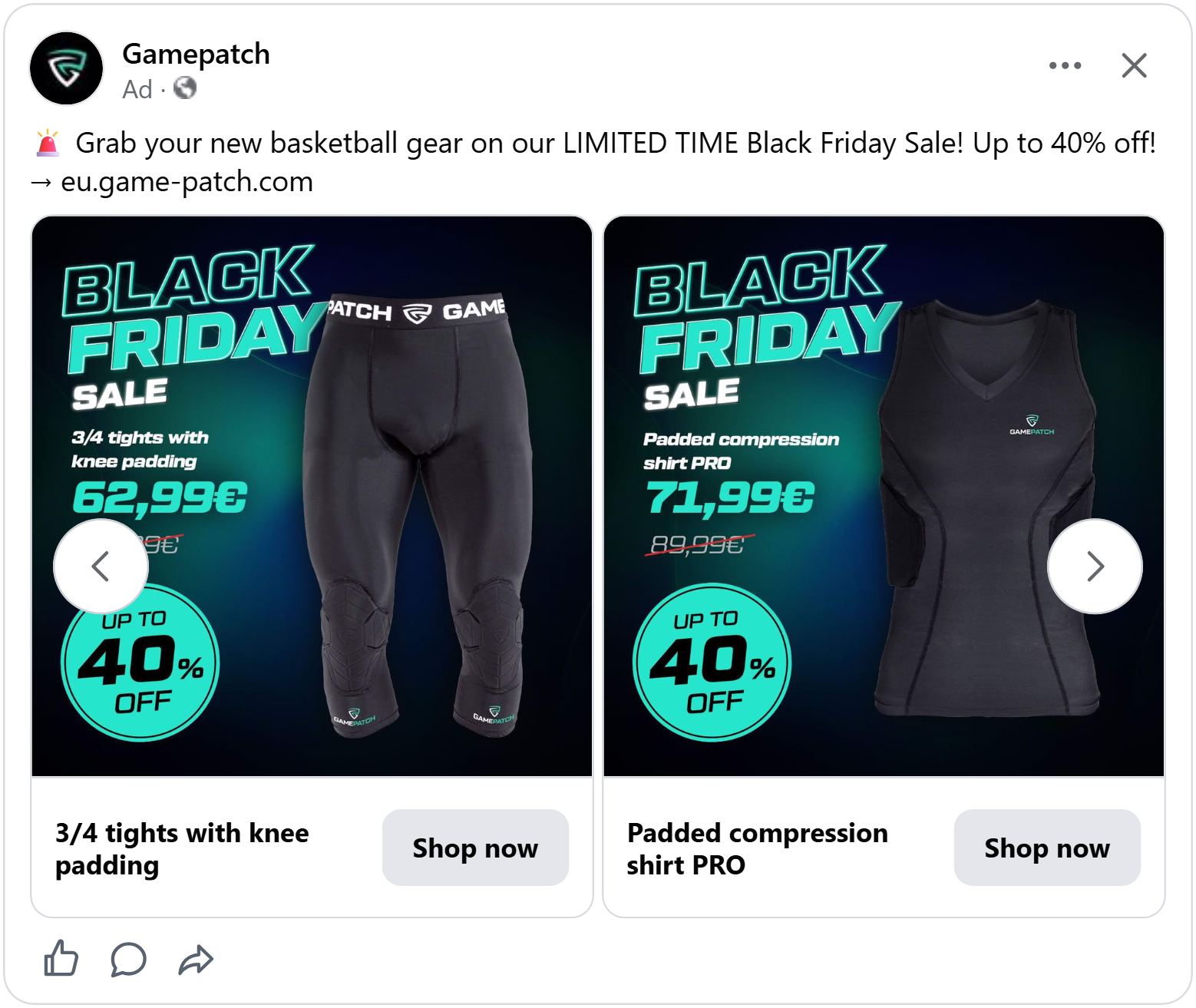
Under the title, the offer is laid out step by step: a plain product name, then the new price in teal with the old price crossed out in red below it. The name says exactly what the product is, so shoppers know what they’re getting before they even look at the photo.
In the bottom left corner, a big teal circle reads “Up to 40% off,” the boldest shape in the ad. On the right, the product stands tall against the dark glow.
The calm Black Friday Ad
Hanoia, a fashion brand from Vietnam, keeps its Black Friday ad as calm as a page from its catalog. A beige shirt with gathered, tie-up sleeves sits in the center of a light grey background, with plenty of space around it.
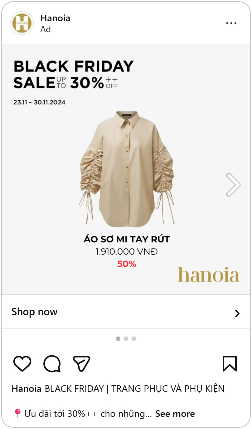
At the top, “Black Friday Sale, up to 30% off” in clean black letters, with the sale dates underneath so shoppers know exactly how long the deal lasts. The “++” hints that some items go even further, which is a quiet nudge to keep scrolling the carousel.
Below the shirt sit its name, the price in thin letters and a red “50%.” That red is the only bright color in the whole ad. Everything else is beige, grey, black and the brand’s gold logo in the bottom corner, so the ad stays elegant and the discount still stands out.
Lowest prices ever
A smiling model wears a pink fluffy robe and you can almost feel how soft the fabric is. The photo sits inside a thick pink-red frame, with a tab at the top that reads “Black Friday” in white, so the sale is the first thing framing the product.
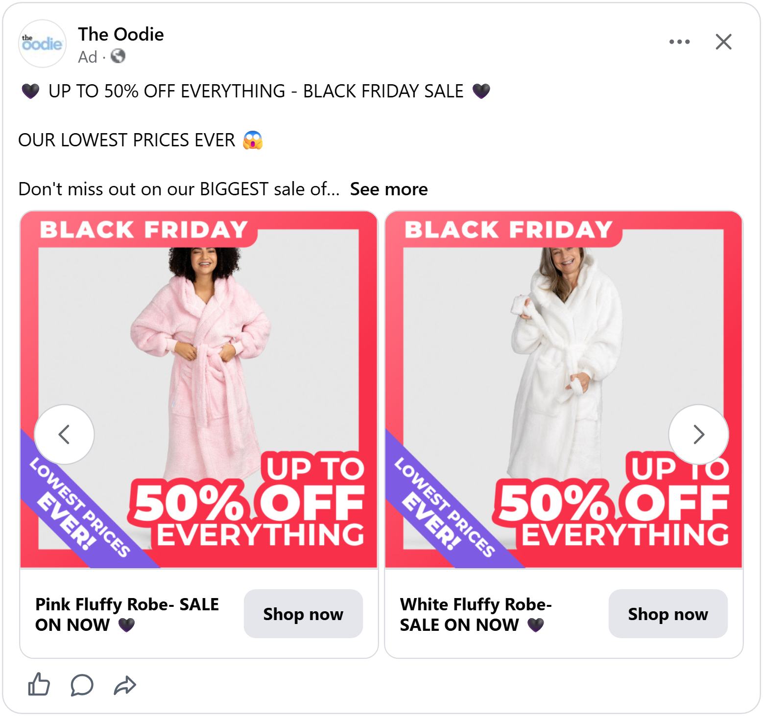
In the bottom right, “Up to 50% off everything” in big white letters spills over the edge of the photo onto the frame. It’s the largest text in the ad, and “everything” tells shoppers the whole store is on sale, not just a few items.
Across the bottom left corner, a purple sash reads “Lowest prices ever!” Its diagonal line breaks the square shape of the ad and pulls the eye straight to it. The promise matters on Black Friday, because it tells shoppers that waiting won’t get them a better deal.
See what to show when low prices are your biggest selling point.
Colorful ribbons around a Black Friday Deal
The first thing you see in this ad is “Up to 70% off everything,” in big bold letters over the product photo. The “70%” is set in 3D orange and yellow, the same colors as the ribbons curling around the edges, so it jumps out of the white text and grabs attention right away. “Everything” tells shoppers the whole store is on sale, so there’s no need to hunt for which items are included.
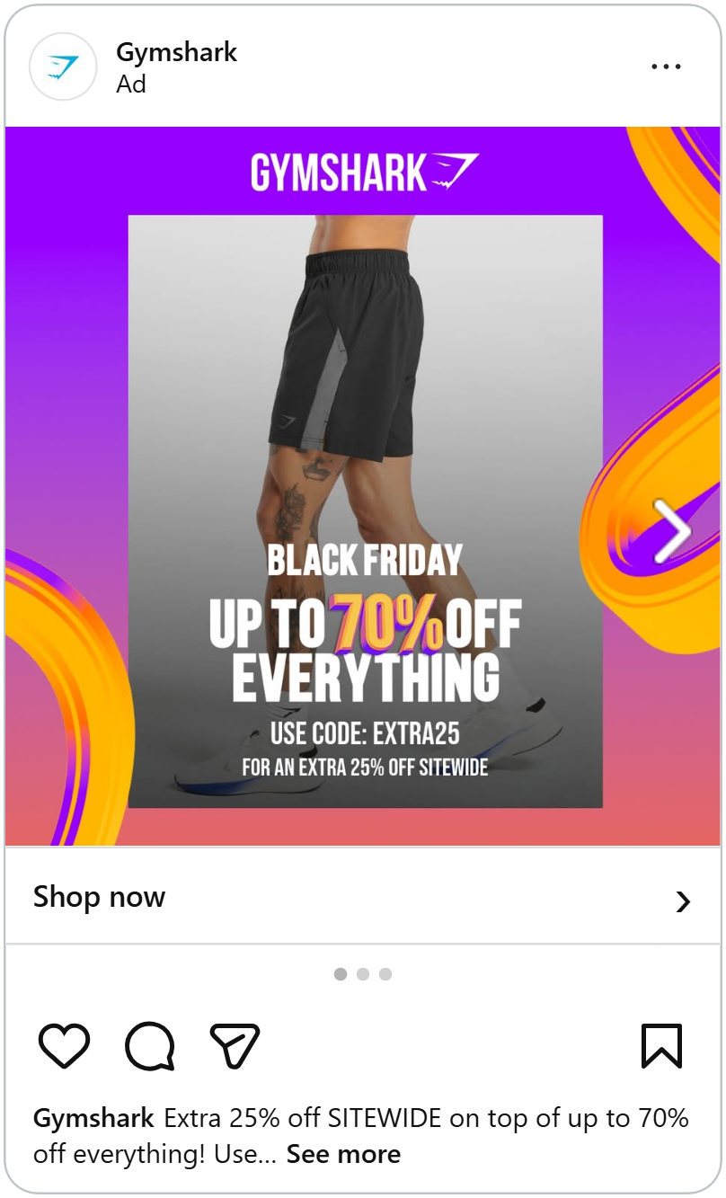
Right below it comes the second hook: “Use code EXTRA25 for an extra 25% off sitewide.” Stacking a code on top of an already big discount makes the deal feel even better, and it gives shoppers a reason to buy now rather than wait.
The rest of the ad frames the offer. The in the middle, with “Black Friday” just above the discount and the Gymshark logo at the top. The purple-to-pink background and orange ribbons give the ad a burst of energy, which helps it stand out in a feed full of black-and-red Black Friday ads.
Three angles, like a product page
This New Era ad shows its caps the way an online store would. In the first card, a large photo of a white and orange Texas Longhorns cap sits on the left, with two smaller photos in rounded frames on the right: one from the side with the “National Champions” patch, and one from the back with “Hook ’em” stitched on it. Swipe to the next card and the black Longhorns cap gets the same treatment, with a side view and a back view next to the main shot. Cap collectors care about every detail, and three angles answer their questions before they even click, just like browsing the product page would.
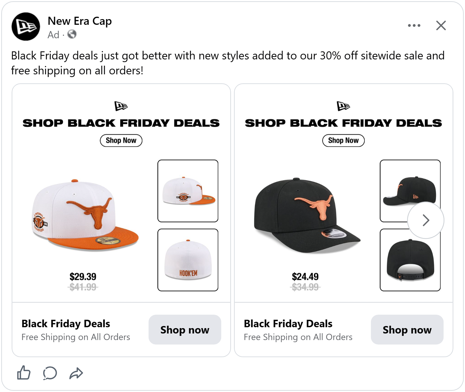
At the top, the logo sits above “Shop Black Friday deals” in bold black letters, with an outlined “Shop now” button right underneath. Putting the call to action inside the image gives shoppers a clear next step the moment they see the deal.
Under the main photo sits the price in bold, with the old price crossed out in grey below it. The new price stands out and the old one fades back, so the saving is clear without needing a percentage badge.
See how extra product photos help shoppers decide.
The product steps in front
A kids’ balance bike, grey with yellow details, stands on a bright orange background. On the left, the headline “Black Weeks, up to -40%” is written in big cream letters, with the Lionelo logo just above it. “Black Weeks” stretches the sale beyond a single day, giving parents more time to shop for the holidays.
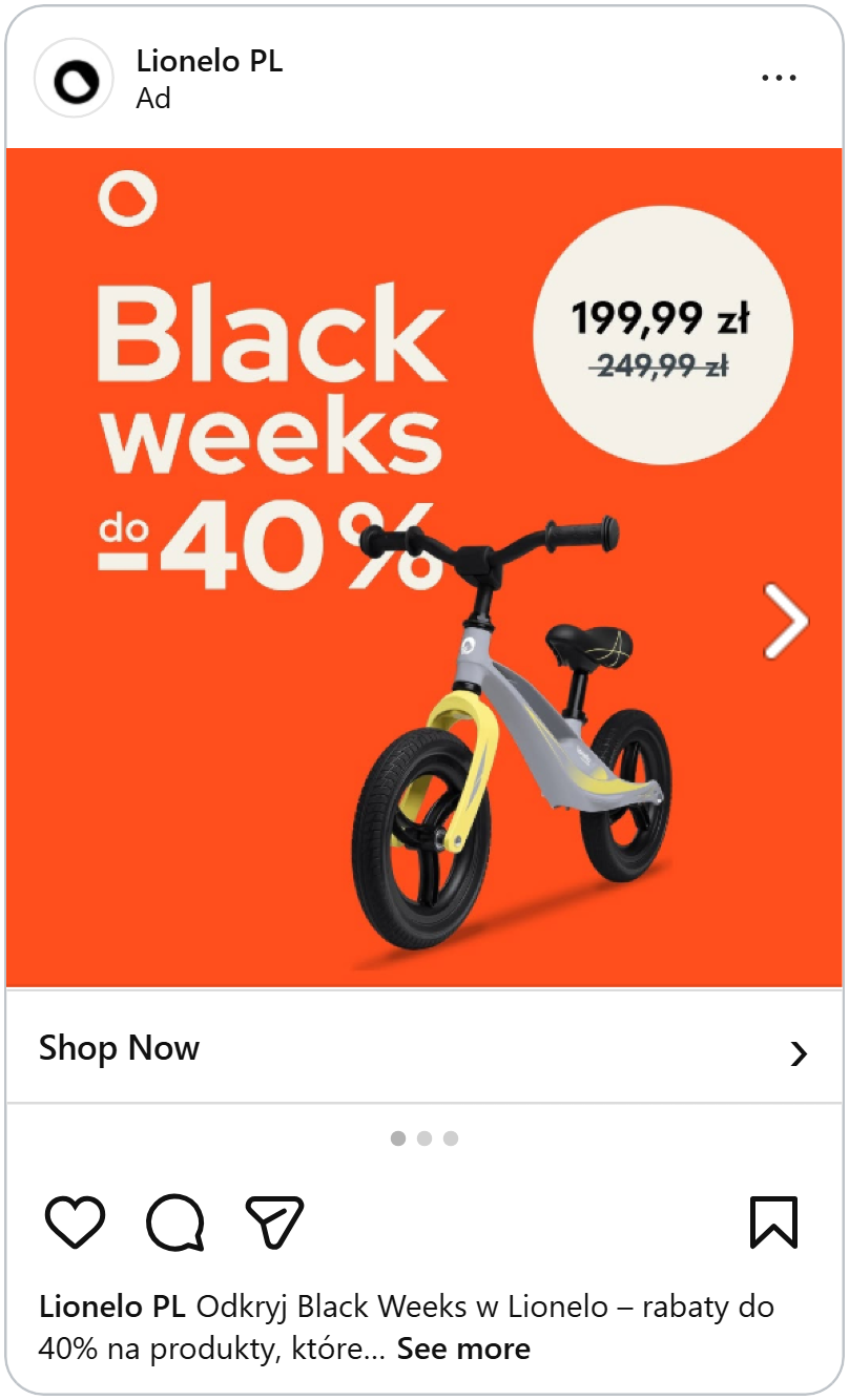
The nice trick: the bike’s handlebar sits in front of the “%” sign, covering part of it. That small overlap makes the bike look like it’s stepping out of the ad, giving a flat design a sense of depth and tying the product directly to the discount.
In the top right, a cream circle shows the price in bold, with the old price crossed out below it. Its round shape stands out against the orange, so shoppers find the exact saving right after reading the headline.
The ad sticks to just orange and cream around the bike. It’s clean, bright and playful, exactly what you’d want for a kids’ product.
Let a bold red frame do the shouting
Milkywayshop wraps every product in a bold red background, the loudest color in any Black Friday feed. The red does the shouting, so the rest of the ad can stay clean. Inside the frame, a black "Focus" road bike sits on a white card, shown from the side so cyclists can see the whole frame, the wheels and the group set in one view.
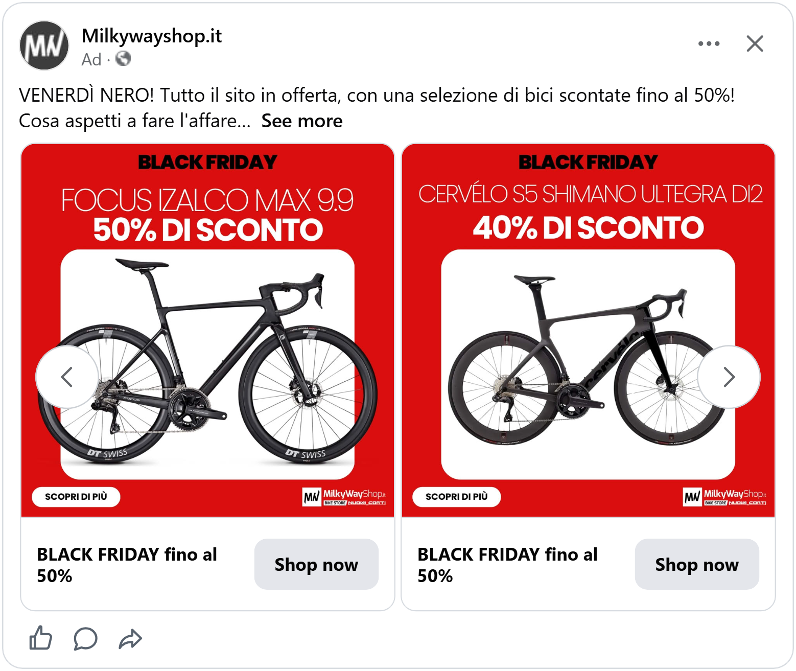
At the top of the frame, “Black Friday” in black letters marks the sale. Right below it comes the exact model, “Focus Izalco Max 9.9,” and then “50% off” in bold white. Cyclists shopping for a high-end bike usually know exactly which model they want, so naming it lets them recognize the deal instantly and the discount follows right after.
At the bottom, a white “Learn more” button on the left and the shop’s logo on the right give shoppers a clear next step.
A face, a price and a full stop
People are naturally drawn to faces, especially ones making eye contact, so a close-up like this stops the scroll in the Black Friday feed. The light puffer jacket adds context too: it’s cold outside, which makes a warm beanie feel like something you need right now, not later.
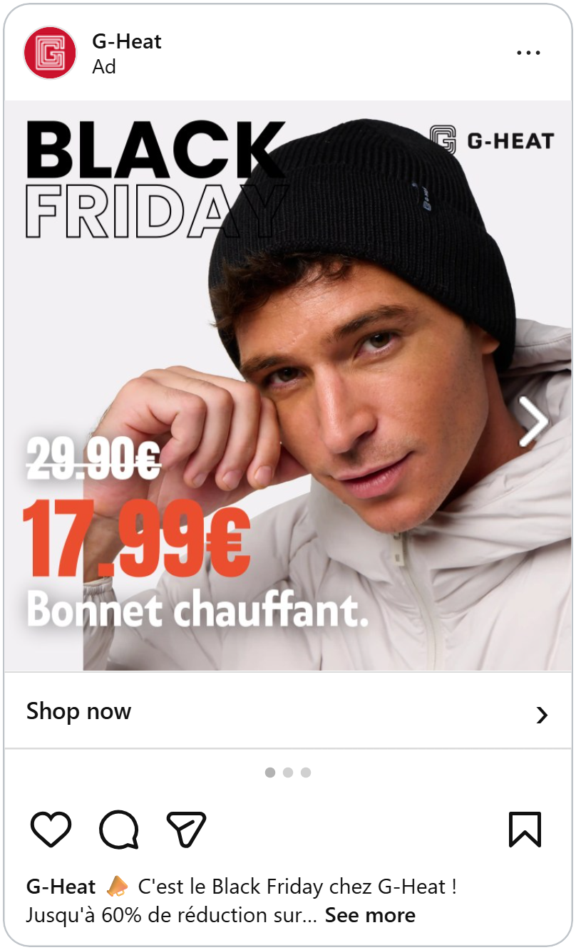
At the top left, “Black Friday” is set in solid and outlined letters, with the beanie overlapping the edge of the words. The overlap gives a flat ad a sense of depth and ties the product directly to the sale, so shoppers connect the two instantly. The G-Heat logo sits quietly in the top right corner, building brand recognition without competing with the deal.
Down the left side, the deal is stacked in reading order, in big orange numbers, and then the product name. Showing the old price first and the new one bigger right below makes the saving obvious in a second, which is exactly what bargain hunters scan for on Black Friday. The orange is the only bright color in the ad, so the new price is the first number you see.
The product name ends with a full stop, a small, confident touch that makes it read like a statement rather than a label.
Learn how much a model can lift your ad's performance.
Mix fonts for a luxe Black Friday look
This ad from Ottica Gida is mostly white space, with a pair of sunglasses in the middle. The empty space around the product makes it feel premium, which matters when you’re selling designer eyewear.
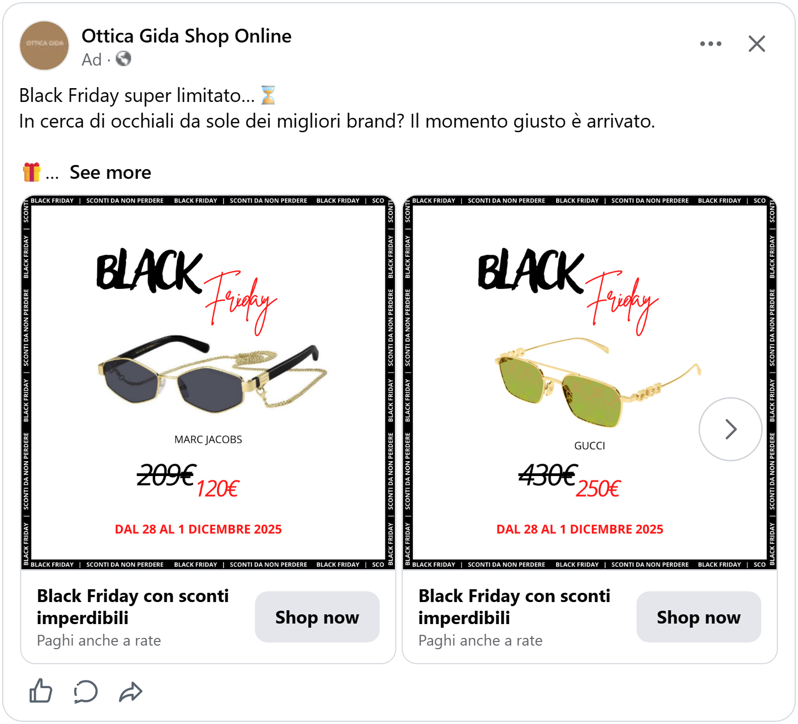
The headline mixes two styles: “BLACK” in thick black brush letters, and “Friday” next to it in thin, flowing red handwriting. The bold word grabs attention, while the red script adds elegance, so the ad feels like a sale and still looks high-end, a little bold, a little glamorous, just like the glasses.
Below the glasses, the designer’s name sits in small capitals, followed by original price crossed out and the sale price in red. For luxury shoppers, the brand name is often the main reason to click and seeing a known label next to a big price drop makes the deal instantly feel worth it. The sale dates sit underneath telling shoppers exactly how long they have to decide.
The red ties it all together: “Friday,” the new price and the dates share the same color, so the eye moves easily from the headline to the deal.
See how luxury brands keep their sale ads feeling premium.
The deal in one line
Nudient’s ad reads like the top of a magazine page. At the top, “40% off everything or more” in clean white letters sets the size of the sale. “Everything” tells shoppers the whole store is included and “or more” hints that some deals go even deeper, a reason to keep browsing.
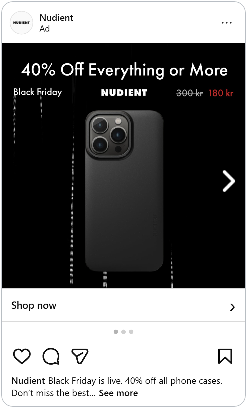
Right below sits one single line that holds everything else: “Black Friday” on the left, the Nudient logo in the middle, and the price on the right. Putting the sale, the brand and the price in one tidy row means shoppers get every key detail in a single glance, without the clutter that fills most Black Friday ads. The red price is the only color in the whole ad, so it’s the first number the eye lands on.
Below that line, there’s nothing but a black phone case on a black background, with faint streaks of light falling behind it. The all-black look fits the Black Friday mood and makes a simple product look premium. Keeping the information in one row leaves the rest of the space for the product, which is a great for brands with clean, minimal products that need room to shine.
Make Black Friday impossible to miss
The first thing you see in this Goodsmell ad is the Black Friday title. “Black” sits in a tilted white box and “Friday” in bold yellow, both leaning to the side as if they’re in a hurry. Against the dark navy background, the white and yellow pop right out and the tilt adds a sense of urgency that fits Black Friday perfectly.
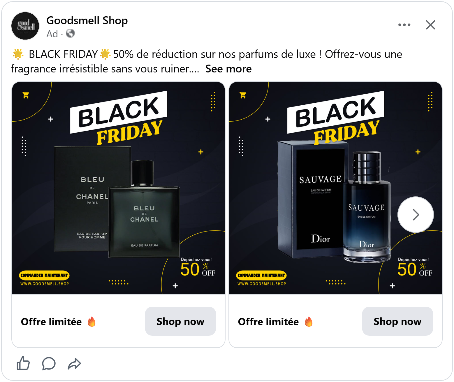
Below it, a bottle of perfume and its box side by side. The box is what shoppers recognise from store shelves and the bottle shows what they’ll actually get. With a famous name front and center, the product sells itself.
In the bottom right, “Hurry! 50% off”. Half price on a luxury fragrance is a strong hook, and the matching yellow links the discount straight back to the Black Friday title.
One detail in each corner
A pair of black Ray-Ban Meta glasses sits in the middle of a clean white background, with a soft reflection underneath. You can even spot the tiny camera lens in the corner of the frame, the detail that sets these glasses apart.
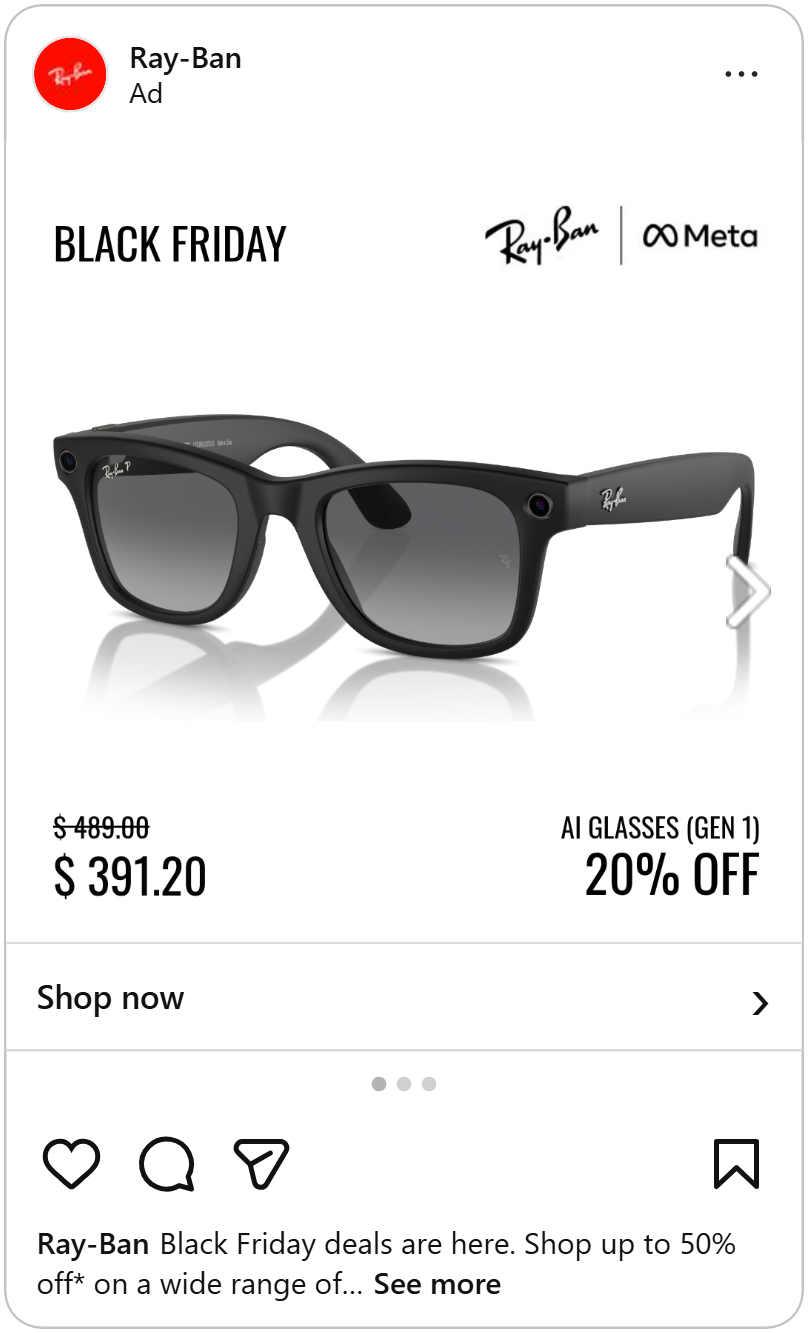
The text is split into the four corners. Each corner holds one piece of information, so the eye moves around the ad and always comes back to the glasses in the middle. Shoppers get the sale, the brands, the price and the discount in a few seconds, without a single element covering the product. The bottom corners work especially well together: the price on one side and the percentage on the other show the saving two ways, so it’s clear whether shoppers think in dollars or in percentages.
Everything is in plain black type on white, which keeps the ad feeling premium. It’s a simple layout that works for almost any product, and it lets a high-end item stand out in a Black Friday feed full of loud, colorful sale graphics.
Make the price impossible to miss
A big yellow badge grabs your attention next to the phone with the text in bold black letters. On the dark background, the bright badge pops right out, so shoppers know the deal before they’ve even read the headline. The small word “from” shows the lowest price and invites shoppers to click to find their storage and color.
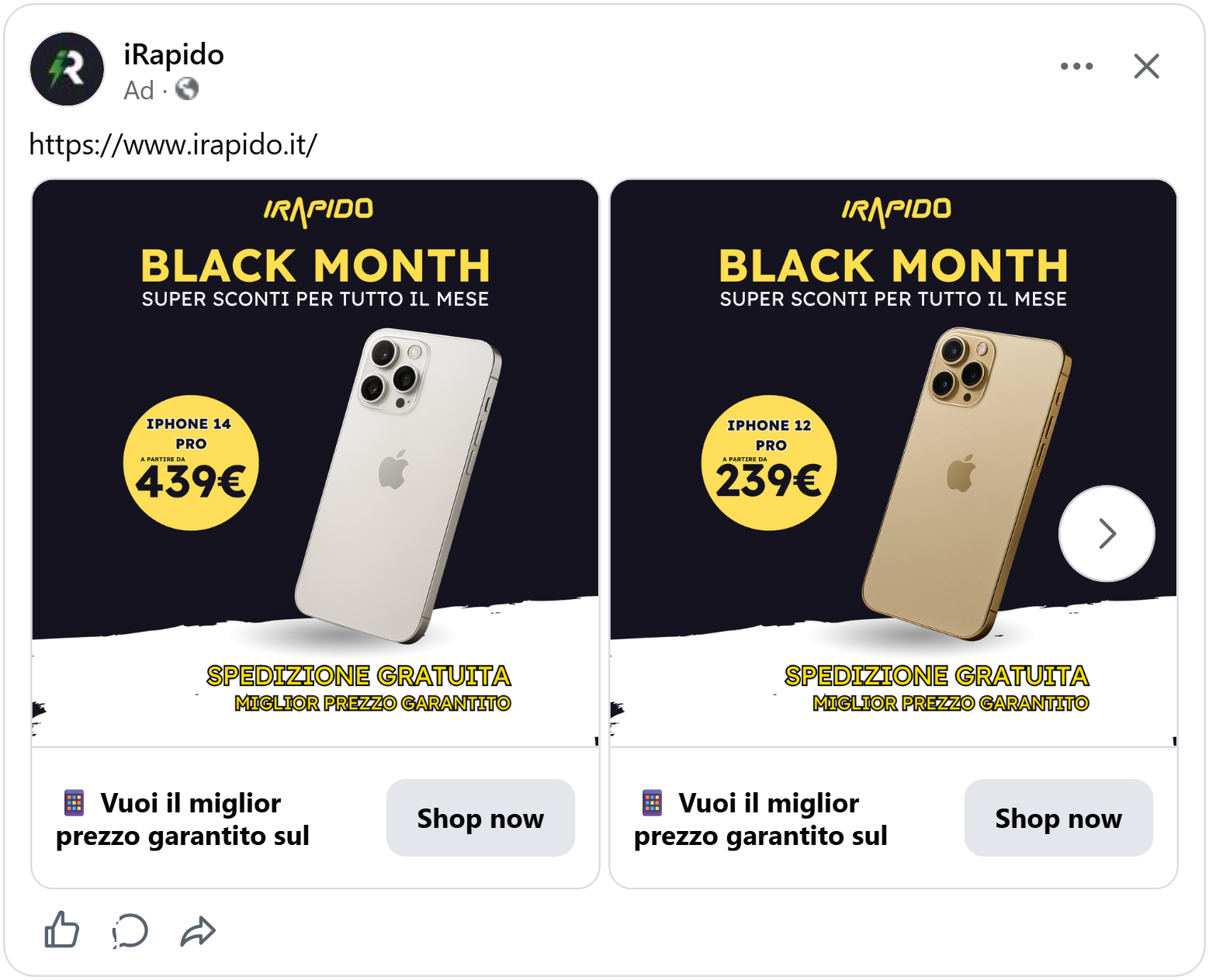
The yellow isn’t random. It’s the same yellow as the iRapido logo at the top and the “Black Month” headline below it, with “super discounts all month long” underneath. Using one brand color for the logo, the sale and the price ties everything together, so shoppers connect the deal straight to the shop. “Black Month” also stretches the sale beyond a single day, giving shoppers more time to buy and the shop more time to sell.
Let a huge red price do the talking and the ratings seal the deal
The first thing you see in this ad is the big red price, so big it’s almost as large as the phone itself. Right under it, the old price of is crossed out in small white letters. On Black Friday, shoppers scroll looking for a deal, and this ad puts the deal front and center before anything else.
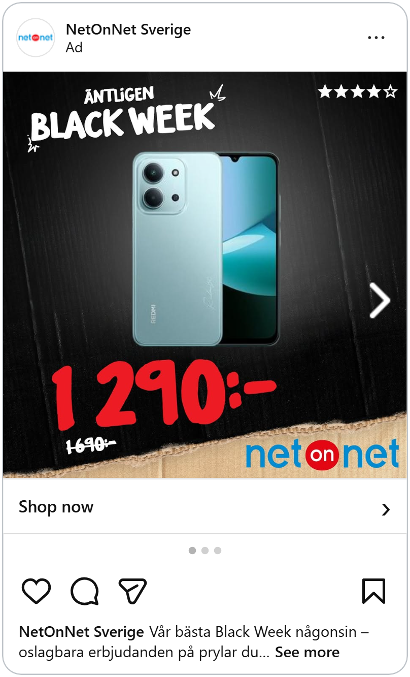
Everything else is there to support the price. At the top, “Finally Black Week” is scribbled in white marker-style letters, telling shoppers this is the seasonal sale they’ve been waiting for. In the middle, the phone sits on a black cardboard background, shown from the front and back so shoppers see the whole product.
Now look at the top right corner: four stars out of five. It’s tiny, but it does a big job. Shoppers who’ve never heard of this phone model get a quick sign that other buyers liked it, which makes the low price feel like a safe buy rather than a risky one. A rating is one of the easiest things to add to a catalog ad. If you collect reviews, it’s worth showing them, especially for products people don’t already know.
Why ratings can beat discounts and free shipping.
Take ratings a step further
This ad for snow pants is split into two halves with a torn paper edge. The top is black, with “Black Week” repeated in faint outlined letters in the background and once more in bold white on the right, so the sale is clear the moment the ad appears.
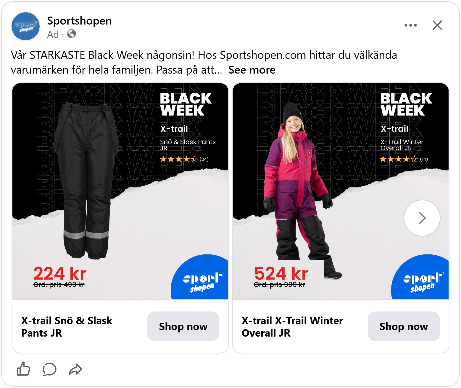
Under the title sit the brand, the product name and four and a star rating with a count next to them. Plenty of ads show stars, but this one goes a step further by showing how many people left a rating.
Stars alone can feel vague, while four and a half stars from 24 reviews feels real and earned. For parents buying winter gear their kids will wear every day, knowing that other families tried it and liked it removes a lot of doubt.
See how leading with reviews lifted ROAS by 93%.
Lead with the look
This ad is subtle, and that’s what makes it work. Instead of shouting about the sale, it starts with the product: a model wearing a dark grey oversized hoodie. Seeing it on a real person shows how it fits and drapes, so shoppers can easily picture themselves wearing it.
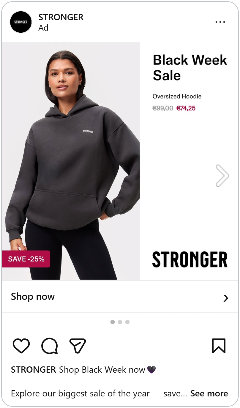
Then your eye moves to the right, where “Black Week Sale” sits at the top, with the product name and price right below it. In a few seconds, shoppers know what it is, that it’s on sale and how much it costs now.
And if they’re still unsure but keep looking, there’s one more detail waiting in the bottom corner of the photo: a pink tag that says “Save -25%.” It’s the final push that seals the deal, turning a hoodie they already like into one they can’t pass up.
Neon strip to stop the scroll
Mammut, the outdoor brand, keeps its ad very simple. The product sits on a clean white background and on the left, a neon yellow strip runs from top to bottom. It’s the brightest thing in the ad, so it catches the eye the moment the ad appears in the feed. “Black Friday” is written sideways in bold black inside it, with the round mammoth logo at the top, so the sale and the brand are both seen in that first glance.
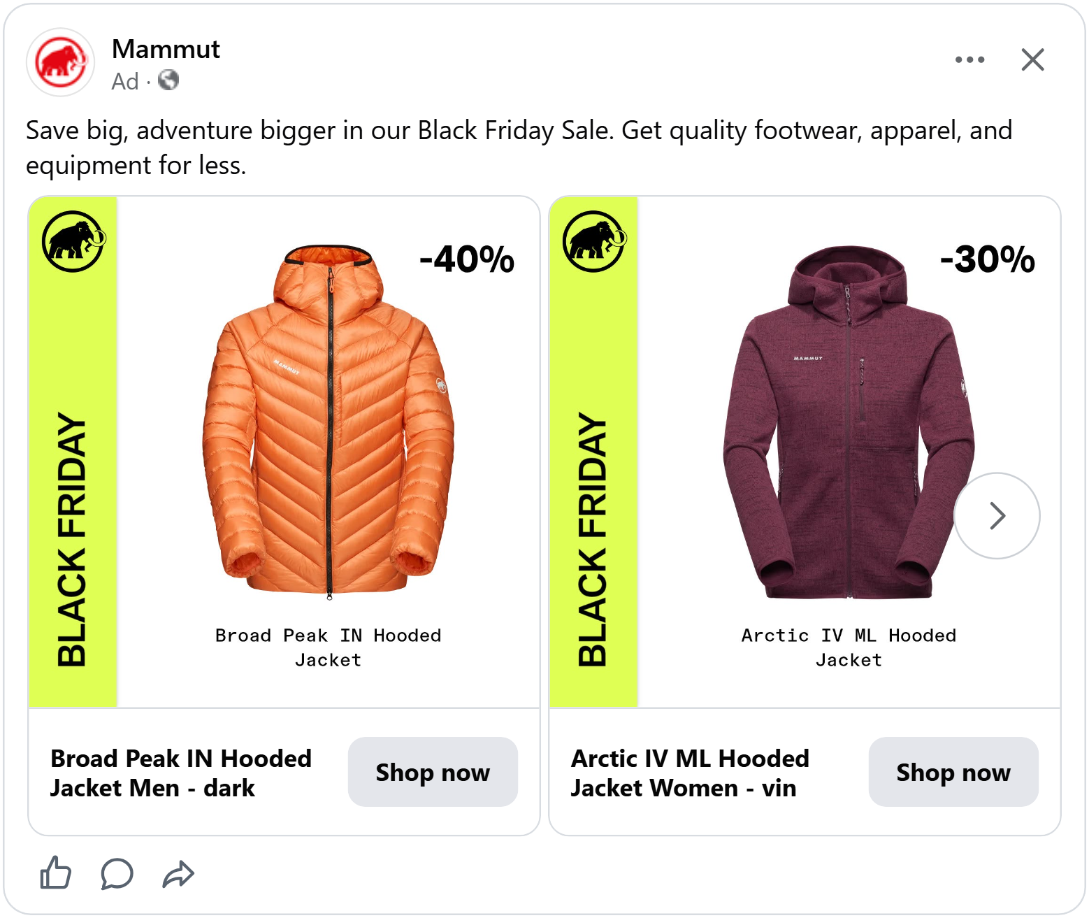
Placing the strip along the edge keeps it from covering the product, so the jacket gets all the white space it needs, and the strip frames it like a label on the side of a box.
Photo grid and an app perk
Parfois shows its product in a neat grid of three photos: one large shot from the front, and two smaller ones from the side and the back. Shoppers see the product from every angle, so they know exactly what they’re getting before they click. For accessories, where small details make the sale, that removes a lot of guesswork.
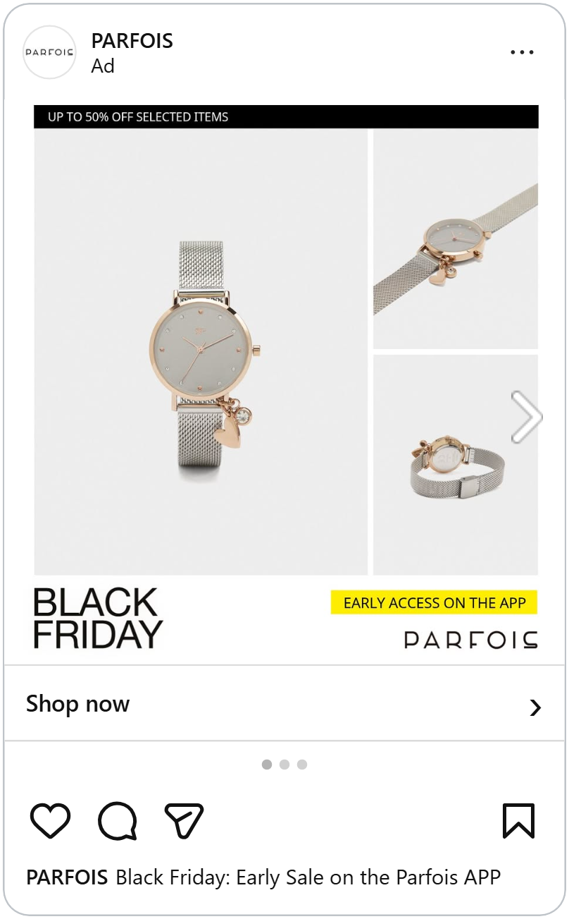
At the bottom left, “Black Friday” sits in big black letters. It’s simple and bold, so shoppers know right away that this is a sale.
At the bottom right, a yellow label says “Early access on the app,” just above the Parfois logo. It’s the only bright color in the ad, so it’s hard to miss. It gives shoppers a reason to download the app and makes app users feel like insiders who get the deals before everyone else.
A label like a price tag on a shelf
Decathlon’s ad is bold red from edge to edge. Red is the color of warning signs and alerts, so our eyes are trained to stop when we see it. In a busy Black Friday feed that instant stop is half the battle, and once shoppers pause the ad shows them why it was worth it.
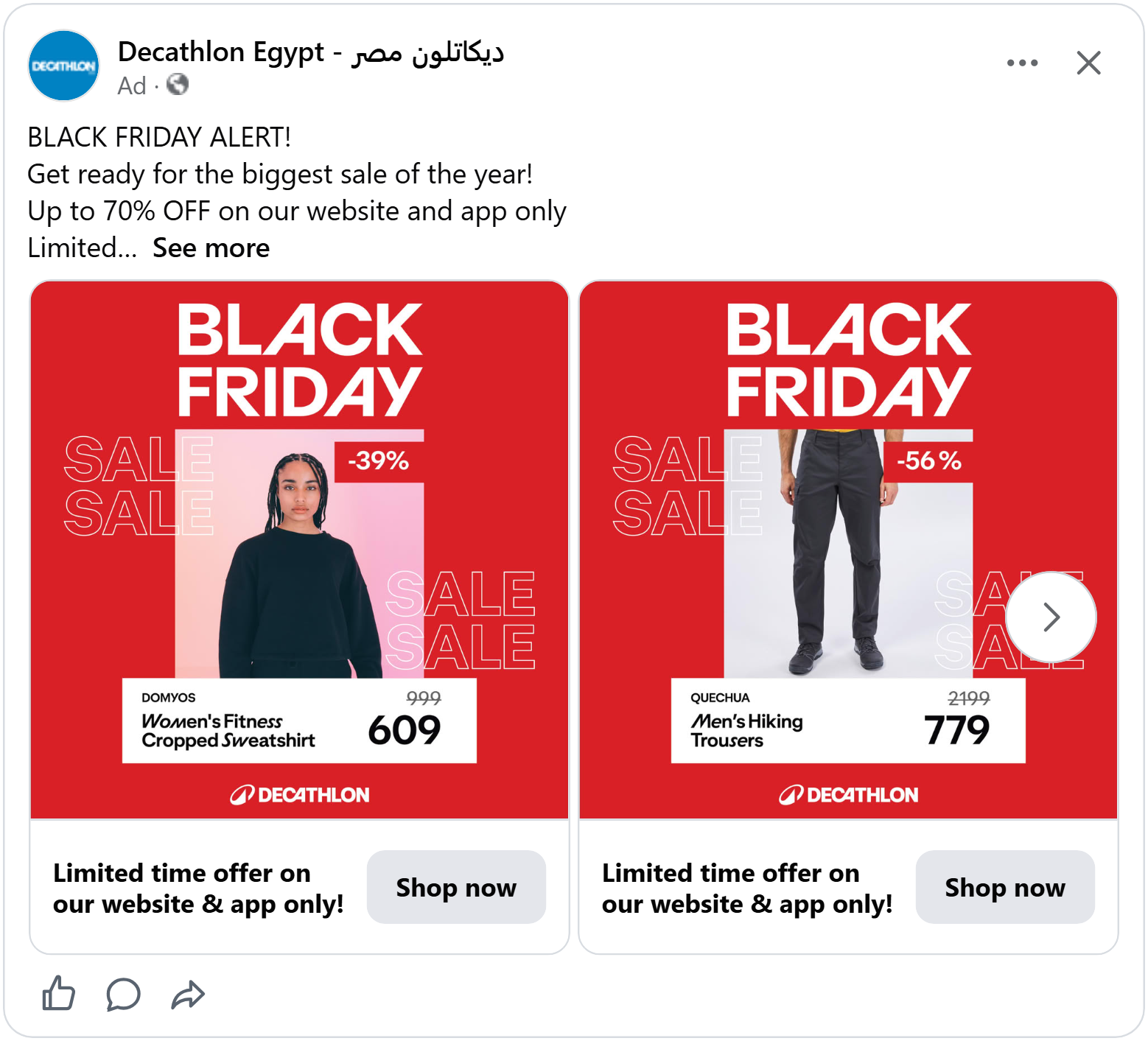
At the top, “Black Friday” in huge white letters makes the sale clear right away. On both sides of the product photo, the word “SALE” is stacked in white outlines. As shoppers read the text, their eyes move across the product in the middle, so the sale message and the product are taken in together.
Then the eye lands on the white box overlapping the bottom of the photo. It reads like a price label on a store shelf: the brand, the product name, the old price and the new price, in big black numbers. Everyone has seen a shelf label in a shop, so everyone knows how to read this one in a second and because it overlaps the photo, the price feels directly connected to the product.
An extra code on top of a big discount
At the top of this ad, the Foot Locker logo sits in a black box next to “Black Friday,” followed by “Up to 60% off” in big white letters. It’s the largest and brightest text in the ad, so shoppers see the size of the sale before anything else.
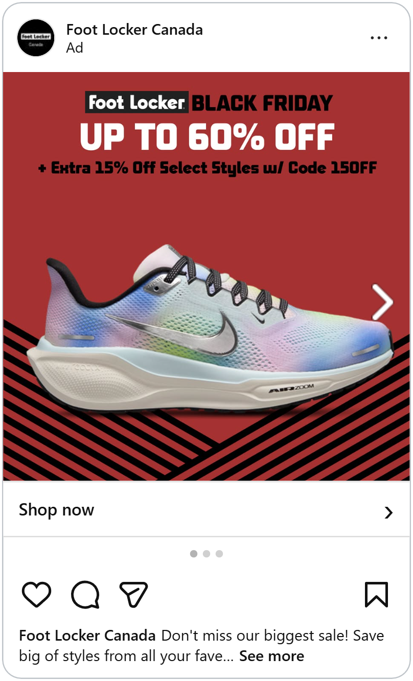
Right below it comes a second line in black: “+ Extra 15% off select styles w/ code 15OFF.” The plus sign makes the offer easy to follow: there’s the sale everyone gets and then a bonus on top.
A code like this gives shoppers a reason to act now, and it makes an already good deal feel even better, as if they’ve unlocked something extra.
See why a code next to the price was the strongest combination we measured last year.
Turn one product into a reason to buy more
This ad shows the same product twice, side by side: the model wearing it from the back, showing the large print and then from the front, showing the small logo. Seeing both sides on real people tells shoppers exactly how it looks and fits, so they can picture themselves wearing it before they even click.
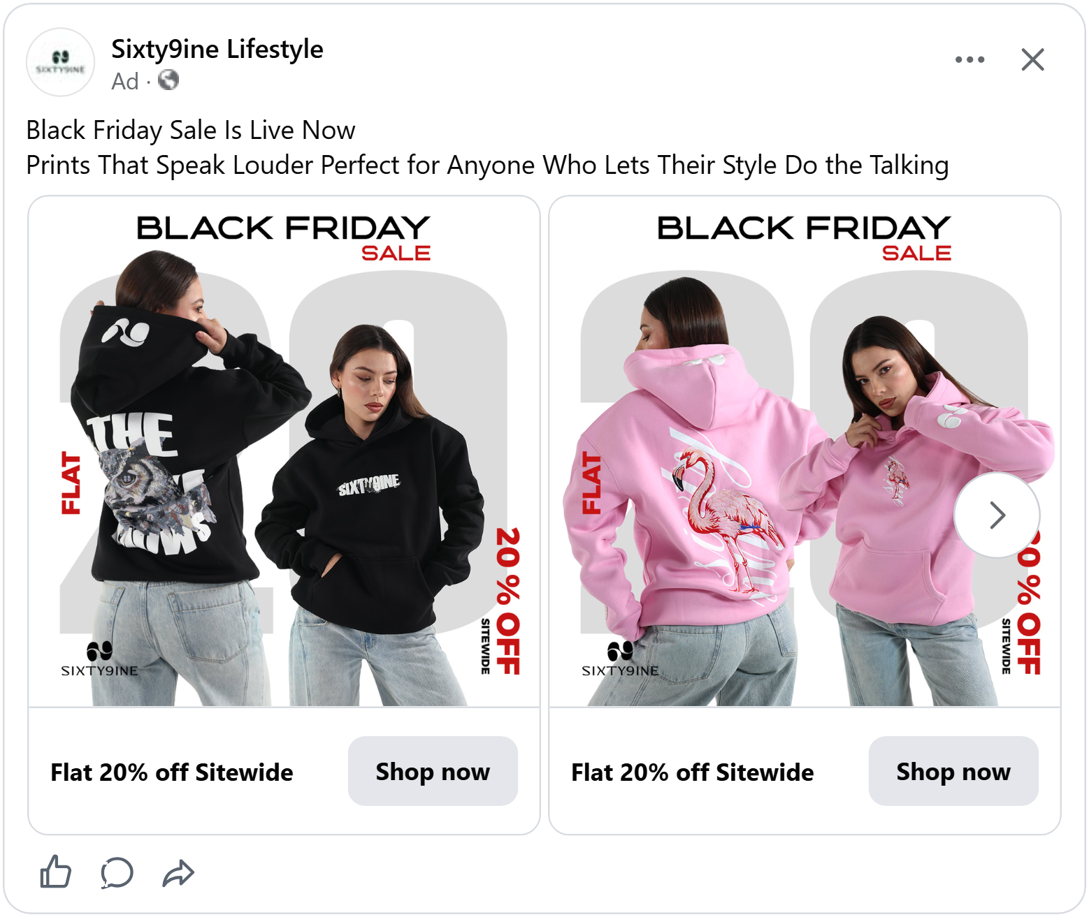
At the top, “Black Friday Sale” makes it clear right away that this is a sale item. Then the ad turns that one product into something bigger. Along the edges, “Flat” runs up the left side in red, and “20% off sitewide” runs down the right. “Sitewide” is the key word: the hoodie draws shoppers in, but the discount applies to everything in the store.
Shoppers who come for one item now have a reason to browse and add more to their cart, which is exactly what you want on Black Friday.
A real sticker for a real deal
This ad is full of Black Friday energy. Coral tapes printed with “Black Friday” cut across the top and bottom corners like caution tape, and “Black Friday” is written in big white brush letters with a coral swipe underneath. On the dark, speckled background, the coral and white pop right out, so the sale is clear the moment the ad appears.
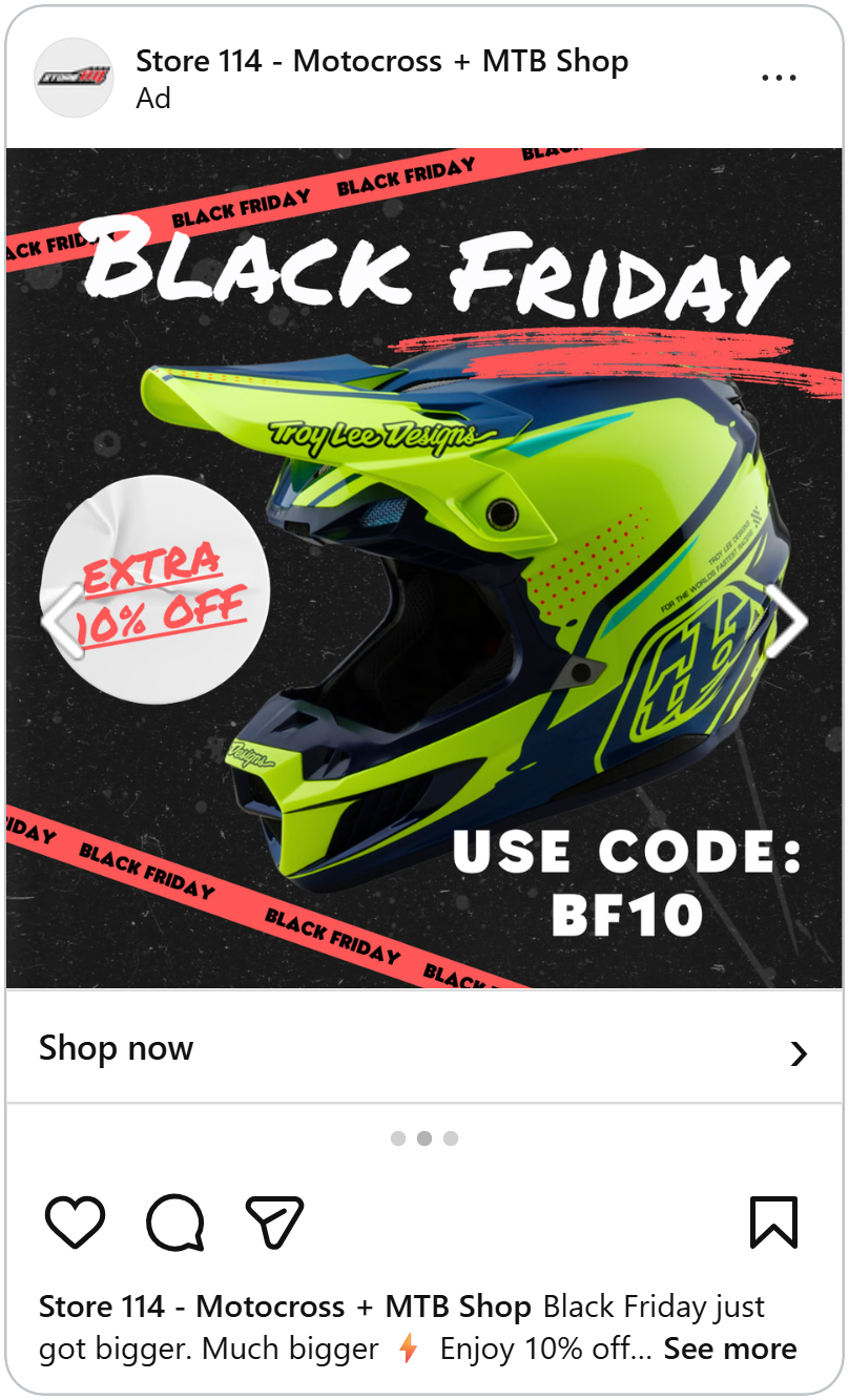
On the left, a round white sticker sits on the edge of the product, slightly wrinkled and peeling up. It looks just like the markdown stickers store staff slap onto items when the price drops even further.
Everyone knows that sticker means “this is cheaper than it was,” so the extra discount feels real and immediate. Placing it right on the product ties the saving directly to what shoppers are looking at.
Push the coupon code
A model in patterned leggings fills most of this ad, cropped from the waist to the ankles so the product is the whole story
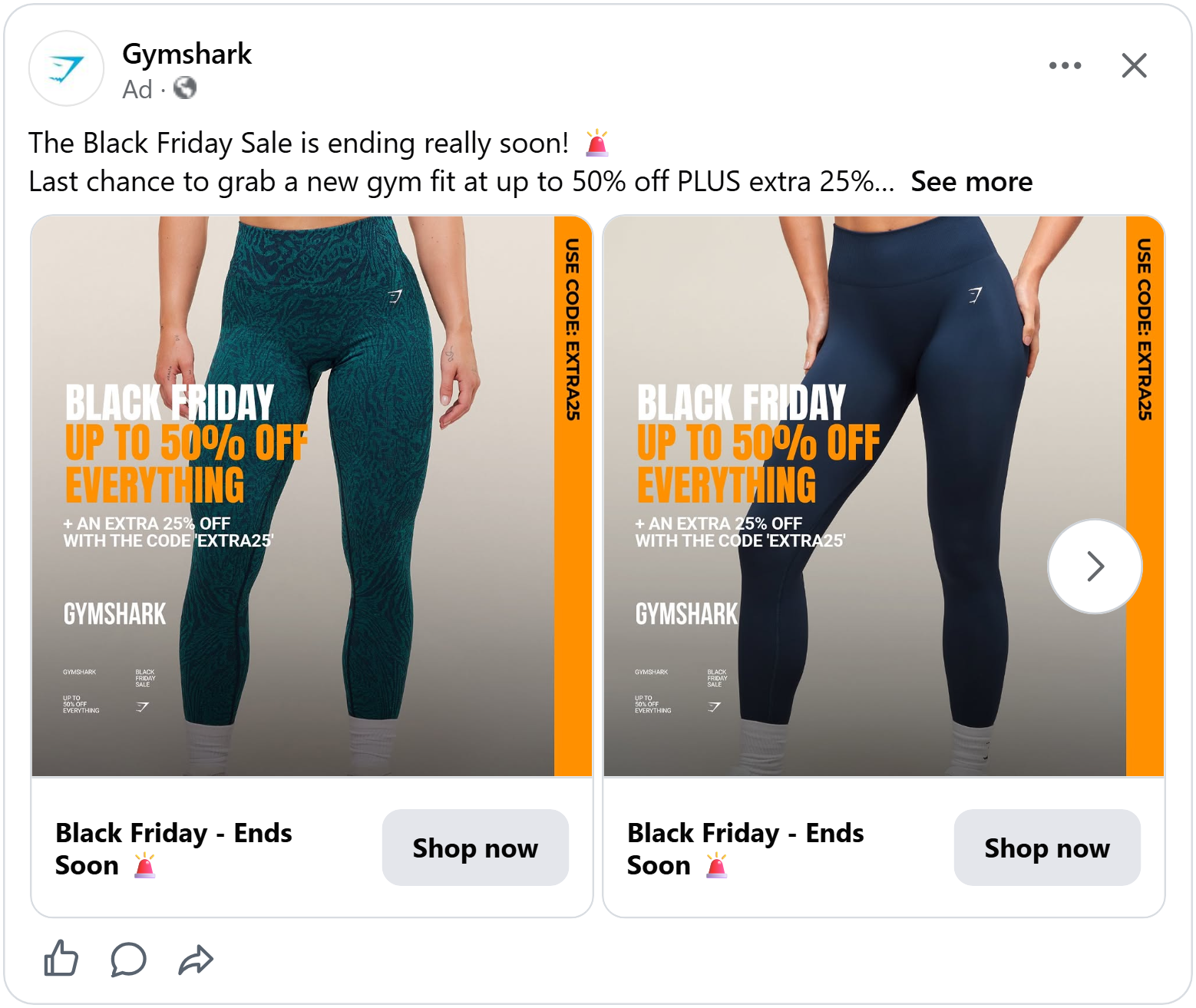
On the left, the offer builds step by step: “Black Friday” in white, then “Up to 50% off everything” in bright orange, and finally “+ an extra 25% off with the coupon code. That kind of double discount makes shoppers feel like they’ve found one of the best deals of the whole Black Friday season and a reason to buy now rather than keep looking.
Down the right edge, a tall orange strip repeats it written sideways. The code appears twice, once in the offer and once on the strip, so even shoppers who only glance at the ad can’t miss it.
Make Black Friday your own
Bulk, the sports nutrition brand, doesn’t call its sale “Black Friday.” It calls it “Bulk Friday,” with “bulk” in white and “Friday” in an orange-red box at the bottom left. It’s a small play on words that turns the biggest shopping day of the year into the brand’s own event, so shoppers remember who the deal came from, not just that it was Black Friday.
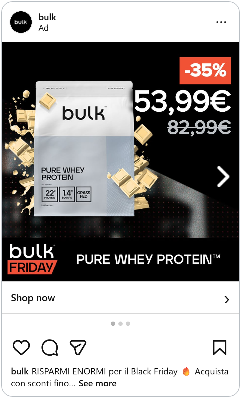
In the middle, the product sits on a dark background with a blurred gym behind it. Pieces of white chocolate and a creamy splash burst out from behind the bag, so shoppers can almost taste the flavor. For food and supplement brands, showing the flavor with real ingredients answers “what does it taste like?” in a single look.
See how to turn any campaign into a Catalog Ad design.
Bold title with a hero product
Most Black Friday ads go black and red, but El Corte Inglés uses a deep green background, the same green as its logo. It stands out in a crowded feed and makes the ad instantly recognisable as theirs. The green also fades darker toward the corners, which works like a spotlight, pulling the eye to the center of the ad.
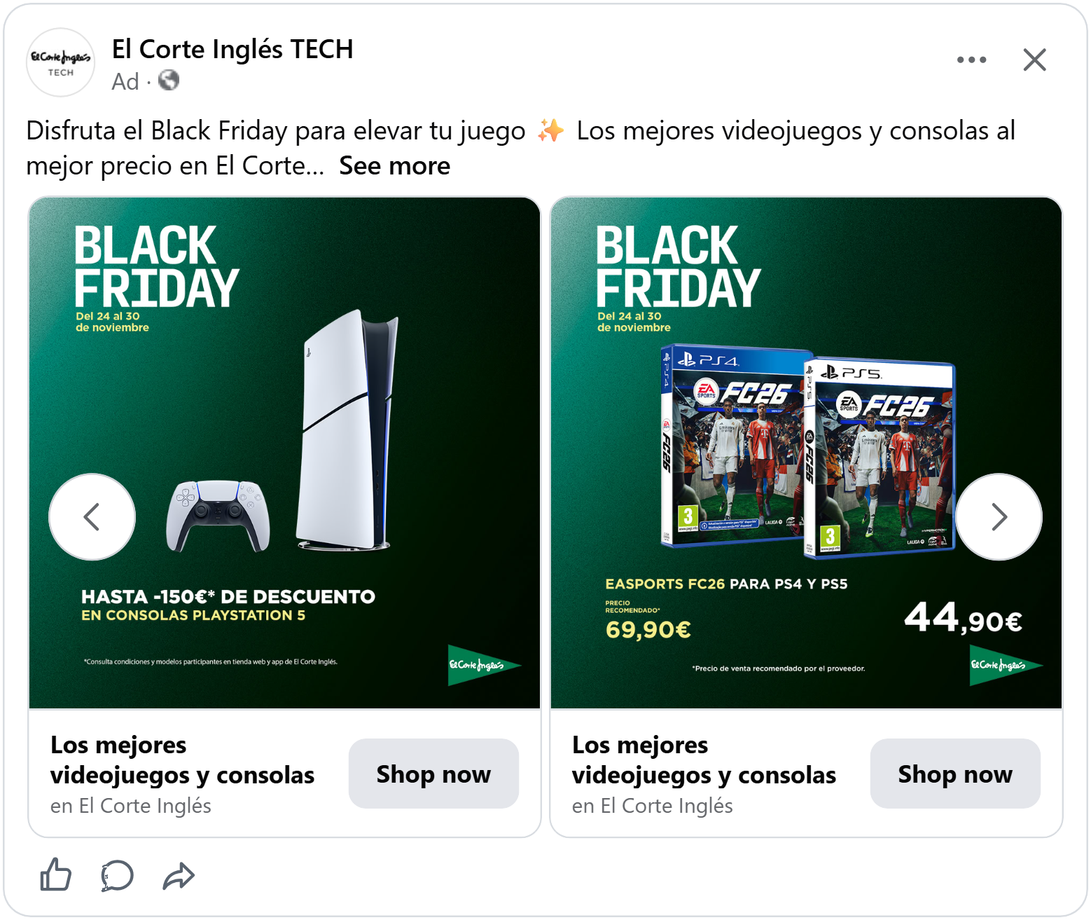
In the top left, “Black Friday” sits in big, bold white letters, with the sale dates in soft yellow underneath. The white pops against the dark green, so shoppers know it’s a sale at first glance and the dates tell them exactly how long they have to decide.
The product takes center stage. The console and its controller stand tall in the middle of the ad, lit up against the dark background, with plenty of space around them. Nothing covers them or competes with them, so they look premium and desirable, exactly what you want for a high-ticket purchase.
Big black discount
The product sits alone in the middle of a soft cream background, with plenty of space around it. The calm, warm tone makes it feel premium and the brand name running sideways in the top corner adds a touch of style without competing for attention.
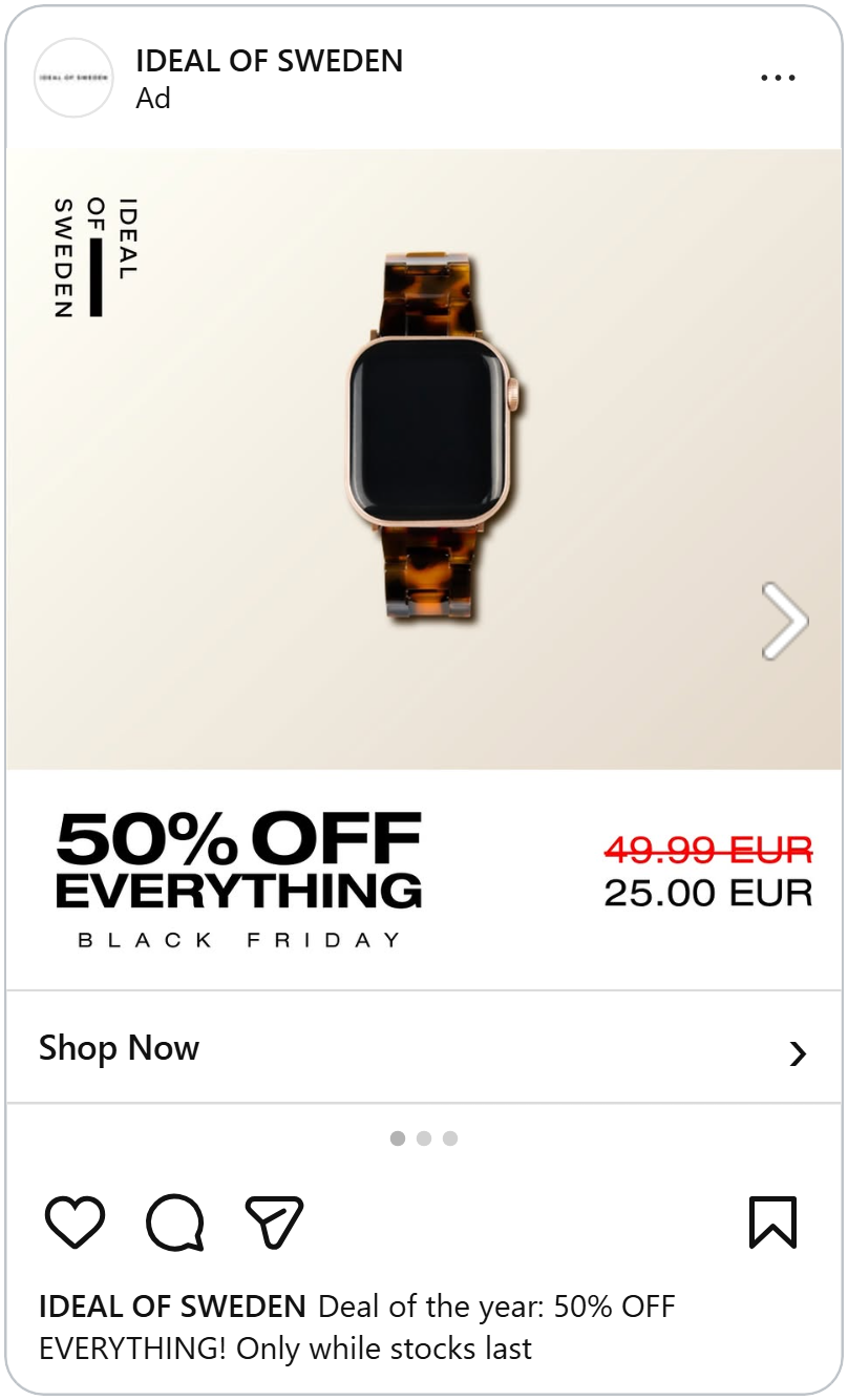
The real work happens in the white bar at the bottom. The store-wide discount is the biggest, boldest text in the ad, set in heavy black letters, so shoppers know the size of the deal before anything else. “Everything” is the key: it tells shoppers the whole store is on sale, turning one product into a reason to browse the full range. “Black Friday” sits underneath in small, widely spaced letters, a quiet label that marks the occasion without stealing focus from the offer.
Big savings badge with a sticker
The first thing you see in this ad is the big yellow circle in the top left corner showing how much shoppers save. It’s the brightest, boldest shape in the ad and the percentage is set in huge black numbers, so the size of the deal lands in a split second. On Black Friday, when shoppers are scanning dozens of ads, a badge this clear tells them immediately whether it’s worth stopping for.
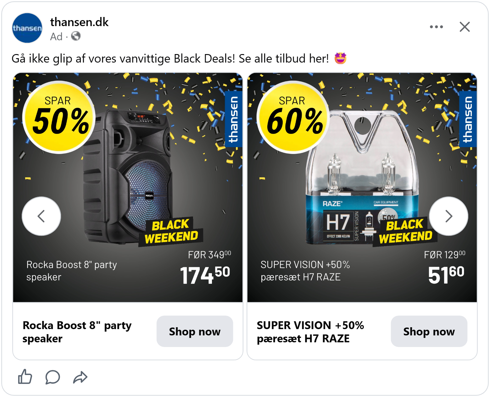
Then the eye moves to the tilted yellow and black “Black Weekend” sticker placed right on the product. The tilt makes it feel like it was slapped on by hand, adding energy and a sense of urgency. And “Black Weekend” stretches the sale beyond a single day, giving shoppers a few extra days to buy, while still reminding them the deal won’t last.
Together, the two elements answer the two questions every Black Friday shopper has: how much do I save, and how long do I have?
More ways to make your savings impossible to miss.
Let the brand sell the deal
The first thing you see in this ad is the product: a pair of designer sunglasses in the middle of a background that fades from bright yellow-green at the top to white at the bottom, with a clear reflection underneath, as if they’re standing on glass..
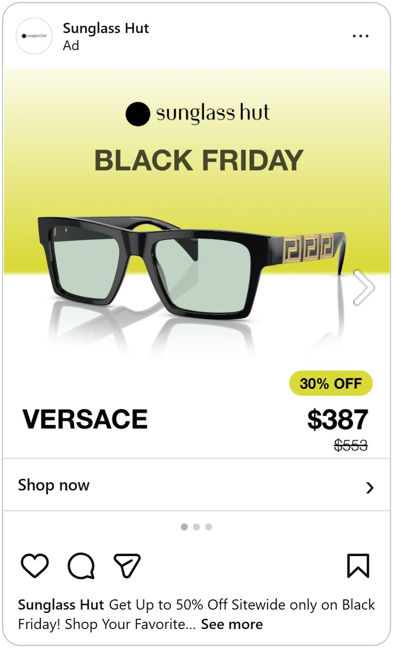
Right above the product, “Black Friday” sits in bold letters under the Sunglass Hut logo. Because it’s placed directly over the glasses, shoppers see the sale and the product at the same time, so there’s no doubt that what they’re looking at is part of the deal.
At the bottom left, the designer’s name is set in big, bold letters, as large as the price itself. For multi-brand retailers like Sunglass Hut, this is a smart move. Shoppers often search for a specific designer, and the name alone can be the reason they stop. Giving it this much space lets the brand’s reputation do part of the selling.
At the bottom right, the deal is grouped together neatly: a yellow-green badge with the discount percentage sits right on top of the sale price, with the original price crossed out below. The badge matches the background color, so it ties back to the rest of the ad, and having the percentage, the new price and the old price in one spot means shoppers understand the whole deal in a single glance.
See how a famous brand name can lift your ROAS.
That's all 45. Every one of these ads does something a little different: a clever detail, a bold color, a smart way to show the price. You don't need to copy all of them. Pick the ones that fits your shop best, click Recreate with Confect, and turn it into your own Black Friday Catalog Ad in minutes.