
9 Beauty Black Friday Catalog Ad Examples That Stand Out
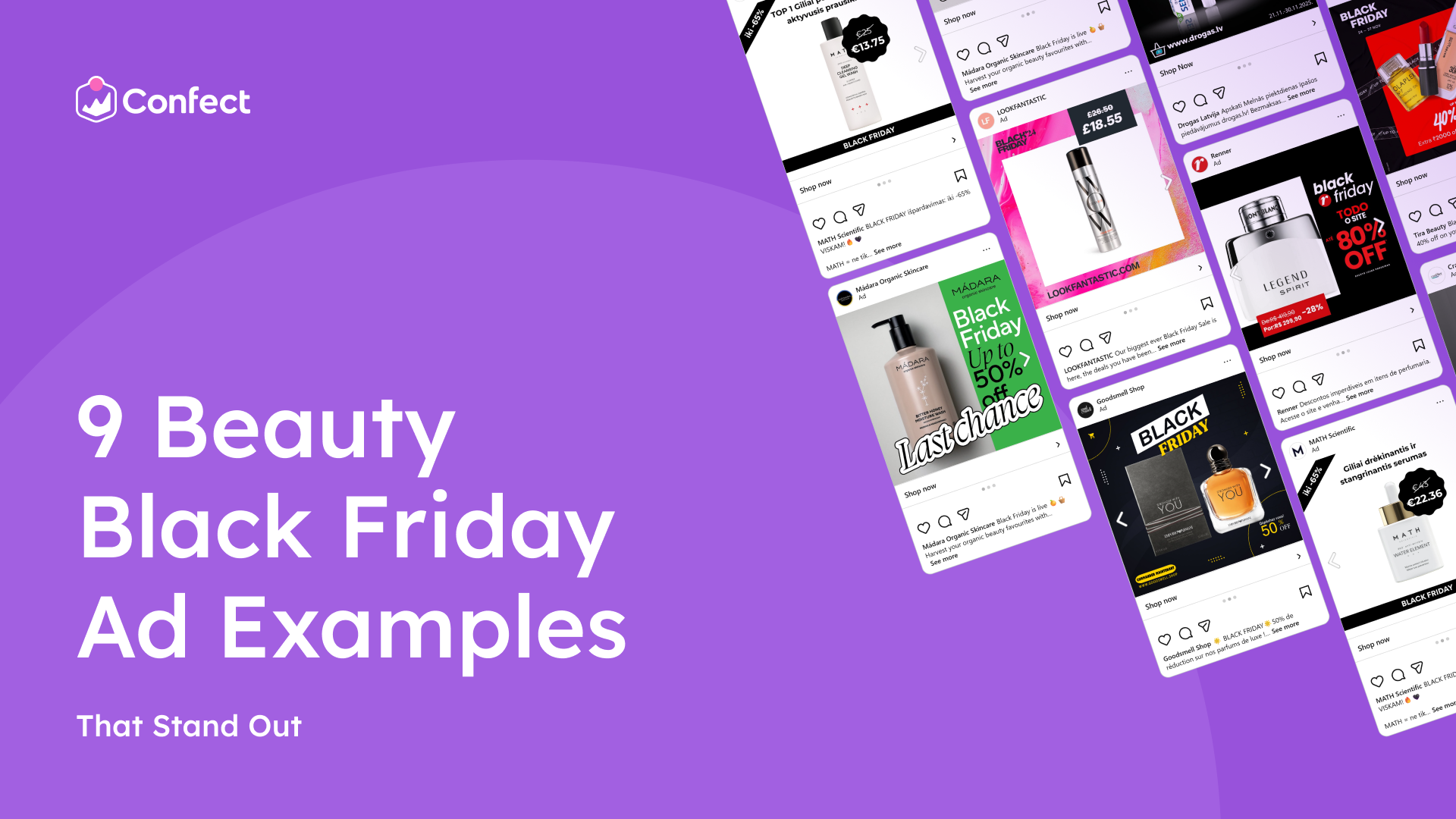
On Black Friday, the beauty ads that sell the most on Facebook and Instagram aren’t the ones with the biggest discount. They’re the ones with the best design. When every brand in the feed is running a sale, great design is what makes shoppers believe the deal, want the product and buy it before it’s gone.
See an ad you like? ClickRecreate with Confect.Confect's AI rebuilds it as a Catalog Ad template filled with your own products.
Below are 9 real beauty Black Friday Catalog Ads that get this right, and the one thing each of them does best. Because one template covers your whole product range, a single design idea from this list can upgrade every dynamic product ad you run. Scroll through, find the designs that fit your brand and apply them to your own Meta Catalog Ads before Black Friday.
Table of contents
A deal on top of a deal
Beauty shoppers love a good haul. On Black Friday, they finally fill the basket with everything they've been saving up for: the hair oil, the new lipstick, the fancy night mask.
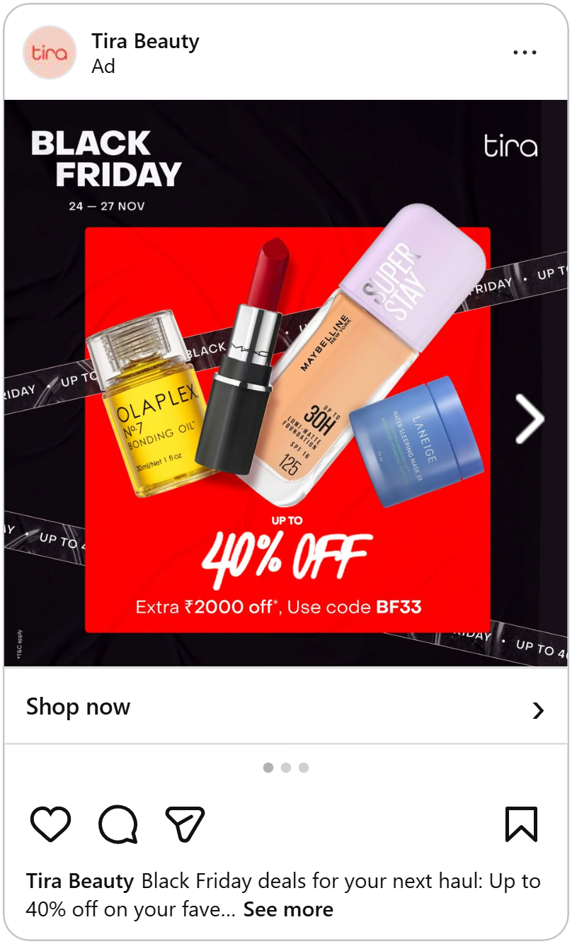
This ad looks exactly like that haul. A bright red square sits on a black background, with four products piled on top of each other: a bonding hair oil, a red lipstick, a foundation and a blue sleeping mask. A strip of tape runs around the edges, repeating "Black Friday • Up to 40% off."
The best part sits at the bottom: "Extra ₹2000 off. Use code BF33."
The more you picture in your basket, the better that code feels. It turns one product into a whole haul. And the dates in the top corner, "24–27 Nov," quietly remind you that the code won't last.
A code makes people feel like they found something extra. But first, they need to trust the price itself.
Show what it used to cost
Beauty prices can be confusing. Is €25 a lot for a face wash? Is £18 a good price for hair spray? Most people don't know, so a big "sale" sign doesn't tell them much.
The old price fixes that. When shoppers see what a product normally costs, crossed out next to what it costs today, they know exactly how good the deal is. Here are three beauty ads that show it in three different ways.
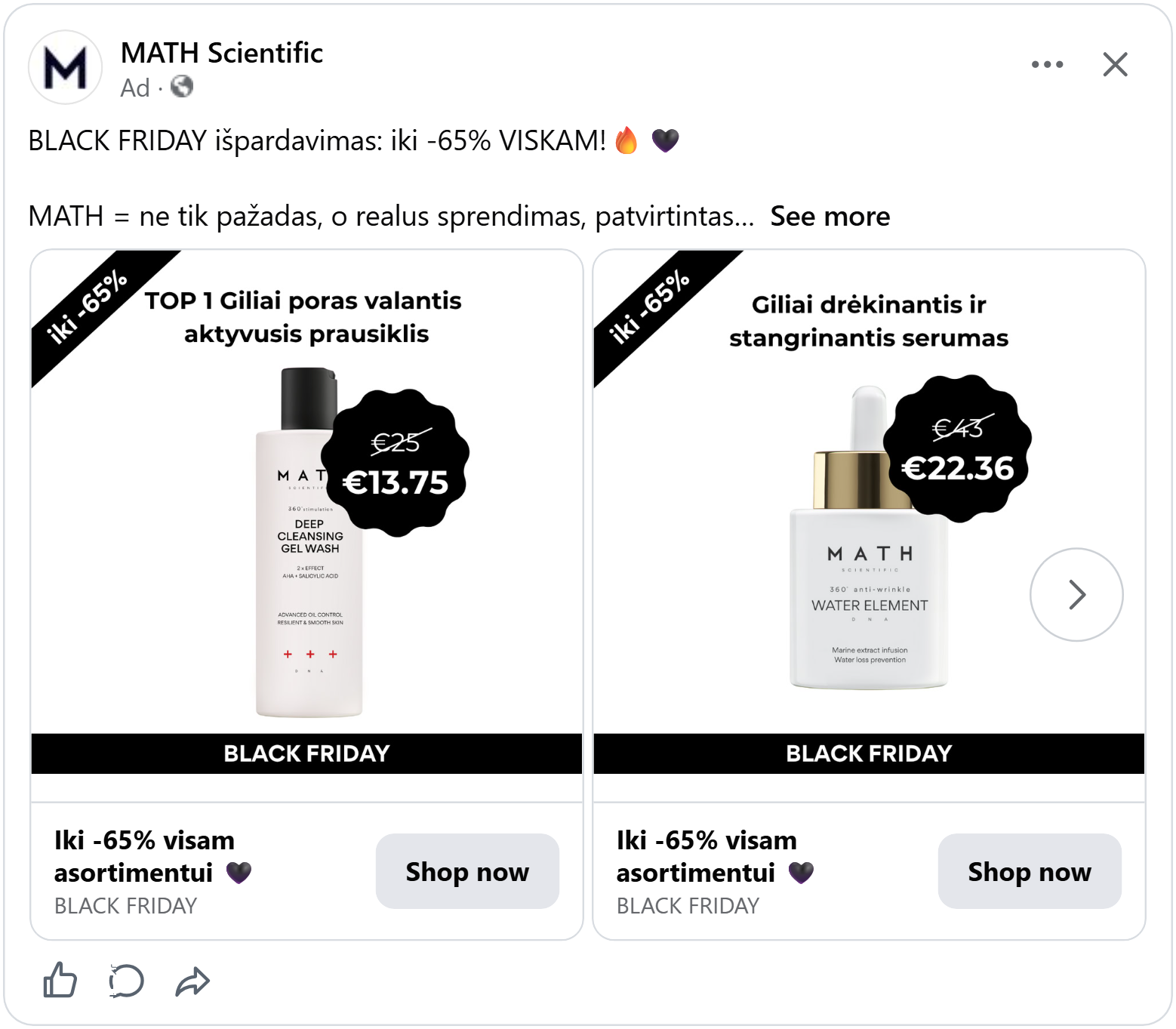
A white bottle of deep cleansing gel wash stands on a clean white background. Right next to it, a big black badge shaped like a bubbly seal. Inside: "€25," crossed out, and under it, big and bold, "€13.75."
At the top, one line says it's the shop's "No. 1 deep pore-cleansing wash" (in Lithuanian). A black ribbon in the corner says "up to -65%." And a black bar at the bottom simply says "Black Friday."
The badge sits so close to the bottle that you see the product and the price in one glance. You don't have to look around to find the deal.
The price in a box
A tall silver can of hair texture spray stands in a white frame. Around the frame, a swirl of hot pink and orange, like paint mixed in water. In the top right corner, a dark box: "£26.50," crossed out, then "£18.55."
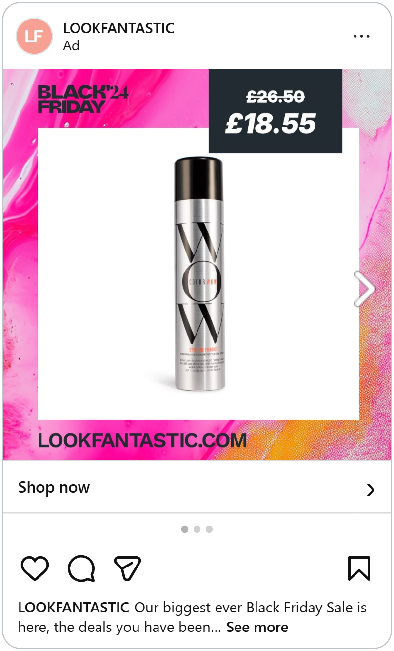
The pink background makes the ad pop in a busy feed. The white frame keeps the product clean and easy to see. And the dark price box is the only dark thing in the picture, so your eyes go straight to it.
The price, the percentage and the sitewide deal
A Montblanc perfume bottle fills the left side of the ad, so big it almost touches the edges. On the right, on black: "Black Friday. Sitewide, up to 80% off". And in a red box at the bottom: "From R$349,90" crossed out, "Now R$279,90," and "-20%."
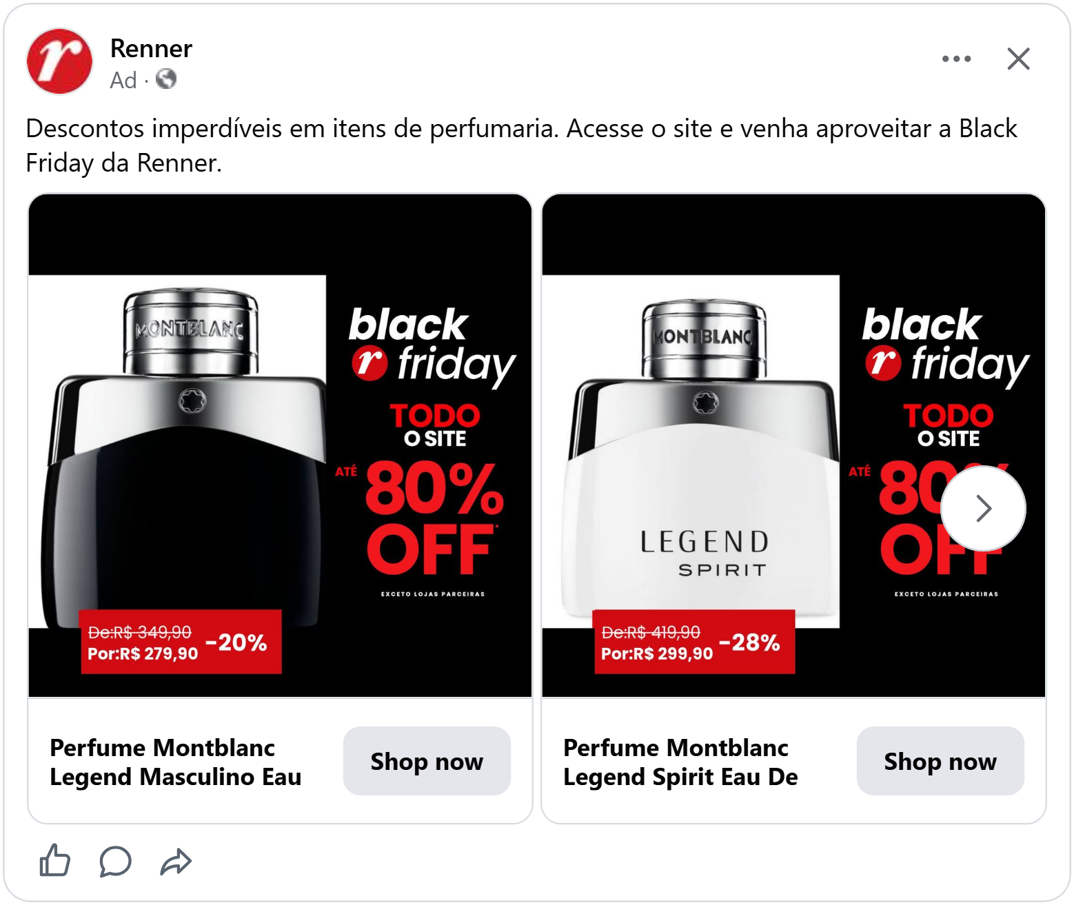
This ad gives you two deals at once. The big "up to 80% off" is for the whole shop and makes you curious. The red box is for this exact bottle, and it tells you exactly what you'll pay. One gets attention, the other gets the sale.
A crossed-out price works for everyone. But some shops go one step further and give their regular customers a price of their own.
More ways to show a discount in your ads.
Give your members a better price
What's better than one price? Two prices, where one is just for you.
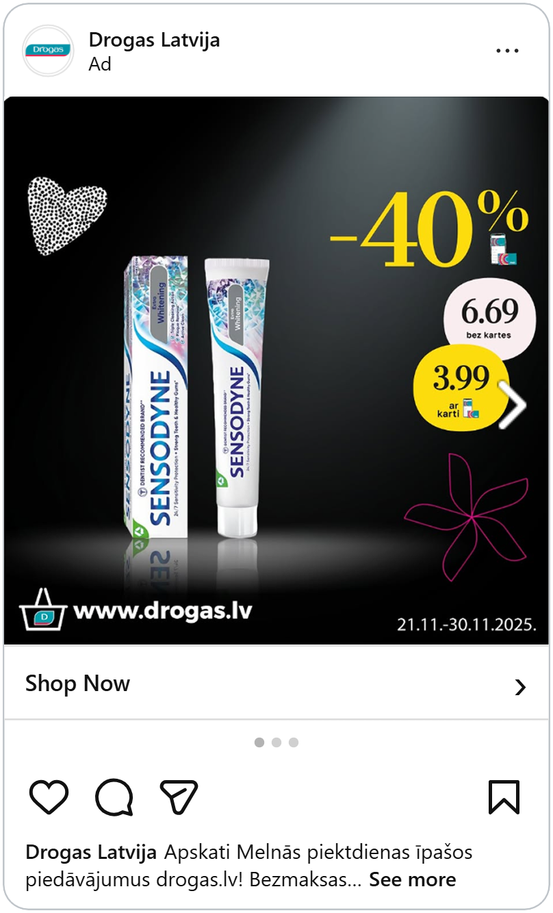
Two tubes of toothpaste stand in a soft spotlight on a black background, like they're on a stage. In the top right corner, a huge yellow "-40%."
Then come two round price bubbles. A pale pink one: "6.69, without card." And a bright yellow one: "3.99, with card". Next to it, a tiny picture of the shop's app and loyalty card.
This ad does something clever. Members see their price and feel rewarded. Everyone else sees how much they could save and thinks: "Maybe I should get that card." And the dates at the bottom, "21.11–30.11.2025," tell everyone exactly how long they have.
This ad makes a simple product feel special with a stage and a spotlight. But some products don't need a stage at all. Their name is enough.
See how a members price lifted ROAS by +33%.
Let the famous name do the work
Perfume is hard to sell online. You can’t smell it through a screen. So how do you get someone to buy a scent they can’t try?
You show them one they already know.
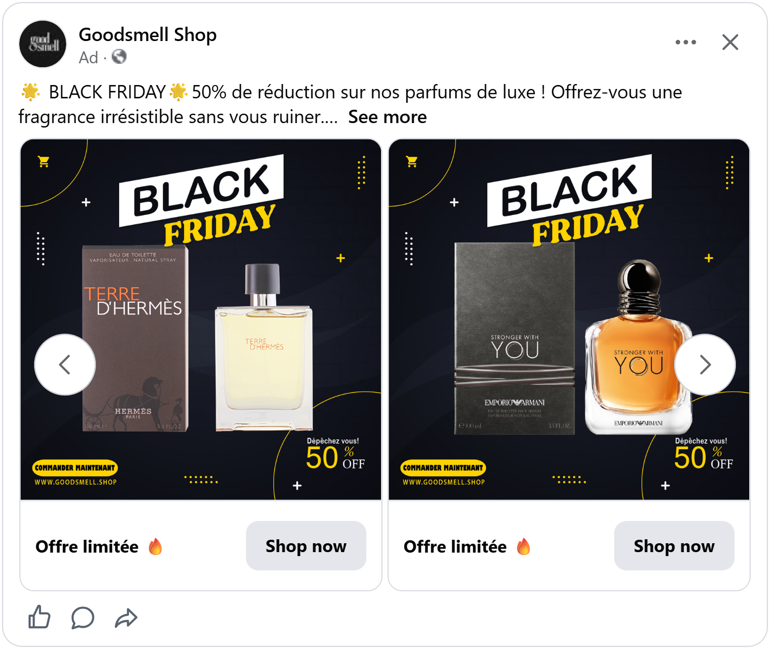
This ad shows a bottle of Terre d’Hermès and its box, big and right in the middle. Above it, “Black Friday” in bold black and yellow letters, tilted as if it’s in a hurry. In the corner: “Hurry! 50% off.” And at the bottom, a yellow button that says “Order now.” Swipe to the next card and it’s Emporio Armani’s Stronger With You, in exactly the same layout.
There are no long sentences or extra products. The ad doesn’t need to explain what Terre d’Hermès is. People who love it will stop the second they see the bottle.
For a perfume shop, a famous bottle is a shortcut. Shoppers recognise it, they know how it smells, and the only question left is the price.
A famous bottle tells you what you’re buying. But a beauty ad can do something more: show you how it feels to own it.
Put a person in the picture
Most beauty ads show a bottle on a plain background. It's clean, but it can feel a bit cold.
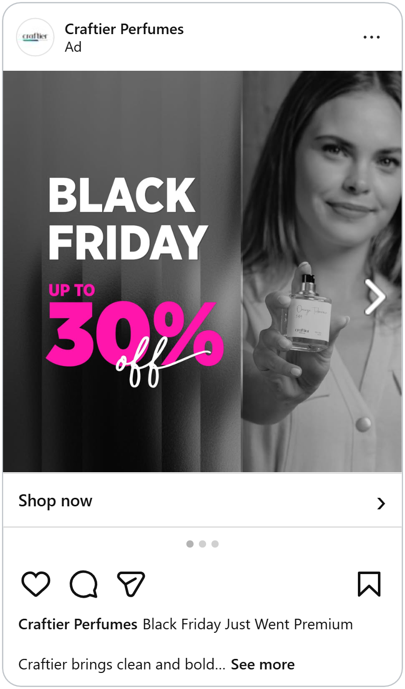
This ad does something different. The whole picture is in black and white. On the right, a woman smiles softly and holds a perfume bottle out toward you, as if she's handing it over. On the left, in white letters, "Black Friday," and below it, in bright pink, "Up to 30% off."
The pink is the only color in the whole ad, so it's impossible to miss. And the woman's smile and outstretched hand make the ad feel warm and personal, like a friend telling you about a perfume she loves.
People connect with faces. A real person holding the product makes it feel less like an ad and more like a recommendation.
Every ad so far gives people a reason to want the product. But beauty shoppers have one habit that gets in the way: they add things to their wishlist and wait.
See how much a model can lift your ad's performance.
Time is running out
A beauty wishlist can get long. The moisturiser, the serum, the new shower gel, all saved for "the right moment." On Black Friday, that moment is now. The trick is making shoppers notice it.
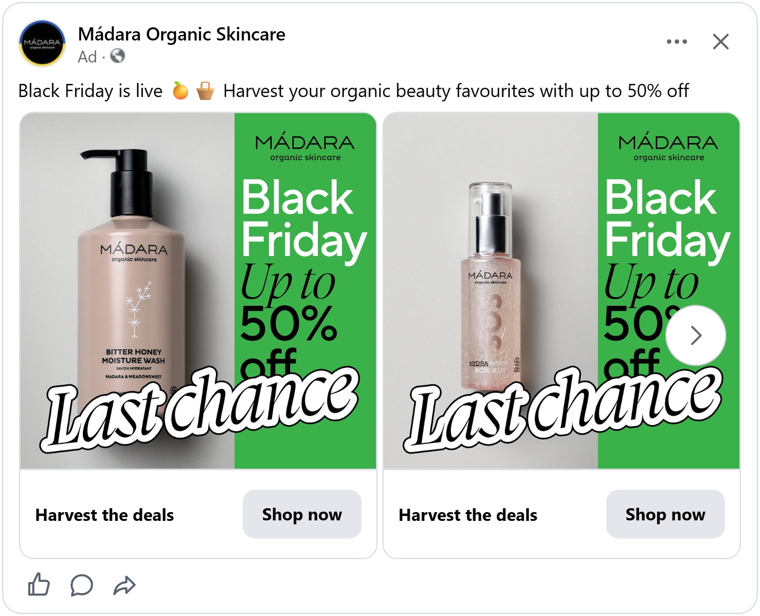
Madara's ad starts like any calm skincare photo. A soft pink bottle of moisture wash stands on a light grey background, next to a green panel: "Black Friday. Up to 50% off."
Then two words crash right through the middle: "Last chance." Big, curly, outlined letters, stuck across both the bottle and the panel.
It breaks the calm on purpose. Organic skincare usually looks quiet and gentle, so a loud sticker is the last thing you expect. That surprise makes you stop and read it. And once you've read "last chance," waiting on your wishlist suddenly feels like a bad plan.
Madara gives shoppers a reason to buy today. The last ad makes buying as easy as one tap.
More ways to make your shoppers buy today, not later.
Add a Call to Action
Some beauty products need a little explaining. An electric foot file isn't something people see in their feed every day, so the ad has to show what it is, what it costs and where to go next.
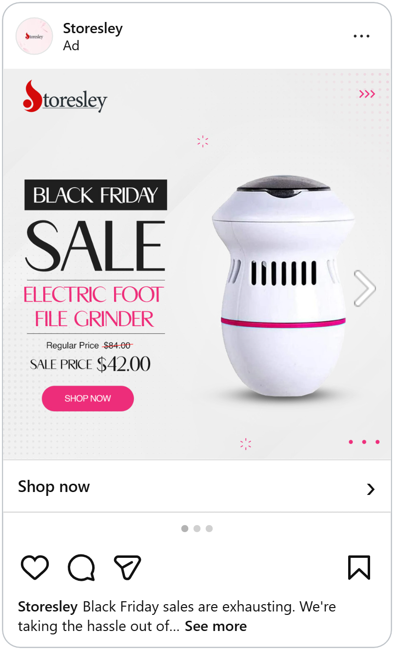
This ad shows an electric foot file on a light grey background. On the left: "Black Friday," then a huge "SALE," then the product name in pink. Under that, "Regular price $84.00," crossed out, and "Sale price $42.00."
And at the bottom, a round pink button: "SHOP NOW."
The ad reads from top to bottom like a label on a shop shelf: it's Black Friday, it's on sale, this is what it is, this is the price. Then the pink button at the end gives your eyes somewhere to land.
The button is the same pink as the product name and the stripe on the foot file, so it feels like part of the design, not something added at the end. And when the next step is right there in the picture, more people take it.
You've seen nine beauty ads that sold well on Black Friday and none of them needed the biggest discount to do it. These ads made the deal easy to trust, the product easy to want and the next step easy to take. You don't need all nine, pick two or three that feel like your brand and your Black Friday ads are ready.