
14 Electronics Black Friday Catalog Ad Examples
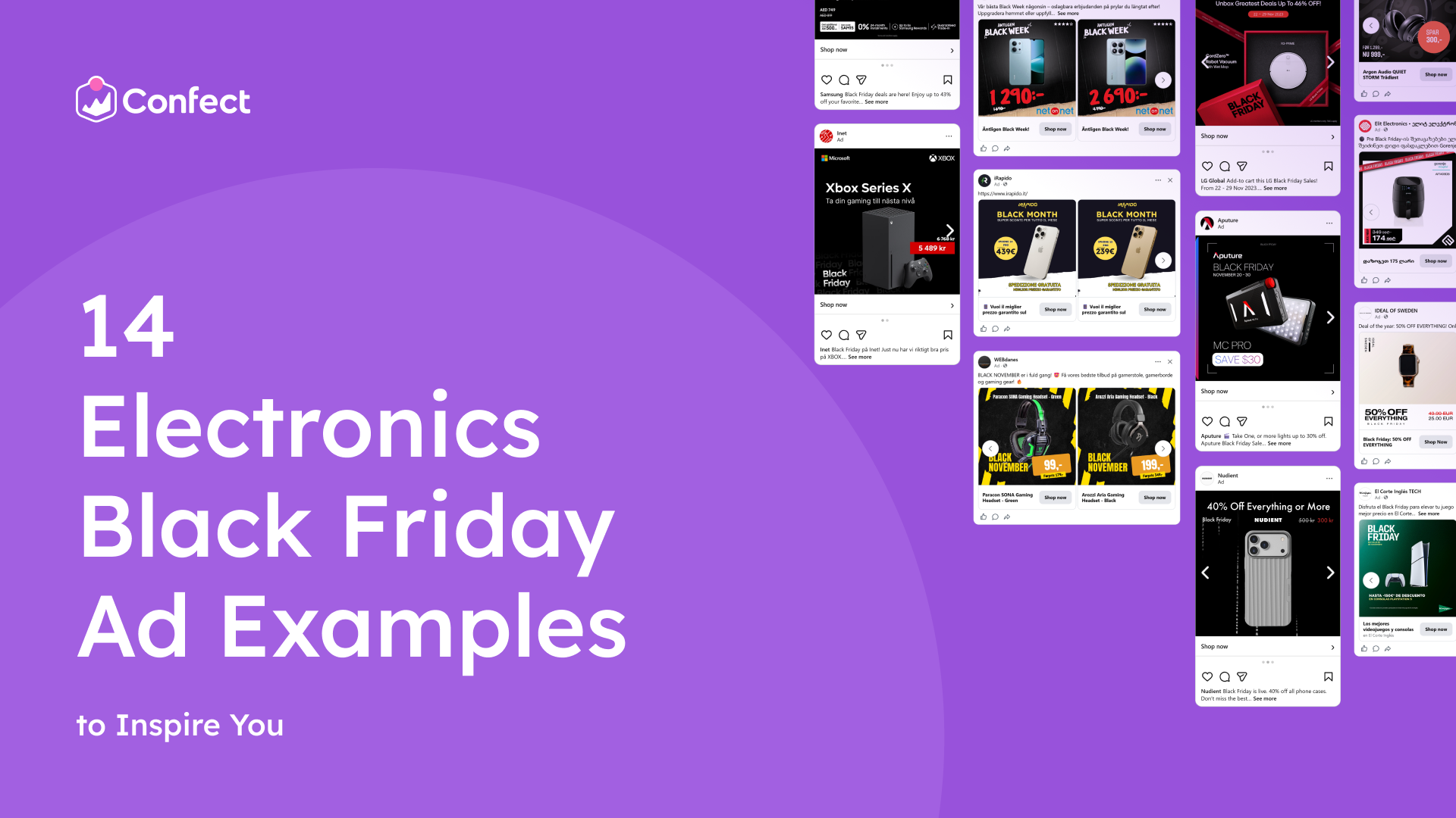
Electronics is the hardest category to stand out in on Black Friday. The same headphones, the same game console and the same washing machine are on sale in dozens of shops at once, often for almost the same price. Shoppers open five tabs and compare.
So when the product and the price are the same, what makes someone pick your shop?
The ad.
A well-designed electronics ad on Facebook and Instagram shows the saving clearly, answers shoppers’ questions before they ask and makes the deal feel safe to take. A badly designed one gets scrolled past, even with a great price. And because Catalog Ads use one template for your whole product range, getting the design right lifts every dynamic product ad you run.
See an ad you like? ClickRecreate with Confect.Confect's AI rebuilds it as a Catalog Ad template filled with your own products.
Below are 14 real electronics Black Friday Catalog Ads that get the design right. Each one shows a different idea you can use in your own Meta Catalog Ads this November. Scroll through, find the designs that fit your shop and apply them before Black Friday.
Table of contents
- State the savings
- Big savings big circle
- Sale price impossible to miss
- A price that looks handwritten
- The details shoppers compare
- The model next to the logo
- Line up every extra
- A promise shoppers can trust
- Wrap the deal like a present
- Let the color lead
- Speak your buyer's language
- Make it loud
- Keep premium tech clean
- Light and calm
State the savings
Percentages are tricky with electronics. "15% off" sounds small, even on a product that costs hundreds. But "$30 back in your pocket" is something everyone understands right away. When a product is expensive, the saving in real money often sounds bigger and feels more real than the percentage.
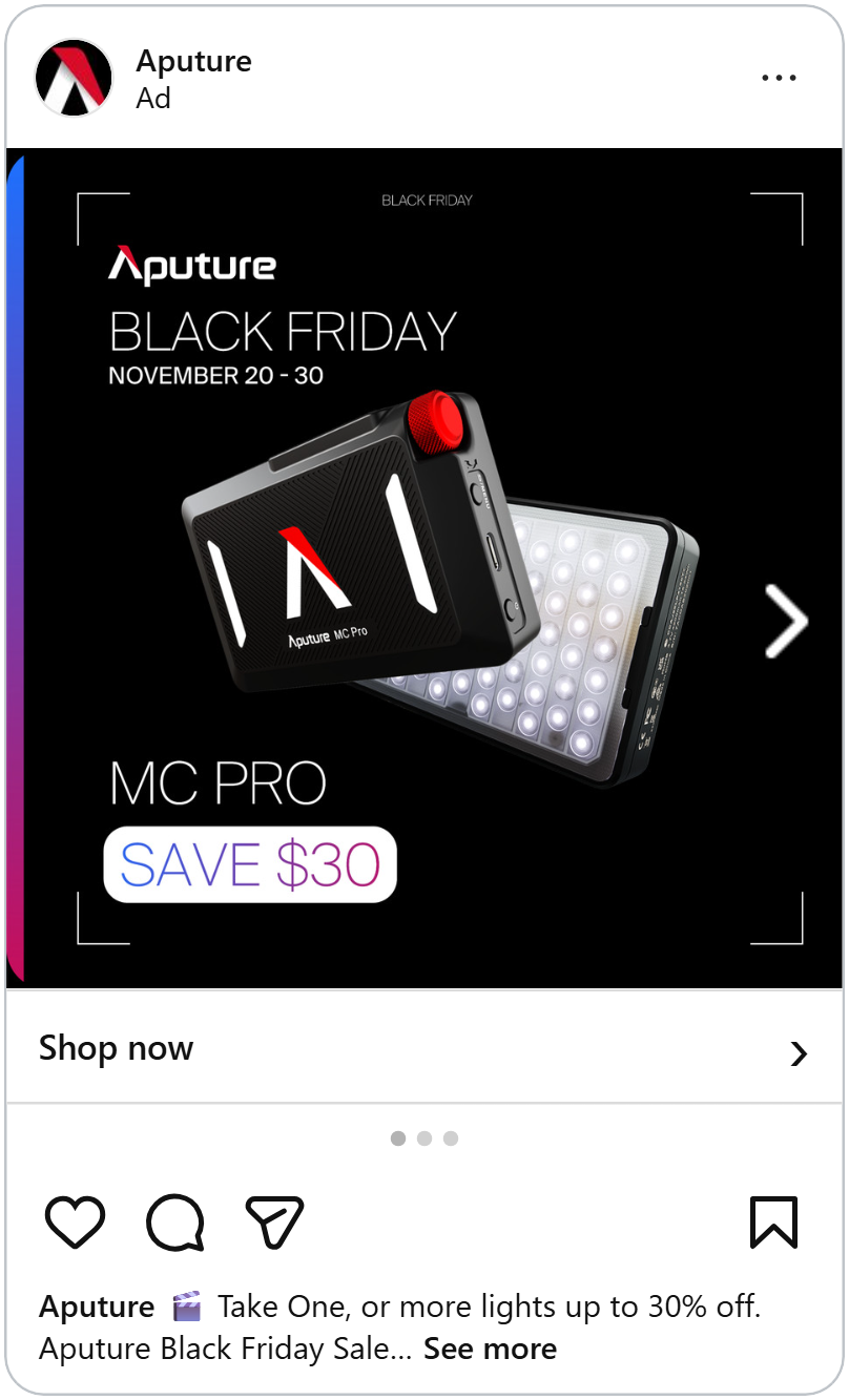
Aputure's ad is almost all black. A small LED light floats in the middle, tilted so you can see both the front and the glowing back. A thin frame of white corner lines sits around the edges, like the viewfinder on a camera. That's a smart touch, because this light is made for people who film things.
At the top: the logo, "Black Friday" and the dates, "November 20–30." At the bottom, the product name, "MC PRO," in big thin letters. And under it, a white pill with "SAVE $30" in a blue-to-pink gradient, the same colors as the stripe running down the left edge.
The ad never mentions a percentage. It just tells you how much you keep. And because the gradient appears only twice, on the stripe and in the badge, your eyes jump straight to the saving.
Big savings big circle
This ad shows a pair of black over-ear headphones on a dark background. Look closely and the background is made of giant percent signs, faded into the dark. It whispers "sale" without saying a word.
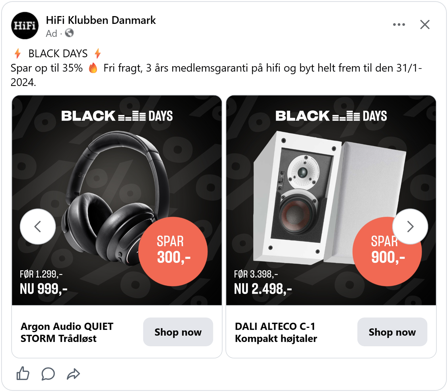
Overlapping the right ear cup is a big coral circle: "Save 300,-" (in Danish). It's the only warm color in the whole ad, so it's the first thing you see. In the bottom corner: "Before 1,299,-" and "Now 999,-."
The circle tells you the saving, and the corner tells you the final price. Shoppers get both answers in one look, without doing any math.
Knowing how much you save is great. But on Black Friday, many shoppers only care about one number: what they'll pay.
See more ways to make your savings impossible to miss.
Sale price impossible to miss
When shoppers compare electronics across shops, the price is the first thing they look for. If they have to search for it in your ad, they'll move on to an ad where they don't. These two ads make the new price the biggest thing in the picture.
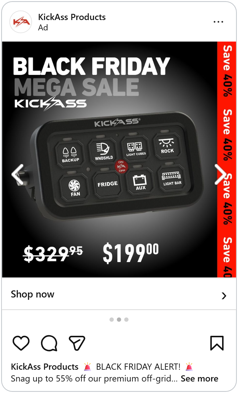
KickAss sells gear for 4x4 cars and campers, and this ad shows one of their switch panels, the kind you mount in your car to control lights, a fridge and a fan. The panel sits on a dark background with a soft spotlight behind it, so every button is easy to read.
At the top, "Black Friday Mega Sale" in huge, chunky letters. At the bottom, "$329.95" crossed out, and next to it "$199.00" in white numbers so big they almost match the panel. Down the right edge runs a red strip with "Save 40%" repeated from top to bottom.
There's no way to miss the price. And the red strip keeps the saving on screen no matter where your eyes land.
See why the old price matters more on Black Friday.
A price that looks handwritten
NetOnNet's ad looks like it was made from a black cardboard box. You can see the folds in the background, and at the bottom the cardboard is torn open to show the brown layer underneath, like a package that just arrived.
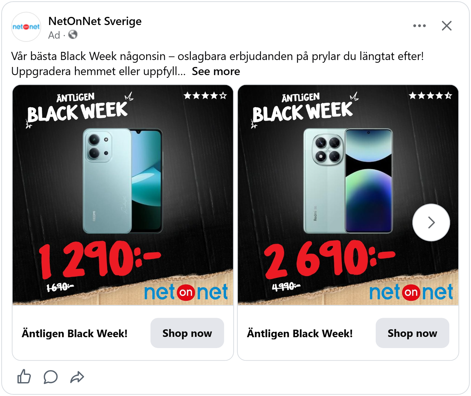
A light blue Redmi phone sits in the middle. At the top: "Finally Black Week", written like a quick note with a marker. In the top right, four stars out of five.
And then the price: "1 290:-" in huge red letters that look painted on by hand, like a price sign in a shop window. The old price, "1 690:-," is crossed out underneath.
The handwritten style makes the deal feel like a real bargain someone just marked down, not a number from a computer. And the stars add one more reason to trust the phone before you even click.
A big price gets attention. But with electronics, a price alone isn't always enough to make someone sure they've found the right product.
The details shoppers compare
Nobody buys a washing machine on a whim. Electronics shoppers want to know exactly which model they're looking at, how big it is and what it can do, because that's how they compare one deal with another. These two ads put those details right in the design.
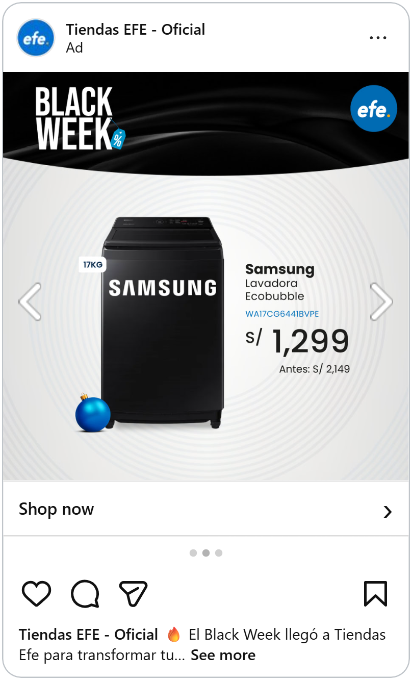
This ad from efe, a shop in Peru, shows a tall black Samsung washing machine on a soft grey background with gentle rings around it, like ripples in water. A small white tag next to it says "17KG," the size of the load it can wash.
On the right, everything a shopper needs, stacked in order: the brand, "Samsung," in bold. The product type, "Ecobubble washing machine". The full model number in blue. And then the price, "S/ 1,299," with "Before: S/ 2,149" underneath.
It reads like a short product page. A shopper can copy the model number, check it against another shop, and see that this deal is the better one, all from the ad.
The model next to the logo
A black air fryer sits on a white card in the middle of the ad. Across the top corner, a red tape with "Black Friday" printed over and over, stuck on at an angle like police tape.
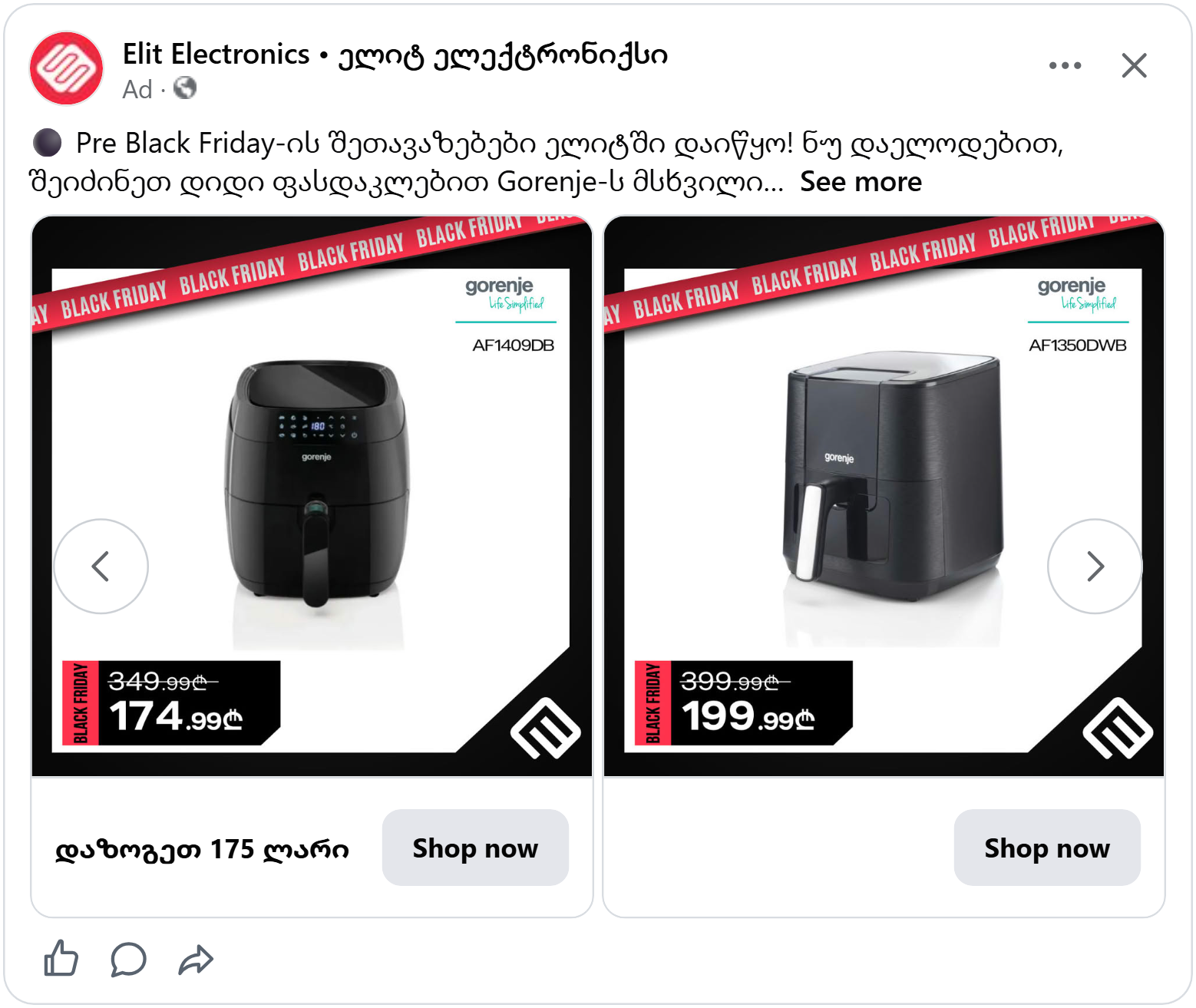
In the top right corner: the Gorenje logo, a thin line, and the model number, "AF1350DWB." In the bottom left corner, a black price box with "Black Friday" written sideways in red: "399.99" crossed out and "199.99" in large white numbers.
The white card keeps the air fryer clean and easy to see. The tape and the price box sit on opposite corners, so the ad feels balanced, and the eye moves from the brand, to the product, to the price.
The right details help shoppers choose the product. But on Black Friday, the product isn't the only thing people compare. They compare everything that comes with it.
Line up every extra
Big electronics brands often can't cut prices as deep as smaller shops. So they win in a different way: by giving shoppers more reasons to say yes.
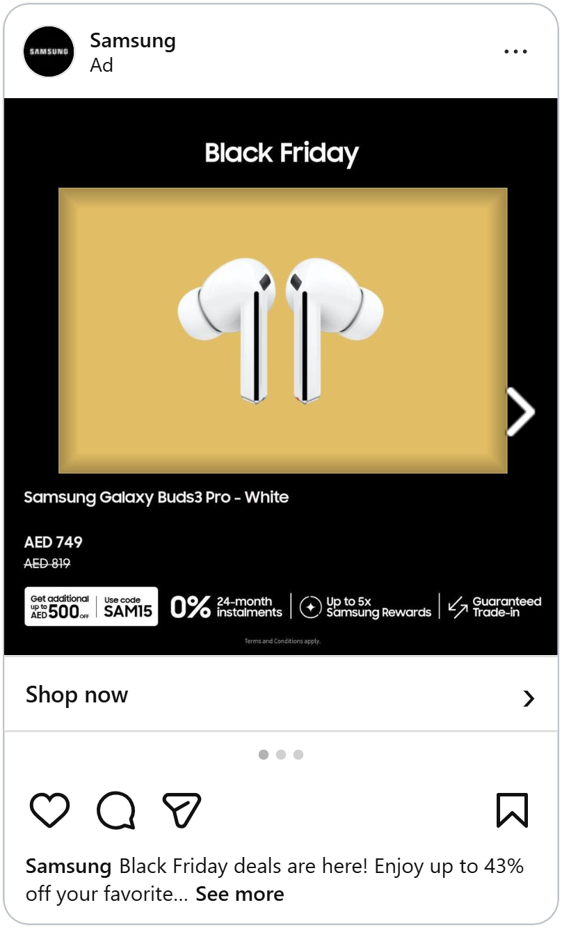
Samsung's ad puts a pair of white Galaxy Buds3 Pro on a warm gold panel, framed on a black background. Below it, the product name, the new price, "AED 749," and the old price, "AED 819," crossed out.
The saving itself isn't huge. But then comes a row along the bottom, split into neat sections with thin lines:
- A white box: "Get up to AED 500 off, use code SAM15"
- "0% 24-month instalments"
- "Up to 5x Samsung Rewards"
- "Guaranteed trade-in"
Each extra has its own small icon, so the row is quick to scan. One shopper cares about paying monthly, another wants to trade in their old earbuds, a third just wants the code. Everyone finds their reason in the same strip.
The gold panel makes the earbuds glow, and the black around it keeps the whole ad feeling premium, even with this much information in it.
Extras give shoppers more reasons to buy. But when a shopper is about to spend hundreds on a phone, the biggest thing they need is to feel safe.
A promise shoppers can trust
Buying an expensive phone from a shop you don't know is a big step. What if there's a better price somewhere else? What if shipping costs a fortune? A short promise in the ad can answer both before the shopper even asks.
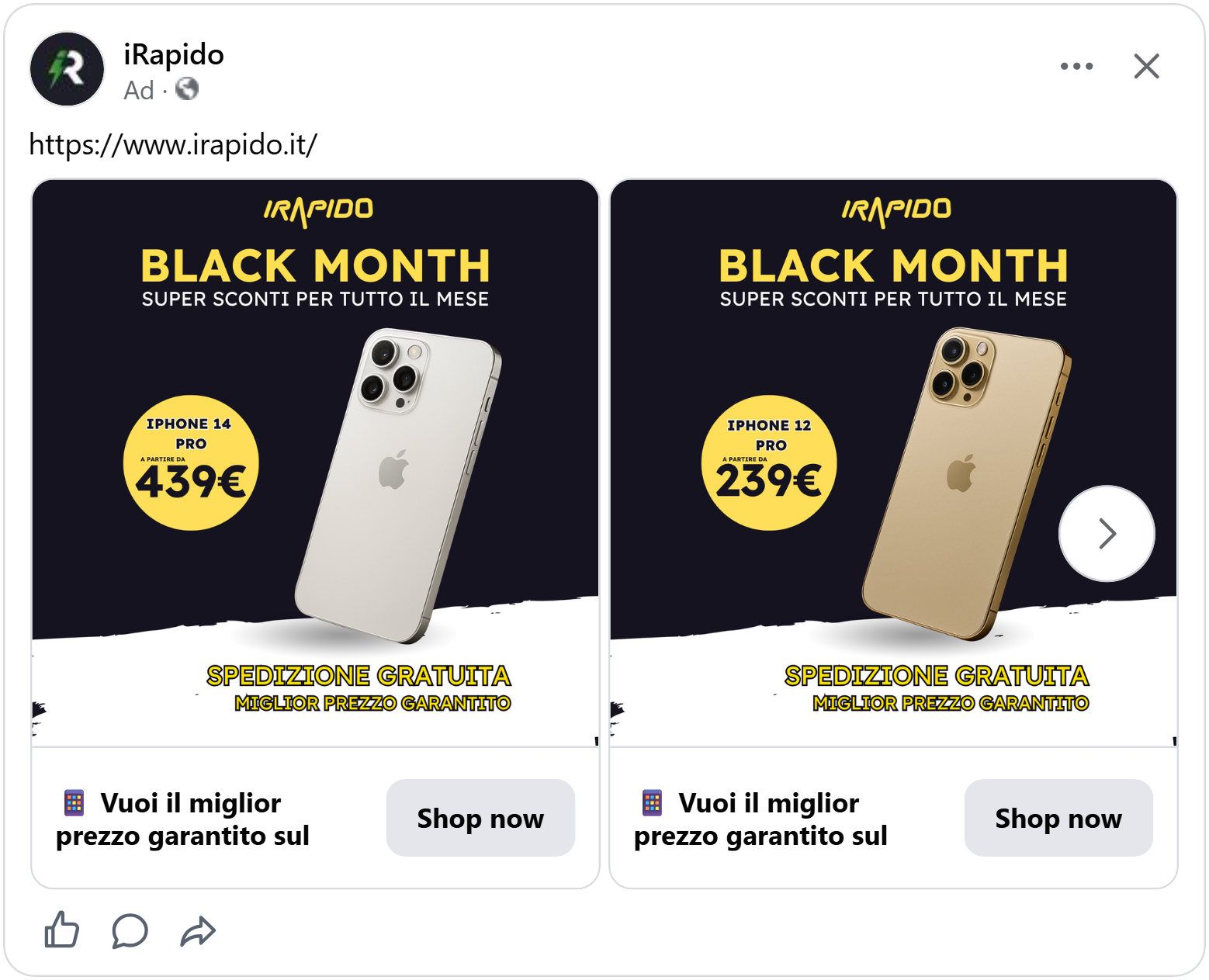
iRapido's ad has a dark navy top and a white bottom, split by a rough brush stroke. A silver iPhone 14 Pro leans across the middle, standing on the white part like it's on a shelf.
At the top, in yellow: "Black Month," and under it, "Super discounts all month long". On the left, a big yellow circle: "iPhone 14 Pro, from 439€."
And at the bottom, in bold yellow letters with a black outline: "Free shipping" and "Best price guaranteed."
Those last two lines do a lot of work. "Best price guaranteed" tells shoppers they can stop opening new tabs to compare. "Free shipping" tells them the price they see is the price they pay. Both remove a reason to wait.
The yellow ties it all together. The logo, the headline, the price circle and the promises are all the same color, so the eye jumps from one to the next and reads the whole deal in a few seconds.
Promises make shoppers feel safe. But a great ad can also make the deal feel exciting, like opening something new.
Wrap the deal like a present
A robot vacuum isn’t the most exciting thing to see in your feed. But turn the ad into a story, and suddenly even a vacuum can catch someone’s eye.
LG’s ad is built like a present being opened. A big red box sits in the middle of a black background, and inside it, a white robot vacuum. The lid of the box has been pushed to the bottom corner, with “Black Friday” printed on it in bold black letters. Red ribbons with “LG Black Friday” written on them stretch across the whole ad.
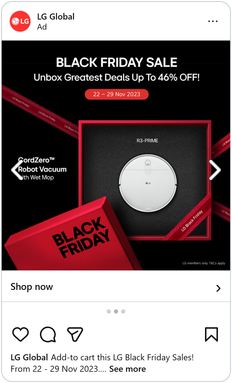
The headline plays along: “Unbox greatest deals up to 46% off!” Under it, a small red pill with the dates, “22–29 Nov.” On the left, the product name, “CordZero Robot Vacuum with Wet Mop,” and above the vacuum, its model number.
The idea is simple: Black Friday deals feel like getting a gift. The box, the ribbons and the word “unbox” all tell that same story, and the vacuum becomes the surprise inside. It’s an everyday product, made to feel special.
A good idea can carry an ad. So can something even simpler: the colors people already know you by.
Let the color lead
On Black Friday, almost every electronics ad is black. That makes sense, but it also means they all start to blend together. A shop with a strong brand color can stand out simply by using it.
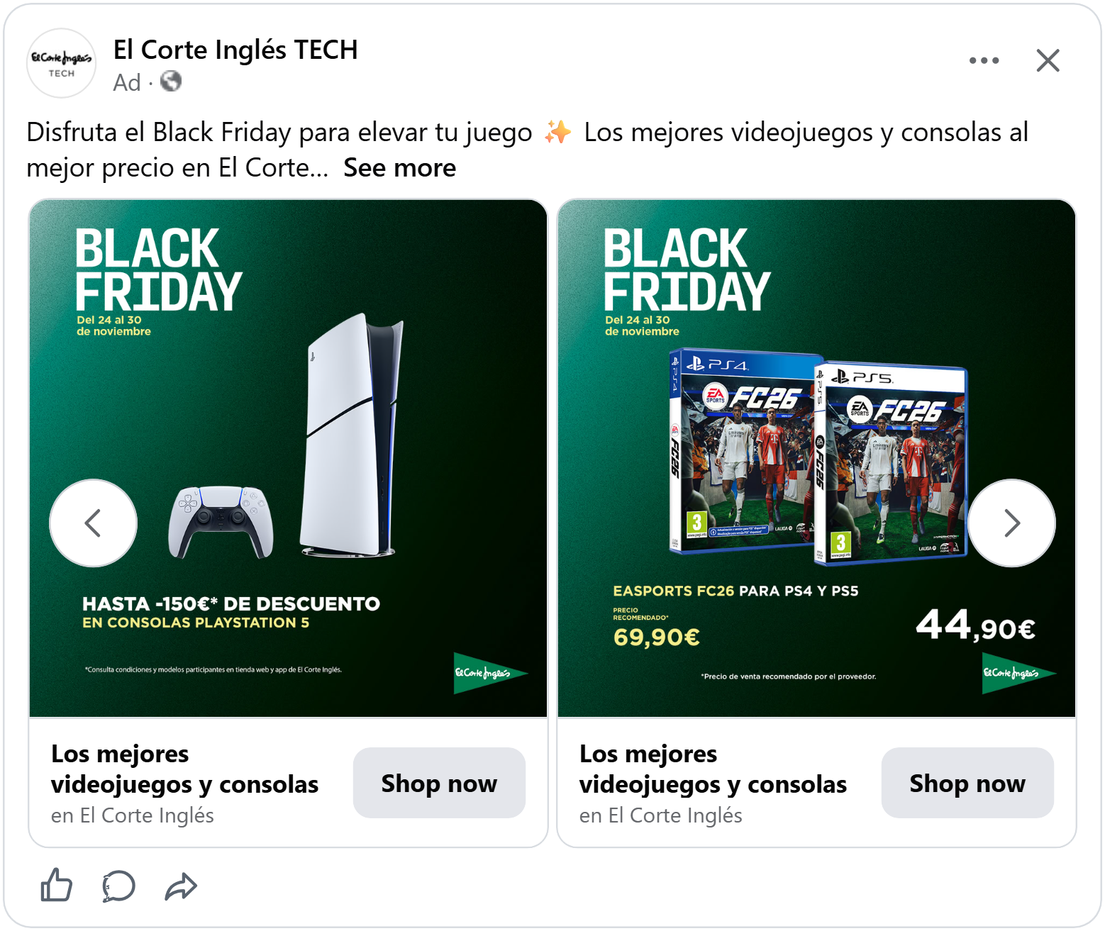
El Corte Inglés is one of Spain's biggest department stores, and its color is green. So its Black Friday ad isn't black at all. A white PlayStation 5 and its controller stand on a deep green background that fades darker toward the edges.
"Black Friday" sits in the top left in big white letters, with the dates, "24 to 30 November," in soft yellow underneath. At the bottom: "Up to -150€ off PlayStation 5 consoles". And in the corner, the store's green triangle logo.
The console doesn't need a price on it. People who want a PS5 already know roughly what it costs, so "up to 150€ off" is all they need to hear. And the green tells shoppers which store it's from before they even read the logo.
Your colors tell shoppers who you are. The way your ad talks tells them who it's for.
See which colors help your ads sell.
Speak your buyer's language
Electronics shoppers aren't all the same. A gamer, a parent buying a washing machine and a photographer looking for a light all want different things. The ads that work best speak to one of them directly. Here are two gaming ads that do it in very different ways.
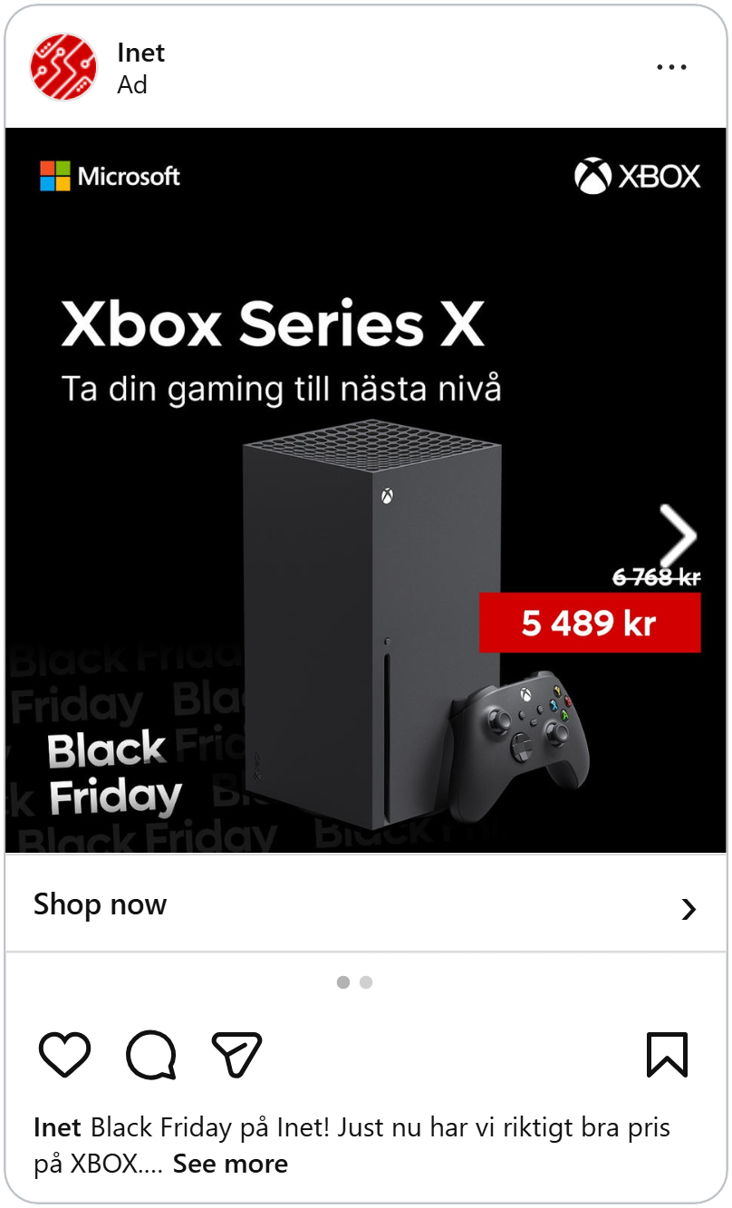
This ad shows an Xbox Series X and its controller on a black background. The Microsoft logo sits in the top left, the Xbox logo in the top right.
The headline is just the product name, "Xbox Series X," in big white letters. Under it, one short line: "Take your gaming to the next level". On the right, "6 768 kr" crossed out and "5 489 kr" in a red box. And in the bottom corner, "Black Friday" repeats in faded grey letters, layered like an echo behind the white one.
The ad doesn't talk about the processor or the storage. It talks about what gamers care about: playing better. One line in their words is enough.
Make it loud
This ad for an Arozzi gaming headset looks nothing like the Xbox one. The background is black and grainy, with torn yellow stripes along the edges, like warning tape ripped off a wall.
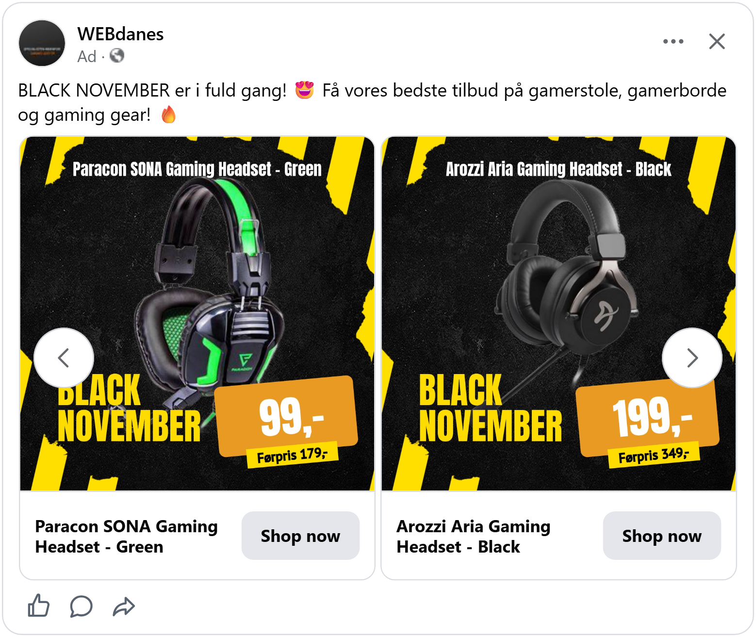
"Black November" is written in tall yellow letters on the left. On the right, a tilted orange box with "199,-" in huge white numbers, and a yellow tag below it: "Previous price 349,-". The product name sits across the top.
It's loud, bold and full of energy, just like the games the headset is made for. A calm, minimal design would feel wrong for this product. This one feels like it belongs in a gamer's feed.
Loud works for gaming. But for some tech products, the smartest design choice is to say less.
Keep premium tech clean
Some brands sell tech that's as much about looks as it is about function, like a phone case or a watch strap. For them, a busy Black Friday ad can make the product look cheap. This ad show the deal while keeping the product looking premium.
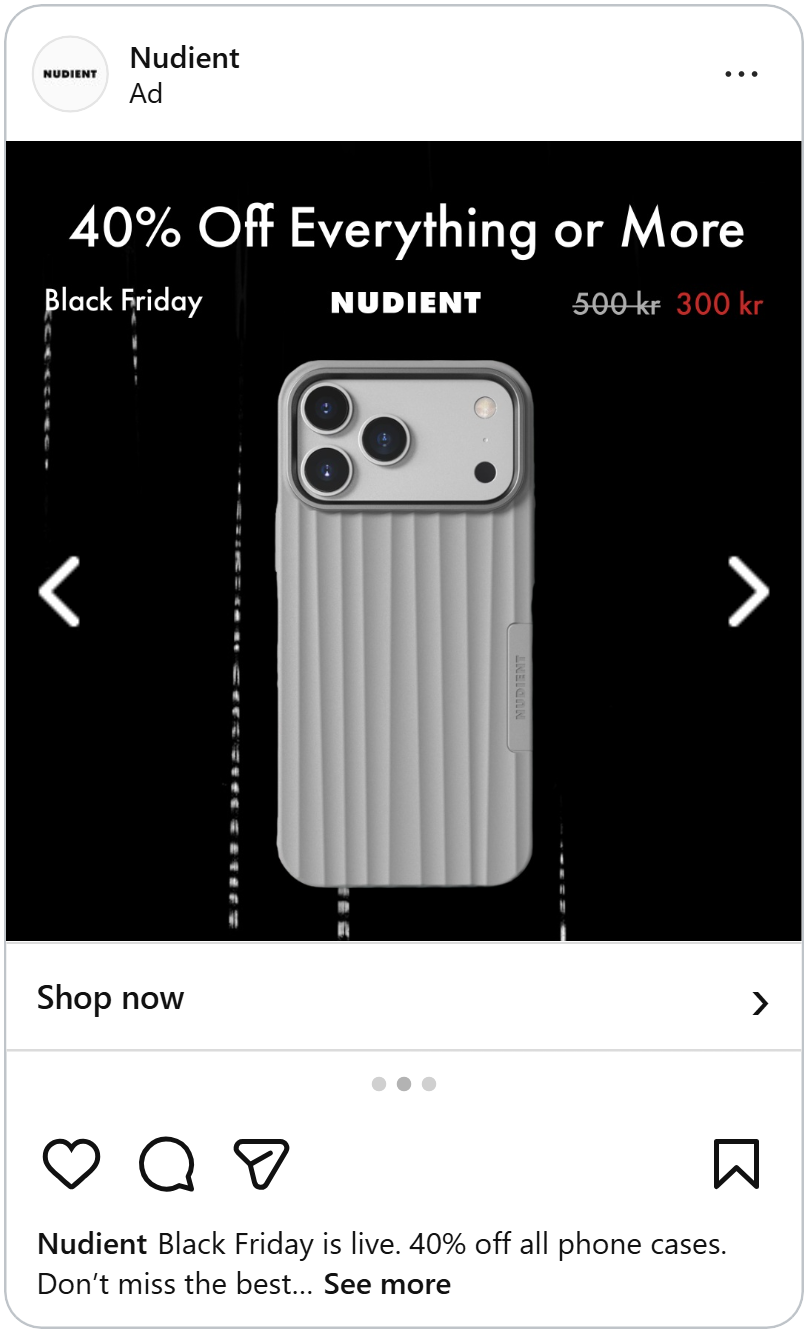
Nudient's ad shows one black phone case on a black background, with thin lines of light falling behind it like rain. That's it for the picture.
All the text sits in one line at the top. "40% off everything or more" as the headline. Under it, three small pieces spread across the width: "Black Friday" on the left, the Nudient logo in the middle, and "300 kr" crossed out in grey next to "180 kr" in red on the right.
The red price is the only color in the whole ad, so it pulls your eye right to it. Everything else stays quiet and dark, just like the case itself.
See how a premium electronics shop sells without shouting.
Light and calm
Ideal of Sweden's ad goes the other way: light instead of dark. A tortoiseshell watch strap on a smartwatch sits in the middle of a soft cream background, with lots of empty space around it. The logo runs down the left side, written sideways.
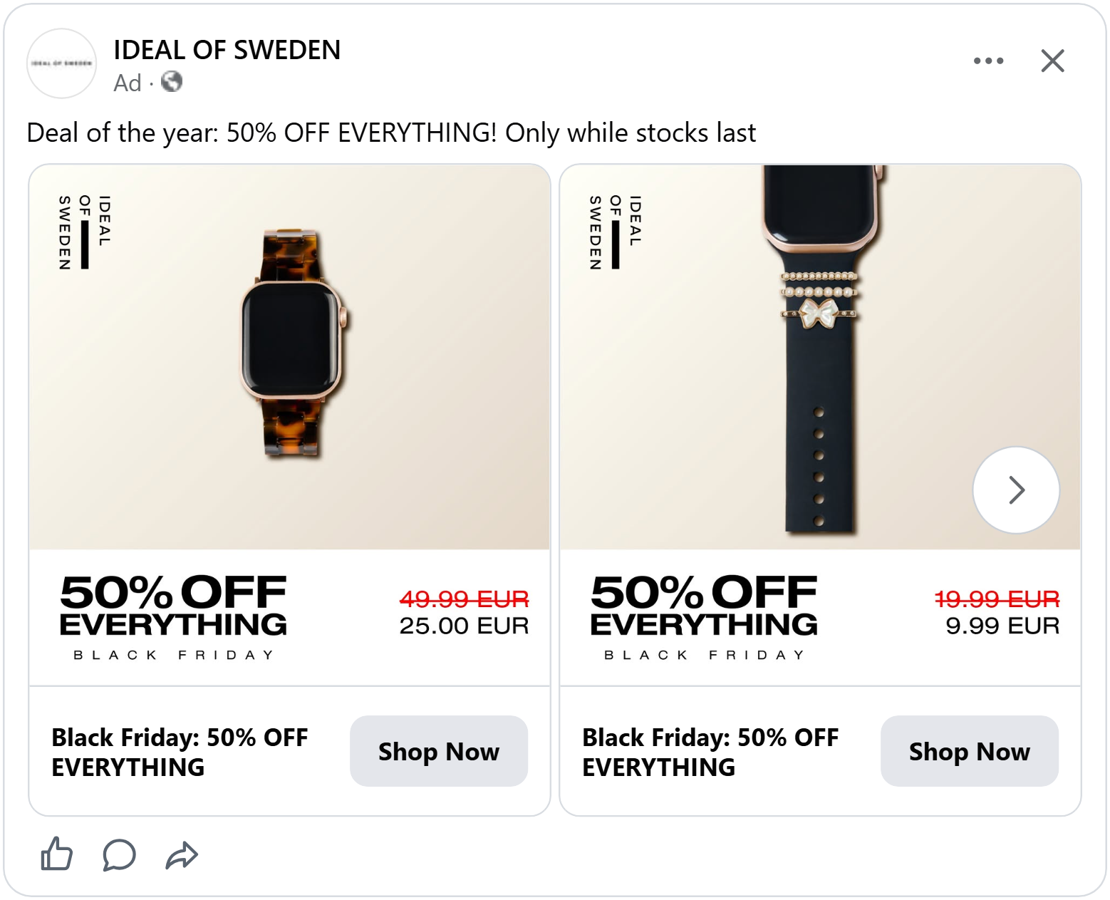
A white bar along the bottom holds the deal. "50% off everything" in bold black letters, with "Black Friday" spaced out underneath. On the right, "49.99 EUR" crossed out in red and "25.00 EUR" in black.
The empty space is what makes this ad feel premium. It's the same trick fashion and jewellery brands use: give the product room, and it looks more valuable. The deal stays in its own bar at the bottom, so it never crowds the product.
You've seen 14 electronics ads that sold well on Black Friday and every one of them was selling something shoppers could find in a dozen other shops. When the product and the price are the same, the ad is what makes them pick you. You don't need all 14, pick two or three that fit your shop and your Black Friday ads are ready