The ultimate guide for creating urgency in Catalog Ads
April 30, 2023
.png)
Let's be honest, most people like to procrastinate.
Whether it's a project for work or a trip we want to take, sometimes having a deadline helps us execute.
And the same logic applies in Catalog Ads.
Why shouldn't your audience wait a day, a week, or even a month to buy from you if there's no deadline?
Urgency and fear of missing out are not new concepts in marketing, but often, advertisers forget to apply this in their catalog ads. When you consider that Catalog Ads are usually used in bottom-funnel and retargeting, it's the perfect stage to create some urgency to buy from your shop.
We all know discounts are one of the best ways to push a user to the checkout page.
But do you know what's even more effective? Combining a discount with a time limit to create an offer that's hard to pass.
 (1).png)
Showing urgency offers in Catalog Ads
The idea is simple: Discounts make us more likely to buy, and a time limit makes us more likely to do it NOW.
You've probably seen a timer on a product page before. Even though it's now a bit of an outdated tactic, the truth is that it works. And your Catalog Ads, especially the ones you use for retargeting website visitors, deserve the same treatment.
But, as always, there's multiple ways to do it - which is exactly why we've made this article.
A key thing to remember is that special offers work best when they're used strategically. If you always offer a discount, it starts to lose its perceived value.
That's why it's important to make the user understand how this is an offer, that will expire soon - e.g. having a lot of urgency around it.
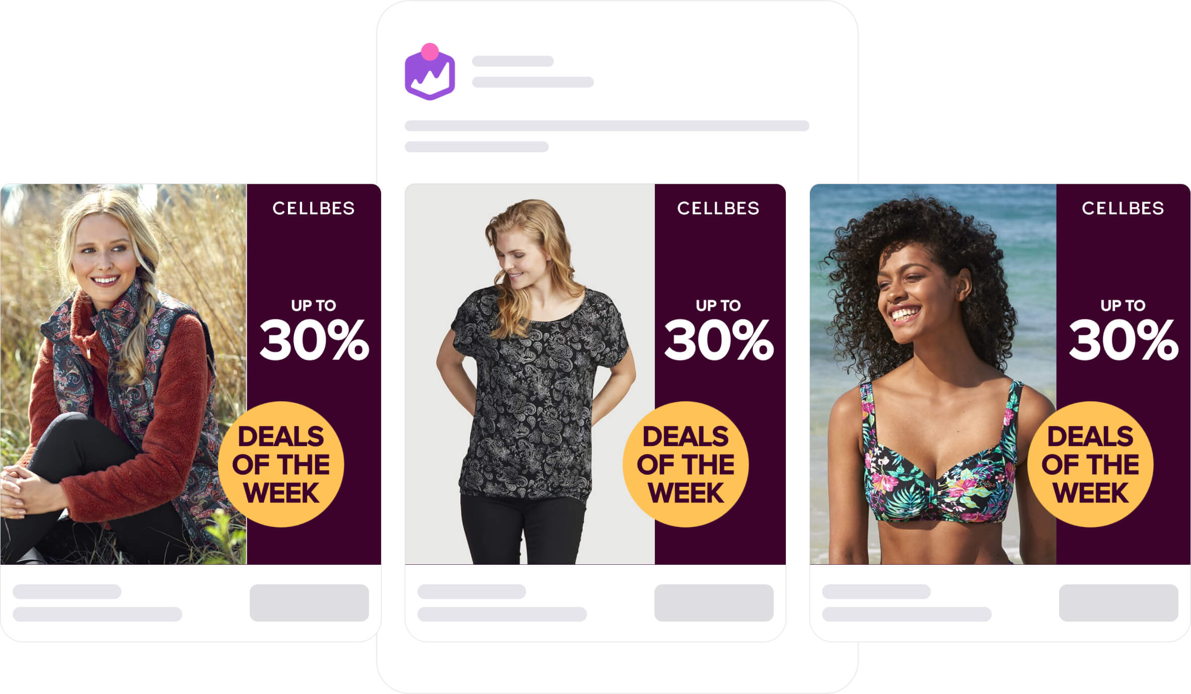
Some brands are doing this with weekly deals: Yes, the shop has weekly deals every week, but the products are rotating (creating urgency for that specific product):

That opens a perfect opportunity for you to run an urgency offer once in a while to convert some of those website visitors, or abandoned carts, you've gathered over time.
When we analysed our dataset, we discovered that Catalog Ads that talk about limited or time-specific offers (scheduled designs) reach, on average, a 30% higher Click-through rate.
.png)
We also found the following when scheduling limited-time designs:
Different ways to run urgency offers
Below, we'll show you all the different ways to create ads that are practically guaranteed to evoke a sense of urgency in your viewers.
But it's also good to know that you can use software like Confect to instantly edit and customize your Catalog Ads to include information such as price, discounts, logos, and more!
Flash sale (24-48h)
 (1).jpg)
The most obvious way of creating an urgency offer is by running a flash sale for only 24 or 48 hours.
An attractive discount valid only for a day or two makes even the most indecisive users think twice about passing this up.
Also, you don't necessarily have to offer huge savings. Depending on your brand and product pricing, a 15% discount might just do the trick. It's definitely worth testing to find the sweet spot, where customers are lining up to give you their payment information, but you're also keeping an attractive profit margin.
In this specific example, the advertiser has chosen not to specify the duration of this promotion. Generally, flash sales last for 2-3 days, so in the eyes of the user, the offer might be valid for as long as 2 days, or as little as 1 hour - quite the psychological trick to create urgency.
And there's many opportunities for having flash sales - singles day being one of them, a sale campaign lasting only that day.

Alternatively, you could specify that this flash sale "ends on Friday", or clarify by stating "today only", based on your marketing decisions.
Specified period
 (1).jpg)
Another useful tactic is specifying the period in which the offer is valid.
This is relevant for time-limited offers that last for more than just a day or two. We've even seen it work great in campaigns such as Black Friday, or December sales.
Generating a fear of missing out this way scream "ACT FAST" less than just running an ad with "FLASH SALE" in bold letters. Making the period noticeable, while not overwhelming the design can take a bit of work but the results are worth it.
Note that it's the end date that creates the urgency, not the start date. That's why it's a good idea to draw more attention to the end date by perhaps making it larger, or omitting the start date completely.
While supplies last
 (1).jpg)
The last option for your urgency offer is making it valid "while supplies last".
You've probably seen this type of offer on TV, in print and even online. It's kind of genius when you think about it.
Since the ad doesn't say exactly how many are left in stock, your shop could have 100 more of them, or maybe it's down to the last 2 pieces. It's this uncertainty combined with a fear of missing out that makes it effective.
"What if the shop literally has just one more of these? - I better get it now!"
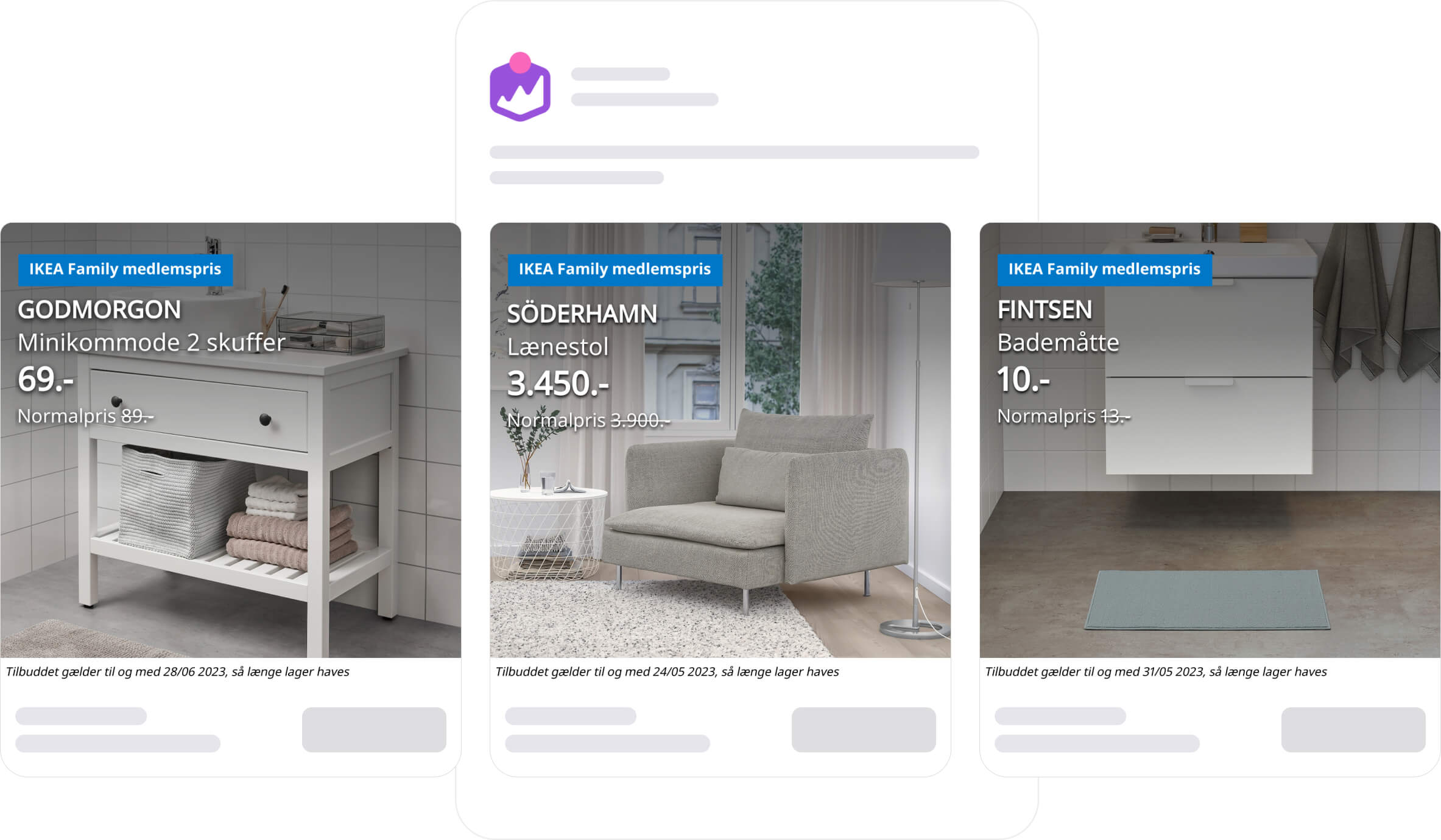
IKEA is doing this with their IKEA Family offers: with their bottom bar in white, they tell 1) when the offer will expire and 2) that it's only while supplies last.

You could add even more urgency by adding a text saying "Hot product / Selling fast". Your imagination is the limit here.
And what's best is that you don't have to limit yourself yourself with dates. You can run this offer until the item sells out - if your objective is to clear this item from your inventory.
How to run urgency offers in your Catalog Ads
Here at Confect, it's our mission to make it as simple as possible to reach higher performance through improved designs for Catalog Ads.
What if we told you that you could make your ads 30% more clickable (for a limited time) in just a few simple steps?
1. Create a design focused on the offer in Confect (i.e. "Today only!")
2. Edit your feed automation's design rules
3. Schedule the design
4. Voila!
Read about how to create designs and how to set up design rules - or learn how to customize your Catalog Ads designs with Confect here.
If you want all the data and insights we have about designing Catalog Ads, based on billions of impressions, you can see it right here.
