
10 Fashion Black Friday Ads: Facebook & Instagram Examples
The Data: 2.6B impressions from 1,400 advertisers during Black Month (November) 2025, compared against 30.9B impressions and $201.5M in ad spend across all of 2025
The fashion Black Friday ads that sell the most on Facebook and Instagram aren’t the loudest ones. They’re the ones that make the deal believable and remove the reasons not to buy. Below are 10 real fashion Black Friday Catalog Ads that do this well, each paired with what Confect’s Black Month 2025 data says about the design element it uses.
Black Month is a big opportunity for fashion brands running Meta Catalog Ads. According to Confect’s data, fashion advertisers saw ROAS rise +29% during Black Month 2025, with Click-Through Rate up +18%, Conversion Rate up +27% and Average Order Value up +13%. CPM rose +40%, so every impression on Facebook and Instagram had to work harder. Design is where that difference is won.
See an ad you like? ClickRecreate with Confect.Confect's AI rebuilds it as a Catalog Ad template filled with your own products.
During Black Month, every ad in the feed claims a deal so shoppers stop trusting the claim and start checking the numbers. Outside Black Month, all types of sale messaging lift ROAS by about the same amount. In November, the Facebook Catalog Ads and Instagram Catalog Ads that show the proof win.
Each example below shows the ad, the design element behind it and what the data says about it. Scroll through, find the ideas that fit your brand and apply them to your own dynamic product ads before Black Friday.
Table of contents
A price tag & a voucher code
Imagine it's Black Friday and you're scrolling. Every ad shouts "SALE!" After a while, they all look the same. Then you see this one.
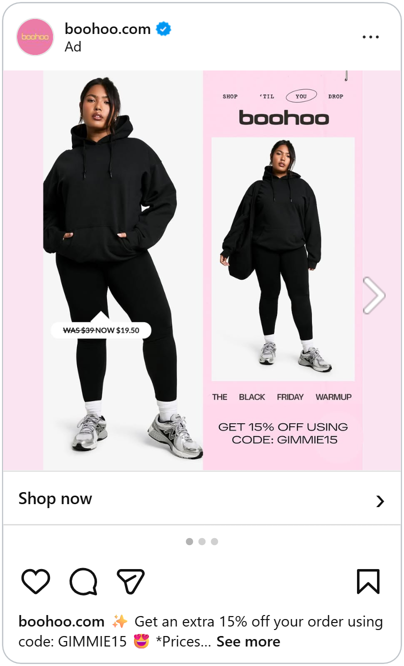
On the left, a woman in a black hoodie and leggings. A little tag hangs next to her: "Was $39, now $19.50." The price is already cut in half.
Then you look to the right. A pink box says: "Get 15% off using code GIMMIE15."
A deal on top of a deal?
That's the trick. The price tag proves the sale is real. The code feels like a secret gift, just for you. And a gift is hard to say no to, especially when you might lose it if you wait.
The numbers: Codes like this were the strongest thing we measured on Black Friday. Ads with a code earned about 38% more for every dollar spent on them. Each sale also cost about 31% less to get. And when the code sat right next to the price like here, those ads earned about 65% more for every dollar.
A code is one way to prove a deal is real, but sometimes all you need is a line through a number.
Cross out the old price
Here's a problem. On Black Friday, every brand says "up to 50% off." After the tenth ad, you stop believing any of them.
Terranova fixes this with one simple line. A line through the old price.
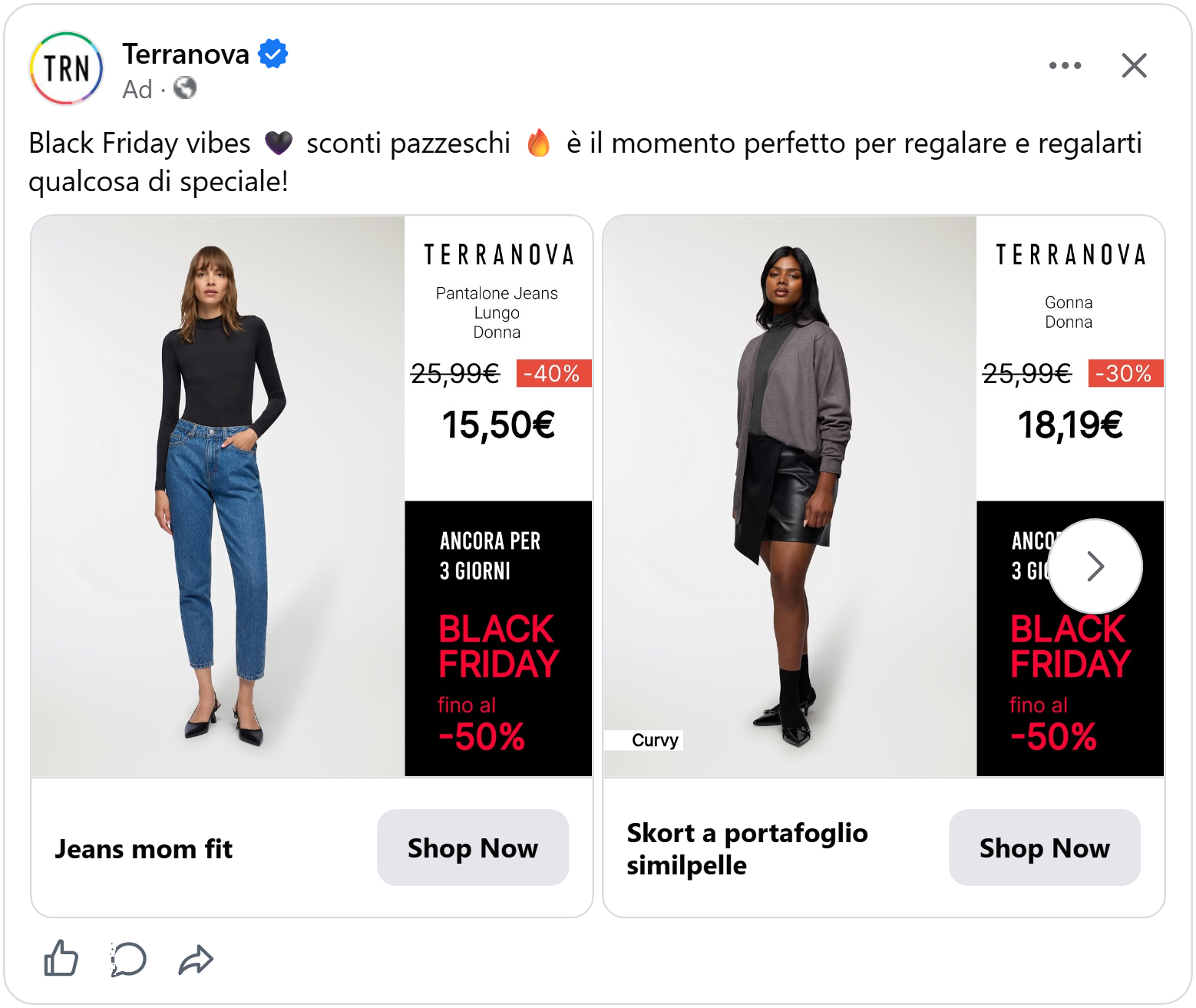
You see a woman in a little black dress. Next to her, "19,99€" is crossed out. There's a red "-30%". And then, big and bold: "13,99€".
You don't have to trust them. You can see it with your own eyes. It cost this much yesterday. It costs this much today.
Then a black box at the bottom adds one more thing: "Only 3 more days" and now the deal has a clock on it.
The numbers: On Black Friday, ads with the old price crossed out had a 20% higher ROAS than the average ad. Ads with only a percentage, like “-30%”, got 13% higher ROAS. Ads that just said “Sale!” got 9% higher. The rest of the year, all three work about the same. Proof only matters this much when everyone is shouting at once.
The old price is doing the convincing for you. See how it performs for mid-priced brands.
But what if every product has the same discount? Then maybe you don't need a price at all. Or do you?
One discount badge
Bamboo Clothing has one sale for everything: 30% off. Every product, same deal.
So they keep the ad simple. A close-up of a woman in a soft purple roll-neck jumper, hands pulled up to the collar so you can almost feel how cozy the knit is. A thin black frame runs around the photo, broken in places, with the BAM logo tucked into the top corner. It looks like a page from a fashion magazine, not an ad.
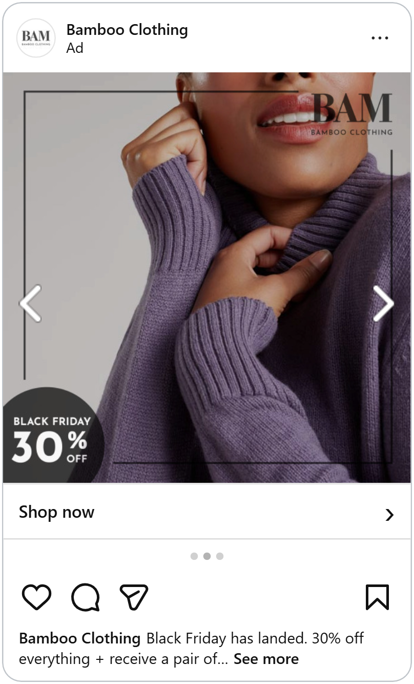
Down in the bottom left corner sits one round dark badge: “Black Friday 30% off.”
That’s it. The clothes stay the star. The badge does the selling quietly.
The numbers: On Black Friday, ads with a discount badge got about 13% higher ROAS than the average ad. One easy way to make this design even stronger is to add the price. Ads that showed the price cost about 10% less per sale, because people like to know what they’ll pay before they tap.
Now the deal is believable. But a good deal isn't always enough. Sometimes people still don't buy. Why?
Free returns
Buying a designer jacket online is a bit scary. You can't touch it. You can't try it on. And it isn't cheap.
Farfetch knows this. Look at the bottom right corner and you’ll find two small words: “free returns.” They’re quiet, but they answer the biggest worry a shopper has before they even ask it.
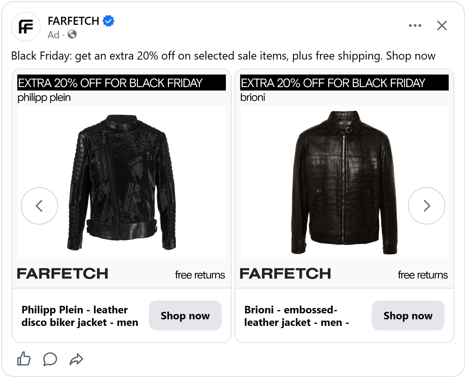
Everything else looks calm and expensive. A black designer jacket on a clean white background. A black banner on top: “Extra 20% off for Black Friday.”
But those two little words do something big. They take the fear away. If it doesn’t fit, you just send it back. It costs you nothing.
The numbers: For most of the year, showing free returns barely changed anything. On Black Friday, it suddenly worked. Ads with free returns got about 22% higher ROAS and each sale cost about 17% less. Even better, about 47% more of the people who clicked went on to buy. When the price was shown too each sale cost about 22% less.
See more ways to show your return policy in an ad.
Free returns answer "what if it doesn't fit?" But there's another question that kills a lot of sales, and it's about getting the package to your door.
"Free shipping" as a sticker
You've probably done this. You put a $20 T-shirt in your basket. You go to checkout. And there it is: $7 for shipping and suddenly the deal doesn't feel like a deal anymore.
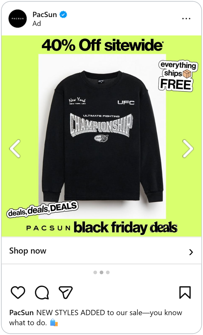
PacSun makes sure that never happens. Their ad is loud and bright. A lime green background. "40% off sitewide" across the top, a black graphic sweater in the middle, and stuck on the corner, like someone put it there by hand, a sticker: "everything ships FREE."
The stickers make the ad feel fun and young, like something a friend made, not a big company. And the free shipping sticker answers the checkout question before you even get there.
The numbers: On Black Friday, ads that mentioned shipping got about 10% higher ROAS, and each sale cost about 20% less. Free shipping also got about 12% more people to click. But the biggest win was with people who had already visited the shop. For them, ads with free shipping got about 40% higher ROAS.
See what shipping info does in retargeting ads all year.
So far, we've talked about the deal and the worries. But wait. What about the clothes themselves?
Show it worn, then show it alone
When you look at a jacket online, you ask yourself two questions. “What would it look like on me?” And: “What does it actually look like?”
Most ads only answer one of them. This ad answers both.
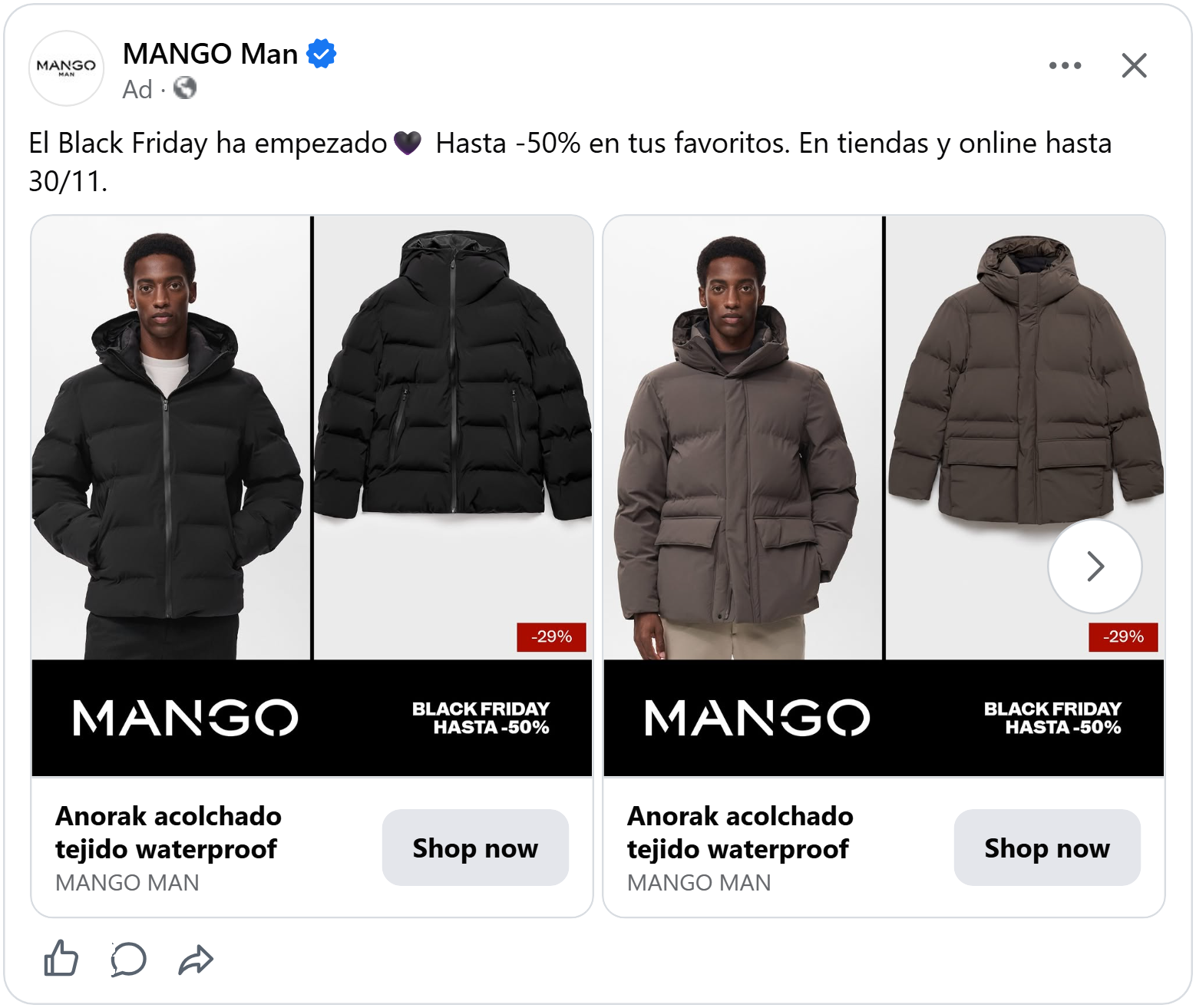
On the left, a man wearing the black puffer jacket, hood up behind his head, hands in his pockets. Now you can picture it on yourself. On the right, the same jacket on its own, laid out flat and clear, so you can see every detail: the zip, the pockets, the hood.
Then a small red badge in the corner: “-29%.” And a black bar at the bottom with the logo and one line: “Black Friday, up to -50%.” Clean, simple, and the jacket stays the star.
The numbers: On Black Friday, ads that showed an extra picture of the product got about 23% higher ROAS, and each sale cost about 21% less. With people who had never heard of the brand, it was the strongest thing we measured, at about 48% higher ROAS.
This ad lets the product do the talking. But sometimes the most powerful thing in an ad isn’t the product. It’s the name on it.
The brand logo as big as the headline
Some names do the work for you. Say "Ray-Ban" and most people can already picture the sunglasses.
So Ray-Ban doesn't hide its name. The swirly Ray-Ban logo sits in the top right corner, almost as big as the words "Black Friday."
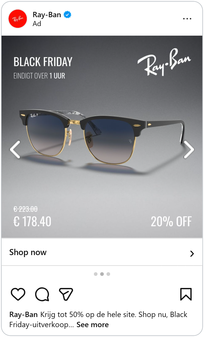
The rest is simple. One pair of sunglasses on a grey background, with a soft shadow underneath. "Ends in 1 hour", the old price crossed out. The new price, €178.40 and "20% off."
When you scroll past an ad from a shop you don't know, a name you trust is a good reason to stop.
The numbers: On Black Friday, ads that showed the product’s brand got about 25% higher ROAS. Almost all of that came from people who didn’t know the shop yet, where brand names lifted ROAS by about 35%. With people who already knew the shop, it barely made a difference (about 2%). Each sale also cost a little more than average, so use the brand to catch new eyes, not to close the sale.
Big brand names catch new shoppers. But what about the people who already know your shop? For them, a different logo matters.
Show your store logo
Have you ever seen a jacket online, closed the tab, and then forgotten where you saw it?
This ad makes sure you remember. The shop’s logo sits right across the top, next to the words “your fashion outlet.”
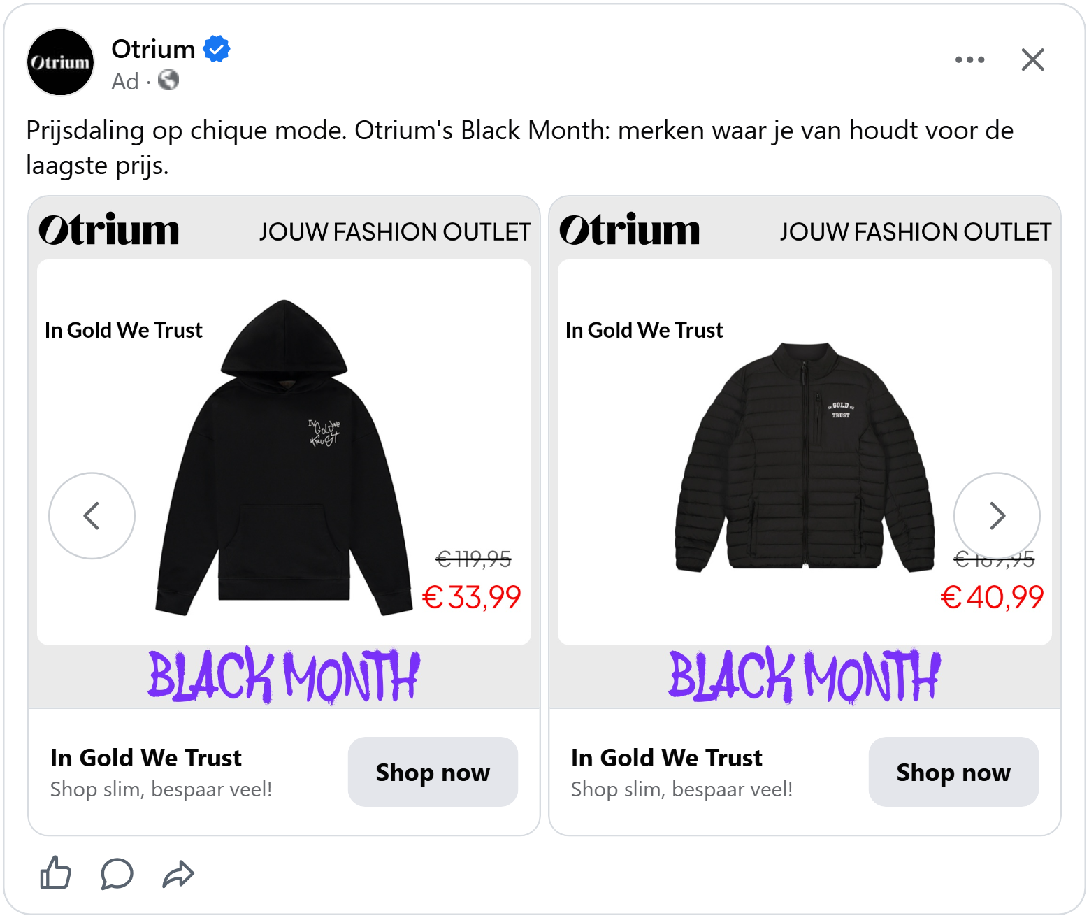
Below it, a white card shows a black puffer jacket. Above the jacket, the brand that made it: In Gold We Trust. The old price €189,95 is crossed out, the new price €40,99 is in bright red. And at the bottom "Black Month" is painted in purple letters.
This ad does two jobs at once. The Otrium logo says: "Remember us? You were here." The jacket's brand name gives new shoppers a name they might know.
The numbers: On Black Friday, ads with the shop’s own logo got about 35% higher ROAS with people who already knew the shop. With new shoppers, the lift was only about 10%. Overall, each sale cost a little more than average, so the logo pays off most with people who have already met you.
Outside Black Friday the logo tells a different story.
By now, your ad has a believable deal, no worries, and the right names on it. There's just one thing left: getting people to act now.
Make “later” feel risky
“I’ll come back to it later.” It’s what we all say. And most of the time, we never come back.
Alo Yoga’s ad is built to stop that thought. At first, it looks like a fashion photo. On the left, a woman in a black crop top and leggings walks down a city street at night, with soft lights glowing behind her. On the right, a warm red panel with “Black Friday” written top to bottom in huge letters, and “30% off sitewide” in the middle.
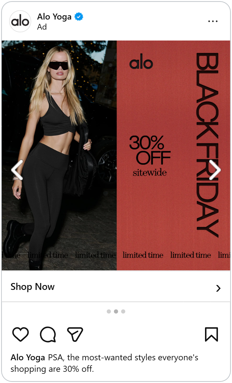
Then you notice the line running along the bottom of the whole ad: “limited time, limited time, limited time.” It goes on and on, like a ticker.
You don’t have to read it closely to get the message. The repeating words feel like a clock ticking, and suddenly “later” feels risky.
The warning is quiet on purpose. A stylish brand can’t scream “HURRY!!!” without looking cheap. A small line, repeated, still gets the message across.
The numbers: On their own, messages like “limited time” barely moved ROAS on Black Friday (about 1% higher). But each sale cost about 19% less. Next to the price, sales got even cheaper, about 30% less each. Here’s the catch: urgency lifted ROAS by about 19% with new shoppers, but lowered it by about 6% with people who had already visited the shop. They have already seen the deal, so more pressure doesn’t help.
How time-limited campaigns work in Catalog Ads.
This ad gives people a reason to act now. Our last ad goes one step further. It tells shoppers exactly what to do.
Call To Action
Sometimes the simplest idea wins. Just tell people what to do.
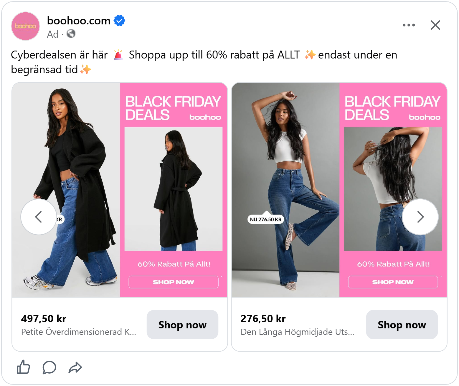
This boohoo ad shows a model in wide-leg jeans, with a small price tag next to her: "NU 276.50 KR". On the right is a hot pink box. "Black Friday Deals." A picture of the same jeans from the back. "60% off everything".
And at the very bottom of the pink box, a button: "SHOP NOW."
It sounds too simple to matter. But the button is right where your eyes already are. It turns "that's nice" into "I'm buying this." And the people who tap it know they're going to a shop, so they're ready to buy.
There's a bonus, too. The picture from the back answers "how do they fit?" before you even click.
The numbers: For most of the year, a button in the design did almost nothing. On Black Friday, it suddenly worked. Ads with a button got about 18% higher ROAS. About 17% fewer people clicked, but about 38% more of the people who clicked went on to buy. With people who had already visited the shop, the button was one of the strongest things we measured, lifting ROAS by about 43%.
Now it's your turn. You've seen the ads that sell on Black Friday and it's time to make yours.
Each one of them did one of three things:
- Made the deal believable.
- Took the worry away.
- Gave a reason to act now.
You don't need all of them. Pick two or three that fit your brand, make them yours, and you're ready for Black Friday.