
Luxury Escapes
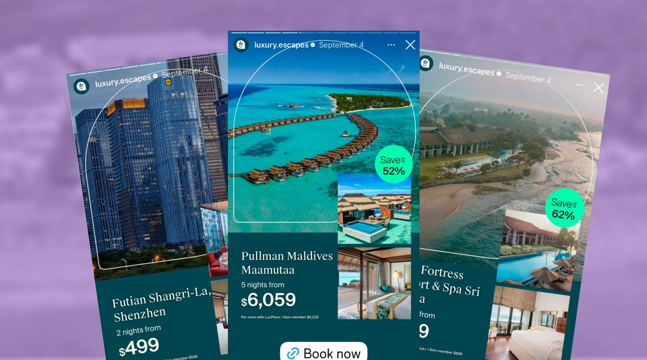
The ad: An ad that gives you a tour of the hotel before you book
Luxury Escapes is one of Australia's best-known travel brands. Founded in Melbourne in 2013, it has grown into a members-based travel platform with more than 9 million members worldwide, offering exclusive deals on handpicked hotels, tours and cruises. The promise behind it is simple: a luxury stay should feel within reach.
This Catalog Ad brings that promise into the feed. Every card is a live LUX Exclusive deal from their data source: the hotel name, the number of nights, the member and non-member price, the saving, and three photos of the property.
Luxury Escapes decided which deals get in, which photo leads and which two follow, which price comes first, and where every piece of information sits. They did not build an ad about a hotel. They built an ad that feels like a short visit to one.
Why it won Catalog Ad of the Week
Beautiful travel photos are everywhere on Meta. The reason this ad earned the feature is what happened when Luxury Escapes combined that with the right deals for the right segment.
A lift like this is what happens when an ad answers a traveller's questions before they have to ask them. More people stopped and tapped, with click-through rate up 22%. Those clicks turned into bookings far more efficiently too: each booking cost Luxury Escapes 40% less than in their other Catalog Ads, which pushed ROAS up 33%.
It is even more impressive given who the ad is built for: travellers discovering Luxury Escapes for the first time. A first-time visitor has two doubts: will the hotel live up to the photo, and why book it here rather than anywhere else? The layout and the three-photo tour answer the first. The member price and the exclusive deals answer the second.
What makes this Catalog Ad great
Show three photos on a clean card to give strangers a tour of the stay
Luxury Escapes divides every card in two. The top is a full-bleed destination photo with nothing printed on it, framed by a thin white arch, with two inset photos overlapping its lower edge: the property's signature feature and the room. The bottom is a solid deep teal panel with the hotel name, the number of nights and the price. Where you'll be, what you'll do, where you'll sleep, and what it costs.
You're scrolling and you catch timber villas on stilts over a calm sea. You've never heard of Pangkor Laut Resort, but your eye moves on to the first inset: palm trees against a purple dusk, the villas lit up on the water. Then the second: a bedroom in dark wood and crisp white linen. Only then do you drop to the panel and read the price. Three photos in, and you have more or less checked in.
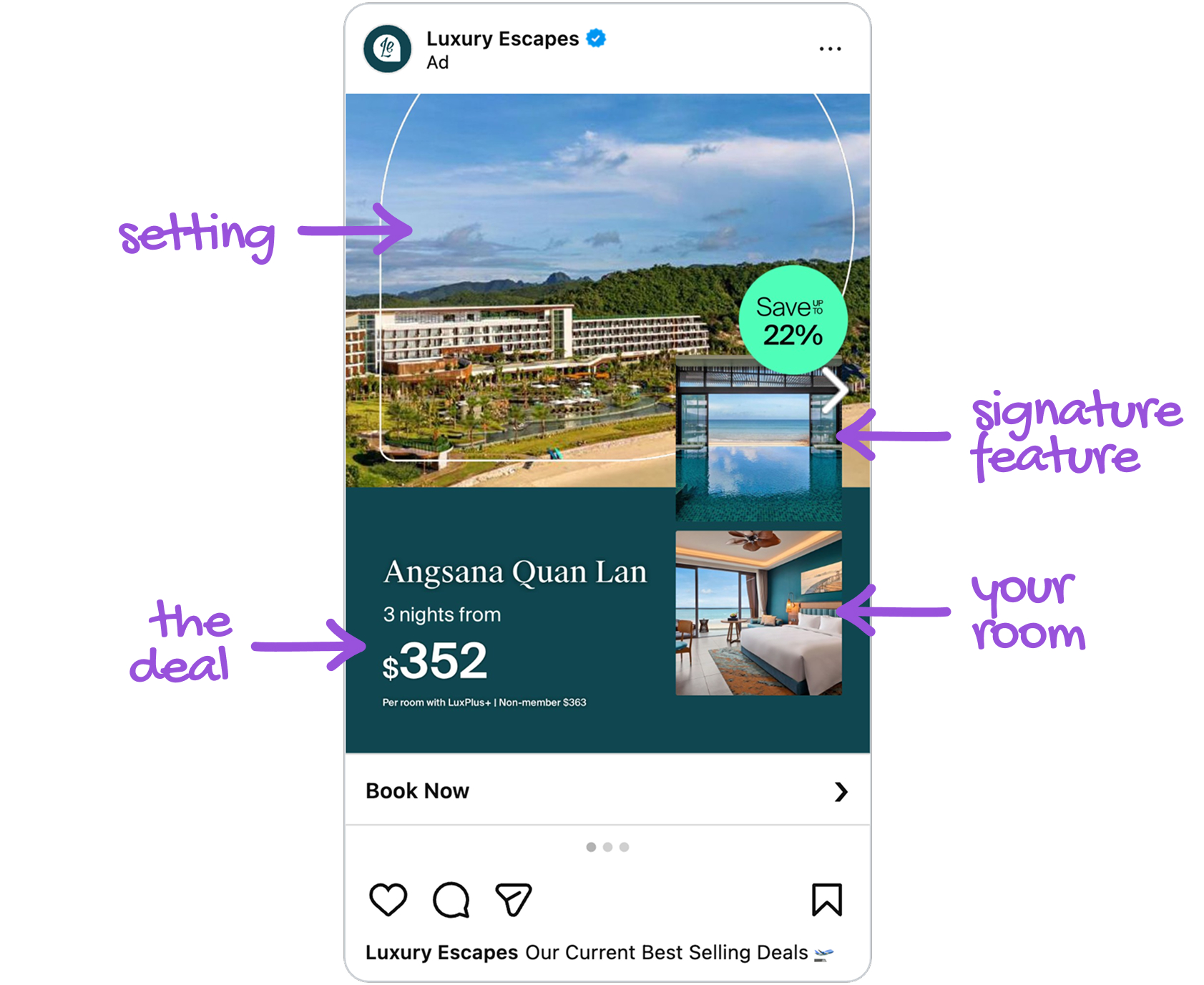
This is mental simulation at work. A hotel stay is what economist Phillip Nelson called an experience good: you can't judge it until you've had it, which makes booking with a brand you don't know yet feel risky. Jennifer Escalas showed that when people imagine themselves using a product, they build a story around it, and that story lifts purchase intent. One photo shows a place. Three photos in the right order give the brain everything it needs to play out the whole stay, including the part new customers worry about most: will the room live up to the pictures? The clean split is what lets that happen. No text breaks the picture while you are imagining, and the facts wait on the panel until you are ready for them.
None of it is assembled by hand. All three photos load from the image fields in Luxury Escapes' data source and drop into place automatically, in 1:1, 4:5 and 9:16, so every deal gets its own curated tour in every placement.
Style the deal like a travel magazine, so the discount never makes the hotel look cheap
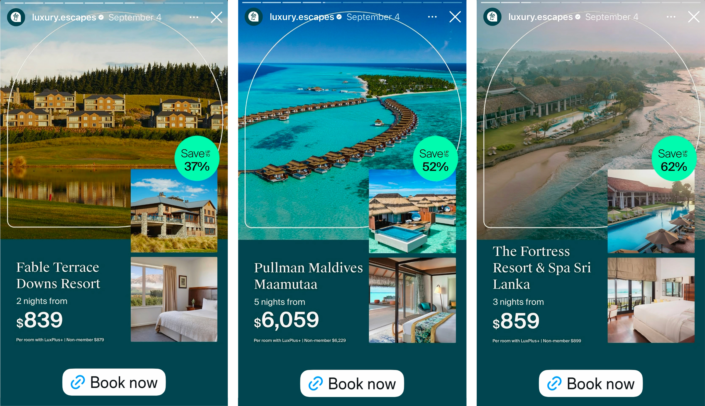
Deal ads usually shout, with bright colours and prices stamped across the photo. Luxury Escapes does the opposite. The hotel name is set in a serif typeface, the panel is a deep, calm teal, the photo sits inside an arch like a window, and the entire discount is contained in one small mint circle: "Save up to 37%".
You see a luxury resort in New Zealand at a price that feels within reach, yet nothing about the card feels like a clearance rack. It looks like a page from a travel magazine that happens to carry a price tag.
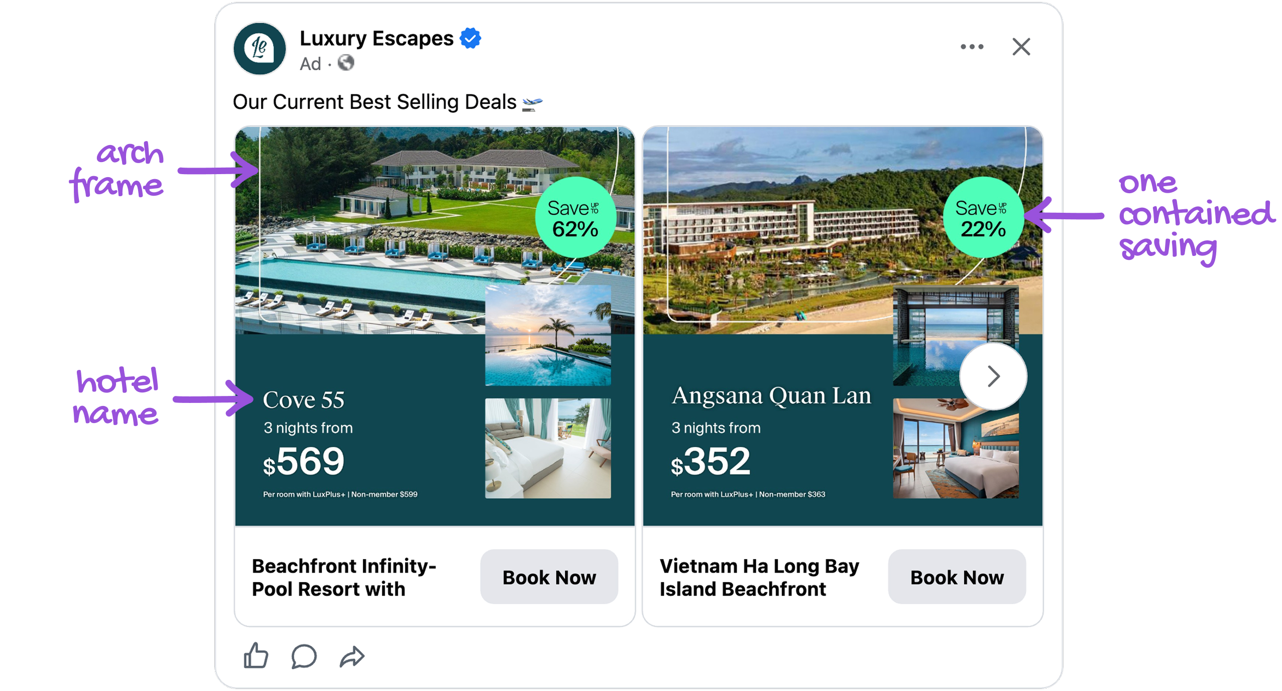
This is semiotics doing the selling. Roland Barthes showed that signs carry meaning beyond what they literally say. Serif type, a deep jewel tone and an arched frame are the visual codes of grand hotels and editorial travel, so the card says "luxury" before you've read a word. That matters most to a stranger, because people judge quality they can't check from the cues they can see, and loud discounting makes them wonder what is wrong with the product. Luxury Escapes still makes the saving impossible to miss. The mint circle is the only bright, cool colour on the card, so the Von Restorff isolation effect pulls the eye straight to it, without the rest of the card having to shout.
It is how Luxury Escapes settles the tension in its own name: a luxury stay, sold as a deal, that never looks discounted. And because the styling lives in one design, every deal in the catalog wears the same codes automatically.
Make the member price the headline, so every card also sells LuxPlus+
The biggest number on every Luxury Escapes card is the LuxPlus+ member price. Right under it, one small line: "Per room with LuxPlus+ | Non-member $879". And in the corner, a mint green circle shows the saving against the hotel's usual rate: "Save up to 37%".
You see $839 for two nights at a resort in New Zealand, and that number is what stops your thumb. Then you read the line underneath: everyone who isn't a member pays $879. Now you're weighing two things. Do you want this hotel, and why would you pay more than members do?
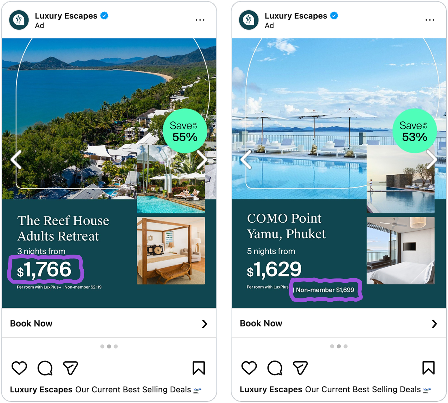
This is loss aversion at work. Kahneman and Tversky showed that a loss weighs roughly twice as much as a gain of the same size. By labelling the higher price "Non-member", Luxury Escapes frames not joining as money left on the table. A members' price also signals an inner circle: some travellers get a better deal, and you're invited to be one of them.
The clever part is that every card markets LuxPlus+ without a word of extra copy, and a member is a traveller with a reason to come back for the next trip. The hotel name, nights, both prices and the saving all load from the data source for every deal.
Key takeaways
Luxury Escapes' ad runs on one idea: give a stranger every reason to book before they've even clicked.
👉 Use three images on a clean card to let shoppers picture the whole experience
For anything people can't judge until they've tried it, show the setting, the signature feature and the part they'll use most, and keep text off the photos. Luxury Escapes' three-photo tour answers a new customer's biggest doubt before they book.
👉 Contain your discount so the product still looks premium
Let the design signal quality and put the saving in one small, bright element. Luxury Escapes sells deals without ever looking discounted.
👉 Lead with the member price and show what non-members pay
Make your best price the headline and name the higher one "Non-member". Luxury Escapes sells the deal and LuxPlus+ in the same line.