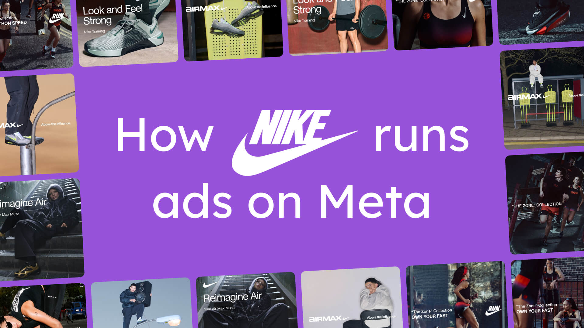
How Nike runs ads on Meta: A complete breakdown of their $51B strategy
April 24, 2026
Nike makes 74% of their ads as static ads. But 75% of their daily ad spend goes to Catalog Ads.
Read that again. The ratio is completely inverted. Nike produces almost three times more static ads than Catalog Ads - yet the algorithm pushes three times more money toward the Catalog Ads.
That one stat tells you more about how Meta advertising works in 2026 than most guides ever will.
We wanted to understand exactly what’s happening inside Nike’s Meta account. Not surface-level observations from scrolling the Ad Library for five minutes. A proper analysis: every active ad, every creative format, every audience breakdown, every spend signal we could extract.
So we did it. We pulled Nike’s full Meta Ad Library, analyzed their creative system, mapped their targeting logic, studied their ad copy, and compared everything against what we know from 3,014 advertisers and $834M in ad spend.
What we found is a masterclass in modern Meta advertising.
Why We’re Breaking Down Nike’s Ads
Nike's strategic shift towards Direct to Consumer
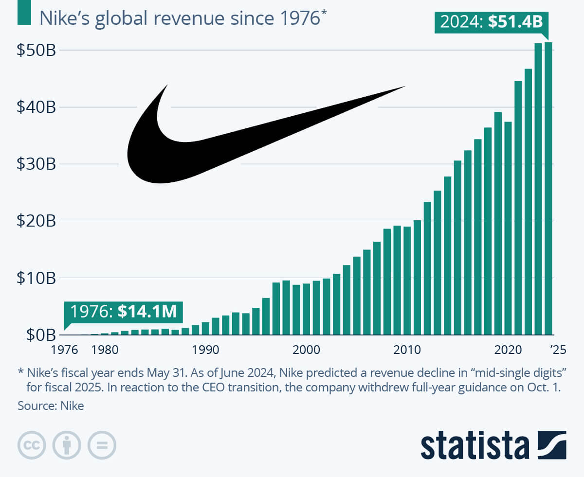
Nike is the world’s biggest sports brand. Roughly $51 billion in annual revenue. But the number that matters for this breakdown is a different one: over 40% of Nike’s revenue now comes through direct-to-consumer channels - nike.com, the Nike app, and owned stores.
Under CEO Elliott Hill, Nike has been investing heavily in digital channels, brand storytelling, and getting closer to the consumer. That DTC focus changes everything about how they run Meta ads. When you’re selling directly, every impression is connected to revenue. There’s no retail partner absorbing the cost of a bad ad. Every ad has to earn its place.
That DTC focus changes everything about how they run Meta ads (and it's a pattern we see across DTC brands investing in Catalog Ads).
That’s what makes Nike’s Meta strategy worth studying. This is not a brand running ads casually. This is a $51 billion company treating Meta Ads as a core revenue channel.
And they’ve been at it for a while. Nike began experimenting with social media networks around 2004 (the year Facebook was founded), and really started investing heavily in Paid Social around 2012. In 2021 Nike started designing their Catalog Ads as well. More than 20 years of investment, iteration, and optimization.
What you’ll learn in this breakdown
Here’s what we’re going to walk through:
- How Nike distributes their ad spend - and why the algorithm pushes 75% toward Catalog Ads despite them being just 26% of the ads
- How Nike targets their audiences - a two-layer system where static ads get manual targeting and Catalog Ads go fully broad
- What this means for Meta’s algorithm - and how Nike’s approach maps perfectly to what Andromeda rewards
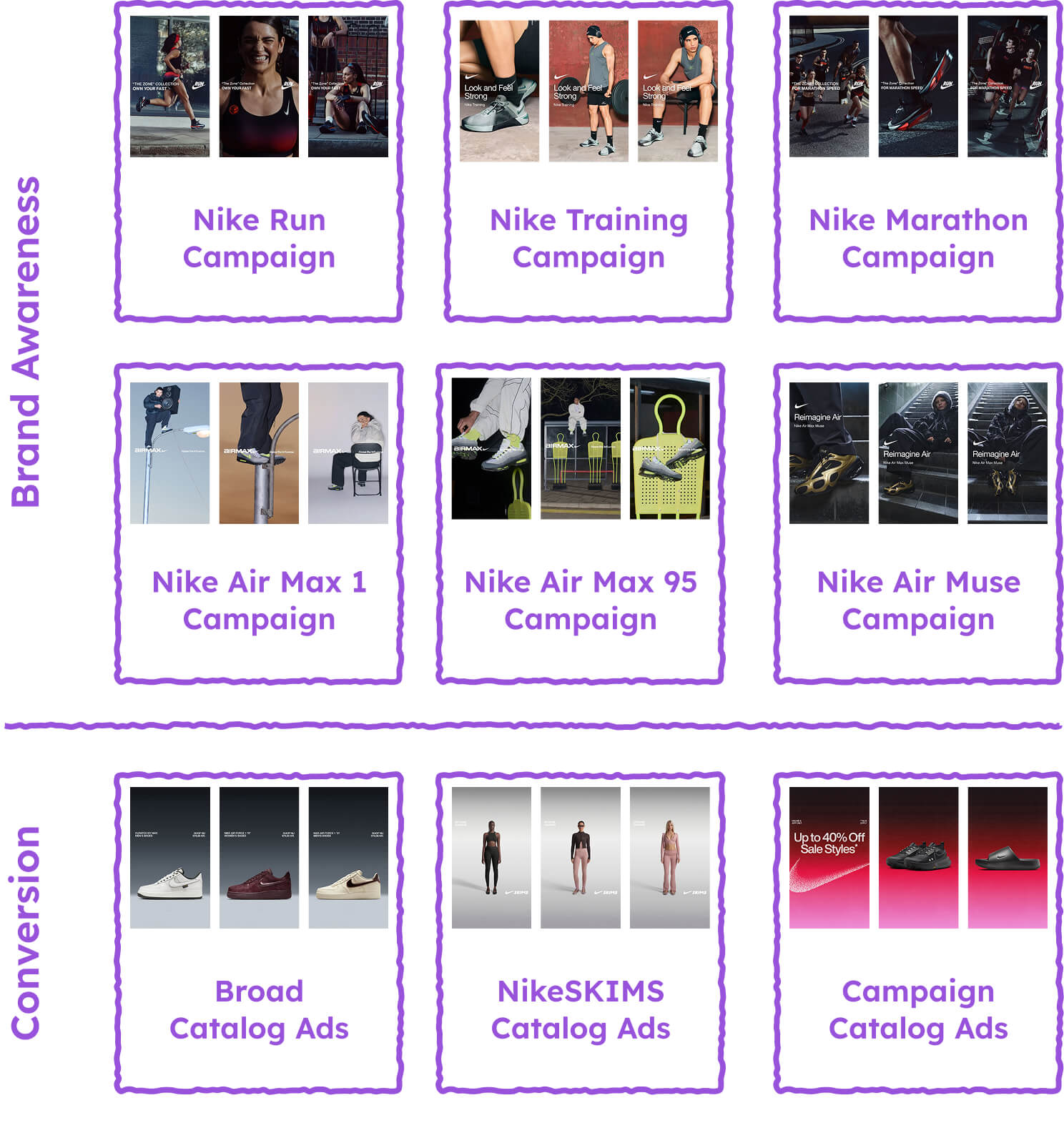
- Nike’s Catalog Ad design system - the modular framework that produces massive variety from a single template
- Nike’s static ads - and why they serve a completely different purpose
- Nike’s ad copy strategy - how they write at the identity level, not the product level
- What you can take from all of this - the concrete patterns you can apply to your own ads
A quick note on methodology
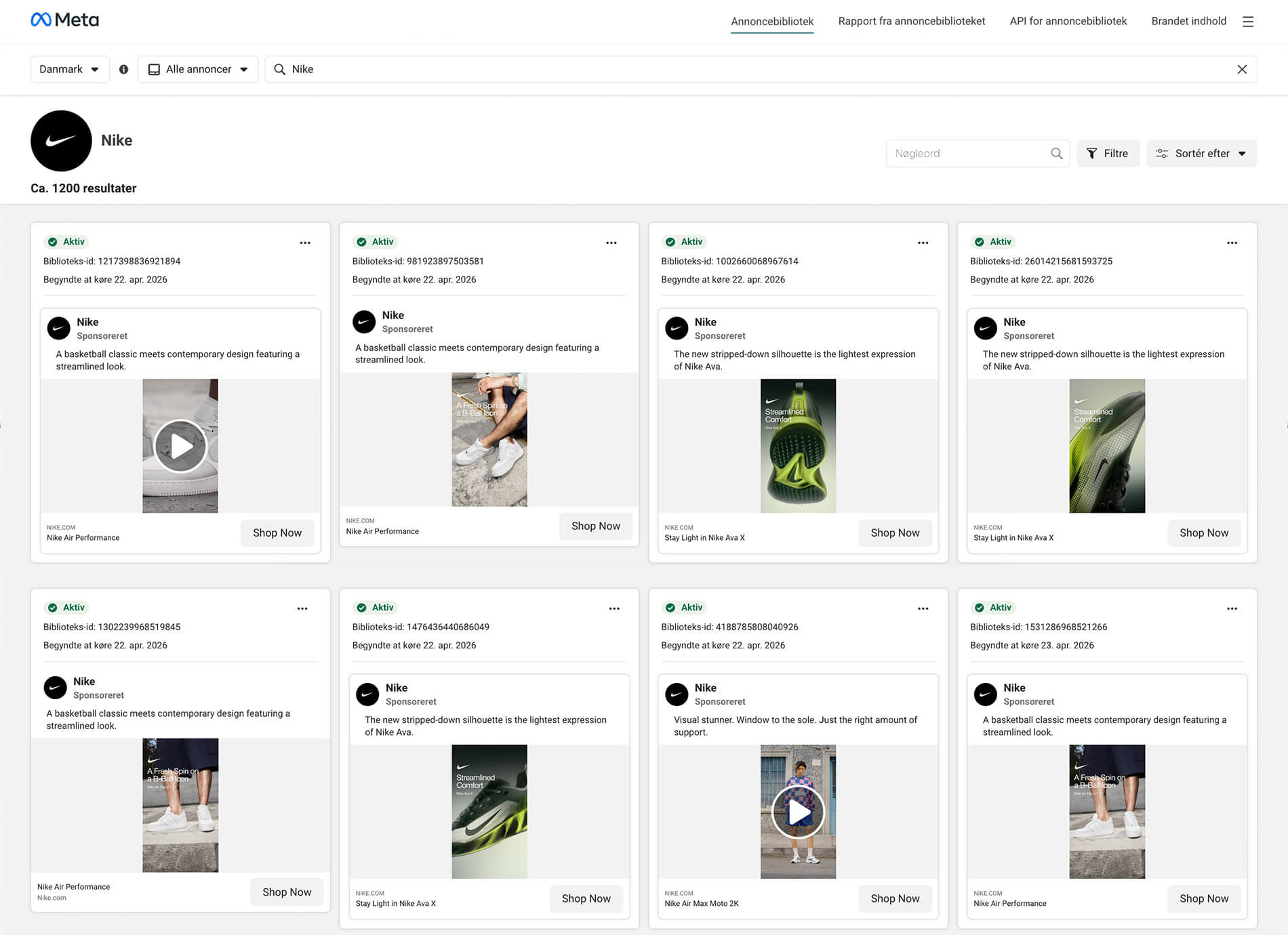
This analysis is based on a snapshot of Nike’s main Meta ad account, taken on April 21st, 2026. Audience data, reach numbers, and spend distribution are based on Nike’s Danish account, made possible by EU ad transparency regulations that require platforms to disclose this data. We did not analyze Nike’s sub-accounts like Nike Running Club or Nike Football - just the main Nike account.
Every section is backed by Meta’s own data about Nike's ads and cross-referenced against Confect’s dataset of 3,014 eCommerce advertisers. You’ll see what Nike does, why it works, and how it compares to what the best-performing advertisers across the industry are doing.
Let’s get into it.
The Numbers: How Nike Distributes Their Ad Spend
This section is where things get interesting. We’re going to walk through how Nike actually allocates their advertising across formats - and the pattern that emerges is consistent, surprising, and telling.
Catalog Ads vs. static ads: the inverted ratio
Let’s start with the headline number.
Nike has far more static ads than Catalog Ads. Out of all active ads in their account, 74% are static and only 26% are Catalog Ads. That’s almost a 3-to-1 ratio in favor of static.
But when you look at where Meta actually sends the money, the picture flips completely. 75% of Nike’s daily ad spend goes to Catalog Ads. Only 25% goes to static ads.
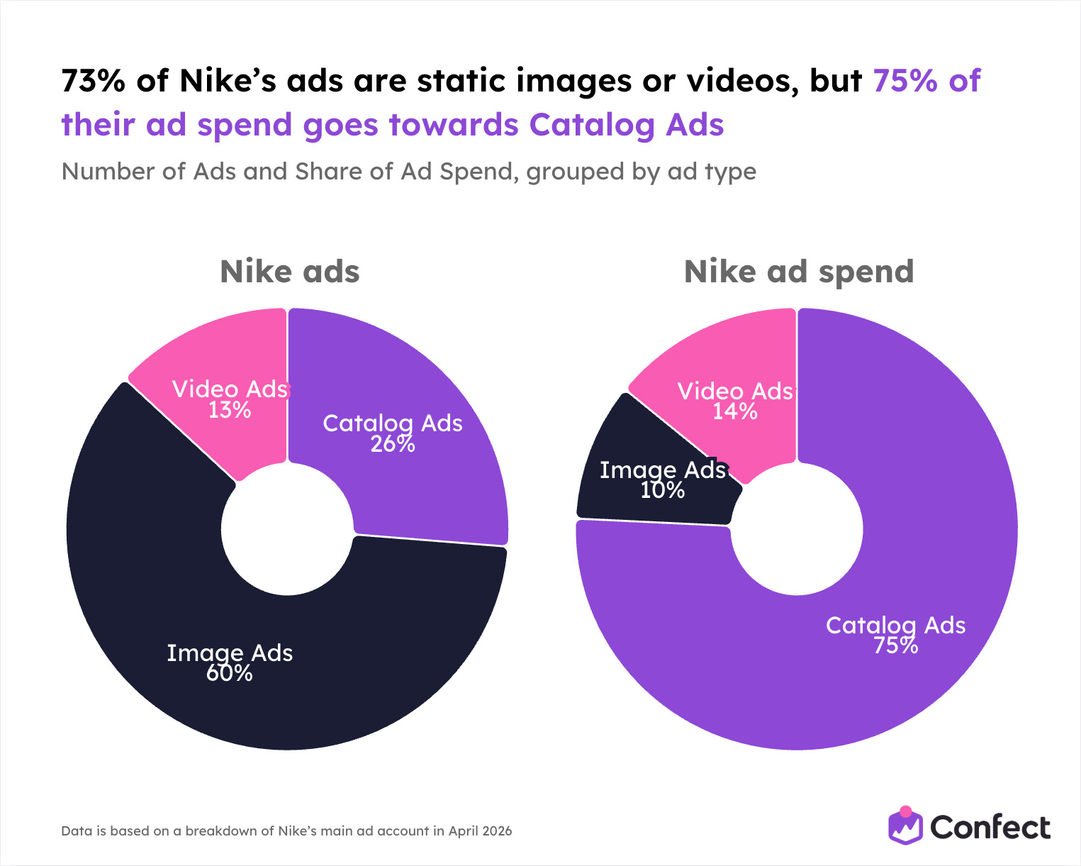
Nike produces three times more static ads. But the algorithm pushes three times more budget toward Catalog Ads.
This is not Nike manually setting those budgets. This is Meta’s algorithm looking at all of Nike’s ads, measuring which ones deliver the best results, and redistributing spend accordingly. When an algorithm has the freedom to allocate budget - and it concentrates 75% into a format that represents just 26% of the ads - that’s a performance signal you can’t ignore.
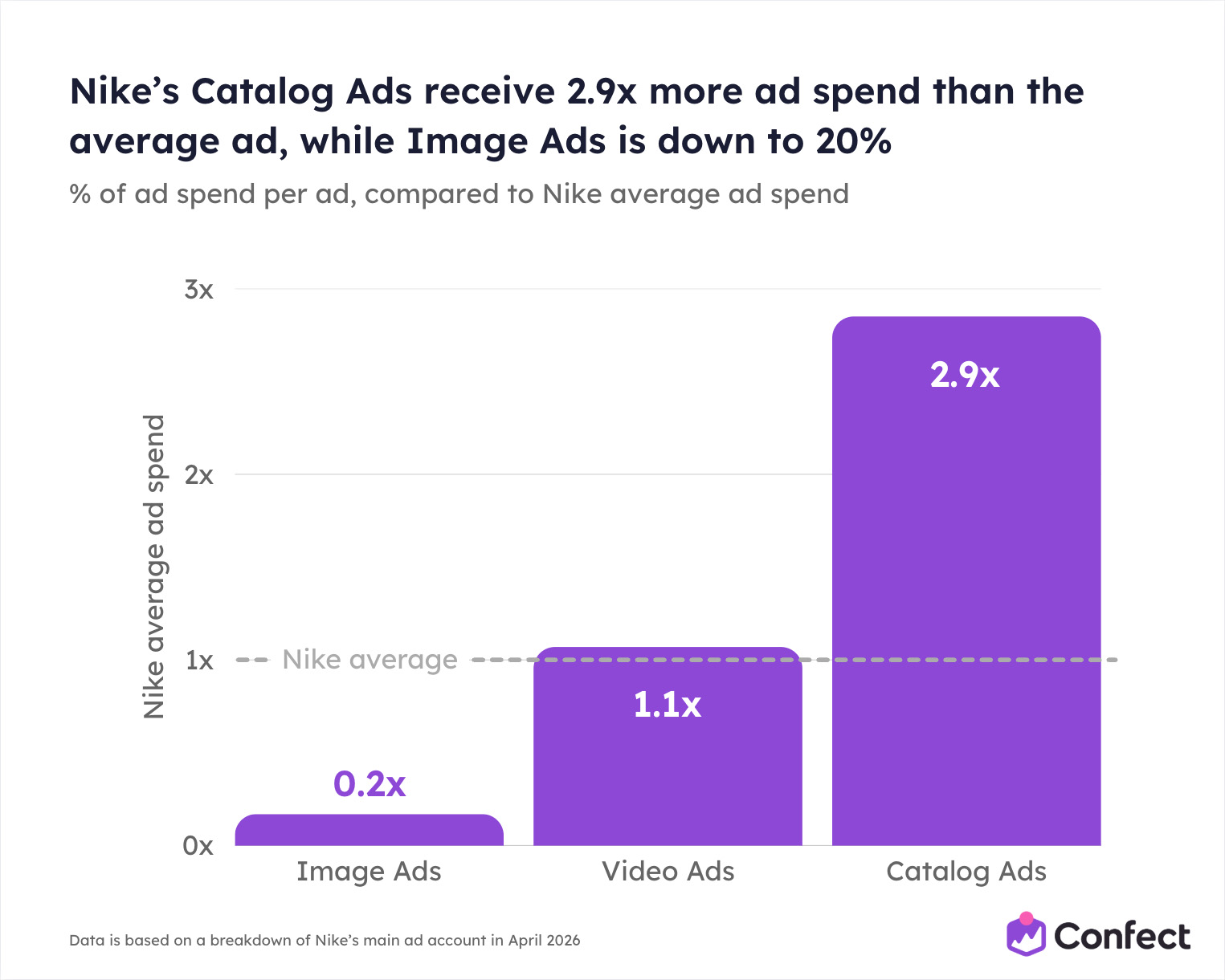
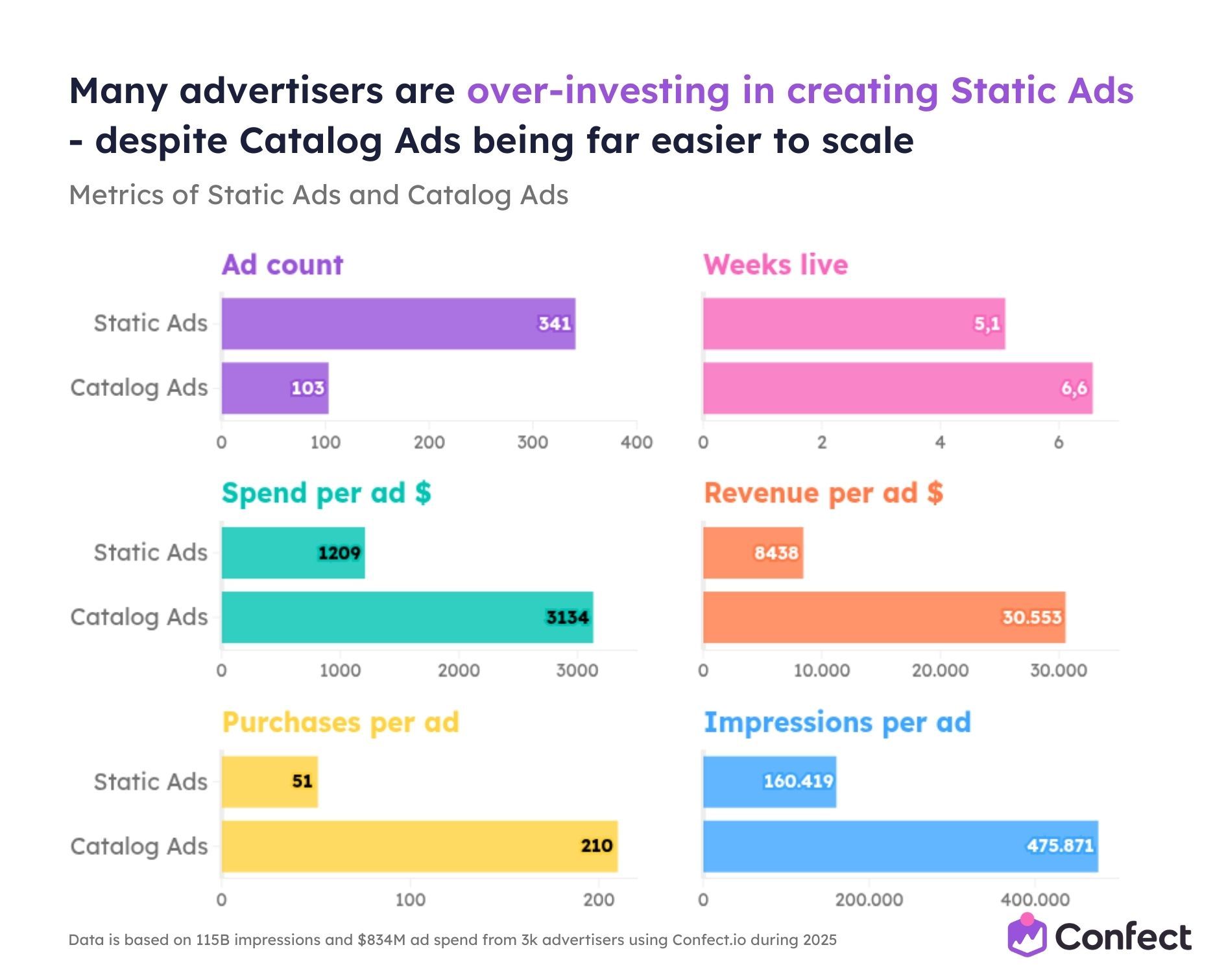
The numbers go deeper. Nike’s Catalog Ads spend 2.85x more per day than the average Nike ad, and a massive 8.53x more than the average static ad. They also stay active longer - 24.6 days on average, which is 22% longer than the Nike ad average. Static ads average just 18.5 days.
The algorithm isn’t just favoring Catalog Ads. It’s favoring them overwhelmingly.
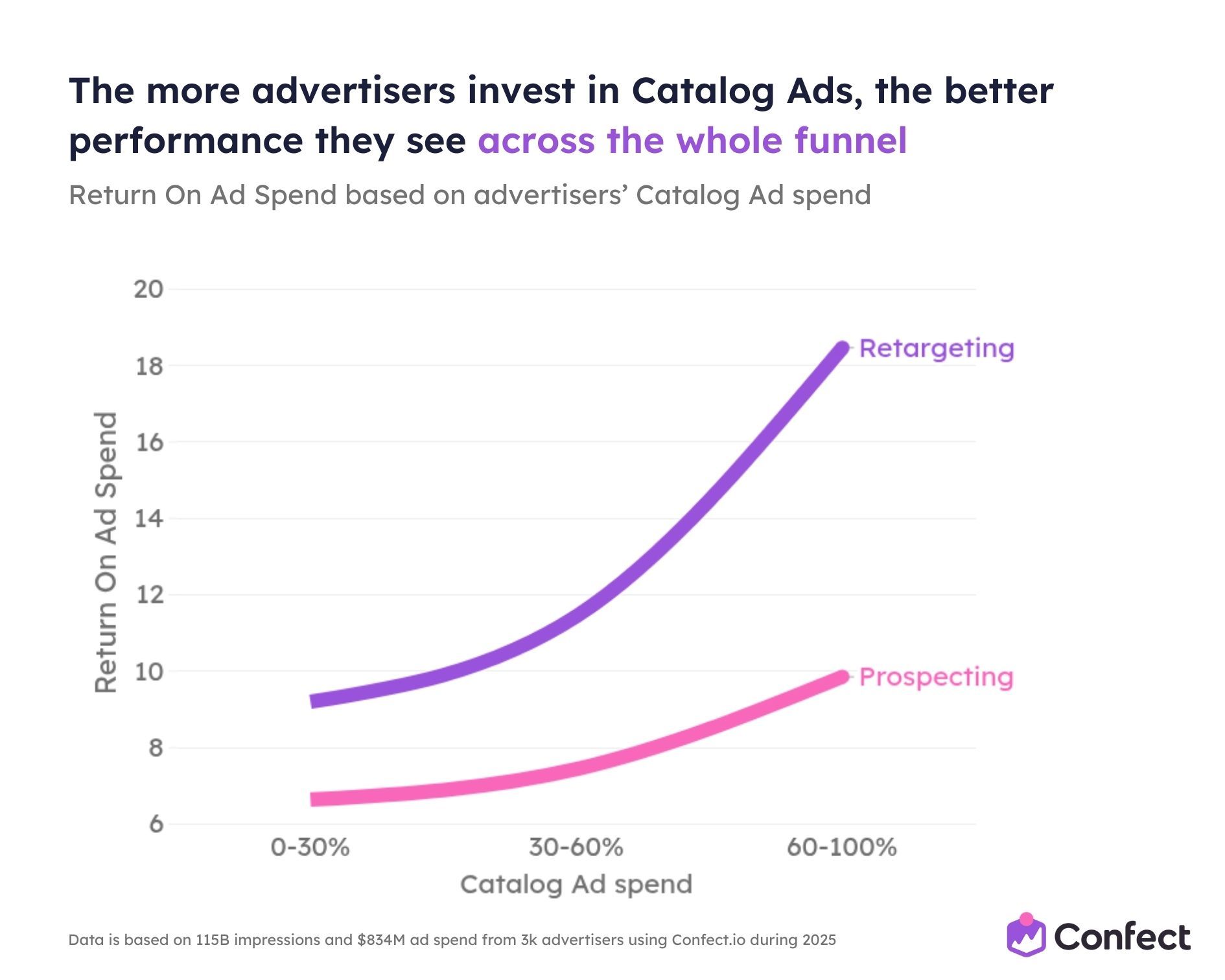
And Nike’s numbers align almost perfectly with what we found across 3,014 eCommerce advertisers in the Andromeda study. Across $834M in ad spend, Catalog Ads outperform static ads by 23% on ROAS and 37% on CPA.
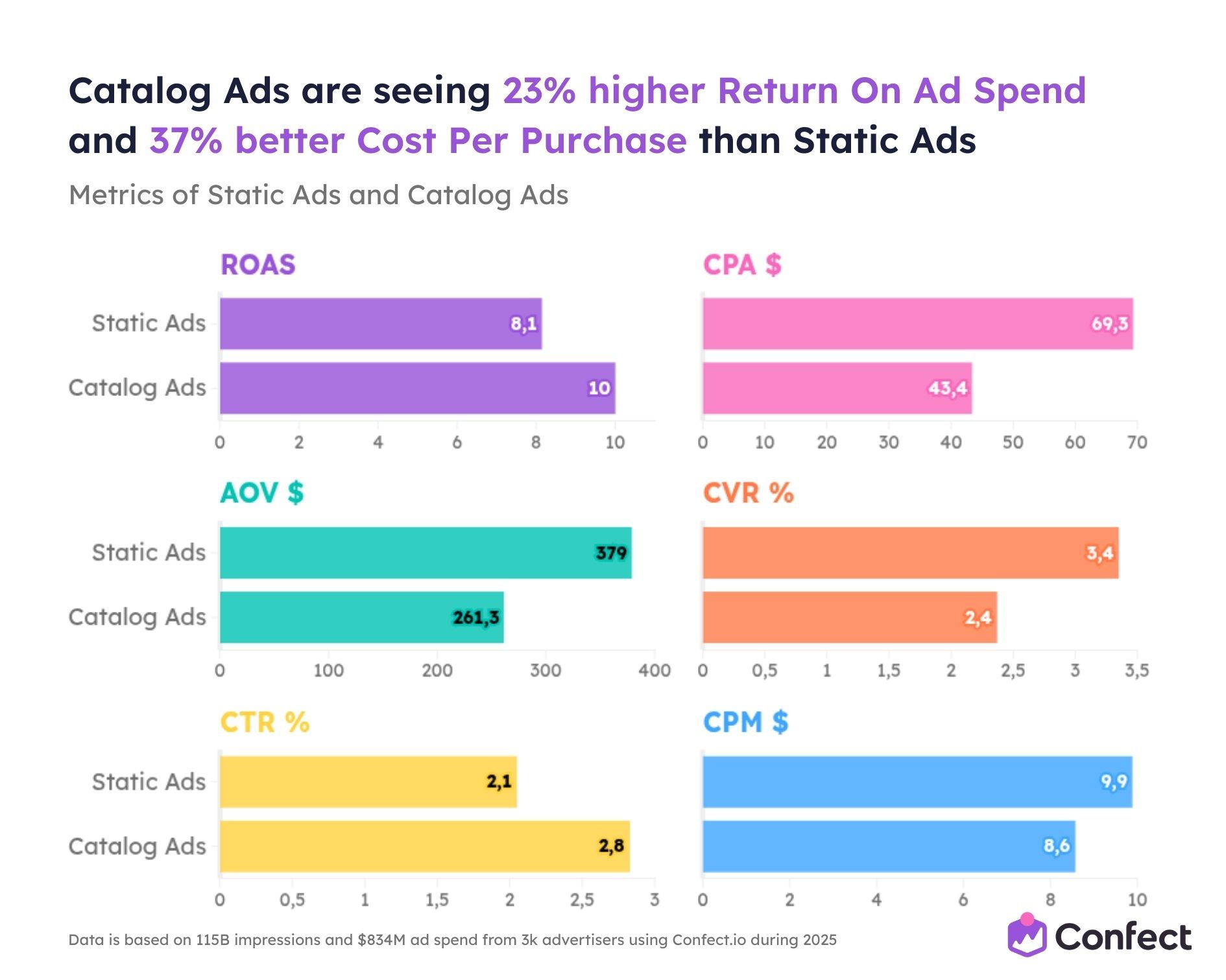
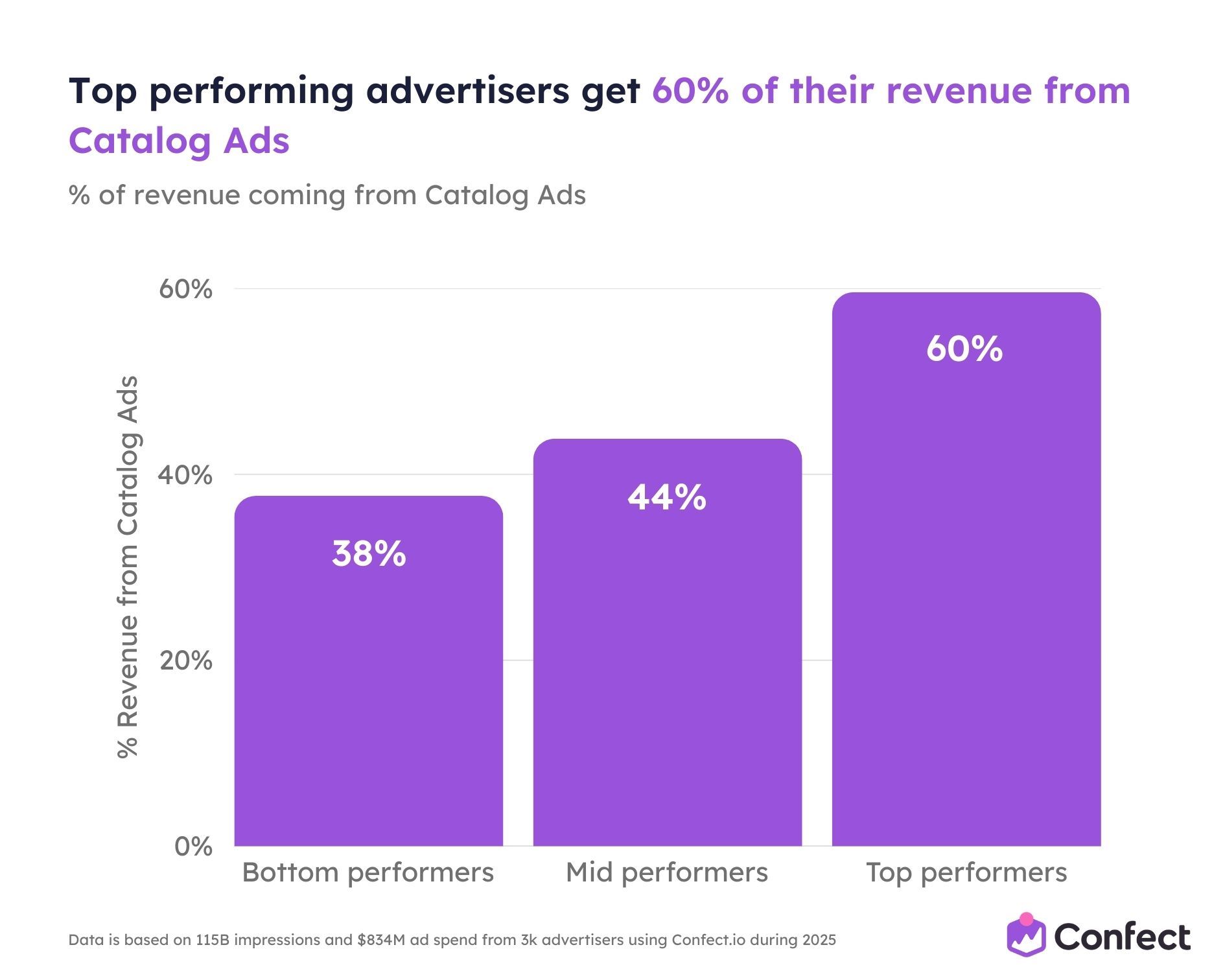
The top-performing advertisers in that dataset spend 60-100% of their budget on Catalog Ads - and they achieve 44% higher ROAS and 68% lower CPA than advertisers who lean on static. Nike’s spend distribution is exactly where the data says a top-performing advertiser should be.
Within static ads: video vs. image
The same inverted pattern shows up inside Nike’s static ads too.
When it comes to the number of ads, 82% of Nike’s static ads are images and just 18% are videos. Images are cheaper and faster to produce, so this makes sense. You can create a lot of them quickly.
But again, the spend tells a different story. 58% of Nike’s static ad spend goes to video. Only 42% goes to images. Nike spends 6.3x more per video ad than per image ad.
It’s the same logic playing out at every level. Nike produces more of the cheap, easy format (images). But the algorithm consistently pushes money toward the formats that perform - videos over images, and Catalog Ads over everything.
The individual ad level: where it gets really dramatic
Zoom in further and look at individual ads. This is where the gap becomes staggering.
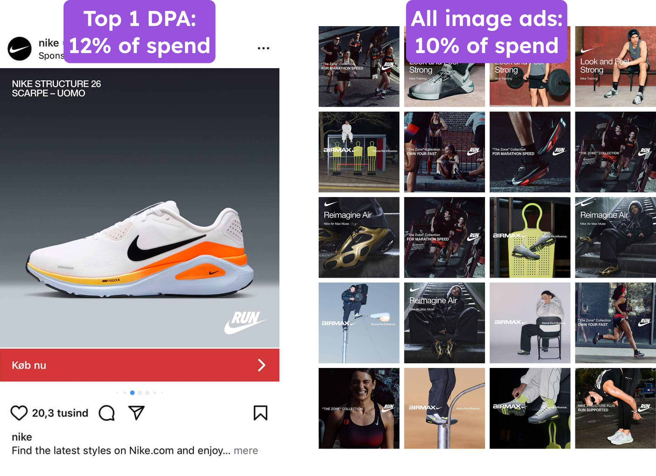
Nike spends more on their single best Catalog Ad than they do on all of their static image ads combined.
That’s not a typo. One Catalog Ad outspends every image ad in the ad account - put together.
Take the next step: Nike’s 2 best Catalog Ads receive as much spend as all of their static ads - image and video - combined. Two Catalog Ads matching the entire static portfolio.
The dominance doesn’t stop at the top. 64% of Nike’s Catalog Ads individually outspend their best-performing image ad. And 43% of all Catalog Ads outspend even their best video ad. These aren’t flukes at the top of the curve. The majority of Nike’s Catalog Ads are outperforming every static image the brand runs.
But here’s the insight that matters most for your own strategy: it’s not just that Catalog Ads win at the top. It’s how the spend distributes across the portfolio.
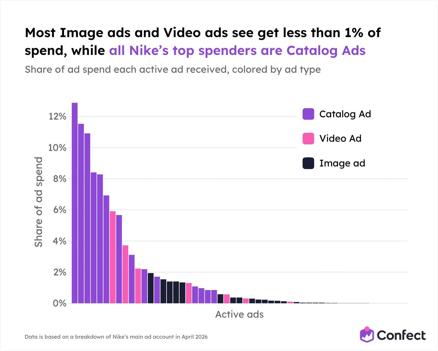
Nike’s Catalog Ads have a smooth, healthy spend curve. Even the “worst-performing” Catalog Ads still receive significant spend. The median Catalog Ad gets about 82% of the average - meaning the portfolio performs consistently, without a few winners propping up a pile of duds.
Image ads are the opposite. The top 20% of image ads capture 72% of all image impressions. Below the top five, almost nothing gets spend at all. The median image ad gets roughly 12% of the average. That’s a portfolio where most of the work is wasted.
Video sits in between - the top 43% of video ads grab 84% of impressions, and the best video gets 3x more impressions than the best image ad. Better than images, but still heavily concentrated at the top.
And this is just static video. Video Catalog Ads combine the performance advantage of video with the scaling advantage of catalogs - something Nike hasn't fully explored yet.
The pattern is clear. Static image ads are easy to produce but don’t scale. You can make a lot of them, but most will get almost no delivery. Video ads are better - they earn more spend and distribute more evenly. But Catalog Ads are the clear winner on both counts: they scale the best and distribute the most consistently across the portfolio.
We see this across almost all advertisers after Meta published Andromeda. Advertisers are still focusing on producing static content for their ads, but most spend - and even more revenue - is captured by their Catalog Ads, due to the better performance and data-driven ad format.
This is why Nike’s inverted ratio exists. It’s not a strategic choice Nike made in a boardroom. It’s the algorithm confirming, ad by ad, impression by impression, that Catalog Ads deliver more value. Nike just had the wisdom to let the algorithm do its job - and to invest in making those Catalog Ads as good as possible.
Which raises the obvious question: what do those Catalog Ads actually look like?
Before we get there, let’s first look at how Nike targets their audiences - because the targeting strategy is just as deliberate as the spend distribution.
Media Buying: How Nike Targets Their Audiences
Nike’s spend distribution shows that Catalog Ads dominate their budget. But how Nike targets those ads reveals something even more interesting about their strategy.
They’re running two completely different targeting systems at the same time. And each one is optimized for a different job.
Two systems, one strategy
Nike’s static ads use manual targeting. Most are targeted toward specific demographic audiences - Men 25-54, Women 18-44, and similar defined groups. The targeting matches the creative: if a man appears in the ad, it’s targeted toward men. If a woman is featured, it’s targeted toward women.
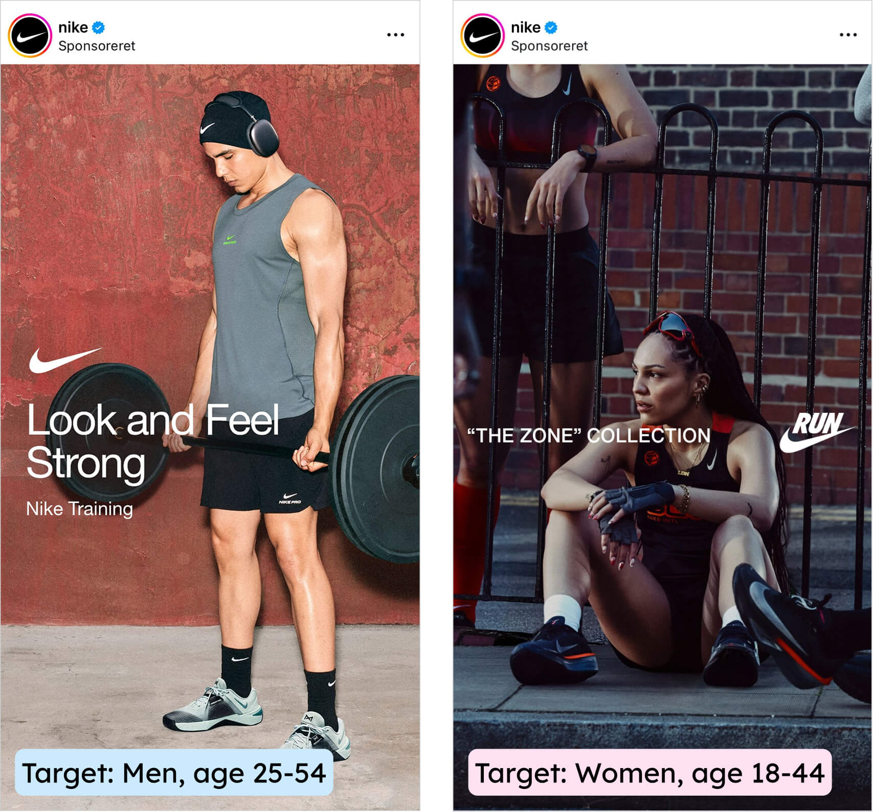
This is intentional and smart. Nike is making ads for specific people - “let’s make an ad that men in their 30s who love to run would want to see” - and then making sure those specific people see it. The creative and the targeting are aligned by design.
Nike’s Catalog Ads use broad targeting. Every single one. All ages, all genders. No manual restrictions whatsoever.
And because of this, each Catalog Ad automatically optimizes towards the consumers that are most likely to be profitable.
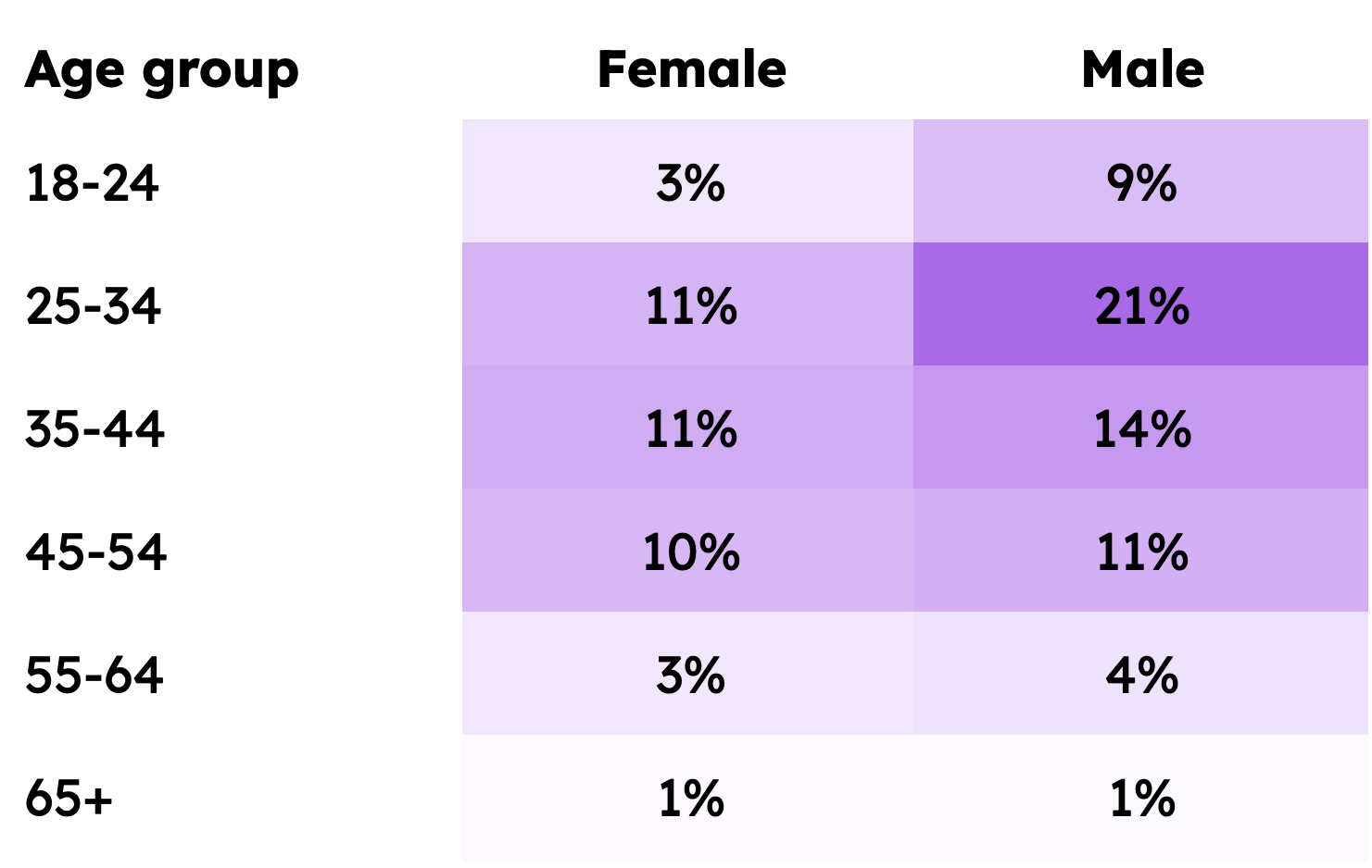
Here's the overall breakdown of who Nike are reaching with their broad Catalog Ads:
This isn’t laziness. It’s a deliberate division of labor.
Static ads are Nike’s brand awareness layer. When you’re telling a brand story - “Own Your Fast” over a cinematic running shot - you want control over who sees that message. You want it in front of runners, not people who’ve never laced up a shoe. Manual targeting gives Nike that control.
Catalog Ads are Nike’s conversion layer. When you’re showing someone a specific product they might want to buy, the algorithm is better at finding the right buyer than any targeting setting you could define. So Nike steps back and lets Meta’s system do the matching.
The logic maps to exactly what we see in the broader data. The Andromeda study found that broad targeting now delivers 49% higher ROAS compared to the old lookalike targeting. The old playbook of carefully segmented audiences has been overtaken by Meta’s AI-driven creative matching. Nike is already running the playbook that Andromeda rewards.
How the algorithm distributes Nike’s Catalog Ad spend across audiences
Here’s what makes broad targeting so fascinating with Nike’s data. Even though Nike sets no audience restrictions on their Catalog Ads, the algorithm creates its own distribution - and it’s not random at all.
Age: 25-34 year olds are the biggest audience at 32% of spend. Here’s the full breakdown:
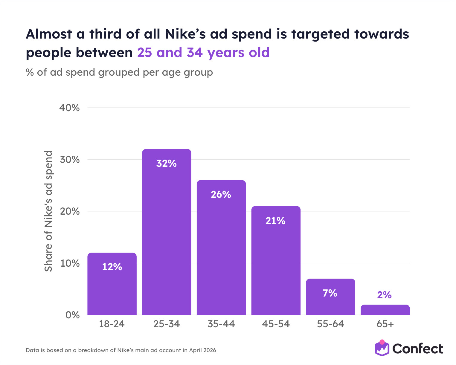
The distribution makes intuitive sense. Nike’s core buying audience - adults with disposable income who care about sports, fitness, and lifestyle - sits in the 25-54 range, and that’s where 79% of the spend lands. Only 12% goes to under-24s, which might surprise you for a brand associated with youth culture. But the algorithm isn’t optimizing for brand affinity. It’s optimizing for purchases. And people in their late 20s through early 50s buy more than a teenager.
The creative does the targeting
But the really clever part is what happens at the individual ad level.
Even though every Catalog Ad targets everyone, different ads naturally attract different audiences based on what they show and say. The algorithm picks up on this and distributes accordingly.
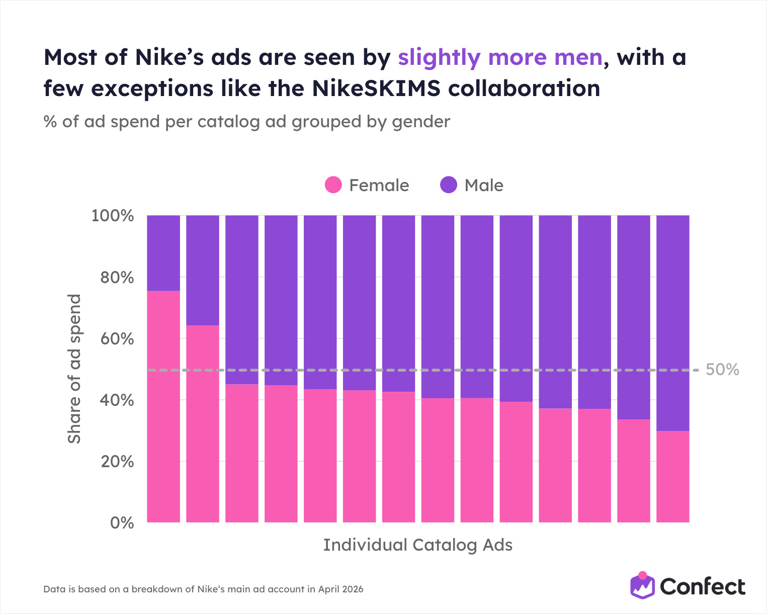
Gender: 60% of Catalog Ad spend goes toward men, 40% toward women. Most of Nike's ads are seen by slightly more men, with a few exceptions like the NikeSKIMS collaboration. Nike doesn’t set this. The algorithm decides based on who engages with which products.
An ad with the copy “Get the gear that’s up for it all. Any time. Anywhere.” sees roughly 70% of its spend going toward men. An ad saying “Discover elegant, ballet-inspired layers and all-new updates to gym and studio favourites” sees about 75% going toward women.
Nike isn’t setting those gender splits of their Catalog Ads. The copy, the design, and the product set are doing the targeting. The algorithm reads the creative, understands who it resonates with, and delivers it to the right people.
This is “creative is the new targeting” playing out in real time at one of the biggest brands in the world.
But it’s worth noting that most of Nike’s Catalog Ads don’t skew dramatically. 46% of all their Catalog Ads distribute roughly 50/50 between men and women (within a 10 percentage point range).
Only 13% see more than two-thirds of spend going toward one gender.
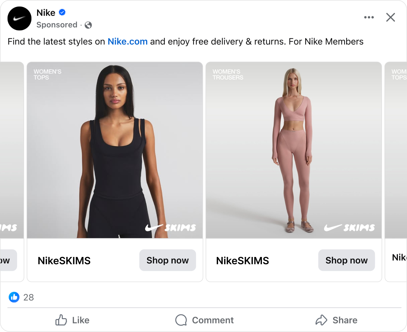
Nike also uses product sets to filter some ads to specific collections - NikeSKIMS products in one ad, broad all-products in another - but the targeting itself stays open.
The Catalog Ads filtered down to specific collections, like the NikeSKIMS product set, are the ones seeing the most skewed gender distribution and age distribution, with the Catalog Ad below for the NikeSKIMS collaboration showing 75% of the impressions to women:
The age distribution is even more stable. The biggest variation between different ads within any single age group is just 12 percentage points. So while the 25-34 group averages 32% of spend, it ranges between about 30% and 41% across different ads. The algorithm isn’t wildly reshuffling the audience from ad to ad. It’s making calibrated adjustments based on what each creative signals.
The takeaway is simple but powerful. Nike gives the algorithm maximum freedom on their Catalog Ads - broad audiences, no restrictions - and lets the creative itself determine who sees what. The copy, the product images, and the product sets all act as implicit targeting signals that Meta’s system picks up and acts on.
It’s a system that only works if you trust the algorithm. And it only works well if your creative is good enough to attract the right people. Which brings us to the question: why does Meta’s algorithm reward this approach so heavily?
What This Means for Meta’s Algorithm (and for You)
We’ve seen the numbers: 75% of Nike’s spend goes to Catalog Ads. We’ve seen the targeting: broad audiences on Catalog Ads, manual on static. But before we look at what Nike’s creative actually looks like, it’s worth understanding why this approach works so well at the algorithm level.
Because it really does.
When we studied more than 3,000 advertisers in our Andromeda study, we saw that top-performing advertisers get 60% of their revenue from Catalog Ads rather than static ads. And in Nike's case, based on their ad library, it's even more than 60%.
Nike’s strategy isn’t just smart marketing. It’s a near-perfect match for how Meta’s ad system actually operates in 2026.
Andromeda rewards exactly what Nike is doing
In late 2024 and through 2025, Meta replaced the core engine that decides which ads get shown to which people. They called it Andromeda. It wasn’t a tweak. It was a complete rebuild of how ad retrieval works - a 10,000x increase in model complexity at the stage where the system decides which ads even get a chance to compete.
The old system leaned heavily on the targeting settings you defined - your interest audiences, your lookalikes, your custom audiences. Andromeda works differently. It uses computer vision and semantic analysis to read the actual content of your creative and match it to individual users in real time.
Your creative now does most of the targeting work.
That single shift explains why Nike’s approach is so effective. Let’s connect the dots.
Nike goes broad on Catalog Ads. Andromeda’s creative-first matching makes narrow audience targeting largely redundant. The algorithm finds the right people based on what the creative shows, not what the advertiser defines. We saw this in Nike’s data - ads about “ballet-inspired layers” reach women, ads about “gear that’s up for it all” reach men, and Nike never sets those splits manually.
Nike runs Catalog Ads as their primary format. Across 3,014 advertisers and $834M in ad spend, we found that Catalog Ads outperform static ads by 23% on ROAS and 37% on CPA. Top-performing advertisers run 72% more Catalog Ads than bottom performers and spend 117% more on them. Advertisers who put 60-100% of their spend on Catalog Ads achieve 44% higher ROAS and 68% lower CPA. Nike, with 75% of spend going to Catalog Ads, is operating right in that top-performer zone.
Nike produces genuine creative diversity. This is one of Andromeda’s most important mechanics. The system clusters similar-looking ads into a single “entity.” If you’re running ten variations of the same product shot with minor tweaks - different headline color, slightly cropped image, small text change - Andromeda treats them as one ad. Ten ads, one retrieval ticket. One chance to compete.
But genuinely different creatives each get their own ticket. And this is where Catalog Ads have a structural advantage that static ads can never match.
Why Catalog Ads are built for Andromeda
A single Catalog Ad template generates a unique creative for every product in the catalog. Different shoes, different jackets, different colorways - each one is a visually distinct product image that Andromeda reads as genuinely different creative. Nike doesn’t need to produce hundreds of individual ads. The catalog does it automatically.
But Nike goes further. As we’ll see in the next section, their Catalog Ad design system isn’t just one template. It’s a modular framework with interchangeable elements: different top texts, different bottom texts, different product image strategies, campaign-adapted designs, and multiple aspect ratios. All from a single design system.
That means Nike isn’t generating variety from just the product images. They’re generating variety at every layer - product, messaging, visual treatment, placement format. Each combination is a genuinely distinct creative in the eyes of the algorithm.
Top performers in the Andromeda study are 75% more likely to use multiple placement formats and 103% more likely to use Design Rules (conditional design logic that adapts the creative based on product attributes). Nike does both.
The spend curve confirms it
Go back to the spend distribution data from Section 2. Nike’s Catalog Ads have a smooth, healthy curve where even the lowest-performing ads receive meaningful spend. Static image ads have a cliff where most ads get almost nothing.
That’s Andromeda telling you which format it can work with. Catalog Ads give the algorithm enough creative diversity to find matches across a broad audience and distribute spend evenly. Static image ads don’t - so the algorithm concentrates on the few that work and abandons the rest.
Nike’s 75% spend allocation to Catalog Ads isn’t something they decided in a planning meeting. It’s the algorithm confirming, impression by impression, that Catalog Ads deliver more value for Nike. And the smooth Catalog Ad spend curve tells you the algorithm can consistently scale this format in a way it simply can’t with static images.
It's probably also why Nike is letting their Catalog Ads stay active for 37% longer before turning them off, compared to static image or video ads. This longevity is one of the reasons always-on Catalog Ads work great for most advertisers.
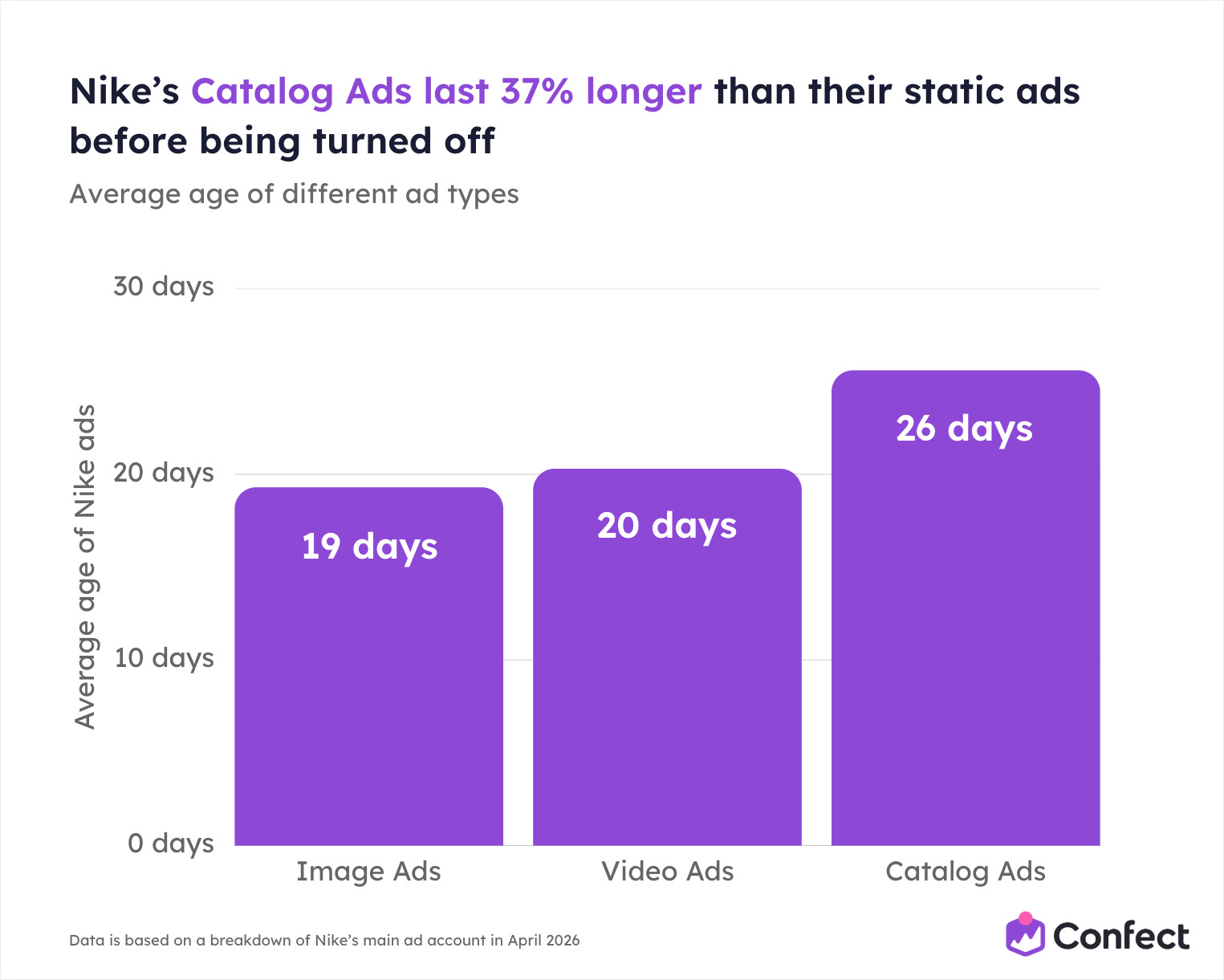
And it's not only Nike seeing this after the Meta Andromeda update. Catalog Ads are live for 6.6 weeks for the average Meta advertiser, while static ads are only live for 5.1 weeks on average.
Nike has built a system that feeds Andromeda exactly what it wants: diverse, high-quality, product-level creative at broad scale. The algorithm rewards them with disproportionate delivery.
Now let’s look at what that creative actually looks like.
Nike’s Catalog Ad Design System: A Masterclass in Modular Design
This is the core of the breakdown. Everything we’ve covered so far - the spend distribution, the targeting, the algorithm alignment - leads here. Because the reason Nike’s Catalog Ads dominate their account is not just that they run them. It’s how they design them.
Nike hasn’t built a Catalog Ad, they’ve built a design system. A modular framework where every element can be swapped, adapted, or rotated without breaking the whole. One framework with infinite variations. And every variation is unmistakably Nike.
Let’s break it apart piece by piece.
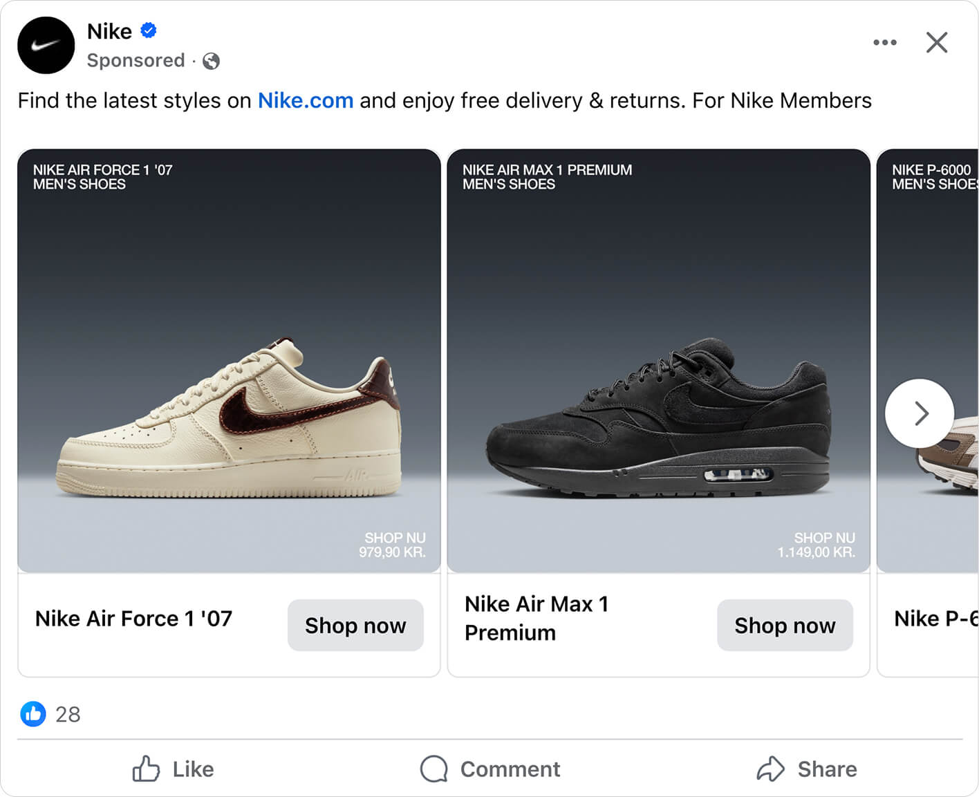
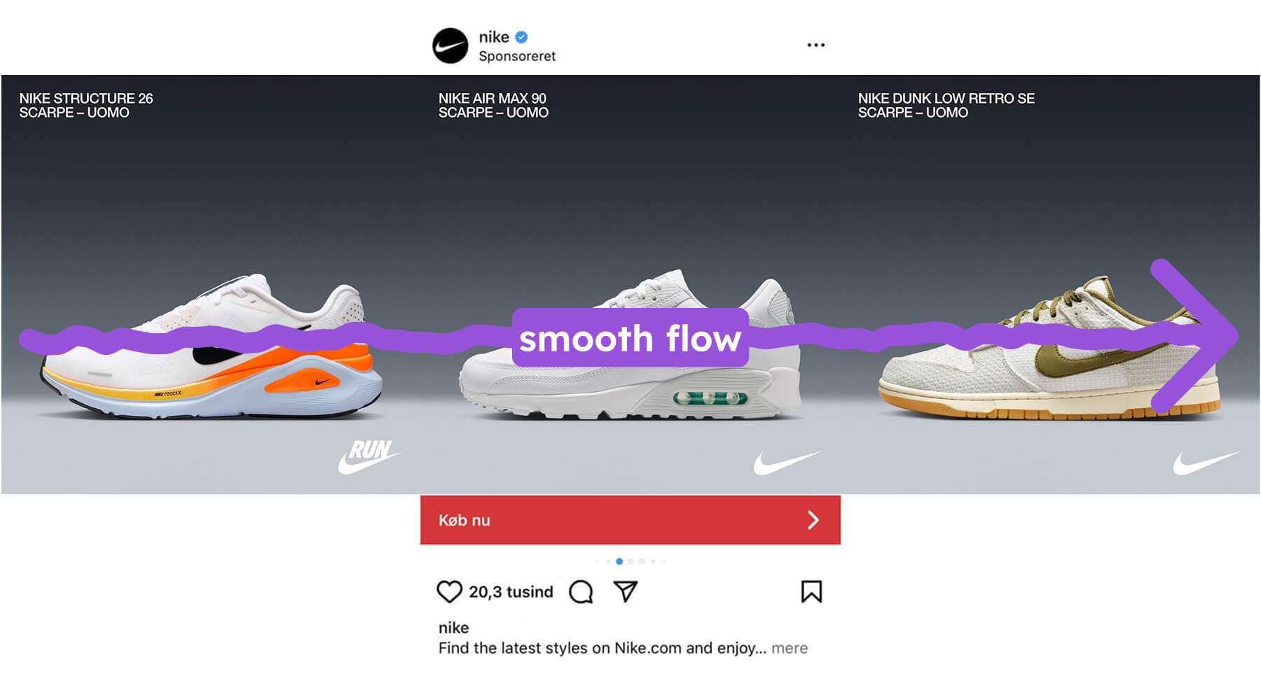
The core design: dark, clean, focused
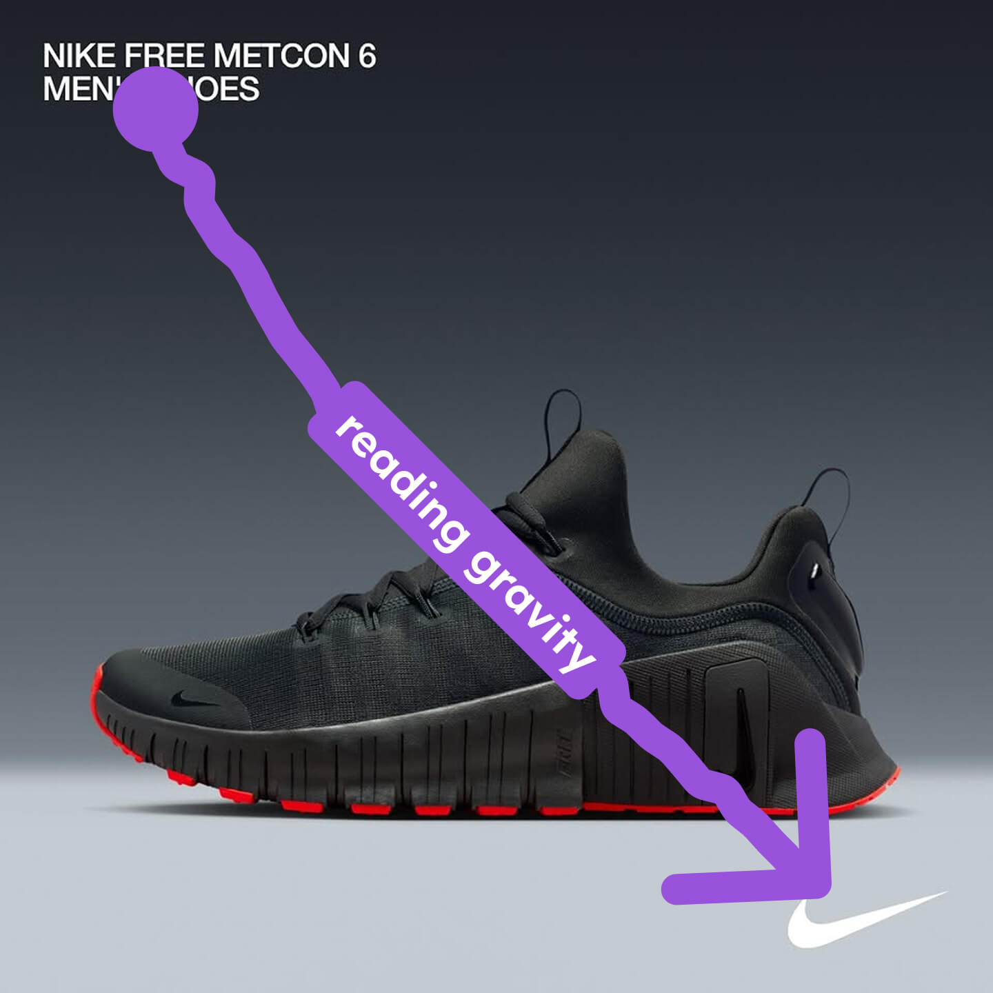
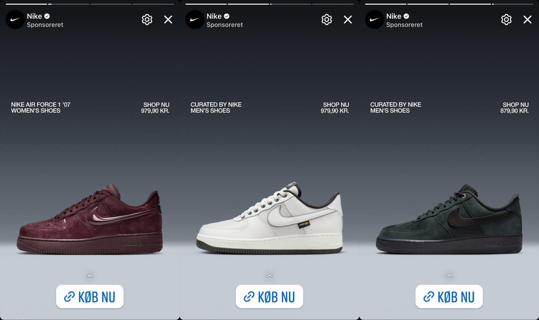
Start with a single product card from one of Nike’s Catalog Ads. At first glance, it looks simple. Dark gradient background. A shoe in the center. Product name top-left. Brand mark bottom-right.
That simplicity is the entire point.
The layout follows the Gutenberg Diagram - a design principle that maps how people naturally scan a rectangular layout. The eye starts in the primary optical area (top-left), where Nike places the product name. It sweeps through the center, where the product dominates. And it ends in the terminal area (bottom-right), where the brand mark, price, or call-to-action sits. Three pieces of information, delivered in the order the eye naturally wants to receive them.
You know what you’re looking at. You see the product. You’re reminded who’s selling it. No clutter. No competing messages. No thinking required.
This is not by accident. A lot of major companies that have A/B tested their designs end up seeing the same pattern - simply because of how our brain and eyes work.
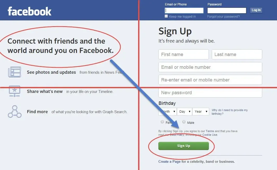
An example is Facebook, that saw the exact same result when A/B testing their homepage:
The dark gradient background is doing double duty. First, contrast. The shoe - typically with a white midsole or bright colorway - pops against the dark backdrop. Light elements are perceived before dark ones, so the product becomes the most visually salient element before the viewer even decides to look at the ad. In design theory, this is pre-attentive processing at work: the contrast is registered by your visual system before conscious attention kicks in.
Second, premium signaling. Dark backgrounds are part of what semiotic theory calls the luxury code - they signal sophistication, quality, and confidence. Nike isn’t a discount brand. A white background would be functional. This dark gradient feels editorial.
It elevates mid-range athletic shoes into something that feels premium - a technique high-end and luxury brands use deliberately in their Catalog Ads.
The consistency across the carousel matters. Every card in the carousel gets the same dark gradient, the same layout, the same typographic treatment. When you swipe through - Air Force 1, Air Max 1, P-6000 - the experience feels cohesive. That’s Gestalt’s law of similarity: same background, same structure, same visual rhythm. Your brain reads the cards as a curated set, not a random collection of products.
Zero friction between the product cards. It's a smooth transition every time.
And cognitive load is kept to an absolute minimum. Three elements per card: product name, product image, brand mark or price. That’s it. No badges, no decorative elements, no competing text blocks. The viewer’s mental resources are free to focus on the only thing that matters - evaluating the product itself. Things that are easy to process are perceived as more trustworthy and more valuable. Nike’s clean design doesn’t just look better. It makes the products feel better.
Product images: different strategies for different categories
Nike doesn’t use the same type of product image for everything. They adapt based on how people actually shop each category.
For shoes and accessories: packshots and flat lays. Clean product images on the dark background, showing the full silhouette - sole shape, upper material, swoosh placement, colorway. Every detail is visible.
For clothing: lifestyle and model images. Jackets, shorts, T-shirts - all shown on a model, in context, on a body.
The reason is simple once you think about it from the customer’s perspective.
When someone sees a shoe in a Catalog Ad, the question they’re trying to answer is: “Is this the right model, the right colorway, the right style?” The silhouette of the shoe IS the product. A lifestyle shot of someone’s feet mid-stride would destroy all of that detail. The packshot gives the viewer everything they need to evaluate and compare across the carousel - maximum processing fluency, minimum cognitive load.
When someone sees a jacket or a T-shirt, the question changes: “How will this look on me?” A flat-lay T-shirt tells you almost nothing about fit, drape, or silhouette on a body. A model wearing it lets the viewer mentally project themselves into the image. That’s future pacing - the customer is already imagining themselves wearing the product before they’ve clicked. The lifestyle image also triggers emotional contagion: if the model looks confident and active, those feelings transfer directly to the product.
It’s a progressive disclosure decision. Each image type front-loads whatever matters most for that product category. Shoes need product detail first. Clothing needs context first. Same brand, same design system - but the visual strategy adapts to how people actually make decisions.
Top text: four patterns, four intents
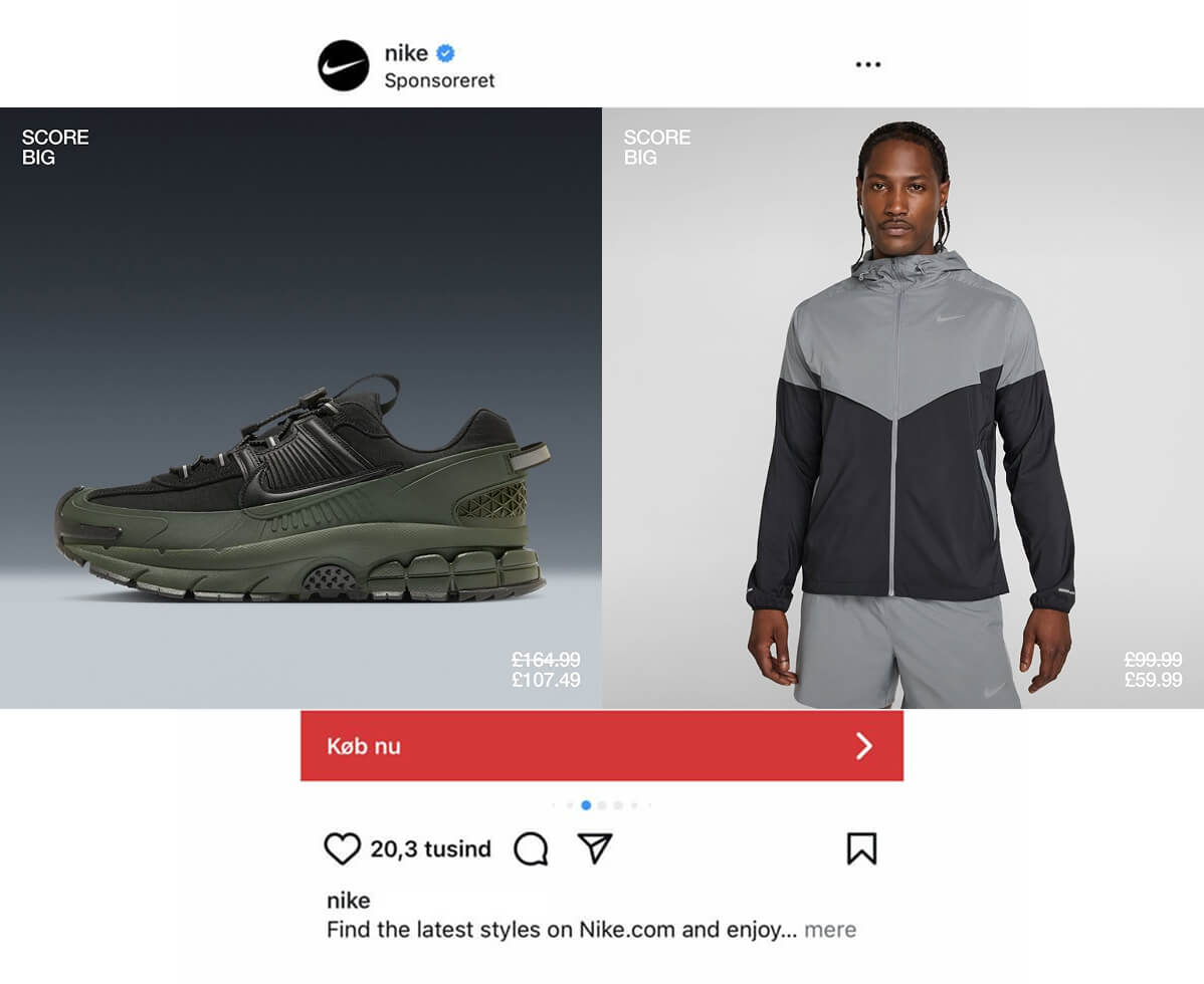
In the top-left of every Catalog Ad card - the primary optical area, the first thing the viewer processes - Nike rotates between four different text patterns. Each one answers a different question.
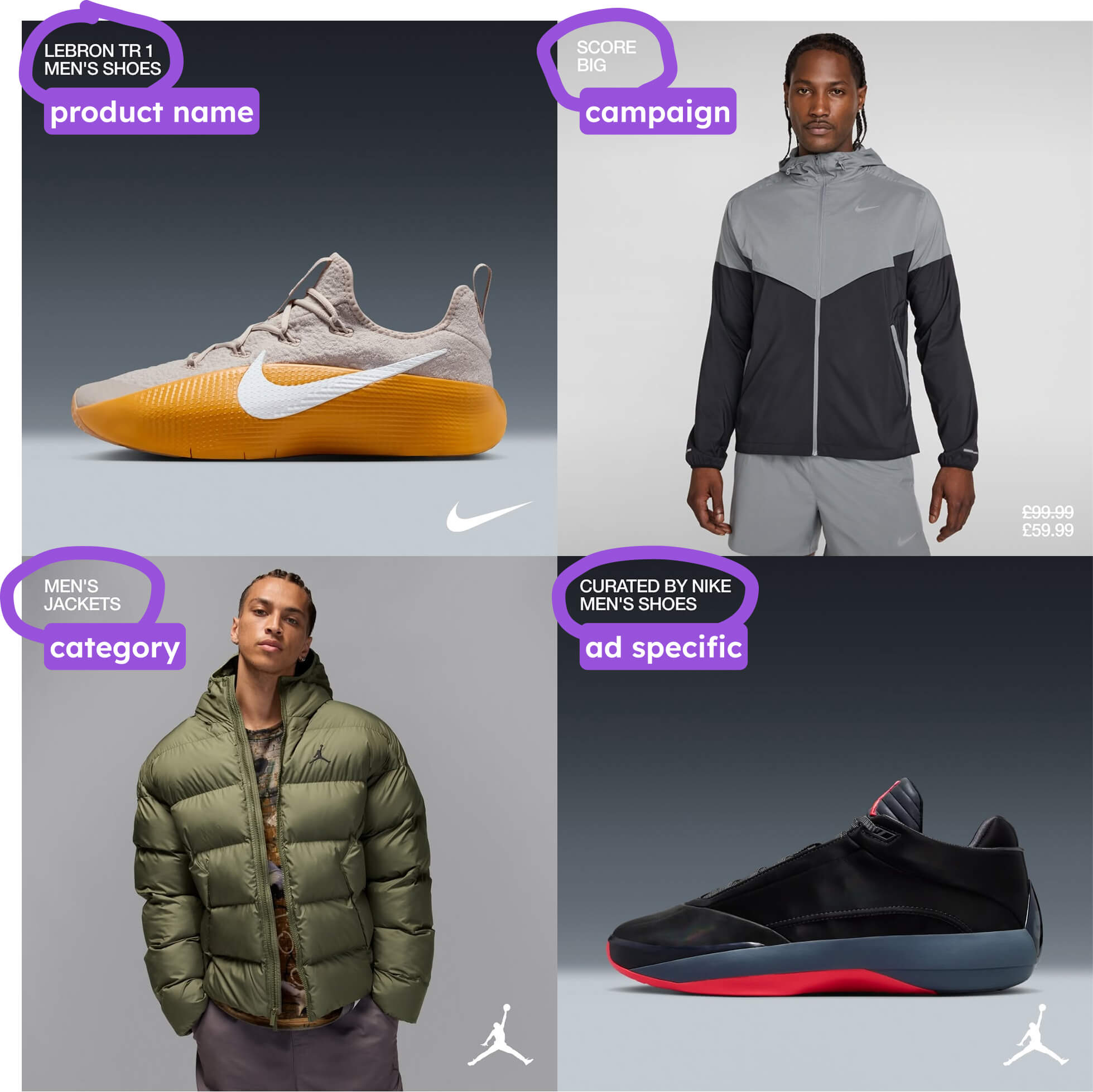
Campaign (“SCORE BIG”) answers: “Why should I care right now?”
This turns the product into a vehicle for urgency. The same shoe means something completely different when anchored by “SCORE BIG” versus a product name. It reframes the product from something to evaluate into an opportunity to act on. Loss aversion kicks in - there’s something happening, and you’re either in or you’re missing it.
Name + category (“NIKE DUNK LOW RETRO SE / MEN’S SHOES”) answers: “What exactly am I looking at?”
Pure product identification. Used when the specific model matters - when “Dunk Low Retro SE” carries meaning the image alone can’t communicate. The viewer who already knows what they want can lock onto the product name and skip straight to evaluating whether to buy. This is a recognition aid for informed shoppers.
In our data we see that showing product names in Catalog Ads improves ROAS by 22% - especially for categories where the specific model matters.
Ad-specific (“CURATED BY NIKE / MEN’S SHOES”) answers: “Why is this product being shown to me?”
This frames the product as a recommendation. Someone at Nike chose this for you. That’s the authority principle and social proof wrapped into two words. The product doesn’t need a name here because the curation itself is the value proposition. The message is: trust us, this is worth your attention.
Category only (“MEN’S / JACKETS”) answers: “What kind of product is this?”
The most minimal option. Just enough to orient the viewer - you’re looking at a jacket, not a vest, not a hoodie. Everything else is left to the product image. This is maximum confidence in the visual, with cognitive load at an absolute minimum.
Why rotating between them is smart: Nike isn’t randomly shuffling. Each text type matches a different advertising intent. When they’re running a promotion, campaign text turns every product in the catalog into a vehicle for that message. When they want to drive consideration for specific hero products, the name helps the viewer compare and identify. When the product speaks for itself, category-only text gets out of the way. One design system, infinite messaging flexibility. That’s modular creative strategy - and it’s exactly the kind of genuine creative diversity that Andromeda rewards with separate retrieval tickets.
Bottom text: three different closing moves
The bottom-right is the terminal area in the Gutenberg Diagram - the last place the eye lands before the viewer decides to act or scroll. What Nike puts here determines how the ad ends. And they rotate between three options, each closing with a completely different intent.
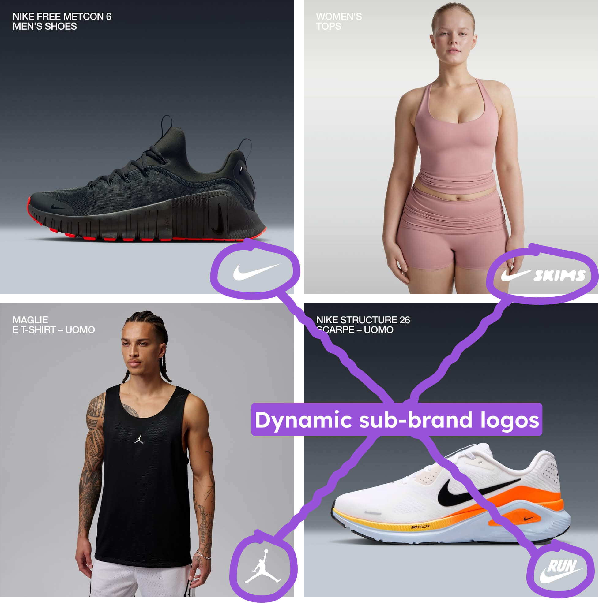
Sub-brand logo (Jordan, Swoosh, Nike Run) closes with a brand impression.
The ad ends on identity, not commerce. The viewer walks away with a brand association, not a price in their head. The sub-brand logo also segments Nike’s massive catalog into recognizable worlds. “Jordan” and “Nike Run” carry completely different associations and aspirations. Thanks to the peak-end rule - where the last thing experienced disproportionately shapes how the whole experience is remembered - the viewer doesn’t remember a price. They remember “that was a Jordan product.”
We studied using these dynamic images in Catalog Ads across 6.5 Billion impressions, and saw something interesting: Using dynamic assets like this in your Catalog Ads on average increases Return On Ad spend by +80% and improves Cost Per Purchase by -33%.
Price + original price ($164.99 / $107.49) closes with the deal.
The crossed-out original price next to the sale price is textbook anchoring bias - the higher number makes the lower number feel like a steal. But placement matters. By putting this in the terminal area, Nike ensures the price is the last thing processed - after the viewer has already seen the product, already built some desire. That’s progressive disclosure working perfectly. Show the product, build want, reveal the price at the decision point. If price came first, the viewer would evaluate everything through a “is this worth it?” lens. By coming last, the price arrives after desire is already formed.
On average, we see a +41% increase in Return On Ad Spend when showing prices in your Catalog Ads - no wonder Nike is doubling down on this in multiple ads.
Shop now + price (SHOP NOW / $129) closes with a direct call to action.
The most conversion-oriented option. “SHOP NOW” is an imperative command - it tells the viewer exactly what to do next. Paired with the price, it compresses the final two steps of the decision (“how much?” and “what do I do?”) into one glance. Maximum friction removal in the terminal area. No thinking required. Just act.
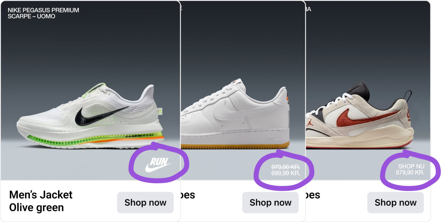
Same design system. Same terminal area. Three completely different strategic outcomes, rotated based on campaign objective.
Design variations: kids, campaigns, and placement adaptation
The core design system handles the vast majority of Nike’s Catalog Ads. But Nike also makes smart adjustments for specific use cases - without ever breaking the system.
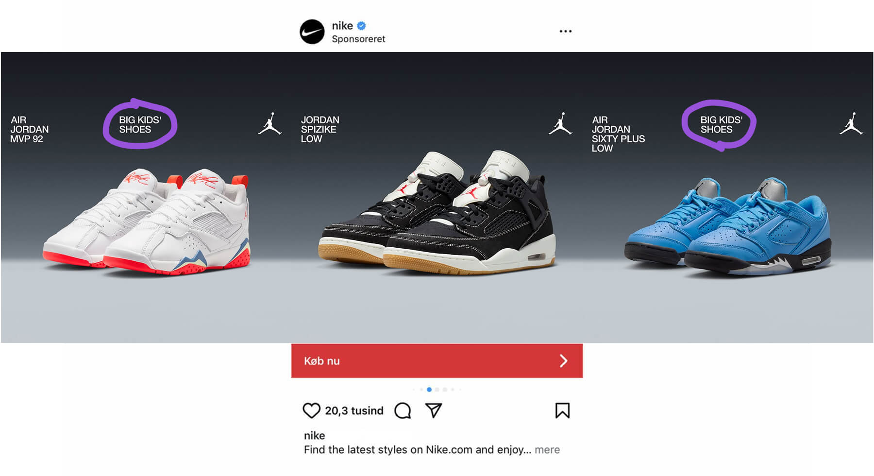
Kids ads add an extra text field to help parents understand the product is child-sized. If you’re a parent scrolling and you see a shoe that looks like an adult shoe, you need a clear signal that this is for your child - and whether it’s for big kids or smaller kids. The extra text does that job without changing anything else about the design.
Campaign-adapted designs take the modular system further. For some campaigns, the entire Catalog Ad visual identity shifts to match the campaign’s look - backgrounds change to campaign colors, the overall aesthetic aligns with what the viewer is seeing across nike.com, Instagram, and email. In one example, the signature dark gradient is replaced with a red-to-dark-red gradient that matches the broader campaign.
Turning your entire catalog into a campaign surface like Nike is doing is one of the highest-leverage moves you can make - here's how to do it without resetting your ad learning.
This is omnichannel consistency - the Catalog Ads feel like part of a coordinated campaign, not a separate feed running in the background.
But it’s especially smart because of what it does to the viewer who has been seeing Nike’s usual dark gradient for weeks or months. The suddenly different visual treatment is itself a signal. That pattern disruption grabs attention precisely because the viewer has been trained to expect the standard look. The changed background says “something is happening” before any text does. Perfect for campaigns and sales. The entire catalog becomes a campaign surface.
Adapt to placement is the final layer. Nike designs their Catalog Ads in both 9:16 and 1:1 aspect ratios separately.
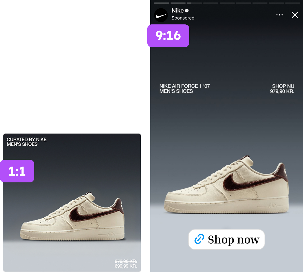
The 9:16 designs are used in Stories and Reels, filling the full screen with the ad design instead of showing the default six tiny product tiles. The 1:1 designs are used in feed placements on Instagram, Facebook, and Marketplace.
This isn’t cosmetic. It’s a meaningful performance driver. A 9:16 Catalog Ad in a Story fills the entire screen with your design, your product, your brand. Without it, your Catalog Ads show up as small, cropped product images surrounded by empty space or auto-generated backgrounds. The difference in visual impact is enormous.
And the data backs it up. Top performers in the Andromeda study are 75% more likely to use multiple placement formats and 103% more likely to use Design Rules - the conditional design logic that adapts the creative based on product attributes. Nike’s campaign-adapted designs and multi-format approach match both behaviors exactly.
The system is the strategy
Step back and look at what Nike has built. One design framework. Dark gradient, clean hierarchy, minimal cognitive load. But within that framework:
- Four different top-text patterns for four different advertising intents
- Three different bottom-text options for three different strategic outcomes
- Two different product image strategies based on product category
- Campaign-adapted variations that transform the catalog into a campaign surface
- Two aspect ratios designed separately for different placements
Multiply these together and you get a massive number of genuinely distinct creative combinations - all produced from a single, consistent design system. Every combination looks unmistakably like Nike. And every combination is, in the eyes of Meta’s algorithm, a genuinely different creative that earns its own chance to compete.
That’s the real lesson. Nike’s power doesn’t come from having one brilliant Catalog Ad. It comes from having a system that produces endless variety without ever losing brand consistency. The system is the strategy.
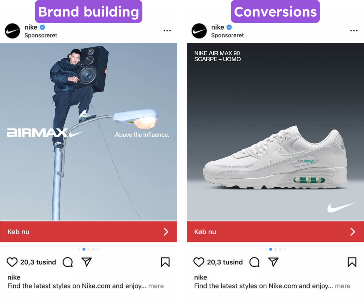
Nike’s Static Ads: Brand Storytelling at the Values Level
Nike’s Catalog Ads handle the conversion work. So what are the static ads doing?
Something completely different. And that’s the point.
One visual system, four distinct worlds
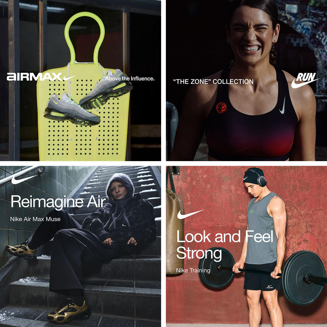
Look across Nike’s static ads and you’ll see something impressive: every sub-campaign has its own visual personality, yet they’re all unmistakably Nike.
The “Zone” Collection ads work in black, charcoal, and hot red-orange. Air Max ads work in muted tones with a single neon volt accent. Nike Training ads lean into warm earth tones against cool greys. Very different aesthetic worlds, all sharing the same DNA.
That DNA is built on a set of rules that never break:
Typography is always bold, white, clean sans-serif, placed mostly the same places. The copy is always short - two to four words maximum for the headline. “Own Your Fast.” “Above the Influence.” “Look and Feel Strong.” “Reimagine Air.” That restraint is rare and powerful. It respects the viewer’s 0.3-second scroll window. You process the message before you consciously decide to engage.
Color palettes are restrained to two or three tones per ad. This makes each ad feel cohesive and creates contrast for the product - the shoe or garment always carries the most saturated color in the frame. The product pops not because Nike added a glow effect, but because the entire palette is engineered to make it the most visually prominent element.
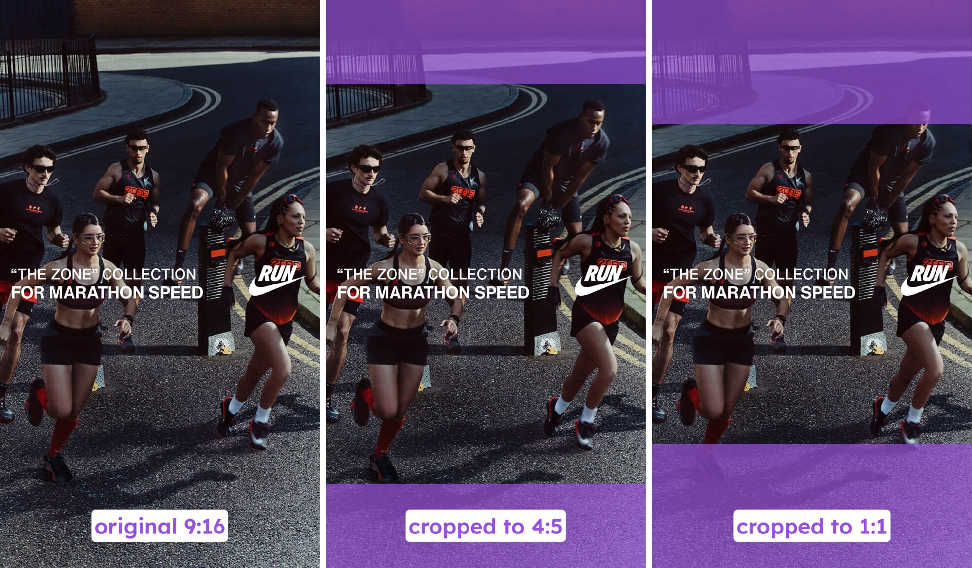
Every creative is designed to work across 9:16, 4:5, and 1:1. Just like their Catalog Ads, Nike’s static creative system accounts for multiple placements from the start. The compositions hold up whether you’re seeing them in a Story, a Reel, or a feed post.
These are Byron Sharp’s distinctive brand assets at work. The swoosh, the typographic family, the left-aligned text placement logic - they function in peripheral vision and at scroll speed. The brand is identifiable without reading a single word.
The product is never the hero. The feeling is.
Not one of Nike’s static ads puts a product on a white background with a “Shop Now” button. Every product exists inside a world - on a body, in motion, in context. A runner mid-stride. A lifter gripping a barbell. A model in streetwear against a cinematic backdrop.
This is the Features-Benefits-Values pyramid played entirely at the values level. Nike’s static ads don’t mention a single product feature. No cushioning technology. No material specs. No price. They sell what it feels like to own your speed, your strength, your influence.
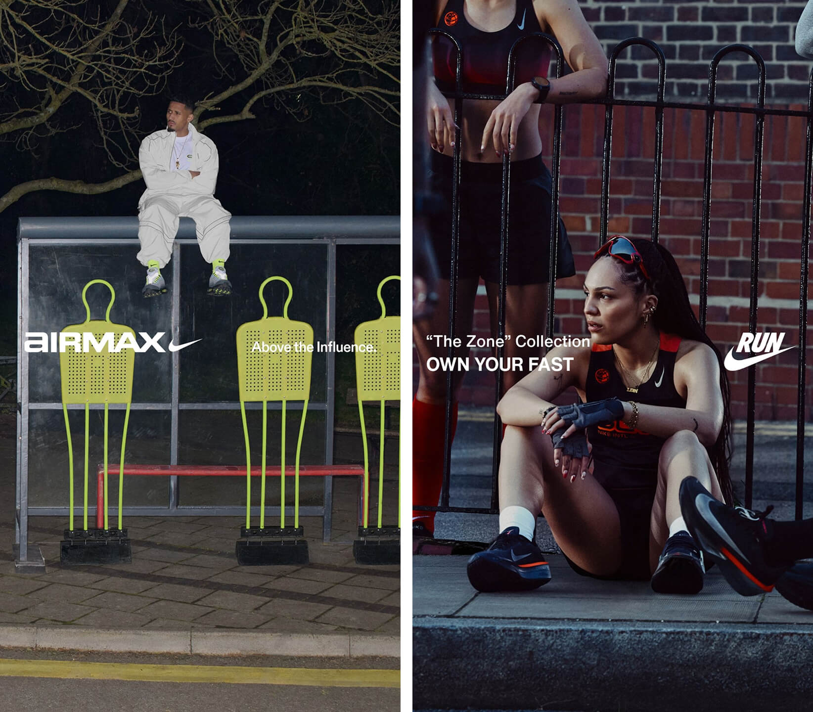
Look at the imagery more closely. Every ad presents people the viewer aspires to be part of. Fast runners. Cool streetwear people. Serious lifters. Fashion-forward individuals. These are aspirational reference groups - the message across all of them is: this is who wears this. Do you want to be one of them?
Each ad addresses a specific tribe. Runners. Sneakerheads. Gym people. Fashion people. The products aren’t positioned as things to buy - they’re positioned as uniforms for groups the viewer wants to belong to. That’s social identity theory applied relentlessly. You don’t just buy Nike. You join the people who buy Nike.
And the emotion in every photograph - intensity, coolness, determination, confidence - transfers to the viewer before any text is processed. That’s emotional contagion. The feeling IS the first piece of information. It colors how the viewer perceives everything else in the ad.
Zero rational arguments. Zero feature comparisons. This is pure pathos - persuasion through emotion. Nike’s static ads are System 1 advertising. They’re designed to be felt, not evaluated.
Two formats, one coordinated system
Here’s what makes Nike’s approach so smart. Their static ads and their Catalog Ads aren’t competing for the same job. They’re a coordinated system.
Static ads build the brand. They create desire, identity, aspiration. They operate at the values level and target specific audiences with manual targeting. They make you feel something about Nike before you’ve ever considered a specific product.
Catalog Ads convert the demand. They show you specific products, adapt to what the algorithm knows about your preferences, and close the sale. They operate at the product level with broad targeting.
And crucially - the visual DNA carries across both. The same typographic confidence. The same restrained color palettes. The same premium feel. A viewer who sees a cinematic Nike running ad in their feed and then encounters a Nike Catalog Ad showing them a specific shoe doesn’t experience a brand disconnect. It feels like the same Nike, just doing a different thing.
Nike’s Catalog Ads don’t look like a separate, robotic, feed-generated afterthought. They look like part of the same brand system that produces their aspirational static campaigns.
Most brands treat their Catalog Ads and their static ads as two completely separate efforts - different teams, different quality bars, different design languages. Nike treats them as two halves of one system. And the results show up in the spend distribution.
Nike’s Ad Copy: Writing at the Identity Level
Nike’s design system and media buying get the structure right. But the words do something just as important - they decide how the viewer feels about what they’re seeing.
And Nike’s copy follows the same two-layer logic as everything else in their Meta strategy.
Static ad copy: you are the hero
Read a few lines from Nike’s static ads:
“Propel yourself beyond what you thought was possible.”
“Control every rep with flexibility, strength, and grip.”
“Leaders of the Pack.”
“Take on your session confidently with locked-in training looks.”
Notice what’s missing. No product specs. No prices. No “30% lighter than the previous model.” Nike writes almost entirely at the benefits and values level of the Features-Benefits-Values pyramid - they skip the feature (“ZoomX foam”), rush past the benefit (“more responsive”), and land on the value (“you exceed your own limits”).
The shoe is just the vehicle for a transformation story.
The consumer is always the subject. Look at how often “you,” “your,” and “yourself” appear. “Propel yourself beyond what you thought was possible.” “Take on your session confidently.” “Control every rep.” Nike makes the reader the protagonist. The product is the tool. The brand is the guide. This is self-congruity theory at the sentence level - the copy reflects the customer’s ideal self back to them.
The verbs carry all the energy. Propel. Control. Take on. These are active, forceful, momentum-creating verbs. Compare “propel yourself beyond” to something like “helps you achieve more.” Same idea. Completely different energy. The verb choice alone makes the copy feel like it’s already in motion.
They address the reader as a pro. Notice how often “confidence” and “control” show up. “Move with confidence.” “Control every rep.” “Take on your session confidently.” Nike isn’t writing to beginners. They’re speaking to the reader as someone who trains seriously, who needs to control every rep, who takes on sessions. Most runners are in the middle of the pack - but “Leaders of the Pack” speaks to who they want to be. That aspiration is more motivating than accuracy.
There’s one notable exception. The Zoom Fly 6 line mentions specific technology: “more ZoomX foam and supercharged FlyPlate.” But even there, the tech serves an aspirational frame. It’s a reason to believe, not the headline message. The feature supports the transformation story rather than replacing it.
This entire approach is built for System 1 processing - the fast, intuitive, emotional brain. Nike knows most people encountering their ads are in low-involvement mode, scrolling a feed, giving a fraction of a second before deciding to engage or move on. Peripheral cues like emotion, confidence, and aspiration are what land in that mode. Detailed rational arguments need active attention that most viewers simply aren’t giving.
Catalog Ad copy: a different job entirely
Now compare Nike’s Catalog Ad copy:
“Get the gear that’s up for it all. Any time. Anywhere.”
“Discover elegant, ballet-inspired layers and all-new updates to gym and studio favourites.”
The tone is still confident and clean. But the purpose has shifted. These lines aren’t selling an identity. They’re directing attention toward products.
“Get the gear” tells you to browse. “Discover elegant, ballet-inspired layers” tells you what kind of products you’ll find. "Find the latest styles" tells you to discover new products. The copy is less aspirational and more directional - it’s guiding the viewer into a product set rather than painting a picture of who they’ll become.
This makes perfect sense when you remember how Nike’s Catalog Ads are targeted. They go to broad audiences. The algorithm decides who sees them. The copy’s job isn’t to inspire a specific tribe - it’s to give the viewer a reason to engage with whatever products the algorithm has matched them with.
The copy mirrors the strategy
Step back and the pattern is the same one we’ve seen in every section of this breakdown.
Static ads speak to identity. Who will I become? They use aspirational language, active verbs, and “you” framing to make the viewer feel like an athlete, a leader, someone who owns their fast. Manual targeting makes sure the right tribe sees the right message.
Catalog Ads speak to products. What should I buy? They use directional language to guide the viewer into a product set. Broad targeting lets the algorithm match the message to the buyer.
Two different copy strategies for two different formats serving two different purposes - but both written in the same confident, short, declarative Nike voice. The words change. The voice never does.
Key Takeaways: What You Can Learn from Nike’s Ad Strategy
Nike is a $51 billion brand with resources most companies will never have. But the principles behind their Meta strategy aren’t exclusive to Nike-sized budgets. They’re patterns you can apply right now.
Here’s what this breakdown comes down to.
1. Invest disproportionately in Catalog Ads
Nike produces three times more static ads than Catalog Ads. But the algorithm pushes three times more spend toward the Catalog Ads. Their single best Catalog Ad outspends all their static image ads combined.
This isn’t a Nike anomaly. Across 3,014 advertisers and $834M in ad spend, Catalog Ads outperform static ads by 23% on ROAS and 37% on CPA. Advertisers who put 60-100% of their budget on Catalog Ads achieve 44% higher ROAS.
Follow the performance signal, not the production habit. If you’re spending most of your creative energy on static ads while your Catalog Ads run with bare product images on white backgrounds - you’re investing in the wrong format.
2. Use static ads for brand, Catalog Ads for conversion
Nike doesn’t ask one format to do both jobs. Static ads build the brand - aspirational, emotional, identity-level. Catalog Ads convert the demand - product-specific, algorithm-optimized, broad-targeted.
Most brands either ignore Catalog Ads entirely or try to make their static ads do the conversion work too. Nike’s approach is cleaner: let each format do what it does best. Your static ads make people feel something about your brand. Your Catalog Ads show them the right product at the right moment.
3. Go broad on Catalog Ad targeting
Every single one of Nike’s Catalog Ads targets all ages, all genders. No manual restrictions. They let the algorithm and the creative do the targeting work - and the data shows the algorithm makes smart decisions about who sees what.
Broad targeting delivers 49% higher ROAS compared to lookalike targeting under Andromeda. If you’re still running tightly segmented Catalog Ad audiences, you’re restricting the algorithm’s ability to find your buyers. Open it up. Let the creative attract the right people.
4. Build a design system, not one-off designs
Nike’s real advantage isn’t one great Catalog Ad. It’s a system: one framework with interchangeable elements that produces massive variety without ever losing brand consistency.
Four top-text patterns. Three bottom-text options. Two product image strategies. Campaign adaptations. Multiple aspect ratios. All from one design template.
You don’t need Nike’s budget to build a modular system. Start with a strong core design, then create variations by changing one element at a time - the same approach the top-performing brands in Advantage+ Shopping Campaigns use. The algorithm needs genuine creative diversity to work well. A system gives you that diversity without starting from scratch every time.
5. Design your Catalog Ads to match your brand
Nike’s Catalog Ads are indistinguishable in quality from their static ads. Same typographic confidence. Same restrained color palette. Same premium feel. A viewer moving from a Nike brand ad to a Nike Catalog Ad doesn’t experience a brand disconnect.
Most brands have a huge gap here. Their static ads are polished and on-brand. Their Catalog Ads are bare product images that look like every other competitor in the feed. That gap costs you both performance and brand equity - especially when Catalog Ads typically receive 60-70% of your total ad spend.
If the majority of your ad impressions come from Catalog Ads, those Catalog Ads ARE your brand in the eyes of most consumers.
6. Adapt to every placement
Nike designs their Catalog Ads in both 9:16 and 1:1 separately. Stories and Reels get full-screen designs. Feed placements get square formats. They don’t let Meta auto-crop their creative.
Top performers in the Andromeda study are 75% more likely to use multiple placement formats. The performance difference between a designed 9:16 Catalog Ad filling a full Story screen and a default set of tiny product tiles is enormous. If you’re only designing in one aspect ratio, you’re leaving performance on the table in every other placement.
The bigger picture
Nike started designing their Catalog Ads in September 2021. Almost five years of investment, iteration, and refinement. The system we analyzed in this breakdown didn’t appear overnight - it was built over time, piece by piece.
But the principles behind it are available to you right now. Design your Catalog Ads. Build a system, not one-off creatives. Match your brand. Go broad. Adapt to placements. Let the algorithm reward you for it.
The biggest sports brand in the world puts 75% of their Meta ad spend behind Catalog Ads. They design every one of them. And the algorithm keeps pushing more budget their way.
That’s not a coincidence. That’s a strategy.
If you want to build your own design system from scratch, our complete design guide walks through every element and the data behind each choice.