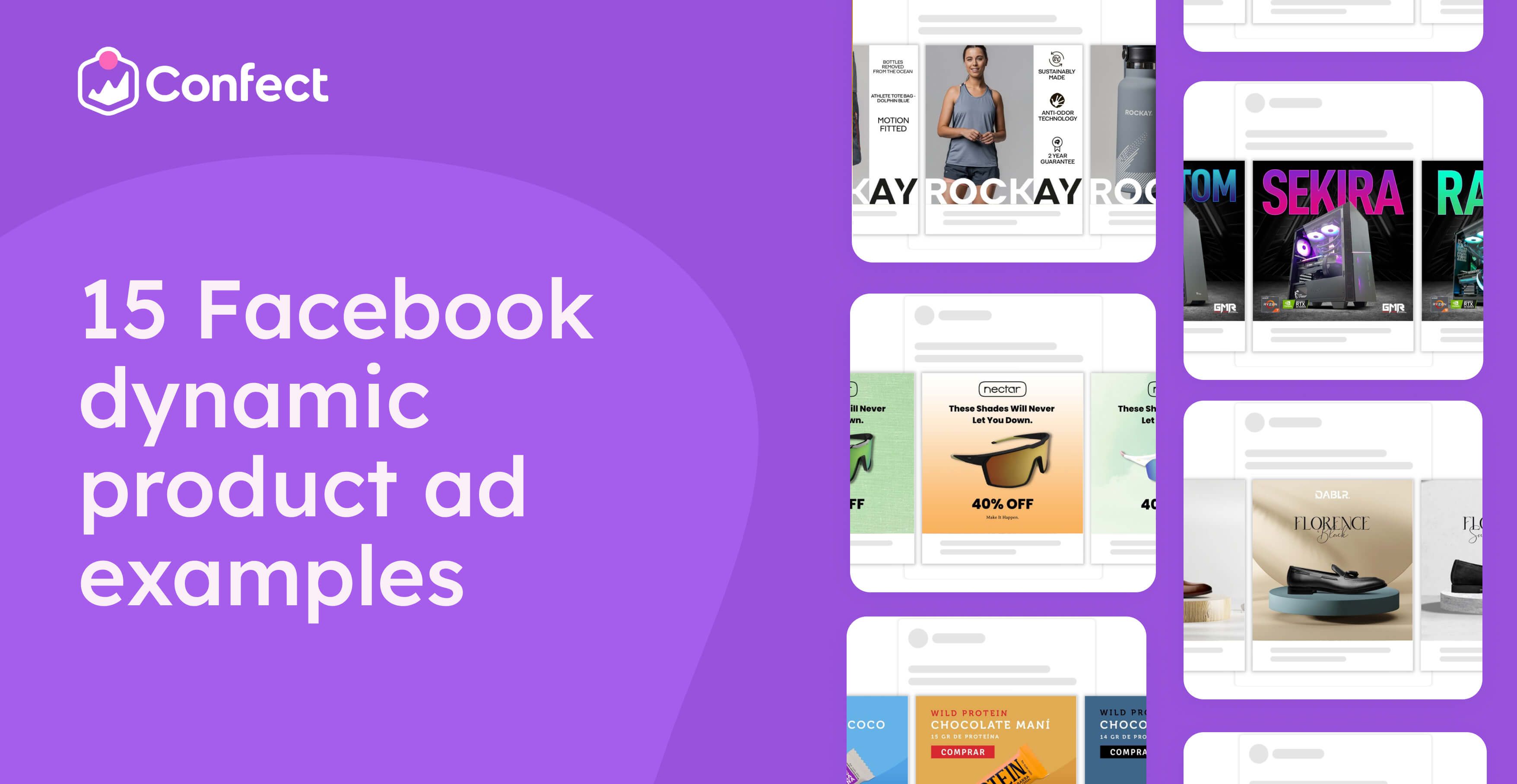
15 Facebook dynamic product ad examples to improve your creatives
February 13, 2023
Deciding on which users to target with which products can be difficult and require a lot of optimization and testing.
Luckily, the Facebook algorithm can take care of this, gather data and optimize the delivery of the ads - so each user will be displayed the ad for the product he is most likely to buy, based on his/her interests and past behavior.
There are a number of factors that will influence the results your DPAs bring in, such as the targeting settings, your branding, the reach of the campaign, and many more. However, the factor with the highest impact on the performance of DPAs is the creative itself (according to a Nielsen study, the design contributes 47% of the overall results).
Good creatives make people buy, poor ones just don’t - it’s that simple
To give you an idea of some of the commonalities between GREAT creatives that convert users into buyers, we have gathered and broken down 15 best DPA examples we could find.
In addition to showing you some amazing dynamic ads, we’ll also explain why they’re great, and what other changes could be tested to improve the return on investment even further. With that, you’ll have an arsenal of new insights to skyrocket your sales through paid social DPAs.
1. Facebook dynamic product ad example breathing elegance
.png)
What makes this dynamic product ad great:
The product is the star: All the other elements, such as the background, the pedestal and text, complement the product without taking attention away from it. This ad makes it clear that these elegant shoes deserve the spotlight.
An elegant feel, throughout: The white marble, beautiful oak wood, the text font and the subtle shadows all work together to create a feeling of elegance and simplicity. A great tactic for promoting a premium product.
Color theory: The colors used evoke luxury. Colors such as brown, black or gray are a great fit for a premium product. Humans can generally process the meaning of colors faster than they can read text.
What improvements could be tested:
Adding unique selling points: The company could test how adding different USPs impacts performance. For example, a bit of extra text could highlight that it’s made of real leather, handmade, or any other aspect that sets it apart from competitors.
Adding social proof: The company could select a couple of customer testimonials to be included in the creative and test whether it achieves higher performance. Social proof can help build credibility, trust and communicate that this brand has a history of satisfying its customers.
Want to appeal to premium buyers with a refined aesthetic? Here’s how high-end and luxury brands use Catalog Ads to balance elegance and performance.
2. Protein bars of all colors (and flavors) with dynamic background
 (2).png)
What makes this ad great:
The color & flavor match: The colors used stand out from a boring feed and draw attention to the product ad. Also, the background changes based on the flavor, making a more coherent design that matches the product being advertised. A great way to use non-verbal elements to communicate details of the product.
All the relevant information: The ad highlights certain important product details, such as the amount of protein, price and whether it is vegan. Many consumers use these details to compare different options and decide. Clearly communicating this can get you one step ahead of your competition.
On the outside & inside: In addition to the main product image (the protein bar inside the wrapper), it also shows an additional image of the bar’s tasty looking cross-section - definitely stimulating hunger, appetite and desire.
What improvements could be tested:
More depth and movement: The company could experiment with adding small design elements to create more “movement or depth”. A fitting adjustment could for example be adding chocolate crumbs into the background to tie the whole design together even more. Elements such as these that create “movement” tend to be more eye-catching.
Different calls-to-action?: This advertiser could test different Calls-to-action, than the current “COMPARE”, such as try it out, buy now, or even leaving the CTA out completely, based on what performs best.
This playful variety works well in food-focused Catalog Ads - see how food & drinks brands use vibrant creative to boost engagement.
3. Customized product ad examples from eyewear brand.
 (2).png)
What makes this ad great:
Dynamic background: The facebook dynamic product ads background changes with the glasses, while also complementing its colors. A nice tactic to separate similar looking products.
“Never let you down”: There is a catchy and memorable tagline at the top that hints at the product’s unique selling point - the glasses are reliable and won’t fall off. Almost guaranteed to be remembered.
The savings: The discount is clearly highlighted, having the largest font size. This creates urgency as users need to act now to get these savings, and makes the offer that much more attractive. Check out our insights about making the best possible SALE campaign.
Different way to do CTAs: At the bottom, there is another tagline that also serves as a call-to-action - “Make it happen”. The great thing about this is that it acts as a CTA, without being as pushy as the standard: Click here or Buy now.
What improvements could be tested:
Good discount, but what price?: In addition to the discount, the company could also try adding the price to see whether that leads to better performance. At the moment, users have to guess the price before clicking. Adding it to the design could, in theory, align expectations and lead to an increase in performance.
Leverage more urgency: This is already an offer you don’t want to miss. However, the brand could test adding more urgency by saying “until stock runs out”, “limited time only”, or something similar to make users click right now.
4. Wine ad example with multiple creatives
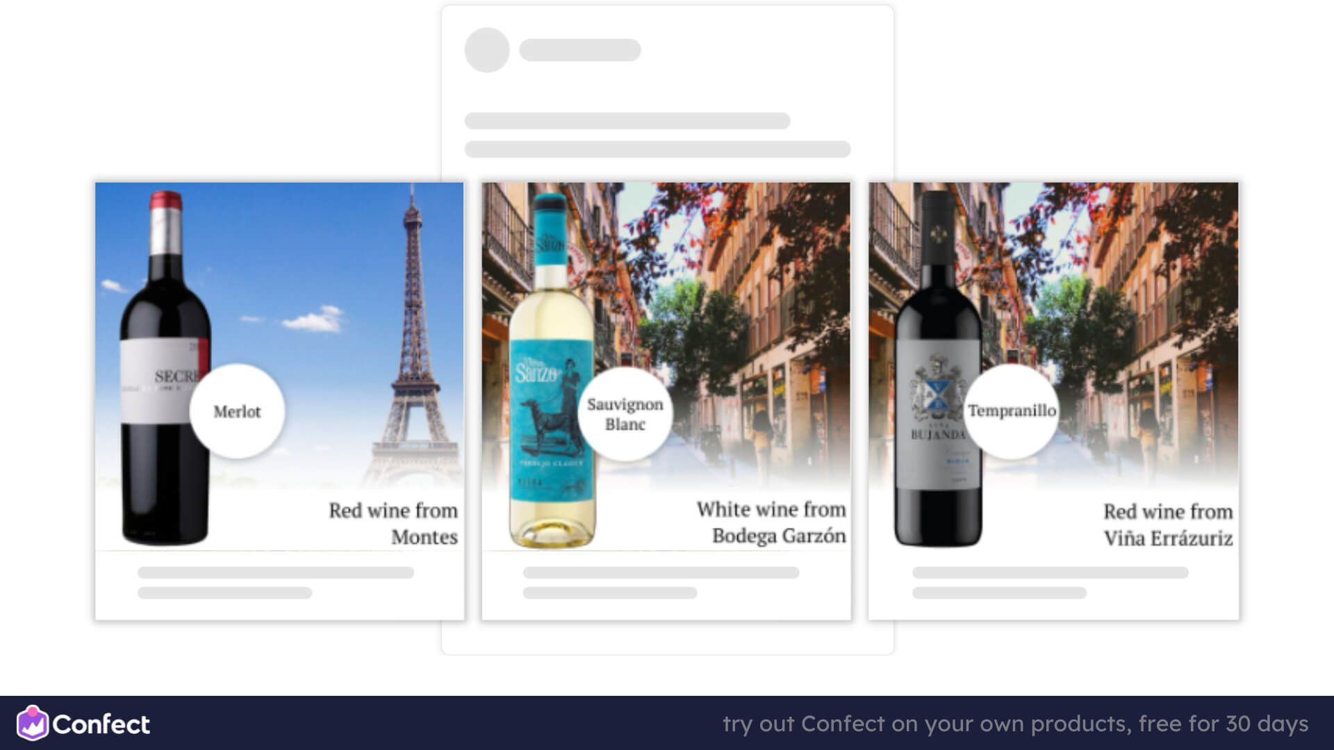
What makes this ad great:
Subtle, important details: The DPA ad not only shows the wine, it also conveys important information for its audience: the type of wine, whether it is red or white, and where it comes from. I personally have no idea what a Tempranillo is, but it’s definitely relevant for the ad’s audience, seasoned wine drinkers.
Dynamic background: The background of this facebook ad changes based on which country the wine comes from. Now that’s a very creative way to communicate the country of origin.
What improvements could be tested:
But how much is it?: Perhaps, adding a price into the design could convey more information and improve performance. At the moment, it’s difficult to judge whether it’s a 15$ or 150$ bottle.
Even more details: There might be more information about the wine that could be included to attract interest and communicate all the relevant details, such as which year the wine is from and whether it’s on the sweeter side, or dry.
Running multiple creative angles in parallel? This case shows how ROImonks improved ROAS by 60% by testing and iterating with Confect.
5. Who doesn’t like chocolate?
 (2).png)
What makes this ad great:
The matching, changing background: I could probably tell the flavor of the bar, even if the product image was removed, from just the background. That makes it so much faster and easier to understand the ad. Over all impressive execution on this dynamic ad.
The colors POP: The colors themselves are super vibrant and saturated, so they stand out in a social feed. To find out more, check out our insights about color choices that lift performance.
The background elements: The pieces of chocolate, fruit and nuts in the background create “movement” in the creative, making it that much more attention-grabbing.
What improvements could be tested:
OHHH? Mmm?: The text “OHHH” and “Mmm” is descriptive, interesting, and honestly even a bit funny. But perhaps the company could also test different taglines that may reach higher performance.
6. Facebook dynamic product ad example with Valentine's day ads
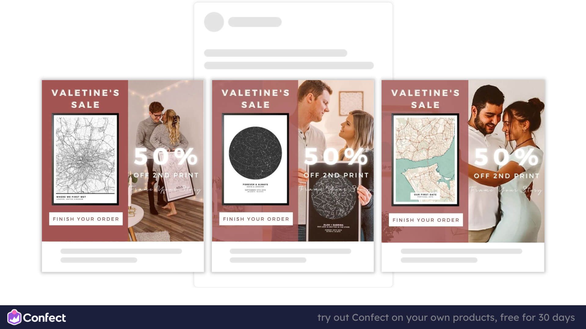
What makes this ad great:
Happy couples: Being a valentine’s sale, in addition to the product, it also shows a happy couple. Humans make the ad more relatable and get more attention. This primes the emotions and makes the users think of the romantic moment when their partner receives this gift
Might as well get two prints: Instead of just offering a normal discount, it is tailored to valentine’s day. A user might want to buy 2 of them (for him and for her), so 50% off on the second print stimulates this and probably leads to upselling and a higher average order.
Finish your order: The CTA is tailored to the funnel stage. This is a retargeting ad for users who visited the site, maybe added products to cart, but didn’t end up buying. For that reason, the CTA says “finish your order” instead of the generic “buy now”.
What improvements could be tested:
The tagline is easy to miss: Right underneath the “50% OFF 2ND PRINT” it says “Frame your story”. That is a very fitting and memorable headline, however, I had to zoom in to see it. Perhaps focusing on making it more visible could boost performance.
How much does it cost?: Adding the price tag could also possibly help align expectations and reach higher performance. This is something that the brand could test, as in many cases, sale ads with price shown reach much higher performance.
Holiday-themed creatives drive urgency and emotion - see how brands crush seasonal campaigns with Catalog Ads.
7. Facebook's DPA's with multiple USP's
 (2).png)
What makes this ad great:
Clearly unique: This example of facebook dynamic product ads plays into the USP of the product, being inspired by African heritage, with the choice of beautiful models, colors and clearly stating “Made in Africa” as the first unique selling point.
Red makes visuals stand out: Red is an attention-grabbing color (that’s why it’s on traffic signs) making this ad instantly pop out from the feed and get the attention of users.
But wait, there’s more USPs: It also highlights other unique selling points such as “fast delivery” and “shop now, pay later” options to provide users with more specific information to help them decide to buy down the line.
What improvements could be tested:
I almost missed that it’s a SALE: Even though this is a sale ad, it’s not very noticeable. The red bar with a discount in the top left is very small and the same color as the right third of the ad, making it hard to see and notice. It also states CLEARANCE, which isn’t as much of a buzzword as SALE. The company could test making the ad more recognizable as a SALE, possibly improving the performance.
8. Custom computer ads.
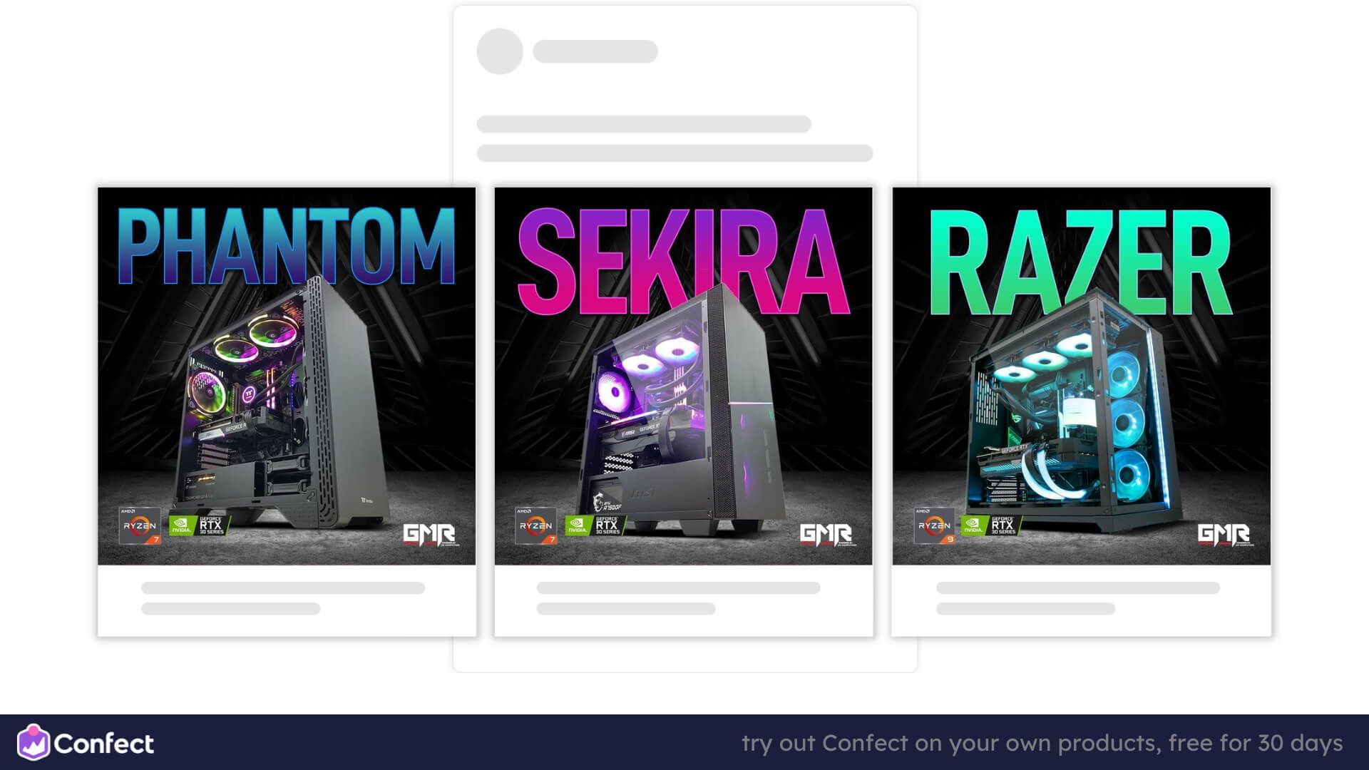
What makes this ad great:
Center stage for the product: The large product in the center takes up most of the ad, making it seem huge and significant, guaranteed to get attention. Using oversized visuals can be a good way to get users to pay more attention.
Sci-fi atmosphere: The colors create a futuristic feel, the text color matching the lights inside the computer, being lifted by the dark gray and black background. The names also sound very high-tech.
Details for the “nerds”: This advertiser knows its audience well, and includes the hardware specifications on the bottom for all the tech-savvy users who find this type of information relevant to decide.
What improvements could be tested:
Building more desire: The company could try stimulating more desire by stating that these are BRAND NEW RELEASES. Making users want to be a part of the very first few who can get this futuristic PC and possibly improving the return on investment.
Targeting tech-savvy users? Here’s how electronics brands use Catalog Ads to highlight product specs and performance visually.
9. Christmas themed dynamic ads

What makes this ad great:
Vibrance and saturation: It’s almost impossible to not notice this ad in a white feed. You don’t always see pink and purple colors on Facebook, automatically drawing your attention.
The timing: The advertiser knows that many people want to replace their old phone with a new one on Christmas, and is running a fitting ad.
GIFTS!: In the spirit of Christmas gift-giving, they are offering a free cooler bag, smarttag or headphones with the purchase. Who doesn’t like free stuff? This makes it seem like a much better deal.
What improvements could be tested:
Consistency: The headline of the ad changes in font size, position and text. In the center ad, the text gets a little too close to the phone. This is not necessarily bad, but might be visually off-putting to some users. It would definitely be wise to test whether having the same headline on all ads leads to a better performance.
How big is the “deal”?: This ad is offering “deals”, but we don’t know how good the deal is - it only includes the price. Also adding “SAVE X%” could emphasize that it’s in fact a sale, showing how much the users can save, and possibly improving the performance.
Seasonal storytelling works best when it's visual and personalized - these always-on Catalog Ad strategies help you stay timely and consistent.
10. This ad might not be a masterpiece, but it works
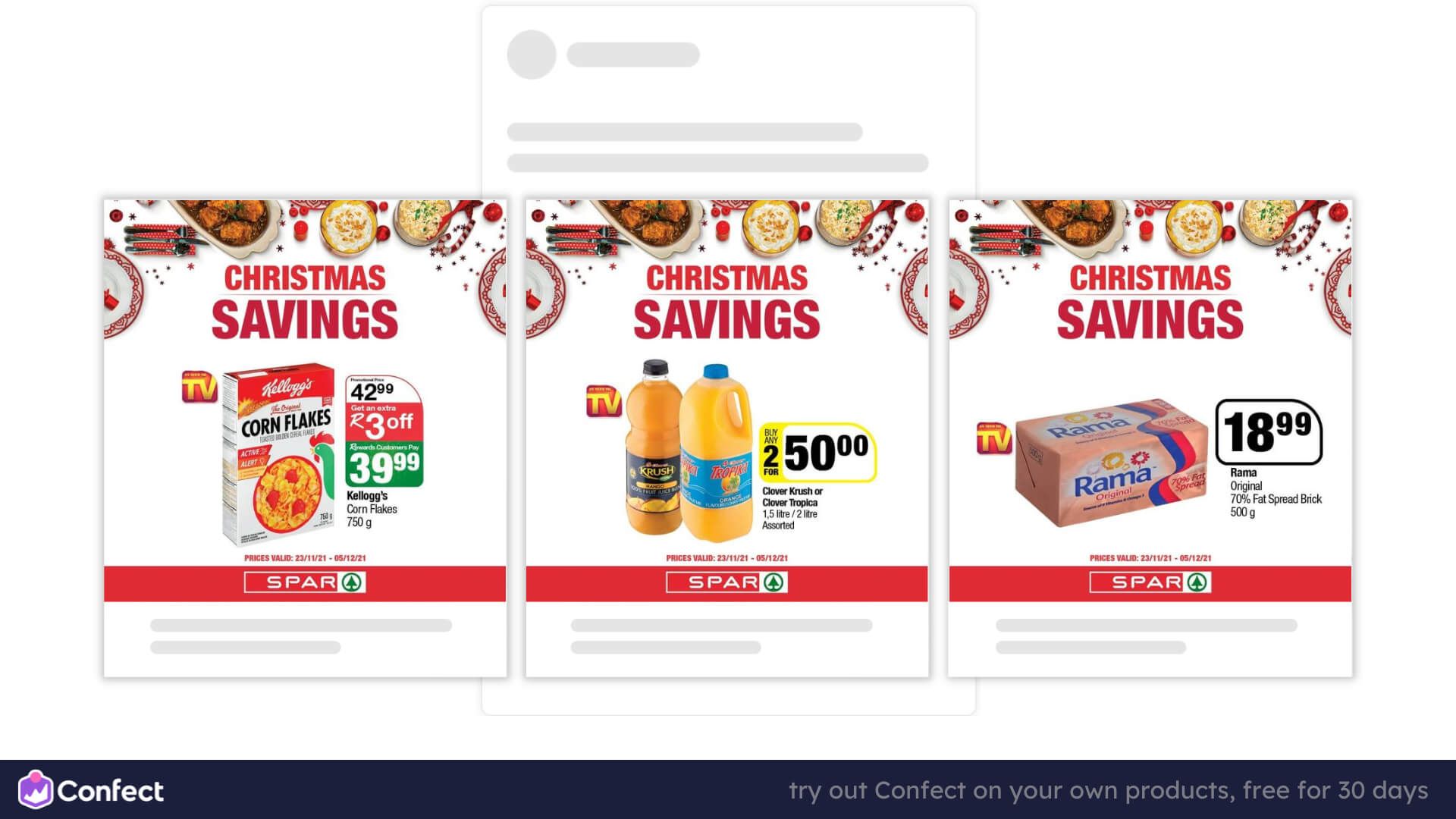
What makes this ad great:
It’s time specific and creates urgency: It clearly states “Christmas savings” and a period of time at the bottom, making shoppers rush to their nearest store to take advantage of the discount for something they’ll definitely need - food for Christmas.
Stands out in the feed: Using a red color makes the ad POP and stand out. Even though it may not be the most visually pleasing, or interesting ad (I mean… they’re groceries), it gets attention and makes people buy - that's what matters.
What improvements could be tested:
Make it look less messy: Even though it can be hard to make groceries seem interesting (it’s something we all encounter everyday), a more coherent use of colors and perhaps an interesting background could be tested. There’s many grocery stores that nail their ad visuals.
Choose one price tag: The way that the price is shown changes from ad to ad and makes the whole DPA look a bit incoherent. The company could try setting up design guidelines to make sure all their ads look alike and fit together more seamlessly.
11. Eye-catching Black Friday ads
 (2).png)
What makes this ad great:
The colors: This ad uses black and orange, which contrast beautifully, for its Black Friday creative. Generally, advertisers use black and yellow, so this ad will surely stand out from the rest, while still being recognizable as a Black Friday campaign.
Urgency: Black Friday deals are always short-lived and only last for a few days. This ad takes it a step further by highlighting “limited time deals”.
It includes more details: In addition to including the original and sales price, it also states that they offer next day delivery all over malta.
What improvements could be tested:
Adding percentages: This ad shows the price before and after a discount, but from our data, savings in percentages reach higher returns than savings in currency ($). The company could test adding “X% OFF” to its creative to perhaps boost ROI even further.
For aggressive sales periods like Black Friday, these tactics will help you stand out in a highly competitive ad space.
12. Product ads for sleek-looking headphones
 (2).png)
What makes this ad great:
The variations: This ad shows the color variations for each product. This can be a great tactic to appeal to a wider audience, without necessarily overcrowding the ad with multiple product pictures.
It highlights savings: The ad clearly shows the before and after price. This shows that it’s in fact a great deal that users won’t want to miss. It would definitely be less attractive if you didn’t know the €249 before price, and only saw €99 as the current price.
The colors and layout: The black products sit at the center of a saturated red background, making them stand out and get attention.
Logos: As not all products in this DPA come from the same producer, the ad specifies this at the top of the ad with a logo, communicating the manufacturer and leveraging the credibility of these well-known brands.
What improvements could be tested:
Again, add percentages: In addition to showing the before and after price, we’ve seen that also showing savings in % can help boost revenue. This puts the discount into a relatable context (percentages), and can make the ad more attractive to buyers. This is something the brand could test.
Does it really need all that text?: The description, or product name, is rather long and doesn’t provide much information. Perhaps, the ad could perform better if the product name was shorter and used a larger font, for example just “BH6”, instead of that long block of text.
13. Dynamic ads for Black Friday stereo
 (3).png)
What makes this ad great:
The contrast between the product and the background: The products stand out well on the dark background, making them more noticeable and enticing for buyers scrolling trough tehir facebook feeds. Seems like a simple thing, but it can make all the difference.
The bold, contrasting, fixed price: All products in this DPA cost 15$. An “everything for X” can be very attractive to users, especially if the price is as low as 15$ and applies to all the products.
Recency: Even though a standard Black Friday ad will use black and yellow colors, this ad doesn’t do that, so it makes sure to communicate that this is in fact a limited time, Black Friday offer with text in the bottom of the creative.
What improvements could be tested:
How much was it before?: Even though 15$ is a low enough price, perhaps also clarifying the original with a strikethrough price or “X% OFF” could make this ad perform better. This can communicate to the buyers how attractive the discount is.
14. Facebook ads gone smooth and sustainable
 (2).png)
What makes this ad great:
Contrast and complementing colors: This Facebook ad looks sleek and elegant due to its color choices of black, gray and white complementing the “dolphin blue color” of the products amazingly. Also, the position of the logo, changing from white to black, creates a very pleasant and captivating visual.
Use of USPs: On the right side of the ad, a description highlights why the product is special. It prides itself in the sustainability of the products and communicates this clearly. Including more text and information can lead to a higher performance for eCommerce ads.
What improvements could be tested:
Consistent layout: The center ad looks perfect. However, the one on the right and left doesn’t use icons on its right side to communicate the USPs. On social media, often enough, users don’t read but scan through content. Also adding USP icons to the rest of the creatives would make them more user-friendly and perhaps lead to a higher ROI.
Using models more: The ad only uses a model in the center ad. Using models in content can be a great way to boost returns. Perhaps the company could test also showing off the rest of the products on models to make them more relatable and eye-catching.
How much?: The brand could test how adding a price to its creatives would impact performance. The price being visible in content could align expectations, so users know what to expect before clicking on the ad.
Eco-conscious branding performs well with the right messaging - see how beauty and lifestyle brands use Catalog Ads to communicate values.
15. Keep your Facebook dynamic product ads simple
 (2).png)
What makes this ad great:
Details on details: This ad includes information about each product to help users understand the offer and decide to buy. It shows who the product is for (men/children), the logo of the producer, the name of the product, price and the current discount. Read our guide for using text in eCommerce ads here.
Time-specific campaign: Even though it may not exactly scream WINTER, the snowflakes in the background and the choice of colors communicate that this is a winter campaign, leading to recency, relevance and urgency.
The savings jump out: The discount in percentages is the only element that uses red. Red is very eye-catching and using it selectively on elements that you want the users to notice can be a great way to direct attention to where you want it - the discount.
What improvements could be tested:
Make the campaign clearer: Even though a user can deduct that it’s a winter campaign, there is nothing that states it directly. The company could perhaps build more urgency and improve performance by clarifying that it’s a limited time campaign, after which, the products will go back to their original price.
That’s a wrap
As you can see, even though these Facebook dynamic product ads examples come from a wide variety of industries and promote completely different products, they all have something in common.
Providing relevant information, using colors and contrast strategically, clarifying the price or discounts, using models, consistent branding and message, and using urgency & recency are just a few of the tactics that you could test to improve your own return on investment with DPAs.
Optimizing ad performance is never a yes or no question, it’s a process. The best possible design will depend on your brand, audience and the products you are promoting.
So pay attention to the commonalities between other great ads and make sure to TEST whether it also works for you. With that mindset, you’ll be skyrocketing your revenue in no time.
More great examples:
Get inspired with more amazing ads
- 13 great Black Friday ad examples from paid social
- 14 Facebook clothing ads examples
- 22 great ads using social proof
- 5 great ads using contrast
- 5 great ads grabbing attention
Learn to use the product feed to optimize dynamic product ads here.
Try Confect for Free
Confect can help you to create great-looking Catalog ads and Dynamic Product ads for Facebook, Instagram, TikTok, Snapchat and Pinterest.