
8 Cyber Monday Catalog Ad Examples for 2026
By the time Cyber Week starts, shoppers have already seen hundreds of Black Friday ads on Facebook and Instagram. Black backgrounds, red price tags, “up to 50% off” everywhere. Their thumbs are tired, and they’ve learned to scroll past anything that looks like the ads they saw last week.
That’s why Cyber Monday ads can’t just be Black Friday ads with a new headline. They need to look fresh, feel a little different and give shoppers a clear reason to stop one more time. The good news: design is the best and easiest place to make that change. With Catalog Ads, one new template refreshes every dynamic product ad in your catalog at once, without rebuilding your campaigns.
See an ad you like? ClickRecreate with Confect.Confect's AI rebuilds it as a Catalog Ad template filled with your own products.
Below are 8 real Cyber Week and Cyber Monday Catalog Ads that stand out in a tired feed, and the design idea behind each one. Scroll through, find the ones that fit your brand and use them as a starting point for your own Meta Catalog Ads this Cyber Week.
Table of contents
Make it cyber
"Cyber" is a word that already comes with a look: shiny metal, glowing screens, colors that fade from one to another. Black Friday ads rarely use it. So when a Cyber Week ad does, shoppers can tell in half a second that this is a new sale, not last week's.
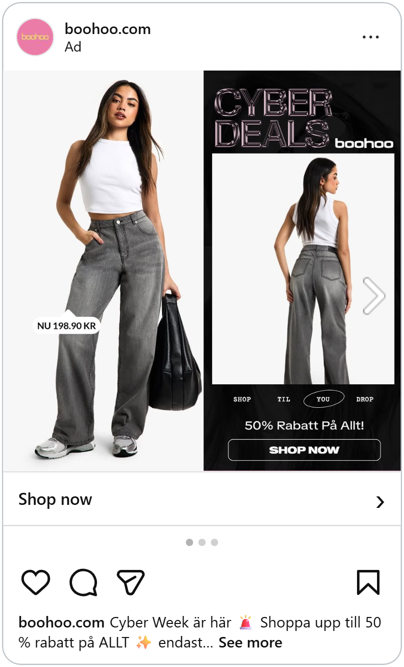
This boohoo ad is split down the middle. On the left, a model in grey wide-leg jeans and a white top on a light background, with a small price tag: "Now 198.90 kr." On the right, a black panel with the same jeans seen from the back.
The headline is what makes it Cyber Week. "Cyber Deals" is written in big chrome letters that look like polished metal, reflecting light like the cover of an old video game. Under the photo: "Shop til you drop," with "you" circled, then "50% off everything", and an outlined "Shop now" button.
The chrome letters do all the work of saying "this is new." Everything else stays clean and simple, so the ad looks modern instead of messy.
See how KICKS switched their ads to Cyber Monday.
A gradient and a stack of "SALE"
Pacvac's ad fades from deep blue on the left to bright pink on the right, the kind of glowing colors you'd see on a screen at night. Behind the product, the word "SALE" is stacked three times in big white outlines, so you can still see the gradient through the letters.
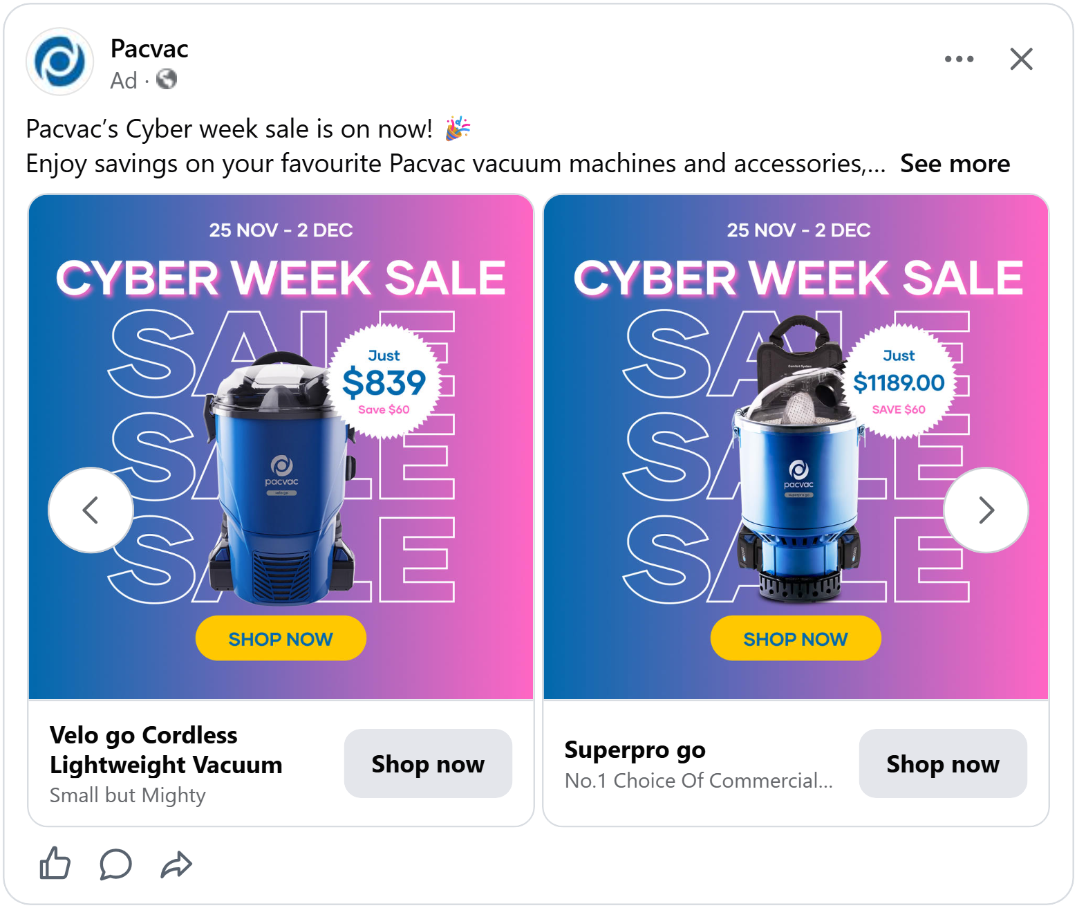
In front of it all stands a blue backpack vacuum. A white starburst badge pops out next to it: "Just $1189.00, save $60." At the top, the dates, "25 Nov – 2 Dec," and "Cyber Week Sale" in bold white letters with a soft pink glow. At the bottom, a yellow "Shop now" button.
A vacuum isn't an exciting product to look at. But the gradient and the outlined letters give the ad energy, and the starburst makes the price look like it's bursting out of the picture.
A cyber look tells shoppers something new has started. Color can do the same job, as long as it's the opposite of what Black Friday looked like.
Give it a Cyber twist
Nudient keeps the same clean layout from its Black Friday ad and gives it a Cyber Monday makeover. The headline still sits at the top, with one tidy line underneath holding the sale name on the left, the logo in the middle and the price on the right. Shoppers who saw the Black Friday version will recognize it instantly, and those who missed it get a second chance at the same deal.
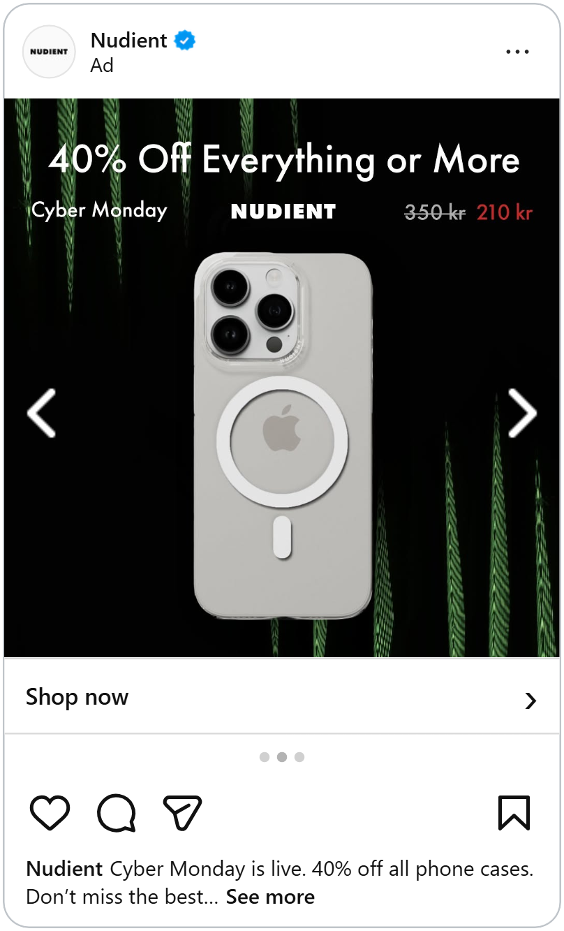
What changes is the mood. Instead of faint white streaks, glowing green lines stretch up from the bottom and down from the top, like strands of digital code. It’s a simple swap that makes the ad feel “cyber” without adding a single extra word, and it tells shoppers this is a new sale moment, not last week’s ad.
The product stands out even more this time. A light, clear phone case sits in the middle of the dark background, so it pops right out of the frame, while the green lines frame it from both sides. The only other color is the red sale price in the top right, so the eye moves from the product straight to the deal.
For brands running both Black Friday and Cyber Monday, this is an easy win: keep the layout shoppers already know, change the background and the sale name, and you have a fresh ad for the second big sale day.
Hot pink and a split price pill
Sunglass Hut's ad is a wall of hot pink, fading lighter toward the top. A pair of silver Ray-Ban aviators floats in the middle, casting a soft shadow on the pink.
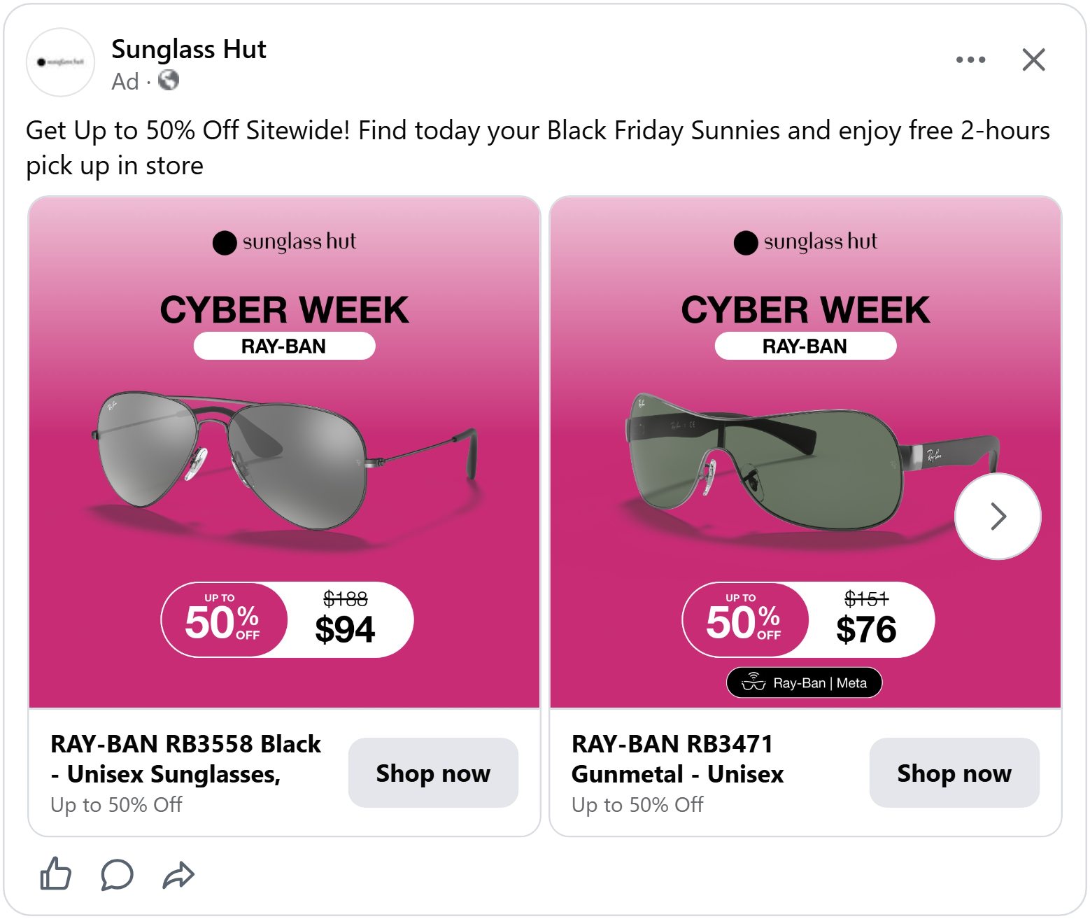
At the top: the Sunglass Hut logo, "Cyber Week" in bold black letters, and a white pill with "Ray-Ban" inside, so you know the brand before you even look at the glasses.
At the bottom sits the best part of the design: one long pill, split in two. The left half is pink with "Up to 50% off." The right half is white with "$188" crossed out and "$94" in big black numbers. The saving and the price are joined together, so your eyes read them as one message.
Bright colors grab attention. But on Cyber Monday many shoppers aren’t looking for a pretty ad, they’re looking for an extra discount.
Put the code in the headline
Cyber Monday started as the day people shopped online, and online shoppers know how codes work. Many of them go looking for one before they buy anything. So why hide it at the bottom of the ad?
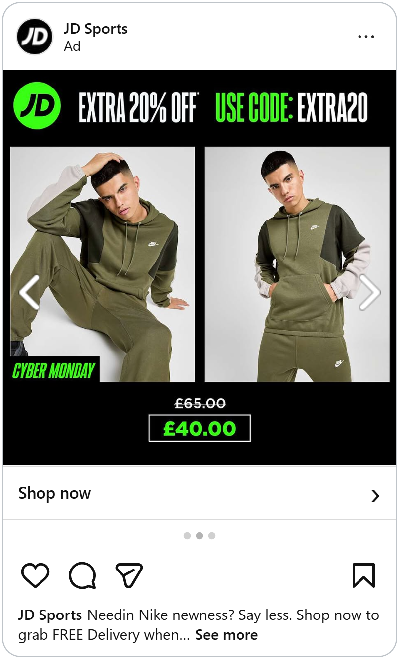
JD Sports puts the code right at the top. Next to the round green JD logo, the headline reads: "Extra 20% off. Use code: EXTRA20," with "Use code" in the same bright green as the logo.
Below it, two photos of the same olive green Nike tracksuit: one of a model sitting on the floor, one of him standing with his hands in his pockets. A small black tag in the corner says "Cyber Monday" in green italic letters. At the bottom, "£65.00" crossed out, and "£40.00" in green inside a thin white box.
The whole ad uses only three colors: black, white and JD's green. The green marks the three things that matter most: the logo, the code and the price. Your eyes follow it from top to bottom, and by the end you know who's selling, how to get the extra discount and what you'll pay.
Why a code next to the price was the strongest combination we measured.
A code is one kind of extra. But some shops have a product where shoppers always buy two things at once, and that's a chance to offer two deals.
Two deals in one ad
Glasses aren't one purchase. They're two: the frames and the lenses. Most shoppers forget about the lenses until checkout, and then the total jumps up.
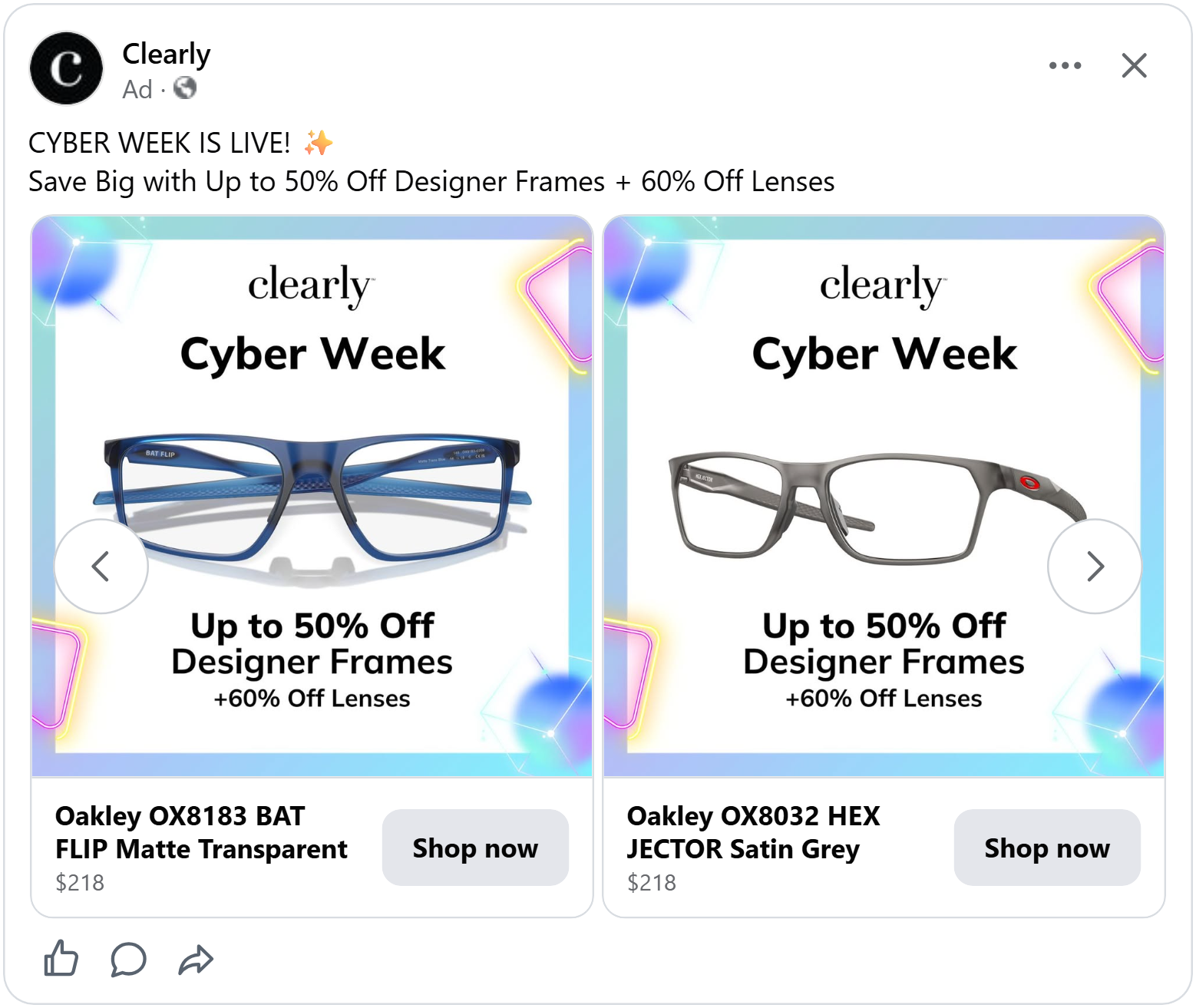
Clearly's ad sits on a soft holographic background, with blue and pink glowing shapes in the corners, like light bouncing off a phone screen. That gives it the Cyber Week feel. In the middle, a big white card holds the logo, "Cyber Week" and a pair of blue sporty glasses, shown from the front with a soft reflection underneath.
The deal comes in two lines at the bottom: "Up to 50% off designer frames," and right under it, smaller, "+60% off lenses."
That second line is the smart part. It answers the question shoppers usually ask too late: "What about the lenses?" By putting both deals in the ad, Clearly makes the whole purchase feel cheaper, not just half of it.
Two deals give shoppers the full picture. But sometimes the best way to sell a product is to show one small part of it, up close.
Zoom in on the detail
Online, shoppers can't pick up a product and look at it closely. A zoomed-in photo is the next best thing. It shows the quality that a small product photo hides.
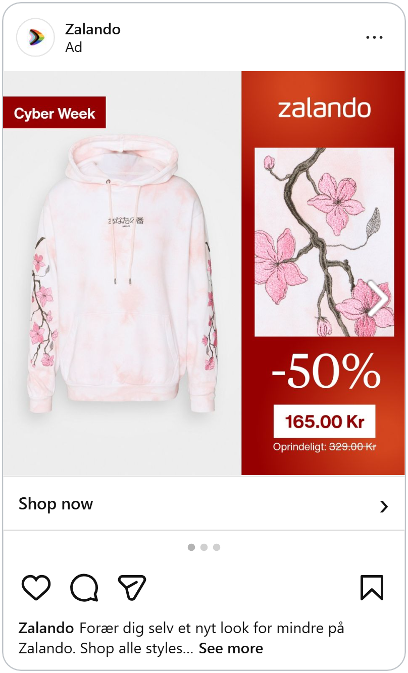
Zalando's ad is split in two. On the left, a white and pink tie-dye hoodie on a light grey background, with a small red "Cyber Week" tag in the corner. You can see cherry blossom branches running down both sleeves, but they're small.
On the right, a deep red panel with the Zalando logo, and below it, a big close-up of those same cherry blossoms. Now you can see every stitch of the embroidery: the pink petals, the dark branch, the tiny buds.
Under the close-up: "-50%" in large white letters, "165.00 Kr" in a white box, and "Originally 329.00 Kr" crossed out underneath (in Danish).
The close-up turns a hoodie into something special. Without it, it's just a pink sweatshirt at half price. With it, you can see the hand-made detail you'd be getting, and half price suddenly feels like a steal.
See how a close-up can help you double your ROAS.
A close-up shows how a product is made. But the most convincing photo of all shows what the product can actually do.
Show the product doing its job
Some products only make sense once you see them in action. A suitcase in a plain product photo looks like every other suitcase. A suitcase being used shows why it's better.
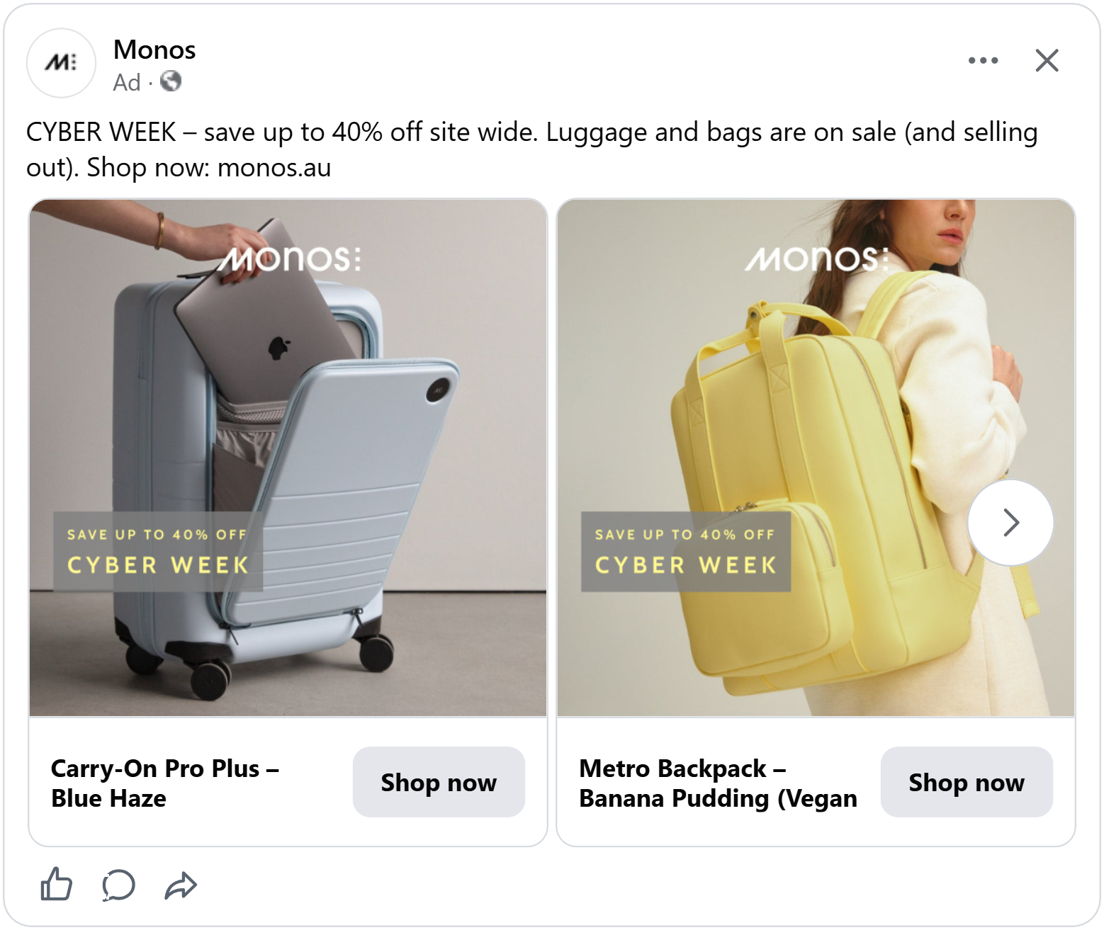
Monos's ad is a single photo. A light blue carry-on suitcase stands on a concrete floor against a grey wall. Its front pocket is open, and a hand is sliding a laptop inside.
That one movement explains the whole product. Without reading a word, you understand that this suitcase has a separate pocket for your laptop, so you don't have to open the whole case at airport security.
The deal sits in a see-through grey box on the left: "Save up to 40% off" and "Cyber Week" in soft yellow letters. The Monos logo sits quietly at the top. Nothing covers the hand or the laptop, because that's the part that sells it.
The ad looks more like a photo from a travel magazine than a sale banner. On a day when every other ad is shouting about discounts, that calm makes it stand out.
See how lifestyle photos can lift your brand's ROAS.
You've seen eight Cyber Week ads that gave tired shoppere a reason to stop one more time. Each one found a way to feel new, whether it was a fresh look, a different color or an extra deal on top.
You don't need all eight. Pick two or three that fit your brand and your Cyber Monday ads are ready.