Sisi Copenhagen & Texta
February 19, 2026
The Ad: An intimate Valentine’s Day catalog ad built around closeness
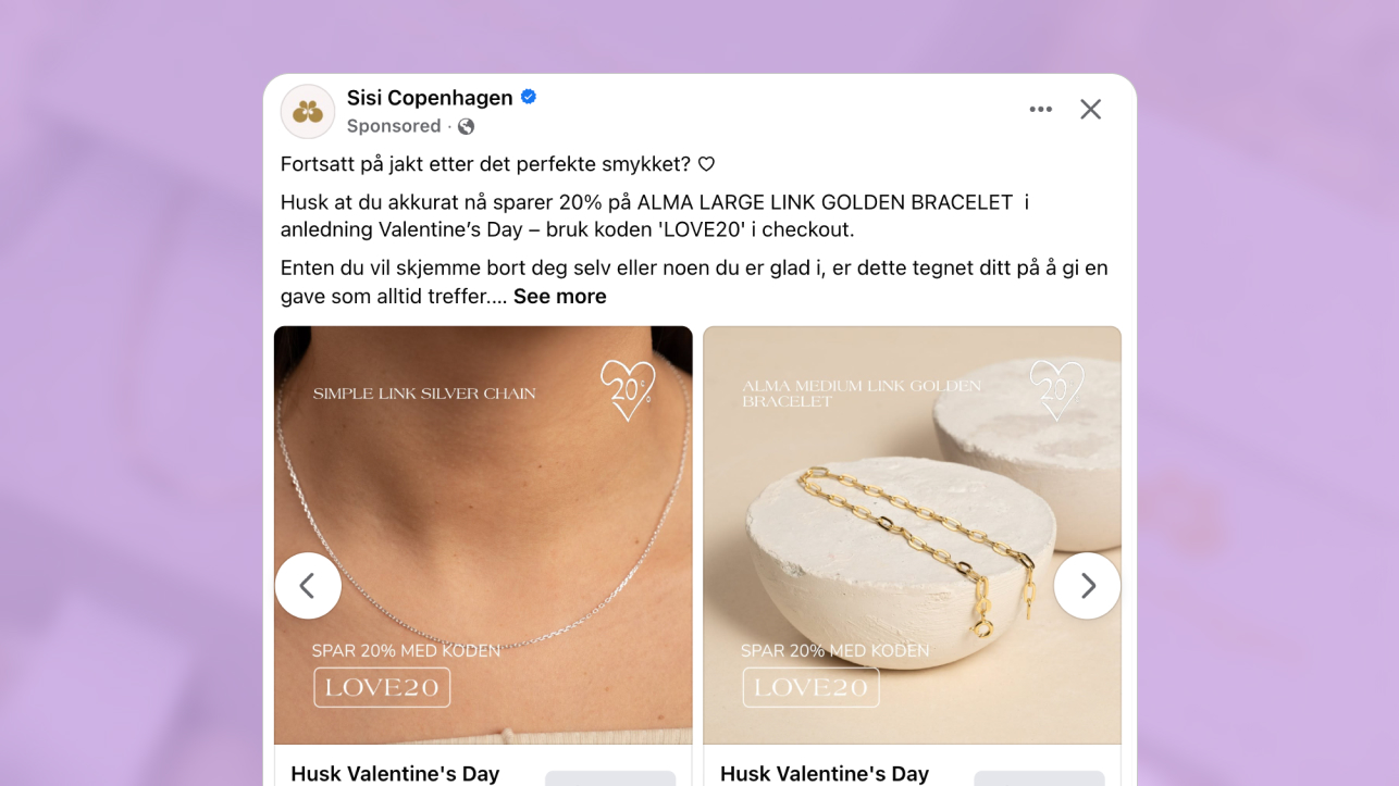
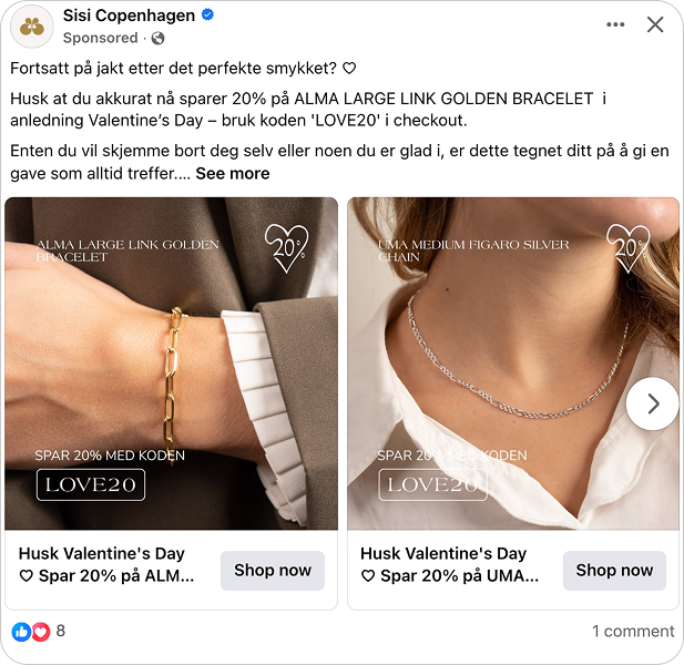
These catalog ads take a refined approach to Valentine’s Day by bringing the jewelry physically closer to the viewer. Instead of wide lifestyle scenes or decorative backdrops, the focus stays tight on how the pieces sit on the skin. The result feels personal, clear, and immediately understandable.
Sisi Copenhagen worked with Texta to translate their understated aesthetic directly into these catalog ads. Soft tones, minimal backgrounds, and controlled typography create a calm visual frame where the jewelry remains the hero. Nothing distracts from the product or the moment.
The seasonal cue is present but restrained. A subtle heart icon and a 20 percent offer connect the creative to Valentine’s Day without overpowering the design. The promotion supports the mood rather than interrupting it. Overall, the structure feels deliberate and composed. You see the product up close, understand the occasion, and grasp the offer within seconds. That simplicity is what gives these catalog ads their quiet strength.
Why it won Catalog Ad of the week
This ad won because it removed hesitation at a moment when decisions needed to feel both emotional and safe. During Valentine’s Day, people are not just browsing. They are looking for something meaningful and they want reassurance before committing.
These catalog ads addressed that directly. The close framing reduced uncertainty around scale and detail. The seasonal message felt timely without overpowering the product. Clear product naming made each item instantly understandable. Together, those elements supported fast and confident evaluation.
The results reflect that alignment, with ROAS increasing by 145% and conversion rate rising by 77%. More people completed their purchases because the structure supported quick, confident decisions.
Overall, the win came from alignment. The product felt intimate, the timing felt right, and the decision felt simple. That is exactly what high performing catalog ads need during short gifting windows.
What makes this Catalog Ad great
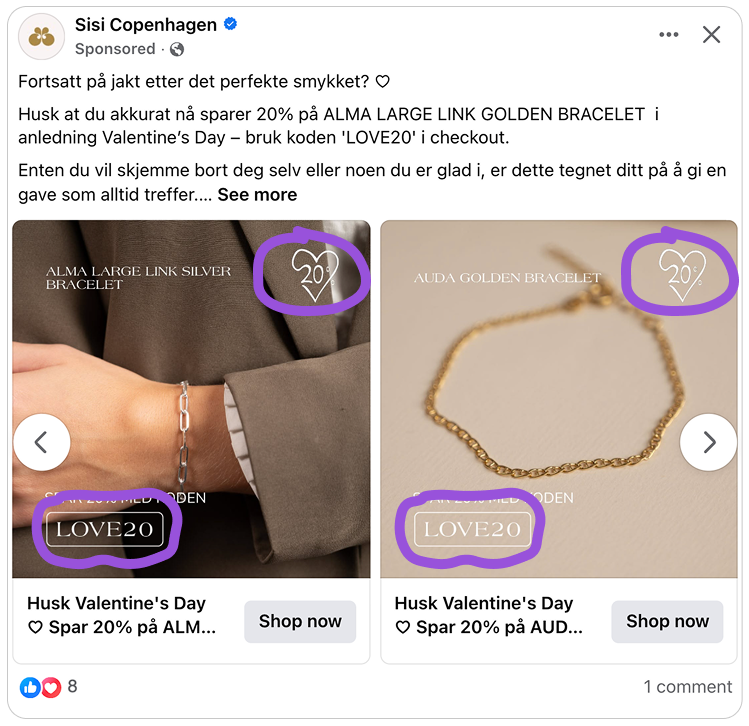
Close up lifestyle framing builds instant confidence
When it comes to jewelry, distance creates doubt. If a necklace is shown too far away, it becomes decorative rather than tangible. You see the vibe, but not the detail.
Here, the lifestyle framing moves in close. You can clearly see how the necklace sits on the skin, how the chain falls, and how the pendant catches light. That proximity makes the product feel real instead of aspirational.
.png)
This matters in catalog ads because jewelry decisions are emotional but detail driven. The close crop allows you to imagine ownership immediately, while still confirming scale and proportion. It reduces the mental gap between scrolling and wearing.
Strong catalog ads in fashion do not rely on atmosphere alone. They bring the product physically closer to the viewer, and that closeness builds trust fast.
Seasonal offer integration connects emotion with action
Seasonal messaging can easily overpower a product, especially in catalog ads. Large banners and loud graphics often shift attention away from the item itself. Here, the seasonal offer feels integrated rather than layered on top. The visual treatment aligns with the mood of the product, so the incentive supports the emotional tone instead of disrupting it.
That connection is important. Jewelry often carries symbolic meaning, especially around gifting moments. When the offer is presented in harmony with that emotional context, it feels like a timely opportunity rather than a hard sell.
The code also reinforces that connection. LOVE20 is simple, memorable, and clearly linked to the moment. It turns a romantic theme into a practical next step without breaking the visual flow.
In catalog ads, the best promotions amplify intent. They do not replace it. By aligning the seasonal trigger with the product mood, the ad turns emotion into action without creating pressure.
Descriptive yet lightweight product naming improves clarity
In catalog ads, the product title does more work than most brands realize. It is often the first line users read after the visual, which means it needs to communicate quickly and precisely.
Strong product naming balances description with brevity. It signals style, category, or emotional value in just a few words. Not too vague, not overly technical. Just enough to make the item instantly understandable.
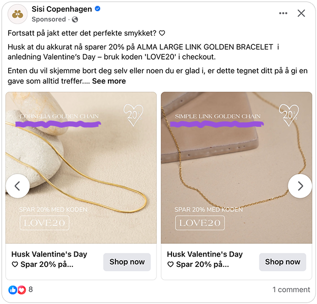
When names are too generic, they add friction. When they are too long, they slow scanning. The best catalog ads use titles that help users assess relevance in seconds, especially in fast moving placements. Clear naming also supports comparison. When each product is labeled in a structured and outcome oriented way, it becomes easier to evaluate differences across options. In performance driven catalog ads, that clarity shortens the path from impression to decision.
Key Takeaways
This campaign shows how well structured catalog ads can turn a short gifting window into strong results. By combining styled presentation, seasonal relevance, and controlled composition, the creative supported confident decision making at the right moment.
👉 Close framing builds immediate trust
Tight lifestyle crops bring the product closer to the viewer. In catalog ads, that proximity helps confirm scale and detail while making ownership easier to imagine.
👉 Seasonal integration turns feeling into action
When the promotional message aligns with the emotional tone of the product, it supports intent instead of distracting from it. Strong catalog ads connect timing and desire in a natural way.
👉 Clear product naming speeds up decisions
Descriptive yet lightweight titles help users understand relevance in seconds. Effective catalog ads use names that communicate outcome and style without becoming long or technical.