James Hawk
July 1, 2026
The ad: The Catalog Ad that turns a week-long deal into a reason to act right now
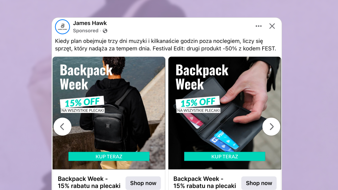
Most Catalog Ads running a promotion look exactly like what they are - a product shot with a badge dropped on top.
James Hawk did something different. For Backpack Week - a one-week sale with a clear end date - they brought their full brand into the frame. Lifestyle photography replacing the standard packshot. A bold "15% OFF" badge in teal that cuts through the dark image. A "KUP TERAZ" button at the bottom that removes any doubt about what to do next. The name alone signals it ends.
The layout carries the same visual language James Hawk uses on their website - the same typographic treatment, the same dark photography, the same teal. Someone who has visited their site before will recognize it without reading the brand name. Someone who has not will still feel the coherence of a brand that knows what it looks like.
Why it won Catalog Ad of the Week
Backpack Week is not a complicated campaign. It is a clear deal, a short window, and a product category that sells itself when shown properly.
What makes this Catalog Ad worth studying is the gap between what most brands would have done and what they actually did. Most would have kept the standard packshot, added a discount badge, and called it done. James Hawk built the campaign from the brand outward - lifestyle photography instead of a studio shot, a named event instead of a percentage, a teal CTA button that pulls the eye from the offer directly to the action.
Once the urgency of Backpack Week is clear, the deal lands harder. Once the image feels real, the product earns attention. Once the site matches the ad, the click feels like a natural next step. A +36% increase in Return on Ad Spend is what happens when the ad works on every level at once. The sections below go through each decision.
.png)
None of these are accidental choices. Each one does a specific job - and together, they turn a week-long sale into an ad that feels like a campaign.
What makes this Catalog Ad great
Lifestyle photography instead of a packshot
James Hawk swapped the product-on-white for lifestyle photography. Instead of isolated product shots, the cards show the products in real settings - the kind of imagery that belongs in a lookbook, not a catalog.
Neither looks like a product shot. Both look like they belong in the brand's own lookbook.
.png)
Lifestyle photography does something a studio shot cannot: it shows scale. When a man holds a bag at his side, you understand immediately how it sits, how it wears, how it fits into a day. A plain product image leaves that to imagination, and imagination is where doubt lives.
There is a second advantage. Lifestyle photography breaks the visual pattern people have learned to skip. An ad that looks like an ad gets filtered out before it registers. An image that looks native to the feed earns attention before the viewer consciously decides to give it.
The same visual language as the website
Here is what makes this ad genuinely smart - and what most brands skip entirely.
The James Hawk homepage runs the same "Backpack Week" campaign as a hero banner. The same bold typography. The same "15% OFF" in teal. The same dark photography as the backdrop. Someone who clicks the ad and lands on the site does not feel a jump. The experience is one continuous thing. The same treatment also runs on their product listing page - so the brand consistency reaches all the way into the moment of purchase.
.png)
Most brands design their Catalog Ads in isolation from the rest of their brand. The result is an ad that looks like it belongs to a different company than the page it leads to. James Hawk avoided that by treating the ad and the site as the same campaign, not two separate pieces of work.
Repeated exposure to the same colors, the same typography, the same photographic feel builds recognition before the brand name even registers. The teal. The dark image. The bold type. That is how a brand becomes identifiable at a glance.
A button that closes the loop
The "KUP TERAZ" button sits at the bottom of every card in the same teal as the discount text above it.
It is not decorative. When someone sees a product they like and a deal they want, there is a brief moment before they act - and that moment is when people scroll on. The button removes it. It tells the viewer exactly what happens next, in the visual language of the offer itself.
.png)
The combination of a bold 15% discount and a "Buy Now" button makes the ad feel instantly shoppable. The viewer does not need to decide - the ad decides for them. The eye naturally travels from the discount to the button because they share the same visual signal. The persuasion sequence - here is the deal, here is the urgency, here is what you do - completes itself without the viewer having to think about it.
Key Takeaways
James Hawk took a week-long sale and made every part of the ad work toward the same goal - give the viewer a reason to act now, show the product the way it actually looks, and make the experience feel like one brand from the first impression to the landing page.
👉 Lifestyle photography stops the scroll before the offer even lands
A product shown in a real setting earns attention before the viewer decides to give it - and it removes the templated feel that most catalog ads never shake.
👉 Matching the Catalog Ad to the website is not a production detail
It is what makes the full experience feel coherent - and what makes the brand feel like it actually has one.
👉 A named promotion creates urgency without a countdown
"Backpack Week" tells the viewer it started and it will end - the time pressure is built into the name, not a timer.