KICKS & s360
December 3, 2025
.jpg)
The ad: A Black Week style that drives recognition and results
This year’s Black Week is behind us, and it gave us a lot of great catalog ads to look at. One that really stood out in performance and creative execution came from KICKS in collaboration with s360.
Together, they developed a clear and consistent Black Week identity that appeared across their catalog ads, Stories, and website, and smoothly transitioned into Cyber Monday, making it easy for shoppers to recognize the campaign wherever they saw it.
The creative uses a simple system: diagonal tape, clean product isolation, and a red badge that communicates urgency. The result is a seasonal look that feels familiar and quick to process, which is exactly what shoppers need during such a busy period.
Why it won Catalog Ad of the week
With Black Week wrapped up, the performance of the KICKS catalog ads stands out for its clarity and consistency. Even during a period where attention is split and competition is high, the setup delivered reliable results.
ROAS increased by +87 percent, and conversion rate rose by an equal number of +87 percent, a fun coincidence that highlights how the structure helped attract users who were ready to act.
The product is clear, the discount is instantly visible, and the Black Week styling remains consistent from the ad to the website. This reduces friction and guides users more smoothly from impression to purchase.
.png)
Overall, it shows how clear structure, simple visuals, and consistent seasonal branding can make a real difference during one of the busiest shopping weeks of the year. It also shows how straightforward visuals can outperform more complex approaches when shoppers are moving quickly.
What makes this Catalog Ad great
Black Friday feel that matches their entire ecosystem
One of the strongest parts of these visuals is how well the Black Week identity carries across every touchpoint. The catalog ads use the same diagonal tape, red FOMO badge, and black and white styling that also appear on their website.
This creates a familiar look that helps shoppers instantly recognize when something belongs to the KICKS Black Week campaign.
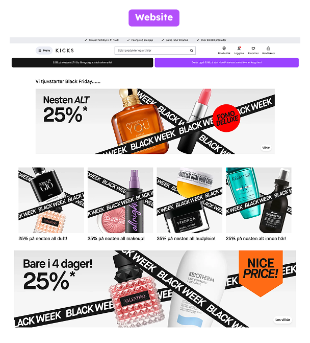
When users move between platforms, the styling feels the same. The product sits on the same clean background, the colors stay consistent, and the seasonal elements repeat in a predictable way. This level of alignment builds trust and helps users connect the ads they see in-feed with the offers they later explore on the website.
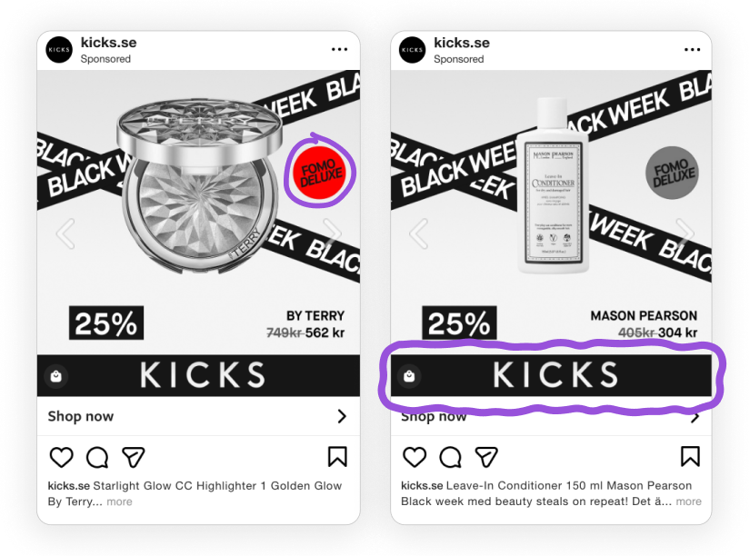
Because Black Week is crowded with similar-looking promotions, this consistency makes the campaign easy to identify without relying on loud visuals. It keeps the branded look intact while still feeling minimal and modern.
Automatically switches the campaign message
Another strength of this setup is how easily the visuals adjust as the campaign moves from Black Week into Cyber Monday. The core layout stays the same, but the message and color accents update automatically, creating a refreshed look without rebuilding the design.
The Black Week tape transitions to a bold Cyber Monday blue, and elements like the red “GRAND FINALE” badge are introduced to highlight the final phase of the promotion.
Because the structure does not change, the updates feel intentional instead of disruptive. The viewer instantly understands that the campaign has entered a new moment, yet the overall identity remains familiar and easy to follow.
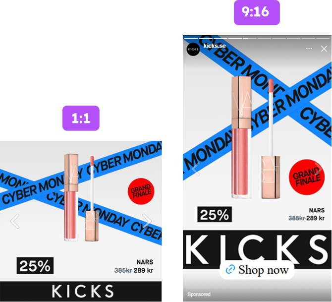
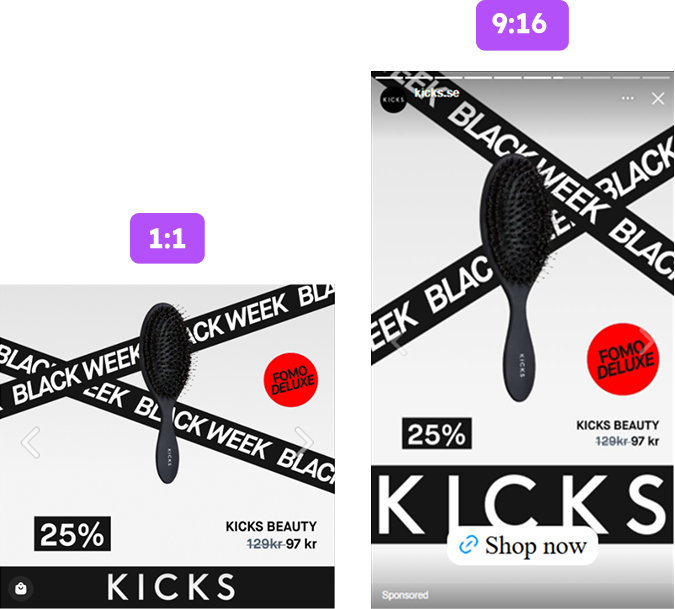
This works especially well because the team prepared both 1:1 and 9:16 versions for these different phases. The Cyber Monday vertical layouts take full advantage of the taller format, allowing the blue tape and updated badges to stand out even more in Stories and other full-screen placements.
By combining automatic message updates with strong, adaptable visuals, the campaign keeps its momentum throughout the entire promotional window while giving each event its own clear and polished identity.
Dynamic diagonal composition that makes the products pop
The diagonal tape plays a more technical role in the composition. Diagonal elements naturally add movement and tension, which keeps the layout from feeling flat or static. This is especially useful in catalog ads, where the product is isolated and needs a bit of visual energy around it to draw attention.
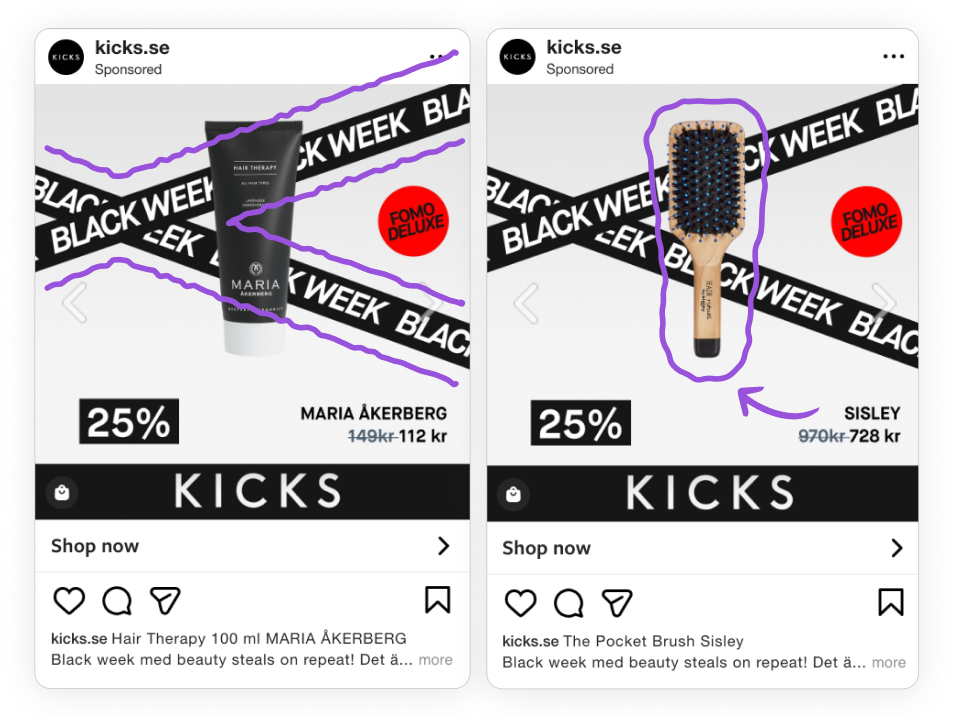
The diagonal angle introduces direction, helping guide the viewer’s eye toward the center without distracting from the product. Because the rest of the layout stays clean, the tape can create motion without overpowering the main subject.
The neutral background, centered alignment, and generous negative space ensure the product remains easy to identify at a glance. This balance of movement and clarity is what makes the layout feel dynamic while still being simple to process.
Technically, it is a structured design system. The angle adds motion, the spacing prevents clutter, and the centered product anchors the entire frame, making the ad easy to scan in a split second.
Instant offer clarity that works for fast-scroll behavior
A key strength of these catalog ads is how directly the pricing is presented. The discount sits in a bold black box, placed immediately beneath the product, making it one of the first things the viewer sees.
This position is intentional. During Black Week, people scroll quickly and evaluate offers in seconds, so having the price and discount grouped tightly together helps users process the value instantly.
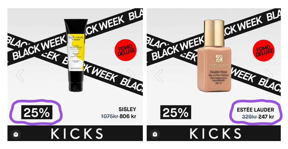
By placing the percentage and updated price directly under the product image, the ad removes any extra steps or interpretation. There is no need to search for the offer or scan the layout.
Everything a shopper needs to understand the deal is located in one compact area, creating an immediate connection between the product and its savings.
This kind of clarity is important in high-traffic periods. When the offer is visible and easy to interpret, users can decide quickly whether it is relevant. The design supports that behavior by making the discount and the product the two things the eye notices first.
Key Takeaways
KICKS’ Black Week catalog ads show that effective performance often comes from simple but well-considered creative choices. Working with s360, they built a clear visual system.
The ads were easy to understand, consistent across placements, and structured in a way that matched how people browse during Black Week.
👉 A consistent Black Week identity across every touchpoint
The diagonal tape, red badge, and clean product layout appear across catalog ads, Stories, and the website, creating a unified look that feels familiar no matter where users see it.
👉 Automatically switches the campaign message
The layout stays the same while the messaging, colors, and badges update automatically for Cyber Monday. This keeps the visuals fresh, cohesive, and easy to follow across the entire promotional period.
👉 A dynamic visual structure that keeps the product in focus
The diagonal composition adds movement, while product isolation and clean spacing keep the layout easy to read. It is visually active without becoming overwhelming.
👉 Instant value recognition for fast-scroll behavior
The black % badge communicates the discount quickly, making the offer easy to understand at a glance. This helps users decide within seconds whether the ad is relevant.
