
Selected
.jpg)
The ad: An ad that helps you picture the full look before you click
Selected is BESTSELLER's grown-up wardrobe brand for men and women. Scandinavian tailoring, leather, knitwear and denim for people who want to look considered without thinking too hard about it. If you have ever wanted your closet to look like a well-edited capsule wardrobe, Selected is aiming straight at you.
This Catalog Ad is an always-on line, not a seasonal burst, and it is framed around value rather than a flash sale. That matters, because Selected made a choice most brands do not: even in a value-framed campaign, they refused to turn the creative into a discount ad.
Instead they built a Catalog Ad that looks like a page torn out of a lookbook. And then they made it hold that lookbook feel across the feed, the carousel and full-screen Stories, without losing a pixel of polish. Every element earns its place. Nothing here is a default setting.
Why it won Catalog Ad of the Week
The design does a lot of quiet work, and it pays off in the numbers. What is striking is that the lift shows up at every stage that matters. People convert more often, and they spend more when they do. That combination is rare, and it is the clearest sign that this ad is doing its job.
A lift like that does not come from one lucky creative. It comes from an ad that does the shopper's homework for them.
Here is the tell. Click-through rate actually dipped slightly, while conversion rate jumped 43%. Fewer people clicked, but far more of the people who did went on to buy. That is exactly what happens when an ad shows enough upfront that only ready buyers bother to tap. Selected front-loaded the product, the fit, the full look and the name into the creative itself, so by the time someone clicked, they were not investigating. They were buying.
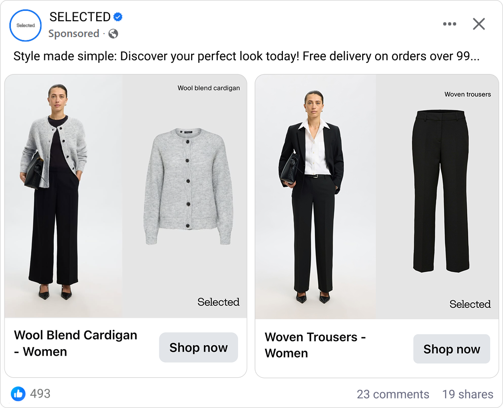
And they were buying more. A 26% higher average order value tells the rest of the story: this ad does not just convert better, it sells bigger baskets. The reason is baked into the design, and it is the second thing we want to show you below.
What makes this Catalog Ad great
Show the product on a body, on its own, with its name and logo, so nobody has to guess what they are looking at
The single smartest thing about this ad is how completely it answers the shopper's questions before they can ask them. Look at any card and Selected has given you four things at once: the garment worn by a styled model, the same garment as a clean studio packshot, the plain product name in the corner, and the "Selected" wordmark quietly holding it all together.
Think about what you are actually doing when you shop for clothes online. You are asking two questions in the same breath. "What is this thing?" and "What will it look like on me?" A packshot answers the first. A model shot answers the second. Most Catalog Ads pick one and leave the other question dangling, which is exactly the moment a shopper clicks away to go and check. Selected closes both questions inside a single frame.
Then they add the product name - "Classic leather jacket", "High waisted wide leg jeans", "Mid waist straight fit jeans" - in plain, specific language. No poetry. If you already know you want wide-leg jeans, that label is a green light. If you do not, it teaches you what you are seeing. Either way, you never have to guess.
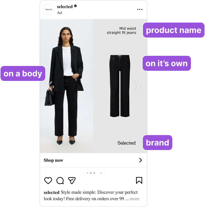
This is dual coding at work. Two complementary representations of the same product, the visual and the verbal, encode more strongly and more completely than either one alone. The packshot carries the product truth of cut and colour and detail. The model shot carries the context of fit and drape and styling. The name pins it down in words. Together they leave nothing unresolved, and that is almost certainly what drove the 43% jump in conversion rate. When there is nothing left to find out, the click that follows is a buying click, not a browsing one.
Style a complete outfit around every product so the average order value climbs on its own
Look again at the leather jacket card. Selected did not photograph a jacket. They photographed a jacket, a white tee, black woven trousers and a pair of black heels, worn together as one finished look. The cardigan card layers the knit over a black jumpsuit. Every single product is shown inside a complete outfit.
You clicked for one thing. But you saw four things that clearly go together, worn by the same person, in the same world. And now adding the second piece does not feel like extra spending. It feels like completing something you already pictured yourself in.
This is the Diderot effect, and Selected engineered it straight into the creative. Acquiring one item creates a natural pull toward the pieces that complete the set. The jacket wants the jeans. The cardigan wants the jumpsuit. Nobody is told to "buy the look" - they are simply shown it, and the wanting takes care of itself.
.png)
It is also the most likely explanation for that 26% higher average order value. An ad built around single floating products sells single products. An ad built around styled outfits sells outfits. Selected chose the second, and the basket size followed. There is a nice lesson here for any fashion brand still running bare catalog ads: the model wearing clothes is not a decoration, it is a cross-sell engine hiding in plain sight.
And this is where the value framing finally makes sense. Selected did not put a discount on the ad. The value you see is the outfit itself, four pieces that clearly work together, which says "this is worth it" far more convincingly than any percentage-off banner.
Design for Stories first, so you win the cheapest, most attention-heavy placement on Meta
Most brands design a square feed ad and then let the vertical version fend for itself. Selected did the opposite, and it shows. The 9:16 Story is not a squashed feed ad. It is its own composition: the model runs full-bleed down the left of the screen, the clean packshot sits beside her, and a black band across the bottom carries the "Selected" name and the "Shop now" pill, kept clear of the phone's own interface.
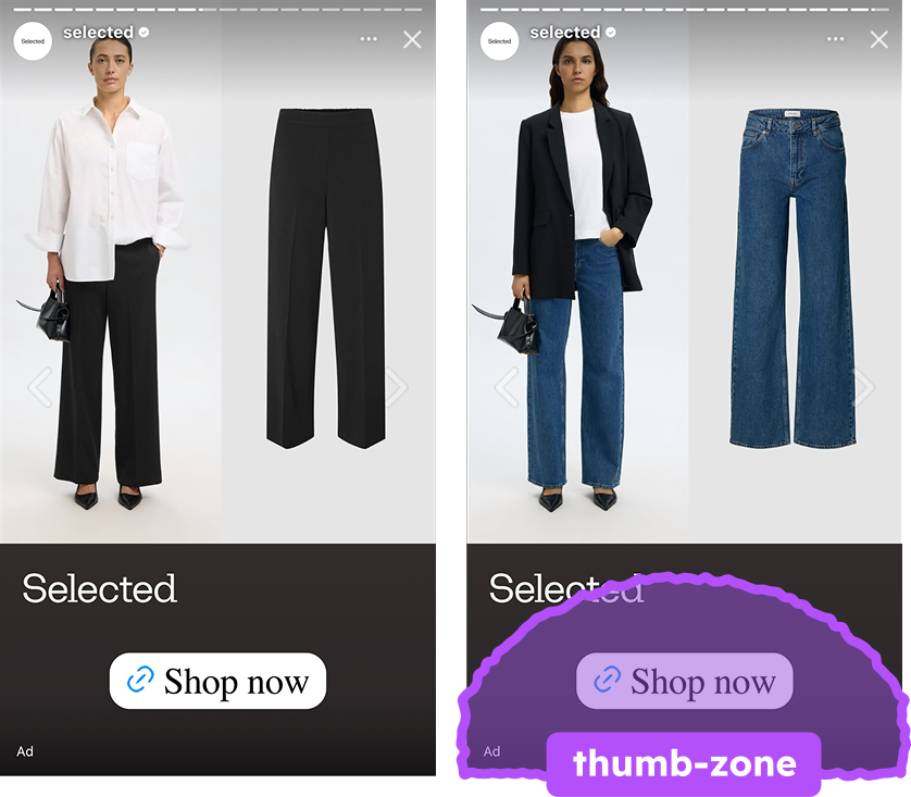
There is a real strategic reason to lead with the Story. Vertical placements like Stories and Reels are often the cheapest impressions on Meta, and they are the only placement that gives you the entire screen with nothing else competing for the eye. When someone is in a Story they are full-screen and one tap from gone, so the ad that fills that screen with a proper fashion image, rather than a cropped square floating in empty space, is the one that holds them.
Selected designed for exactly that. The model gets the full height. The look gets your full attention. And the "Shop now" button sits right where your thumb already rests, so acting on the ad costs almost no effort. That last part is Fitts's law in practice: the closer and larger the tap target, the more likely the tap.
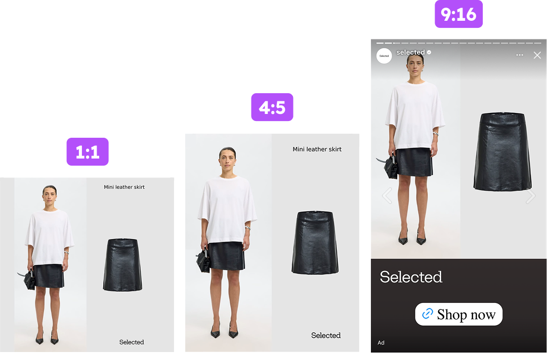
This is format-native design done properly. Ads built for the placement they run in beat repurposed crops every time, and because the 1:1, 4:5 and 9:16 were designed together as one system, Selected looks equally intentional whether it lands mid-feed or full-screen. The Story is not an afterthought here. It looks like the format the whole ad was built for first.
Key takeaways
What makes this one stand out is how much of the work happens before the click. Selected could have run a catalog ad with a simple product shot together with a discount banner, most fashion brands do. Instead they built a catalog ad that looks like a finished editorial page: model, packshot, name, and a full outfit, all designed for the exact screen it would land on.
👉 Answer "what is it" and "what will it look like on me" in one card
Pair a clean packshot with a styled model shot and add the plain product name. You close both shopping questions before the click, which means fewer trips to the product page and the warmer, higher-converting clicks that lifted Selected's conversion rate by 43%.
👉 Style the whole outfit, not just the product
When every item is shown inside a complete look, the add-ons feel inevitable instead of pushy. That styled-outfit approach is the most likely driver of Selected's 26% higher average order value. The styling is a cross-sell engine, not decoration.
👉 Design for the Story first
Vertical placements are often the cheapest impressions and the only ones that own the whole screen. Build the 9:16 as its own composition with the CTA in the thumb zone, and design all your aspect ratios as one system, so the brand looks intentional everywhere it lands.