
Dormy & Ingager
October 7, 2026
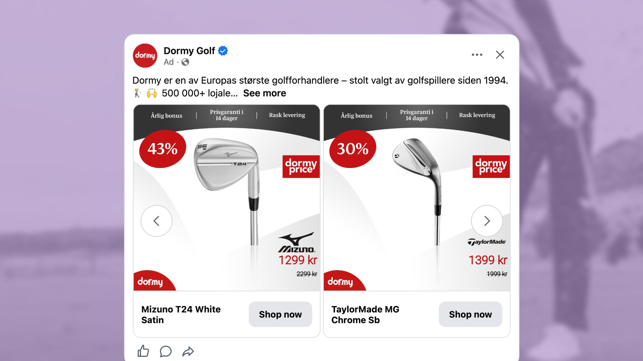
The ad: a Catalog Ad that justifies its own prices
Dormy is one of Europe's largest golf retailers, chosen by golfers since 1994, with 12 stores, online sales across 12 countries and more than 100 top brands on the shelves. This Catalog Ad was made together with their agency Ingager.
Golf equipment is a considered purchase.
A buyer wants to know the gear is the real thing, that the price is fair, and that ordering online carries no risk. Dormy and Ingager built a Catalog Ad that answers all three of those on the Catalog Ad itself, across a catalog of more than 4000 products.
Why it won Catalog Ad of the Week
Great design is nice to look at. But great design should also perform, and this one did both. Compared to Dormy's other Catalog Ads, this one delivered:
A conversion rate and an average order value moving together by roughly a third is the signature of an ad that removes hesitation rather than pushing harder. Buyers are converting more often and spending more when they do, which is what happens when the card answers the questions a golfer would otherwise leave the feed to go and check.
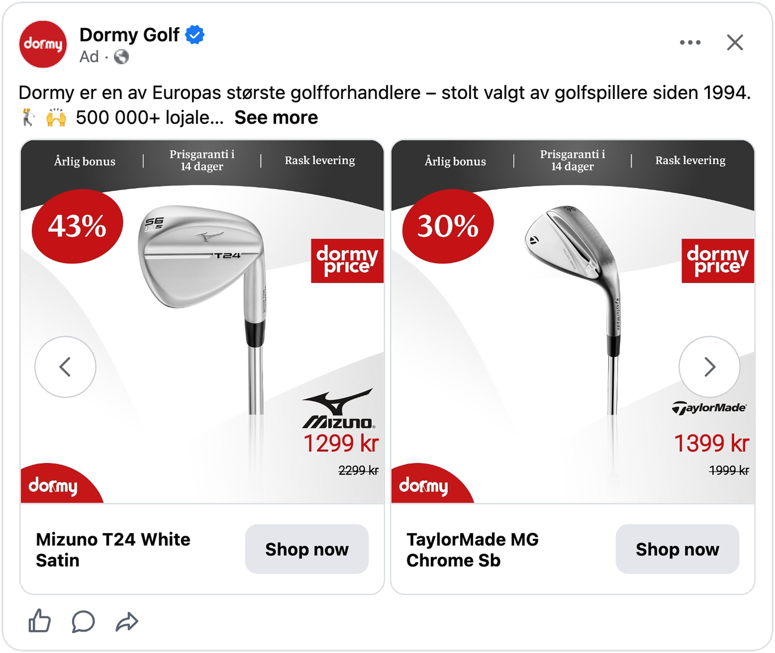
So what did Dormy and Ingager actually do to earn that? Three decisions stand out.
What makes this Catalog Ad great
Pull in the brand logos automatically, and place them next to the price
Every single Catalog Ad visual here carries the logo of the brand that actually made the product: Wilson, Mizuno, Cobra, TaylorMade, and the rest of the 100+ brands Dormy has in stock.
None of these were placed manually, it all works dynamically.
The logo is pulled from the product's own visual assets, so each of the 4000+ products in the catalog arrives with the correct brand mark already on it. Doing that manually across a catalog this size would be impossible, which is exactly why most retailers skip it and run a card carrying only their own logo.
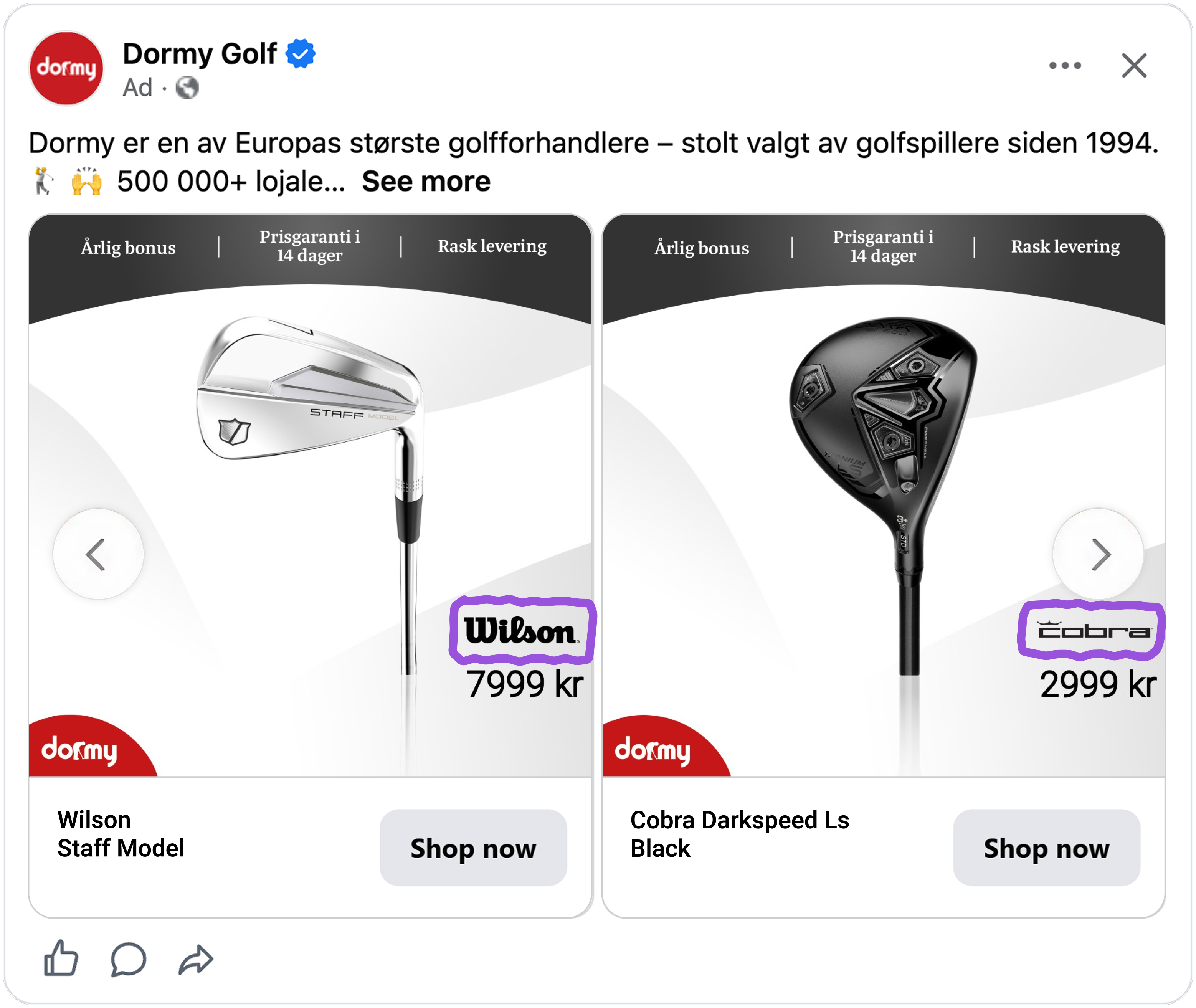
Where the logo goes is the next clever part. It is placed right beside the price, so the two are read together rather than separately. For a golfer, a recognized brand logo is a shortcut to quality: seeing Wilson or TaylorMade answers whether the product is any good before the price is even evaluated, so the number that follows reads as what the quality costs rather than as a number to judge on its own. A retailer selling the same club without the brand mark visible is asking the price to defend itself.
This is a large part of why average order value climbed by roughly a third. A buyer is not being pushed toward a cheaper option, they are being reassured that the more expensive one is worth it.
Let design rules split the catalog into three states
This Catalog Ad is built with rule-based logic, making sure every product gets a design relevant to its most recent price status.
Design rules read each product's pricing status and sort it into one of three types, automatically, every time the feed refreshes.
- A product at full price gets the clean, standard design.
- A product on sale gets the sale design, carrying the saving as a percentage alongside the original and reduced price.
- A product on Dormy's own special pricing gets its own dedicated design again, distinct from a regular sale.
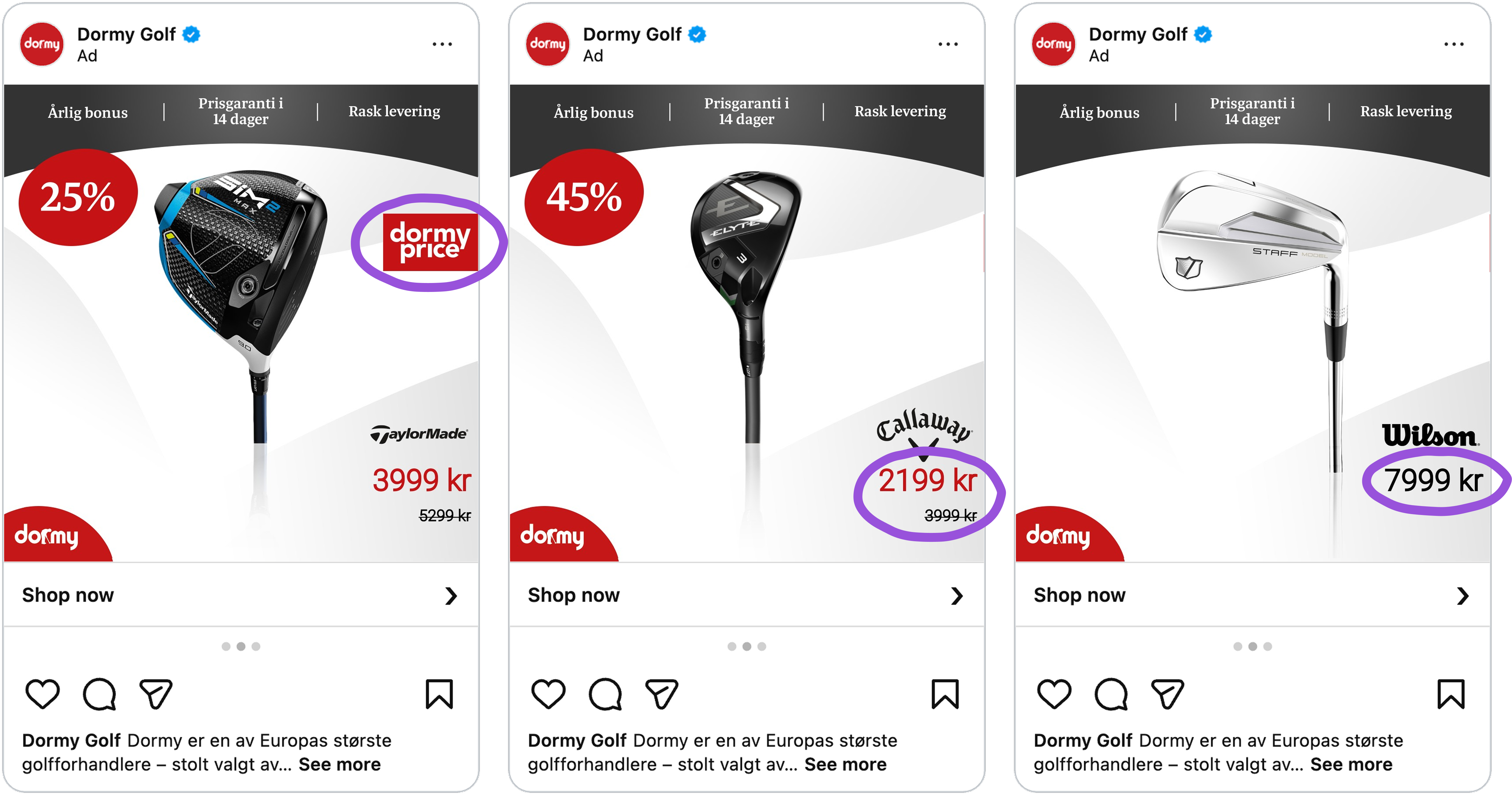
Two things come from this.
- The saving is quantified rather than implied, so a shopper sees exactly what they are getting rather than reading the word "sale" and guessing.
- Seeing a real, quantified saving also gives the shopper a reason to keep looking for what else is discounted.
There is another payoff too: three templates matched to product state means your catalog is producing three genuinely different creatives instead of one, and that variety is exactly what Meta's Andromeda algorithm rewards.
Remove operational objections while on Catalog Ad
On the top part of the Catalog Ad, Dormy covers the reasons a hesitant buyer might otherwise leave: fast delivery, a bonus on the purchase, and a price guarantee.
Each one removes a specific objection:
- Fast delivery answers "when will I actually get this."
- The bonus answers "is there anything extra in it for me."
- The price guarantee answers the biggest one for a considered purchase: "could I find this cheaper somewhere else."
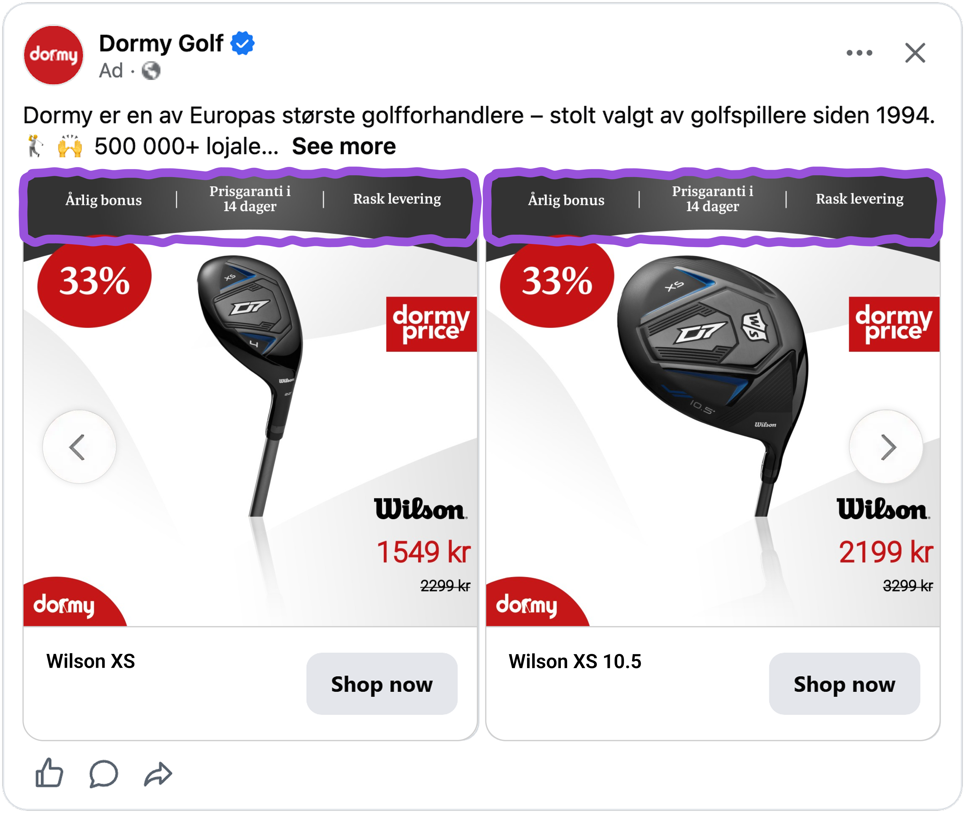
That last one matters most, because the alternative is a buyer opening a new tab to go and compare, and most of them do not come back.
This is risk reversal, and it belongs on the ad rather than three clicks deep on the product page. By the time a golfer has read the card, the brand is credible, the price is justified, and the purchase carries no real downside.
Key takeaways
👉 Pull brand logos from your product data, and set them beside the price
If you sell other brands, pull their logos from your product assets so every card carries the right one automatically, the only way to do it across thousands of products. Then place the mark next to the price, where a recognized brand turns a number into what quality costs. Separate them and the price has to defend itself on its own.
👉 Split your catalog into pricing states with design rules
Full price, on sale, and your own special pricing each deserve their own design. Quantify the saving with a percentage and the original price, and keep the sale design honest by only applying it to genuine discounts.
👉 Put your objection handling on the card
Delivery speed, a bonus, and a price guarantee answer the three questions that send a buyer away to check. Answer them in the feed and there is no reason to leave. Dormy and Ingager got all three of these right in one creative, which is exactly why it is this week's Catalog Ad of the Week.