Design Cykler & Lazzaweb
July 27, 2025

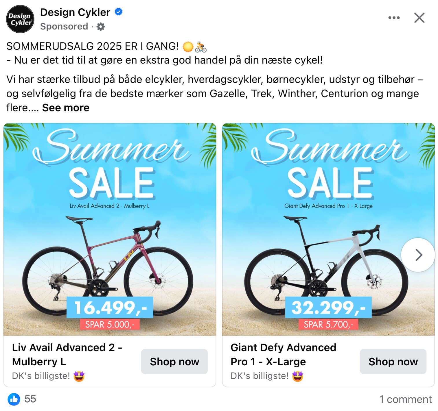
The ad: Summer sale on bikes
A vibrant and seasonally on-point Catalog Ad crafted for Design Cykler’s Summer Sale 2025 - and it ticks all the boxes for high-performing creative.
At its core, this ad leverages the power of Meta's dynamic product ad technology, but it's far from “just another Catalog Ad.” It's a visually rich, campaign-aware creative that combines personalization with polished design.
The campaign ran in multiple aspect ratios - 1:1, 4:5, and 9:16 - ensuring optimal presentation across placements like Facebook Feed, Instagram Stories, and Reels. Instead of defaulting to square creatives, the team prioritized mobile-first formats, ensuring more screen real estate was used to command attention where it matters most.
And while the template may be dynamic, the feeling it delivers is cohesive, bold, and unmistakably "summer sale." Every version, every placement - optimized, aligned, and ready to convert.
Why it won Catalog Ad of the week
First of all the performance of this Catalog Ad speaks for itself: This Catalog Ad had a 69% higher Return On Ad Spend compared to their other Catalog Ads.
That kind of lift is rarely accidental - it’s the result of thoughtful strategy, great creative execution, and a deep understanding of the catalog ad format.
But beyond the numbers, it also nails the intangibles:
- It's seasonal, relevant, and campaign-driven - breaking out of the generic product feed format.
- It speaks clearly and immediately to the customer’s intent and interests.
- It balances automation (from product feeds) with deliberate creative design choices that make it pop in a crowded feed.
This ad didn’t just perform - it raised the bar for what Catalog Ads can look like when media, creative, and data work in harmony.
What makes this Catalog Ad great
Let's dive into some of the things, that makes this Catalog Ad so great.
Adapting to 9:16, 4:5, and 1:1
Adding 4:5 and 9:16 formats via Confect’s formats isn’t just a design choice - it’s a strategic move that maximizes performance.
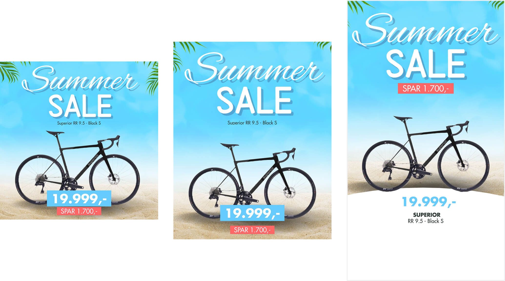
By tailoring creatives for all major aspect ratios, this Catalog Ad ensures Meta can deliver the right format for the right placement:
- 9:16 fills the screen in Stories and Reels - grabbing attention in a full-screen, immersive environment.
- 4:5 dominates the vertical space in mobile feeds - offering more scroll-stopping visual real estate than the standard 1:1.
- 1:1 remains perfect for desktop feeds, marketplace, and other placements - clean, centered, and familiar.
When you give Meta’s algorithm the flexibility to serve the most suitable format for each context, you don’t just improve performance - you create a smoother, more intuitive customer experience.
No awkward cropping. No scaled-up pixels. No guessing what the product is.
It's designed massively well
This ad is a masterclass in visual hierarchy and layout psychology - every element earns its place.
The “Summer SALE” headline sits in the top-left, catching the eye first and initiating a Z-pattern flow (from Gutenberg’s Principle), where viewers naturally scan left to right, then diagonally across the image. That diagonal glance passes right through the product - the bike - and finishes at the price and discount in the bottom-right.
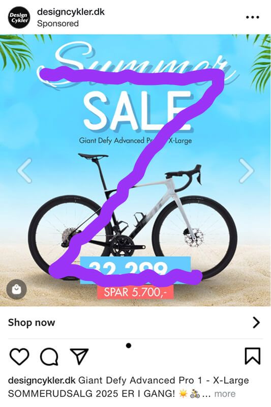
It’s not just well-placed, it’s purposefully mapped to how people read visuals.
Even more cleverly, the stylized “Summer SALE” text is shaped like a downward-pointing arrow, using gestalt principles of continuation and direction to subtly guide the eye toward the bike. The product isn’t just visible - it’s spotlighted through smart, subconscious design.

Add in a bright, seasonal background with clean whitespace, and you get more than just clarity - you get conversion-focused design rooted in behavioral flow.
It's easy to understand for consumers
This ad nails visual hierarchy - guiding the viewer’s attention in exactly the right order.
First, the eye lands on the bold “Summer SALE” text placed in the top third. It’s high-contrast and seasonally relevant, capturing attention instantly.
Second, the gaze naturally flows down to the product, which is centered and with a lot of white space around it. If the user is in doubt which bike it is, they can read the small product name above the picture.
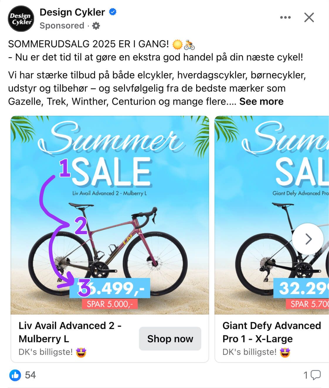
Finally, the price and discount come into view - positioned on top of the product, where viewers look once interest is piqued.
This flow follows progressive disclosure: leading the viewer step by step without overwhelming them.
In just seconds, the viewer gets it all:
- It’s a summer sale
- On the products I'm interested in buying
- At this discounted price
Simple, structured, and highly effective. A great Catalog Ad.