
END. Clothing
October 8, 2025
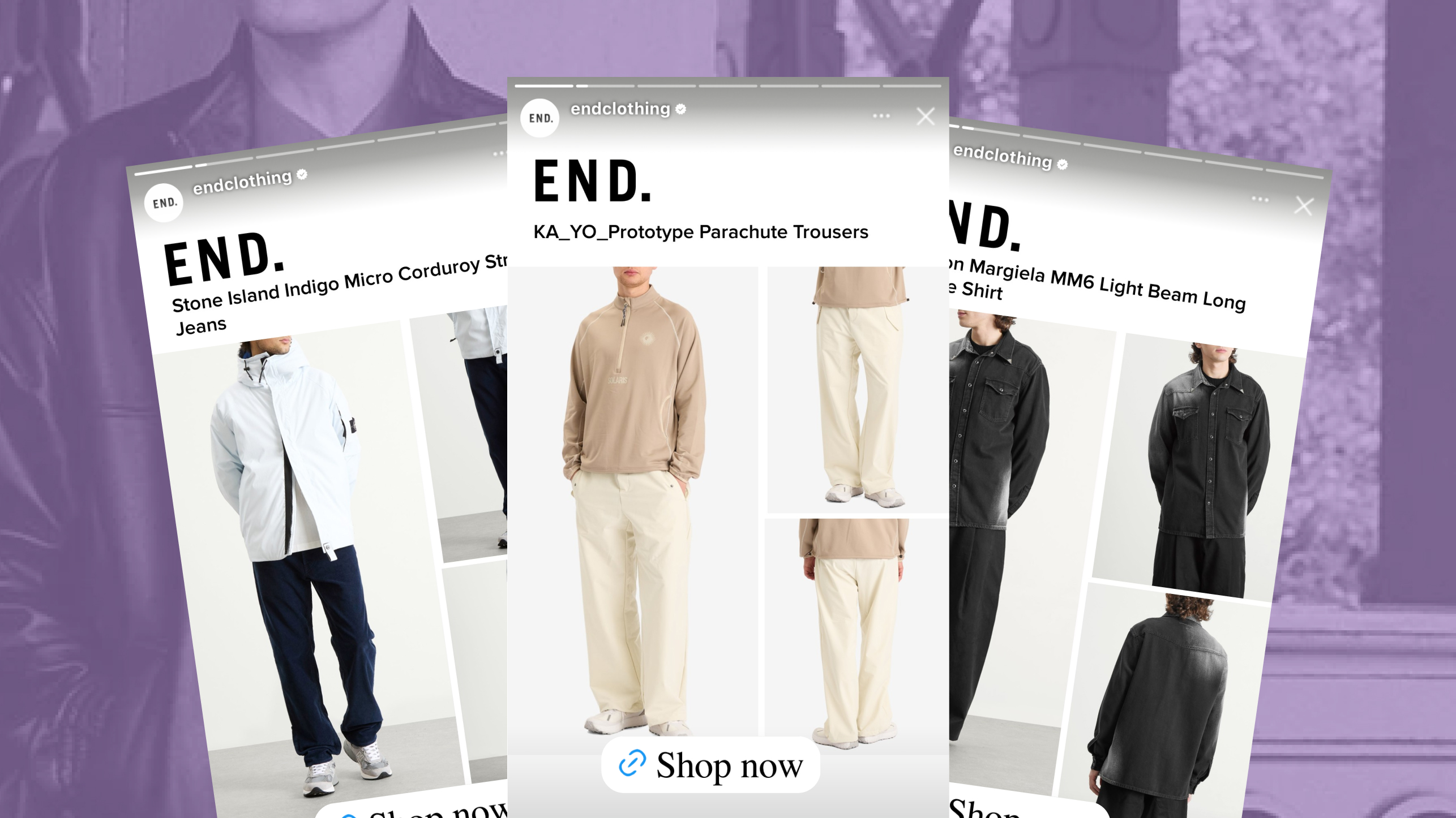
The ad: a streetwear Catalog Ad that feels familiar on every channel
END. is the British retailer known for high-end fashion, streetwear and exclusive sneakers, selling across a catalog that runs into the tens of thousands of products.
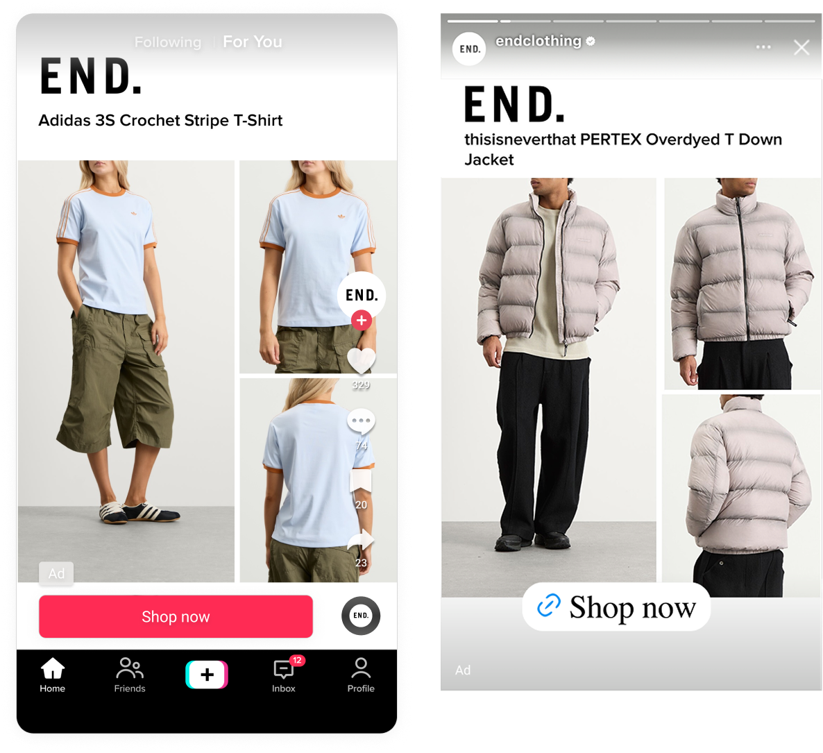
END. made their Catalog Ads match the brand feel no matter where you meet them. In the Facebook feed, on Instagram or on TikTok, you know it is END.
When we look for great Catalog Ads to feature in our weekly awards, we consider both the visual design and performance. This one delivered on both counts.
Why it won Catalog Ad of the Week
A click-through rate up by nearly 40% alongside a 35% rise in average order value points to an ad doing two jobs at once. It earns far more attention in the feed, and the people who act on it commit to larger orders. So what did END. actually do to earn that? Three decisions stand out.
What makes this Catalog Ad great
Show the best of your product on Catalog Ads
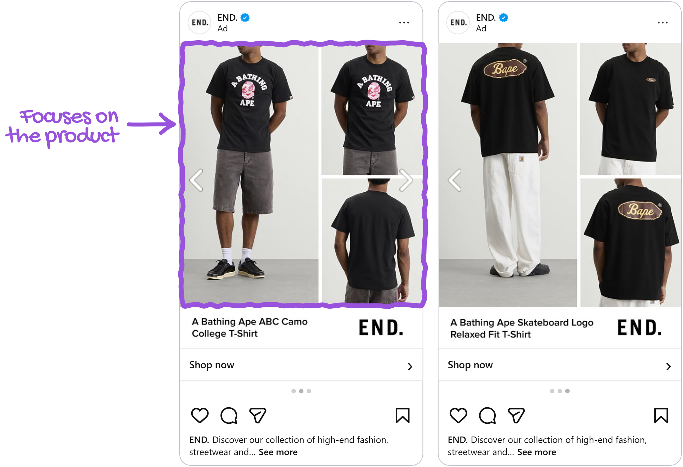
END. built the design around three views of the same product: worn on a person, a close-up on the material, and a shot from the back.
Streetwear is a social purchase, and the product details are what matter. One way to convey them is by showing the piece on someone, so you can see how it actually sits on a body. Pair that with the close-up, where you can see the detail and the texture. Then the back, which is the view a product page usually makes you hunt for.
In digital spaces, brands have to overcome the lack of touch and feel that an in-person store gives. Consumer research has consistently found that people who can picture themselves using a product form stronger purchase intent than people who simply evaluate it from the outside. A clothing piece shown on a person invites that simulation directly, while a flat product shot leaves the buyer to do the imagining on their own.
END. also built separate versions of the design for footwear and for clothing, on the reasoning that the angles worth showing are not the same for a boot as for a jacket. Design rules handle the sorting, so the right version reaches the right product across the whole catalog.
Build the Story design so it belongs in the placement
Their design looks great no matter where Meta shows it, and that comes from giving the platform specific designs for each placement rather than one that has to stretch.
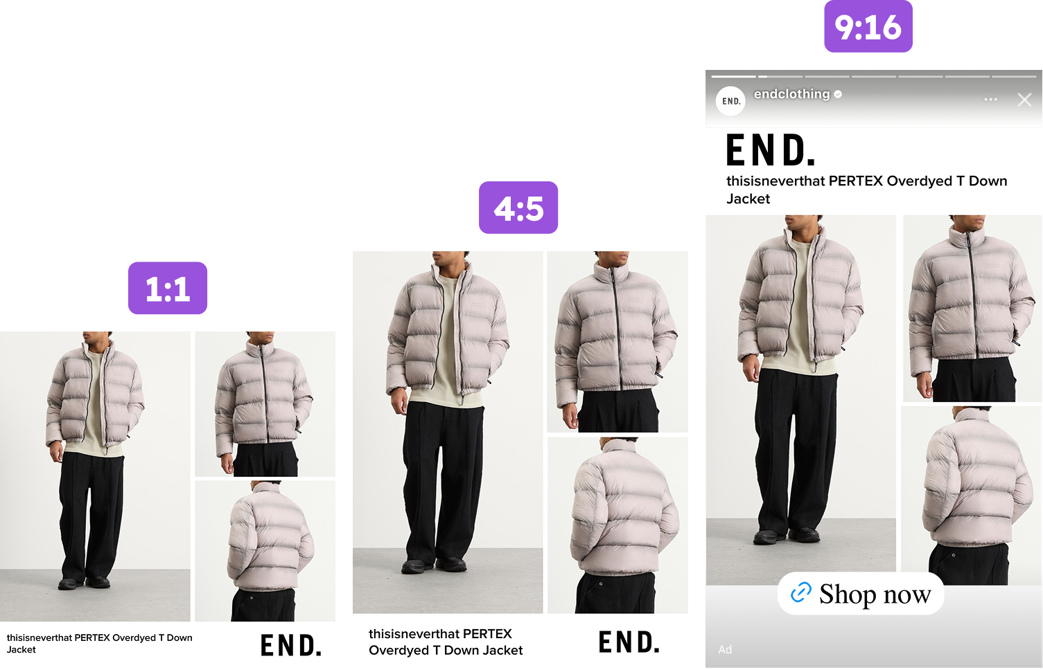
The design was built properly for 9:16 rather than letting a square get cropped into the slot. In Stories it fills the screen as something made for a phone held upright.
END. respected the safe zones and made sure none of the Story interface elements obstruct the information or the product. Without a custom design, how Meta's resizing handles that is left to chance.
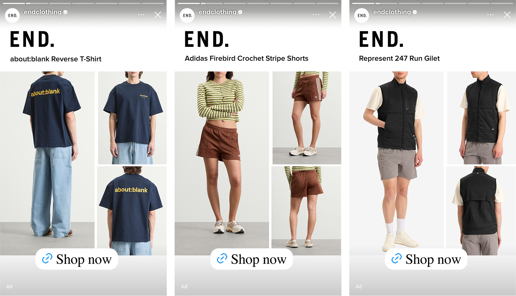
Processing fluency is the reason this matters more than it sounds. When something is easy to take in, people experience that ease as a positive feeling about the thing itself rather than as a property of the layout. A design that fits its placement is quite literally judged more favorably than the same design forced into a shape it was not made for. The work of adapting to the format buys goodwill the shopper never consciously registers.
Run the same design on TikTok
END. runs the same template on TikTok, so the design built for Stories is working across platforms rather than sitting in one place.
A shopper meets the product on Instagram, then comes across it again while scrolling TikTok, and the second encounter carries a familiarity the first one could not. TikTok is no longer only the platform for dances. Brands are tapping into the commerce side of it, and delivering Catalog Ads that carry your brand's own design is a strong choice.
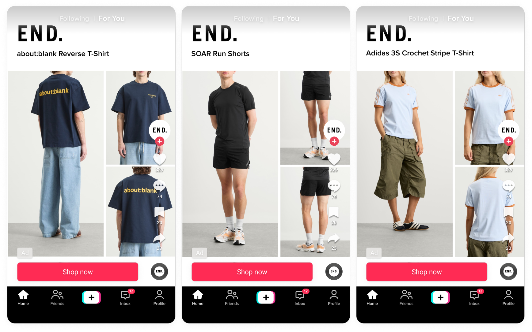
Running one design across two platforms is not simply twice the reach. It builds a sturdier memory of the product than the same number of impressions in one feed would.
Key takeaways
A Catalog Ad has a few seconds to answer what a shopper would otherwise leave to go and find out. END. used every part of the format to shorten that gap.
👉 Give a product more than one image when one cannot carry the decision
Worn, close up, and from the back answer three different questions. The worn shot helps a buyer picture themselves in it, and the close-up delivers the texture they cannot touch.
👉 Build the design for the placement, not just the feed
A proper 9:16 design reads as native in Stories, and a design that is easy to take in is judged more favorably than the same one cropped to fit.
👉 Take your best design to other platforms
The same template running on TikTok as on Meta does more than add reach. Meeting a product in two different contexts makes it stick in a way repetition in one feed does not. END. got all three of these right in one creative, which is exactly why it is this week's Catalog Ad of the Week.