Ksubi & Elephant Room
August 25, 2025
The ad: Clarity and convenience for frictionless shopping
Ksubi’s ad campaign is an example of how to combine clarity, convenience, and urgency effectively. Their ads show how it’s entirely possible to create catalog ads that still stand out on Facebook and Instagram and encourage action without having to use overly salesy language or a wide range of design elements.
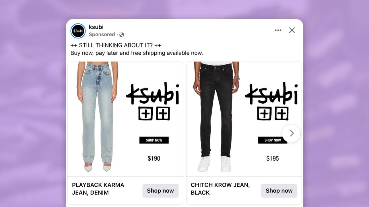
Just like the denims advertised, the ads are all about clean lines. The ads use minimalistic design to keep the focus on this wardrobe staple and create a straight path to purchase.
Why it won Catalog Ad of the week
Ksubi’s ad campaign generated a 79% increase in return on ad spend (ROAS). That kind of lift comes from a smart blend of fashion and function, the design choice shifts the focus to the product while still suggesting how it fits into an everyday, stylish wardrobe.
The simplicity of the overall design also reflects the effortless lifestyle that Ksubi sells. The jeans are photographed cleanly, showing detail and fit, which appeals to fashion-conscious buyers who value both style and quality.
These ads also stand out because they prove that there are other psychological principles that you can tap into that don’t require running pushy promotions. By simply highlighting a perk like free shipping or alternative payment options in the ad copy instead of the image itself, you can also create urgency and lower the perceived risk.
What makes this Catalog Ad great
Applies repetition and consistency
Just like in fashion, patterns also have a powerful function to play in the design of catalog ads. You might think that applying the same brand font, logo, and media style across different ad platforms will cause your target audience to lose interest, but it can, in fact, have the opposite effect. Repeating the brand name and logo in the ads reinforces brand recall and creates consistency which makes the ads easier to scan and remember.
Ksubi creates this consistency by using the same visual style and colour palette. In each ad, model shots are used, and, for further consistency, the models use a similar pose. Plus, the fact that the shot is cropped just below the torso keeps the product presentation uniform and the focus on the denims.
Then, there’s also minimal colour variation. All the ads use a clean design (white background with black text) which highlights this wardrobe staple and makes buying it easy. This design choice also ensures that the Ksubi look is instantly recognisable, even with different layouts across platforms (single product vs carousel).
Adopts simplicity
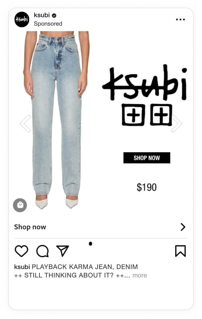
For Instagram, Ksubi uses a tall, vertical product photo with a lot of empty space. This encourages mobile scrolling and is more visually appealing, making it ideal for fashion brands.
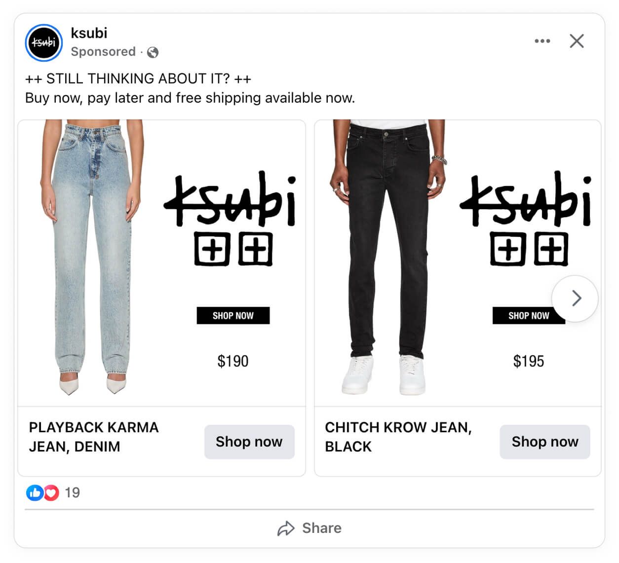
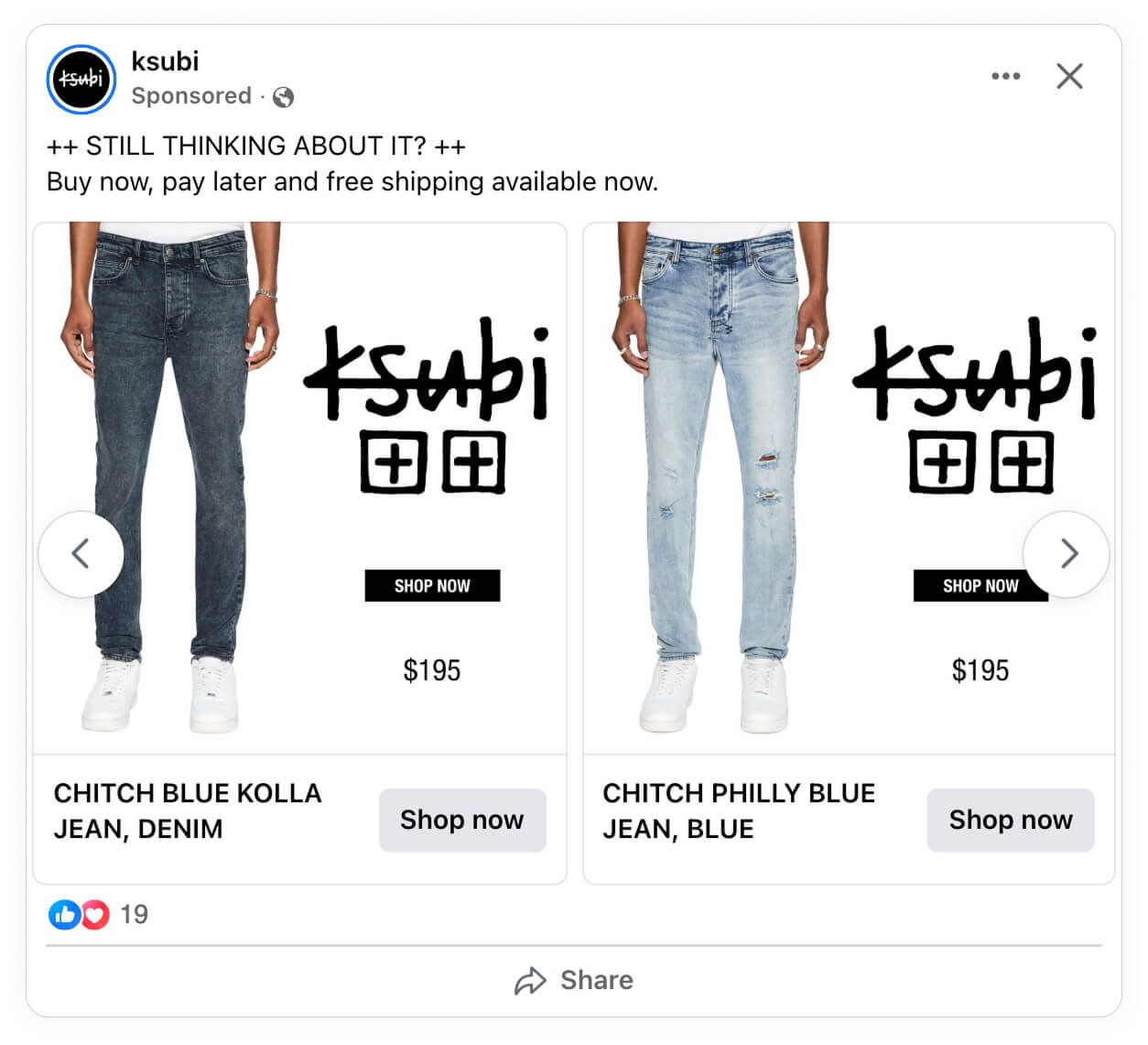
Then, on Facebook, the carousel format encourages comparison shopping and multiple touchpoints in one ad impression.
Creates scarcity and urgency
The copy (“still thinking about it?”) is more than a rhetorical question. It’s a reminder to your bottom-of-the-funnel audience members that they looked at the jeans without buying it, making it an effective strategy for retargeting campaigns. In other words, the jeans are positioned as an incomplete purchase, not just a fashion statement. This way, the messaging plays into the Zeigarnik Effect, a psychological principle that suggests we remember unfinished tasks better than ones we’ve already completed.
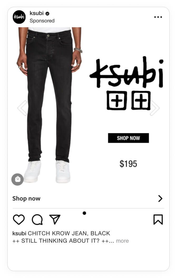
Then, to encourage action further, Ksubi chooses to highlight the buy now pay later (BNPL) option and free shipping in the ad copy. This works because it’s creating a sense of urgency while at the same time reducing the risk of buying online.
Key Takeaways
Ksubi’s ad campaign is a great example of how basic marketing principles like repetition and subtle urgency work together to create ads that leave an imprint.
Here’s how they went back to basics and what you can take from their ads:
👉 Lead with simplicity
Strip away distractions so that your product is the hero. A clean white background and centered framing put all of the attention on the denims’ fit, wash, and details.
👉 Create platform-native experiences
Adapt your creatives to match how people browse. Use tall, singular product shots on Instagram for scrolling impact, and carousel comparisons on Facebook to encourage exploration.
👉 Build brand recall through repetition
Keep your logo placement, typography, and styling identical across placements. Consistency reinforces premium positioning and makes the brand instantly recognisable.
👉 Use subtle urgency to nudge action
Phrase your messaging so that your target audience is presented with an unfinished task. Then, add a perk like free shipping to trigger decision-making momentum without coming across as too salesy.
👉 Let price signal positioning
Present the premium price point cleanly and confidently. This reinforces brand value and aligns with the luxury streetwear market.