
DETOMASO

The ad: An ad that makes every dial pop before you read a word
DETOMASO is a watch brand with a Mediterranean soul. Its range spans chronographs, solar and quartz watches with a sporty character, clean shapes, striking details and expressive colours, on straps in steel, mesh, leather and textile. That confident, colour-led character is exactly what DETOMASO's Black Friday Catalog Ad puts centre stage.
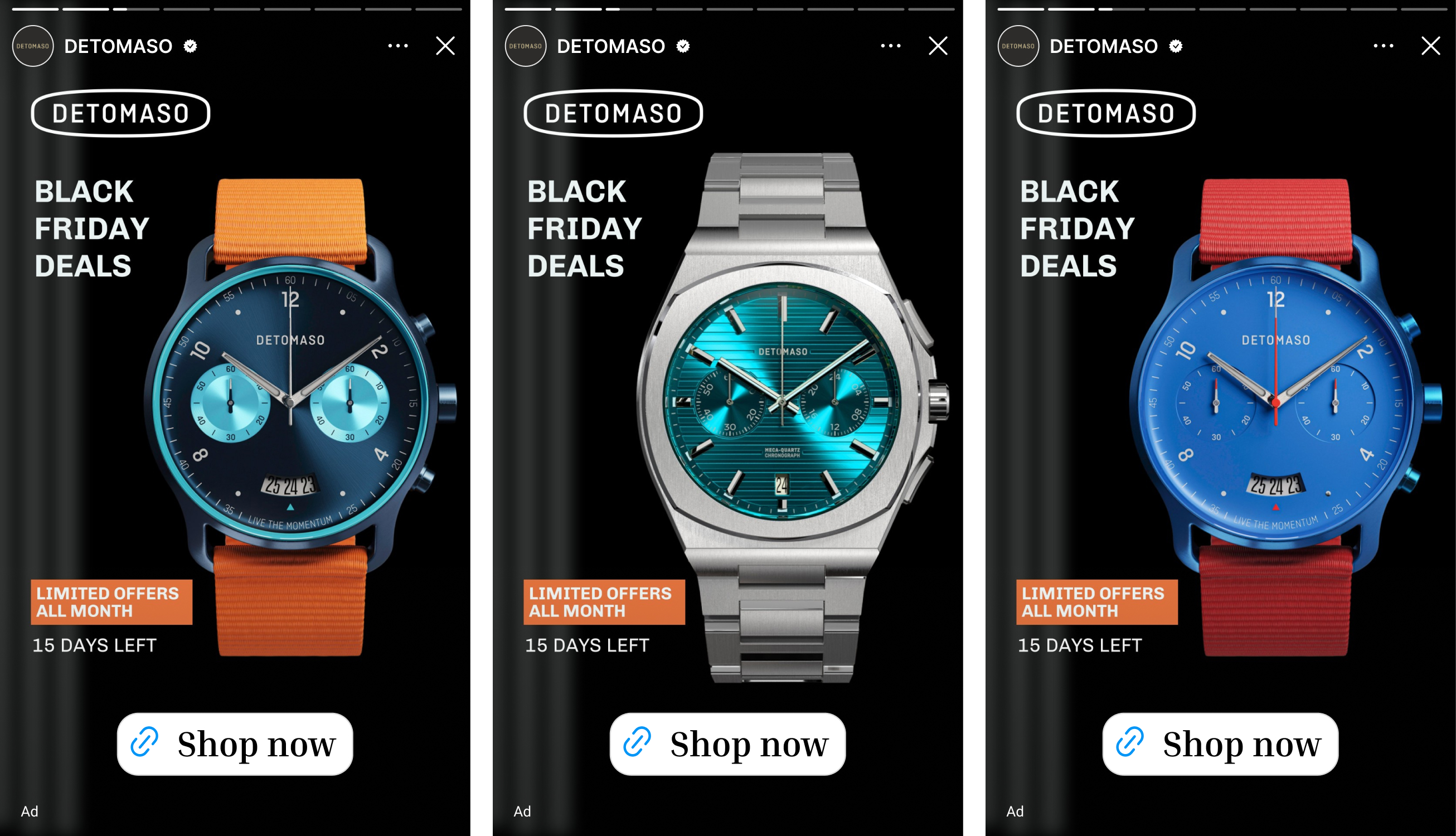
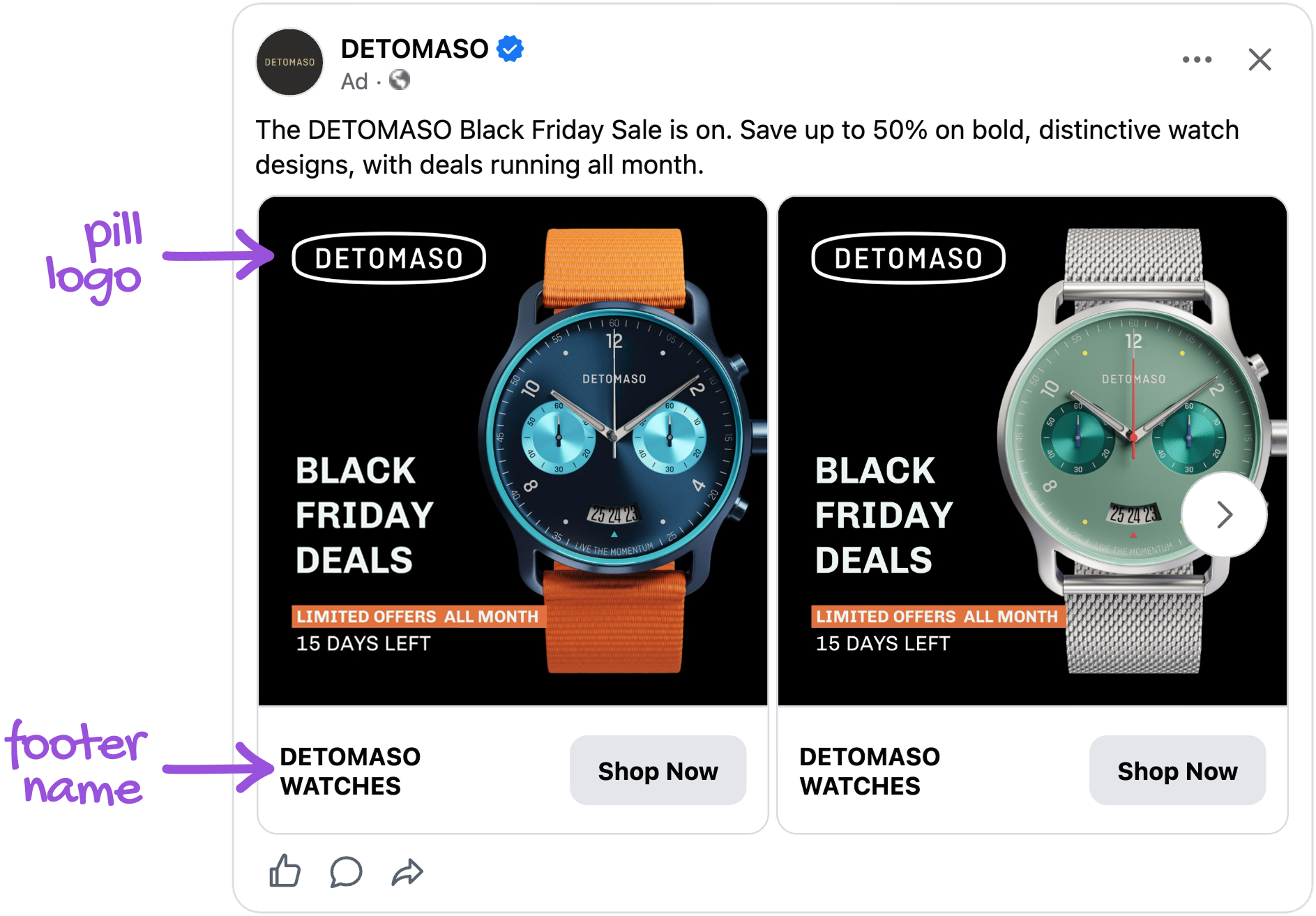
For the Black Friday campaign, DETOMASO runs a carousel of its watches during its Black Friday period, built for one of the busiest stretches of the shopping year. Every card puts a single watch on black, with the offer and a live countdown to the left of it.
Nothing here is a default setting. DETOMASO decided what the shopper sees first (the watch), what they learn second (the offer) and what makes them act now (the clock). Every element earns its place, which is why the ad reads as brand design rather than a template.
Why it won Catalog Ad of the Week
Great design is nice to look at. The reason this ad earned the feature is what it did for DETOMASO compared with its other Catalog Ads.
A +51% CTR means DETOMASO's carousel earned the click far more often than the rest of its Catalog Ads. The shoppers who clicked were also more likely to buy, with conversion rate up 20%, so the extra attention was the right attention. Together that brought cost per purchase down 36% and lifted return on ad spend by 33%.
A result like that is what happens when a bold visual stage meets a clear deadline. DETOMASO gave every watch the space to show its colour, then gave the shopper a reason to decide now. Running through Black Friday, it was one of DETOMASO's strongest Catalog Ads.
What makes this Catalog Ad great
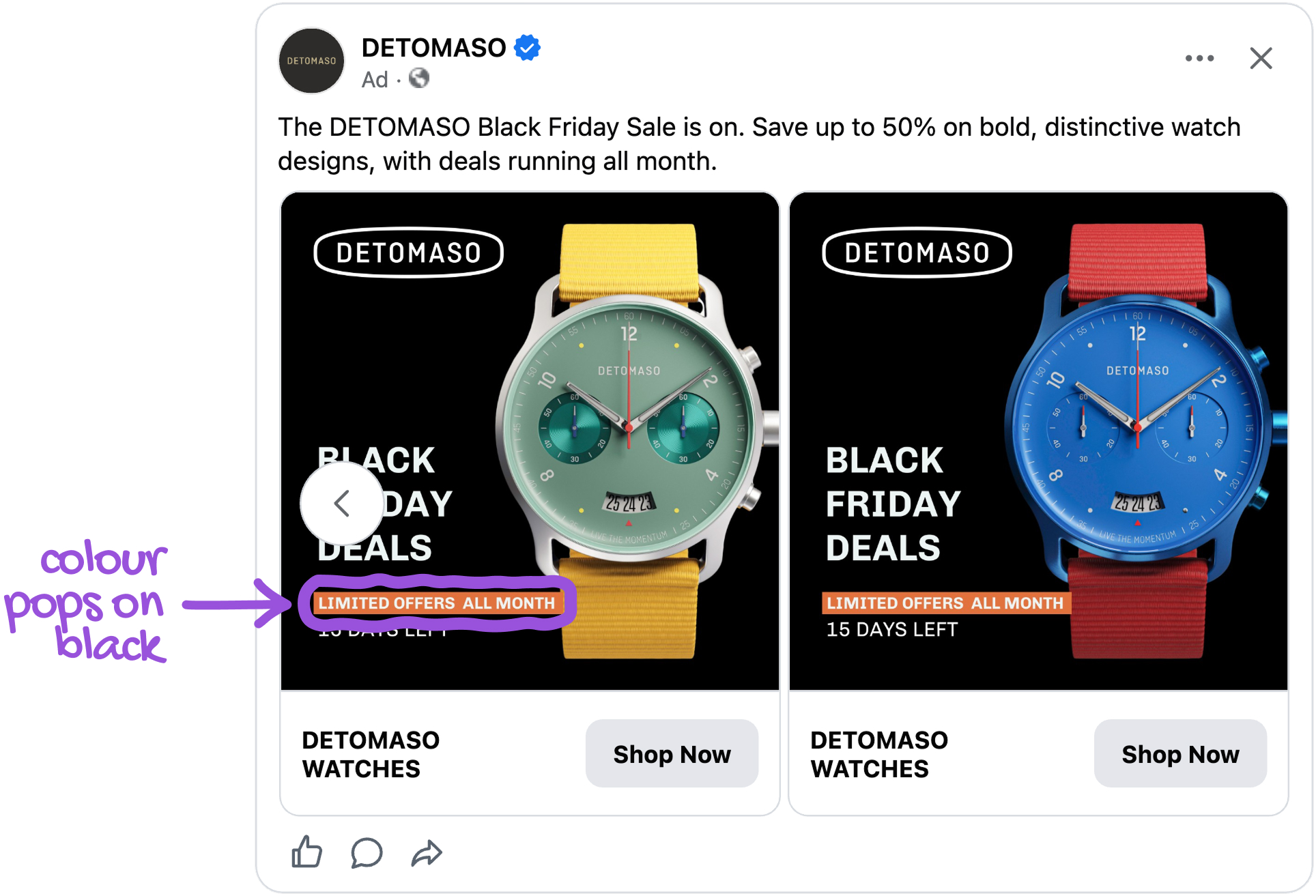
Put every watch on black so its own colour does the selling
DETOMASO placed each watch on a pure black card and kept everything else white or orange. The only colour that changes from card to card is the one on the watch itself: the turquoise chronograph, the purple dial, the sage face on a mesh strap, the yellow and red straps. The watch also fills the full height of the card, with its strap running off the top and bottom edges, so the brushed steel and the dial texture stay readable on a phone.
You are scrolling through a feed full of busy sale creatives. Then a black card appears with a glowing turquoise dial in it. Nothing competes with the watch, so your eye lands there before you have read a single word. Only then do you notice the offer.
This is the Von Restorff isolation effect at work: the item that differs from its surroundings is the one we notice and remember. DETOMASO made colour the difference by taking it away from everything else on the card. The orange offer tag then adds Itten's complementary contrast. Warm orange sits opposite the cool teals and blues of the dials, so the offer stands out against the watch without fighting it.
Add a countdown that updates itself so the deadline is always true
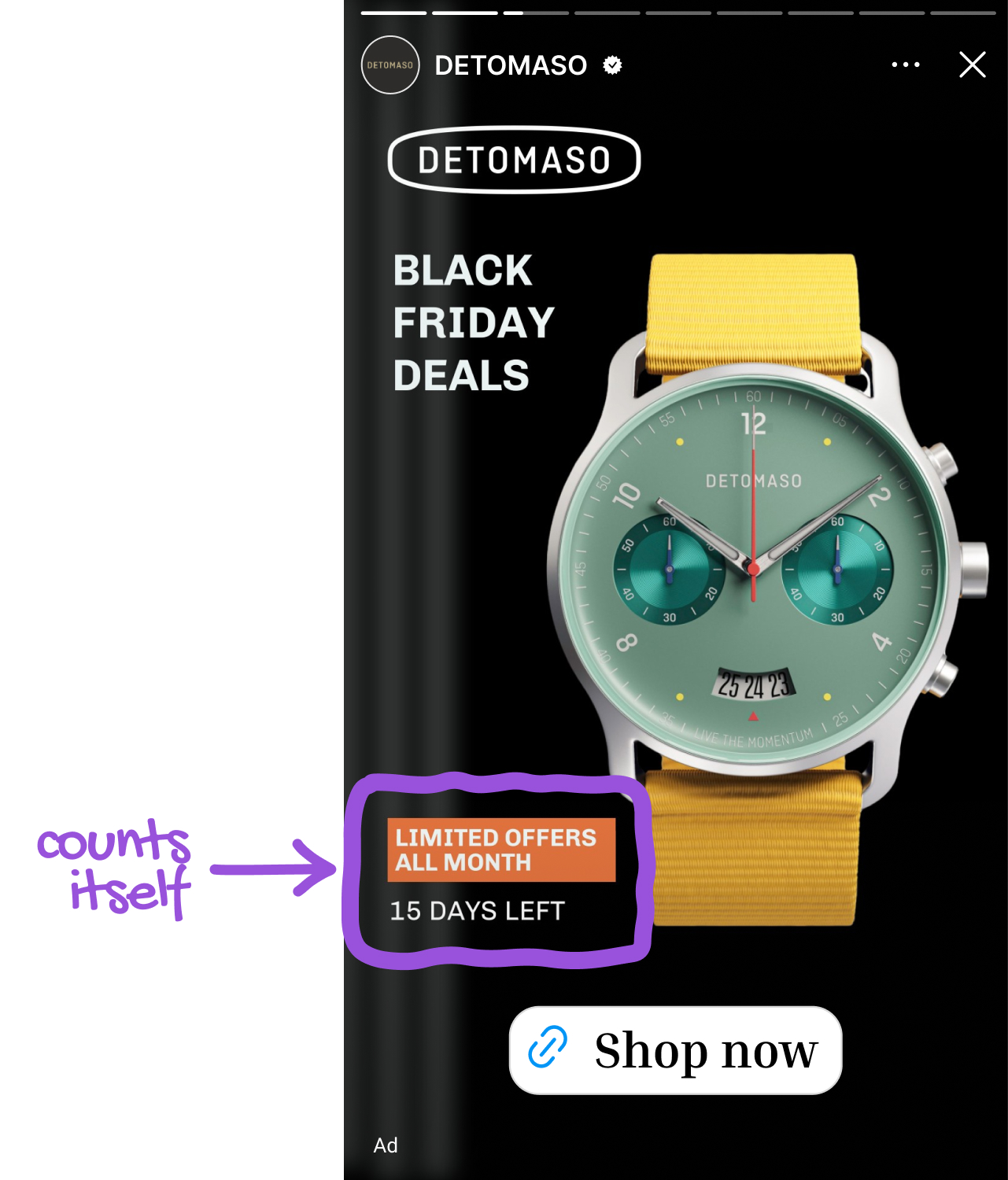
Under the orange "LIMITED OFFERS ALL MONTH" tag, DETOMASO shows "15 DAYS LEFT". The tag says what kind of offer this is, and the countdown says how long it lasts. The number is not typed in. The design changes automatically to reflect how many days is left. Because the design calculates the countdown itself, nobody at DETOMASO has to edit the creative each morning, and the shopper never meets a stale deadline.
A specific number is clearer than a vague "ends soon": shoppers know exactly how long the offer runs and can plan their purchase. Because the design updates the countdown itself, the date shown is always correct. This also fits the higher conversion rate: shoppers who clicked knew what they were getting and until when.
Design one card and let the product feed fill it with every colourway
DETOMASO did not make a separate creative for each watch. It built one card, with the black background, the pill logo, the headline, the orange tag and the countdown all fixed, and let the product feed supply the watch. Out come the turquoise chronograph, the purple dial, the navy watch on an orange strap, the sage face on mesh and on a yellow strap, the blue watch on red, each one a finished-looking ad. The same system runs in 1:1 for the feed and in 9:16 for Stories, with the same six watches in both.
If you love purple, swiping the carousel brings you to your watch. Each card feels like a poster made for that one product, and you never see a template.
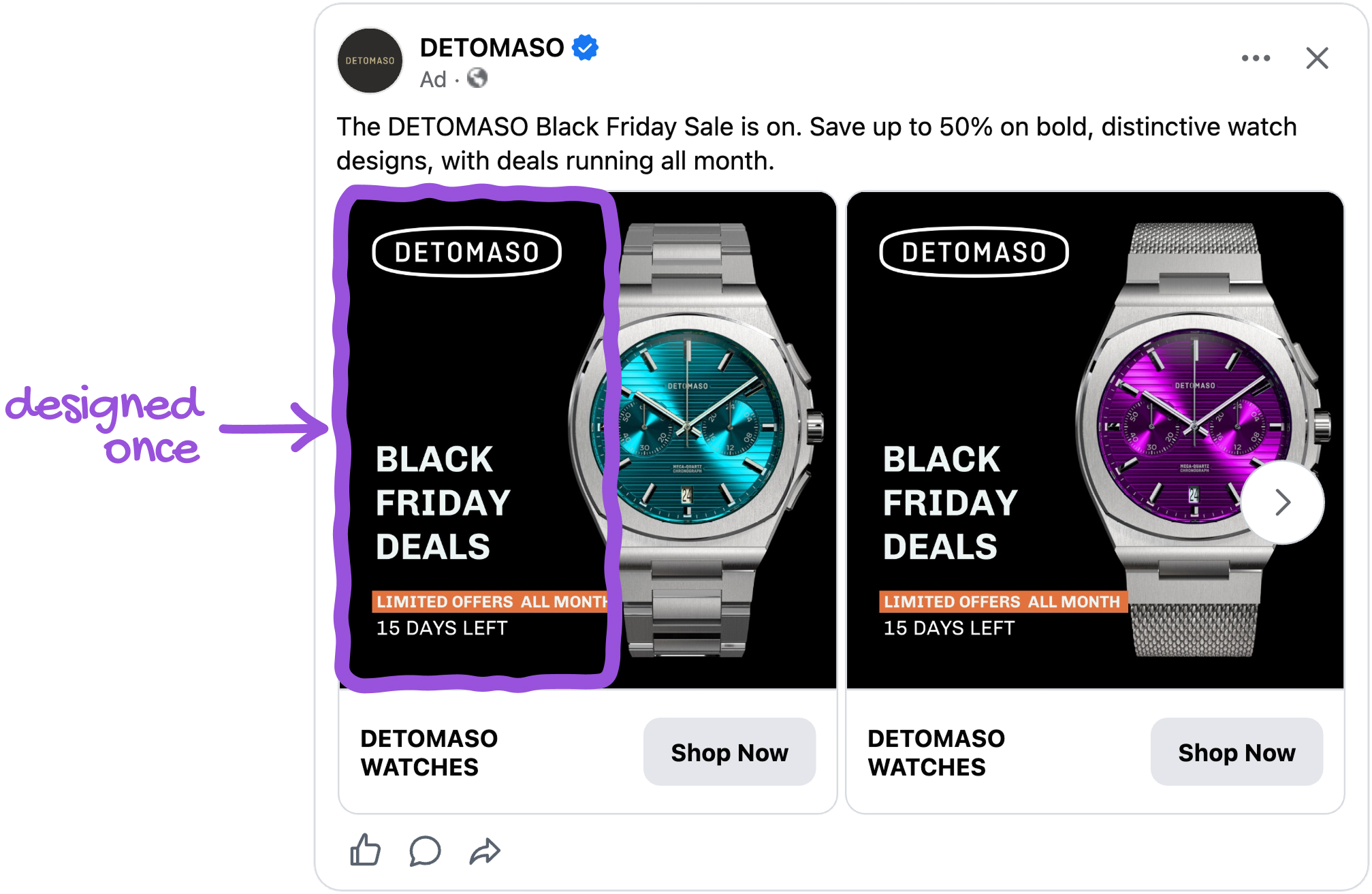
This is the Gestalt law of similarity: elements that share features are read as one group. Because everything except the watch stays constant, the eye reads every card as part of one family and compares watches rather than layouts. It also shows why variety drives results. The more colourways a card can show, the more chances a shopper has to find the one that fits them. With a data source feeding the design, every new colourway DETOMASO adds to its catalog becomes a finished ad the moment it enters the feed.
Make your brand the one people remember in a month of Black Friday ads
DETOMASO puts its name on every card several times without crowding the design. There is the outlined pill logo in the top left, the name printed on the dial of the watch itself, and "DETOMASO WATCHES" in the footer beside Shop Now, plus the profile name and the primary text above the card. The pill shape, the black field and the single orange tag together form a look that is easy to recognise.
By the third week of Black Friday, your feed is full of sale banners that look alike. Then the black card with the outlined pill appears, and you know whose it is before you have read the name.
This is what Romaniuk and Sharp of the Ehrenberg-Bass Institute call distinctive brand assets: the colours, shapes and logos that people link to a brand, which make it easy to notice and easy to remember when they come into the market. Black Friday brings many buyers into the market at once, so that is exactly when being recognisable pays off most. DETOMASO built its ad so that the brand stays remembered long after the sale ends.
Key takeaways
The idea running through DETOMASO's ad is simple: let the product shine, let the clock decide, and keep the brand easy to recognise.
👉 Let the product be the only colour on the card
DETOMASO's black field means every dial glows and nothing competes with it. Keep the background neutral, limit the accent to one tag colour that sits opposite your product colours, and let the product carry the colour.
👉 Show a deadline that counts itself
A specific number such as "15 days left" is clearer than "ends soon". Pair it with a tag that says what the offer is, and let the design calculate it so the deadline is always true.
👉 Design one card and let the catalog make the variety
DETOMASO fixed everything around the watch and let the feed supply the rest. One template becomes a full range of finished ads, and every new product gets its own creative automatically.
👉 Put a few distinctive brand assets on every card
The pill logo, the black field, the orange tag and the name printed on the dial make DETOMASO recognisable in a feed full of Black Friday ads. Pick a small set of assets and repeat them on every card.
DETOMASO shows what a Catalog Ad can be when every element has a job: one watch, one clock and a brand you remember.