
hummel & Oui Oui
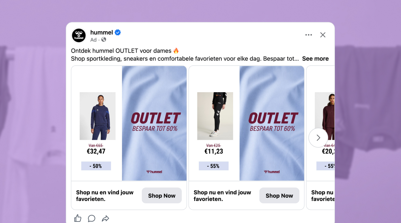
The ad: An outlet ad that gives the product one half of the card and the offer the other
hummel is one of the biggest sportswear brands in the world, with a history that stretches back to 1923. It kits out the Danish national team, and has a look you can recognize from across a room: the bee logo, the bold wordmark and the double chevrons running down the sleeve. A brand with that reach and that identity is a gift to a Catalog Ad, and hummel & Oui Oui have built a design around it.
The ad runs in hummel's broad-audience, all-products Catalog Ad campaign, as a row of swipeable product cards that point shoppers to hummel's shop with a simple promise: stylish and sporty. The featured design is the Primary design, the default every product in the catalog starts from, and it flexes for sale periods through design rules. The screenshots show it in its Outlet state, where the whole card is built around the outlet offer.
Every element earns its place: a product photo, the old and the new price, a discount badge, and a full-height OUTLET panel that says what the offer is.
Why it won Catalog Ad of the Week
Great design is nice to look at. But the reason hummel's outlet ad earned the feature is what it did to hummel's results, compared with hummel's other ads.
What stands out is that hummel's ad moved both ends of the funnel at once. Click-through rate climbed +32%, so more shoppers stopped for the ad, and conversion rate climbed +42%, so more of those shoppers went on to buy. Together they cut the cost of each purchase by -39% and lifted ROAS by +65%.
That combination is rarer than it sounds. A design built to grab attention often attracts curious clicks that convert less. hummel & Oui Oui avoided that trade-off because the thing that earns the click, a clear outlet offer with the saving in plain sight, is the same thing that prepares the purchase. The shopper who taps has already seen the product, the old price, the new price and the discount.
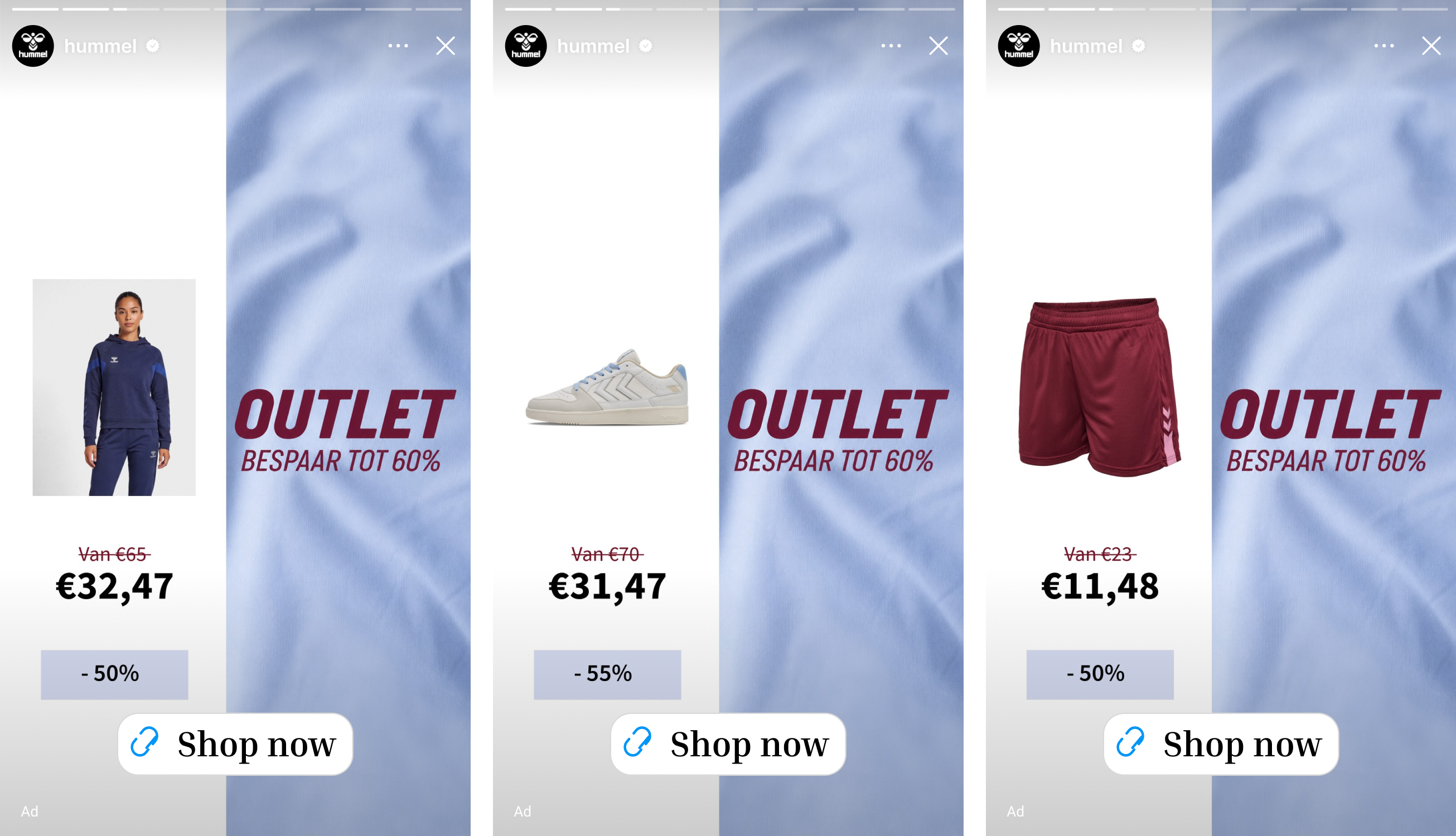
What makes this Catalog Ad great
Show the old price, the new price and the discount together on every outlet product, so the saving is obvious
Under the product photo, the left panel stacks three things. The old price is crossed out in hummel's maroon ("Van €65"), the new price sits below it in large bold black (€32,47), and a discount badge in pale lavender closes the stack (-50%). The saving is stated twice, as a price pair and as a percentage, so nobody has to do the maths.
In a feed of small, similar product shots, the boldest thing on the card is the number the shopper cares about. The badge also changes with the product, from -50% on one card to -60% on another, so each card shows the real deal on that item instead of one blanket claim. hummel & Oui Oui understood that on an outlet card, the price block is the product's headline.
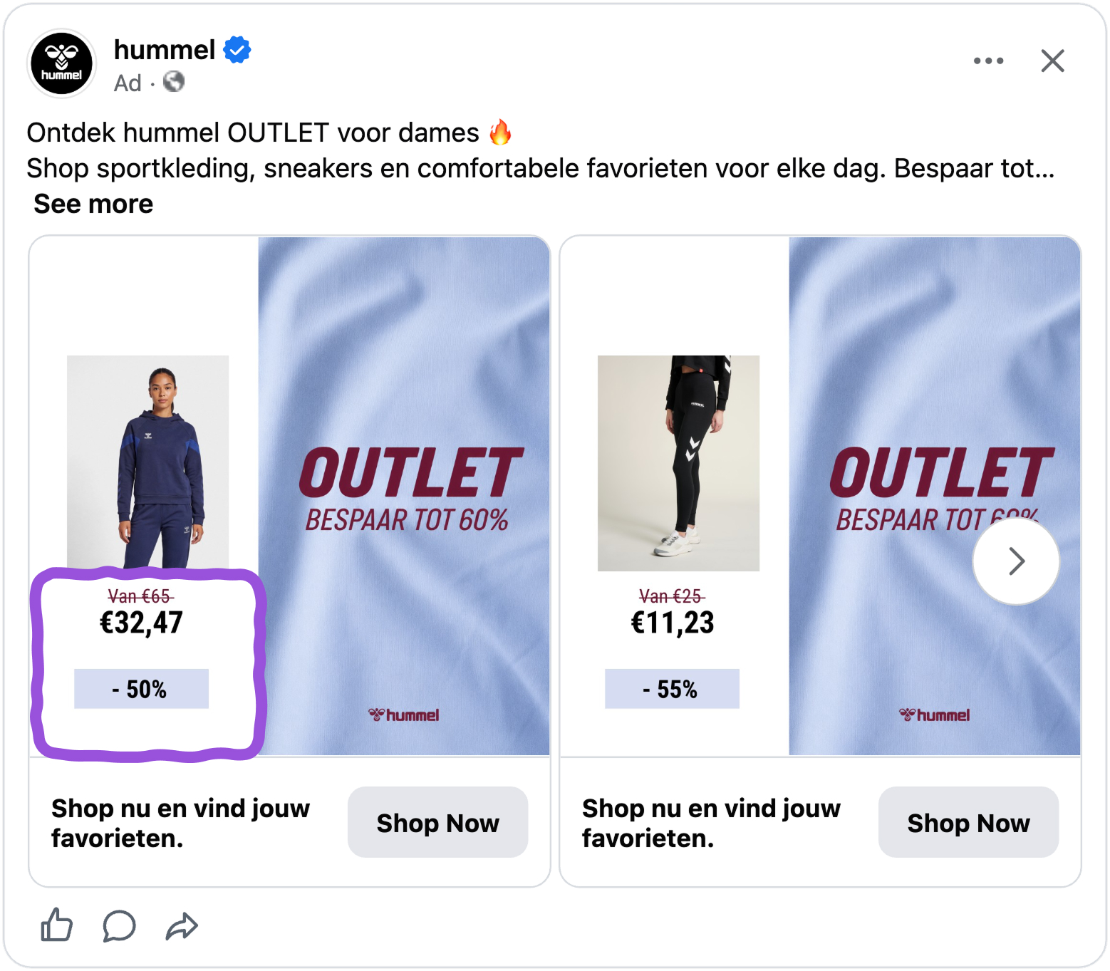
Two ideas explain the effect. The crossed-out price sets a reference point (anchoring, Tversky and Kahneman), so the new price reads as a gain against it, and the percentage badge frames the saving in a form that is quick to compare from card to card. Showing the final price also qualifies the click, because the shoppers who tap have already accepted what the product costs. That is a strong match for the -39% cost per purchase.
Give the OUTLET offer its own panel, so the product photo can stay simple
Every hummel card is split in two, and each half has one job. The left panel is for the product: a model photo, the price and the saving. The right panel is for the offer. On a soft blue fabric background, "OUTLET" runs in large italic maroon, with "Bespaar tot 60%" (save up to 60%) beneath it and the hummel bee logo at the bottom. The right panel is identical on every card, whichever product sits next to it.
For the shopper, the right panel does the framing. Before they have judged the hoodie or the leggings, they already know this is the outlet and that the deals go up to 60%. The product panel then only has to show the product and the price. And because the offer panel never changes, the shopper has learned the pattern by the second card.
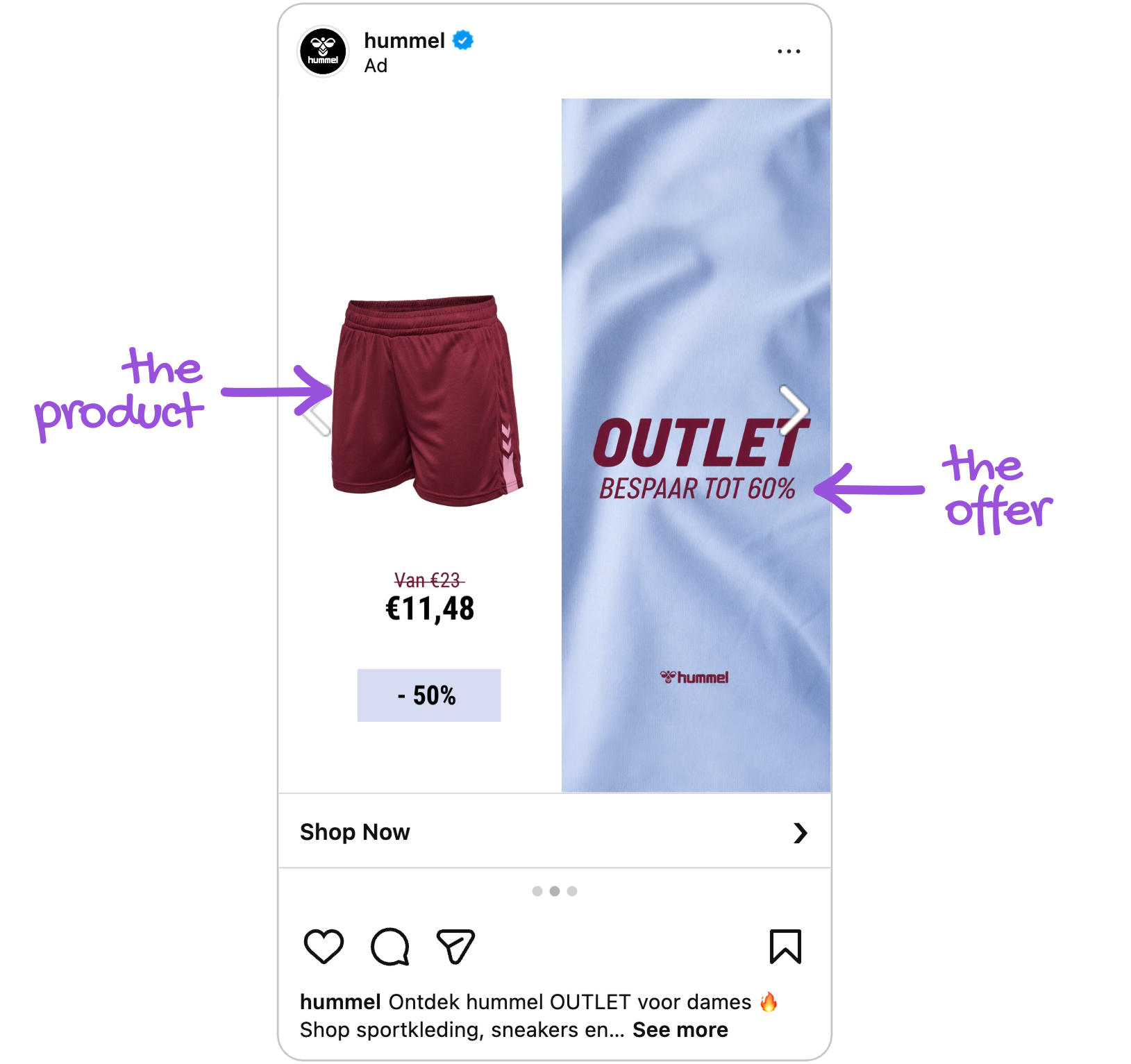
This is the Von Restorff effect: a tall pale-blue panel with dark maroon type is the one element that differs from the white, photo-led cards around it, so it is the one that gets noticed. Dark maroon on pale blue is also high contrast, which makes the words readable at a glance. The maroon and the bee logo repeat on every card, and these are the kind of distinctive brand assets (Romaniuk and Sharp) that build recognition with each scroll. Together they are a good explanation for the +32% click-through rate.
Let the product data fill the card, so every outlet product gets the right offer
Everything that changes from card to card comes from hummel's product feed: the photo, the old price, the new price and the discount percentage. The Primary design reads those fields and fills the card, and sale status decides which layout shows. All of it lives inside one ad, across more than 9,600 products, so every item in the catalog lands on a correct card without anyone building it by hand.
For the shopper, the result is a carousel in which a hoodie is followed by leggings and then a pair of shorts, and each card carries its own price and its own discount. Nothing is stretched, empty or mismatched.
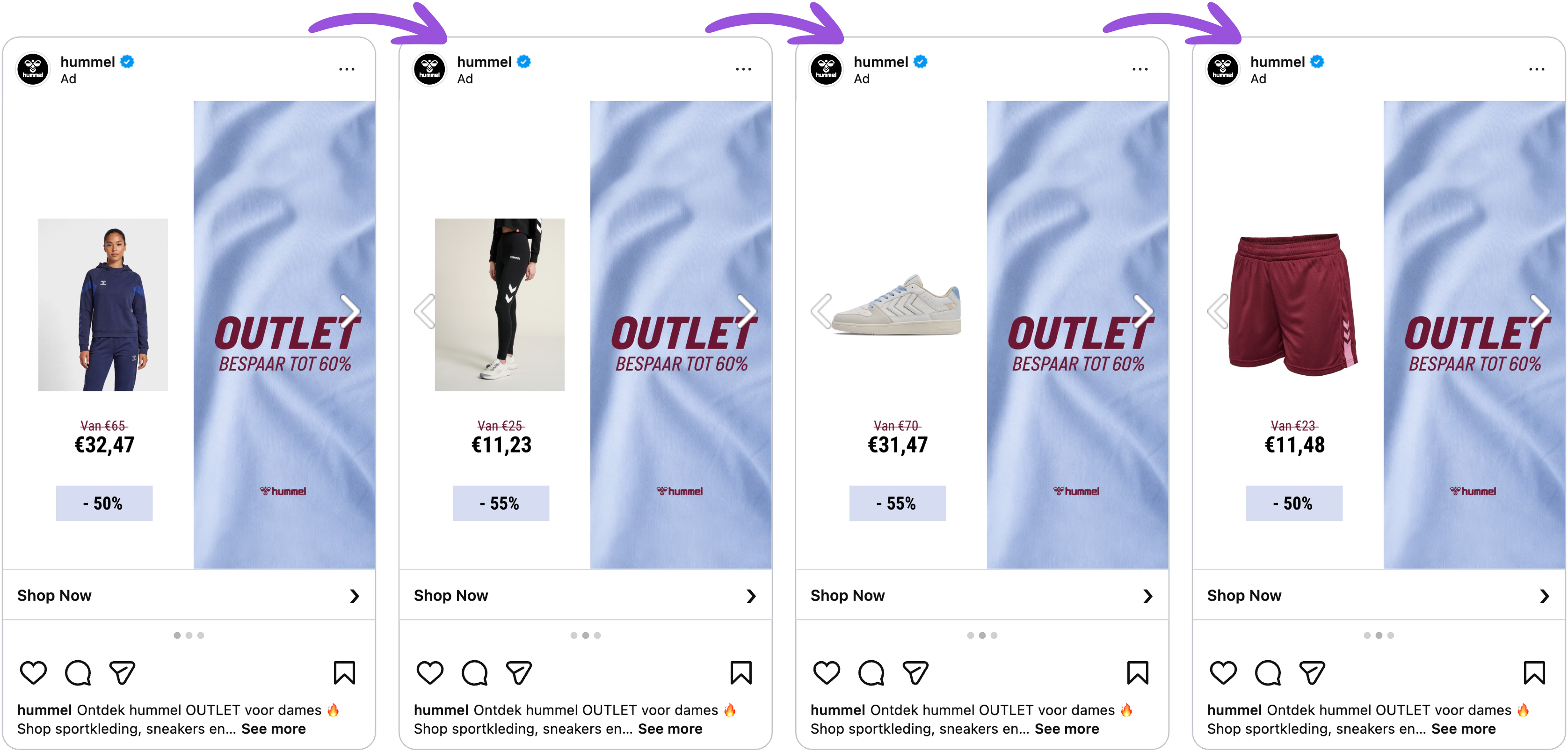
When every card works the same way, the shopper reads each new one faster, which is processing fluency (Reber, Schwarz and Winkielman): layouts that are easy to read feel more trustworthy. These aren't handcrafted creatives. The design rules read hummel's own product data and fill each card automatically, meaning hummel runs one purpose-built layout at catalog scale, with zero manual design per product.
Key takeaways
One idea runs through hummel's ad: give the product one half of the card and the outlet offer the other, and let everything else on the card be exactly as simple as it needs to be. The result is an ad that wins attention and then keeps it, with +65% ROAS to show for it.
👉 Show the old price, the new price and the discount together on every outlet product
hummel stacked a crossed-out price, a bold new price and a percentage badge, so the shopper sees the whole deal at a glance. Give every outlet card all three, and let the discount change with the product.
👉 Give the OUTLET offer its own panel next to the product
One side shows the product, the other says it is the outlet and how big the saving goes. Keep the offer panel identical on every card, and the shopper learns the pattern in a swipe.
👉 Let your product data fill the card
Photo, old price, new price and discount percentage all come from the feed. Make sure those fields are in your feed, and the whole catalog looks purpose-built.