
Aligne
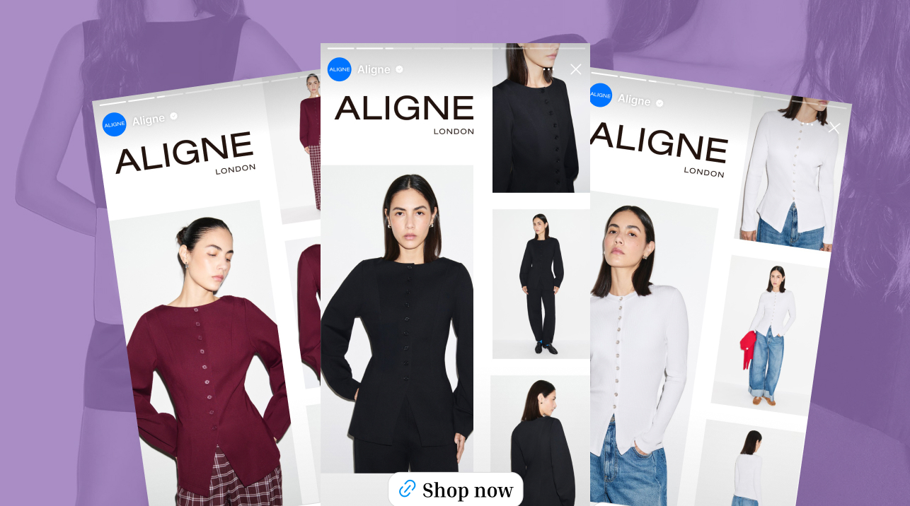
The ad: An ad that lets you see the piece move before you click
Aligne is a contemporary womenswear label designed in East London, built around easy-to-wear cuts for any occasion, from statement to smart attire. That promise is a lot to deliver in the second or two a shopper gives an ad while scrolling, and it is exactly what Aligne's Catalog Ad sets out to do.
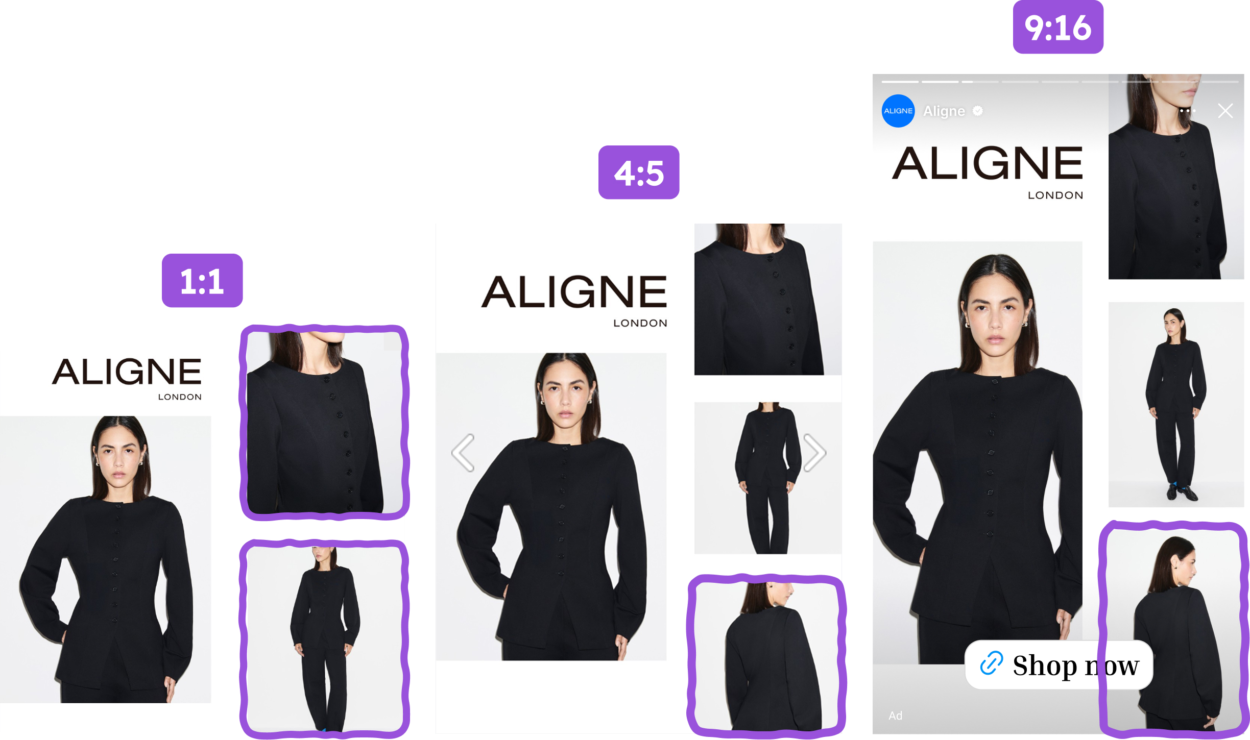
Aligne's new-season message is easy-to-wear fresh cuts for any occasion, from statement to smart attire, and this design is how that message meets the scroll. Aligne also designs for the format, not just the feed: the square card shows three pictures of each product, and the taller 4:5 and 9:16 placements, with more room to work with, show four.
Every element earns its place: a brand block that sets the tone, a spread of photographs that each answer a different question, and a card with nothing on it that the shopper has to decode.
Why it won Catalog Ad of the Week
Great design is nice to look at. But the reason Aligne's multi-angle design earned the feature is what it did to Aligne's results, compared with Aligne's other ads.
The shape of those numbers is the interesting part. Click-through rate (CTR) held in line with Aligne's other ads at +1%, so the design did not need to win extra clicks. What it changed was everything after the click: shoppers converted +38% more often and spent +49% more per order, which adds up to +63% ROAS. A lift like that is what happens when a brand answers the biggest question of online fashion shopping (will this look and move the way I imagine?) before the click instead of after it.
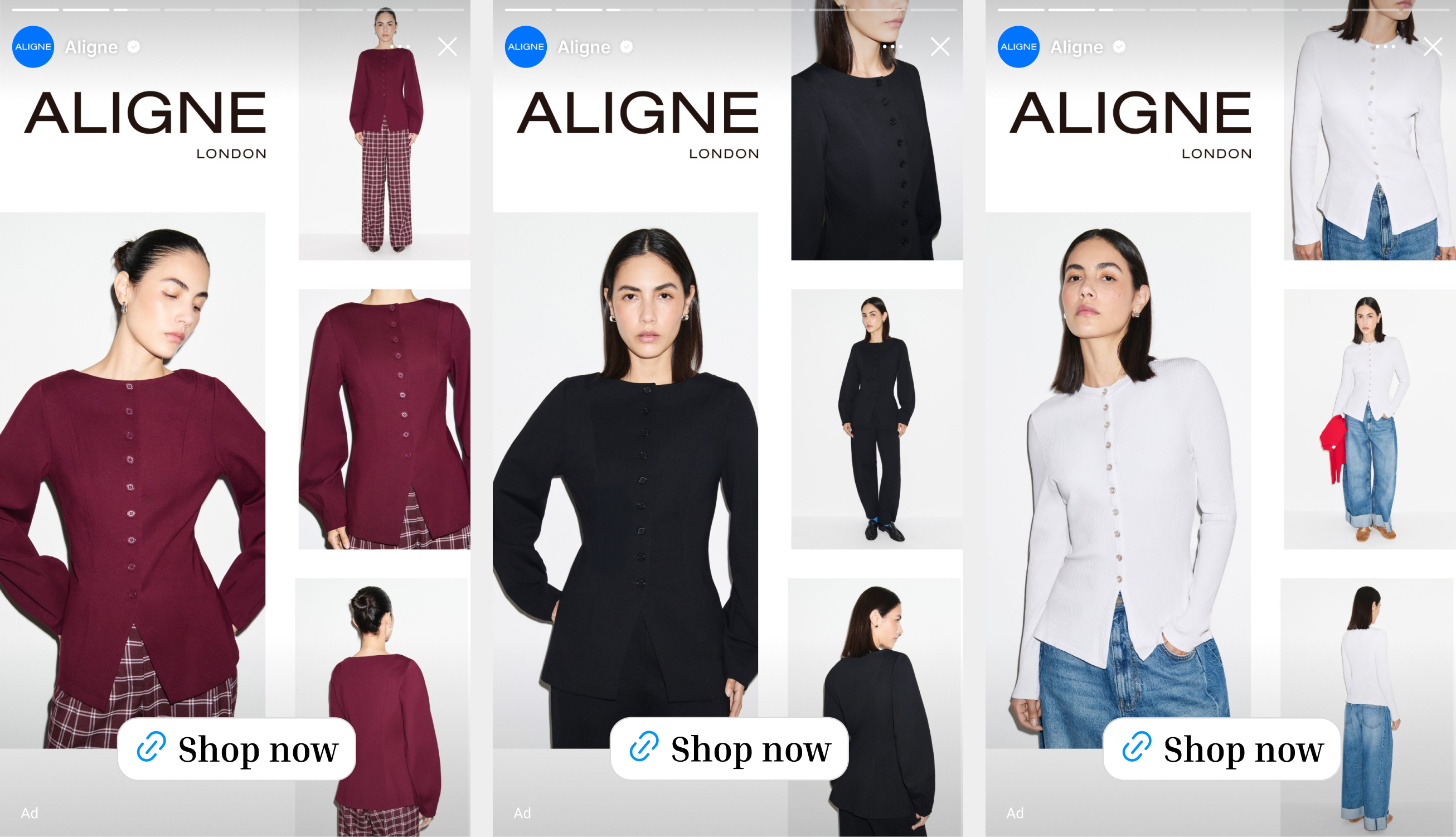
That is the quiet strength of Aligne's approach. Shoppers who tap this ad have already seen the garment from the front, up close and from more than one angle. They arrive on Aligne's product page already knowing how the piece looks and moves.
What makes this Catalog Ad great
Show the same piece from several angles, and use the bigger formats to show even more
Aligne gives every product a spread of photographs in one frame. In the square feed that is three: a large hero shot and two more pictures that change with the product, such as a close-up of the buttons and fabric, a full-length view or a side view. In the taller 4:5 and 9:16 placements, Aligne uses the extra room to show the shopper a fourth picture, treating the bigger formats as a chance to show even more of the piece. On the white ribbed cardigan in the design, that means a close-up of the buttons and rib texture and a full-length look styled with wide-leg jeans in the square feed, with the back view added in the taller formats. The burgundy button-front top works the same way: the front on the hero, the fabric up close, a full-length look with plaid trousers, and the back. Aligne recognized that the main reason a shopper hesitates on a garment is not the price. It is uncertainty about how the piece will look and move.
Put yourself in the scroll. A white ribbed cardigan stops you. In a single glance you can see the ribbed texture, how the pearl buttons sit, and how the cardigan falls over a pair of wide-leg jeans. Questions you would normally answer by opening the product page, swiping through a gallery and imagining the rest are already settled.
This is product diagnosticity at work (Jiang and Benbasat). Online, fashion shoppers cannot touch fabric or try on a fit, a gap which researchers call "need for touch" (Peck and Childers). The more attributes a shopper can judge from the images, the less uncertain they feel and the more willing they are to buy. Aligne's multi-angle spread raises diagnosticity without adding a single word, and each extra picture in the bigger formats gives the shopper another attribute to judge. The full-length shot adds mental simulation on top: seeing the piece worn and styled with jeans or trousers makes it easy to picture wearing it and supports the mental try-on that drives purchase intent. It is no surprise that conversion rate climbed +38%.
Frame it like an editorial spread so the brand leads and the eye follows a clear path
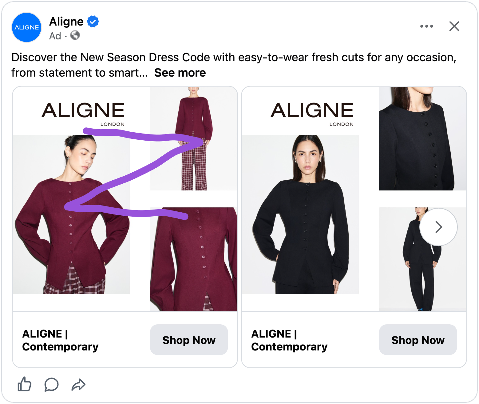
Aligne opens the card with a large ALIGNE LONDON wordmark on clean white space, then arranges the images asymmetrically: one tall hero on the left, two smaller images stepping down the right (three in 4:5 and 9:16), each separated by room to breathe. Nothing is crowded and nothing is competing with the brand block.
For the shopper, it does not feel like an ad. It feels like a page from a lookbook. You know whose it is before you have registered the clothes, and your eye travels a Z: from the brand at the top left, across to the first picture on the right, down the diagonal to the hero, and out to the last picture at the bottom right. That is Gutenberg's Principle doing its job, with Aligne placing the brand in the strongest starting position.
The white space is doing semiotic work too. Research on advertising (Pracejus, Olsen and O'Guinn) found that generous empty space reads as luxury and exclusivity. And because the same wordmark, with LONDON beneath it, appears on every card and echoes the line "womenswear designed in London" in the ad text, Aligne's name becomes a distinctive brand asset (Romaniuk and Sharp) that shoppers learn to recognize at a glance. A premium frame also fits the +49% AOV: a lookbook invites browsing the range, not just one piece.
Leave the price off the card and let the garment make the case
Aligne's design carries no price tag and no product name. It is the Aligne brand block, the photographs, and nothing else. Aligne saves the price for the product page, where it sits next to fabric, fit and reviews, and lets the imagery do all the persuading at the scroll stage.
For the shopper, that changes the question. You are not doing sums while you scroll. You are asking one thing: do I love this? By the time a price appears, you have already been picturing yourself wearing it, so the number is weighed against how much you want it, not against the rest of your month.
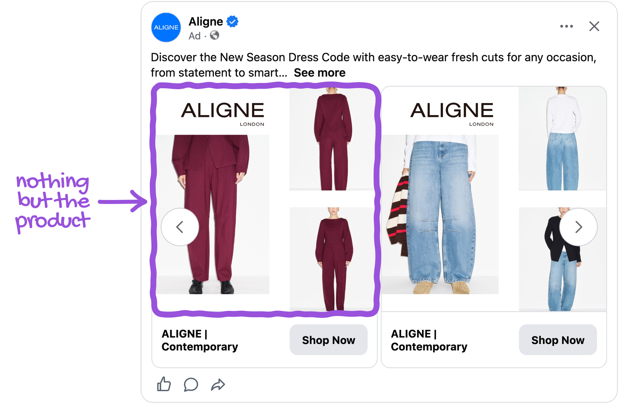
Behavioral economics calls the alternative the pain of paying (Prelec and Loewenstein): a visible price triggers a small sense of loss that competes with the pleasure of wanting. By keeping the price out of the frame, Aligne lets desire form first. The effect shows up in the basket, where shoppers spent +49% more per order than on Aligne's other ads. It is also a quiet statement of confidence: a label that trusts its clothes to speak for themselves.
Let the product feed build a multi-image spread for every product
None of Aligne's cards is hand-built. Each one pulls its images from the photography Aligne already shoots for every product, so each of the 182 products in this ad gets its own spread automatically. Whether you are looking at a burgundy button-front top, a black blazer or a white ribbed cardigan, the card feels made for that piece, and you never meet a stretched or half-empty template.
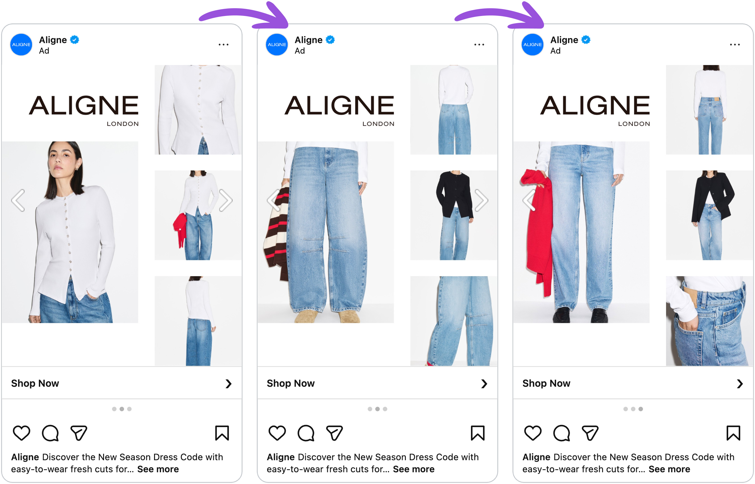
These aren't handcrafted creatives. The images are pulled from Aligne's product feed and arranged by the design in 1:1, 4:5 and 9:16, with a fourth picture added in the taller formats, meaning Aligne is running a lookbook-style layout across the whole range with zero manual design per product. That matters more than it first appears. In the long tail of a catalog (Anderson), the depth of the range is only an asset if every item can be shown properly. A hand-designed ad can feature a handful of bestsellers. A feed-driven design makes the thousandth-ranked product look as considered as the first.
Key takeaways
One idea runs through Aligne's whole ad: let the shopper do the deciding inside the ad. Aligne turned a scroll-by into a short, confident try-on, and the +63% ROAS shows how much that is worth.
👉 Show several views of the same product, and add more in the bigger formats
Aligne paired a hero shot with two more views of the same product, such as a close-up and a full-length shot, then used the bigger 4:5 and 9:16 formats to add a fourth picture, so shoppers could judge the garment even better before clicking. Look at the question your customers ask most about your products, and give it its own image in the frame.
👉 Lead with your brand and give the images room to breathe
A large wordmark block, clear white space and a Z-shaped path made Aligne's card feel like a lookbook, not a template. Place your brand where the eye starts, and let the photography follow in order of importance.
👉 Keep the price off the card when desire should come first
Aligne let the clothes persuade at the scroll stage and showed the price in context on the product page, with +49% AOV as the result. For considered purchases, test a version where the image earns the want before the number appears.
👉 Build the layout from your feed so every product gets the same care
Aligne's multi-image spread assembles itself from the photography already in the feed, growing from three pictures in the square to four in 4:5 and 9:16. Design the system once, and the whole catalog looks as considered as the bestsellers.