
Beaverbrooks & Glass Atlas
August 12, 2026
Creators
Natalie Archer
Stephanie Birch
Emma Cook
Udara Wickramarathne
Sally Morgan
Peju Akinade
Olivia Haigh
Sam Harvey
Platform
Meta
Design tool
Confect.io
The ad: The Catalog Ad that turns a jewellery sale into a reason to spend more
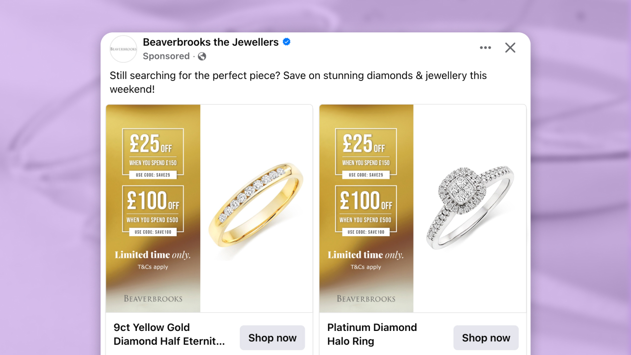
The first thing you notice is the gold. A warm, rich gradient running down the left side of every card, carrying the discount tier, the saving, and a coupon code. Before you have looked at a single ring, you already know there is a deal on the table - and that it gets better the more you spend.
This is a Catalog Ad from Beaverbrooks, one of the UK's most established jewellery retailers, built by Beaverbrooks and Glass Atlas for a tiered promotional campaign. The offer is structured around spend thresholds: the higher the basket, the bigger the percentage saved.
It is the kind of mechanic that usually lives on a landing page or in an email. Beaverbrooks and Glass Atlas put it inside the Catalog Ad itself - and designed everything around making that logic land immediately.
Across the catalogue, every card follows the same structure. The ring sits isolated on a clean background, large and uncluttered. The gold information panel anchors the left side. The price shows both the saving and the original figure.
Some cards carry a "Limited Time Only" label alongside a coupon code. One tells you the deal is real and claimable, the other tells you it will not be there tomorrow. Together they make the offer feel like something you need to act on now.
Why it won Catalog Ad of the Week
Beaverbrooks is a considered purchase. Nobody buys a diamond ring mid-scroll. Every shopper who sees this ad already has some version of the question: is now the right moment?
Beaverbrooks and Glass Atlas built the campaign around that. The tiered offer is not a discount mechanism dropped on top of a Catalog Ad. It is the reason the format was the right choice in the first place.
Because Catalog Ads let buyers browse an entire range before they commit, the "spend more, save more" structure has somewhere to go. The more cards a shopper moves through, the closer they get to the next threshold - and the stronger the pull to keep going.
The result is a campaign that feels premium, actionable, and built to drive higher-value purchases. Bold savings, a clear coupon code, and a hard deadline - all inside a single design system that never looks like a clearance sale.
A +31% lift in Return on Ad Spend does not happen by accident in a category this considered.
.png)
It is the result of an offer structure, a format choice, and a design system that all point in the same direction: make it easy for a shopper who is already interested to spend a little more than they planned.
What makes this Catalog Ad great
A tiered offer built for how Catalog Ads are actually consumed
A "spend more, save more" offer makes most sense when the buyer can see what else is available before they commit. That is precisely what a Catalog Ad enables.
You are scrolling through your feed and an offer catches your eye. The discount tier on the first ring is good. The next card shows something you like even more, and the offer is still right there on the panel. A third card. A fourth. You are building a mental basket before you have left the platform.
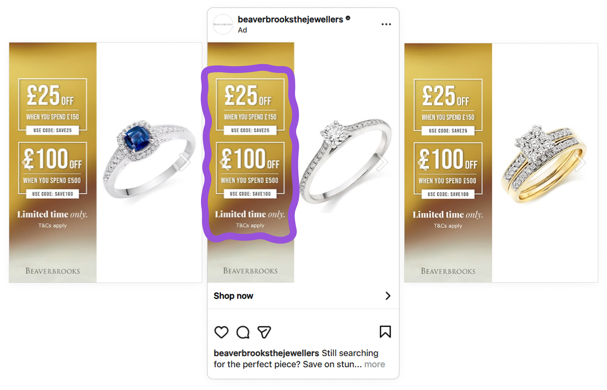
That is a behavior the Catalog Ad format is uniquely built for. On a static image ad, the viewer sees one product and one offer, then has to go to the website to see more. In a Catalog Ad, the offer creates pull - and the format gives that pull somewhere to go.
It is also worth noting that Beaverbrooks can set an automatic design swap when the promotion ends. The moment the campaign closes, the ads revert to their regular creative. No manual update needed.
The gold panel: premium design carrying a promotional message
The gold gradient panel running down the left side of every card holds three things: the discount percentage, the exact saving against the regular price, and a coupon code.
In jewellery advertising, the risk with a sales campaign is that the promotion undercuts the premium feel. A red starburst and a bold percentage would do the job - but at the cost of everything Beaverbrooks has built around quality and occasion.
Beaverbrooks and Glass Atlas resolved this by placing every piece of commercial information inside a gold panel. The offer reads as premium. The deal feels like a privilege rather than a clearance.
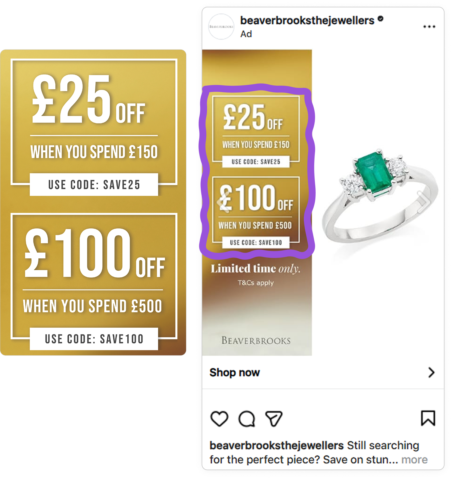
The coupon code and the "Limited Time Only" label work as a pair. The code gives the buyer a clear way to claim the reward. The deadline removes the option to wait. Together they answer both questions a considered shopper has: how do I get this, and do I need to decide now.
A 9:16 format designed for the placement, not adapted to it
The campaign includes 9:16 format ads built for Stories and Reels. This matters more than it looks.
Most brands design a square Catalog Ad and let Meta resize it for other placements. On a 9:16 Stories placement, that usually means logos cropped at the edge, prices sliding behind the platform UI, and product shots losing their composition. The ad technically runs - it just does not work.
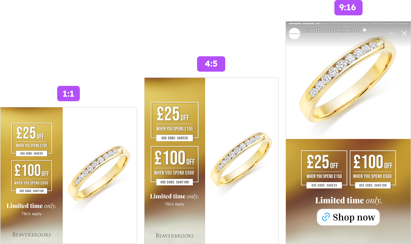
Beaverbrooks's 9:16 format keeps the same gold panel and offer structure, but the ring gets more vertical room to fill the frame. For jewellery specifically, that space makes a difference. A diamond solitaire at the wrong size in the wrong crop is nothing. Given the full height of a Stories frame, it becomes the only thing on screen.
.png)
The same design system carries across every format without losing anything. Gold panel, coupon code, Limited Time Only label - all of it intact. That consistency means every placement reinforces the same message, whether the buyer sees it in the feed or in Stories.
Stories and Reels ads do not compete with other content for attention - they are the only thing visible. A time-limited offer with a coupon code, in a full-screen format, to a buyer who has already seen the ring in the feed - that is a well-placed second touchpoint.
Key Takeaways
Every decision in this campaign points toward the same thing: make the offer as easy to act on as the product is easy to want. Here is what Beaverbrooks and Glass Atlas got right.
👉 Match your offer mechanic to what the format enables
A tiered "spend more, save more" structure belongs in a Catalog Ad because the format lets buyers browse the whole catalogue before they commit. The offer creates pull - the format gives it somewhere to go. No other ad format builds that basket before the buyer reaches the site.
👉 Let the design carry the promotion without cheapening the brand
In premium categories, where you place the offer matters as much as the offer itself. A gold panel keeps the discount feeling like a privilege. A coupon code makes it actionable. A deadline makes it urgent.
👉 Build for the placement from the start
A 9:16 Stories ad built for that format will always outperform a cropped square. Design for how each placement is actually consumed, and keep critical information inside the safe zones.