Text in your Black Month lead generation ads
October 6, 2022
Great persuasion is essential when getting people to sign up for your newsletter.
People are often bombarded with emails and ads, but this can be particularly prevalent during Black Month. In this circumstance, text is an effective way to convey a message and persuade people.
However, when designing an ad, it is common to minimize the amount of text to make the image or video more aesthetically pleasing.
So, how can you effectively use text when creating a lead generation ad during Black Month?
Keep reading to find out.
The more text you include the more leads will sign up
People often need a lot of persuasion and, therefore, a lot of text.
Including more text in your content increases people's likelihood of taking action. Content with a high amount of text performs 68% better than content with a low amount of text. By including a more in-depth description of your offer in a larger amount of text, you can more effectively convince to choose your offer.
On the other hand, having very little or no text in your content is the least effective approach. Using phrases like "WIN!" or leaving the message of your ad to the viewer's imagination is ineffective, as people don't have the time or incentive to try to guess what's in it for them.
It's important to be specific and communicate the value that you offer in your ad.
If your brand guidelines are strict and you are limited in the amount of text you can include, a medium amount of text is still 9% more effective than a low amount or no text.

There’s a big difference in which layouts that are most effective
The placement of text in your content is just as important as the amount of text you include.
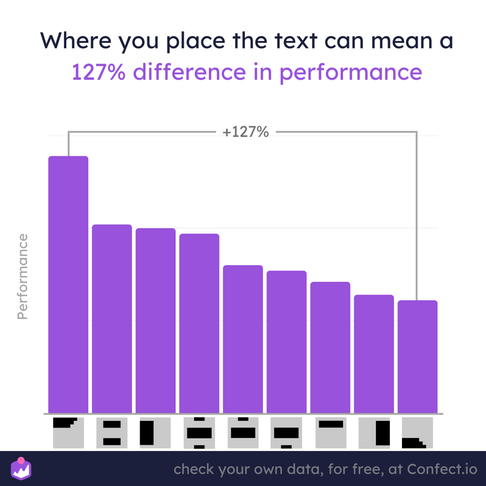
When we look at the data, we see the best layout performs 127% better than the worst text layout you can use.
When it comes to placement, it's most effective to have text in the top third or the left third of your content.
This fits with the primary optical area in the top left of a screen, which is the most effective placement for lead generation during black month.
On the other hand, the least effective text placements are in the right third or bottom third.
If you choose to place text in these areas, it's important to also have text in the top third. This follows the F and Z pattern of how people tend to scan content on a screen.

Here's a recap of best practices for using text in your Black Month lead generation ads.
People often need a lot of persuasion and, therefore, a lot of text. The more text you include, the more leads will sign up.
It's important to be specific and communicate the value that you offer in your ad. Leaving the message of your ad to the viewer's imagination is ineffective, as people need more time and incentive to try to guess what's in it for them.
When it comes to placement, it's most effective to have text in the top third or the left third of your content. The least effective text placements are in the right third or bottom third.
More to read
This article focuses purely on the text of Black Friday lead gen ads. Keep optimizing with the following insights:
- Why lead generation is smart during Black Month
- The most effective Lead Generation tactic during Black Month
- Should you show your logo in Lead generation ads during Black Month?
- Designing Black Friday lead generation ads
Data section
The dataset from this article is based on 37.6M impressions and 772 pieces of individual content on Meta (Facebook) platforms. It takes into account data from all countries and industries, with the campaign objective of Lead Generation. The period is from 1. November 2021 - 30. November 2021 (Black Month).
Numbers are looking at correlation only, not causation. Remember to check your own data: numbers for different brands, industries, and contexts will vary.
If you were intrigued about a specific insight, you can go in-depth into the various dimensions and how data can be segmented in Confect, here.
