Oddballs
September 15, 2025
The ad: The art of standing out using brand familiarity
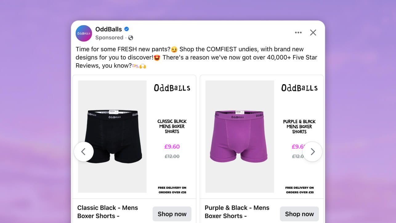
OddBalls’ Facebook and Instagram ads are great examples of how incorporating playfulness into your ads can make your target audience take you just as seriously. If your product offers value and comfort and you keep your branding consistent, your ads will build brand credibility (even if you’re different to your typical fashion brand).
This is the core message with which they lead, whether it’s by using big, bold words and phrases like “ultimate comfort” and “ultra comfy” or including social proof.
Why it won Catalog Ad of the week
OddBalls’ ads are picked to show the importance of testing various ad designs. Recognition and appeal are achieved by applying your branding consistently, and not through using the same template and channel over and over again.
Each ad leads with a strong value proposition to convert the attention into sales. In the case of OddBalls, they know that the comfort of their products is what appeals to their target audience.
What makes this Catalog Ad great
Applies branding consistently
The ad reinforces Oddballs’ bold and quirky personality through consistent visual branding. The logo is always visible at the top of each creative, ensuring instant recognition.
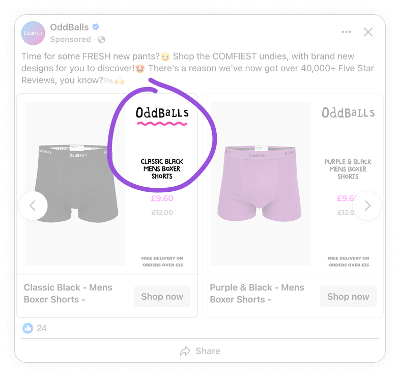
This is echoed by the typography choice that’s playful, but readable. Together the brand logo, playful font, and striking color combo build familiarity, strengthens brand recall, and make the ads unmistakably OddBalls in a crowded feed. The result is a cohesive look and feel that’s true to the brand’s signature style.
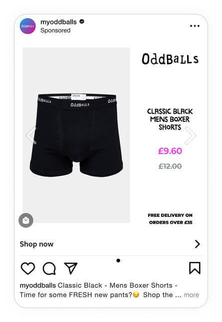
Uses color contrast to highlight value
Using eye-catching colors, OddBalls helps shoppers to spot sales instantly. Bright pink is used consistently for discounts, which works well as the rest of the ad sticks to monochrome tones. In addition to letting the sales price stand out, the bright pink discounts on clean white backgrounds also make the overall ad pop to stand out in feeds.
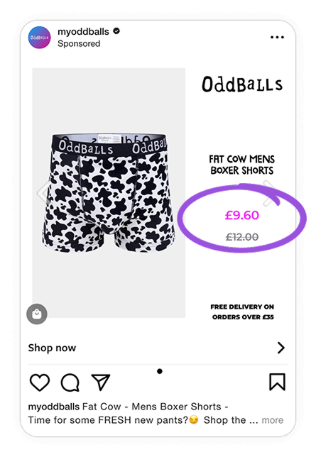
OddBalls then goes one step further to pair this visual contrast with price anchoring. The pink color makes the discount easy to spot by putting it above the original price. The fact that they opted for bright pink to advertise men’s underwear also works well to communicate their quirky brand identity. This way, the discount feels more significant and urgent as shoppers can easily compare prices at a glance.
The result is a dual effect. The ad draws the eye immediately and, at the same time, reinforces the sense of value to nudge users toward quicker purchase decisions.
Creates emotional appeal
OddBalls doesn’t simply rely on discounts to communicate value. Their ads also use social proof and lifestyle-driven messaging to communicate the value that their underwear offers.
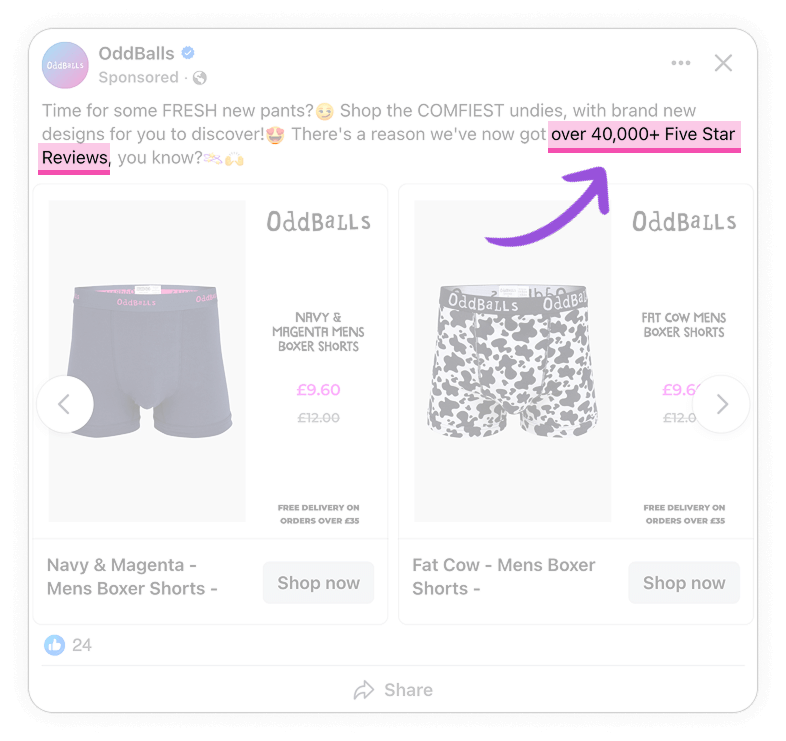
Over 40,000 five-star reviews prove that product is trusted and reliable, helping to reduce buyer hesitation. At the same time, it highlights that many customers have already chosen this product, which can create a sense of urgency for new buyers.
The fact that they use “comfiest” instead of “comfortable” to describe their product isn’t just a matter of using a shorter word to save space. Using casual phrasing like this along with emojis let the brand feel fun and relatable.
This way, they reassure their target audience with evidence of popularity while simultaneously triggering positive feelings of comfort. This makes their products feel both safe to buy and enjoyable to wear.
Beyond one winning design: Oddballs' testing mindset
While OddBalls have found a winning strategy, they still continue to test a lot of different elements. After all, your products aren’t going to be on sale all year round? If there’s no discounted price, which element are you going to highlight?
This second set of ads show how you can still communicate value without using sales or discounts. Here’s how they tailored their ad designs in a different campaign.
Keep the core message the same for different products
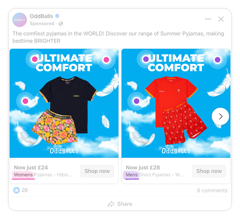
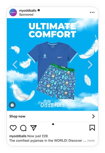
OddBalls keeps the visual theme consistent (for example, bright blue skies, feathers, and bold typography) to build recognition. At the same time, they adapt creatives to showcase different products like men’s pajamas, women’s pajamas, boxers, and bundles. This way, various customer segments are introduced to the same quirky brand known for its comfortable products.
Applies platform-specific variations
OddBalls isn’t afraid to test their ads across various formats like Facebook carousels, Instagram single-image ads and stories.
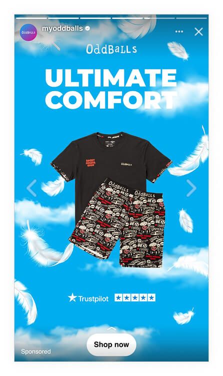
They effectively adapt their designs to look native on each platform. For example, Facebook carousels focus on variety, while stories include Trustpilot ratings so that they’re designed for immediacy.
Design tweaks with a purpose
OddBalls isn’t just running one strong creative. They are testing multiple variations at the same time to see what resonates best with different audiences.
For example, some ads emphasise comfort with floating feathers, while others rely on more text to communicate the same message. As they’re not changing the value proposition, but only the elements, they can more accurately pinpoint which design resonates better.
Key Takeaways
👉 Consistency builds recognition
OddBalls’ applies their brand logo and the same typography and colour palette to reinforce their branding. This consistent branding makes their ads instantly recognisable, strengthening recall in crowded feeds.
👉 Value is made visible
Clear, high-contrast price framing highlights discounts, creating urgency, and reinforcing perceived savings.
👉 Keep things social
Social proof (“40,000 five star reviews”) reduces hesitation, while playful, friendly messaging makes the brand feel approachable and fun.
👉 Testing drives performance
OddBalls doesn’t rely on only one creative. They test across products, formats, and messages, balancing consistency with experimentation.