Eventyrsport
September 1, 2025
The ad: Familiar layouts for new products
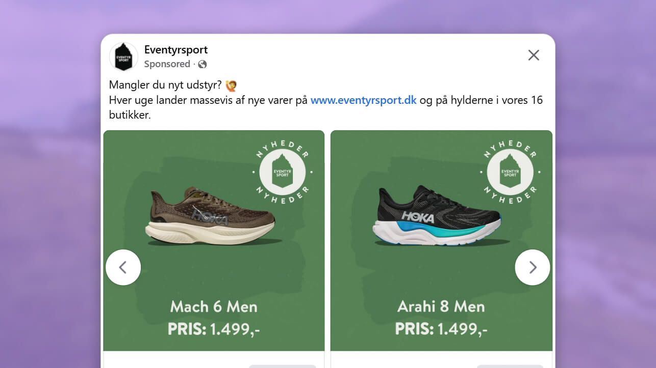
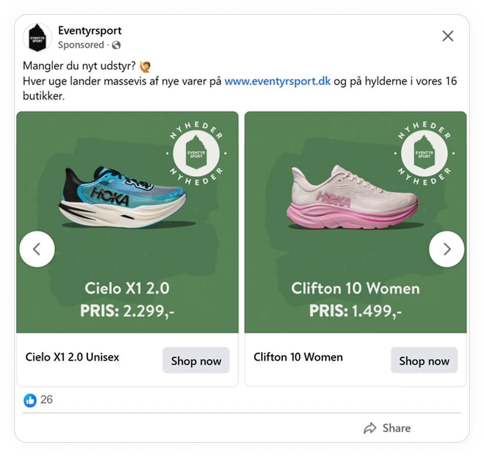
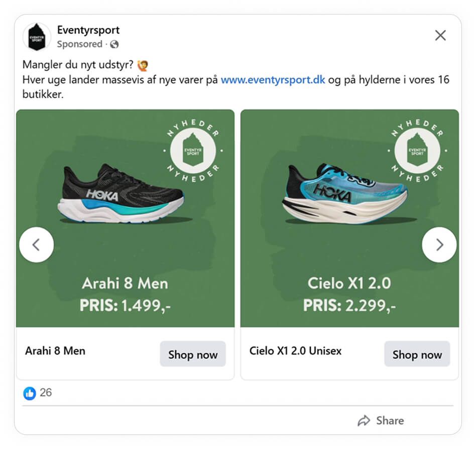
This ad campaign of Eventyrsport, a Danish multi-brand retailer selling outdoor gear, focuses on showcasing their wide range of running shoes using various ad formats. Facebook catalog ads are set up for product comparison, while static image ads on Instagram place specific shoes in the spotlight.
The golden thread among these ads, whether they’re on Facebook or Instagram is that they all use the same layout. It shows that even if you’re advertising new products, there’s no need to reinvent your layout.
Why it won Catalog Ad of the week
Eventyrsport’s ads are great examples of how you can combine familiarity with novelty. These ads show how design and psychological principles, like Gestalt laws, work hand in hand to create a cohesive ad experience that guides shoppers from comparison to conversion.
Across their campaign ads promoting their new products, they use the same green background and layout to create a consistent visual identity. Then, to prevent their target audience from getting the feeling that all the ads are the same, they include a “NYHEDER” (new item) badge in the top right corner.
The simplicity of the layout means that it’s easy for Eventyrsport to replicate their success. After all, why change your ad if it works?
What makes this Catalog Ad great
Applies Gestalt principles of proximity and simplicity
Minimalist design and consistent layout create simplicity that reduces cognitive load. Using the same plain green background ensures that the focus stays on the product. Then, each ad repeats the same structure (“new arrival” badge, shoe, brand/product name, and price) which helps shoppers to process the ad faster and move on to the decision-making stage.
These details are also grouped close together (proximity). This design choice organises information into a cluster so that users can perceive them as related information at a glance.
Builds visual hierarchy
This ad is a good example of how color choices and sizing can create a logical visual hierarchy to ensure shoppers notice the product first, followed by the price and then the “Shop now” call to action. All the elements (the product photo, price, and shoe name) stand out thanks to the contrast created. The white text used for the price and shoe name in particular creates a strong visual contrast against the green background.
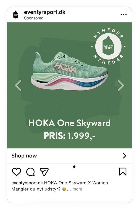
Then, to help ensure the shoe is the star of the ad and draws shoppers’ eye first, they use sizing and white space strategically. The shoe image is the largest element and the generous white space around it helps to make it stand out even further.
Leverages novelty and price anchoring
Consumers are naturally curious about new products. Eventyrsport taps into this by using the word “NYHEDER” (Danish for news or new arrivals) as a badge. Aside from stirring interest, it also plays into their fear that they might miss out on the “newness” if they don’t act fast.
What makes the way they’ve highlighted their new arrivals so effective is that they don’t fall into the trap of using a lot of text. In fact, we’ve found that ads featuring new products perform 59% better when they use little text. After all, the whole reason why ads highlighting new arrivals work is because it makes shoppers curious. If you add a lot of text, you run the risk of revealing too much.
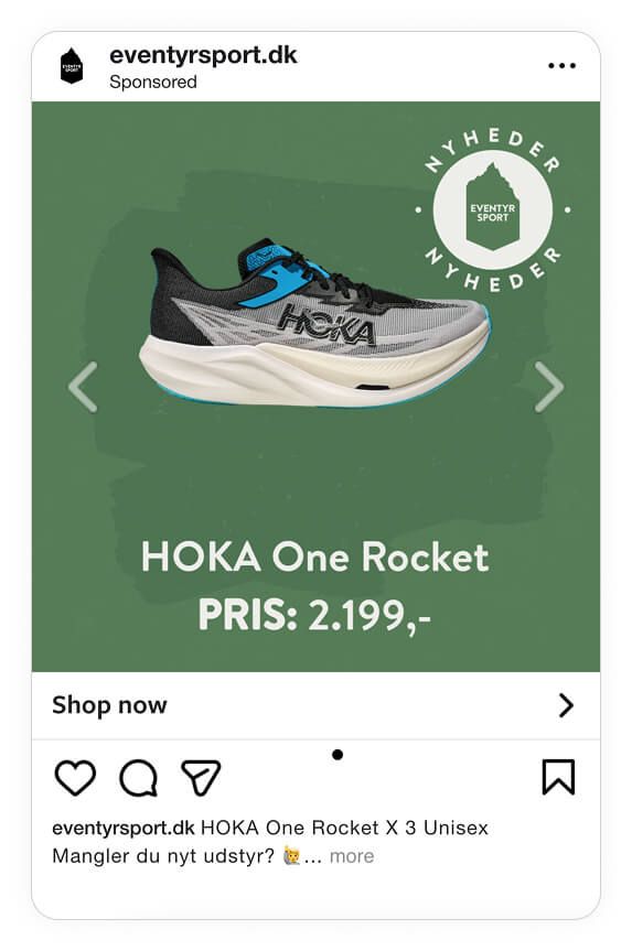
In this case, the price is the information that Eventyrsport focuses on. This is a clever choice as showing a clear, bold price upfront anchors the product in the consumers mind.
Using prices in catalog ads works especially well for multi-brand retailers like Eventyrsport as it also allows shoppers to compare products quickly. According to our data, multi-brand stores see an improvement of 56% in ROAS, more than double the increase brands and DTC companies can expect.
Key Takeaways
The Eventyrsport campaign is a strong example of how one product image can have a huge impact when you nail your layout.
Here’s what stood out:
👉Proximity and simplicity drive clarity
Clean backgrounds and tight grouping reduce distractions and make the ad effortless to process. Online shoppers can instantly connect the product to the price and brand without needing to “decode” the ad.
👉Contrast and hierarchy guide attention
The strong visual contrast (white on green) ensures that key info like the price stands out immediately. While the same contrasting colour scheme is applied to all the details, the clear order of information (product → price → CTA) guides shoppers so that it’s not a case of information overload.
👉Novelty and price anchoring increase persuasion
Highlighting “NYHEDER” (new arrivals) taps into curiosity and urgency, making people more likely to explore. Plus, by displaying the price upfront, their exploration won’t uncover hidden surprises.