
Danish Endurance
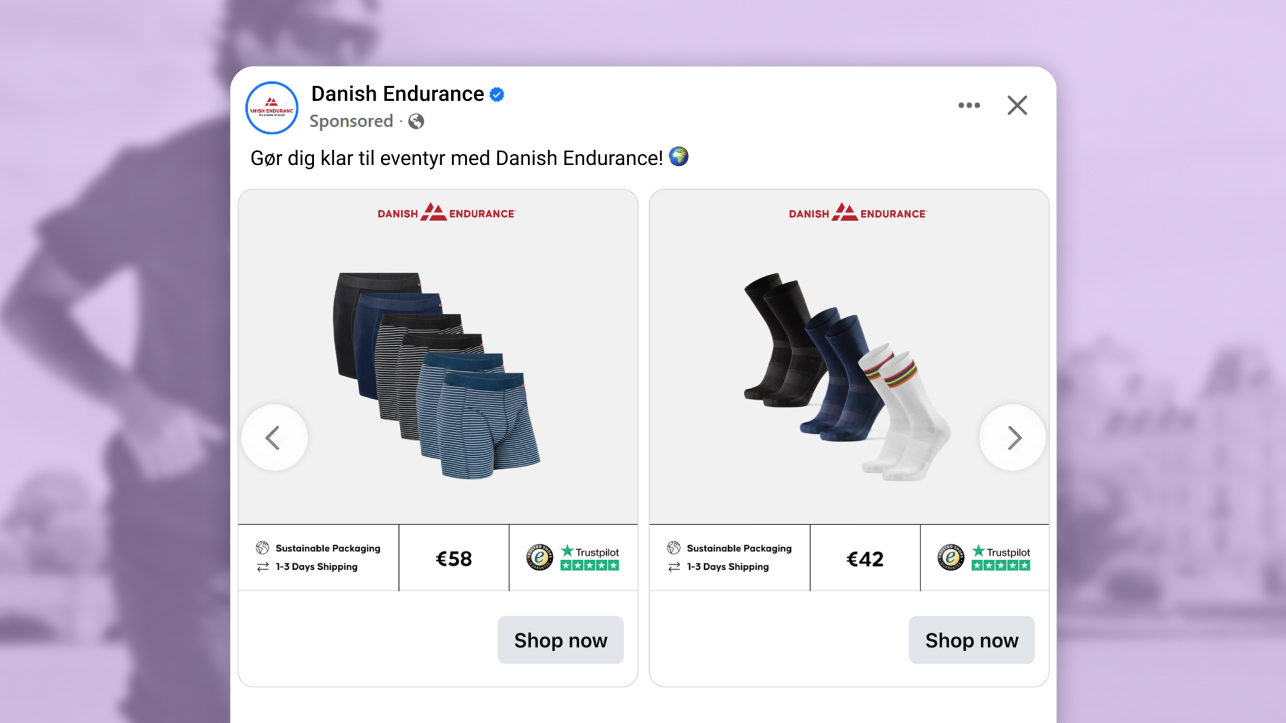
The ad: an always-on Catalog Ad built to grow the basket, not just show the product
Danish Endurance is the Danish performance brand built on functional basics done properly: socks, base layers, and the everyday sports essentials people tend to buy in multiples. Its always-on Catalog Ad is not a simple product-and-price listing. It is created around the moments a shopper actually hesitates, whether a product is worth the price, whether the brand can be trusted, and whether clicking to buy is easy to do.
This is a business-as-usual (some call it an "always-on") Catalog Ad running across the whole range of the shop's products. Nothing on the Catalog Ads design is a default setting: the Catalog automatically splits itself between discounted and full-price products, the price information is placed between the shipping details and trust badges. But enough about the obvious, let's look at what decision people from Danish Endurance made that led this Catalog Ad to earn its place in our weekly feature.
Why it won Catalog Ad of the Week
When we look at the best ads, two things come to mind: the look, and the performance. Compared to Danish Endurance's other Catalog Ads, this one delivered:
Who wouldn't love results like that? Let's look at the mechanics behind it. The conversion rate rose because the shopper had what they needed to decide before they clicked, and the average order value rose because the ad made adding one more feel like an easy, justified choice rather than an upsell. So what did Danish Endurance actually do to the design to earn that? Four decisions stand out, let's check them out!
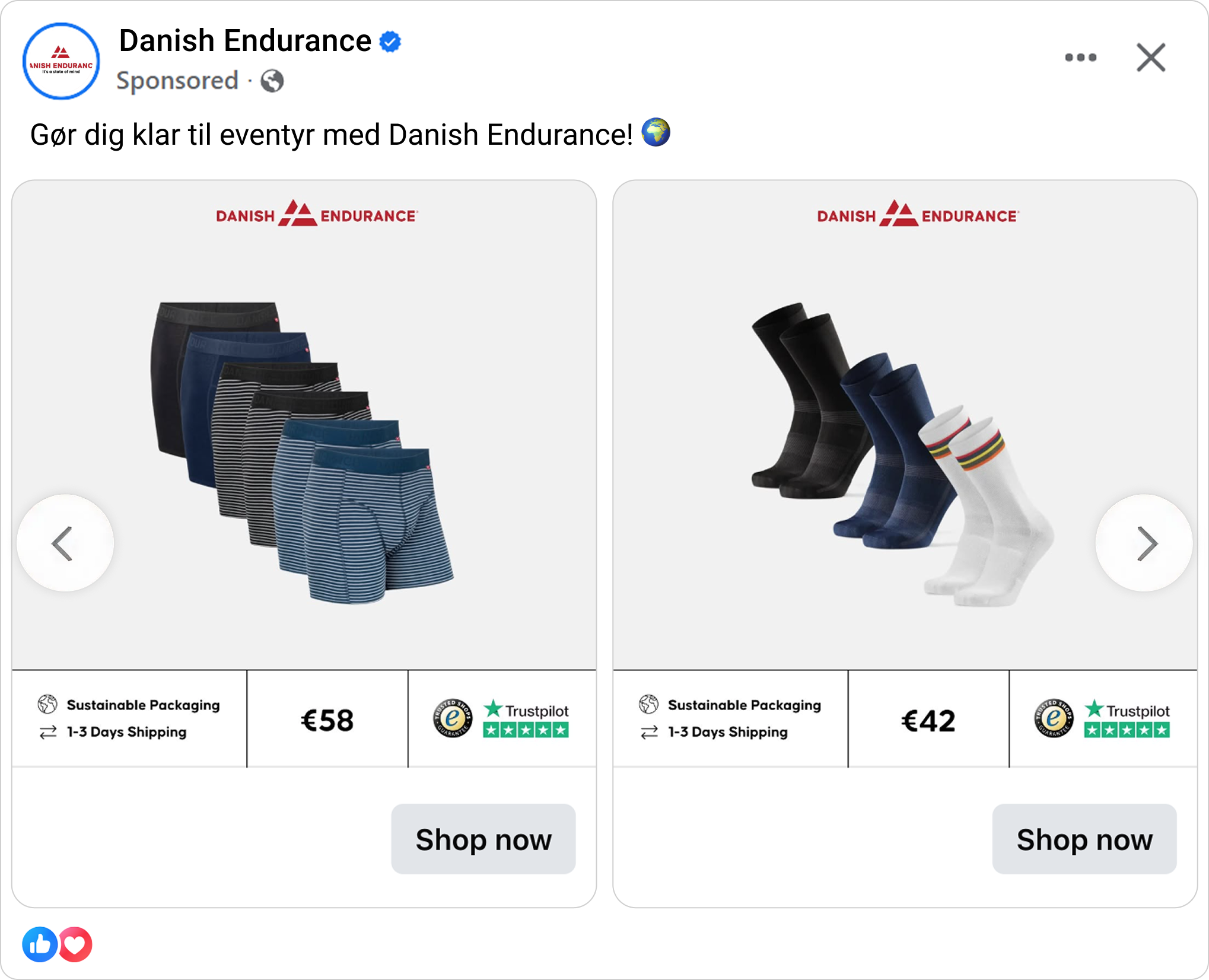
What makes this Catalog Ad great
Divide the Catalog between reduced price and full-price products
Almost every brand has products with reduced prices. On a standard setup, they run the same Catalog Ad design for both. The team from Danish Endurance set up a design rule that separates the two types, and each gets its own - very distinct design. The design rule is the particularly smart thing here as it is dynamic, once the product gets reduced price it qualifies for "sale" design and the switch happens automatically.
.png)
This matters because it makes the sale products stand out, and it entices shoppers to hunt for the deal, to see what else is discounted and where they can find a bargain.
Remove the price hesitation with the shipping and packaging details
One more smart thing in this ad is how little it leaves to chance at the moment of decision. The product is shown with its price and its shipping speed, and packaging specifics right next to each other, so the buyer is not clicking through just to discover how long it will actually take to get it. Danish Endurance understands their buyer very well, no one wants to be surprised about delivery times. Fast, reliable shipping is a real competitive edge today, and pairing that with considerate packaging is what makes the price justify itself.
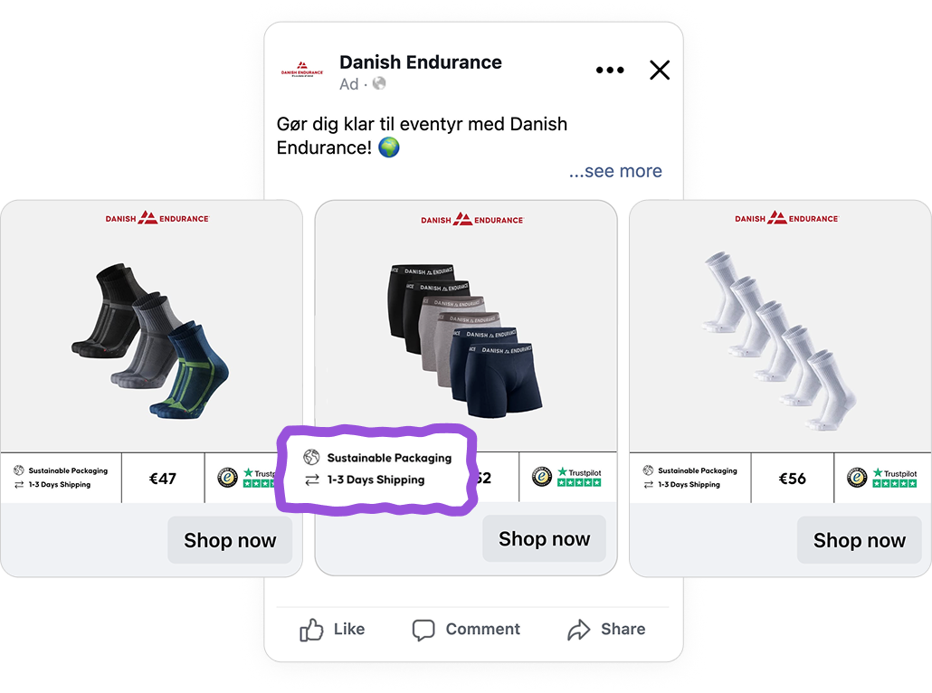
On a deeper look, this is a form of reason-based choice: shoppers do not only buy on fast impulsive desire, they look for a reason that makes the purchase feel sensible, and fast delivery paired with the price is exactly that reason, shown before the click rather than left as a surprise at checkout. It is a large part of why average order value climbed +18%, the format surfaces the right multi-pack, and the ad removes the friction that usually sits between the feed and the basket.
Make the trust signals to seal the deal
Price, shipping and packaging all sound good, but there still might be a trust barrier, especially from a brand a shopper may be meeting for the first time in the feed. Danish Endurance answers that by putting its proof directly on the ad: a Trustpilot rating and an eShops trust badge sit on the opposite side.
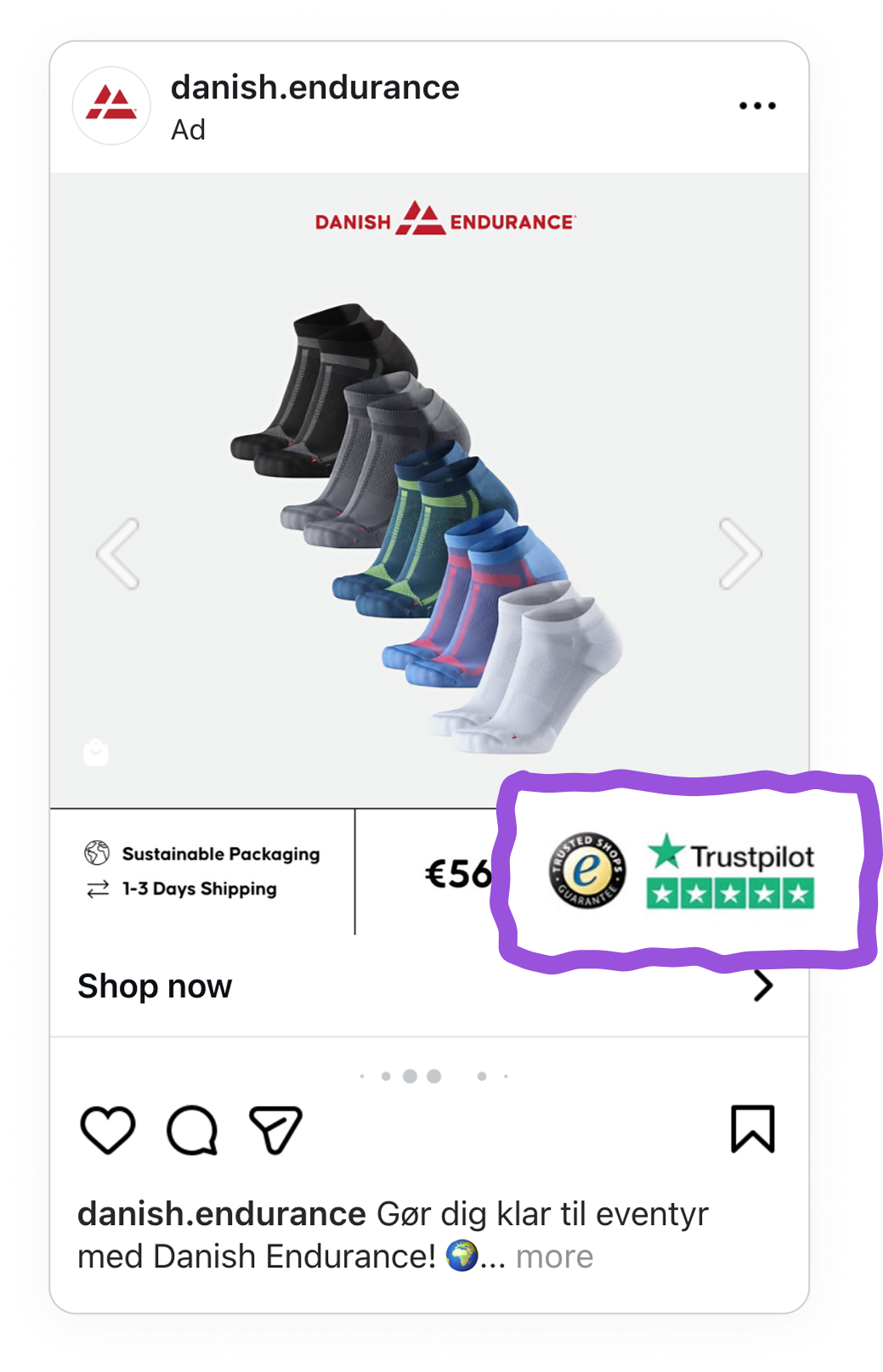
This is social proof doing its job right, the shopper does not have to leave the feed to go and check whether the brand is legitimate, because the ad has already shown it. For a performance brand selling online, putting that reassurance in the Catalog Ad rather than hoping the shopper researches it themselves removes a hesitation most Catalog Ads leave unanswered.
On Story Catalog Ads, leave the thumb zone empty on purpose
On the vertical placements, Danish Endurance makes a deliberate choice most brands miss: it keeps the area around the call to action clear. Rather than filling every pixel of the given real estate, the design leaves space near the Shop Now button so nothing crowds or obstructs the tap target.
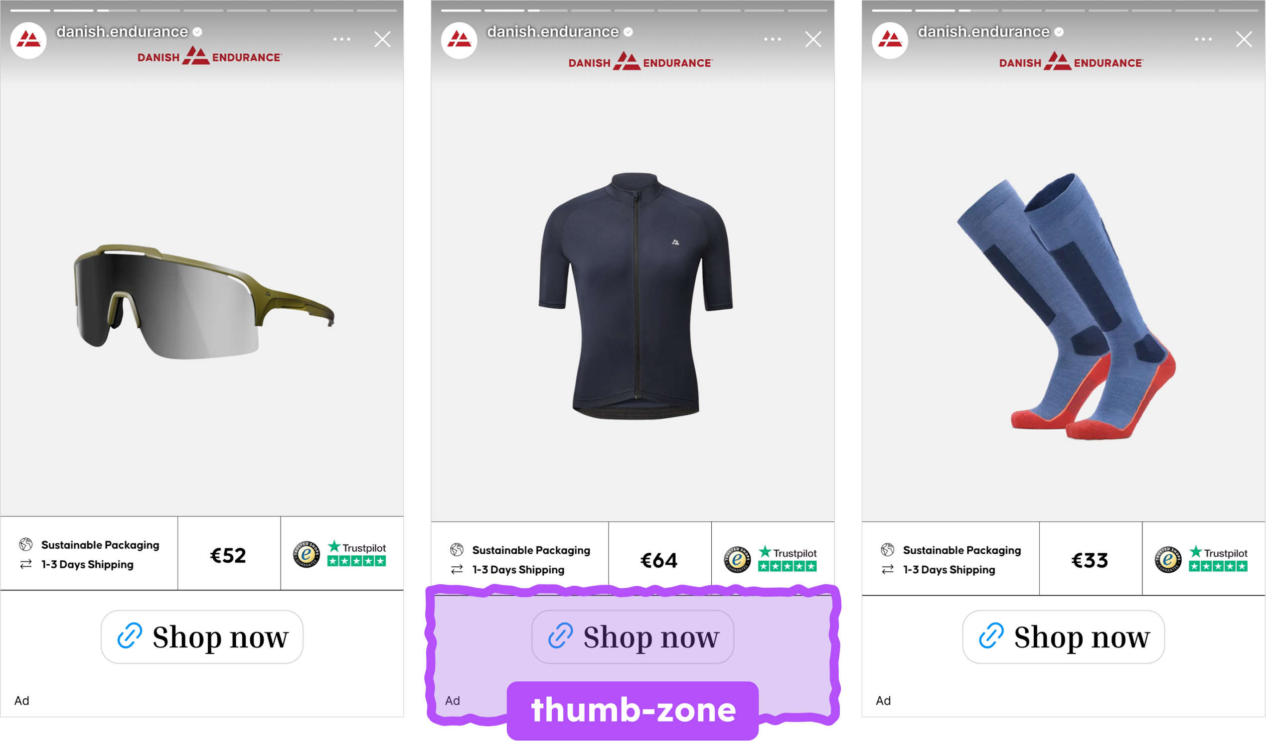
This is the thumb zone at work, the area of a phone screen a thumb can reach and tap easily without repositioning the hand. By leaving that zone empty, Danish Endurance makes sure the one action that matters, tapping Shop Now, is never fighting for space with the design around it. The empty space is not wasted, it is the reason the Story feels effortless to act on.
Key takeaways
To wrap it, this always-on Catalog Ad is built around the actual moments a shopper hesitates, and every added detail can exist to remove that hesitation rather than just serve as decor the Catalog Ad.
👉 Let a design rule split sale from full-price automatically
Read the price straight from your feed and use a sale specific design to highlight only the products that are genuinely discounted. A sale design that always means what it says builds trust, and automating the split means it works across the whole Catalog without manual work.
👉 Pair the price with the delivery speed
Show the price and the shipping speed together so the purchase already justifies itself before the click. For multi-pack or basics products, this is a direct lever on average order value.
👉 Put your trust signals on the Catalog Ad, not just the site
A rating or trustmark shown directly on the Catalog Ad answers the shopper's hesitation before they click, rather than leaving them to research the brand on their own.
👉 On Story Catalog Ads, protect the area around your CTA
Leave the space near the Shop Now button clear so the tap target is never obstructed. An empty zone around the CTA is a deliberate design decision, not a missed opportunity to fill the Catalog Ad.
Danish Endurance got all four of these right in one creative, which is exactly why it is this week's Catalog Ad of the Week.