
Cozmo & Precis
July 29, 2026
.jpg)
The ad: An ad that answers your biggest worry about buying a sofa before you've even seen the price
Sofas are Cozmo's flagship product, built for real living rooms, though the range also includes club chairs and other seating. It is a brand people notice for its design: reviewers consistently praise the look and feel of the pieces and the experience in Cozmo's showrooms, and that same sensibility, in the hands of their agency Precis, carries straight into how the ads are built.
This set of designs runs inside Cozmo's summer sale push: a broad catalog campaign timed to peak-season furniture browsing, when shoppers are weighing up which pieces are right for their home.
Nothing on this card is a default setting. Before the price, before the product name, Cozmo answers the one question that's usually holding a furniture shopper back, and every other element on the card is built to get out of that message's way.
Why it won Catalog Ad of the Week
Great design is nice to look at. But great design should also work, and this one did. Compared to their other Catalog Ads, this one delivered:
A lift like that is what happens when a brand removes the exact objection that is stopping someone from clicking "add to basket." Furniture carries a lot of hesitation, and once it is gone, shoppers convert more (CVR +52%). The jump in average order value (AOV +46%) comes from the same place: the saving grows the more you buy, so a bigger sofa or a second piece saves you more, and when it is all arriving in a week or two rather than months, going bigger feels a lot easier to say yes to. So what exactly did Cozmo and Precis do to the design to unlock that? Three decisions stand out.
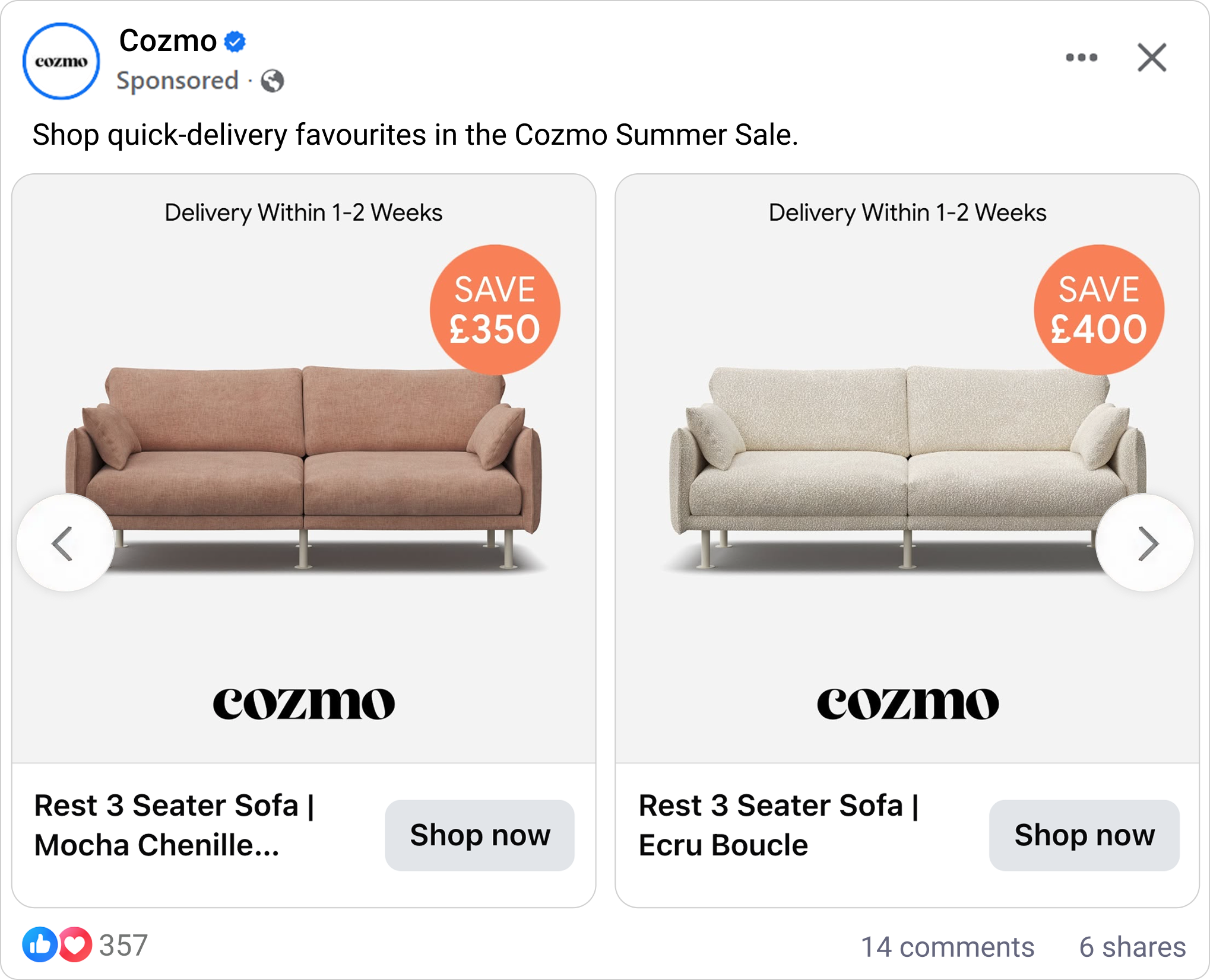
What makes this Catalog Ad great
Make the ad look exactly like your product page
The biggest decision Cozmo and Precis made in this catalog ad is one most brands never make on purpose: it looks almost exactly like Cozmo's own product pages.
Same clean background, same product photography, same orange savings badge.
"Put the ad and the shop side by side, and you can barely tell which is which."
That continuity does a lot of quiet work. When someone clicks through the ad and lands on the site, nothing jars. The environment feels instantly familiar, the shopper senses they are in the right place, and the momentum that earned the click carries straight through to the basket.
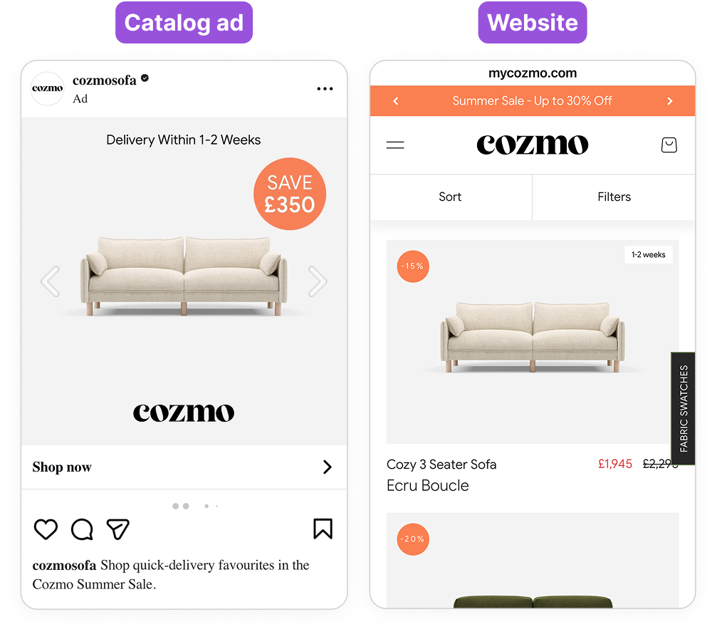
It is only possible because the ads are built in the same system and to the same brand rules as the site itself, so the whole journey feels like one continuous experience rather than an ad bolted onto a different-looking shop.
There is a name for why this works: processing fluency. When something feels familiar, the brain processes it faster and with less effort, and it quietly reads that ease as a signal of trust and rightness. A shopper who lands on a page that looks exactly like the ad they just tapped does not consciously think "this matches," they simply feel like they are in the right place, and that feeling does the persuading before a single word is read.
The savings badge is a good example of that shared design language at work. It is the one saturated element on an otherwise calm, neutral card, so it is the first thing your eye lands on, whether it reads £500 or £250.
This is the Von Restorff effect: a single element that visibly differs from everything around it gets noticed and remembered far more than if it were competing with five other loud badges. Cozmo does not need to shout. By keeping everything else quiet, one badge is enough, and it is the same badge the shopper will see again the moment they reach the site.
Answer "how long will this take" before the shopper even asks "how much"
"Delivery Within 1-2 Weeks" sits at the very top of the card, where Precis and Cozmo chose to put it: above the product, above the price, above everything else. It is the literal first thing read.
Buying a new sofa comes with a burst of anticipation: picturing the room finished, the new look, friends seeing it for the first time. The problem is that furniture usually makes you wait 4-8 weeks for that payoff, and a long wait quietly drains the excitement the closer you look at it. It's the exact friction that makes people hesitate on a purchase they otherwise want, which is why customers already single out Cozmo's fast delivery in their reviews.
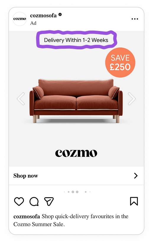
Leading with delivery speed is a well-established best practice for considered purchases: when the wait is the main thing standing between a shopper and something they're excited about, brands that put the reassurance first tend to win the click. By promising 1-2 weeks right at the top of the catalog ad, well inside the 4-8 weeks shoppers usually brace for, Cozmo protects the excitement instead of letting the wait talk the shopper out of it. It's fast enough that there's barely a reason to check whether picking it up yourself, or going with a different retailer, would actually save any real time, and it does all of that before the price ever enters the conversation.
Show the real saving, in pounds, pulled straight from the feed
Cozmo's badge reads "SAVE £500" or "SAVE £250," never "30% OFF."
On a sofa priced in the hundreds of pounds, saving three digits already feels like a substantial, real amount of money, something "30% off" doesn't convey nearly as directly.
£500 or £250 reads as cash the shopper can picture spending elsewhere, in a way a percentage just doesn't land.
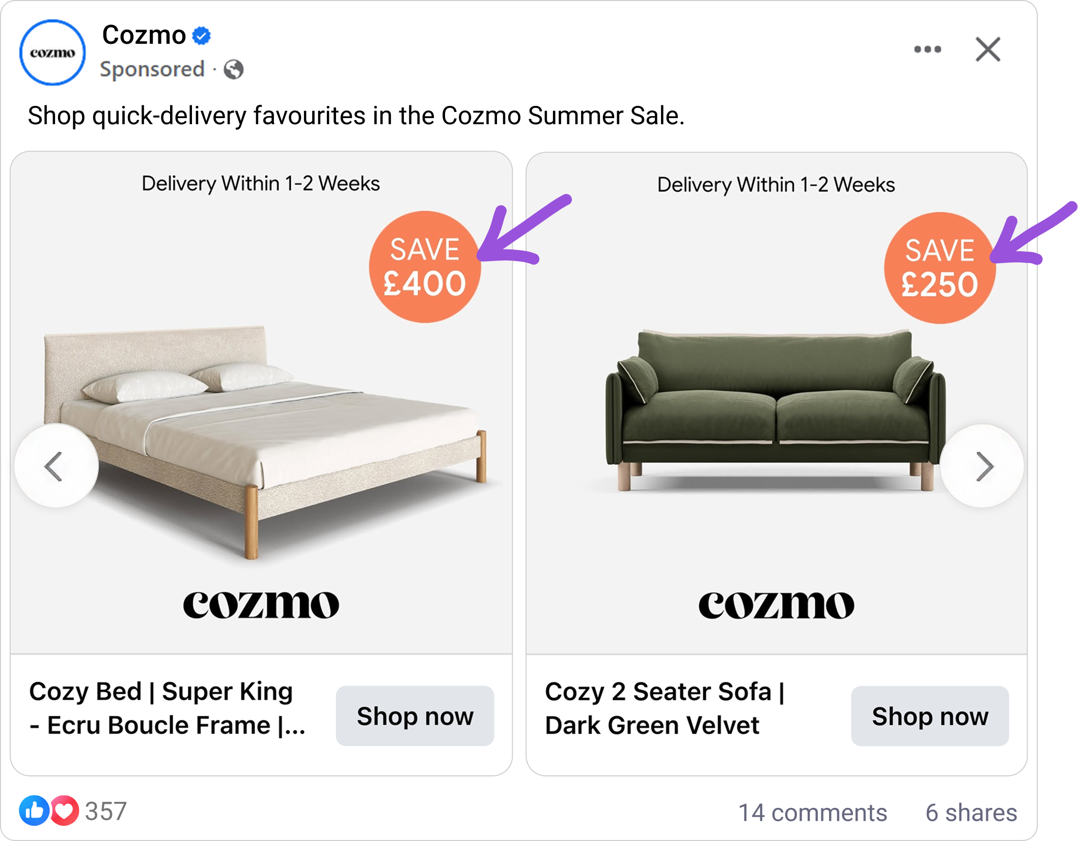
It is worth noting that Cozmo shows the discount as a percentage on their website, but switches to the pound figure in the ad. That is exactly the right call for the format. An ad has very little space and only a second or two of attention, so every extra element it has to carry adds cognitive load and makes the creative feel heavier.
A single clean pound figure lands instantly, where a percentage quietly asks the shopper to do the math. The website, with more room and a shopper already in a considered browsing mindset, can comfortably afford the percentage.
Key takeaways
The throughline here isn't really about sofas. It's about knowing exactly which objection to remove first.
👉 Make your ads look like your product pages
When the ad shares the same background, badge, photography, and layout as your site, the click-through feels seamless and the shopper never has to re-orient. Design your Catalog Ads to the same brand rules as your site.
👉 Lead with the objection, not the price
If your category has a well-known pain point (long delivery, complicated setup, high return rates), put the reassurance above the product, not below it. Removing doubt before the price appears buys you a more open-minded reader by the time they see the number.
👉 Show the real saving in pounds, straight from your feed
Once the price gets serious, a currency figure feels weightier than a percentage, and pulling it from your feed means every product shows its own accurate saving. That's also what lets one design rule dress your whole catalog, so the performance holds across every product instead of a handful of hero SKUs.