
côte&ciel & Up Collective
August 19, 2026

The ad: one evergreen Catalog ad template, priced per product
côte&ciel is the French design house known for its sculptural bags and tech-carry, pieces that look as considered as the laptops and cameras they are built to protect. It is a brand people notice for its design, and that same sensibility, in the hands of their agency Up Collective, carries straight into how the Catalog ads are built.
This set of designs is not a one-week sale burst. It is côte&ciel's business-as-usual, always-on Catalog Ad, the kind that carries the majority of a brand's Catalog spend all year, running across discounted and full-price products at the same time. In peak-season browsing, when some of the range is on offer and some is not, that mix is exactly the problem most brands solve with two separate ads. Côte&Ciel and Up Collective solved it with one.
Why it won Catalog Ad of the Week
Great design is nice to look at. But great design should also perform, and this one did both. Compared to côte&ciel's other Catalog Ads, this one delivered:
A result like that is what happens when a Catalog Ad template reflects a brand's values and a true understanding of its customers. The lift in average order value and conversion rate is a strong signal that the design côte&ciel and Up Collective built meets what shoppers expect
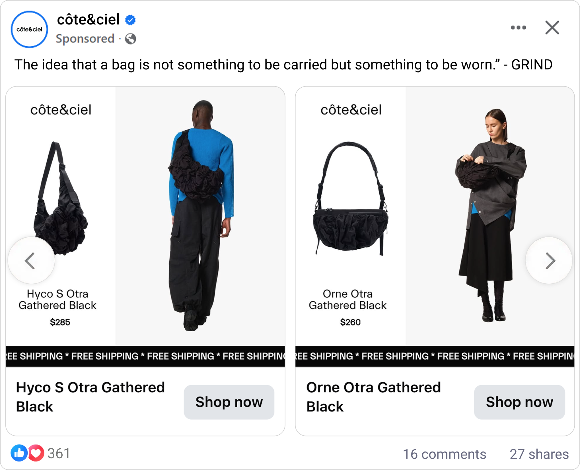
What makes this Catalog Ad great
Reserve a space for the reduced price details, and only fill it when there is one
The single most special move in this ad is how côte&ciel handles price. The template is built with a dedicated spot for pricing, and the design decides what goes in it, product by product. When a product is on offer, the ad shows the original price alongside the reduced price. When a product is not on offer you see the regular price alone Same template, two behaviours, chosen automatically for every product in the Catalog.
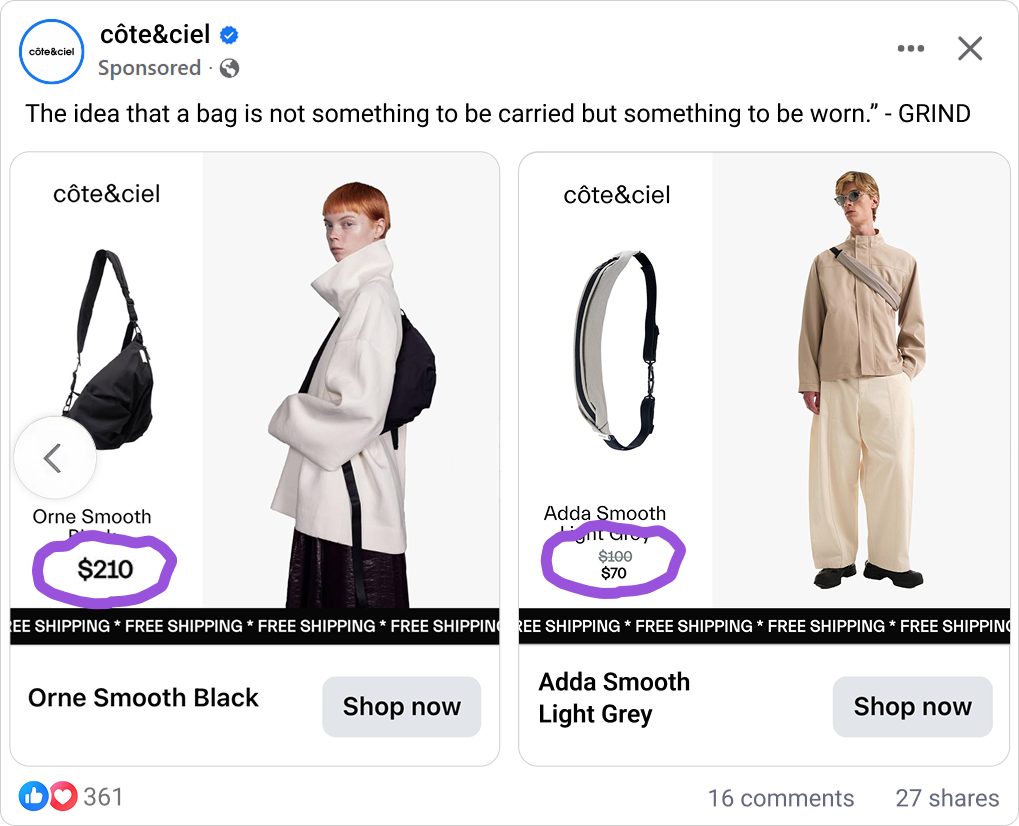
This is the anchoring effect at work. When côte&ciel places the original price next to the reduced price, the original becomes the reference point the brain measures against, and the new price reads as a concrete, quantified gain rather than an abstract "sale."
On the full-price pieces, côte&ciel does the opposite on purpose: showing no price keeps the attention on the object and the craft, and sends the shopper to the product page to find out, rather than filtering them out on price in the feed. It works because the whole thing is automated. The information about price and sale price comes straight from the data source, so the behaviour is correct across the entire Catalog without anyone pricing a single card by hand.
Bring the details to Catalog ad: product, name, price and free shipping.
Because this ad runs always-on, côte&ciel uses that permanence to show the shopper everything they need to decide, not just a photo. The bag is the hero, shown large and clean with the model behind it for scale, so the shopper sees exactly what they are getting. The product name tells them precisely which piece it is. The price, and the reduced price when there is one, tells them what it costs. And free shipping, standing on the card, removes the last hesitation before the click.
.png)
There is a name for why a card this complete is so persuasive: the marketing mix, or the 4 P's. côte&ciel's card carries all four in a single always-on unit.
Product is the bag itself and its name, shown as the hero. Price is the price and the reduced price. Promotion is the visible saving and the free-shipping offer. And the ad turns the feed itself into the Place, the point of sale, where the whole decision can be made without ever leaving the scroll.
Most Catalog Ads show a product and a price and stop there. côte&ciel built a card that answers product, price, delivery and offer at once, and because it runs continuously, every single impression carries that full picture. An always-on ad earns its permanence by being complete, and this one is.
One Catalog ad design template for 1:1, 4:5 and 9:16 placements
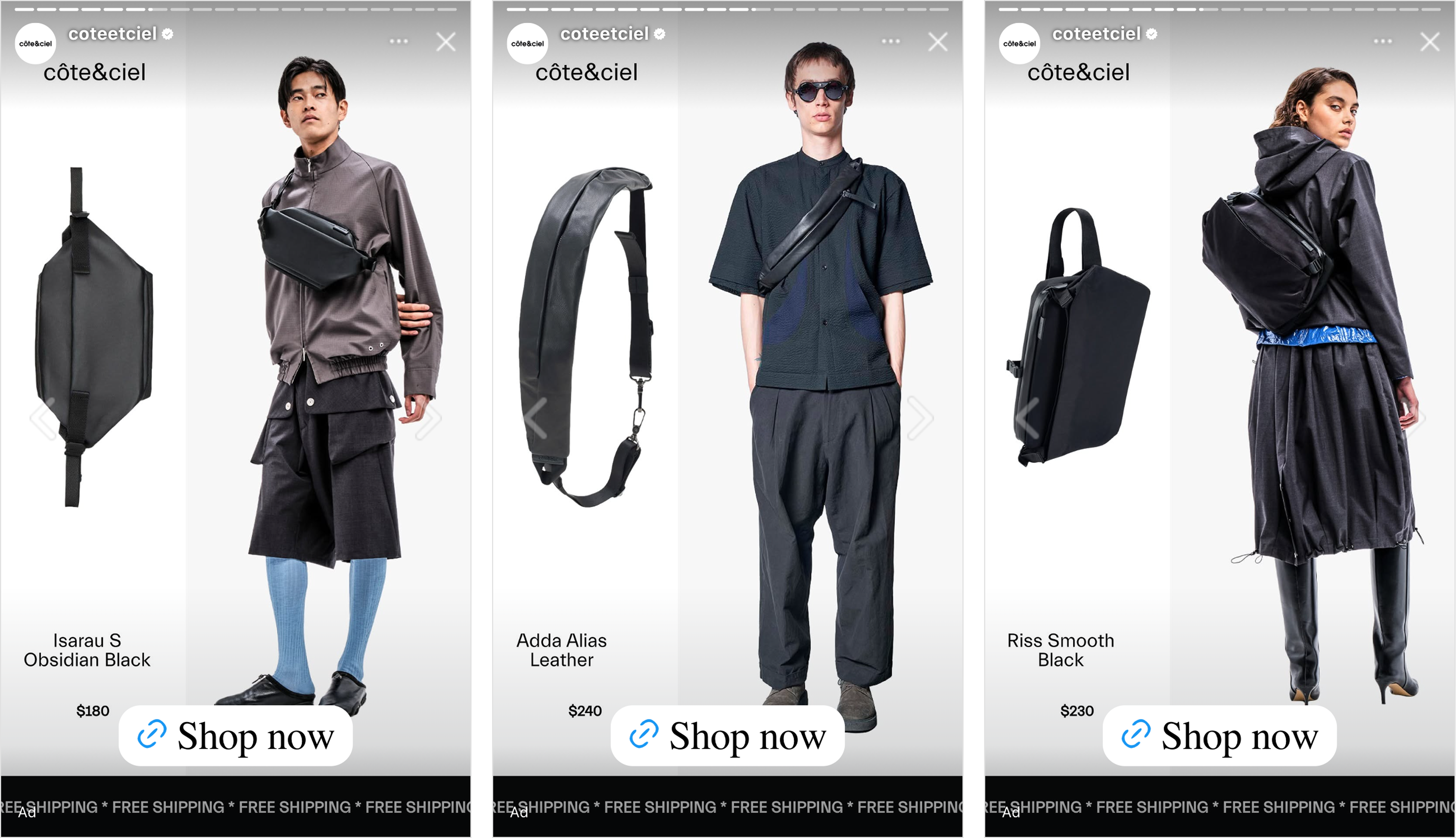
côte&ciel did not stop at the default square feed. The same design is built across 1:1, 4:5 and 9:16, so it holds in the feed, in the taller portrait placements, and full-screen in Stories, without ever looking like a square that got stretched to fit. Each format keeps the bag as the hero and keeps the pricing slot behaving the same way.
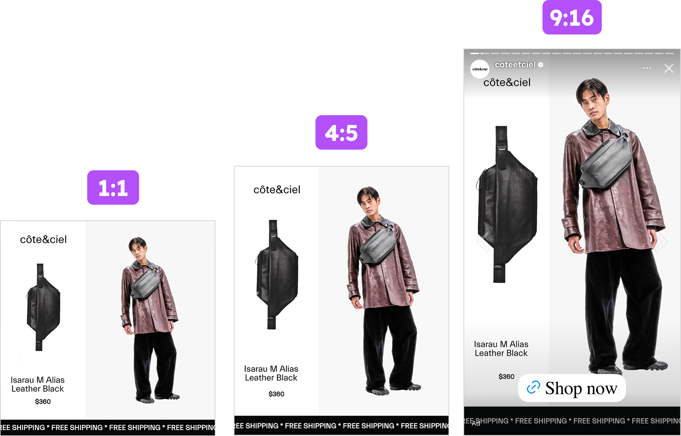
Designing for every placement the ad will actually appear in, rather than shipping one aspect ratio and letting the platform crop it, is the difference between an ad that feels native everywhere and one that only really works in one slot. It is the last step in how the design was made, and côte&ciel took it, so the ad meets the shopper as an intentional piece of creative in every placement, not an afterthought.
Key takeaways
The throughline here is not really about bags. It is that one always-on template, made complete and made smart, can carry a brand's whole range, on sale and off, without ever being rebuilt.
👉 Reserve a slot for the reduced price and let it be dynamic
Build the reduced-price details into the layout as a dedicated slot, then use a design rule to show the before-and-after only on the products that are actually discounted, reading the price straight from your feed. One design covers your whole Catalog, sale and full-price, with no card priced by hand.
👉 Give the offer on the Catalog ad: product, name, price and free shipping
An always-on ad earns its permanence by being complete. Carry all four P's in one card, the product and its name, the price, the free-shipping promotion, with the feed itself as the point of sale, so the shopper has everything they need to decide without leaving the scroll.
👉 Build one design template for every placement
Design the same template for 1:1, 4:5 and 9:16 so it looks intentional in the feed, in portrait, and in Stories. It is the last step after the design is made, and it is what makes an always-on ad feel considered in every slot a shopper meets it. côte&ciel and Up Collective got all three of these right in one creative, which is exactly why it is this week's Catalog Ad of the Week.