Using Catalog Ads as a fashion brand
January 30, 2024
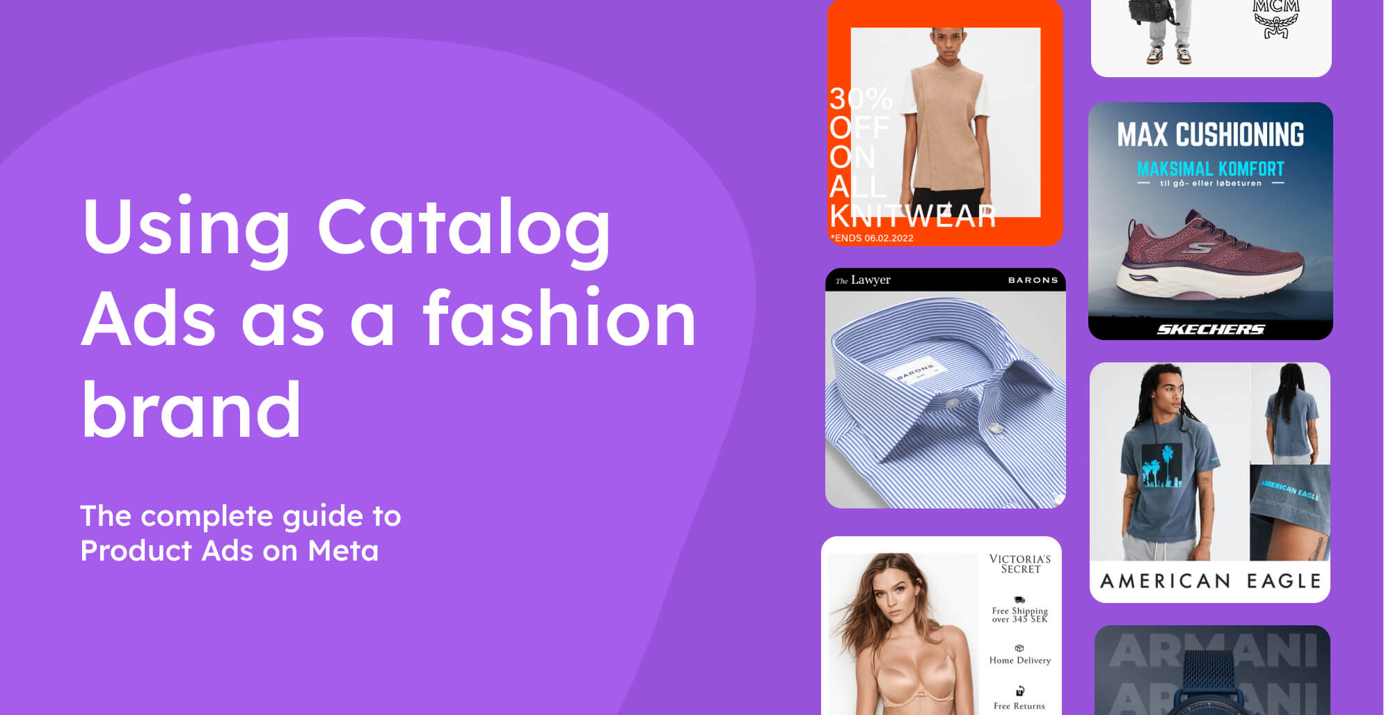

For most fashion brands, the key to success with Catalog Ads is nailing three areas: Always-On, Campaigns, and product set-specific ads. This article will give you an overview of the options that lie in those areas.
The most used product fields in Catalog Ads designs:
The moderately used product fields in Catalog Ads designs:
The rarely used product fields in Catalog Ads designs:
Table of contents:
Always-on Catalog Ads for Fashion brands
Your Always On Catalog Ads are the first step to getting the perfect Catalog Ad setup. It's probably the ads you will spend the most money on, and the ads that will take most of your time - hopefully, also generate most of your purchases.
For you as a fashion brand, there are a lot of directions to move your Catalog Ads towards. Generally, the best fashion brands move in one of the following directions. But, the one thing the most successful brands have in common is that they are always testing new designs & ideas.
So, no matter what you decide your first Catalog Ads should look like, you should always try to test new designs & ideas.
Show your products & logo
This is always a foolproof way of designing your Catalog Ads. Show your logo and show your products - in some cases, this might be all that you need.

This kind of Catalog Ad will be perfect for a fashion brand just getting started designing its Catalog Ads, as it is a good foundation to make the Catalog Ad designs even better.
There is a downside to this, though. You are not giving any information about the product, so the user has to recognize your product or brand to be interested.
Show Additional Images
More product images = better performance. Right?

It's always great to show the product from different angles, in different settings, with different models, or whatever distinction your additional images have. Almost every fashion brand should at least test in their catalog ads, as it's often a case that increases performance.
Benefits:
- Show more of your product: It's a great possibility to show more of your product
- Sell each product better: You sell your products better when you provide more information (or images)
Disadvantages:
- Canvas space: As we have a limited amount of design space, including multiple additional images might be a tough nut to crack in some cases.
Additional Images are very powerful to show your products visually on their own; they are very bad at conveying anything more than that.
If you combine the additional images and some product information, you will have the best of both worlds. Show your product in the best way possible while also telling why your audience should be interested in this product.
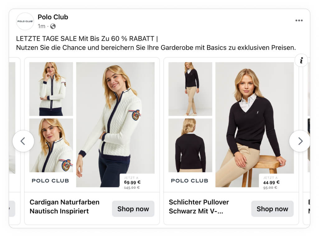
It's totally up to you what information you choose to show; this can be the product name, the price, the brand, the description, or any information you have in your feed.
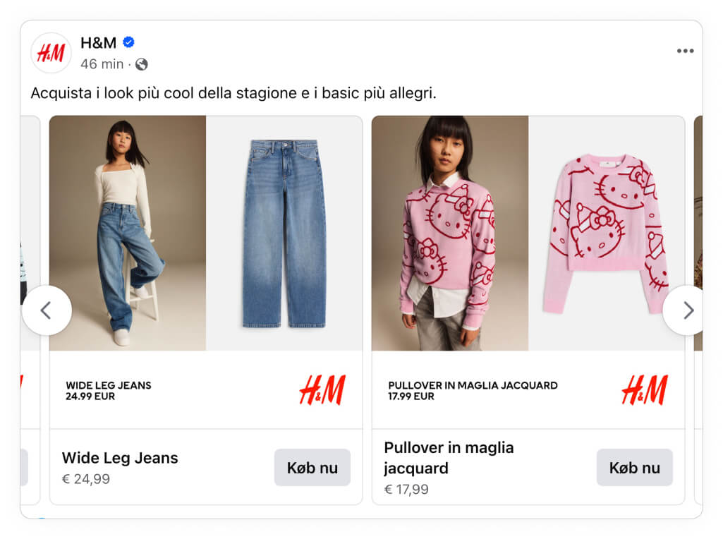
Look at these examples from Polo Club, Pretty Little Thing, and H&M; these are tactics we usually see working well. They use additional images, their logo, and the product's price.
You can, of course, alter this as much as you want or even insert more elements, like a CTA in the example from Pretty Little Thing.
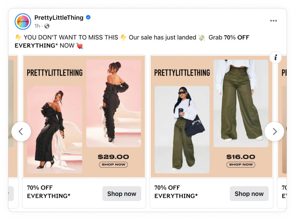
Remember to keep the elements as product-relevant as possible, so think about (or a/b test your way to) what sells your products the best. Is it your brand, the price, or another element?
In H&M's case they seem to have found out that people are interested in seeing a packshot image, a model image, the product name, the price, and their logo - this has no doubt taken a couple of tests to figure out.
One of the biggest reasons for a successful Catalog Ad setup is being as product-relevant/specific as possible! You can do this in many ways, depending on your brand and what you sell.
A simple but great example is this ad from the German e-commerce retailer ABOUT YOU. They show something that many consumers want to know: What is the product (packshot on the left), how would it look on me (additional image on the right), and what brand is it from?
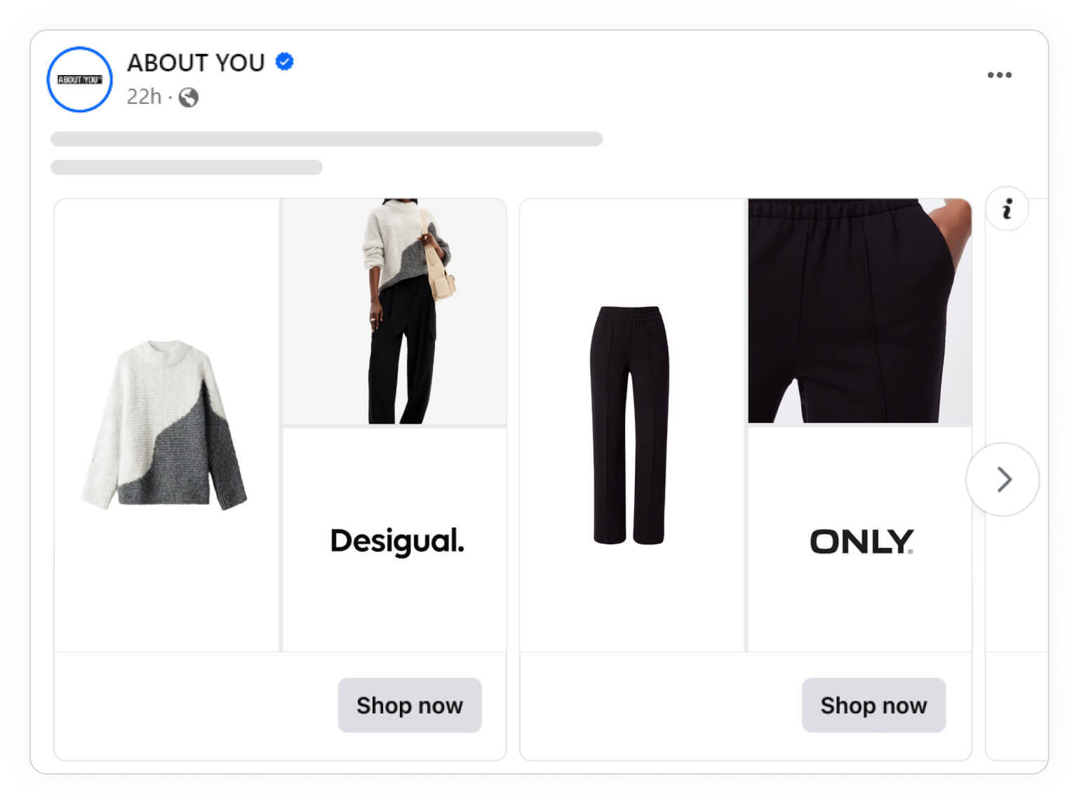
In general, this means that you should strive to include as much specific & dynamic information (information that is different for each product, e.g., name, price, color, etc.) in your ads as you can. You can include this information differently through text, images, shapes, etc.; just let your imagination run riot.
Names and Brands
Showing the product's name is sometimes not the best choice; in fact, on average, Catalog Ads with the product's name perform 30% worse - so you have to consider whether people are interested in knowing the product's name.
If you're selling plain t-shirts, people are probably more interested in seeing how your product looks, but if you're selling collector's sneakers, the name is likely important to include! So, it's super important to think about what answers your audience is looking for.
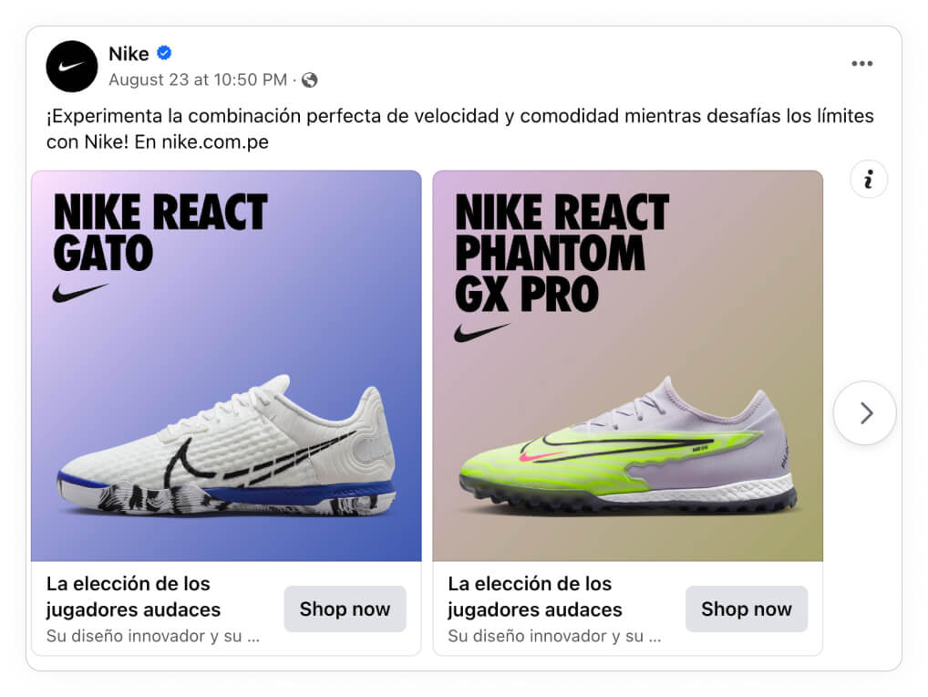
In this Nike example, they are showing nothing but the product's name. It is ideal if your customers focus on getting one exact model! Which, in this case, they definitely are.
If you're selling very brand-focused items, it might be an idea to include the product's brand logo in your Catalog Ads.
It might not be that the user can connect the product with a brand without being told the brand, as in this case, with the sunglasses, we wouldn't know the brand if it weren't for the logos.
On top of that, showing the product's brand in Catalog Ads performs 38% better on average.

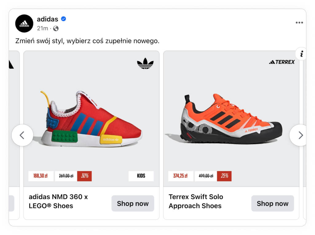
Showing different design elements depending on the category of your product is another way to be super product-relevant; for instance, is it a male, female, or kids item? Show this in the ad!
All of this can be done with Product Assets inside Confect.
Product & shop information
Product information can be many things; it can be name, price, etc., as we've already covered in this guide, but it can also be more advanced & specific information. You can show the product's origin country, rating, description, or any available information in your feed.
Look at this Uniqlo example where they show the height of the model and the size they're wearing - this is a genius use of the data available!
In fact, on average, Catalog Ads with product-relevant fields perform up to 93% better.

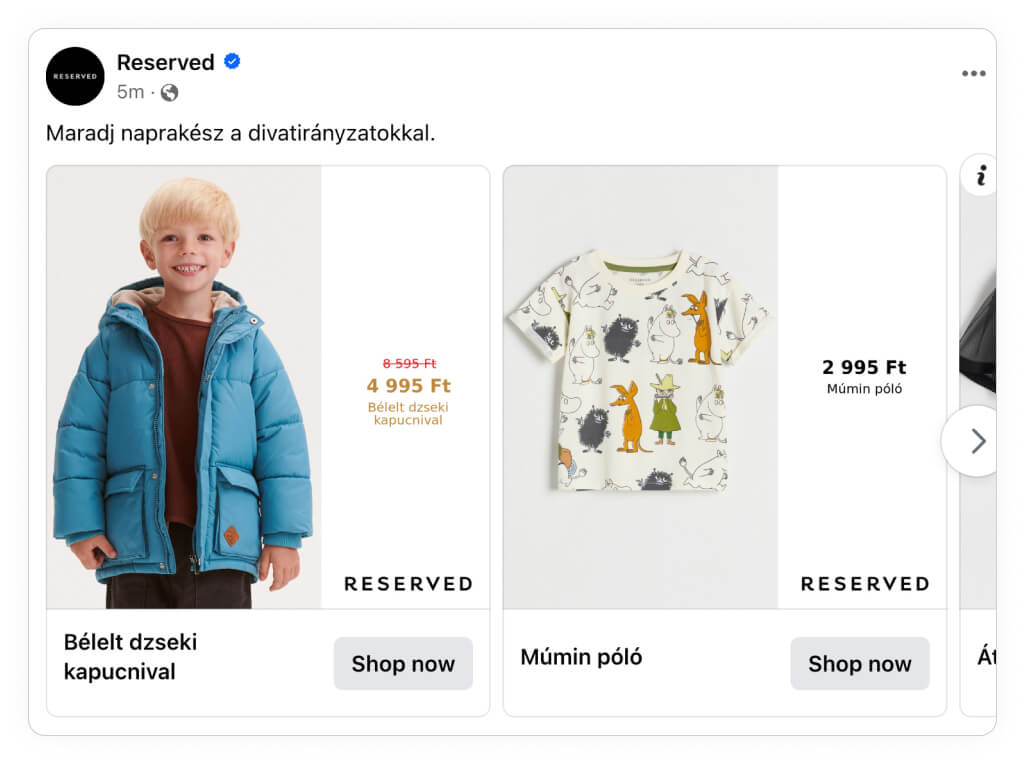
One of the more obvious and simpler ways to include more product information is changing the design when you have products on sale.
When you have products on sale, you should, of course, show this in the design. It can be in a completely different-looking design or just minor changes to your current design to highlight the sale - like the example below.
The information you show doesn't necessarily need to be dynamic. A good practice is to remove friction by showing that you offer free shipping over XX, that you have a Buy Now, Pay Later solution, or other USPs general to your shop.
It's always interesting to run one or more A/B tests to determine what mix of static/dynamic information works the best for your brand.

You can consider all of these use cases when making your own always-on Catalog Ads, take them, and form them into your own beautiful Catalog Ad design. There's no right or wrong when designing Catalog Ads; the most important thing is that you test some designs.
Whether your goal is to improve ROAS, include your brand in your catalog ads, or do something entirely different, you should be able to take an idea from the section above and turn it into your new catalog ad design.
Campaigns & Sales
Including campaigns & sales in your Catalog Ads is the best way to synchronize your funnel. No more doing beautiful static campaign ads just to hit your audience with generic Catalog Ads afterward.
Campaign Periods
Black Week, Christmas, January clearance sales, and so on. All users know great deals are coming and are often waiting for exactly this moment to buy your products. A tailored campaign design is the final green light they need to push the "Purchase" button.
For instance, look at this example from Pretty Little Thing; it's the same fundamental design as the example we looked at earlier; they just changed the design elements (colors, fonts, splashes) to be "Pink Friday" themed instead!

Almost every fashion company runs some kind of campaign period, be it Black Friday, Summer Sale, Winter Sale, or something entirely different - and there is a reason for that! It makes sense for almost everyone. We do see that some higher-end fashion companies retain from running campaigns.
The biggest campaign period of them all has to be Black Friday (including 'Pink Friday,' 'Green Friday', etc.). It's a time when many users are super ready to buy; some even retain from buying items in the leading months to see if they will come on sale during Black Friday.
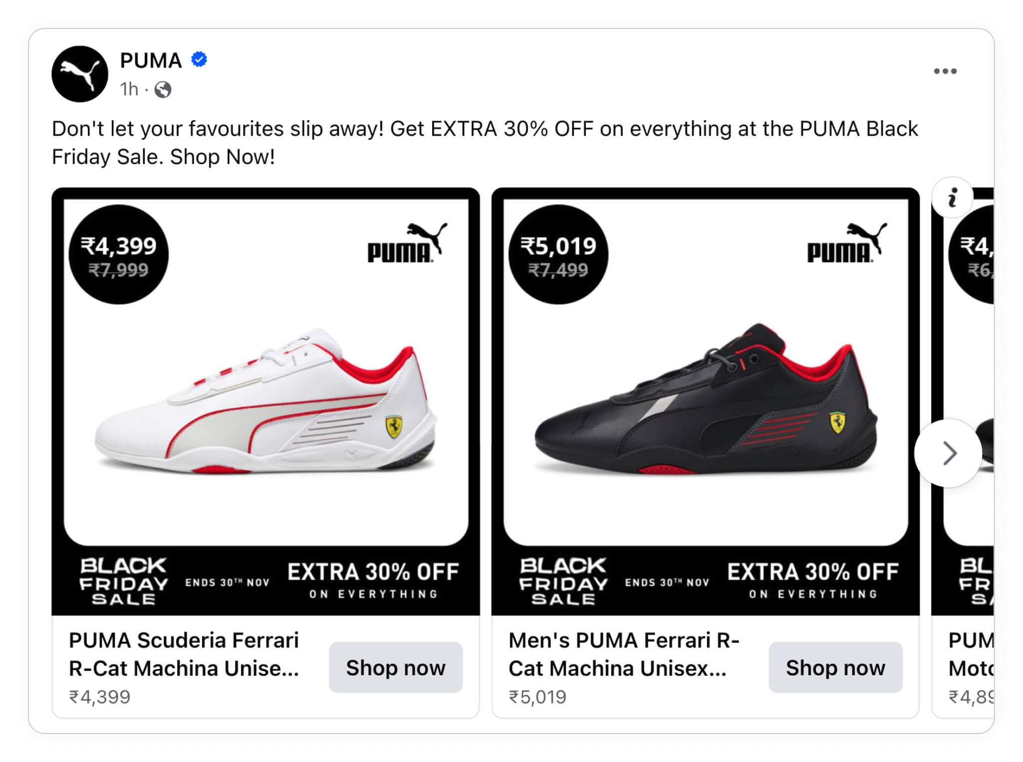
A Black Friday design for your Catalog Ads is a must if you're already participating in Black Friday.
Benefits:
- People are ready to buy: People know that a campaign period is coming.
- Easy to recognize: During November, Black colors immediately scream Black Friday.
- Higher average order: Users are more likely to make larger purchases
Disadvantages:
- High competition & higher CPM: Many advertisers want to run ads during campaign periods.
Black Friday is, of course, not the only campaign period with high demand; for example, Christmas, Boxing Day, and Back To School campaigns usually see levels comparable to Black Friday.
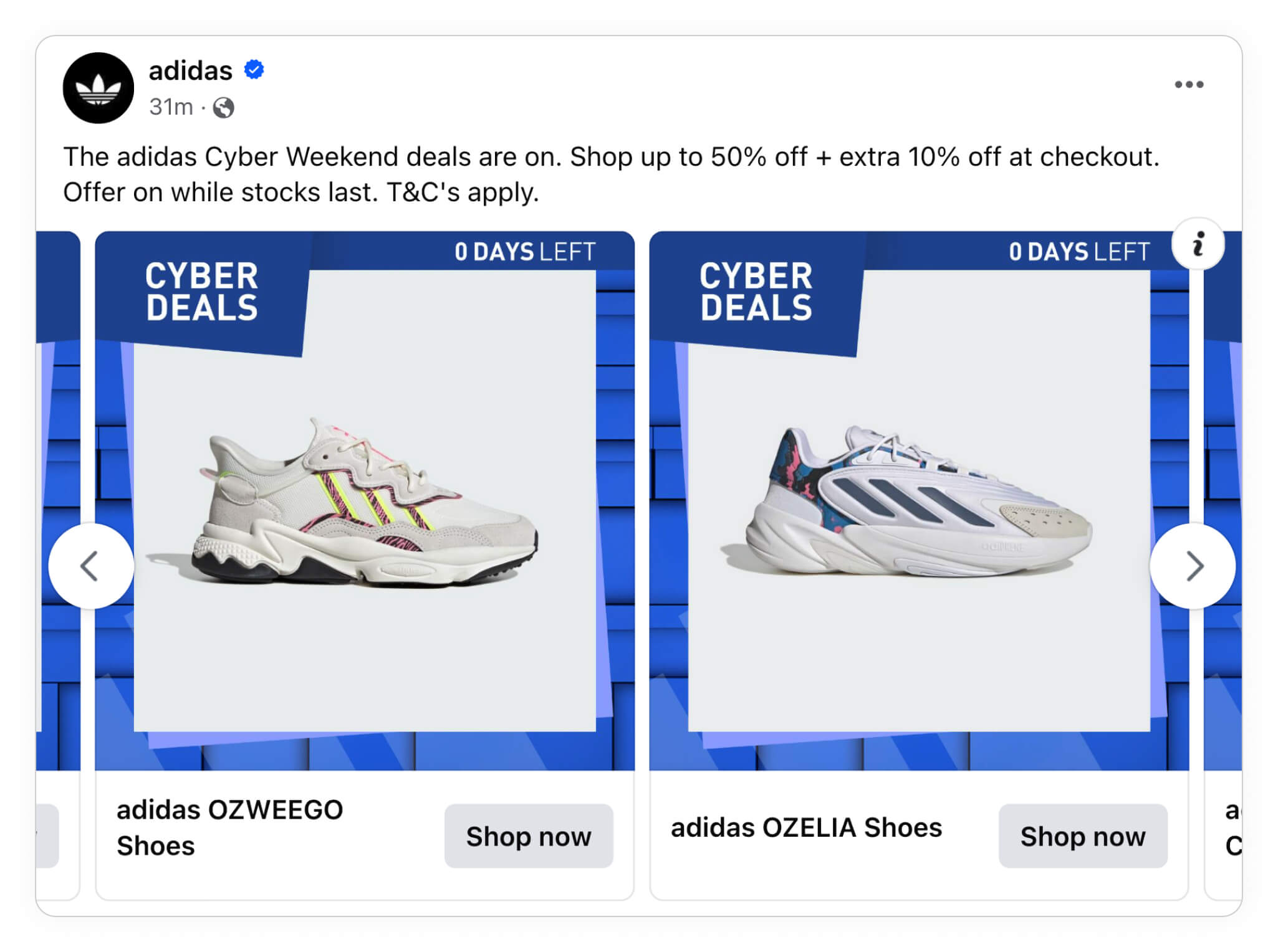
Many advertisers are also splitting one campaign period into multiple; for instance, Cyber Monday is a continuation of Black Friday - which is very profitable for many Fashion brands.
Christmas is, of course, another very high-traffic campaign period. It's equally important to stand out in your Catalog Ads during Christmas as it is during Black Friday.
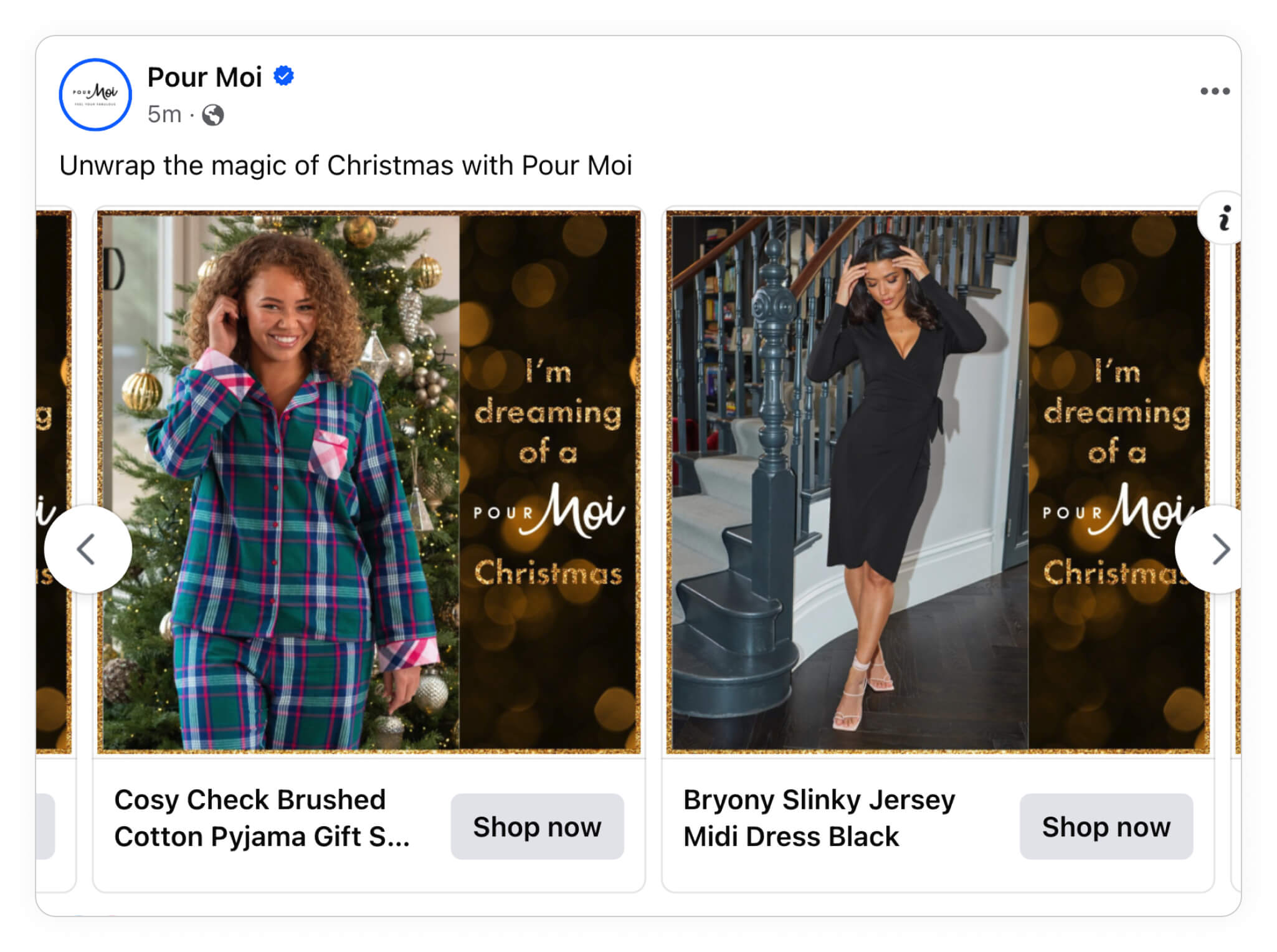
In general, it's important to include your campaigns in your Catalog Ads, but especially with the high-traffic campaigns, you can get a lot of value by synchronizing your campaign designs through the entire customer journey.
If you want some general tips for your Christmas campaign, take a look at this article.
Before moving on to the more season-based sales from these popular campaign periods, we wanted to show you how you can make your own campaign periods - instead of only relying on the industry norms.
A great example of this is BestSecret, a members-only platform having discounts on premium and luxury brands. Here's the design they ran during their "Women's week sale" - a campaign period they have invented themselves:

No matter if you are in the season for sales or not, sales and discounts are extremely effective in your Catalog Ads.
You get the best of both worlds: Consumers see the product they are most likely to buy (the data-driven ad format Catalog Ads) on a great offer that will probably expire soon (a lot of urgency and scarcity).
Season-based Sales
These types of campaigns are great at maximizing value capture during high-traffic periods. Also, you can use this to clear certain inventory to focus on different product lines in the upcoming season.
Below is a Catalog Ad from Ralph Lauren showing their winter offers, with selected items having up to -50% discount:
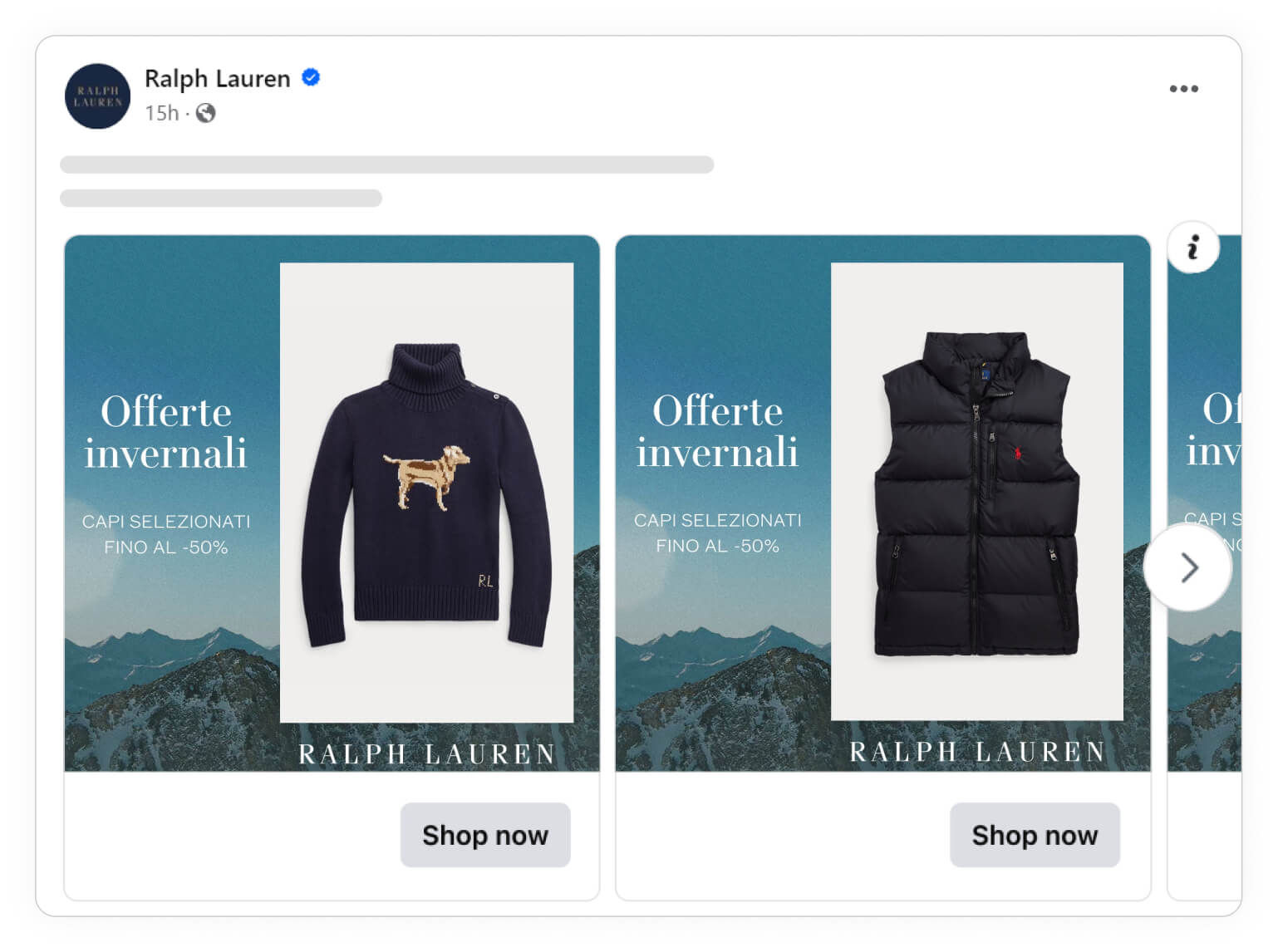
"End of Season" sales are a very common type of seasonal sales, and it makes good sense - it's a natural time to place a sale, and a lot of users have gotten used to End of Season sales, so they are ready for them!
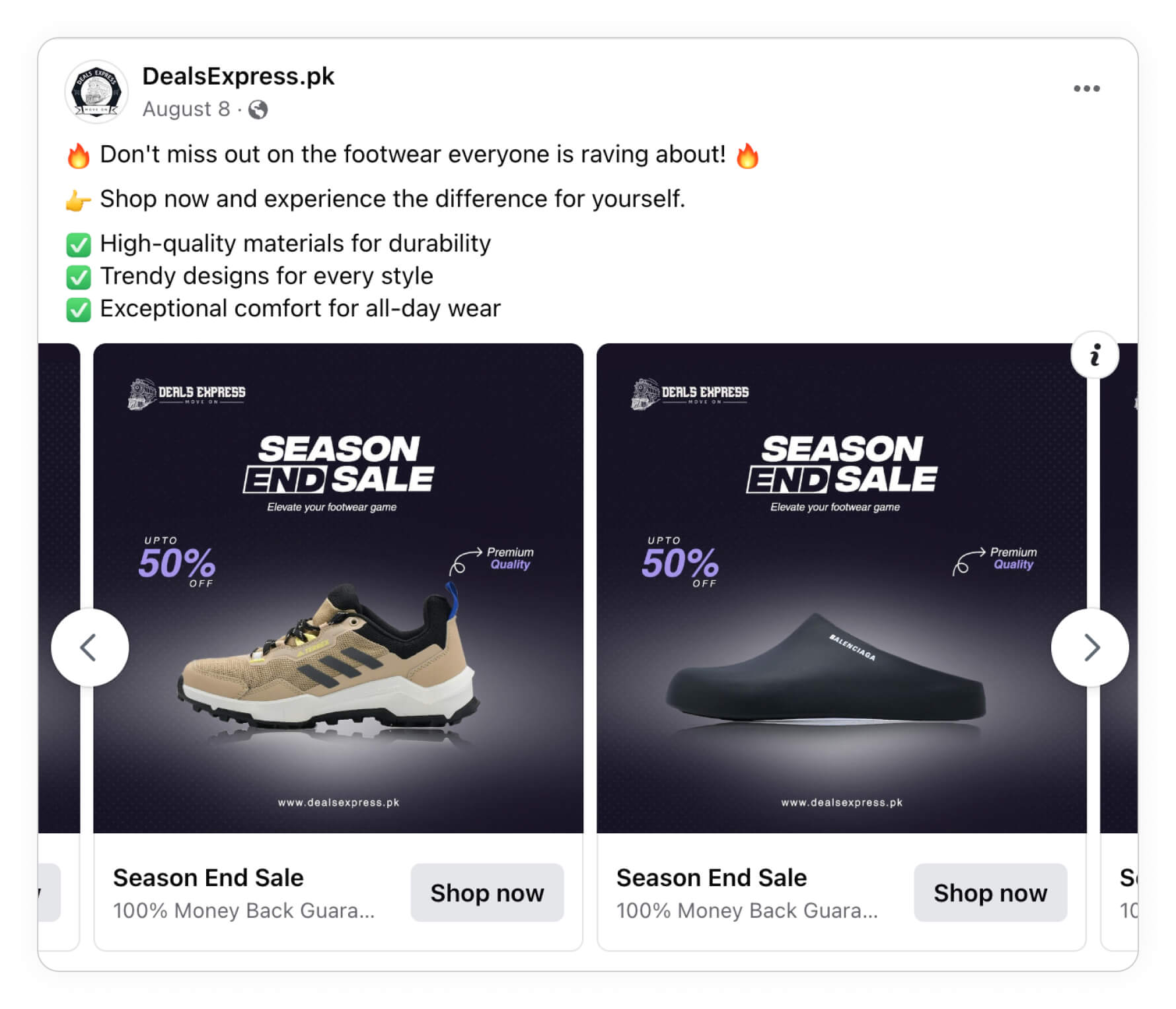
Season sales are, of course, more relevant to you if you're selling products that follow the change of seasons (e.g., outerwear: from coats in winter to windbreakers in spring), but it's generally something that all Fashion brands can indulge in, no matter what you're selling!
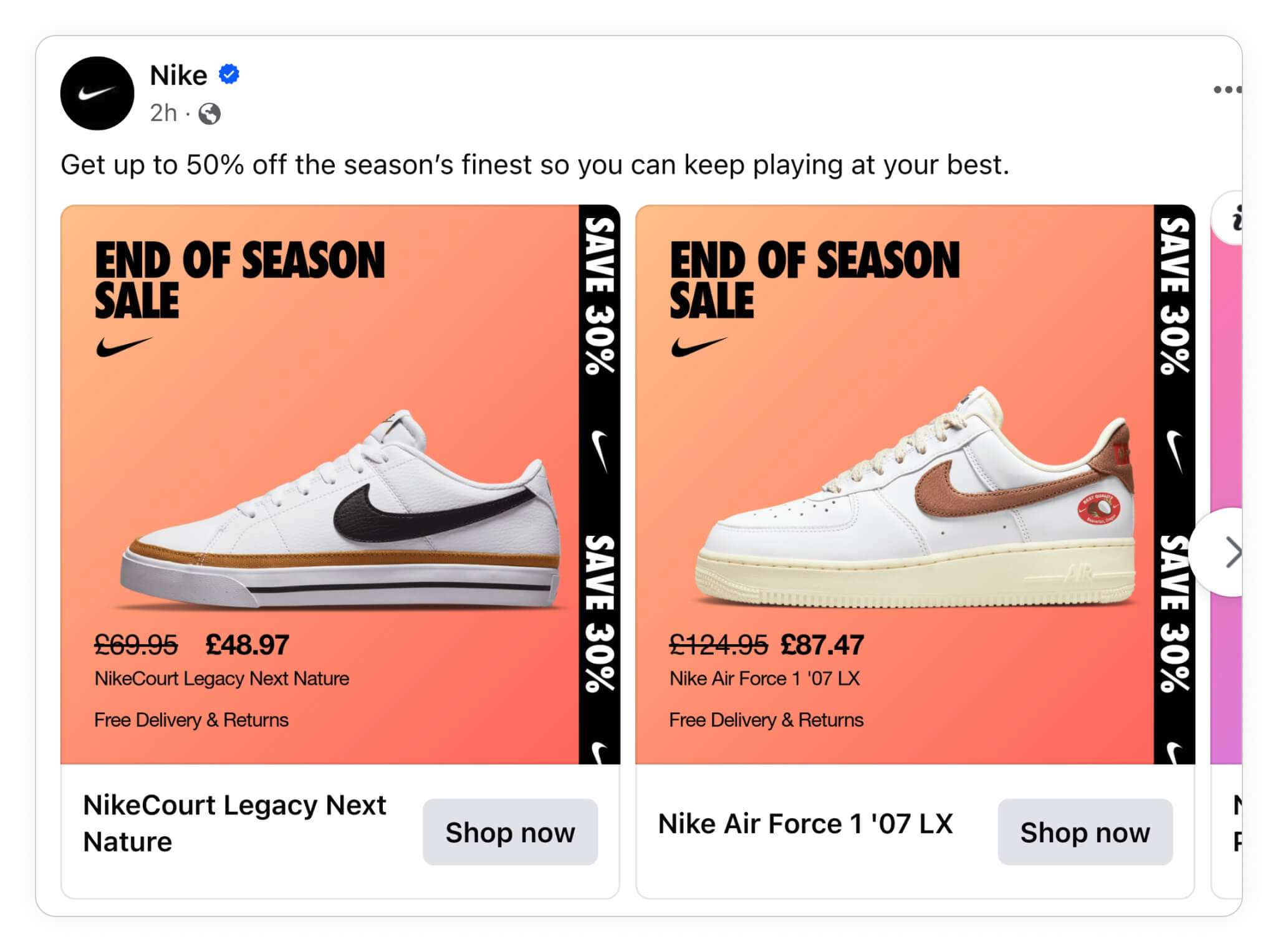
Mid-season sales have almost become equally as valuable and popular as end-of-season sales. This means you can make a mid-season sale whenever you want and avoid a good chunk of the "end-of-season competition." If you run a sale outside your competitor's sales, your customers might be more likely to buy at your sale.

Seasonal products
We have been talking enough about seasonal sales - let's talk about something a bit more different; Showing the best products for that specific season!
Here's how Ralph Lauren is showing new drops in their "Wardrobe refresh" design:
.jpg)
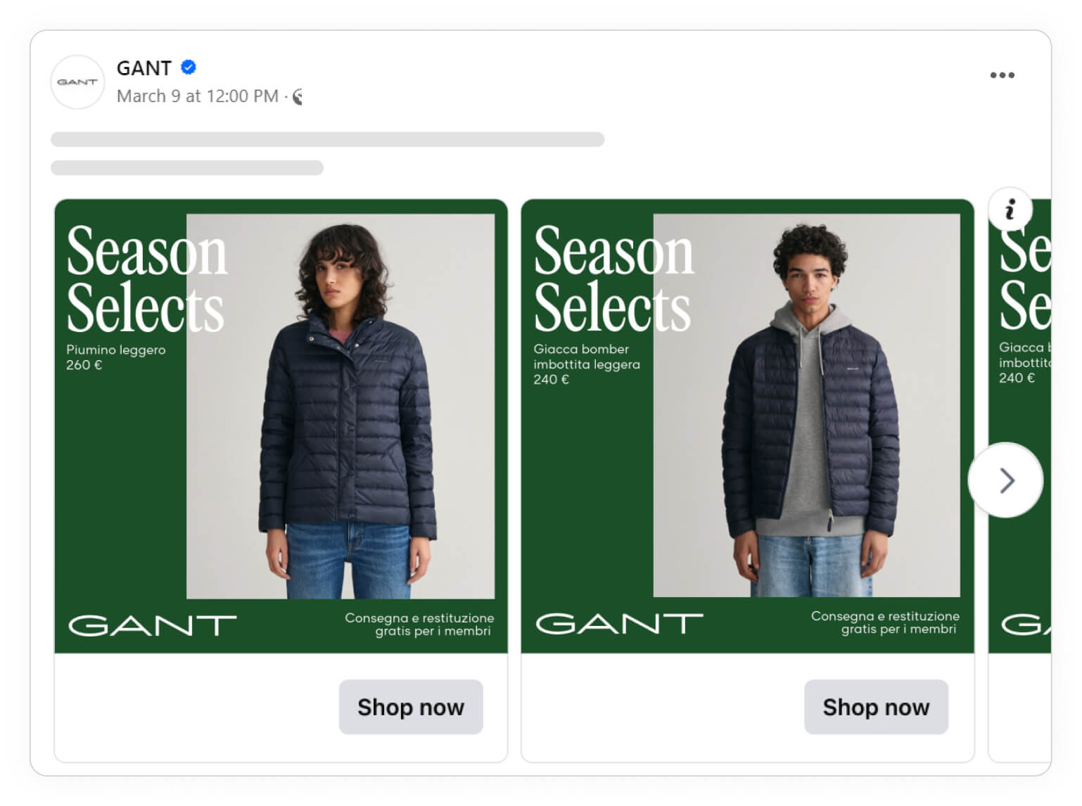
The Swedish brand GANT is also doing a great job by showing season selects.
It's a great way to stay high-end while showing how relevant the following products are - and how you should buy them right now, since they are in season.
Keep in mind the italian text in the bottom - which means "Free delivery and returns for members". This is the products we have selected for this season, and you even get it with free delivery and return:
Other campaigns
Your campaigns don’t have to fit into a predetermined bucket to deliver results. Often, it is these unexpected and unique campaigns that can break the routine and get attention. If you have any reason to celebrate or offer a discount, you can easily make this a campaign.
A custom campaign could be: Birthday or Anniversary sale, Archive sale, Last Call or Flash sale, or holidays relevant to your brand (Earth Day, International Women’s Day, etc.)
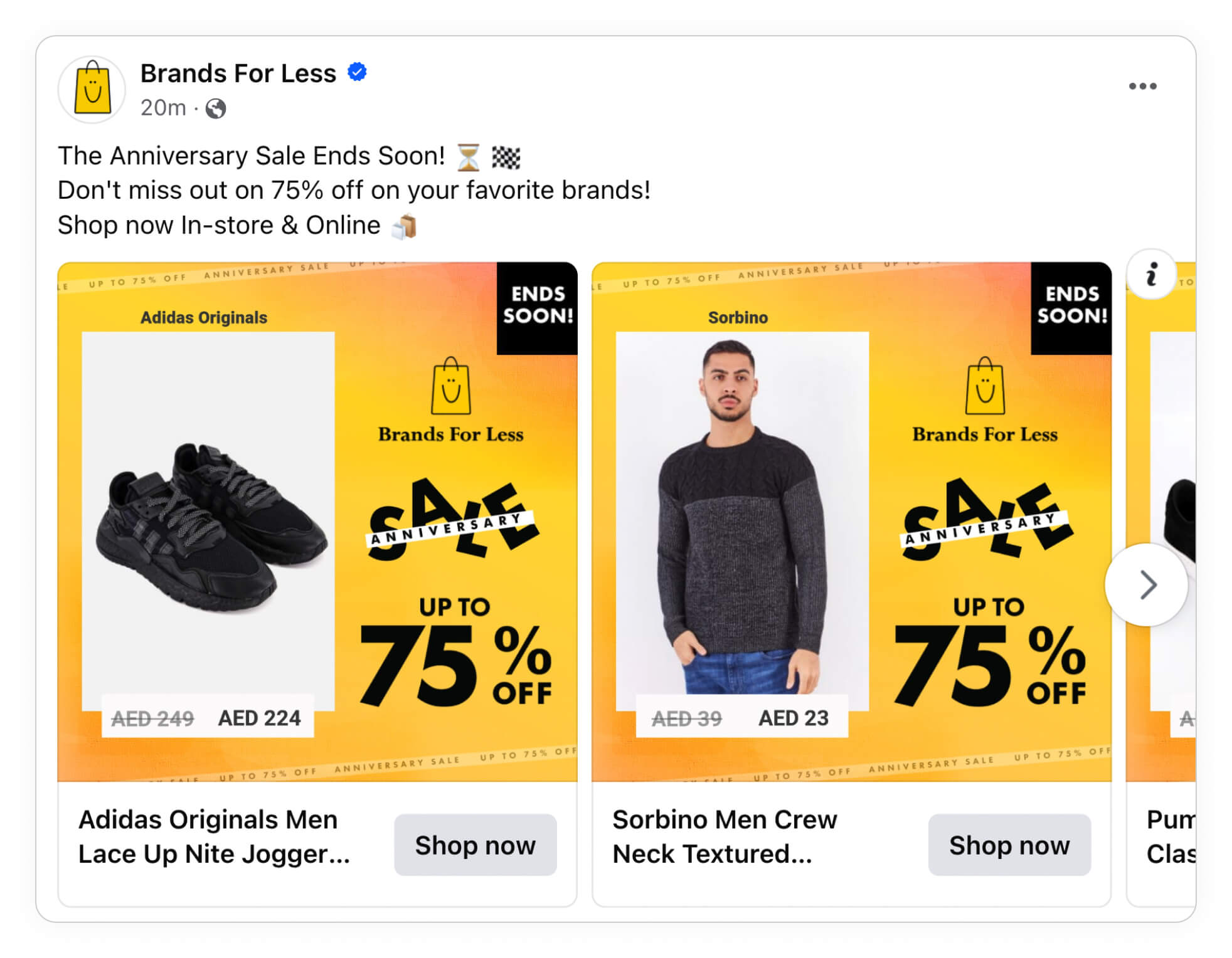
Back to School, or Back to Office, is a great example of an offer meeting the demand. Before returning “back to the office”, one has to make sure they have everything they need, and with this use case, you can offer to be the solution to their problem.
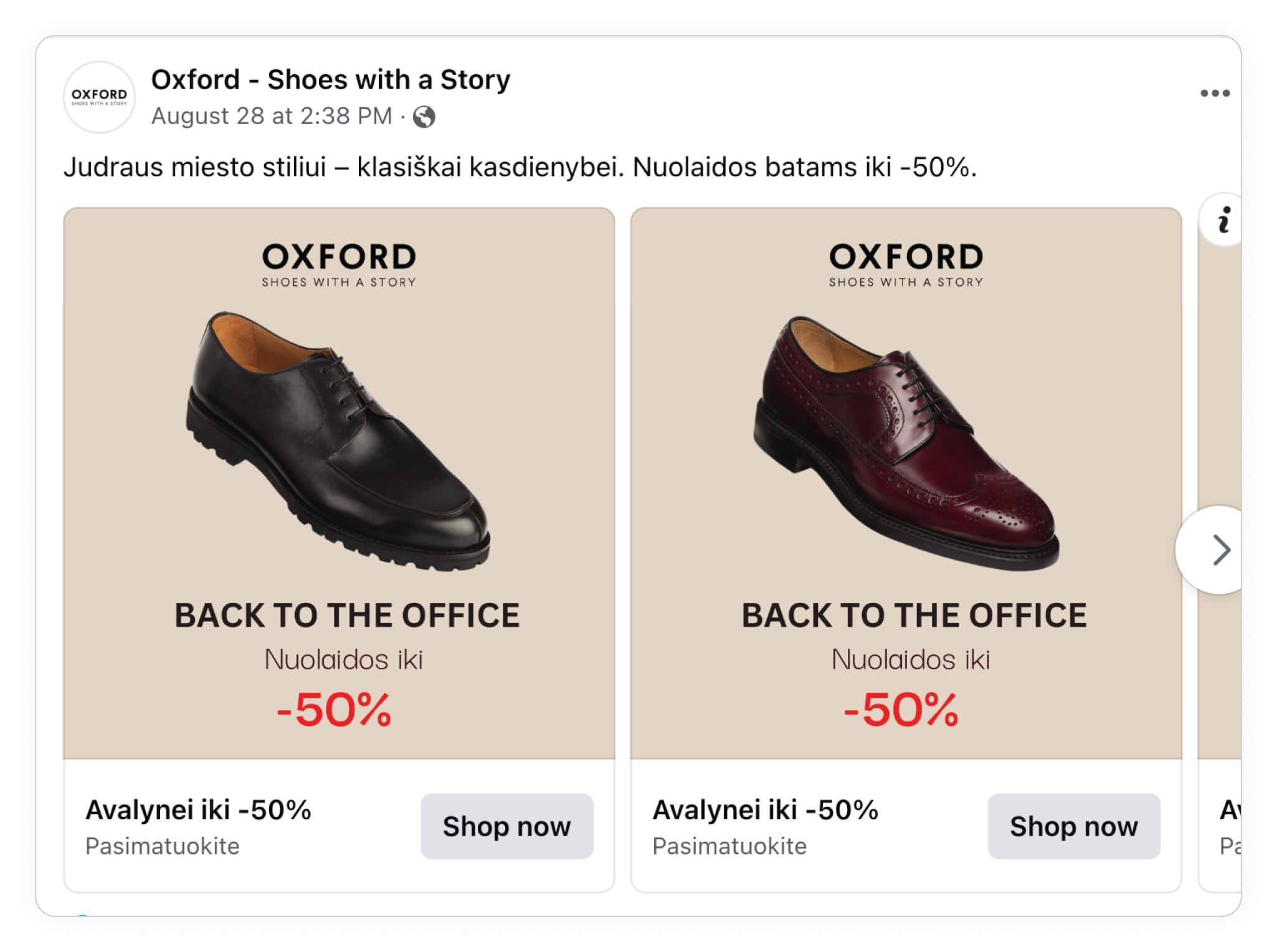
Combining the personalization and performance power of Catalog Ads with the urgency of your campaigns can be a very powerful tool, so take the examples from the above section with you and plan your next campaign with your Catalog Ads in mind.
If you're running campaigns, there is simply no reason not to include them in your Catalog Ads; you synchronize your funnel, combat ad fatigue, and, on average, Catalog Ads promoting campaigns perform 98% better!
Fashion Ads tailored to a Product Set
Being product-relevant doesn't have to mean that you change the design for each product; it could also be that you change the design depending on different groups of products (i.e., product sets)
It could be that you are doing a restock campaign on a specific group of products, then you should, of course, show this in your Catalog Ads!
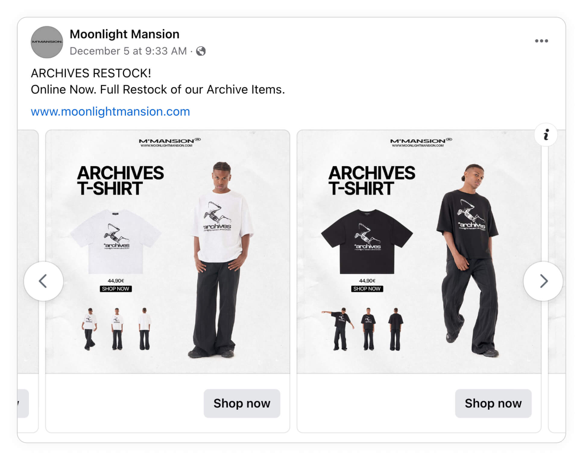
This really applies to every group of products that have something distinguishable. It can be everything from limited edition products to all your red T-shirts. There are, of course, cases where it makes more sense than others; usually, cases, where you can introduce some kind of urgency or scarcity, are great cases because it makes sense to highlight that product set.

Showcase your collections
If you are structuring your products by collections, chances are that your audience wants to know if they are buying from the newest collection or if they can get the old collection at a discounted price. Show the collection of your products in your Catalog Ads!

When advertising a collection, you will often advertise that it's either a new or an old collection; in some cases, it might be better to tie the collection to a specific time to enhance your message - instead of just stating the fact that you're item belongs to X collection.
So if you are launching a new collection, make a specific Catalog Ad design for that collection!

Highlight new products
You already know that everyone loves brand-new stuff; we don't have to explain that to you. When something is fresh off the press, we want to get our hands on it. It's an instinct. We want to be the first mover if we can!
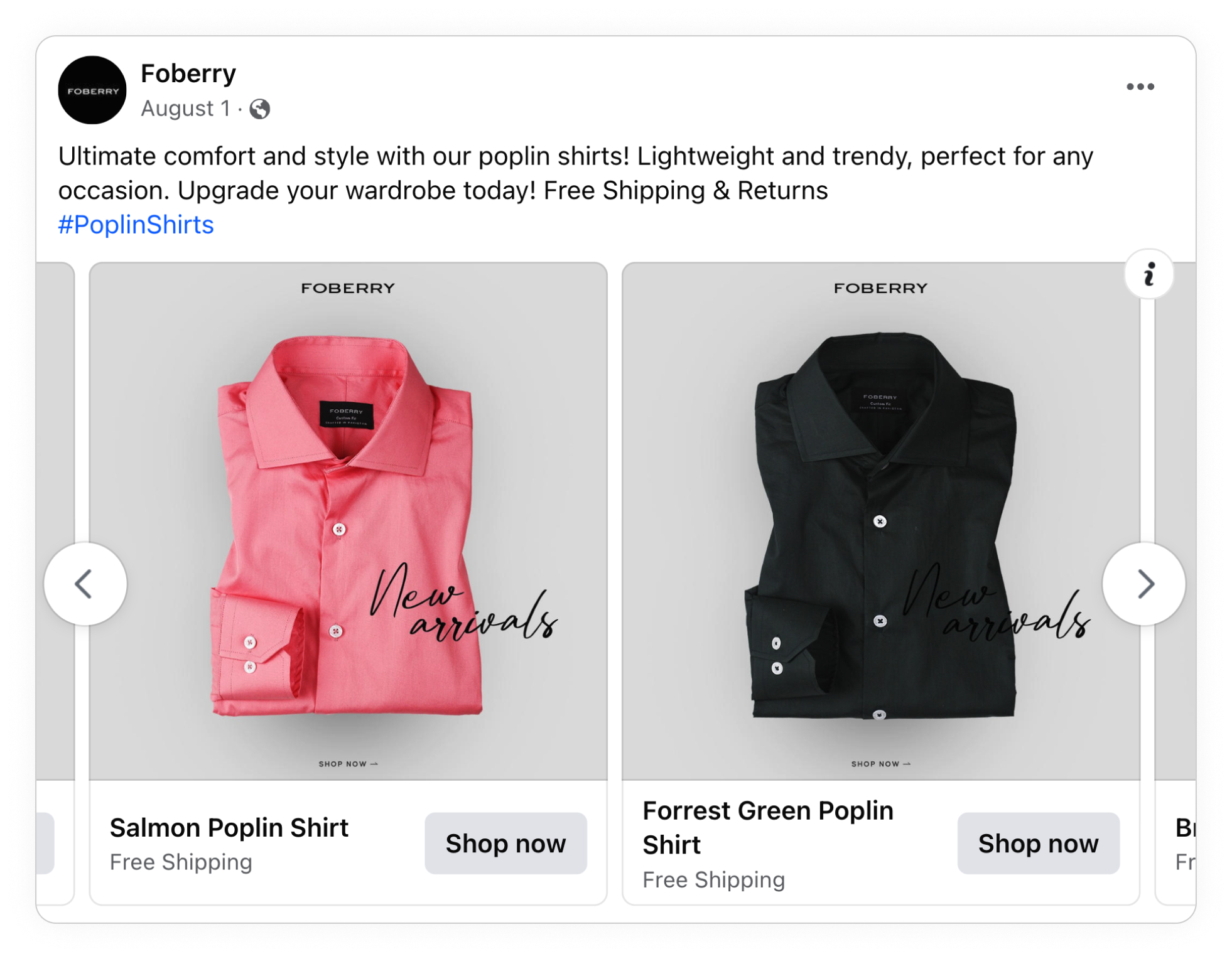
How you phrase the launch of new products is worth considering. It might make sense to be more specific than just saying "new arrivals"; instead, say what the news is! New T-shirts! New colorways! New jackets! This way, your offer is way more compelling.
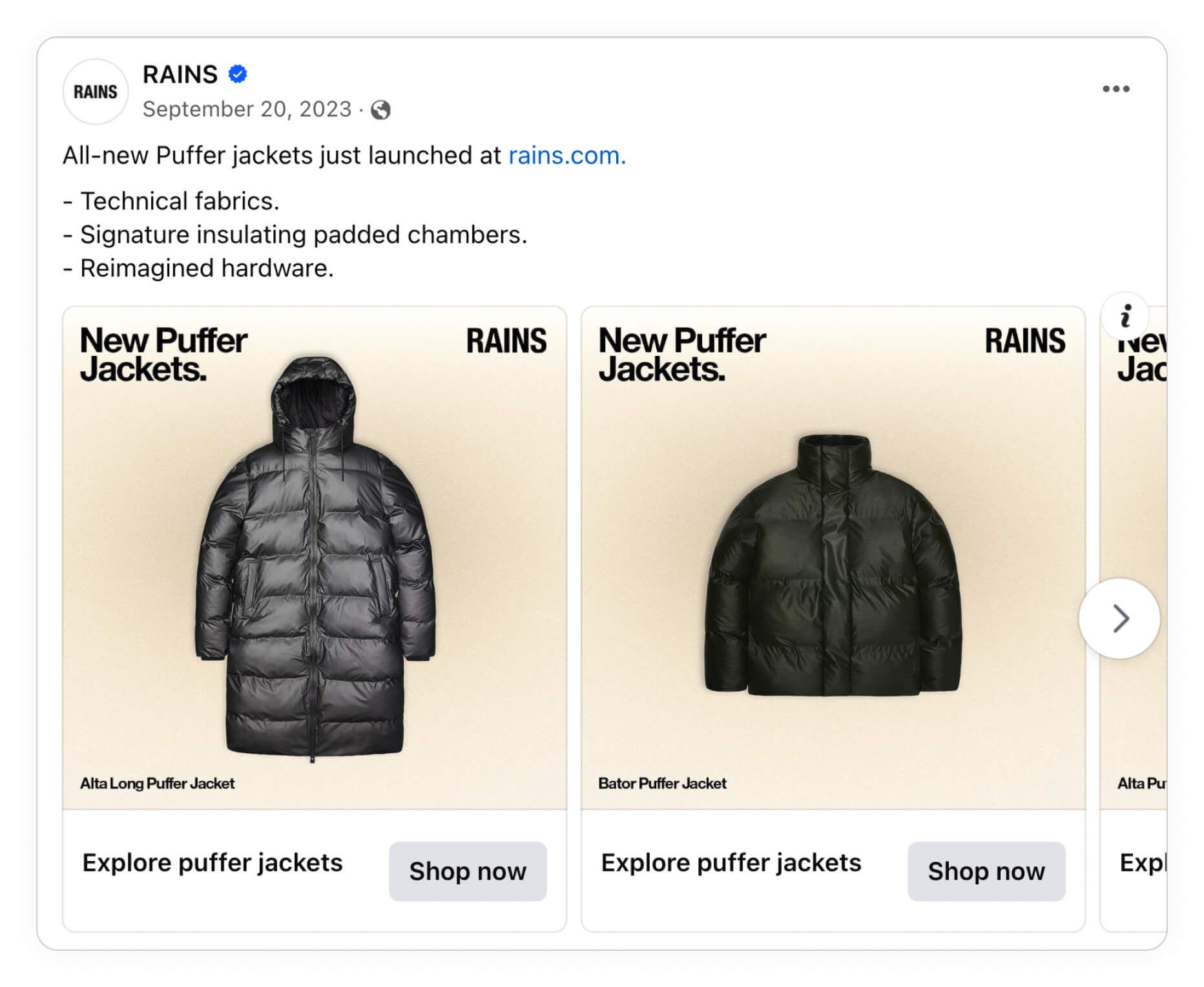
You already know what items are new, so you should, of course, convey this message to the consumer. If you have multiple product categories or sets with new products, you can easily include them with Design rules in Confect.
Always-on campaigns
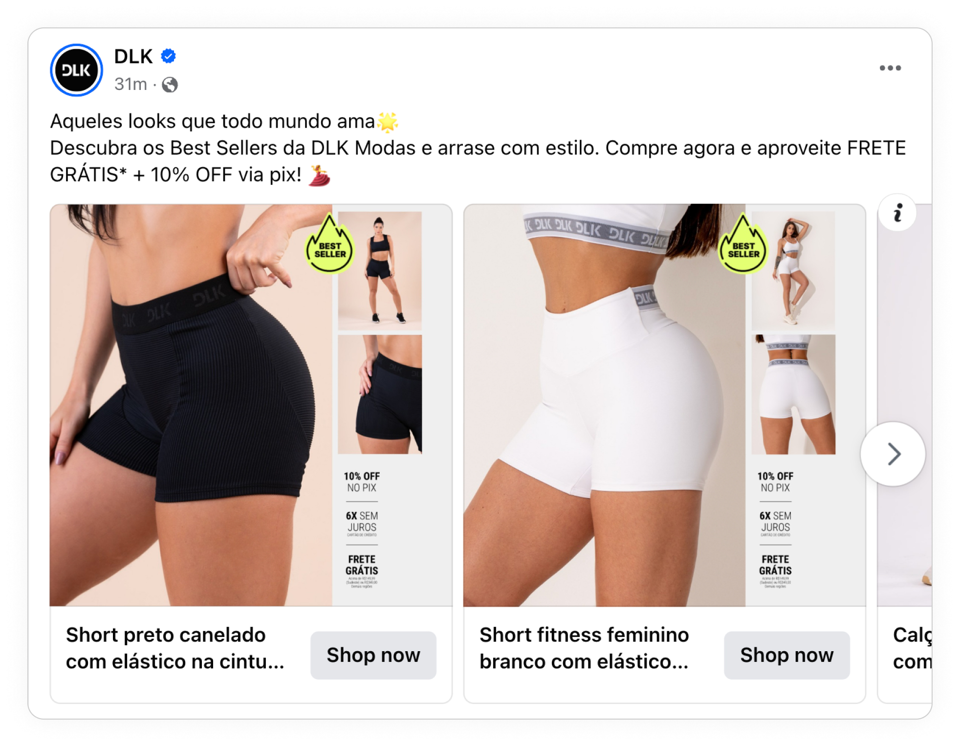
Bestsellers are a typical product set to highlight. You always have bestsellers, and there will always be people interested in bestsellers. The only downside is that the offer can seem vague if people see it multiple times on the same products.
Highlighting your bestsellers is easy; you can highlight them with a splash, text, a custom element, or a completely different bestseller design. The more obvious you make it, the better!
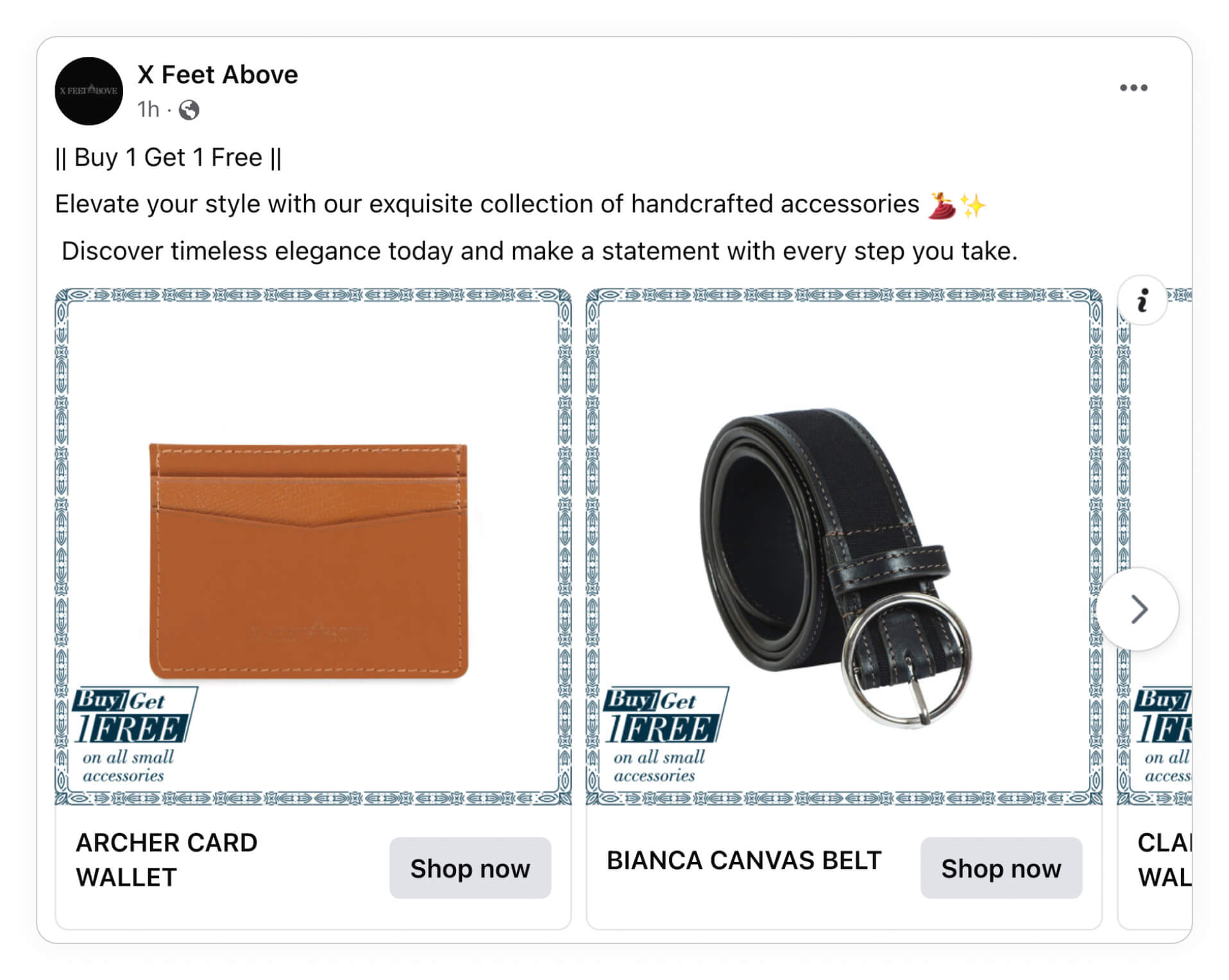
Running things like "buy X get X free" is a well-used technique in fashion. And it works. You can easily ensure that all products involved in the "buy X get X free" offer get a highlighted design with the needed information.
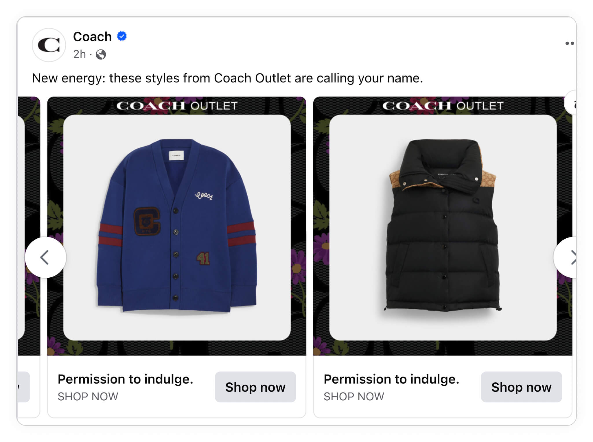
What's even better than the two previous examples is combining them both in an outlet! An outlet where you sell old collections, bestsellers, or another product set for cheaper than usual.
If you're running an outlet sale, consider how this differentiates itself from your 'normal' sale campaigns. A good practice is to make a completely different outlet design.
Use all of these use case ideas to elevate your Catalog Ads. You shouldn't (and can't) do everything, but you should pick out what you think is most relevant for you and try that out!
Again, remember that the key to success with Catalog Ads is nailing these areas: Always-On, Campaigns, and product set-specific ads. You can use this article for inspiration going forward or check out some of our in-depth guides on implementing exactly the use case you want.
