The Fold & Adnomics
September 22, 2025
The ad: Focal points that create interest and context
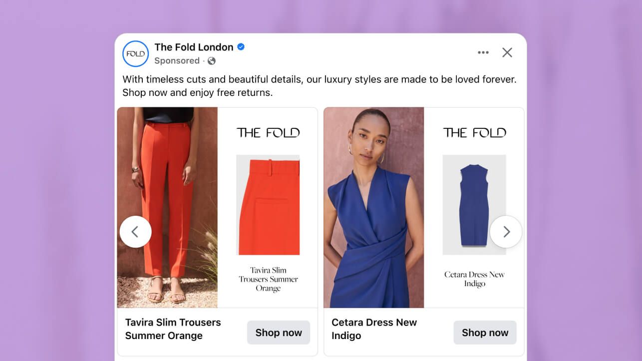
This ad campaign showcasing The Fold’s fashion range is a great example of why using additional images in catalog ads is a smart choice. It combines lifestyle images to show how the clothing looks in real life with close-up shots that highlight the attention to details.
Their Facebook and Instagram ads show that adding an extra product photo doesn’t have to make your creative feel cluttered, as long as you build a clear visual hierarchy and apply your branding consistently. With this formula, you can keep the focus on the product.
Why it won Catalog Ad of the week
The Fold’s campaign generated a 124% increase in return on ad spend (ROAS). They achieved it by tying all the elements (lifestyle shot, product close-up, and product name/description) back to their brand identity.
What makes this result even more impressive is that The Fold didn’t use the product fields, like price and sales, that we typically see in fashion brands’ catalog ads. In fact, according to our numbers, catalog ads with the product’s name generally perform 30% worse, while fashion brands rarely add additional images.
The lesson to be learned here is that creating fashion pieces and catalog ads aren’t that different. You often need to follow your style to stand out.
What makes this Catalog Ad great
Uses focal points to build a visual hierarchy
The Fold uses focal points very effectively to guide shoppers’ attention and create a visual hierarchy. Each ad has a main product photo along with an extra shot that catches your eye first. The fact that both these photos are styled cleanly against a neutral background makes the clothing item stand out even further.
Then, above each product photo the logo, beneath - a short product description and a clear call to action (CTA) that acts as a secondary focal point. This extra information offers clarity and makes the next step obvious without drawing attention away from the striking outfits.
By keeping the logo, description, and CTA sized just right and placed consistently, the design creates a natural rhythm. Your eye moves from the product image to the brand name and then down to the action button without any friction. It feels effortless, like the ad is leading you along without you even noticing.
Applies branding consistently
The Fold successfully applies the key elements like typography, logo, color palette, and tone of voice consistently. Here’s how:
- The product names and descriptions use a clean typeface consistently that matches the brand’s modern aesthetic and positions it as a premium choice. Minimal, refined typography signals confidence, premium brands don’t need loud or decorative fonts - restraint itself suggests quality and timelessness.
- The consistent logo placement reinforces brand recall and strengthens the premium feel. Think of the logo placement like a signature, when it’s always in the same spot, it clicks with people. That consistency makes the brand stick and builds trust over time.
- The product name/description, logo, and photos are set against a neutral background which helps to keep the focus on the product. A clean backdrop is like putting it under a spotlight, it removes distractions and makes the product stand out. Neutral tones also feel timeless, which fits The Fold’s classic identity.
- Phrases like “timeless cuts” and “beautiful details” use aspirational language that aligns with the fashion brand’s identity as a high-end fashion label. Rather than pushing discounts or urgency, the copy invites shoppers into a lifestyle - elegant, refined, and sophisticated. That’s the power of aspirational language for luxury brands.
Shares contextual imagery
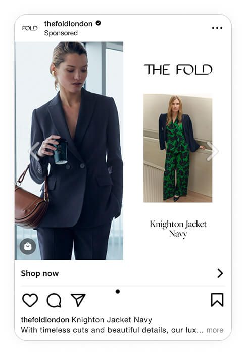
Instead of using only flat product images, The Fold also uses a styled model shot. This combination of a close-up and full-body shot ensures that product details are highlighted while it also creates lifestyle appeal. In one shot, you get a better idea of how the trousers, for instance, will fit and look as part of a real outfit.
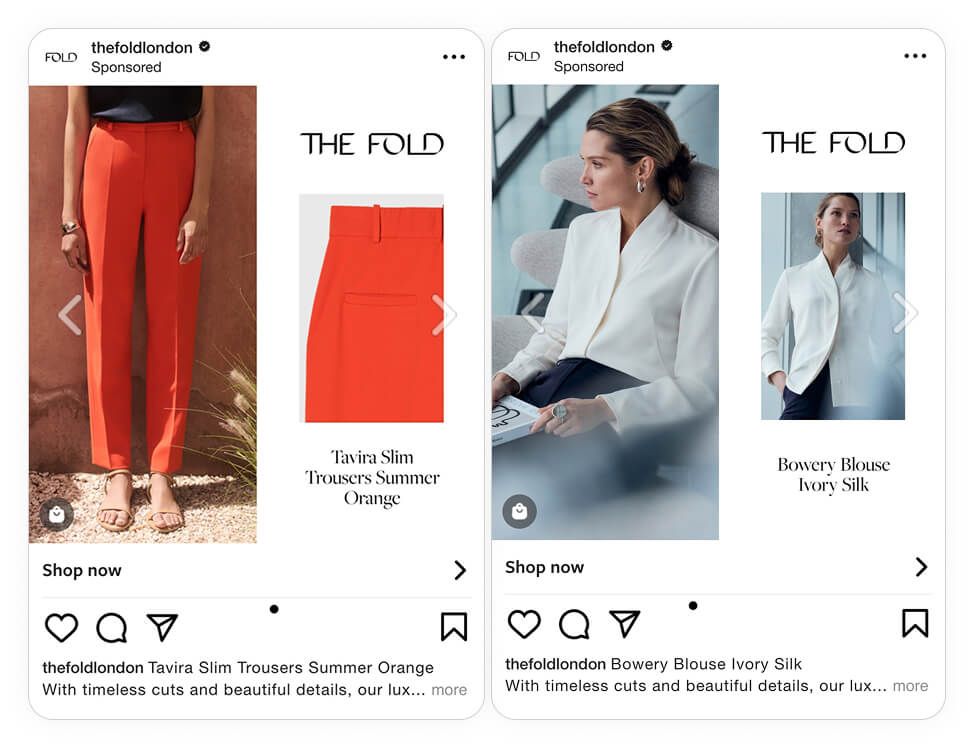
The images also help to create seasonal and situational relevance. For example, they paired bright orange trousers with the summery outdoors. On the other hand, the ivory blouse is shown in an office setting, highlighting its suitability as workwear. These different settings also help to showcase its broad product range and versatility.
You can take the same approach here. Instead of showing the dress and trousers in isolation, the ad places them in context, styled together, on a model, in motion. That context does the heavy lifting: shoppers don’t just see clothes, they imagine how they’d look and feel wearing them.
Key Takeaways
The Fold’s campaign proves that when it comes to high-end fashion using models in your ads can have a greater impact than discounts.
Here’s how they made this strategy work for them:
👉 Lead with visual hierarchy
Let the product command attention by using high-quality, large images. Use the product description/name to add context without competing for the spotlight.
👉 Maintain brand consistency
Incorporate your brand’s typography, color palette, and tone of voice across all placements. Consistency builds brand trust and recognition.
👉 Blend detail with lifestyle
Pair close-up product shots for clarity with full-body model shots that tell a story. This combination taps into both shoppers’ practical and aspirational motivations.