Terranova & Visioni Agency
May 27, 2026
.jpg)
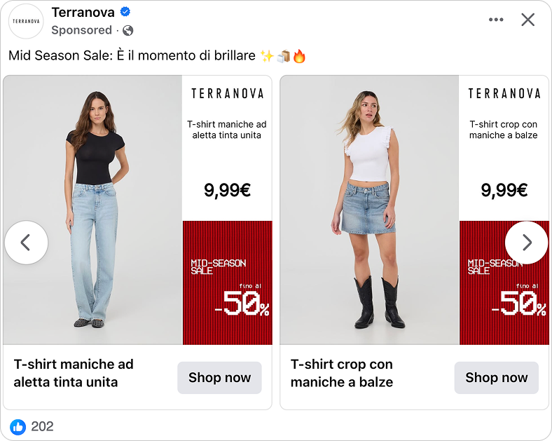
The ad: A Catalog Ad that makes the Mid-Season Sale impossible to scroll past
The first thing you notice is the red block. Bold, solid, sitting in the corner of every card. "MID-SEASON SALE. fino al -50%." You know exactly what kind of ad this is before you have read a single product name.
This is a Catalog Ad from Terranova, one of Italy's most recognised fast-fashion brands, built by Visioni Agency for their Mid-Season Sale. Affordable, trend-driven, and present across dozens of markets, Terranova needed a Catalog Ad that carried that energy without overcomplicating it.
The layout is clean and consistent across every card. On some cards, a full-height model wearing the product. On others, a clean product shot. A white panel on the right with the brand name, product name, and price. Some cards show a strikethrough original price and a percentage badge. Others show just the current price. The design adapts to what each product actually has to offer.
What makes this worth studying is how every element earns its place. Nothing is decorative. And that thinking carries all the way through to two different format sizes, each one built properly for where it actually runs.
Why it won Catalog Ad of the Week
Most Catalog Ads running a sale just drop a discount badge on the existing design and call it done. Terranova and Visioni Agency thought about it differently - the split, the pricing logic, the sale block, the format variations - every part was built with a clear purpose.
This is not the first time the two have worked well together. Visioni Agency has a proven track record with Terranova on Meta, and the Mid-Season Sale Catalog Ad is built on that same foundation of knowing how the platform works and designing creative that plays to it.
The results speak for themselves. Beyond the +116% increase in Return on Ad Spend, there was a +94% lift in conversion rate, showing stronger efficiency and higher purchase intent across the board.
Every section below breaks down one of those decisions, and why it works.
What makes this Catalog Ad great
Putting the sale inside the frame
Most brands running a sale update their caption and call it done. "Mid-season sale, up to 50% off" sits in the post copy, and anyone who scrolls past without reading it misses the message entirely.
Terranova and Visioni Agency made a different call. The sale block is baked into the design itself - "MID-SEASON SALE / fino al -50%" in solid red, sitting in the corner of every single card. It is not an overlay Meta adds. It is part of the creative.
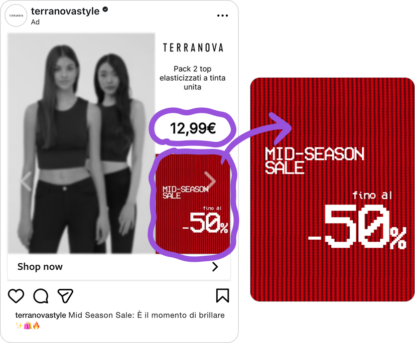
That distinction matters more than it looks. Caption text disappears the moment someone scrolls. A design element inside the frame lands on every impression, in every placement, whether the shopper reads the copy or not. The sale message is inescapable.
And because it is built into the template rather than added manually, it appears consistently across every product in the catalog - hundreds of cards, all carrying the same umbrella promise. Even a product with a modest individual discount benefits from "fino al -50%" sitting in the corner. The whole catalog feels like a sale, not just the products that are heavily discounted.
The split layout: fashion's most reliable Catalog Ad format
If you have been following Catalog Ad of the Week for a while, this layout will look familiar. We have featured it before. And we will probably feature it again.
That is not laziness on our part - it is the point. The split layout keeps showing up because it keeps working. Design Cykler used it. H&M uses it. Zalando uses it. Some of the biggest fashion advertisers on Meta have independently landed on the same solution.
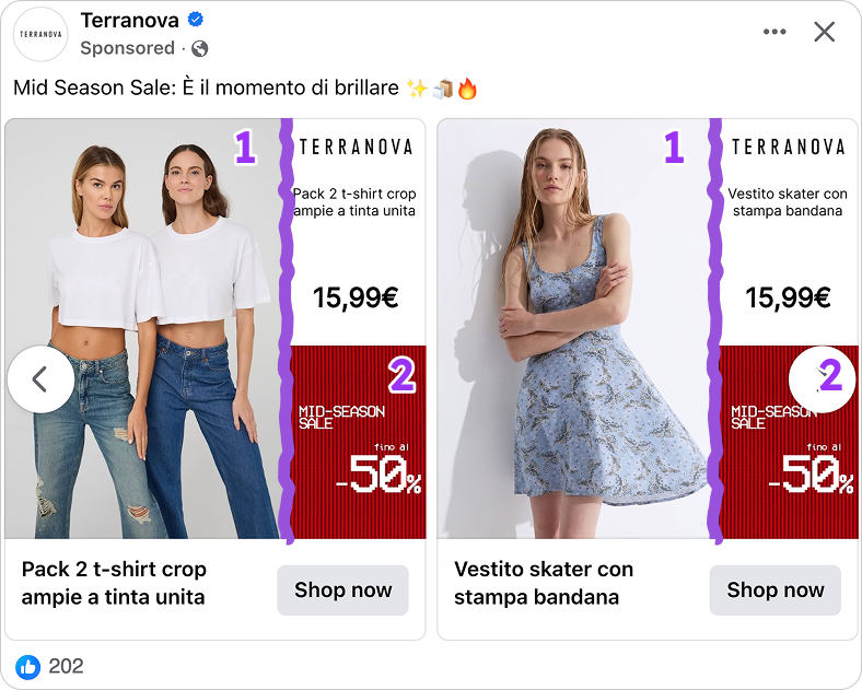
The reason is simple. Fashion needs a vertical product image. A model shot, a full-length product photo, something that shows the item the way it actually looks when worn. The split layout gives you the full height of the card for exactly that - no cropping, no compromising the image to fit text around it.
The remaining half of the card is then free to do everything else. Brand name, product name, price, discount badge, sale block - all of it sitting cleanly in its own space without touching the image. The shopper gets the visual and the information at the same time, in the same glance, without either getting in the way of the other. That is why this layout is the default for fashion Catalog Ads. Not because nobody has thought of anything better. Because it genuinely solves the problem.
Three formats, three proper designs - not three crops
This campaign runs across three Meta formats: a 1:1 carousel for the feed, a 4:5 for Reels, and a 9:16 for Stories. None of them is a resized version of the others. Each has its own layout built for how that placement is actually consumed.
Most brands design one Catalog Ad and let Meta resize it for every other placement. The result is predictable: logos get cut off, prices land behind the interface, and product shots lose their composition.
.png)
Safe zones are why this matters. Every Meta placement has areas where the platform UI sits - the profile icon, the "Sponsored" label, the CTA button. Any key element that lands in those zones gets obscured on a real device.
.png)
Visioni Agency kept the sale block, the price, and the brand name inside the safe zone boundaries on every format. That is the difference between a design that looks correct on screen and one that actually works when it goes live across placements.
Key Takeaways
Every decision in this Catalog Ad points in the same direction: make it easy for the shopper to understand what they are looking at and why it is worth buying. Here is what Terranova and Visioni Agency got right.
👉 Put the sale message inside the frame
Caption text disappears the moment someone scrolls. A design element inside the frame lands on every impression, in every placement, no matter what. Even a product with a modest individual discount benefits from an umbrella "fino al -50%" in the corner. The whole catalog feels like a sale.
👉 Use the split layout - it exists for a reason
Fashion needs a vertical image. Give it the full height of the card. The remaining half handles everything else - brand name, product name, price, sale block - cleanly, without touching the image. The shopper gets both in one glance.
👉 Build each format for where it actually runs
Every Meta placement has its own safe zones, its own proportions, its own viewing context. Resizing one design for all three leaves performance behind. A 9:16 built for Stories will always outperform a cropped feed card.