Sniph & Spotlight
November 3, 2025
The ad: Seasonal, optimized, timely and relevant
Sniph is a Swedish-based cosmetics company founded in 2015. They sell a range of curated perfumes and accessories and have the goal of helping customers create their own “scent wardrobes” with the help of their scent experts.
The brand recently teamed up with Spotlight to revamp their Catalog Ads on Meta. Their old ads weren’t terrible. But they just weren’t achieving the results Sniph and Spotlight knew they could.
So, the duo leveraged a bit of design creativity and the brand’s existing assets to try and drive better returns. And, not surprisingly, it worked!
Why it won Catalog Ad of the week
This specific Catalog Ad achieved a +45% uplift in ROAS. Spotlight used on-brand colors, seasonal visuals, optimized ad placements, and existing product information to create ads that didn’t just look better… they performed better, too!
Great ads aren’t as complicated as some people think. As Sniph and Spotlight show us, the right colors and design elements can really grab your audience’s attention. And when you pair that with the information you know shoppers want to see, you get a campaign that sells with ease.
What makes this Catalog Ad great
Use branded colors and seasonality to your advantage
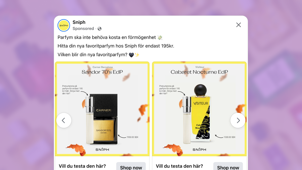
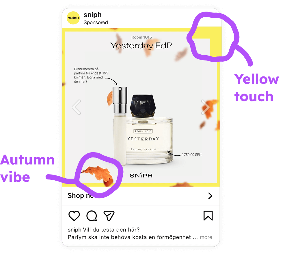
Visit Sniph’s website and the first thing you notice is that bright yellow is their most noticeable branded color. It’s present on their site and on their logo. So it was an obvious move to include a bright yellow border around each ad.
It’s subtle and doesn’t take up a huge portion of the ad. But it’s genius for two important reasons…
First, it ensures Sniph’s ads match their site, creating a seamless transition between scrolling in feed and shopping on the brand’s website.
Secondly, it’s an eye-catching color. So it’s great for stopping people mid-scroll and making them take a look at the product. Bright colors like this practically shout: “Hey! Look here! We’ve got cool stuff for you!”
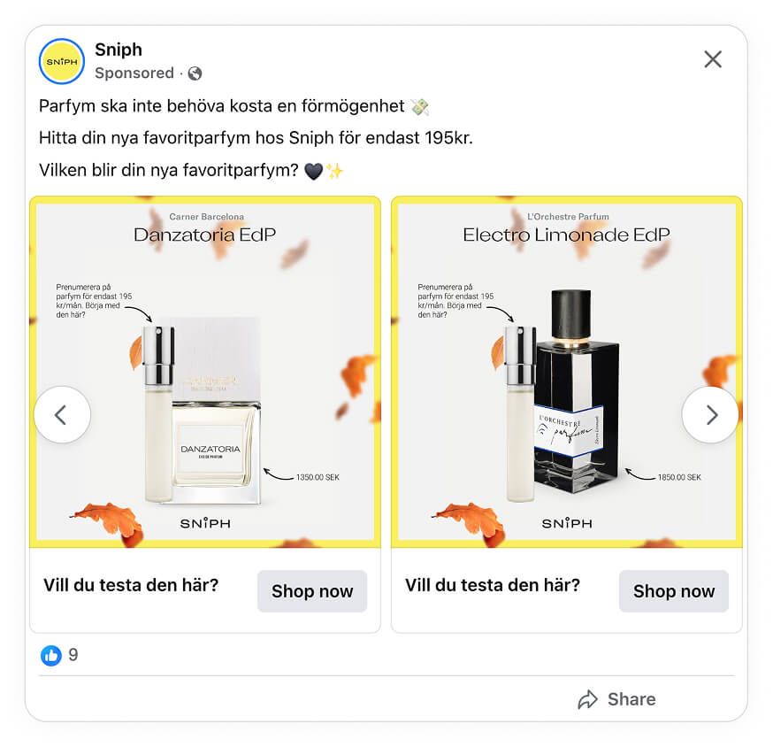
Spotlight also added a few red/orange leaves to the ad to create a more seasonal feel. This was another savvy move because it helps make the ad more noticeable. But it also makes the whole design feel more timely and relevant. Perfect for any fall campaign!
Show product information that matters to your audience
When an ad hits a home run, it’s usually because it tells the audience exactly what they need to know before they click. So Spotlight’s move to include relevant details was another smart and effective change that aligns the product with the audience’s expectations.
By including the product name, description, and price directly in the creative, people can now decide whether or not the product is right for them, without having to click-through to the website.
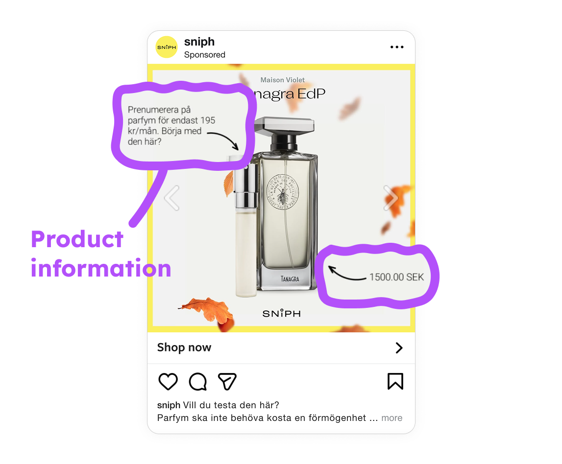
When people see the new ad, they get the information they need, and all at a glance. There’s a snapshot of the product, what it is and how much it costs. So Sniph no longer has to waste ad spend on clicks that won’t convert into sales.
Sure, that’ll still happen. But most times, if somebody sees the ad and doesn’t like the product, they just won’t click. Or if they like what they see, they’ll click and they’re already that much more likely to make a purchase.
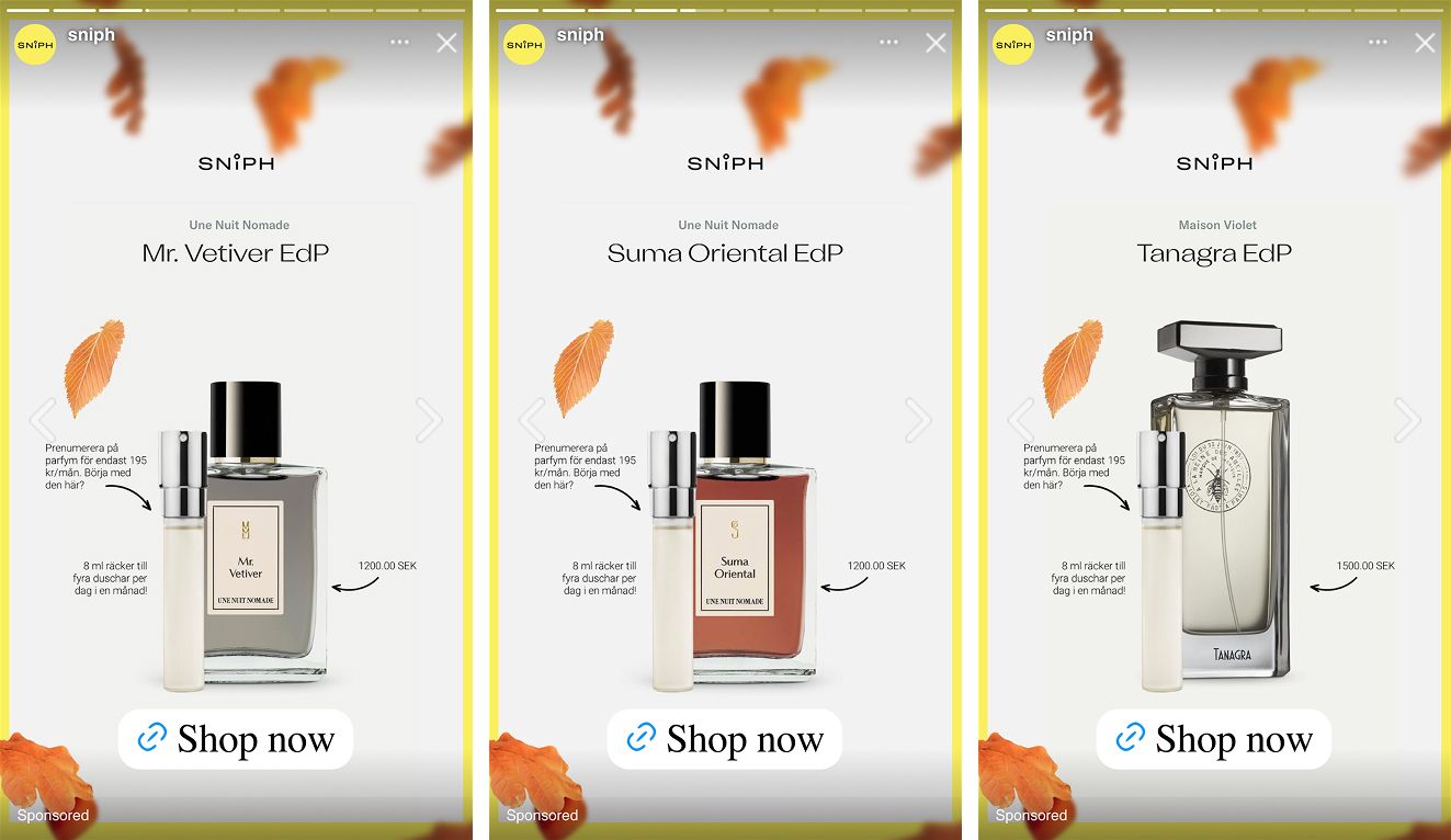
Optimize for 1:1 and 9:16 ads
One of the most common complaints marketers have is that ads look great in feed, but awkward, misaligned, and just bad when shown in Stories or Reels. That’s why the next step Spotlight took was to optimize Sniph’s ads for 9:16 ad Meta placements.
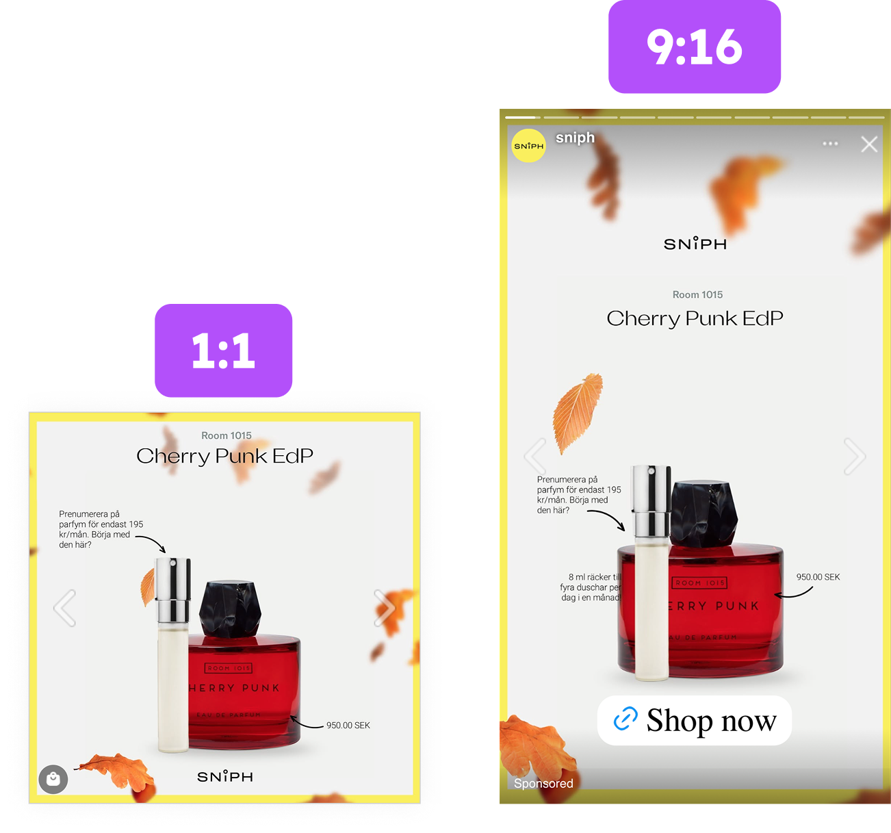
By using Formats, Spotlight made sure that Sniph’s 1:1 square ads would be optimized and shown in a 9:16 format when shown in placement like Stories and Reels. Now, no matter where the ads are served up, they look native, professional, and way better than they would have.
But native ads don’t just look good. Formats also ensure that all important information (brand name, product images, USPs, etc) are shown within safe zones. No more important details covered up or cropped out. All information is now shown front and centered, right where it needs to be!
Key Takeaways
Sniph’s new and improved Catalog Ads show us that performance marketing isn’t always about thinking outside the box. Here’s a recap of how Spotlight helped Sniph improve their campaign performance.
👉 Use branded colors and seasonality
Using branded colors created a more frictionless shopping experience. It made sure the ads and website matched, making the brand look more professional and trustworthy. But pair that with eye-catching colors and seasonal design elements and you’ve got an ad that catches your attention and that feels timely and relevant too!
👉 Show relevant product information
By showing relevant product details, people can decide if a product is right for them without having to click-through to the shop to look for the information they need. This means less ad budget going to clicks that don’t convert. And the clicks you do pay for? They’re that much more to be your next customers.
👉 Optimize for Stories and Reels
Square ads might look great in feed. But shown in placements like Stories or Reels… they just look bad. Important details get cropped out or covered up, and images can be misaligned. That’s why using Formats was a smart way to ensure Sniph’s ads look great, no matter where they’re shown.
Sniph and Spotlight didn’t waste time creating these high-performing Catalog Ads. They already had branded colors and product details they knew people would want to know. All they had to do was combine that with a bit of seasonality and ads optimized for 9:16 placements, and they got a campaign that achieved better results than ever before.