
Oslo Tool Company
July 8, 2026
Advertiser
Oslo Tool Company
Creators
Christian Nybø
Pål Fossum
Platform
Meta
Design tool
Confect.io
The ad: The Catalog Ad built for the product that earns it
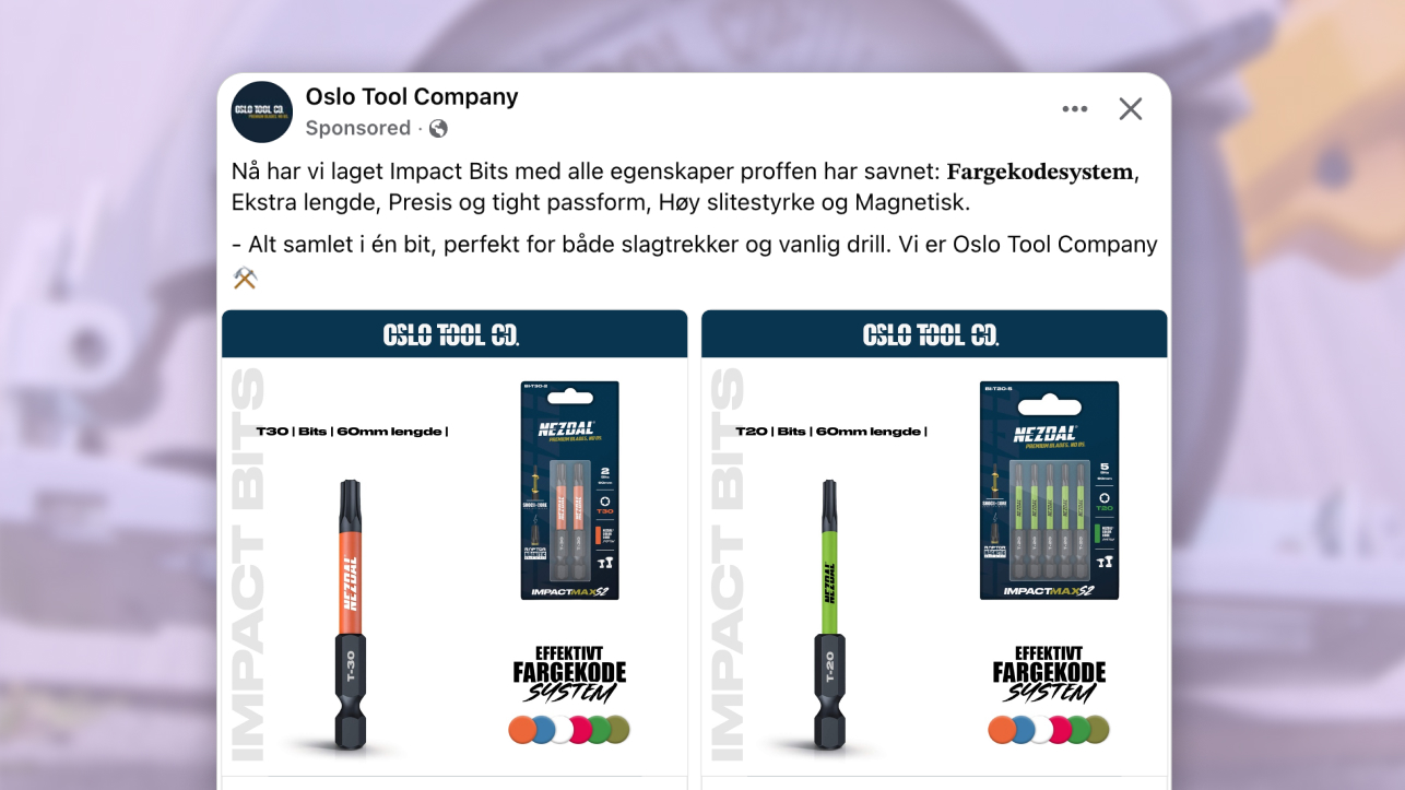
Most tool catalog ads show a product on white and leave everything else to the shopper. This one explains exactly why the right bit is worth caring about.
Oslo Tool Company sells tools built for professionals. Their IMPACT BITS line is one of their best sellers - currently featured in the main promotional banner on their site - and the Catalog Ads.
Catalog ad is designed around what a tradesperson actually needs to know before buying a precision bit: the type, the length, what comes in the pack, and the one thing that sets these apart from the cheaper alternatives.
The campaign is built around the IMPACT BITS range specifically. Not the full catalog. Not a mixed collection of tools. Just this category, designed as if the product deserved its own world - because for the trades buyer scrolling past, it does.
Why it won Catalog Ad of the Week
A bit is a bit. Nothing separates the professional spec from the blister pack at the supermarket checkout - until you actually use one.
Oslo Tool Company understood that the purchase decision for IMPACT BITS is not really about the bit itself. It is about confidence. Confidence that you have the right type, the right length, and a product that will not let you down mid-job. The Catalog Ad design is built around that. The design gives the trade buyer what they need to make a certain choice before they ever tap through.
A +25% increase in Return on Ad Spend does not come from running a better product on white. It comes from giving a ready buyer a reason to choose this one over the cheaper version sitting next to it. That is exactly what this Catalog Ad does.
.png)
It matters that IMPACT BITS is already Oslo Tool Company's best seller. This was not a campaign trying to create demand from scratch. The demand existed. The design turned it into a decision - and made that decision easy.
What makes this Catalog Ad great
One design built entirely for this product
A Catalog Ad that has to work across an entire tool catalog ends up being a compromise. It cannot go deep on bits because it also needs to work for workwear. It cannot show the details that matter for blades because those are not the same details that matter for hand tools.
The Oslo Tool Company team built this campaign specifically around IMPACT BITS. That single focus is what gives every element permission to go deeper.
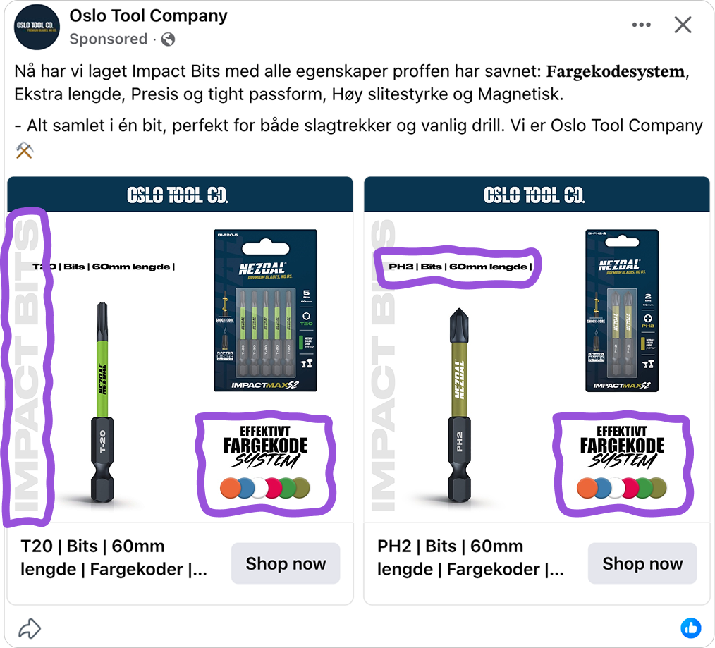
Because the design only needs to serve one category, every element earns its place. The individual bit is shown so the buyer can see exactly what they are getting. The retail package shows what comes in the box. The bit type and length are named clearly.
And then there is the color code system - the detail cheaper alternatives do not offer. For a tradesperson with a tool bag full of bits, each type has its own color so you can grab the right one at a glance. No squinting at engravings mid-job. That is the real differentiator this ad is selling. Not just a bit - a bit you can always find.
Catalog Ads that support the product the website leads with
IMPACT BITS is not just a product in Oslo Tool Company's range. It is the product they lead with - featured in the main promotional banner on their site, positioned as their best seller.
That kind of prominence on the website tells you something. It is the product with the most proven demand, the clearest differentiator - that color code system that cheaper alternatives do not have - and the strongest reason to choose Oslo Tool Company over something cheaper. It is the right product to build a Catalog Ad campaign around.
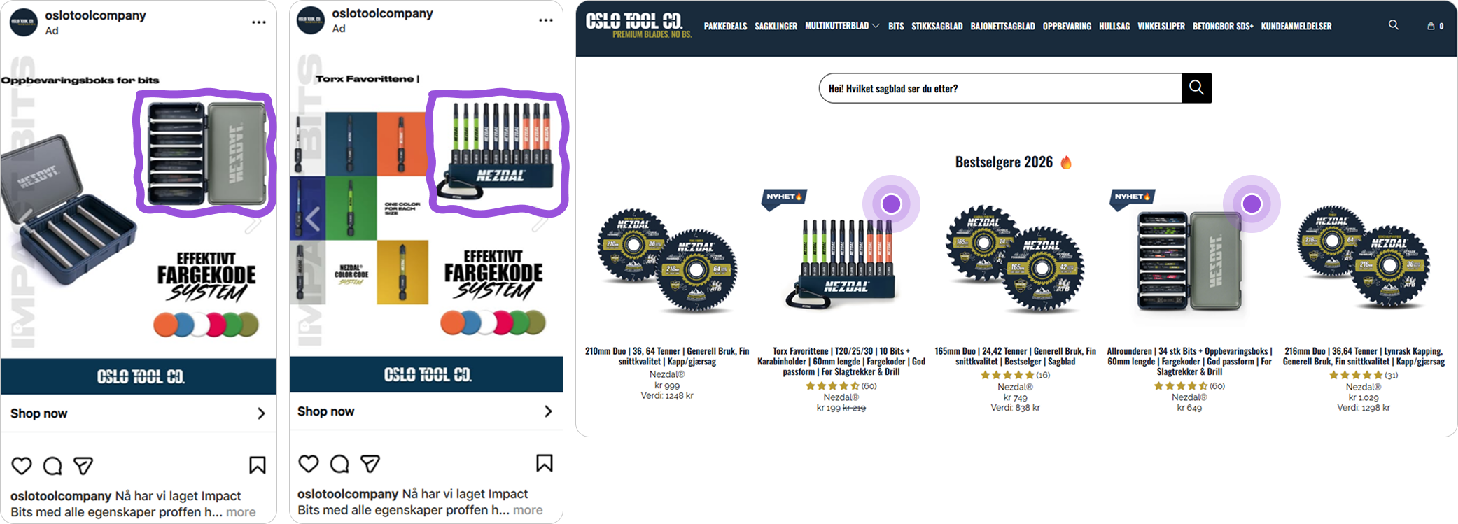
What the Catalog Ad does is carry that same confidence into the feed. A shopper who lands on the Oslo Tool Company website and sees IMPACT BITS front and center is seeing the same product, the same visual identity, and the same recognizable design they already encountered in the ad. The two reinforce each other. The website validates what the ad promised. The ad primes the shopper before they ever arrive on the site.
That continuity between ad creative and site presence is not accidental. It is what happens when the most important product in the catalog gets a Catalog Ad designed to match its importance.
Three formats, each one built for where it runs
This campaign runs across 1:1, 4:5, and 9:16. None of them is a resized version of the others.
.png)
Most brands build one Catalog Ad and let Meta adapt it for every placement. The result is predictable: logos get cut, prices land behind the platform UI, and the product loses its composition. A buyer who sees a polished 1:1 in the feed and a broken 9:16 in Stories does not consciously register the inconsistency - they just feel slightly less confident about the brand.
.png)
Each format in this campaign keeps the dark navy background, the IMPACT BITS wordmark, and the bit photography intact - but the layout shifts to fit the space properly. The product has room in every format. The key information stays inside the safe zones. The ad looks intentional wherever it runs.
When the same visual system holds across every placement, each impression compounds. A buyer who sees the same confident creative in the feed, in Reels, and in Stories starts to feel like the product is everywhere - and that is exactly what drives the decision to finally click.
Key Takeaways
Every design decision in this campaign points in the same direction: give the professional buyer exactly what they need to make a confident choice, before they have to ask.
👉 Design for the category, not the whole catalog
Different products have different purchase considerations. When the creative is built around what actually matters for one specific category, it speaks more directly to the buyer who is ready to purchase that thing.
👉 Build Catalog Ads around the product your site leads with
The product you feature most prominently on your website already has the most demand behind it. A Catalog Ad campaign built around that product does not need to create interest from scratch - it just needs to convert the interest that already exists.
👉 Build each format for where it actually runs
Resizing one design for every placement leaves performance behind. When each format is built with its own layout logic, the campaign looks intentional everywhere - and each impression reinforces the last.