Kremmerhuset & INEVO
February 11, 2026
The Ad: Where real-life imagery and value lead the way towards conversions
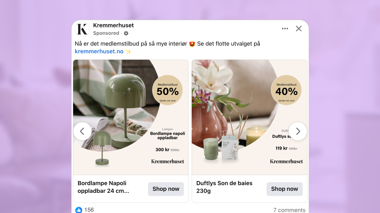
This catalog ad was designed to quietly help shoppers say yes. Even at a quick glance, the design makes both the product and offer easy to understand, and additional design elements support informed purchasing decisions.
Designed by Kremmerhuset & INEVO, this catalog ad took a classic and smart approach to its design. It’s soft, calm and approachable. But it works effectively to capture your attention with its lifestyle imagery of various household products and the easily visible “member’s club” discount badge.
Everything from the layout and offer to the imagery and visual hierarchy give this catalog ad a slightly more premium feel. But it also ensures the sales messaging doesn’t feel pushy or overwhelming.
Instead, the product and offer are the stars of the show. The overall design makes owning the products feel realistic and the offer makes the promo feel like a real win.
Why it won Catalog Ad of the week
This catalog works well because it puts a clear focus on value. Without having to search for information, viewer attention is immediately captured by the lifestyle imagery and the visible discount badge.
The strongest performance driver is the discount badge itself. Because the offer is easy to spot, the design communicates value instantly and without friction. That clarity is a key reason why this ad achieved a +30% ROAS and won Catalog Ad of the Week.
By making the value obvious at a glance, the layout removes unnecessary decision making. Shoppers do not need to interpret the message or look for the offer. Everything they need to understand the value is already presented upfront.
When ads look approachable, make products easy to understand, and clearly communicate value, decision making feels seamless. By simplifying the buyer’s journey, catalog ads like this quietly encourage shoppers to move from interest to purchase.
What makes this Catalog Ad great
Real-life product placement makes ownership easy to imagine
One of the worst parts about shopping online is that it’s hard to know what something looks like in real life. Size, shape, textures are all tricky to imagine, which is why using lifestyle shots or models can be so effective.
Instead of showing an isolated image, these products are shown in real-life, everyday home interiors. This was a smart choice because it makes the overall design look natural and more visually appealing.
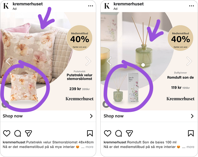
Viewers don’t even need to think about what the product looks like in real life because they get a snapshot of how it fits into a real home setting, making ownership feel easy and natural.
Because of that, this catalog ad didn’t need to use persuasive copy which can often turns viewers off from clicking on ads.
Clearly visible discount offers that communicates strong value instantly
Once your attention is captured by the imagery, it’s naturally guided towards the value being offered. Even while scrolling fast, it’s still easy to spot the 40% off “member’s club” badge.
Not only is that an attractive discount, but it also invites viewers to become members, turning this ad into a double-edged sword. Members get a great discount and non-members see it’s worth signing up to access future promos.
.png)
The advertiser also used a larger and bolder font for the badge, which ensures it’s easily seen and understood, showing this design generated a lot of interest from members and non-members alike.
Ultimately, member’s pricing and the badge’s placement turned this catalog ad into a real scroll-stopper. Value is communicated clearly and efficiently, which makes the offer feel like an easy win for shoppers.
A well-balanced layout that doesn’t distract from the product
Another reason this catalog ad works well is because it’s split into two, with one-third used for product details, and the other two-thirds used to show the product itself.
What’s smart here is how the 1:2 layout is not super noticeable to everyday shoppers. Marketing and design experts might notice it. But using a traditional design layout in a different manner was a smart way to give the ad a high-end feel.
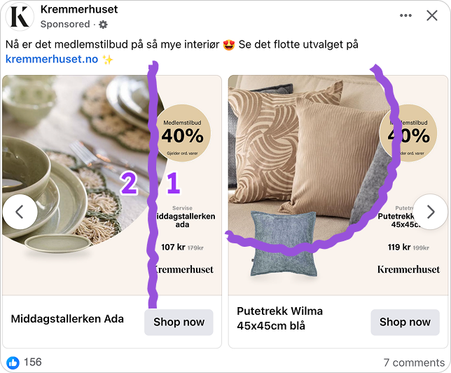
The layout also includes written details shoppers need to decide if the offer is right for them, such as the product name, price, and brand. But it’s all included in a light and subtle way, making it supportive rather than overly descriptive.
Layout, color theme, and the amount of copy used give the ad a softer, more approachable and more premium look. It keeps the focus on value and product ownership, which quietly helps shoppers say yes, even before they read the copy.
Key Takeaways
This design shows us that it can often be more effective to create catalog ads that communicate value and that make product ownership feel easy and natural, rather than using traditional sales tactics.
👉 Choose imagery that supports product ownership
High-quality images are often more effective than sales-focused copy. Lifestyle imagery or model shots make it easy for people to imagine themselves owning a product without having to think about it.
👉 Communicate value quickly and efficiently
The best ads communicate value quickly and efficiently, without distracting from the product. This can be done by using large discount badges, bold fonts, or high-contrast colors that make offers easy to spot.
👉 Support products and give ads a premium feel
Split layouts can be used to guide attention towards important details. Choose layouts and copy that support products and offers, without being overly descriptive, which creates catalog ads that look better and feel more approachable.