iTechworld & Impressive
November 13, 2025
The ad: Generating more than just electricity… Sales and ROAS too!
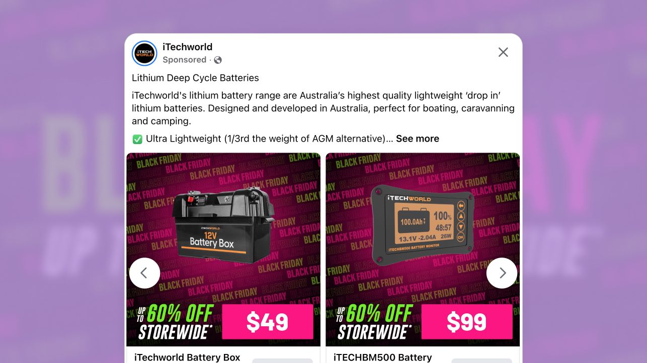
This Black Friday, Australian electronics brand iTechworld launched a standout Meta campaign that broke away from the flood of dark, identical sale ads. Working with digital agency Impressive, the team created bright, high-contrast visuals that made their off-grid power and battery products impossible to scroll past. Since 2006, iTechworld has been helping adventurers and remote workers stay powered anywhere with high-performance lithium batteries, solar panels, and power stations.
This time, iTechworld wanted to reach even more people with a Black Friday campaign that stood out from the flood of dark, identical-looking sale ads dominating social media. Working with Impressive, the brand launched Meta Catalog Ads designed to promote their wide lineup of lithium batteries and related gear during their biggest sale of the year.
The ad’s goal was simple: grab attention fast, spotlight a massive storewide sale (up to 60% OFF), and drive qualified clicks, all while staying true to the brand’s bold visual identity.
Why it won Catalog Ad of the week
When it comes to Black Friday, expectations are sky-high, and so is the competition. The campaign’s new creative nearly doubled its click-through rate (+101%) and delivered a strong 44% lift in ROAS, proving that bold design and clear value messaging can drive results even in the most competitive season.
The proof is in the results: a +101% increase in CTR means the creative compelled action. And achieving this level of performance during Black Friday, when ad costs surge and audience attention is split across countless offers, makes this win even more impressive.
.png)
The campaign turned bold design into measurable growth, showing that clarity and creativity can outperform the chaos of the season.
What makes this Catalog Ad great
To achieve these results, iTechworld and Impressive used a mix of bright, high-contrast Black Month visuals leading up to Black Friday, combining clear pricing and strategic ad structure to turn scrollers into shoppers.
Here’s what stood out:
Black Friday colors done differently
Color was the first, and most impactful, creative decision. Instead of falling into the predictable “all-black” aesthetic that dominates Black Month campaigns, the team used a bold magenta and neon green palette layered over a dark backdrop.
.png)
The combination creates a visual vibration that immediately pulls the viewer’s focus in a crowded feed, especially on mobile, where color contrast determines whether an ad earns a glance or a swipe past.
Beyond visibility, the palette evokes emotion. The bright magenta injects energy and excitement, tones that are psychologically tied to impulse and urgency, while the deep base color grounds the design, preventing it from feeling chaotic. Neon and highly saturated colors like these activate the brain’s alert system, signaling novelty and urgency—two triggers that naturally boost attention and recall.
The repeated “BLACK FRIDAY” pattern subconsciously, ensures that even a fleeting look communicates the occasion. Together, these choices make the ad unmistakably seasonal yet distinct, achieving instant recognition and emotional activation without sacrificing brand cohesion.
Clarity through pricing and offer visibility
The second pillar of this ad’s success lies in how it communicates value. Rather than hiding the price behind a click or burying it in body text, iTechworld made it the hero of the layout. The “Up to 60% OFF Storewide” line and large, hot-pink $199 tag are the strategic focal points.
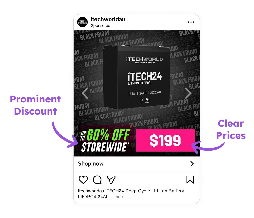
By putting the offer front and center, the ad respects how users interact with sales content during Black Month, they don’t read, they skim for relevance. The “Black Friday” label immediately captures attention and drives curiosity, fueling a +101% lift in CTR, while the clear “Up to 60% OFF” and visible pricing qualify intent, contributing to a +44% boost in ROAS.
This combination of awareness trigger (Black Friday message) and value clarity (pricing and offer) works in tandem: one gets people to click, the other ensures those clicks come from genuinely interested shoppers. The large typography, bold color contrast, and transparent structure guide the eye naturally from product → price → CTA — turning quick scrollers into high-quality site visitors.
Simplify composition to optimize attention flow
While the colors and pricing drive attention, the composition ensures it’s sustained long enough to convert. The product is perfectly centered, cleanly lit, and isolated against the branded background. This it’s a tactic that reduces cognitive load, allowing users to process the message faster.
.png)
The design follows a natural visual flow: from the product image, down to the pricing. This intuitive pattern keeps viewers engaged without distraction, making the layout feel balanced and effortless.
Key Takeaways
iTechworld’s collaboration with Impressive for their Black Friday campaign shows how design precision and strategic clarity can transform a seasonal ad into a performance powerhouse.
This ad it’s deliberately structured to command attention, communicate value instantly, and guide the viewer’s eye toward conversion.
Here’s a quick recap of how iTechworld designed such a great ad.
👉 Leverage Black Friday colors differently
Instead of sticking to the usual “all-black” theme, iTechworld used a vibrant magenta and lime-green palette against a dark backdrop.
This contrast sparks instant recognition and energy, helping the ad pop in a crowded feed.
The repeating BLACK FRIDAY pattern reinforces the sale message subtly, keeping the look modern and cohesive.
👉 Lead with clarity and offer visibility
Leading with price and promotion made the ad both eye-catching and efficient.
The “Up to 60% OFF Storewide” line and bold pricing communicate value in a single glance — no extra reading required.
This transparency attracts qualified clicks, boosts engagement, and supports stronger CTR and ROAS, proving that clarity converts.
👉 Product selling points & copy highlights
A centered product, clear spacing, and a smooth visual flow guide the viewer effortlessly from product → offer.