Grundled & Searchmind
June 10, 2026
The ad: A Catalog Ad that looks nothing like a Catalog Ad
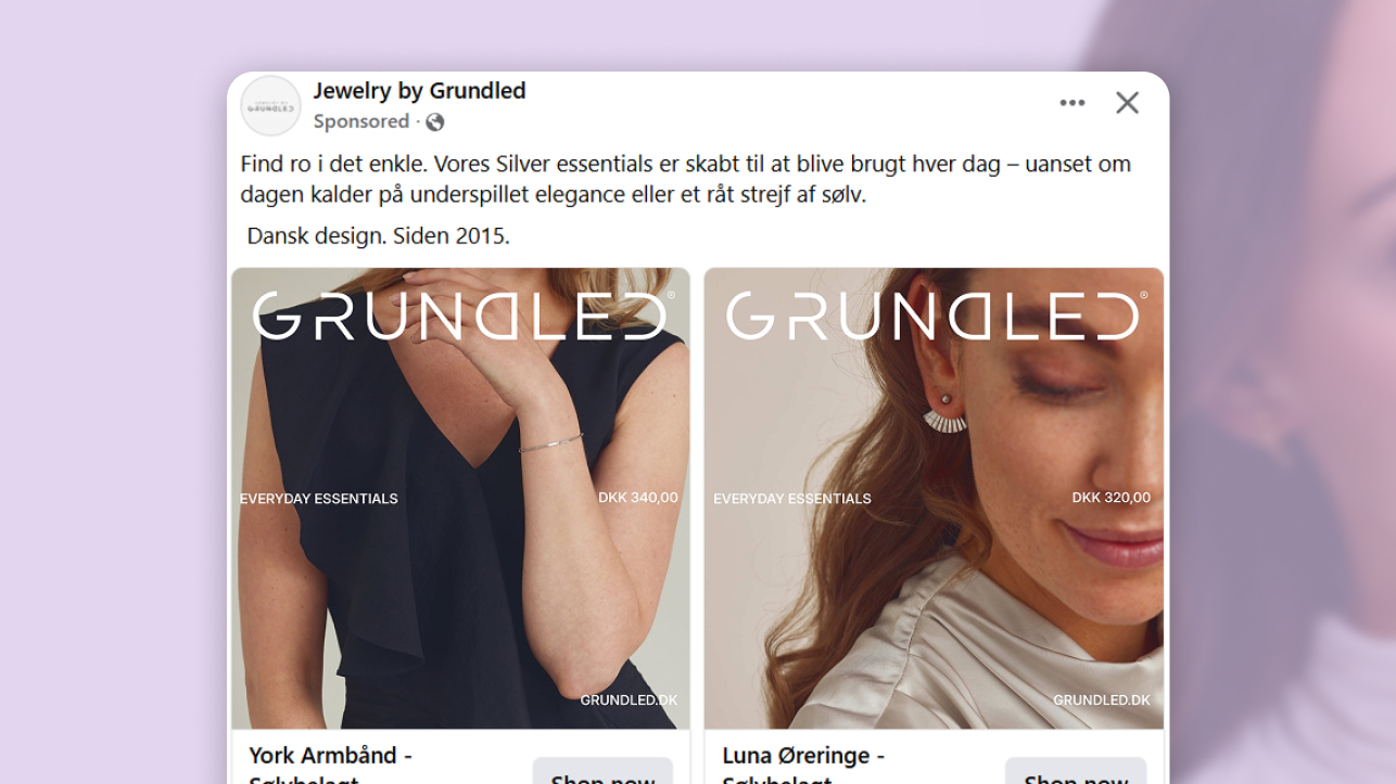
You are scrolling through your feed. You see a close-up of a woman's ear, a small gold hoop catching the light against warm skin. Then a collarbone. Then a hand, a ring, a delicate chain.
No white background. No product floating in space. Just jewelry on a real person, shot like a magazine editorial.
This is Grundled's Everyday Essentials Catalog Ad, built together with Searchmind. And the first thing it does well is not look like an ad at all.
What stops the scroll here is not the design. It is the absence of it. No panel, no badge, no frame within a frame. Just a piece of jewelry on a real person, shot the way a magazine would shoot it. The design is what you do not notice.
Why it won Catalog Ad of the Week
Jewelry is an emotional purchase. Nobody buys a necklace because the specs checked out. The decision starts with a feeling - a split-second moment of wanting something while scrolling - and Grundled and Searchmind built their Catalog Ad entirely around that moment.
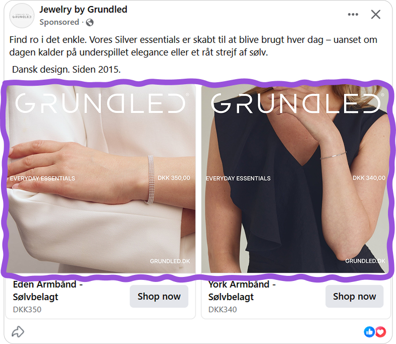
What makes this set impressive is not any single card. It is the consistency across all of them. Move through the carousel and only the jewelry changes.
That +73% improvement in ROAS did not come from one good creative decision. It came from Grundled and Searchmind applying the same clear creative philosophy to every single card - the same editorial tone, the same quiet hierarchy, the same choice to let the jewelry carry the frame. Nothing in this set looks accidental.
.png)
Most Catalog Ad sets fall apart on card three or four. The first card is polished, the rest are rushed. What makes this set different is that the standard never drops. Every product gets the same treatment - and that consistency is what turns individual impressions into a brand that sticks.
What makes this Catalog Ad great
A layout that finally breaks the mold
Most jewelry and fashion Catalog Ads in the feed use a split layout: product image on one side, information panel on the other. It is a smart format - it works, and there are good reasons it keeps showing up across the category.
Grundled used none of that.
Their cards are full-bleed. The lifestyle image fills the entire frame. There is no panel, no dividing line, no container for the brand information.
The jewelry, worn on a real person, gets the whole canvas - and the text sits directly on top of it, quiet enough not to compete.
A split-layout ad, even a beautiful one, has a recognizable silhouette. Before you read a single word, your brain has already filed it as an ad. That categorization happens fast, and once it does, the skip reflex is right behind it.
A full-bleed editorial image does not have that silhouette. It looks like the content around it: a post someone chose to share, a photo from a brand's own Instagram grid. The ad filter never fires. The scroll stops not because the creative is louder than everything else, but because it looks like it belongs.
Jewelry that is always worn - never alone
The full-bleed layout earns the stop. But what holds attention is what fills that frame.
Every card in this set shows the product on a person. Not a product shot on white, not a floating ring against a neutral background - jewelry in use, the way you would actually see it in real life.
This is not a stylistic choice. It is the answer to the most basic question a jewelry buyer has: what does this actually look like when worn?
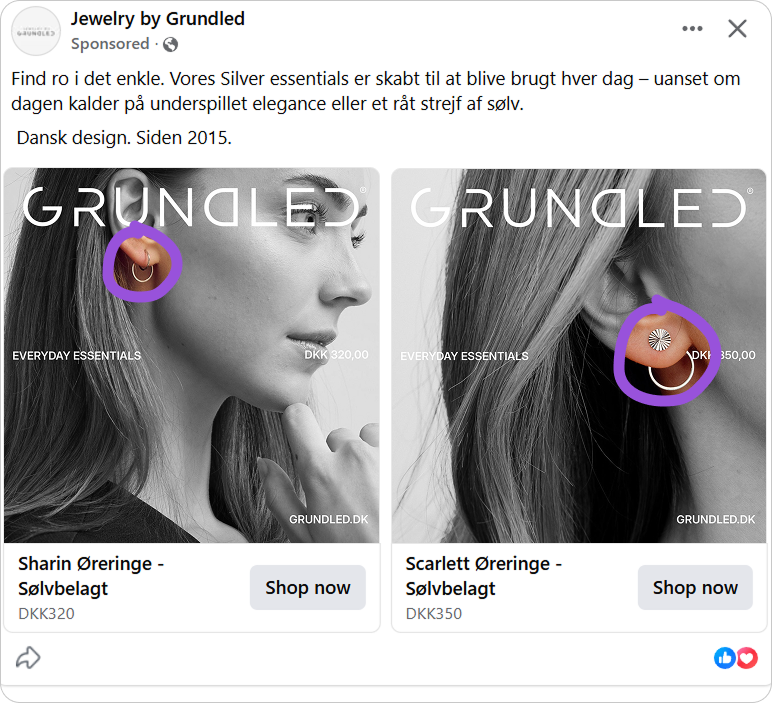
A pair of earrings on a white background tells you almost nothing. Not the scale, not how it sits on a face, not what it does to a neckline. A close-up of those same earrings on a real person answers all of it in a fraction of a second.
When someone sees a necklace resting on a collarbone, the question is never "that looks nice on her." It is "would that look like that on me." The lifestyle image does not just show the product - it activates the desire to own it by making the benefit immediately imaginable.
Grundled built that psychology into every single card.
Supporting elements that know their place
A lot of brands invest in strong photography and then undo it with the design layer - a price badge here, a logo box there, a website URL competing for space in the corner. The image is great. The overlay makes it feel like an ad again.
Grundled's approach is the opposite. The logo is visible but set in a typeface that reads as part of the editorial, not a stamp dropped on top.
"EVERYDAY ESSENTIALS" does something smart in two words: it positions the pieces as things you wear every day, not special-occasion jewelry that sits in a drawer. That is a brand statement and a purchase argument compressed into a line that barely takes up space.
The price sits beside "EVERYDAY ESSENTIALS" in the middle of the frame, small and understated, exactly where someone already interested will look. First the image creates the want.
The brand name at the top provides context. Then the price and category line answer the practical questions together, quietly. The website sits at the very bottom, present for anyone who wants it, but never competing for attention. Staged by size and position, the whole thing reads without effort.
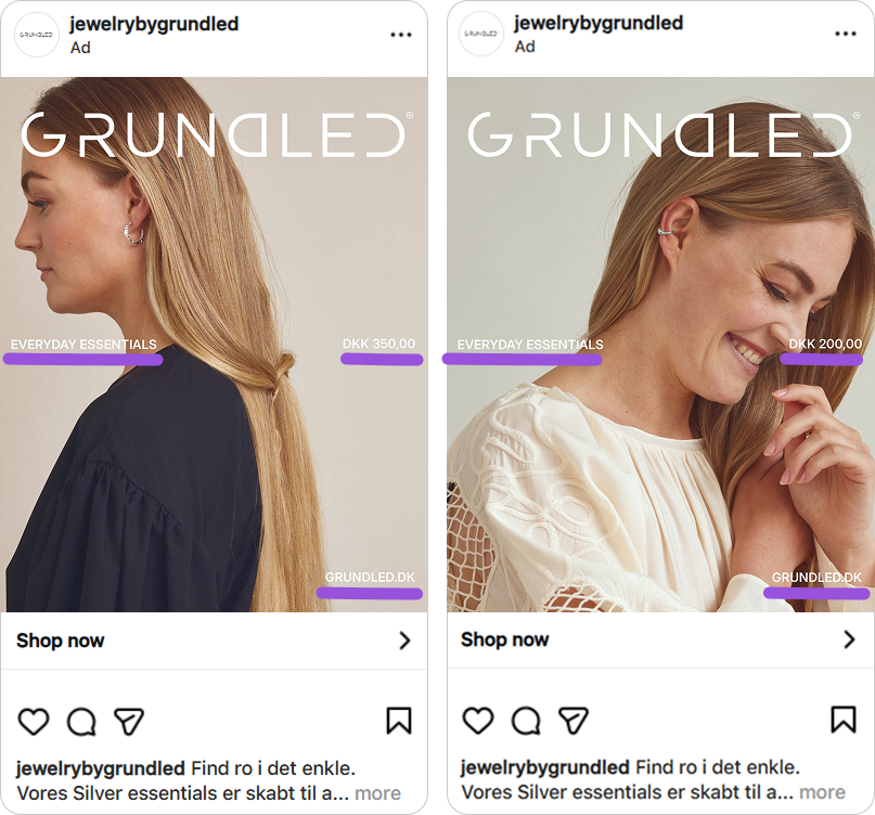
Three formats, three proper designs - not three crops
This campaign runs across 1:1, 4:5, and 9:16. None of them is a resized version of the others.
Designing once and letting Meta handle the rest is the default. It is also where most sets quietly fall apart - logos drift, prices hide behind buttons, products get cropped in ways nobody approved.
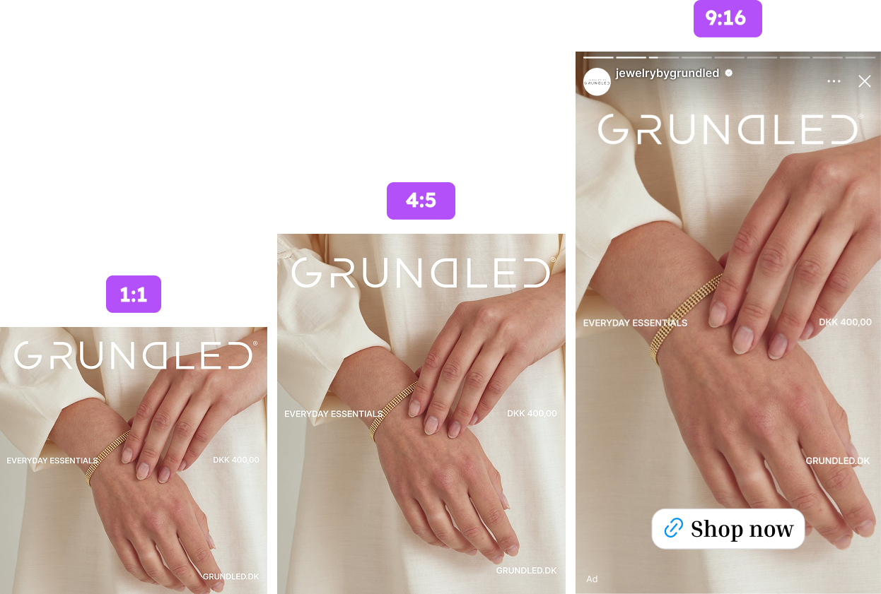
Grundled built each format for the placement it actually runs in. The 1:1 is tight and confident. The 4:5 gives the composition more room to breathe. The 9:16 expands to full-screen with a Shop Now CTA at the bottom, built for how Stories are consumed.
The photo was shot with all three in mind - the framing holds at every ratio because it was planned that way.
.png)
The editorial quality travels with it. Close-up, soft, intimate - the kind of image that looks at home in a magazine. That does not change as the format gets taller. In Stories especially, a full-screen image that feels editorial lands very differently from a product shot that was built for a feed square and resized to fit.
The logo, the type, "EVERYDAY ESSENTIALS", the price - all in the same position across every format. A shopper who sees the 1:1 in their feed and the 9:16 in their Stories is not seeing two versions of Grundled. They are seeing the same brand, twice.
That editorial consistency across the full set is the real wow factor here.
Key Takeaways
Every decision in this Catalog Ad points in the same direction: earn attention through the quality of the creative, not the loudness of the message. Here is what Grundled and Searchmind got right.
👉 Full-bleed layouts stop the scroll without signaling ad
If your category allows for strong lifestyle photography, a full-bleed layout works harder than a split panel. It looks like content. The skip reflex never fires.
👉 Show the product on a person, not in isolation
A model wearing the piece answers everything a product shot cannot: scale, context, how it sits. Grundled made that the foundation of every single card.
👉 Let supporting elements know their place
Small logo, quiet price, minimal text. That is not an absence of design - it is a decision to give the product room to do its job.
👉 Consistency across the full set is the real asset
One great card is a start. A full set where every card holds the same standard is a brand asset. That accumulated familiarity is what closes the gap between interest and purchase.